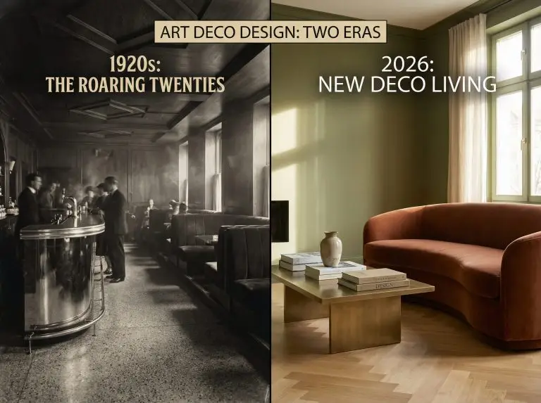
Art Deco never really went away. It just… evolved.
If you close your eyes and picture Art Deco, you probably see The Great Gatsby: stark black and white geometry, high-gloss gold, and the electric energy of a jazz club. While that high-contrast drama is the soul of the style, the body has changed. In 2026, we are witnessing the maturation of “New Deco” (or Soft Deco)—a movement that takes those iconic geometric shapes and gilding but softens the edges with warmer, more livable colors.
Whether you are looking to recreate a historically accurate 1920s speakeasy vibe or want to inject a touch of “Warm Minimalism” into a modern apartment, color is your most powerful tool. It is the bridge between the past and the present.
In this deep-dive guide, we are going beyond the basics. We’ll explore the historical psychology of these hues, break down the specific paint codes you need for 2026, and show you how to blend these palettes into a contemporary home without it looking like a movie set.
Don’t just imagine these colors; see them. If you’re unsure how Emerald Green will look next to your current flooring, upload a photo of your room to our Free 3D Color Visualizer and test these palettes instantly.
🎨 Hackrea Pro Tip
What Defined the Original Art Deco Palette?
To break the rules effectively in 2026, you first have to understand them. The Art Deco interior design style (roughly 1920–1939) was born in a time of rapid industrialization and post-war optimism. It wasn’t about being shy; it was about the future, luxury, and the machine age.
The original palette was driven by three main influences that are surprisingly relevant again today:
1. The Machine Age & The Future
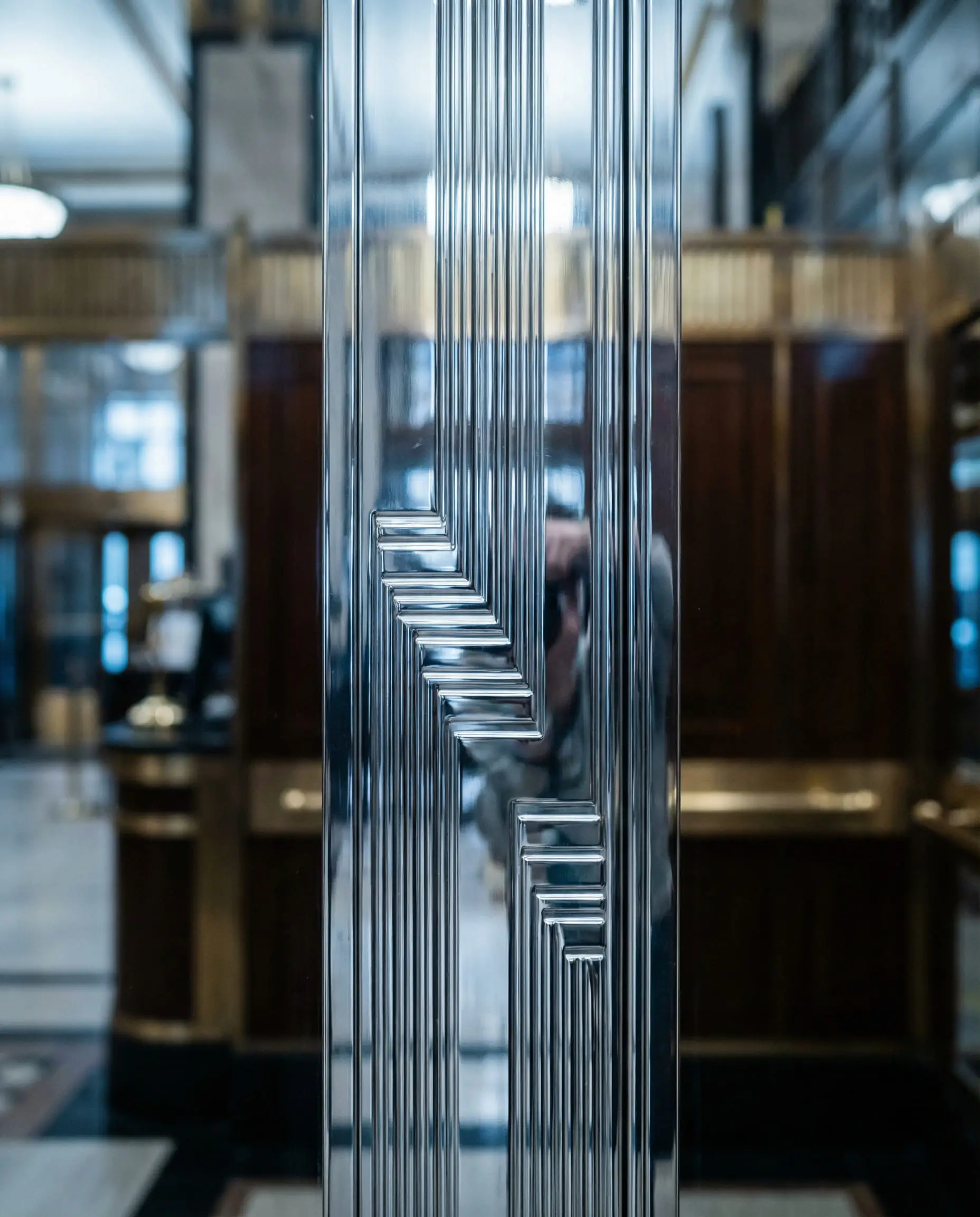
The 1920s saw the rise of automobiles, skyscrapers, and aviation. This brought chrome, silver, and steel into interiors, not just as hardware, but as dominant neutrals. The sheen of metal represented progress. Today, we are seeing a similar fascination with “future-retro” aesthetics, bringing silver and cool metals back into the conversation after a decade of brass dominance.
2. Exoticism & Archeology
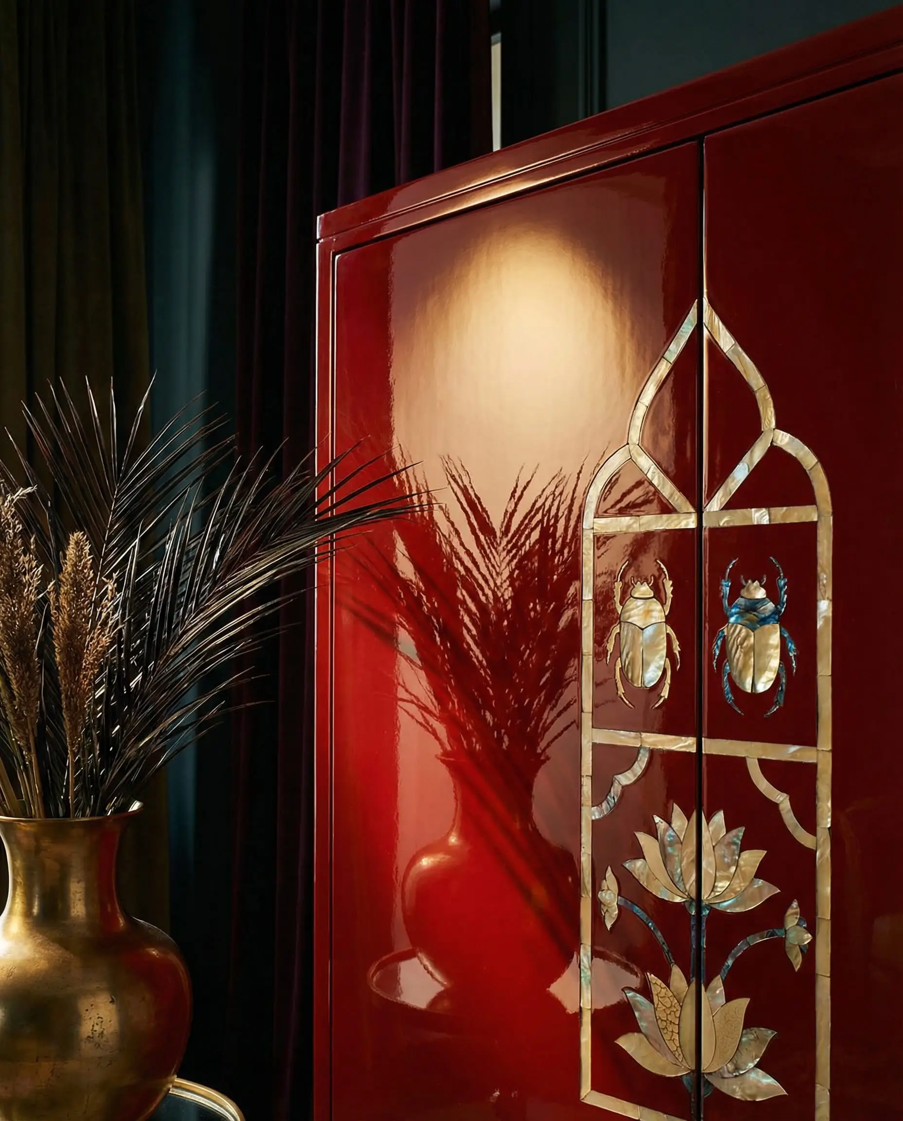
The discovery of King Tut’s tomb in 1922 sparked a global obsession with Egyptian motifs. Simultaneously, trade with Japan and China introduced deep, rich pigments to the West. Designers moved away from Victorian pastels to Egyptian Blue, Jade Green, and Red Lacquer. These were colors of wealth, travel, and mystery.
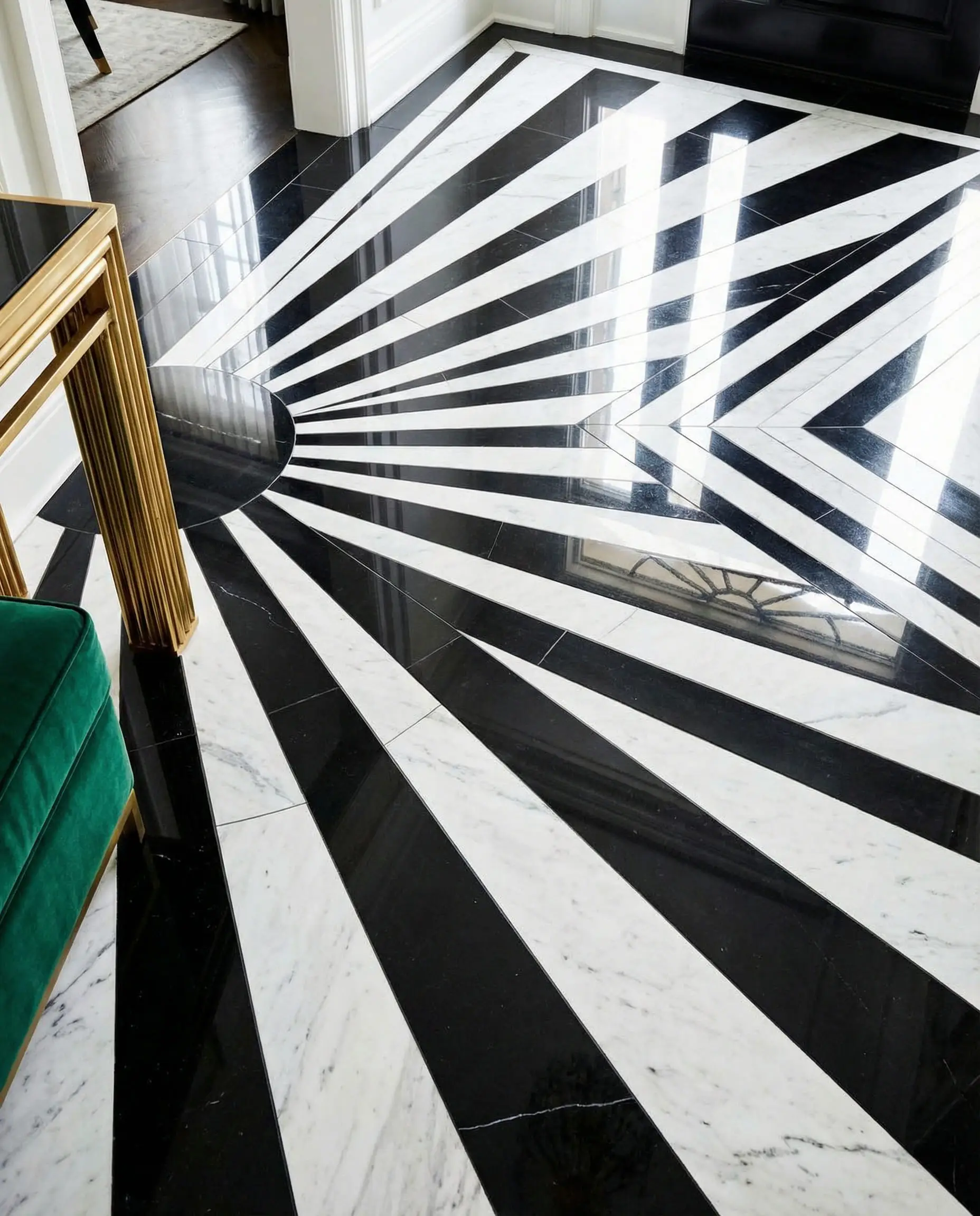
3. The Graphic Contrast
To make the era’s signature geometric patterns pop (chevrons, sunbursts, zigzags), designers relied on the ultimate high-contrast duo: Black and White. This created the “tuxedo look”—sharp, tailored, and undeniably expensive.
You can apply wallpapers, paints, etc. on walls and see how they look in various interiors.

The “New Deco”: Modern Art Deco Color Trends for 2026
While we love the drama of the 1920s, living in a museum isn’t for everyone. The “New Deco” trend adapts the style for modern living. We are seeing a shift away from the “Showroom” look toward the “Sanctuary” feel.
Here is how the palette is shifting this year, aligning with broader interior design trends:
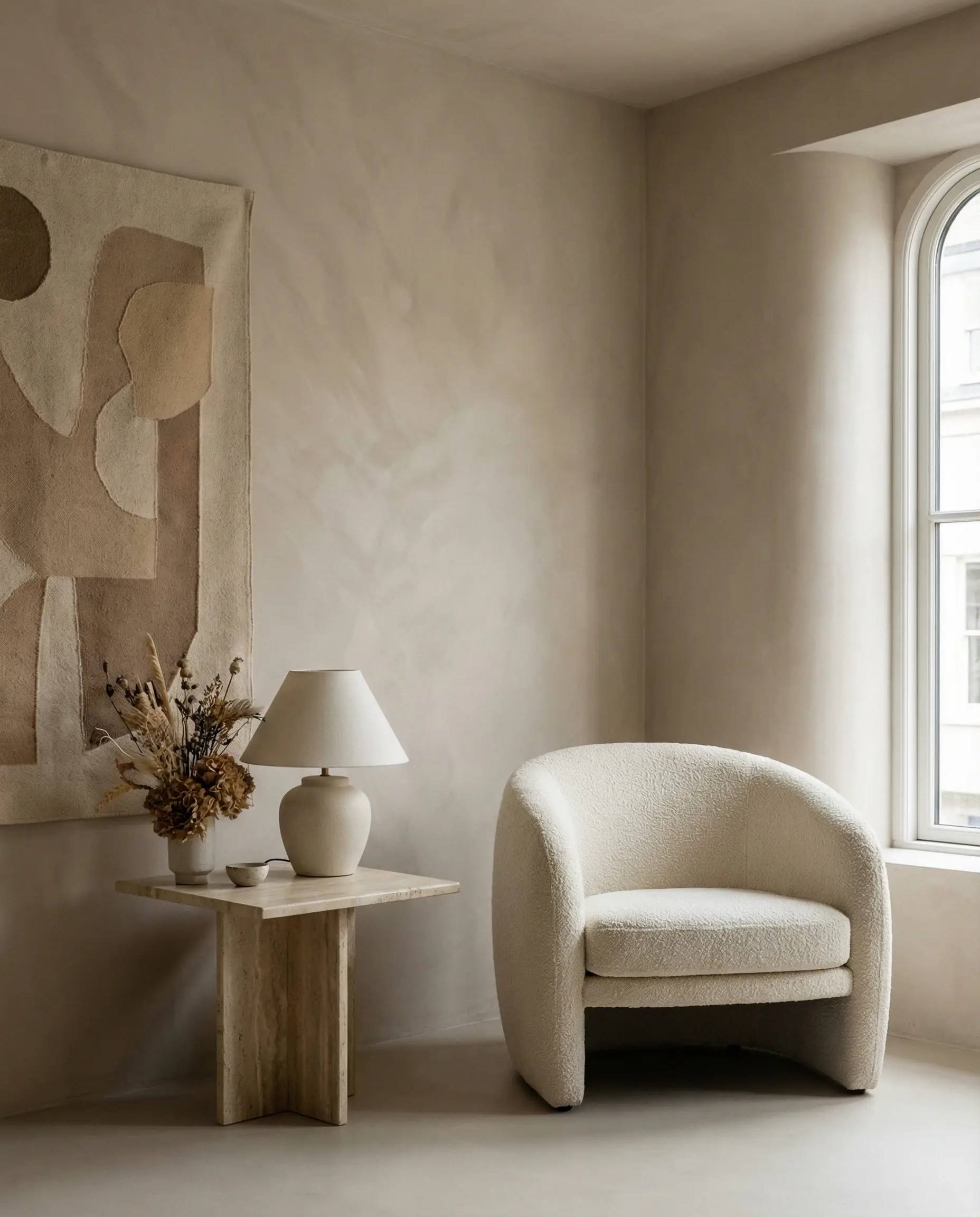
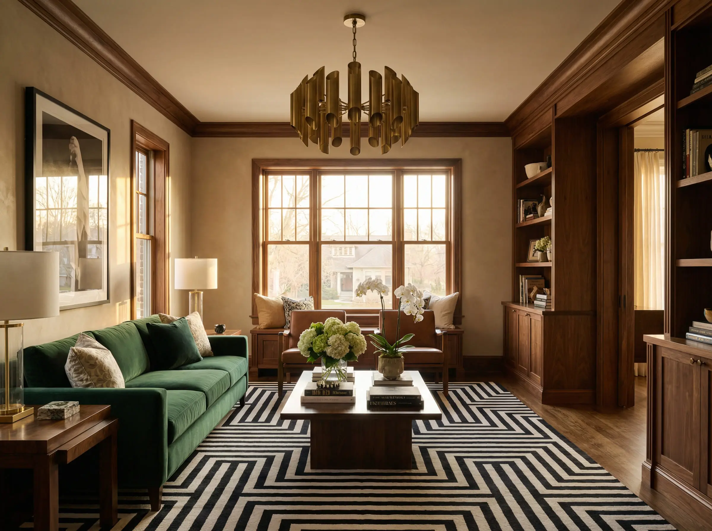
1. Warm Neutrals & “Soft Deco”
Forget the sterile, hospital-white walls. The 2026 background is all about cream, mushroom, beige, and taupe. These shades provide a sophisticated backdrop that allows your velvet furniture and brass accents to shine without feeling cold.
Key shift: High-gloss surfaces are being replaced by matte, velvety wall finishes (like lime wash) that absorb light rather than reflect it. This creates a “cocooning” effect that is central to the hygge concept but with a glamorous twist.
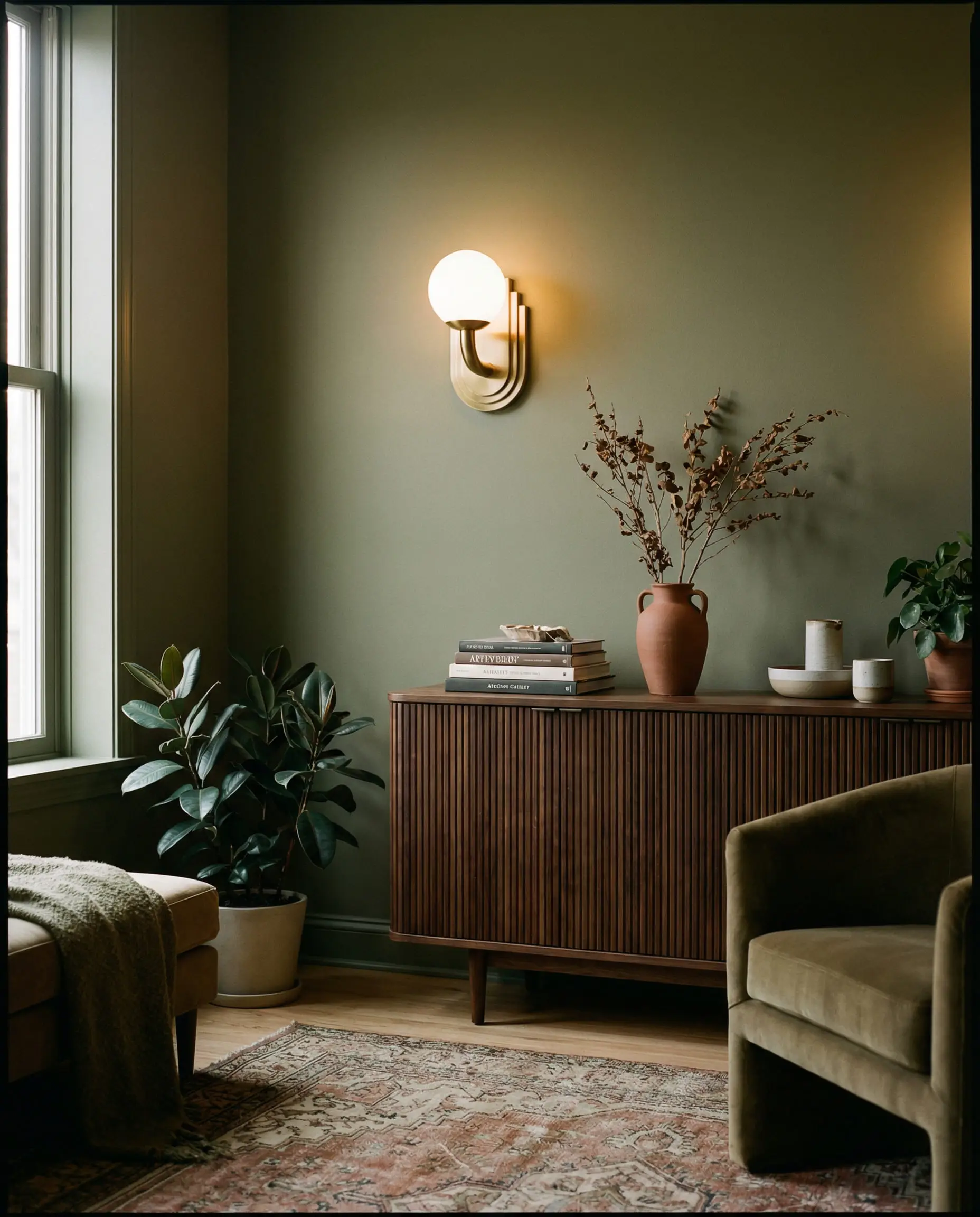
2. Earthy Jewel Tones
The classic Art Deco jewel tones (emerald, sapphire, ruby) are still here, but they’ve gone organic. In 2026, we are seeing:
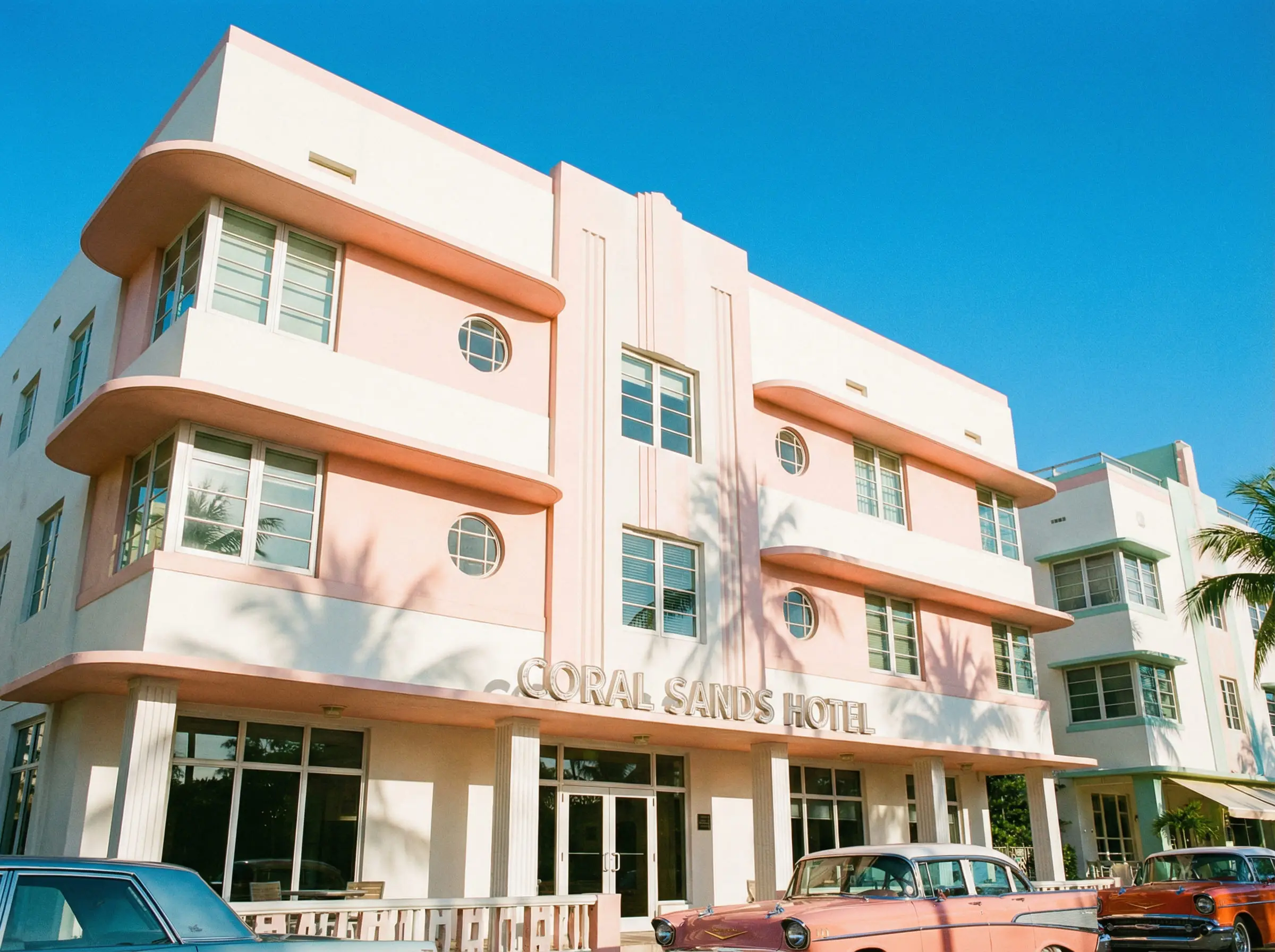
3. Tropical & Miami Revival
A massive trend for 2026 is the resurgence of “Tropical Deco” (think Miami Beach in the 1930s). This palette is playful, utilizing seafoam green, pastel pink, and pale yellow, often paired with white plaster and rattan. It’s Art Deco on vacation—breezy, light, and unapologetically joyful.
6 Essential Art Deco Color Palettes (With Paint Codes)
Ready to paint? We’ve curated six distinct palettes ranging from moody classics to modern interpretations. We’ve included Hex codes for digital designers and specific paint recommendations from top brands to help you visualize.
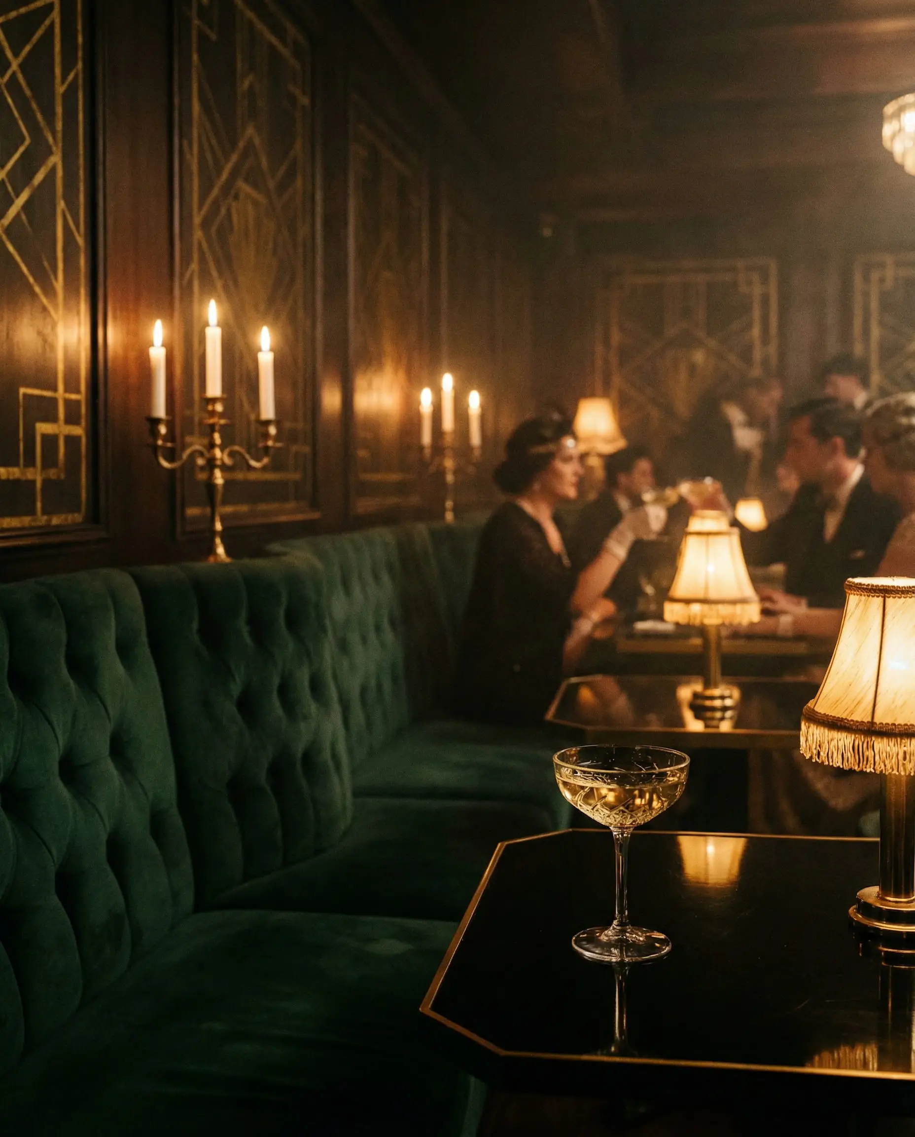
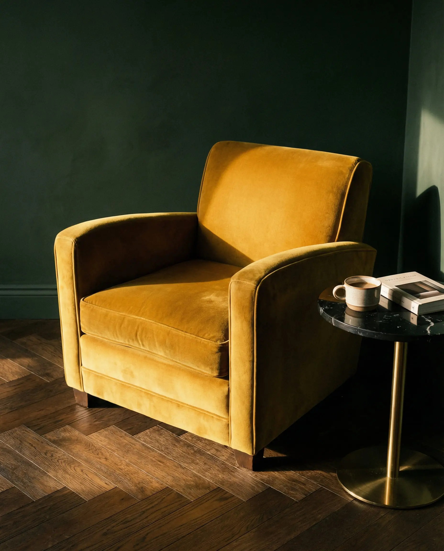
Palette 1: The Gatsby Night (Moody & Classic)
This is the quintessential Art Deco look. It’s dark, dramatic, and best suited for dining rooms, powder rooms, or a moody lounge. It relies on the interplay between deep shadows and metallic highlights.
Where to use it: Paint the walls dark emerald or black, and use gold for the trim or lighting fixtures. This works exceptionally well in an Art Deco dining room to create an intimate, expensive feel.
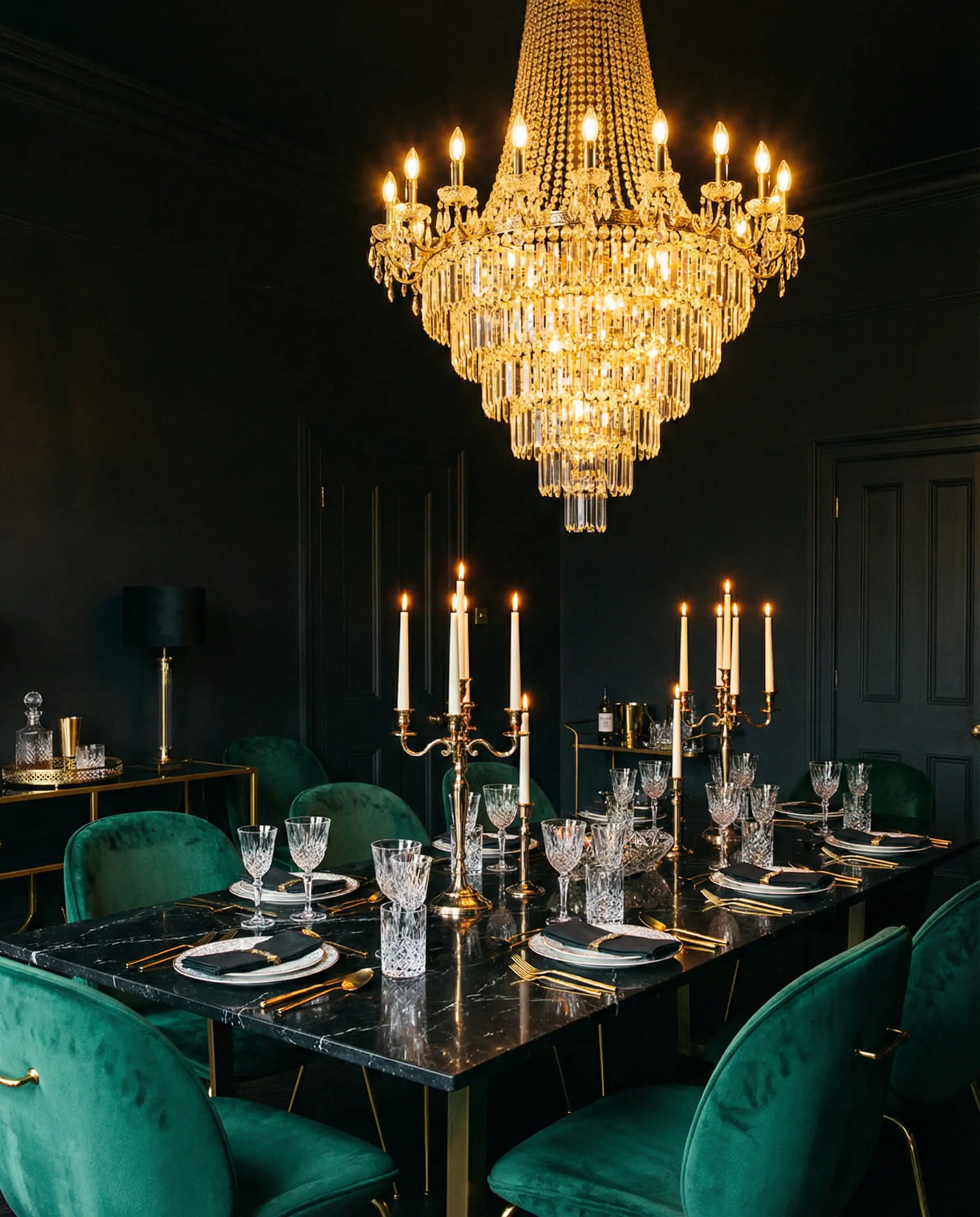
If true black feels too intense, opt for a “soft black” with blue undertones. It adds depth without the void-like feeling.
🖌️ Designer Tip
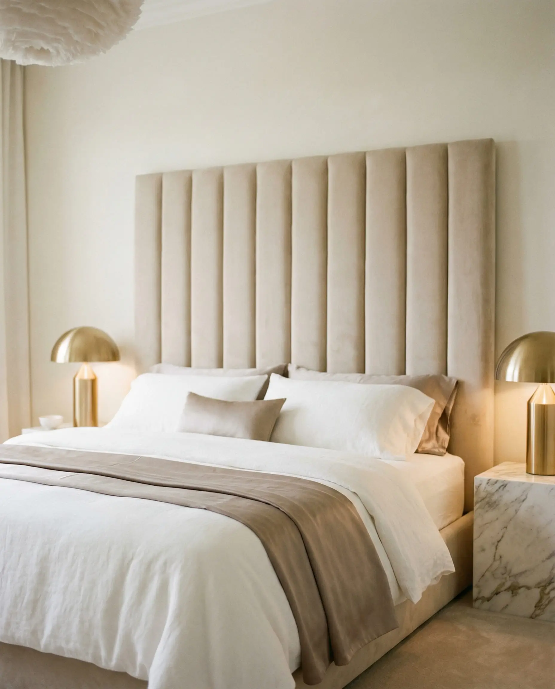
Palette 2: The New Neutral (Soft & Elegant)
Perfect for living rooms and bedrooms where you want the Art Deco geometry without the visual noise. This palette uses texture (bouclé, velvet) to create interest rather than high contrast.
Where to use it: This is the ideal palette for furniture in the style of Art Deco, allowing curves and fluting to take center stage against a calm background.
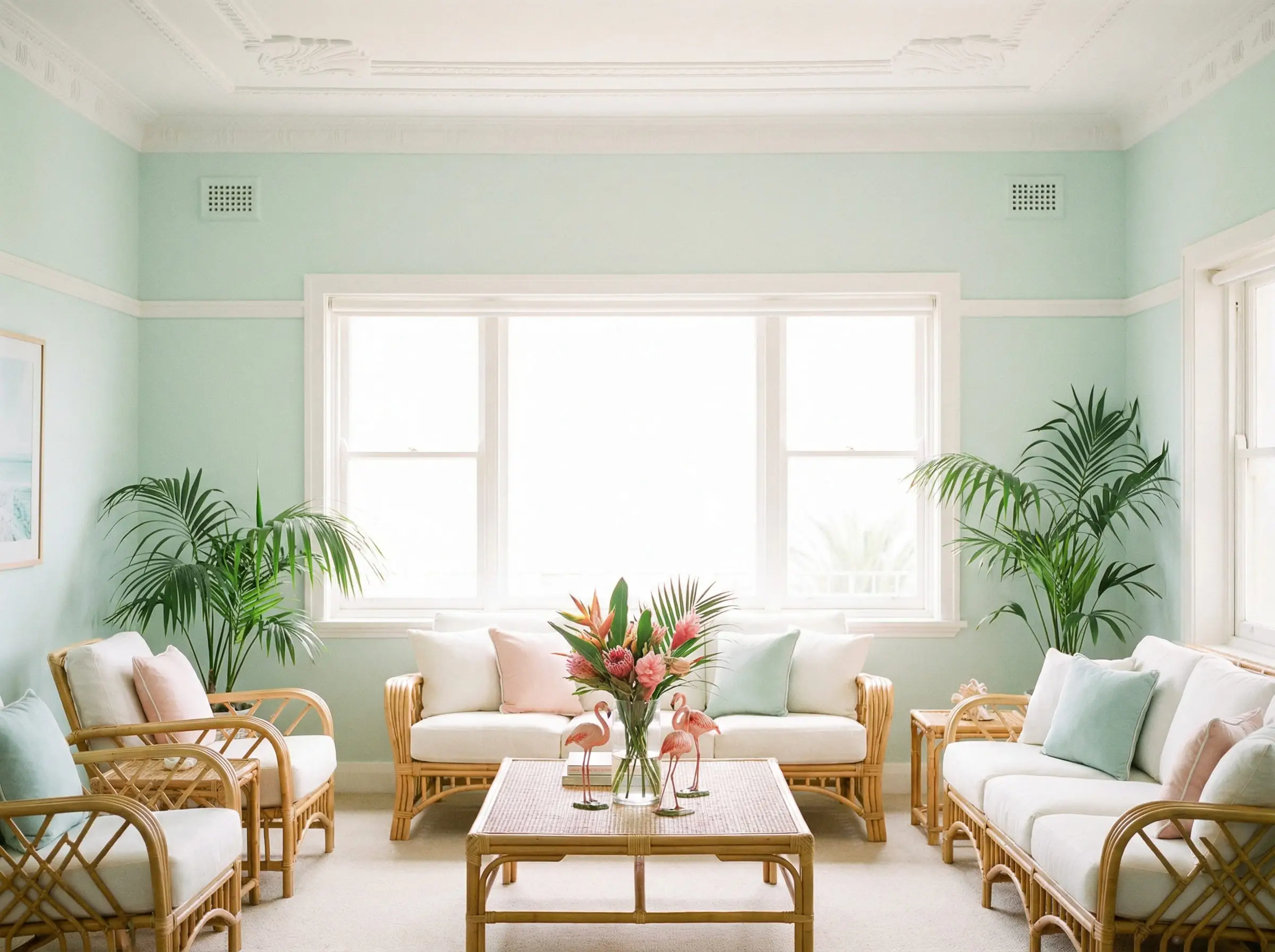
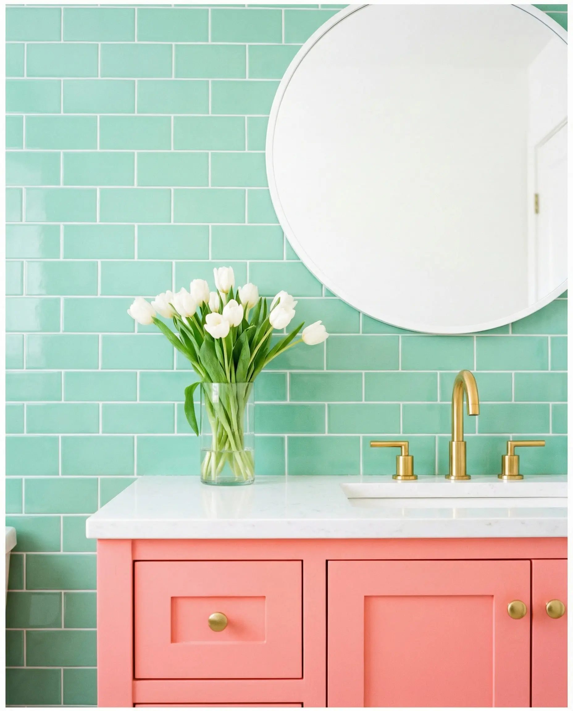
Palette 3: Miami Sunset (Playful & Fresh)
For those who love color, this 1930s coastal vibe is joyful and bright. It works exceptionally well in bathrooms or sunrooms.
Where to use it: Try a Mint Green vanity against a Coral Pink Art Deco wallpaper pattern.
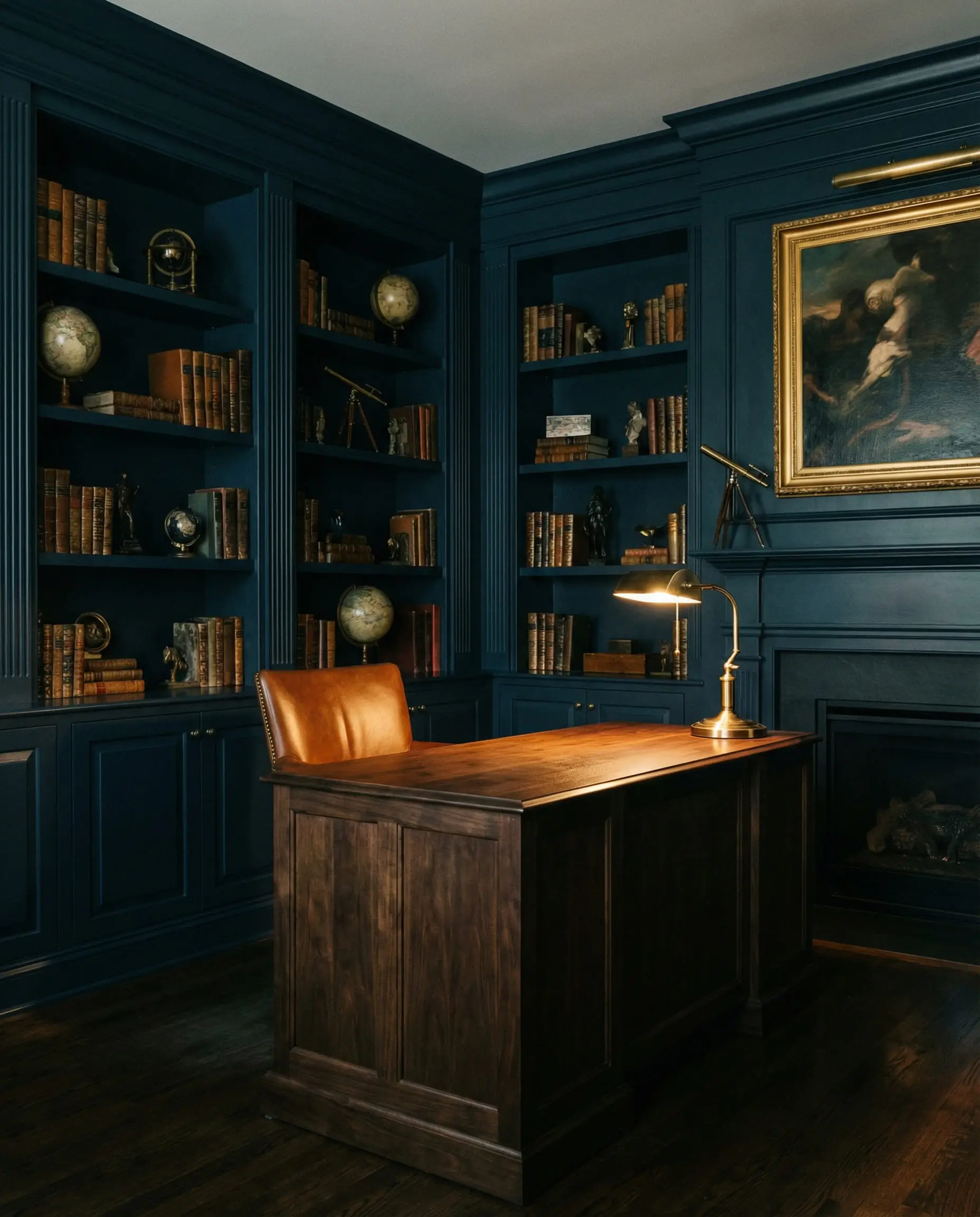
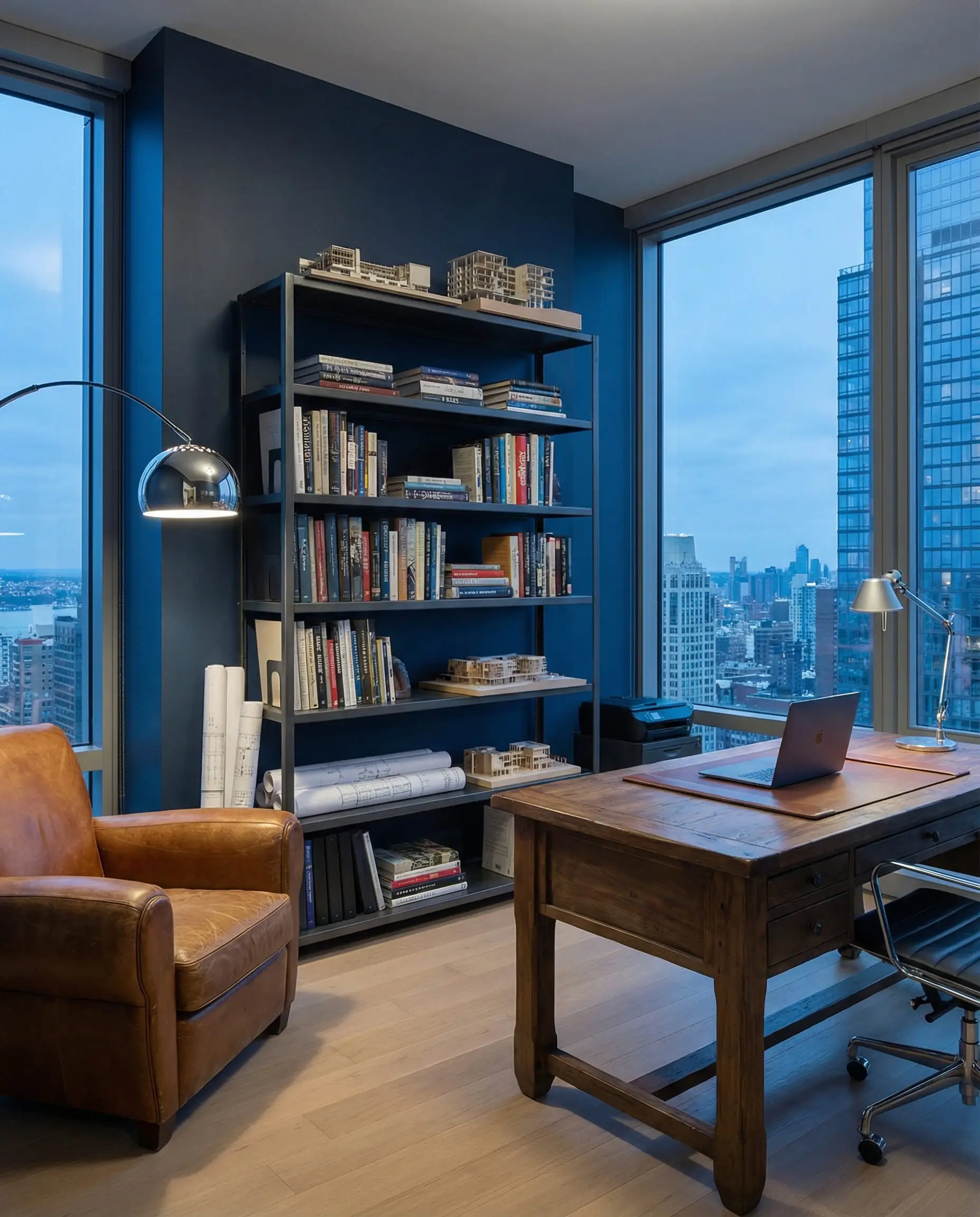
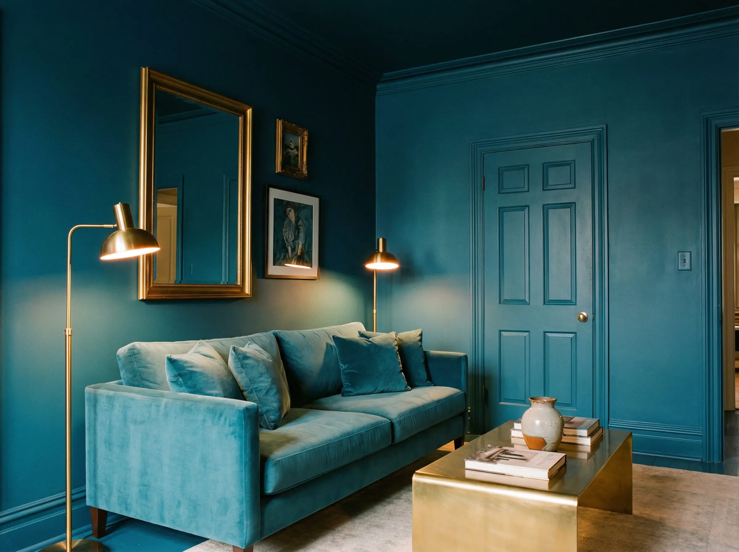
Palette 4: Industrial Chic (Masculine & Sharp)
A nod to the skyscraper era and the Chrysler Building. This palette feels masculine, tailored, and serious. It pairs beautifully with rich leather and walnut wood.
Where to use it: A home office or a library. The navy walls promote focus, while the leather adds warmth.
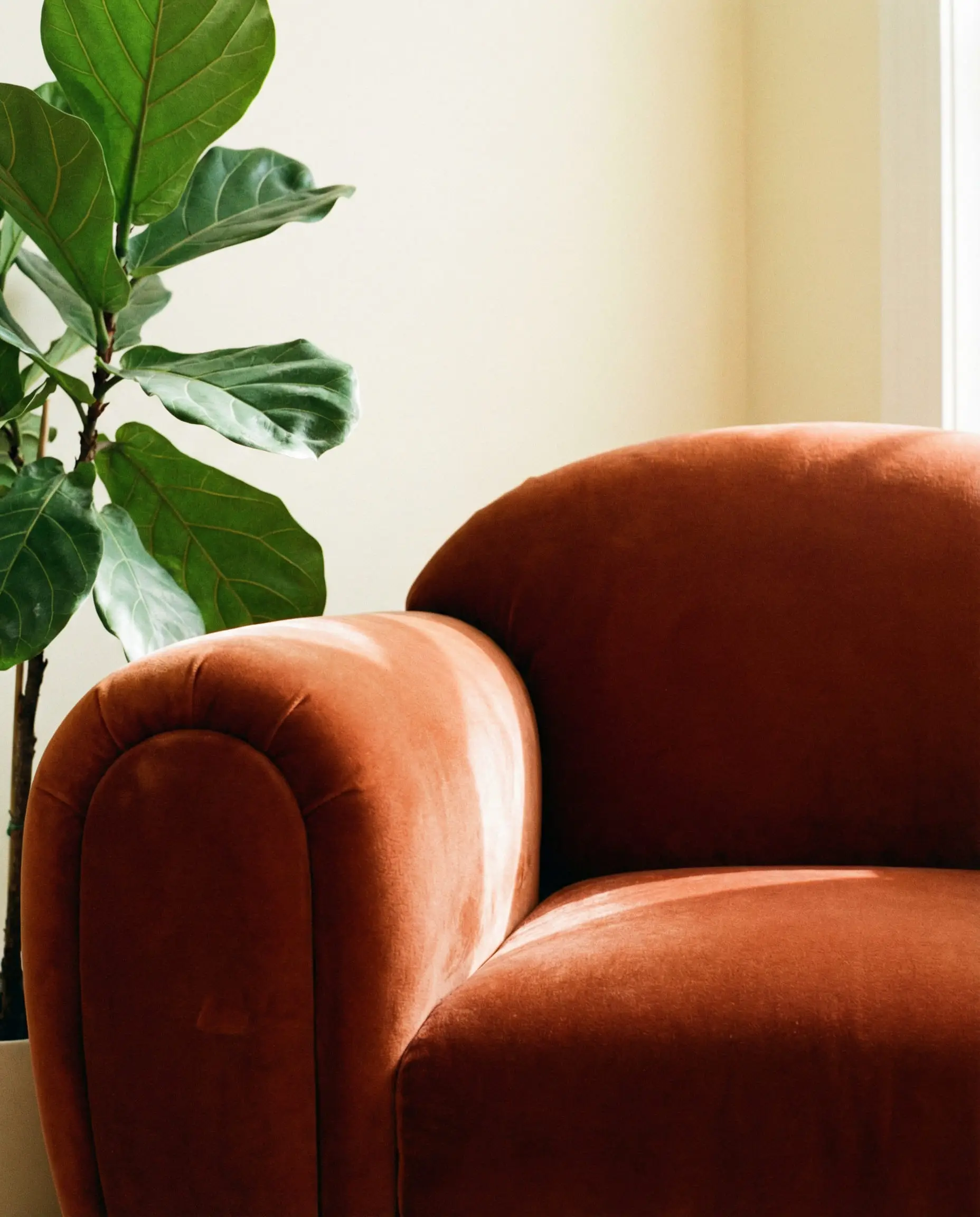
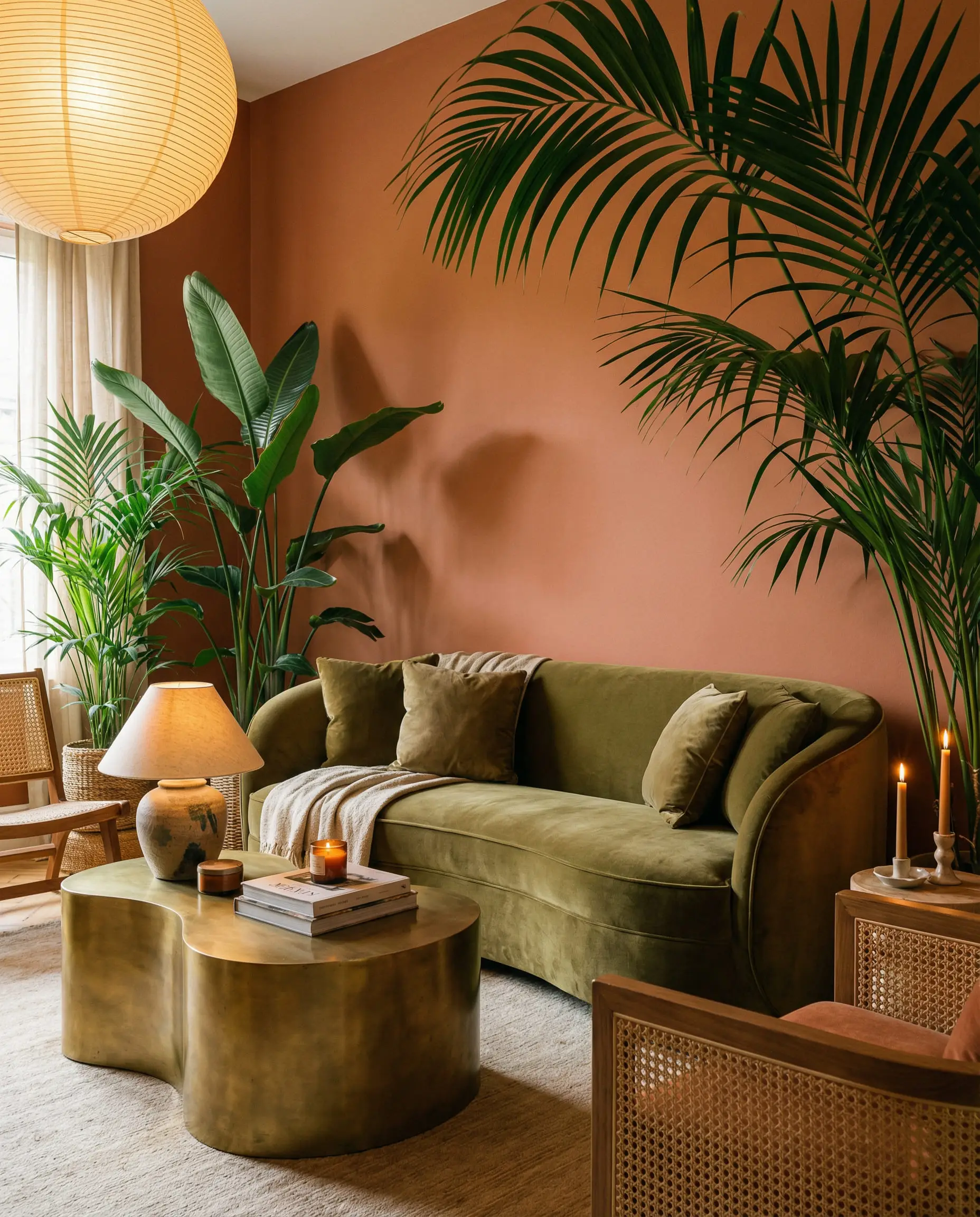
Palette 5: Organic Opulence (The 2026 Trend)
This is where Art Deco meets nature. It uses the geometric shapes of Deco but fills them with the colors of the earth.
Where to use it: A cozy living room with a Terracotta velvet sofa and Olive walls. This fits perfectly with the paint color trends of 2026.
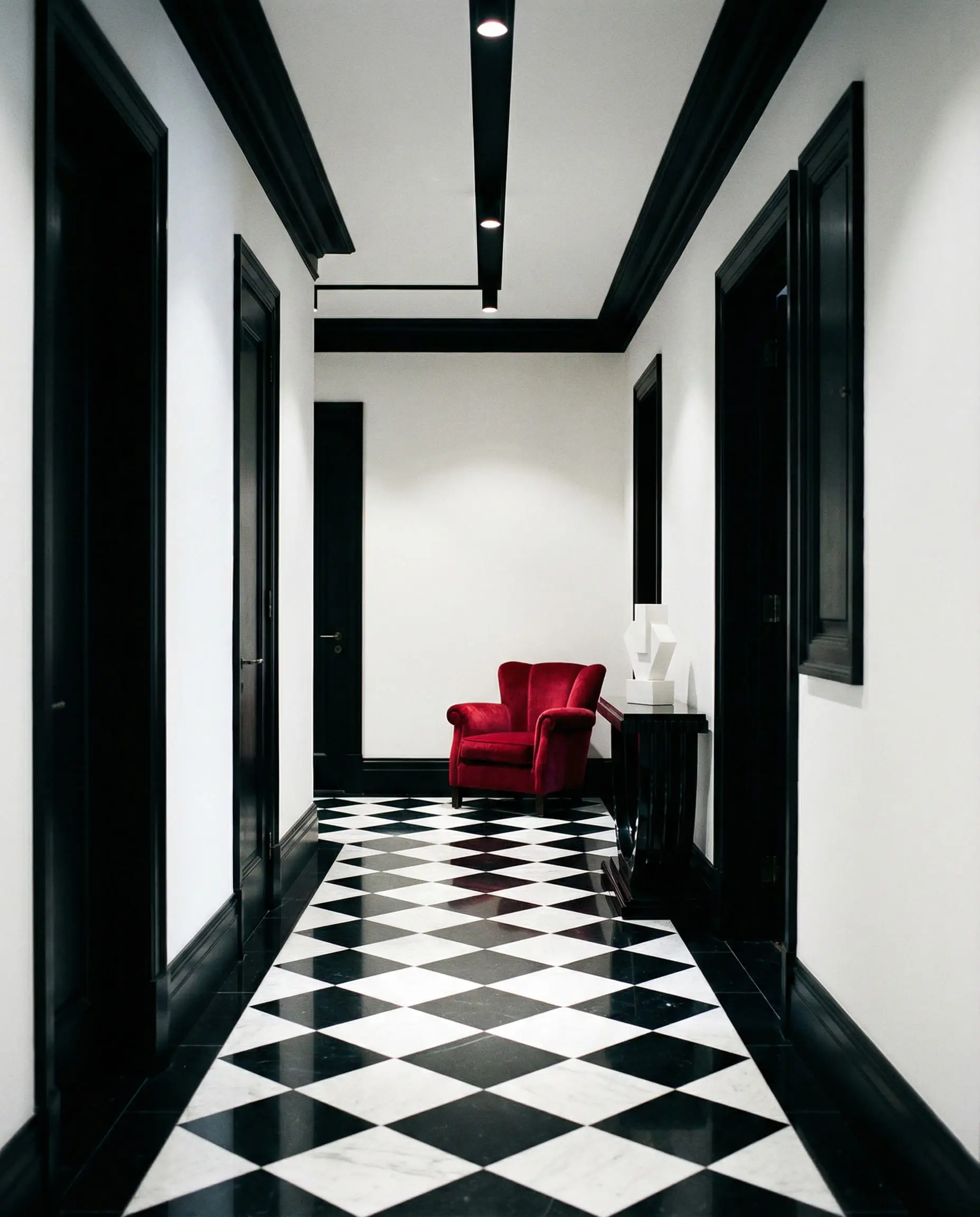
Palette 6: Monochrome Drama
You can’t go wrong with the original. To keep it from looking like a diner, vary the textures.
🛑 Stop Guessing: Not sure if “Hale Navy” is too dark for your north-facing room?
> Click here to test these exact colors in your room with the Hackrea Visualizer
How to Apply Art Deco Colors Room by Room
Knowing the colors is half the battle; knowing how to apply them is the rest. In Art Deco, placement is everything. You are painting a set stage for your life.
The Living Room: Statement Walls & Color Drenching
In the 1920s, walls were often treated as canvases. Today, we achieve this through Color Drenching—painting the baseboards, walls, and crown molding the same color.
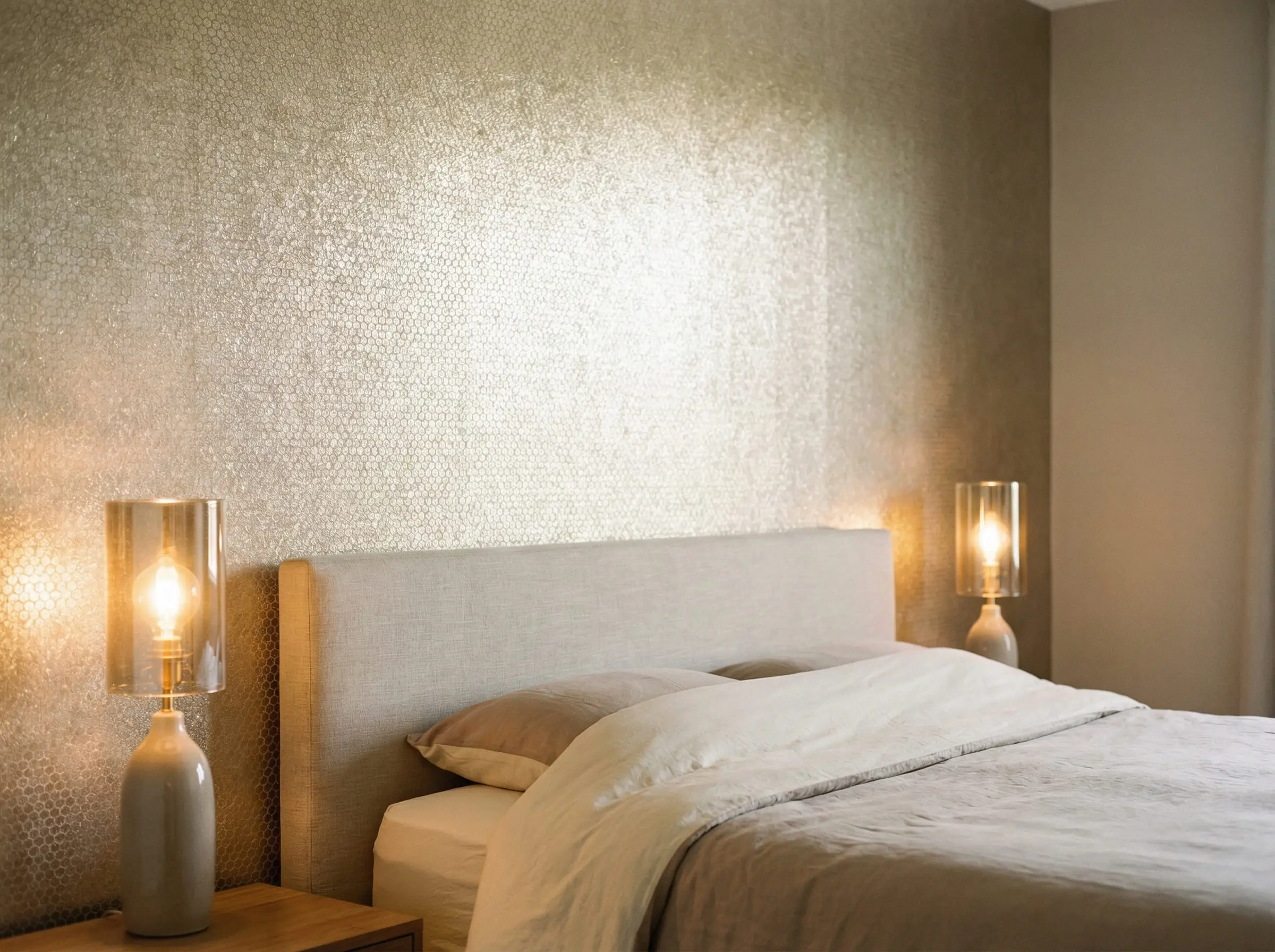
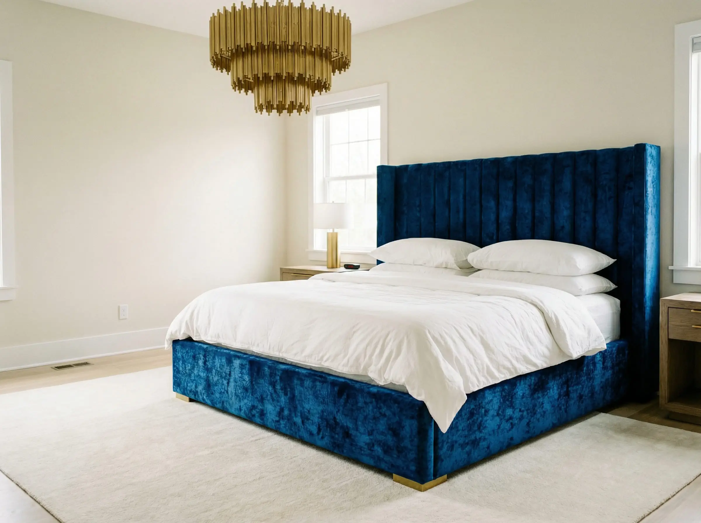
The Bedroom: Tranquility meets Glamour
While high-contrast is fun, it doesn’t always promote sleep.
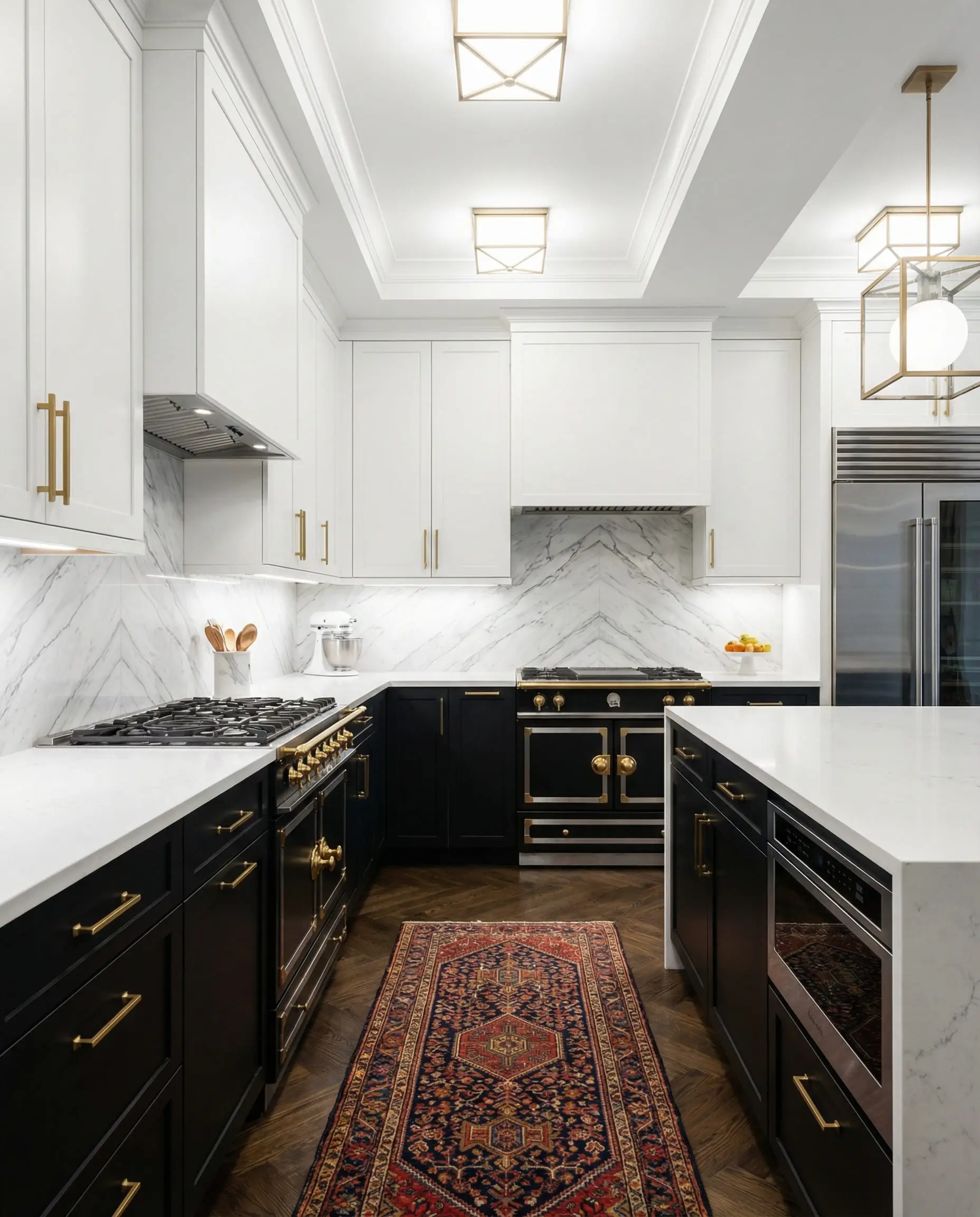
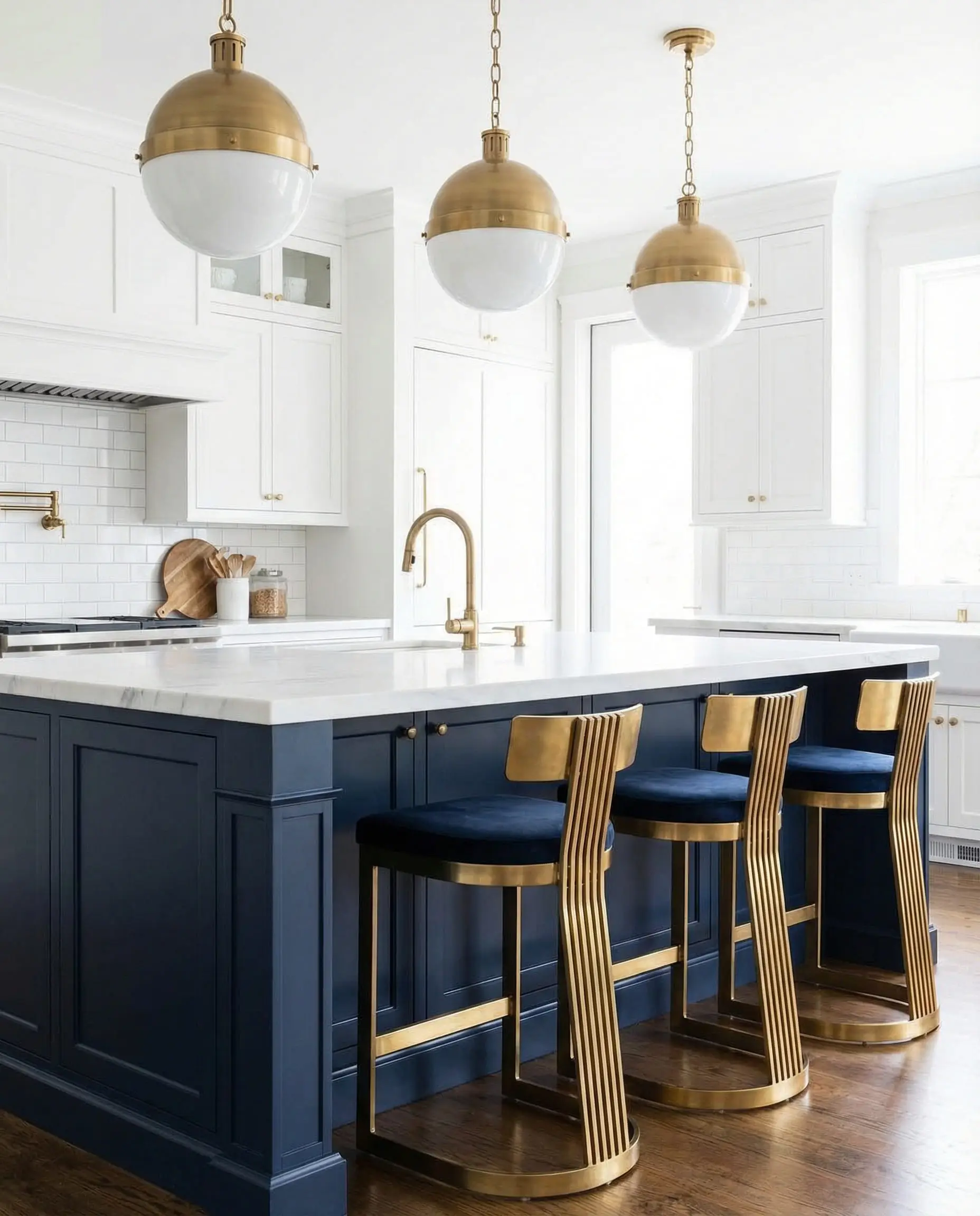
The Kitchen: The Two-Tone Return
Kitchens are the easiest place to implement the “Industrial Chic” palette.
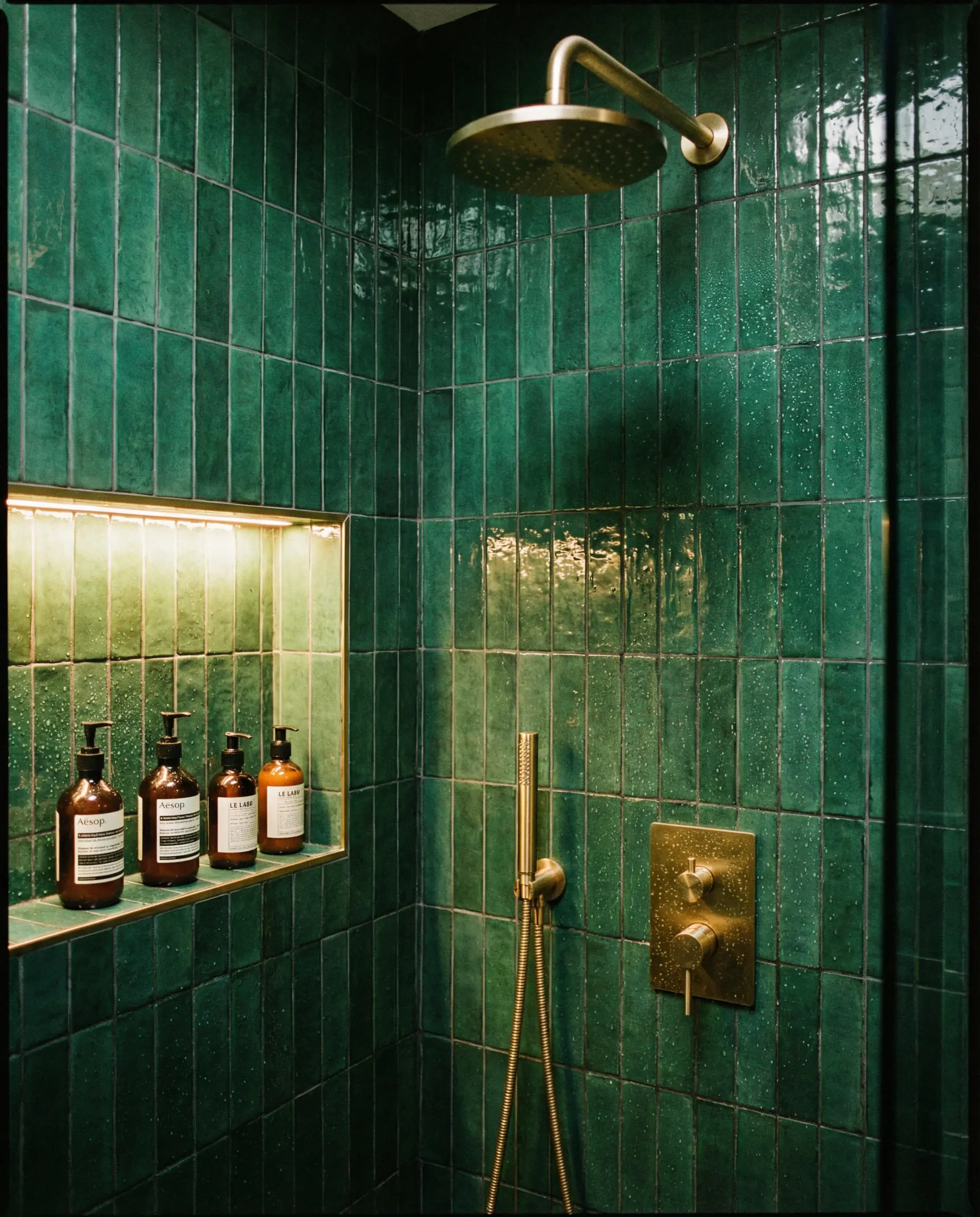
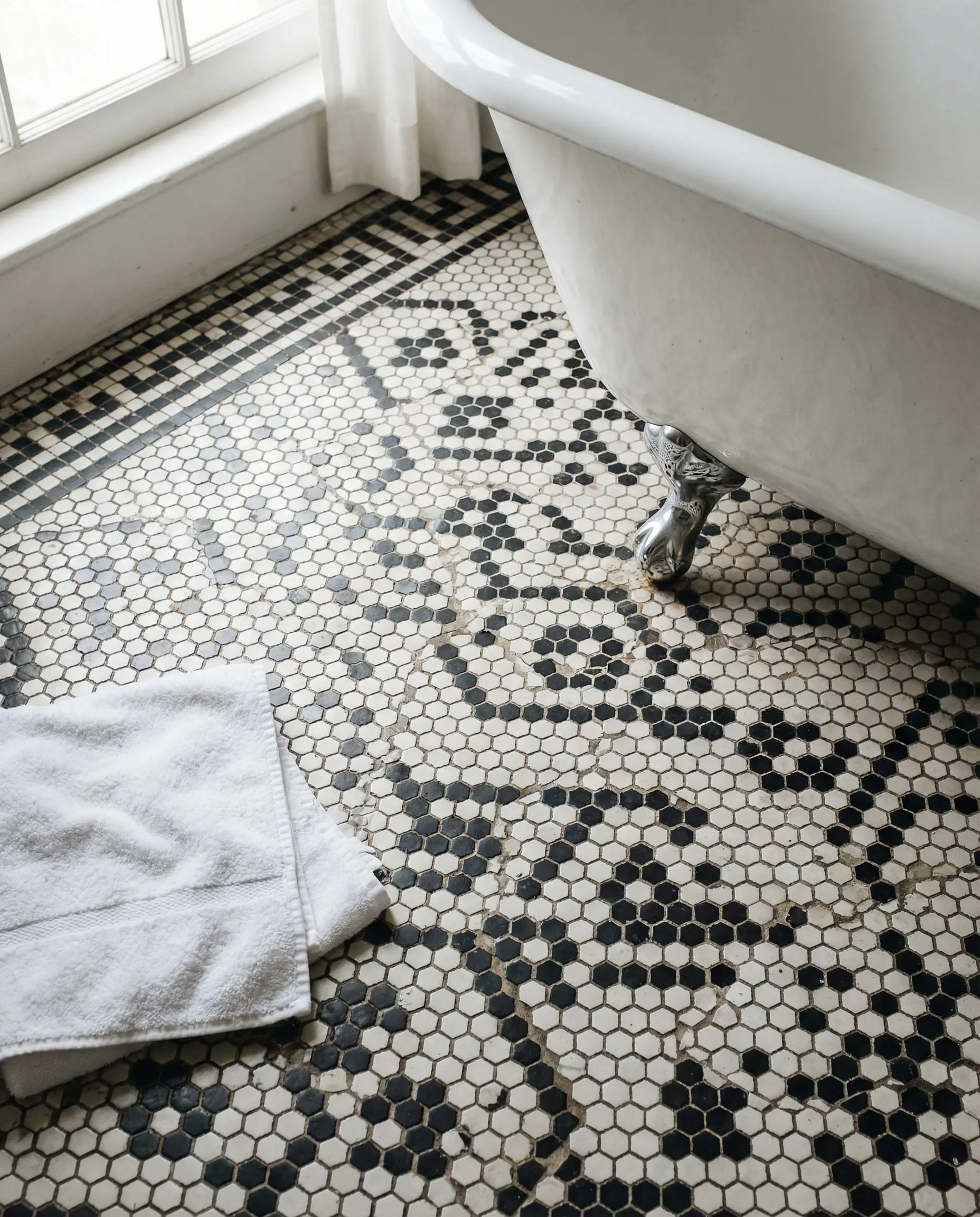
The Bathroom: The Jewel Box
Bathrooms in the Art Deco era were temples of hygiene and luxury.
Materials & Textures: The Secret to Art Deco Color
A common mistake is thinking color exists in a vacuum. In Art Deco, a color changes completely depending on the material it sits on. A “Flat Matte Black” wall feels very different from a “Black Lacquer” cabinet.
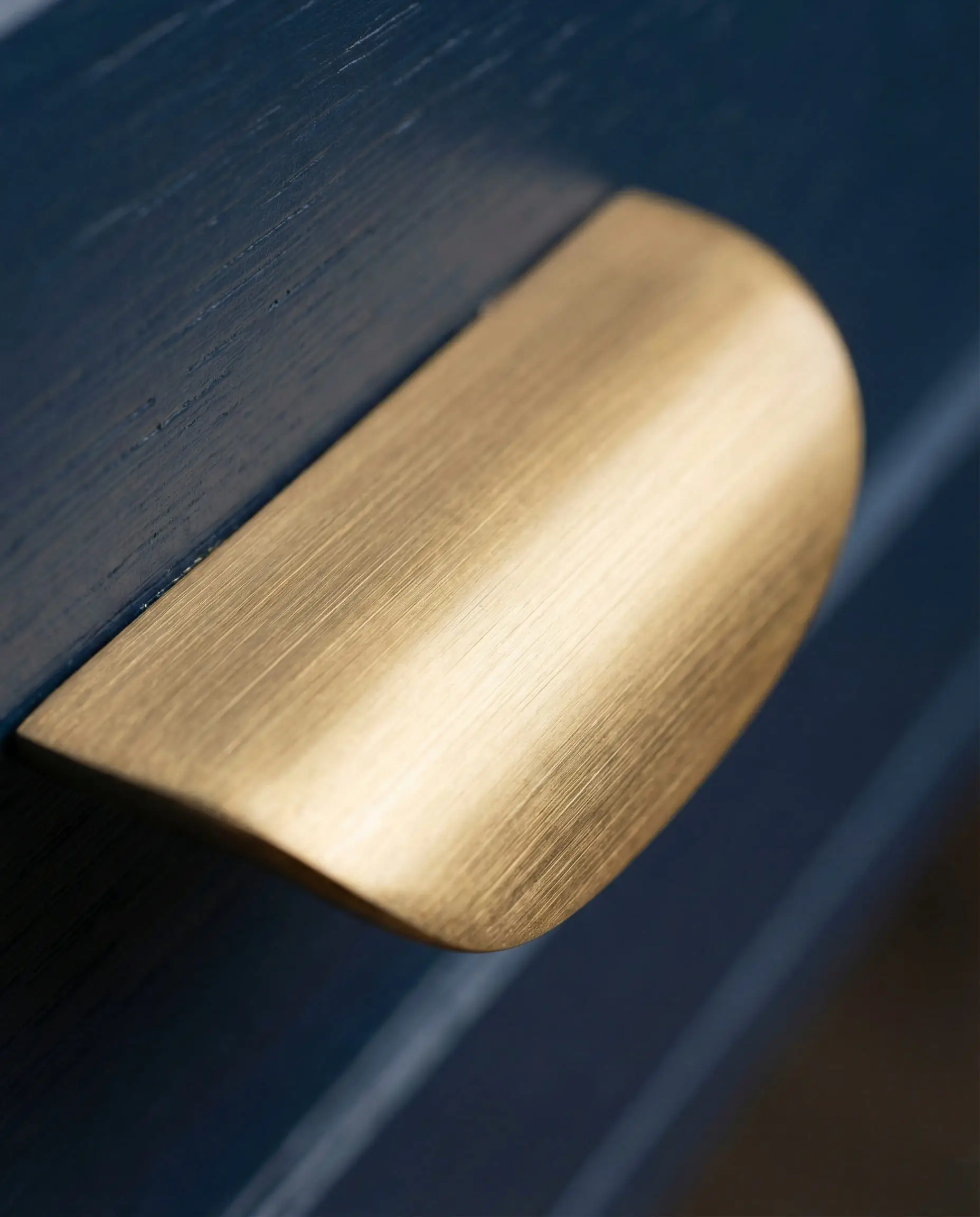
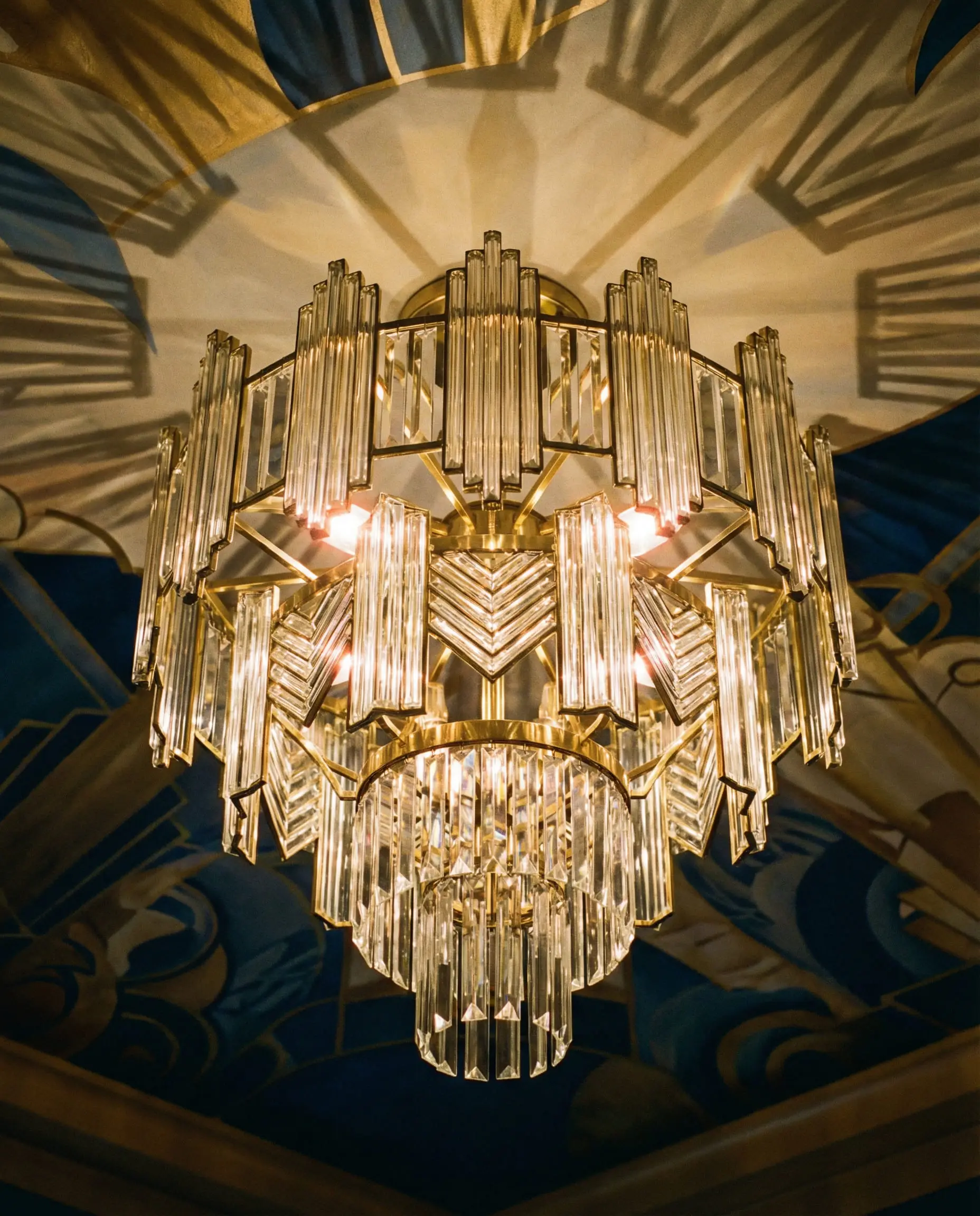
1. Metallics: The Neutral of the 20s
In this style, gold, brass, chrome, and silver are not accents; they are neutrals.
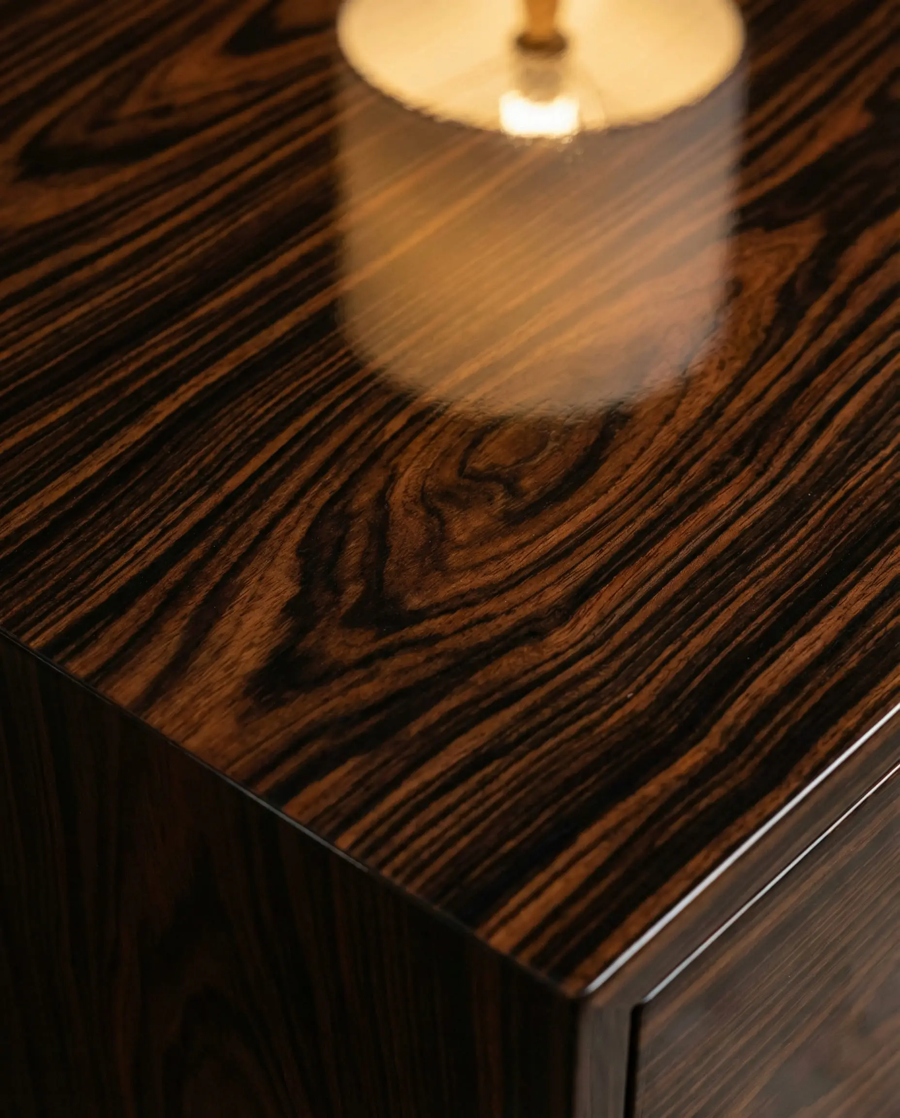
2. Wood Tones
You rarely see light pine or rustic oak in Art Deco. The woods are dark, rich, and often lacquered.
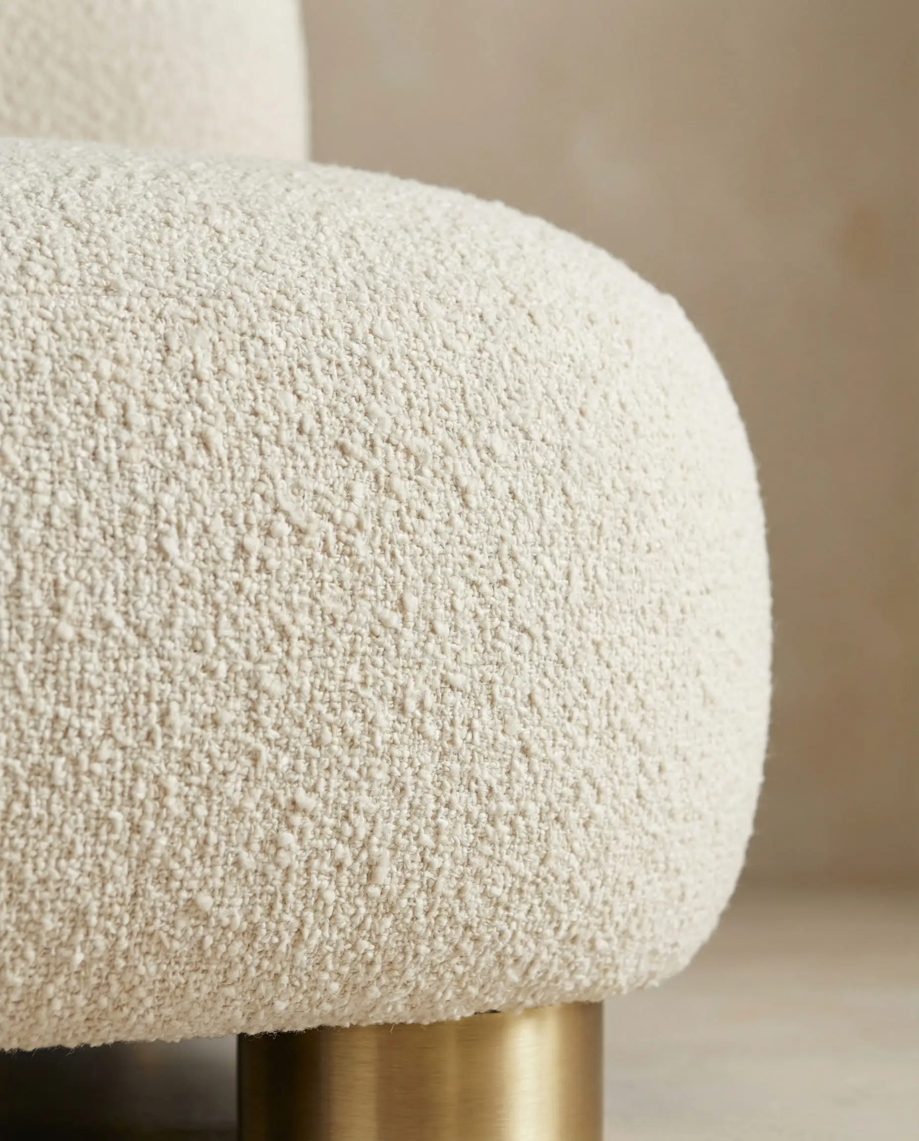
3. Fabrics: The Softness Factor
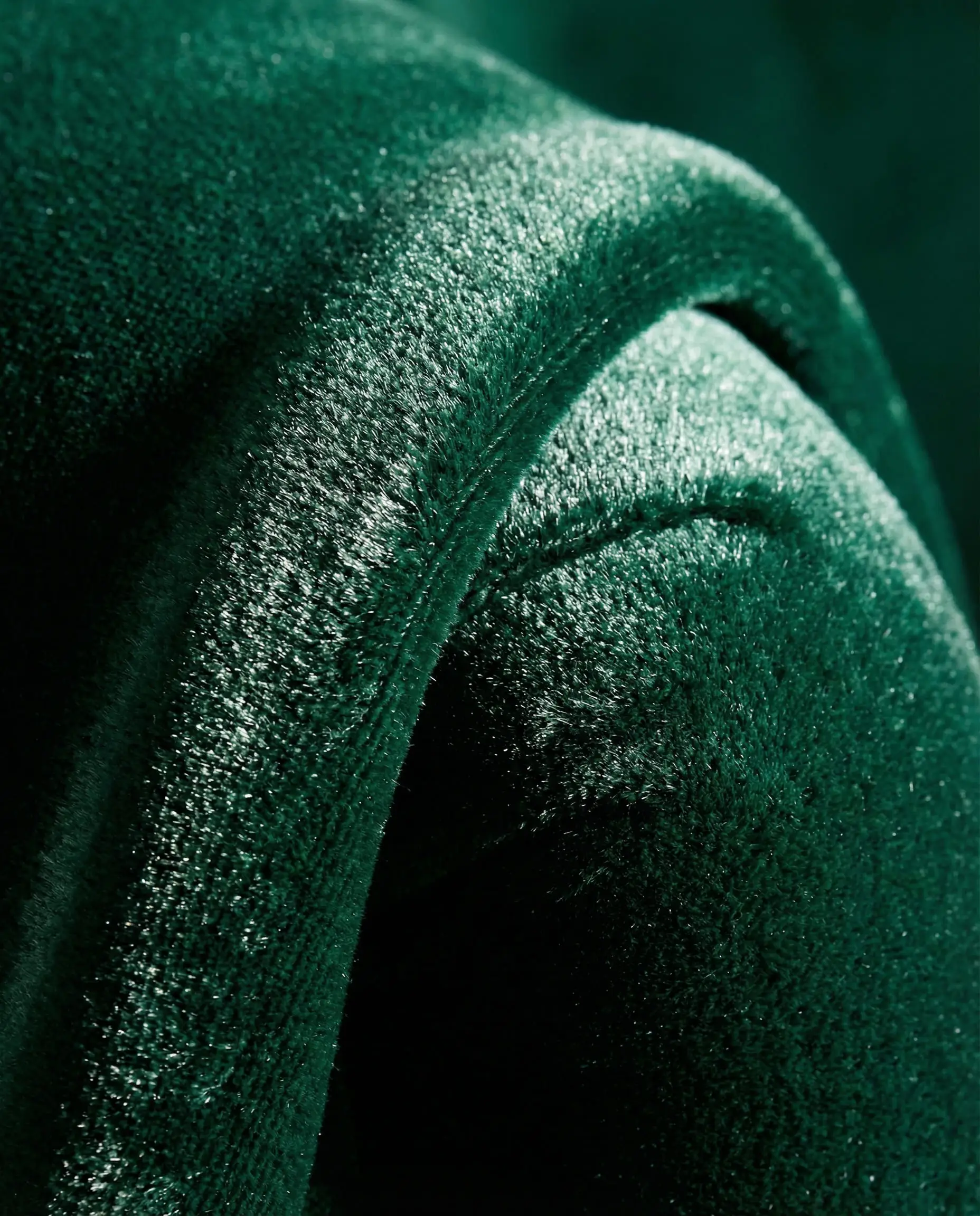
If you paint a wall matte black, you need a sofa that reflects light to stop the room from feeling like a cave. This is why velvet furniture is the fabric of choice. It catches the light and creates natural highlights and lowlights, giving a single color (like emerald green) dynamic range.
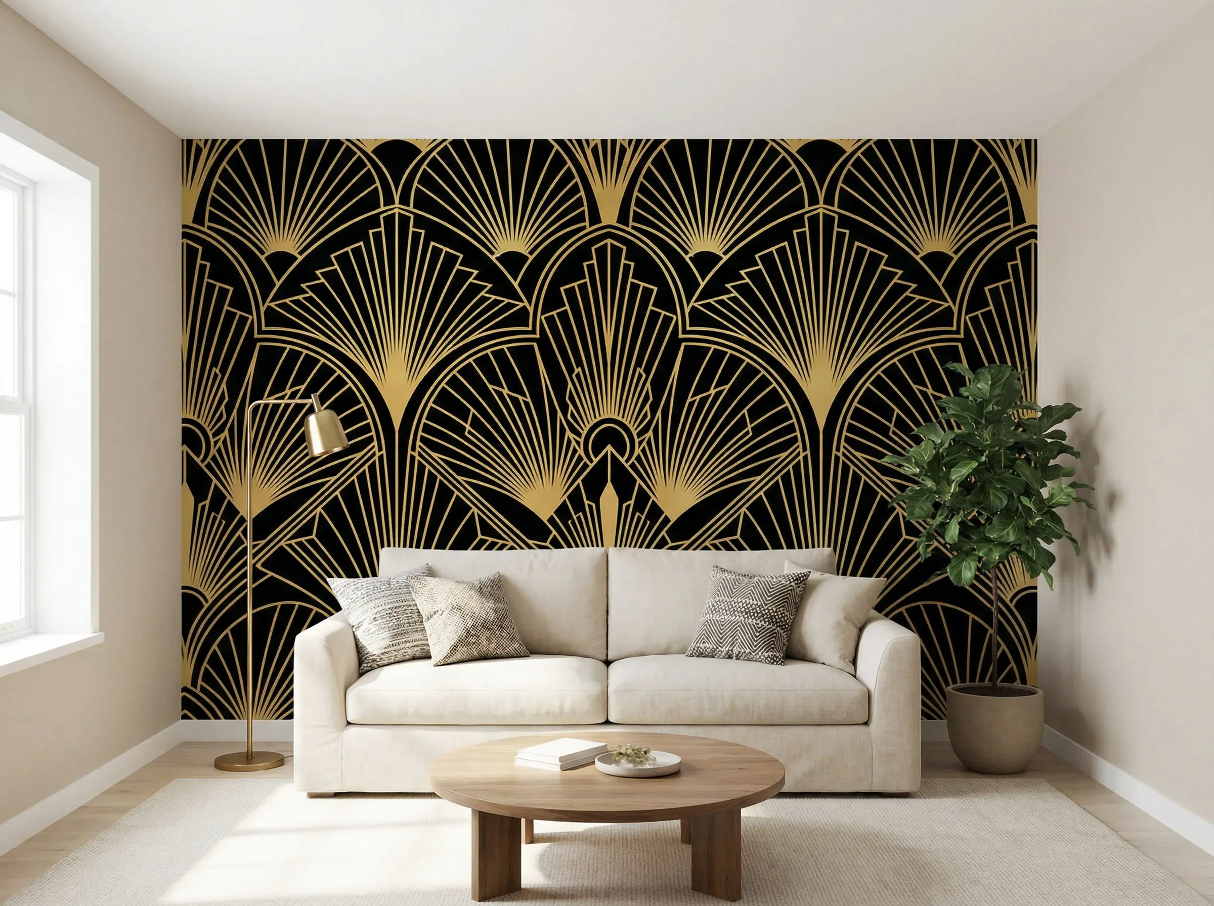
If you are using neutral walls, consider using Art Deco wallpapers with geometric prints on the ceiling. It draws the eye up and adds that signature “surprise” element of the era.
💡 Styling Tip
Lighting: The Final Color filter
You can pick the perfect paint color, but the wrong light bulb will ruin it. Art Deco colors are sensitive to light temperature.
Frequently Asked Questions
A: Absolutely. This is essentially the “Gallery Style.” If you keep your walls white, you must rely on high-contrast black framing (on photos, windows, and door frames) and bold, colorful furniture to carry the style. Check out our Contemporary Style Interior Design guide to see how modern minimalism blends with these concepts.
A: No, they are opposites! Art Nouveau (1890–1910) uses muted, nature-inspired “muddy” colors like sage, mauve, and ochre with whiplash curves. Art Deco (1920–1940) is bold, synthetic, and high-contrast (black, chrome, bright red) with sharp geometry.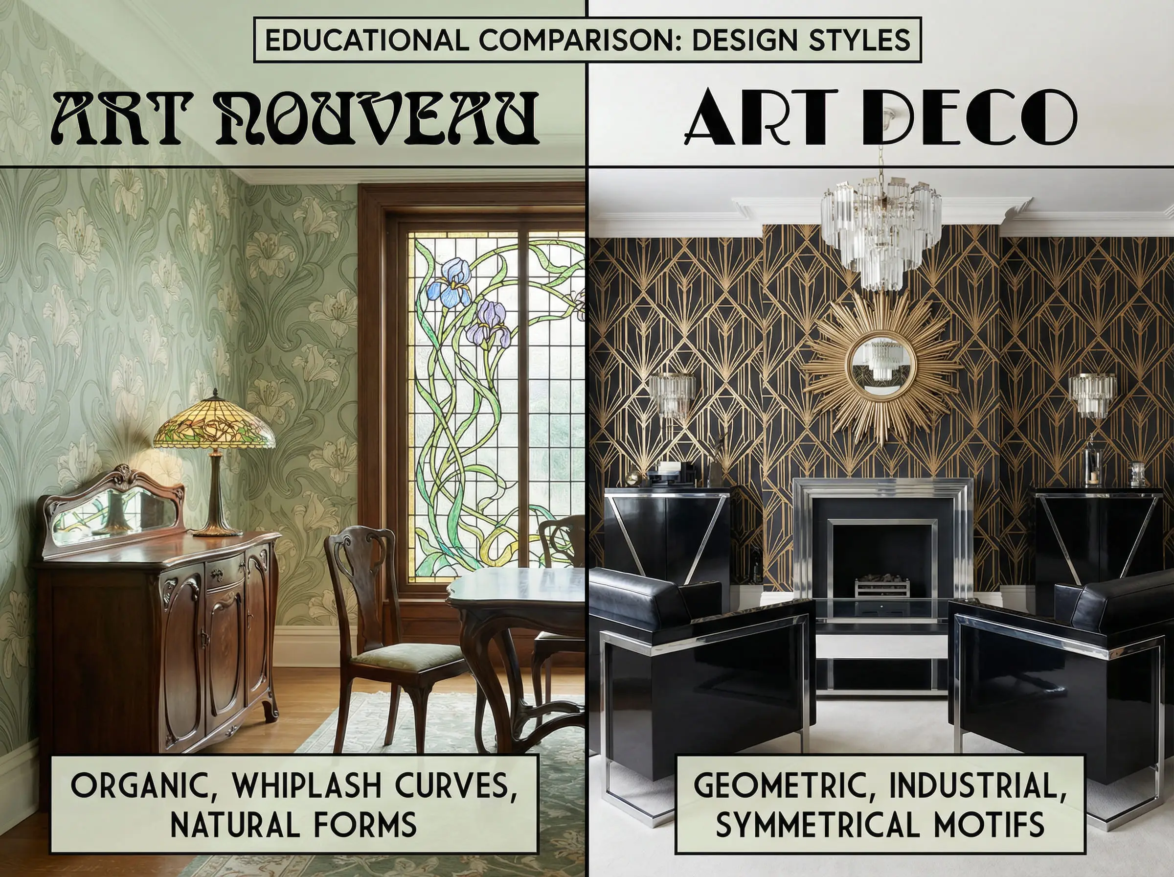
A: A good rule of thumb to keep the room balanced:
60% Neutral background (Cream, Grey, or Soft Black).
30% Rich Color (The velvet sofa, the heavy curtains).
10% Metallic Accent (The brass lamp, the gold frame, the cabinet hardware).
A: The key is matte finishes. Vintage Art Deco was often high-gloss lacquer everywhere. Modern Art Deco keeps the shapes and colors but uses matte wall paints and natural woods to ground the look, making it feel more residential and less commercial.
Conclusion: Start Your Transformation
Art Deco is more than just a historical period; it is a mood. It is the confidence to pair pink with green, the elegance of black and gold, and the joy of geometric precision. It is a style that says, “I have arrived.”
Whether you are planning a full renovation or just looking to swap out some throw pillows, the palette you choose sets the stage. Will you go for the moody mystery of the Gatsby Night or the sun-drenched vibes of the Miami Sunset?
Don’t leave it to imagination.
Colors look different on every screen and in every home. The lighting in your living room will change how that “Midnight Navy” appears. Before you buy a single can of paint, use the Hackrea Visualizer.
> Upload your room photo and test Art Deco colors instantly
Ready for more inspiration? Explore our deep dive into Art Deco Living Room Design Ideas next.
The Aesthetics Desk curates the visual direction for Hackrea. Specializing in design history, global architectural movements, and interior styling, this desk focuses on the psychology of space and how to translate high-end, magazine-quality aesthetics into approachable residential design without falling into fleeting micro-trends.