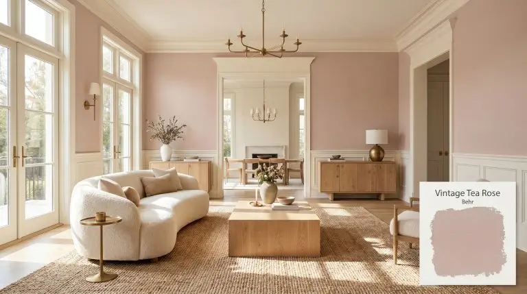
Behr Vintage Tea Rose is a muted, earthy pink with a Light Reflectance Value of 47. Grounded by beige and gray undertones, it acts as a sophisticated, warm neutral rather than a bright pastel, shifting beautifully between dusty rose and soft mauve depending on the lighting.
| Temperature | Warm |
|---|---|
| Primary Undertone | Earthy beige |
| Hidden Undertones | Dusty mauve, gray, soft brown |
| Best Exposures | South, East |
| Best For | Nurseries, home offices, cozy living rooms, front doors, painted furniture |
Hackrea Review
Vintage Tea Rose is a triumph in the 'grown-up pink' category. It avoids the saccharine trap of traditional pastels by leaning heavily into earthy beige and gray. It is incredibly versatile, providing a calming, sophisticated backdrop that feels both nostalgic and deeply modern.Spatial Applications for an Earthy Beige & Dusty Rose Palette
Cozy Nurseries and Children’s Rooms
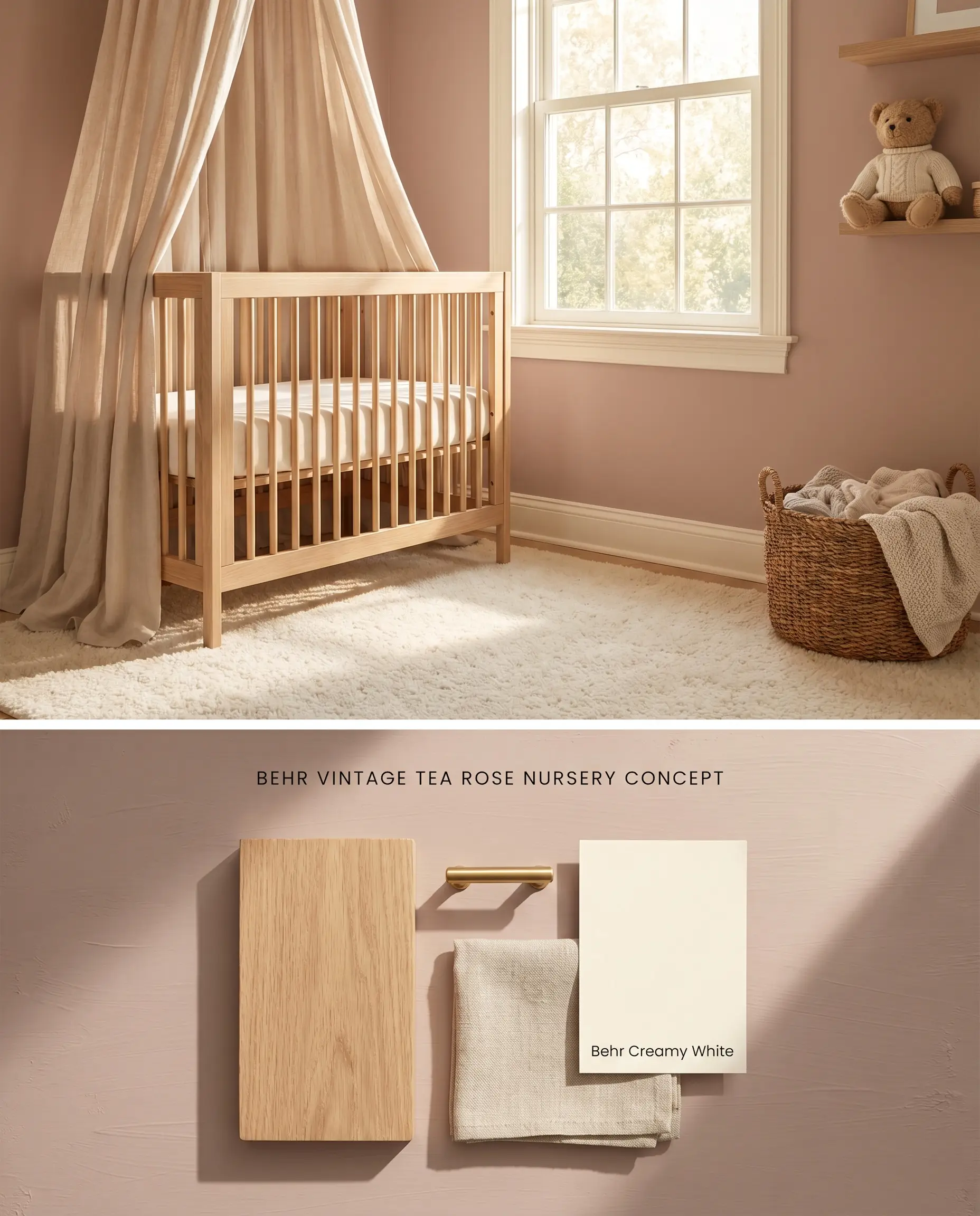
The earthy beige undertones ground this grown-up pink, preventing it from reading as a juvenile pastel, while natural wood grains absorb excess light reflection. Avoid stark, cool whites in this nursery decor, as the high-contrast temperature clash will pull the gray base forward and cause the walls to look dirty.
Sophisticated Home Offices
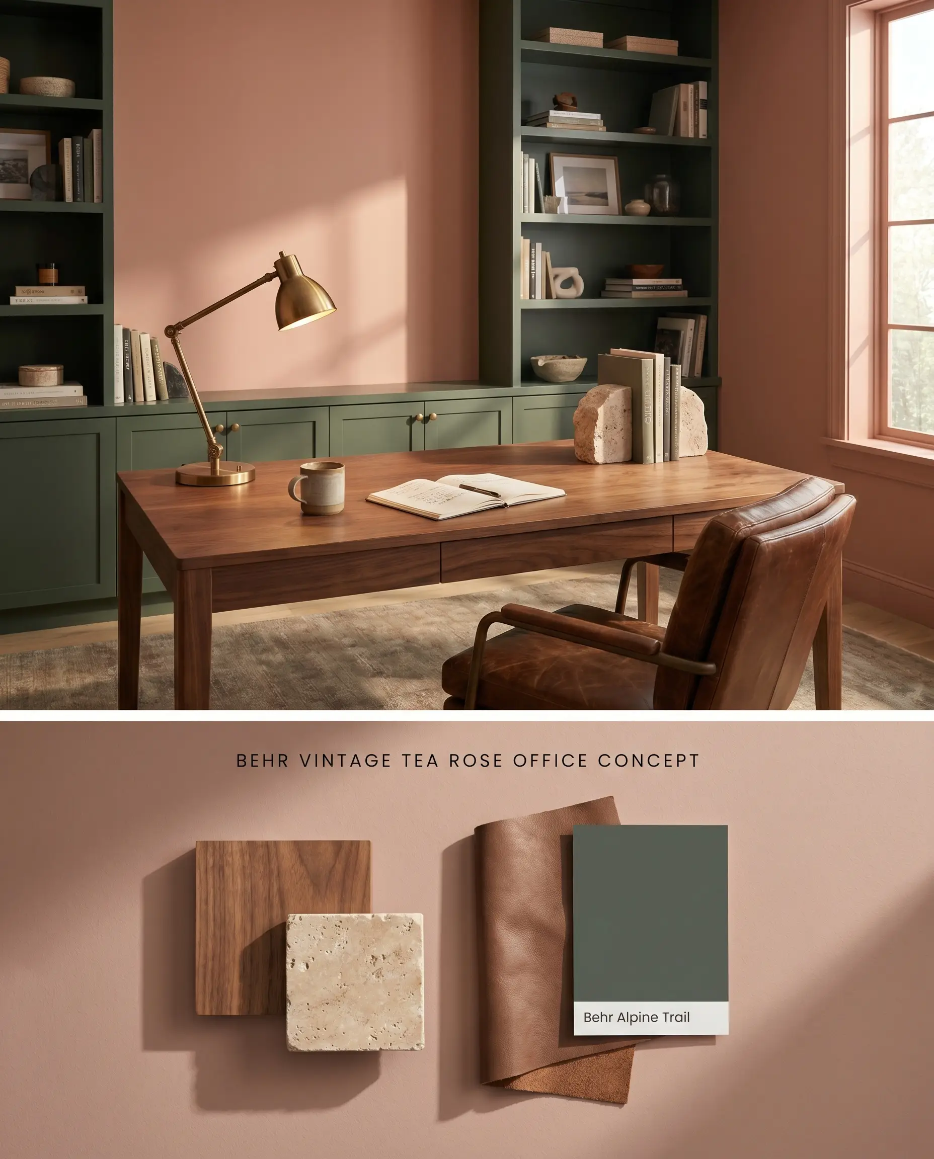
In a sun-drenched workspace, this warm neutral backdrop absorbs harsh glare and reduces visual fatigue against digital screens. The muted mauve undertones become highly prominent when paired with deep green accents, creating a high-contrast environment that sharpens the room’s architectural lines.
Painted Furniture and Cabinetry Accents
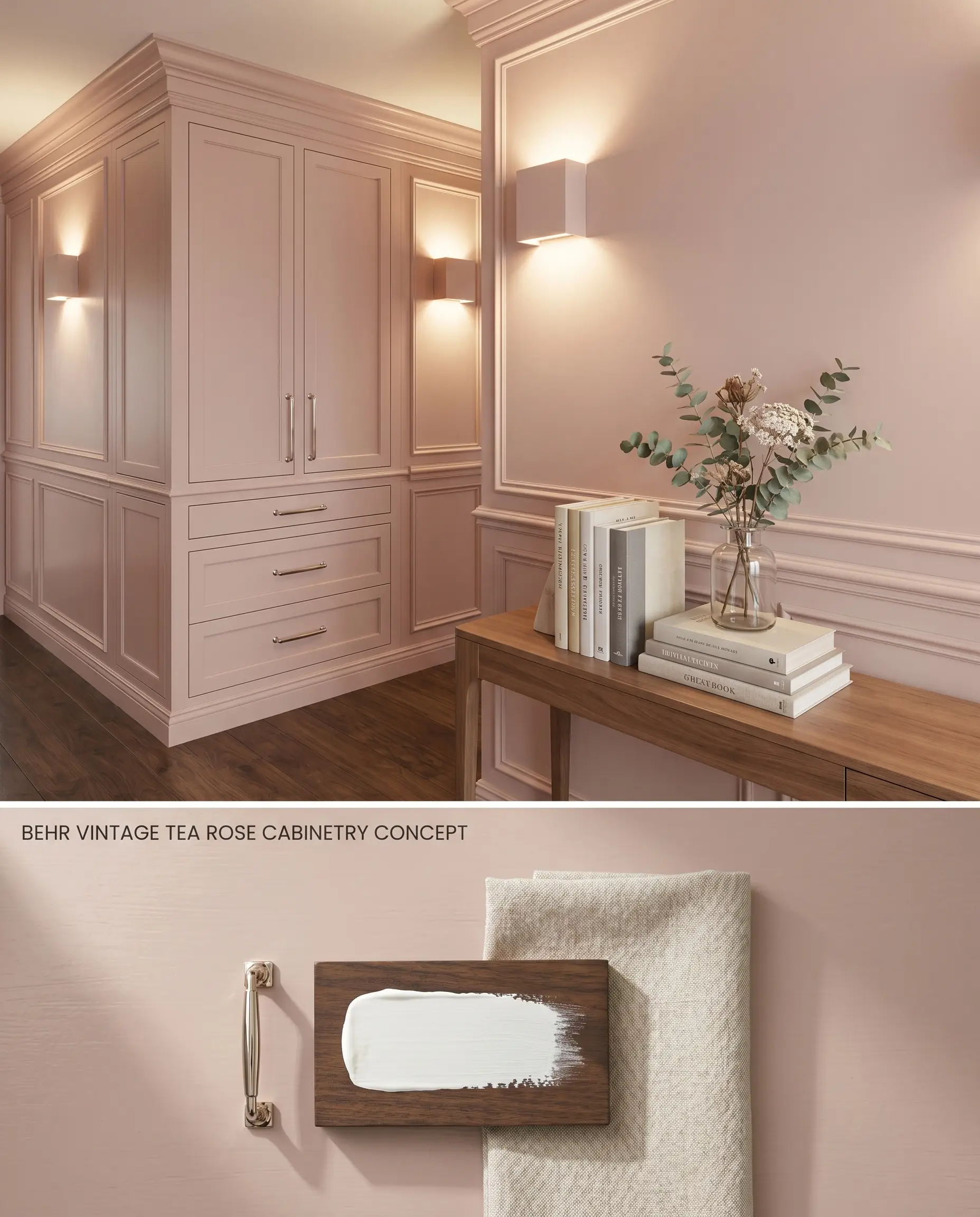
Applying this architectural finish to millwork transforms a standard built-in into a focal point, provided it is layered over a tinted primer to ensure the gray base doesn’t muddy over dark wood. The chromatic profile shifts depending on the surrounding light, bouncing a subtle, earthy warmth onto adjacent surfaces.
Front Doors against Green Vinyl Siding
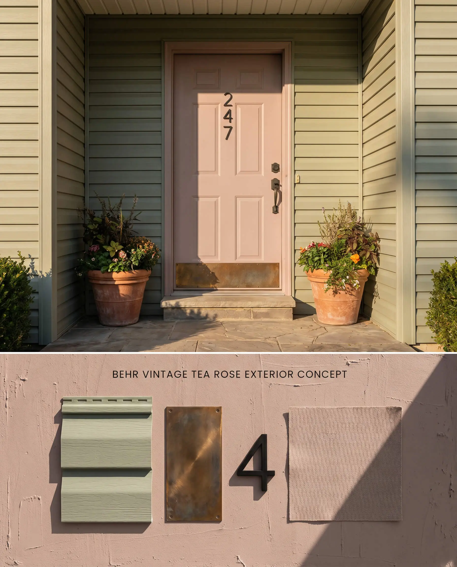
The red-based pink sits directly opposite green on the color wheel, creating a complementary exterior contrast that immediately draws the eye without relying on high-gloss saturation. The earthy beige undertones prevent the door from looking artificially bright against the vinyl siding, grounding the entryway in organic tones.
Color-Drenched Living Rooms
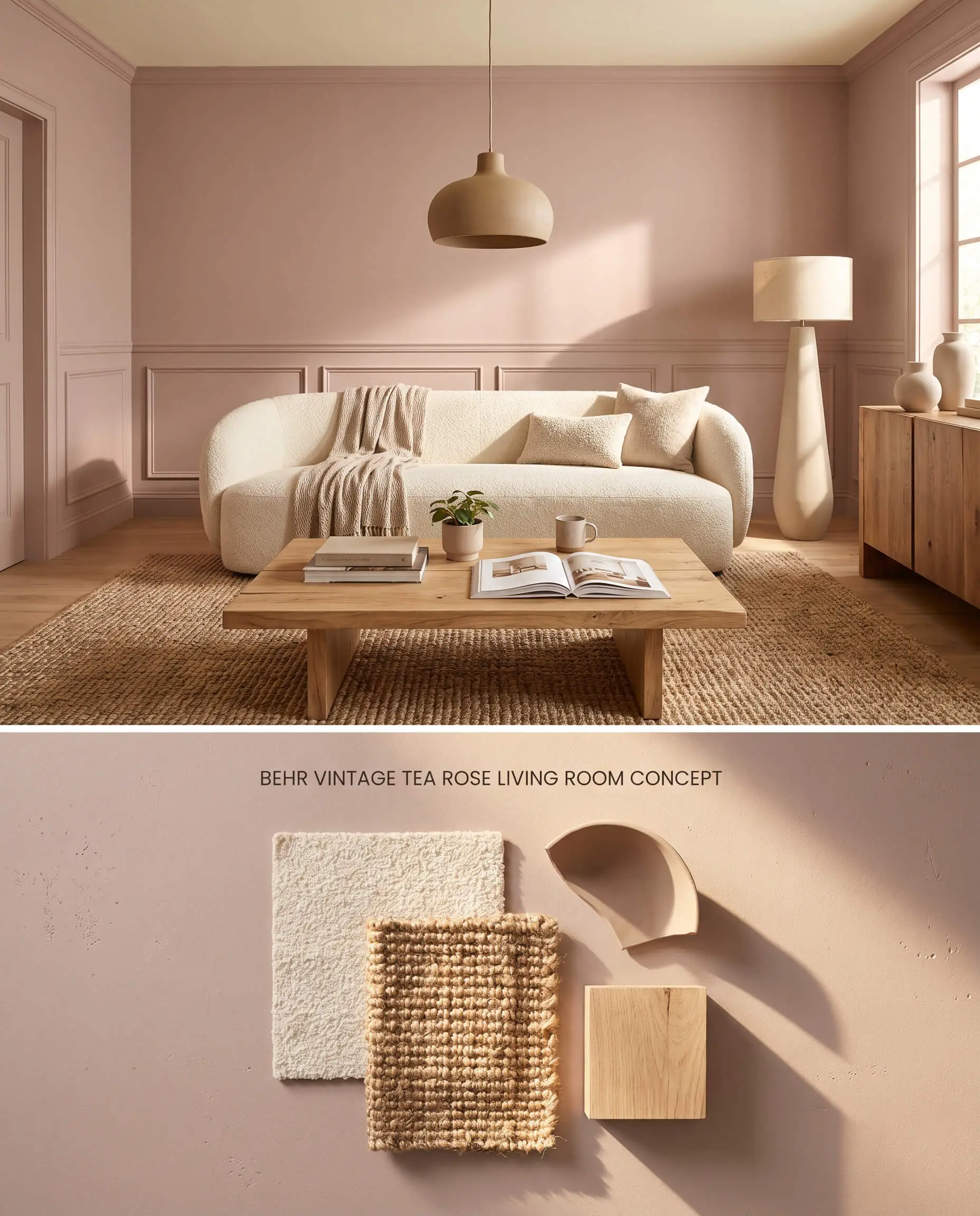
Wrapping a well-lit living space in this shade intensifies the pink through light bouncing off parallel walls, creating a highly saturated, warm glow. To prevent the color drenching from feeling visually overwhelming, breaking the spatial plane with creamy white textiles and large-scale natural wood furniture is necessary to absorb the excess reflection.
You can apply wallpapers, paints, etc. on walls and see how they look in various interiors.

Behr Vintage Tea Rose HDC-CT-07A vs. Sherwin Williams Insightful Rose SW 6023
Sherwin Williams Insightful Rose (SW 6023) operates with an LRV of 48 and features a slightly cooler, more distinct purple lean compared to the earthy beige base of Vintage Tea Rose. If your space features stark white trim or cool-toned flooring that clashes with Behr’s earthy base, Insightful Rose provides a cleaner, cooler architectural transition. Conversely, Behr Vintage Tea Rose HDC-CT-07A thrives in rooms dominated by warm woods and creamy whites, where its beige undertones can physically anchor the space without reading as an icy pastel.
Behr Vintage Tea Rose HDC-CT-07A vs. Benjamin Moore Hint Of Mauve 2097-50
Benjamin Moore Hint Of Mauve 2097-50 (LRV 53) is noticeably lighter and leans heavily into a true, airy lilac-mauve. In low-light or North-facing rooms where Behr Vintage Tea Rose HDC-CT-07A risks flattening into a muddy plum due to its lower LRV (47) and heavy gray influence, Hint Of Mauve retains enough light reflectance to stay buoyant on the walls. Behr Vintage Tea Rose HDC-CT-07A is the required choice for South-facing, sun-drenched rooms where its deeper earthy profile prevents the walls from looking washed out by intense UV exposure.
Technical FAQs: Mastering a Muted Mauve Chromatic Profile
Yes, in low-light or North-facing environments, the gray and mauve undertones become highly prominent. This lack of warm natural light flattens the color, causing it to read as a muted purple or dark plum rather than a warm dusty pink.
Yes, pairing this paint with stark, cool whites will emphasize its gray base and cause the walls to look dirty or overly purple. It requires creamy whites or warm off-whites to maintain a harmonious, sophisticated transition along the trim.
In a color drenching application, light bouncing between the parallel surfaces intensifies the pink, creating a highly saturated, warm glow. In smaller rooms, this bounce effect can easily overwhelm the space, making it best reserved for large, well-lit areas or mitigated by leaving the ceiling a creamy white.
It pairs exceptionally well with green siding and olive accents due to their complementary positions on the color wheel. The earthy beige base in the paint harmonizes with the organic tones of the green, creating a balanced, high-contrast exterior without looking artificially vibrant.
Similar Paint Colors
Same Brand
Cross-Brand Equivalents