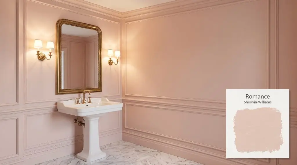
Romance SW 6323
Sherwin-WilliamsSherwin-Williams Romance (SW 6323) is a sophisticated, soft blush pink with warm apricot and subtle coral undertones. This calming, muted hue avoids looking overly sweet, making it an elegant choice for bedrooms, powder rooms, and chic dressing areas.
Paint Technical Profile
| Color ID / SKU | SW 6323 |
| HEX Code | #EBCFC3 |
| Light Reflectance (LRV) | 66 |
| Temperature | Warm |
| Primary Undertone | Apricot |
| Hidden Undertones | Coral, Cream |
| Use | Interior, Exterior |
| Best Exposures | North, East |
| Best For | Bedrooms, powder rooms, dressing areas, accent doors |
Real-World Inspiration Be the first to upload a real photo of Romance!
No Photos Yet
Includes +20 First Upload Bonus!
Real Experiences
Insights from people who have used Romance.No reviews yet
Be the first to share your experience with Romance.
Earn 15 points instantly!
Digital Visualizations & Applications Explore curated design concepts and coordinating palettes.
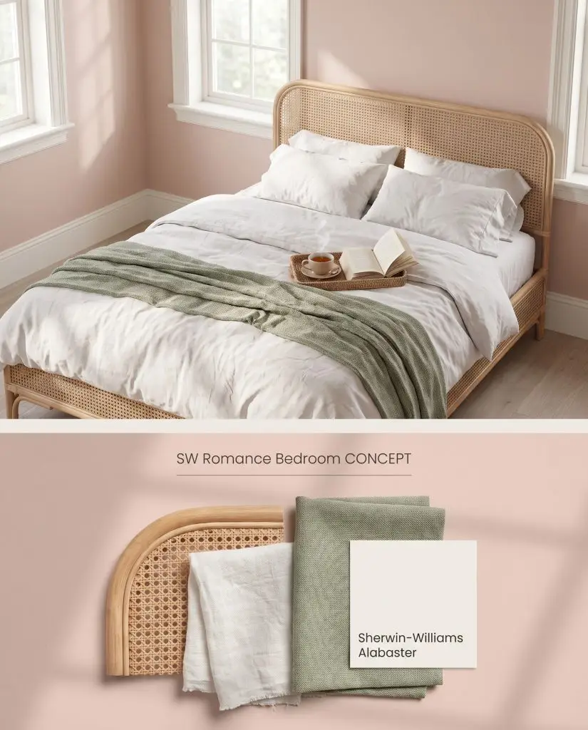
Digital visualization: This soft blush hue creates an airy, romantic atmosphere when paired with natural woven textures and muted green accents.
Design Specifications
- Lighting Exposure:Soft diffused morning light
- Trim Color:SW 7008 Alabaster
- Textiles:White washed linen, sage green throws
- Bed Frame:Natural rattan
- Vibe:Romantic and airy
Complementary Paint Colors
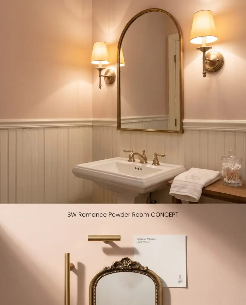
Material study: A delicate pink shade applied above crisp white beadboard wainscoting, accented by warm antique brass and gold fixtures.
Design Specifications
- Lighting Exposure:Warm sconce lighting
- Wainscoting Color:SW 7005 Pure White
- Hardware:Brushed gold
- Mirror:Antique brass arched
- Architectural Style:Classic Traditional
Complementary Paint Colors
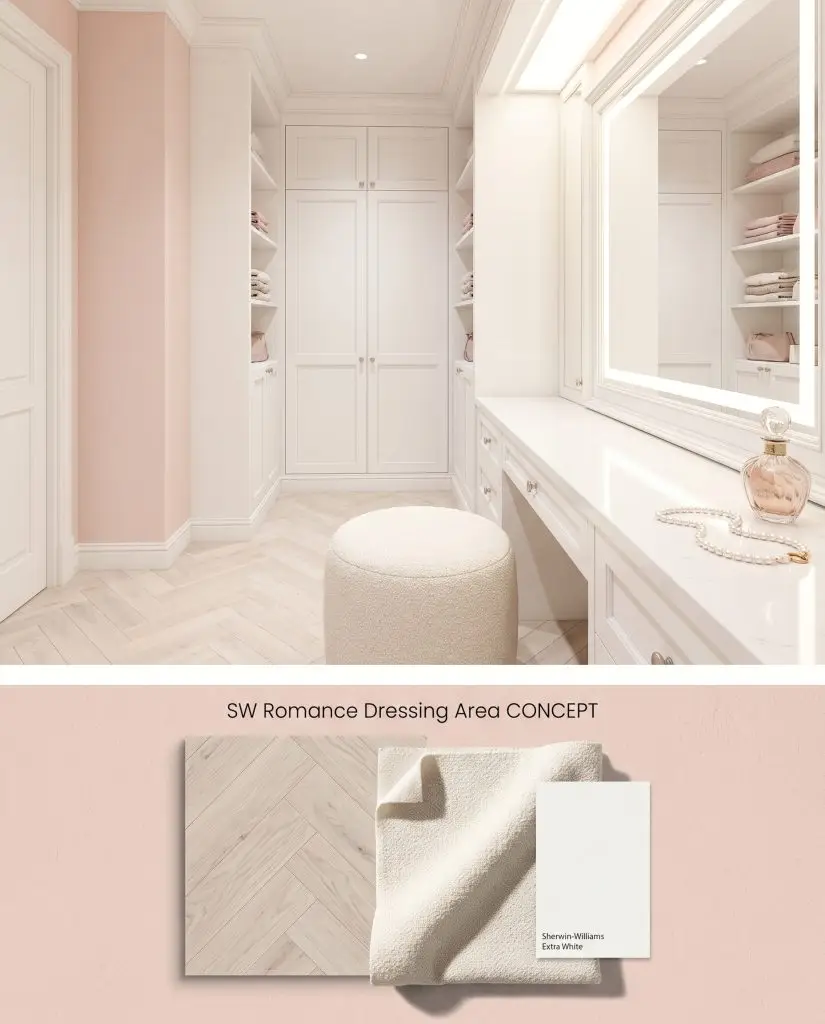
Concept board: This feminine pastel tone elevates a luxurious dressing space, reflecting beautifully off bright white built-ins and herringbone floors.
Design Specifications
- Lighting Exposure:Bright even vanity lighting
- Trim Color:SW 7006 Extra White
- Flooring:White herringbone oak
- Seating:Cream boucle pouf
- Vibe:Luxurious and feminine
Complementary Paint Colors
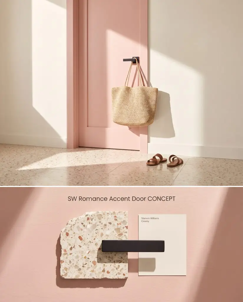
Space visualization: A playful pastel pink applied to an interior door, providing a striking contrast against colorful terrazzo flooring and dark hardware.
Design Specifications
- Lighting Exposure:Bright direct sunlight
- Surrounding Wall:SW 7012 Creamy
- Hardware:Matte black lever
- Flooring:Terrazzo
- Vibe:Playful Modern