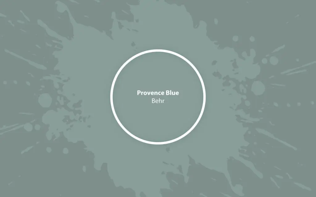
Provence Blue HDC-AC-23
BehrA soothing green-blue inspired by the French Provence fields of sage and lavender that will add refined air and serenity to your home's design.
Paint Technical Profile
| Color ID / SKU | HDC-AC-23 |
| HEX Code | #8a9c99 |
| Light Reflectance (LRV) | 32 |
| Use | Interior, Exterior |
Provence Blue (Behr HDC-AC-23): What Color Is, Review, and Use
As we go through Behr’s 2024 color palette, a gorgeous mid-green-blue steals our attention, and we know it’s love at first sight. Today, we want to review a trendy paint color, the January color of the month at Behr – Provence Blue. Its story begins with the sage and lavender fields from southern France. So much serenity, refinement, and comfort accompany this paint color. In a world of overused neutrals or overly bright hues, we invite you to admire the calmness and elegance of a mid-tone blue. Who knows, maybe you’ll want to use it in your home. Read on!
Provence Blue Paint Color Features
Behr’s team says Provence Blue feels like “strolling past sage and lavender fields.” There couldn’t be a more precise description. Color is a feeling. Reminiscent of the late winter sky or the fresh veggie blue, this dusty green-blue nurtures our need for peace and safety. Like the quiet Provence life and French country flair, this finest blue shade is a breath of fresh air in contemporary design, when everything designers and homeowners are talking about is the rise of maximalism. Take a moment and enjoy the simplicity of a quiet lifestyle, far from the city bustle, which you can easily recreate even if you live in a city. The answer is color. Provence Blue from Behr is meant for countryside-style interiors, and not only.
Provence Blue: Is It Warm or Cold?
Although part of the Blue color family, it’s still a green-blue. So, in its RGB value (red, green, blue), green slightly outruns the other two contestants. However, this value reveals one more thing. The prevalence of blue over red indicates Provence Blue is a cool paint color. Note, this is a soft kind of blue – unconditional, appealing.
How Does Lighting Affect Provence Blue?
Lighting knows its role in how a color looks. With Provence Blue, everything is clear and uncomplicated. If you decide to use it in your home, you should know that exposure is key. Provence Blue will read slightly cooler and paler in a room with northern exposure, like a fresh sage tone. However, blue may stand out under the cold, bluish natural light. Let’s switch to a room with southern exposure. Here, Provence Blue will feel at home with its rich coloration, leaning towards the green side, especially when interacting with sunlight.
At night, this paint color will turn into a muted sage shade with blue undertones. Of course, you should ensure that there are enough sources of artificial light. We wouldn’t say Provence Blue is overly dark – you can safely apply it to all walls. Still, consider a paint sample before committing to this particular shade – what looks great in one home won’t necessarily look the same in your abode.
Provence Blue LRV
If you wonder why Provence Blue is a mid-tone paint color, check its Light Reflectance Value, which shows how light or dark a color is. With an LRV of 32, this green-blue bounces back 32% of the light it receives. Although it leans toward the dark group of colors, it is relatively light yet full of coloration. Your room doesn’t risk feeling too dark if you paint all walls with Provence Blue. However, designers advise us to use this paint color in well-lit rooms.
Provence Blue Undertones
Since this feathery paint color is a blue shade, we can say green is the standout undertone. However, we can also notice the shadowy gray trace. Well, it wouldn’t be associated with sage without the gray tinge.
Similar Colors
We agree with colorists – Provence Blue is perfect. Yet, in case you need a flawless alternative to this green-blue, you know where to find it:
Coordinating Colors
Unlike other Behr’s paint colors, Provence Blue has a more serene and solid coordinating color palette. You’ll love it! First, we start with the trim color – a balanced white will do. Lighter and deeper grays will suit monochromatic codes with Provence Blue. Last but not least, our favorites are neutral greens and blues, more profound and richer browns, and cherry on the pie – golden shades. There is no need to look for exact matches. Here is your go-to list:
Use of Provence Blue in Interior Design
The name indicates the suitability of this paint color in the Provence style. However, designers have also been using it in coastal and cottage-style interiors. The thing is, Provence Blue is a surprisingly versatile paint color that will agree to become part of plenty of design ideas. Such a unique shade of green-blue is worth the best. So, we gathered a list of expert design concepts with the finest neutral out there.
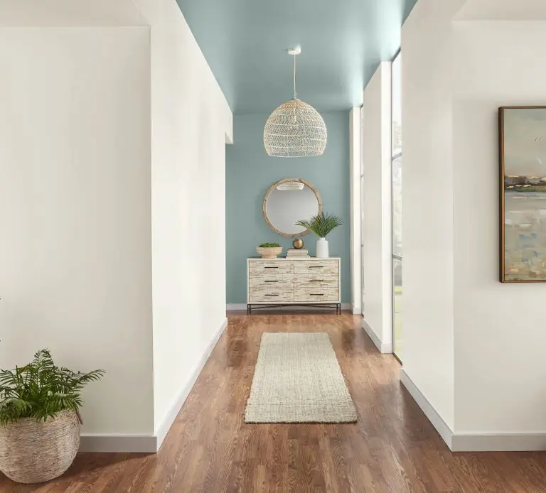
Coastal Breeze
We can all agree that a soothing green-blue paint color is everything a Modern Coastal interior can dream of. Use it on walls, furniture, or the ceiling in the company of light matching colors, light wood flooring or furnishing, occasional sea glass decor, indoor greenery, plenty of natural light, and an airy environment.
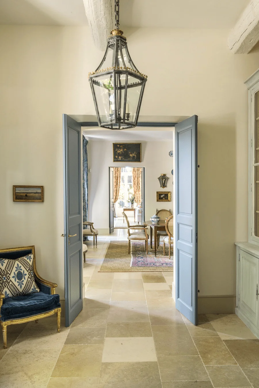
Provence Lifestyle
More interior designers and homeowners are dreaming of rustic interiors with a French twist, which offers a quiet and calm lifestyle. Recreate this refined idea by pairing Provence Blue with other pastel colors, floral prints, light-colored flooring, porcelain decor, and fresh flowers in your home.
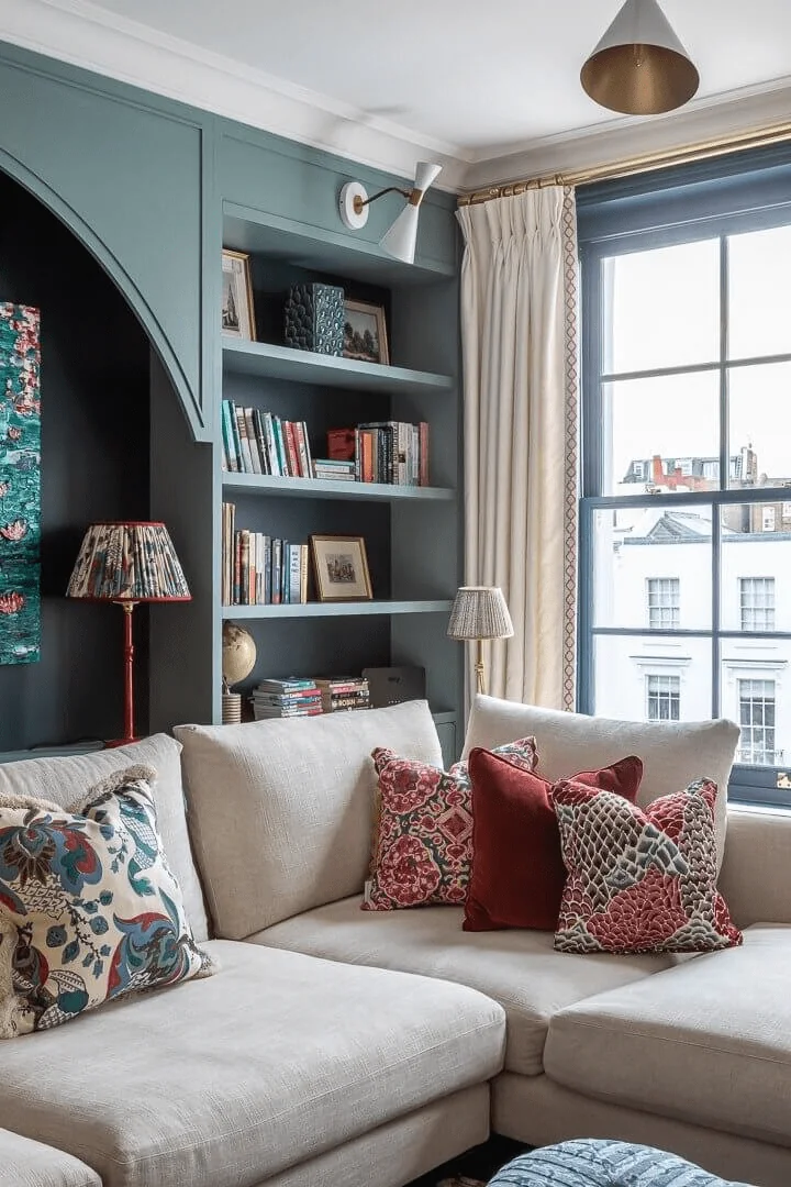
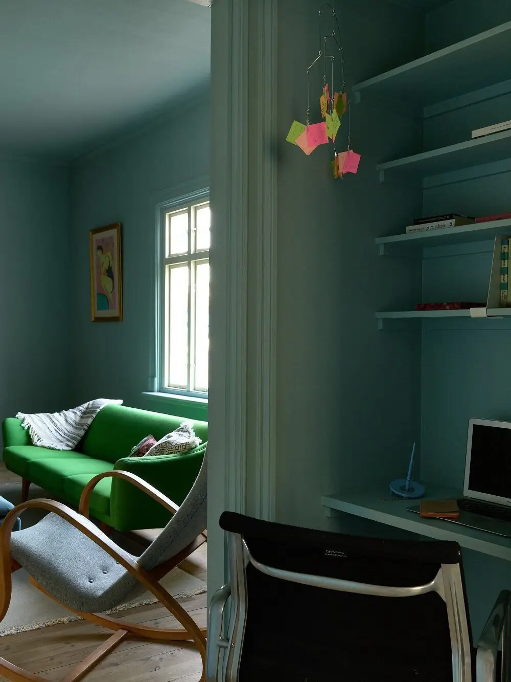
Refined Living Room
If you’re more into soothing and relaxing palettes, you’ll love Provence Blue in your lounge zone. The tiniest splash of this dusty green-blue makes everything seem calm. Paint all walls, including the ceiling, in this French blue tone for a moody ambiance in your modern living room decorated with bright, statement furnishing. Or, add more formality to a classic or traditional living room with ornamented furniture and stately decor.
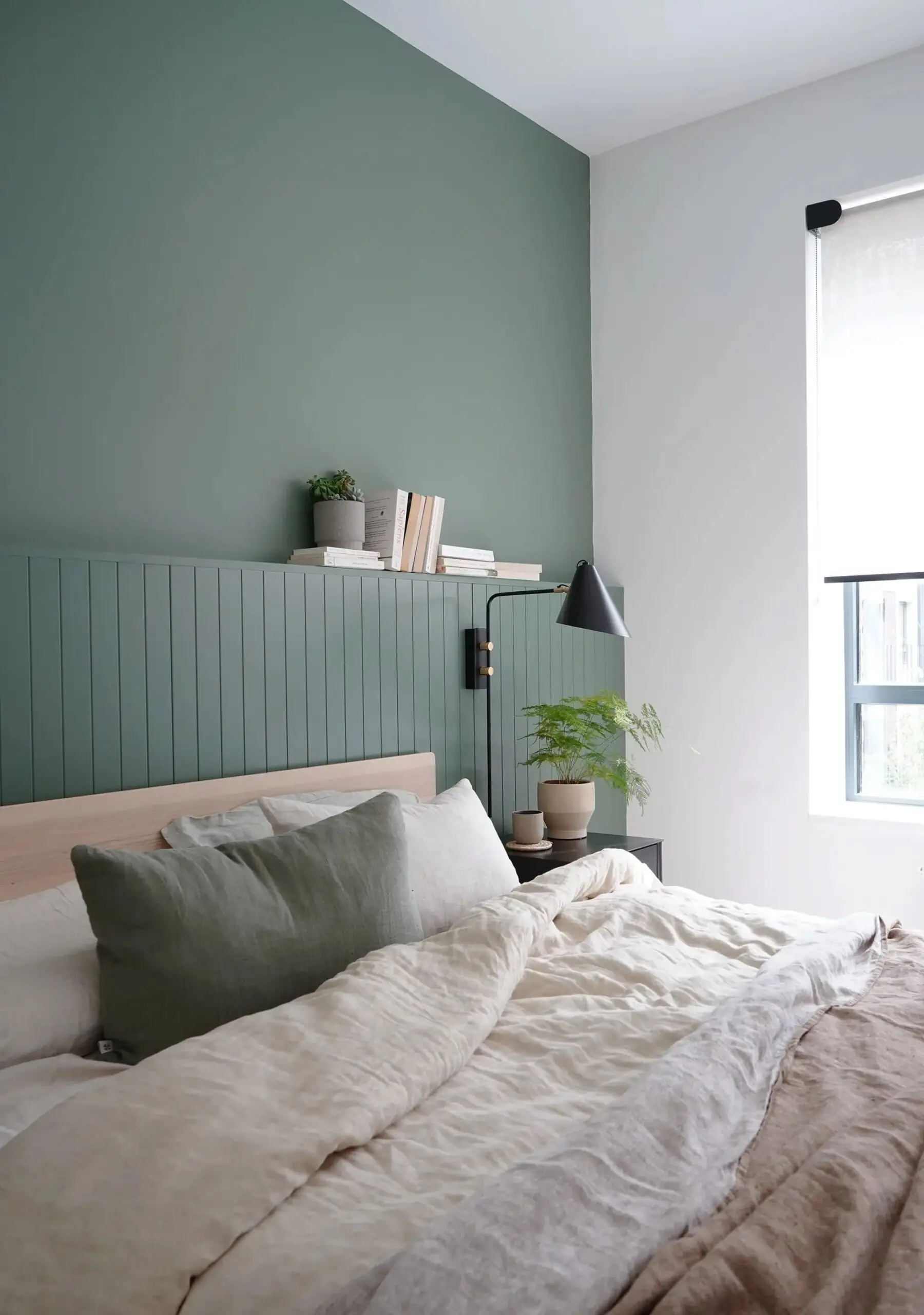
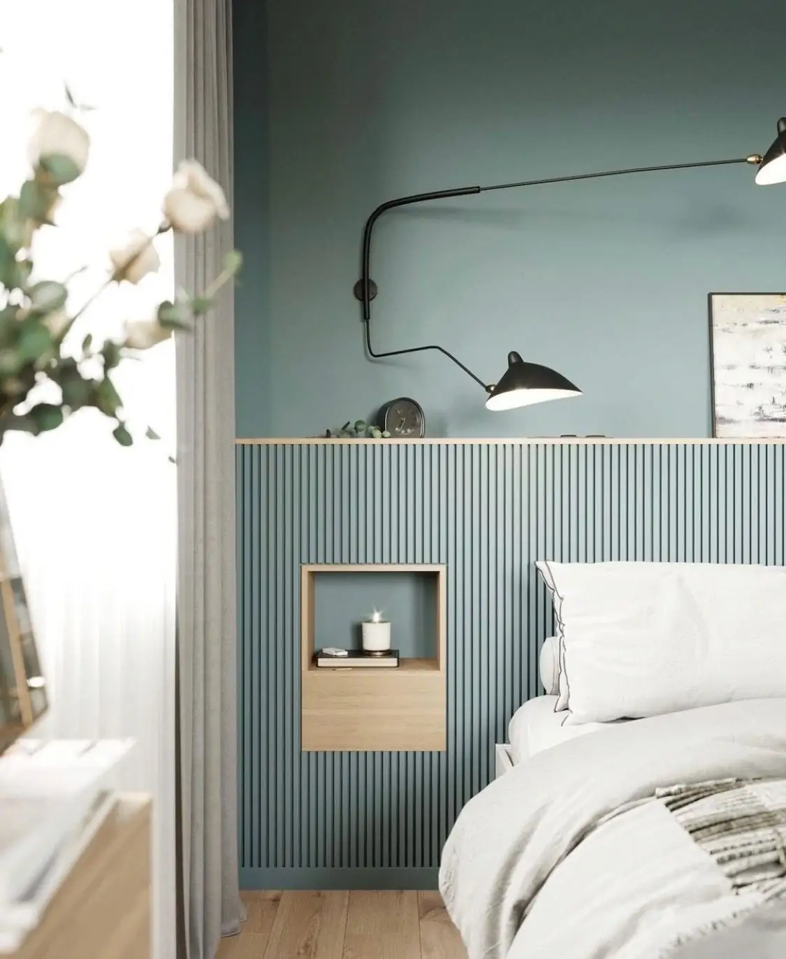
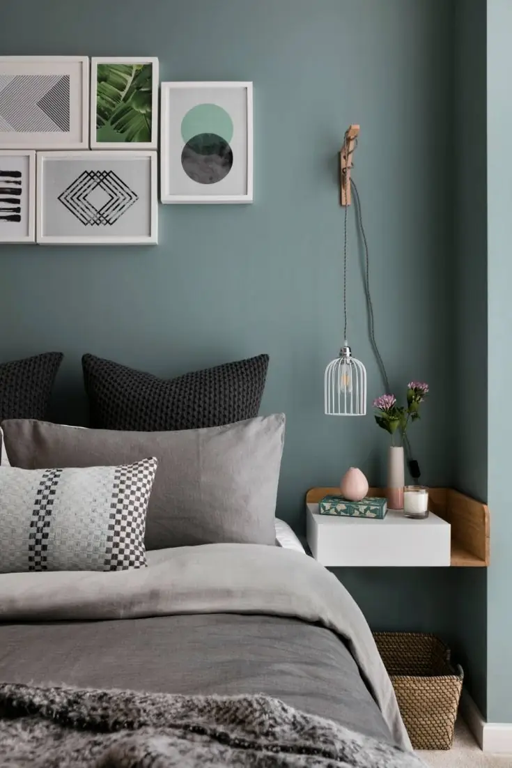
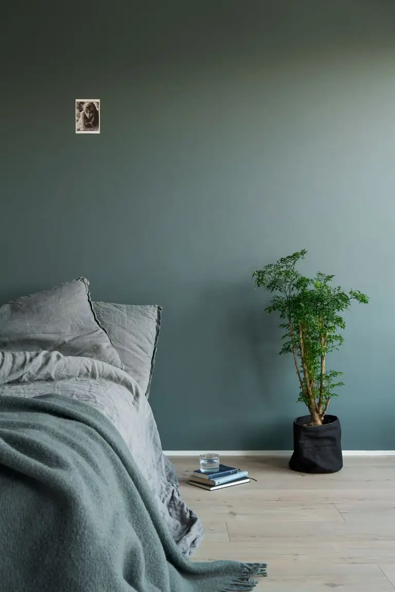
Soothing Bedroom
It’s no secret Provence Blue has impressive calming properties. The pairing of blue and green reaches unprecedented levels of serenity. We firmly recommend using it in your bedroom to ensure a collected ambiance. The slightly played-down color base will make for a moderately moody effect that you’ll happily enjoy after a long day. Here, Provence Blue again pairs with many colors, textures, and styles. A multi-purpose canvas ready to display your preferences.
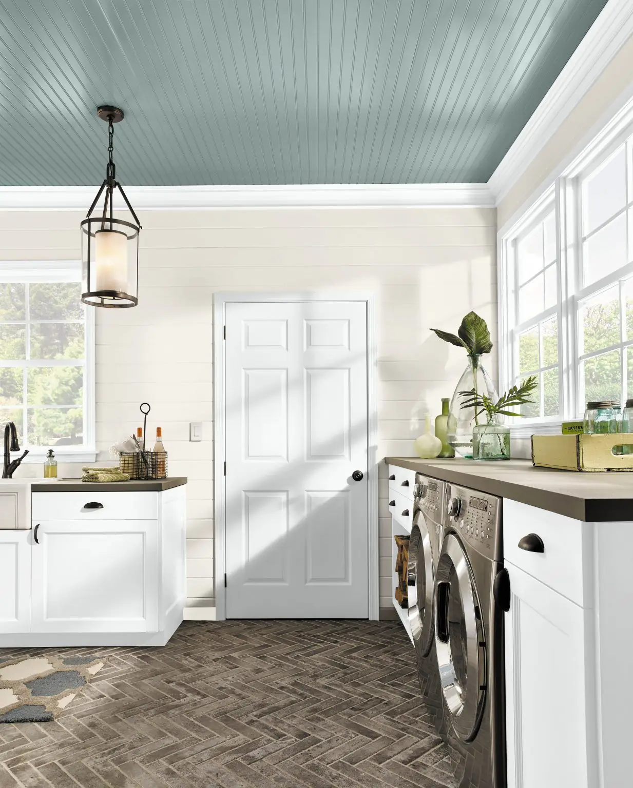
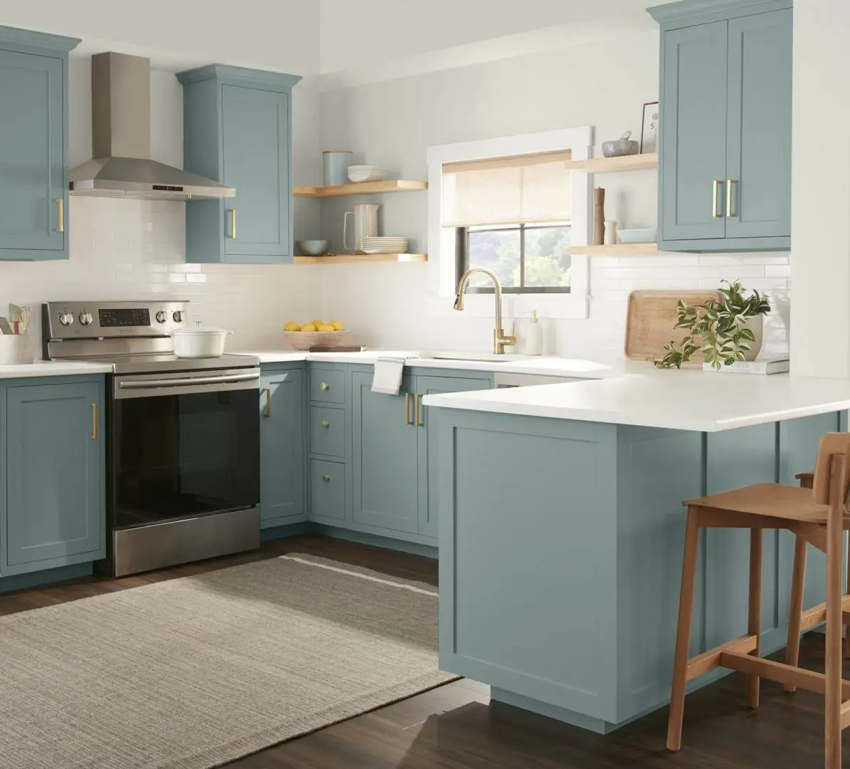
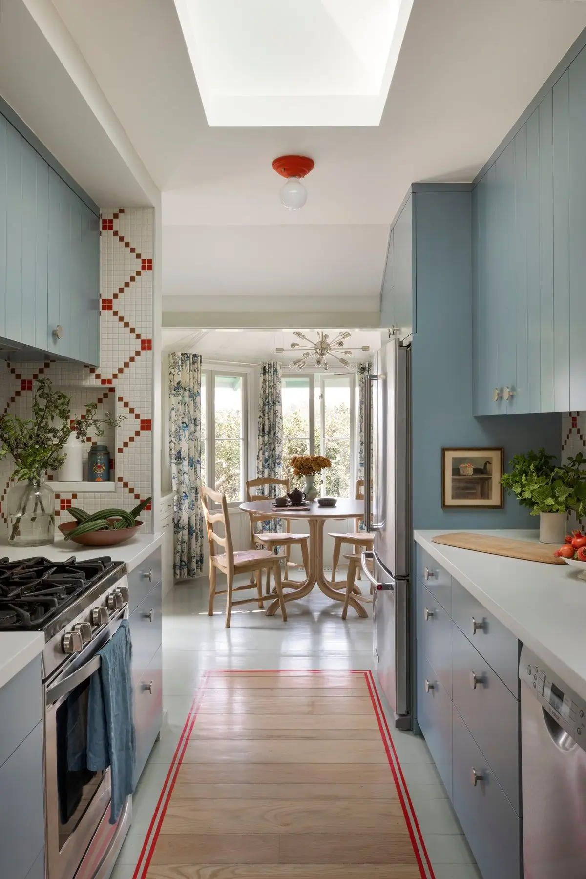
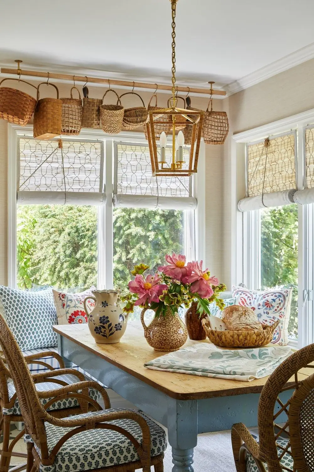
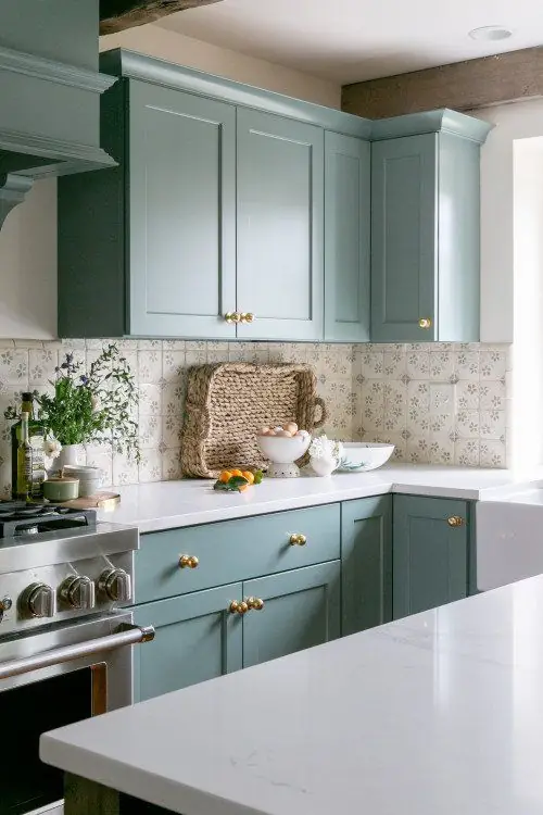
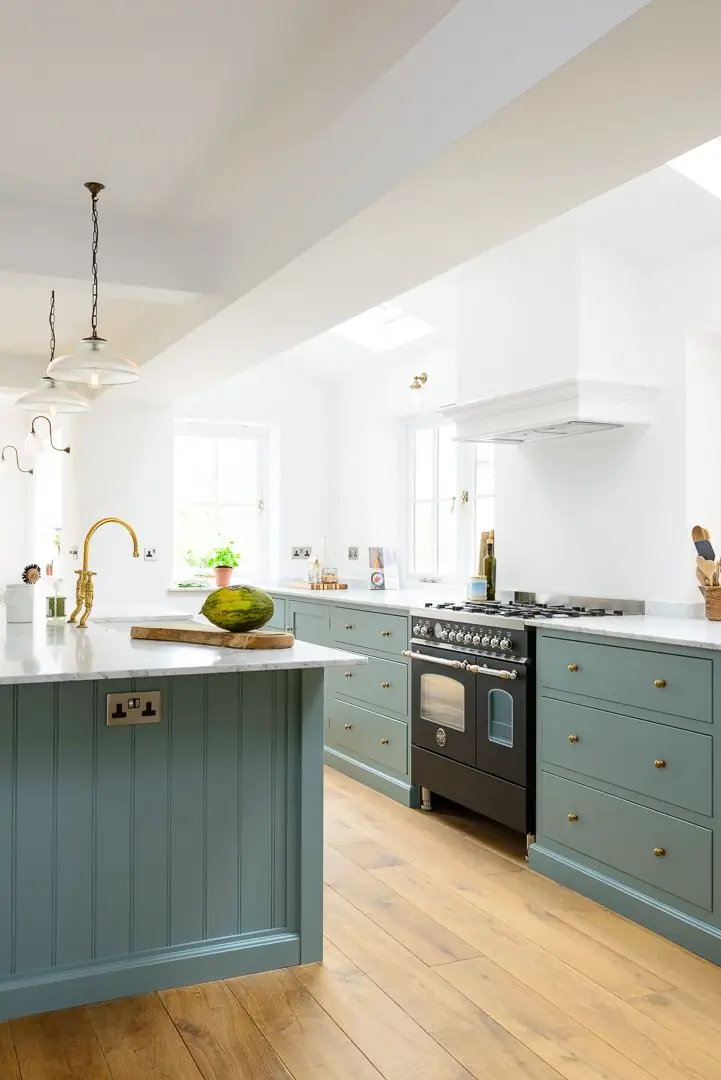
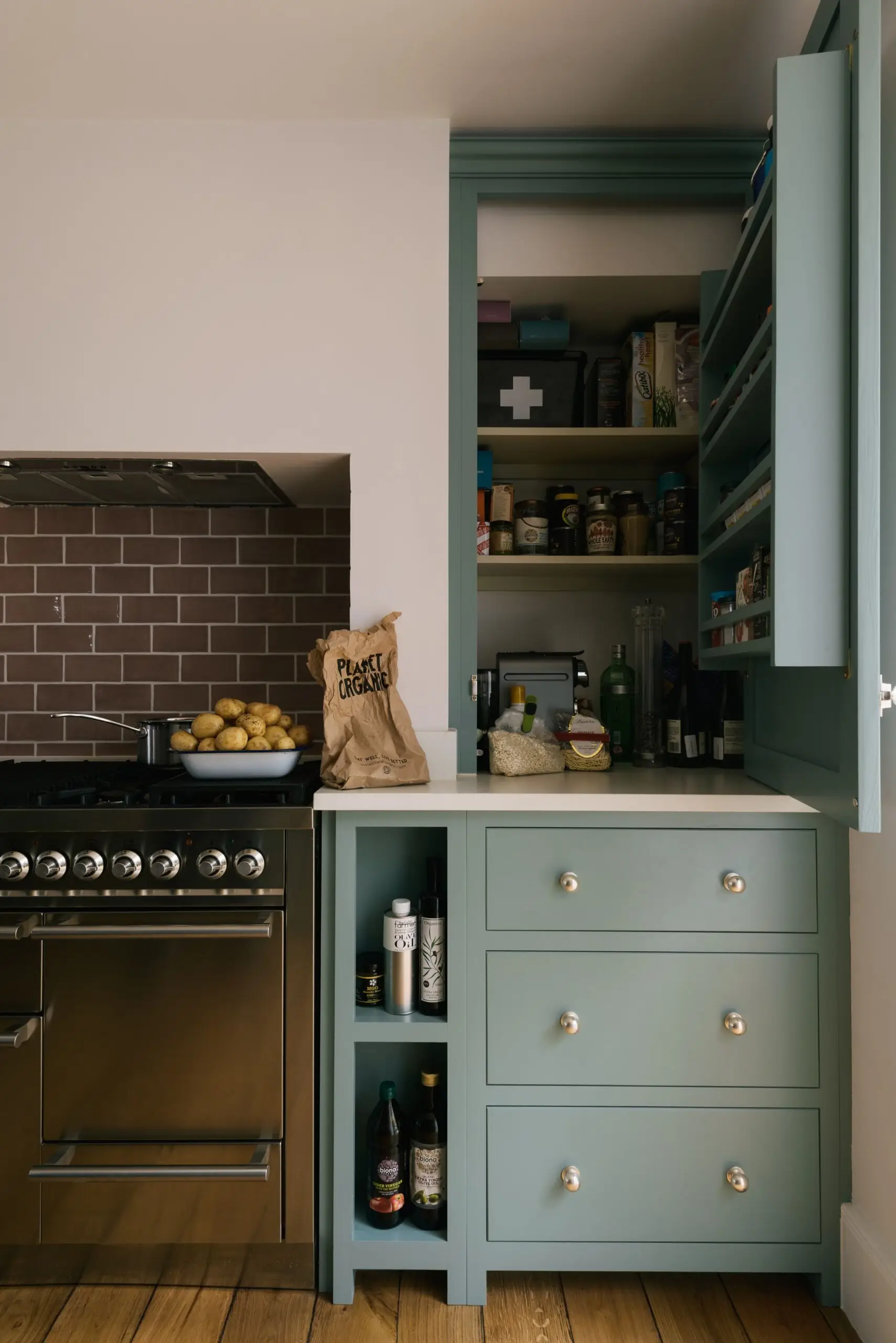
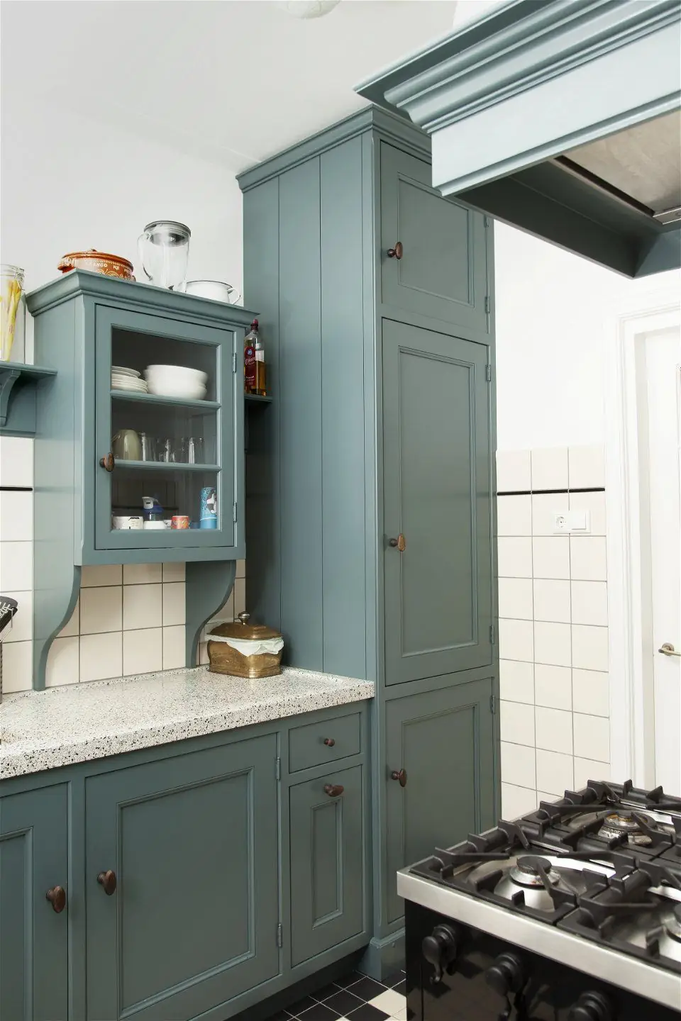
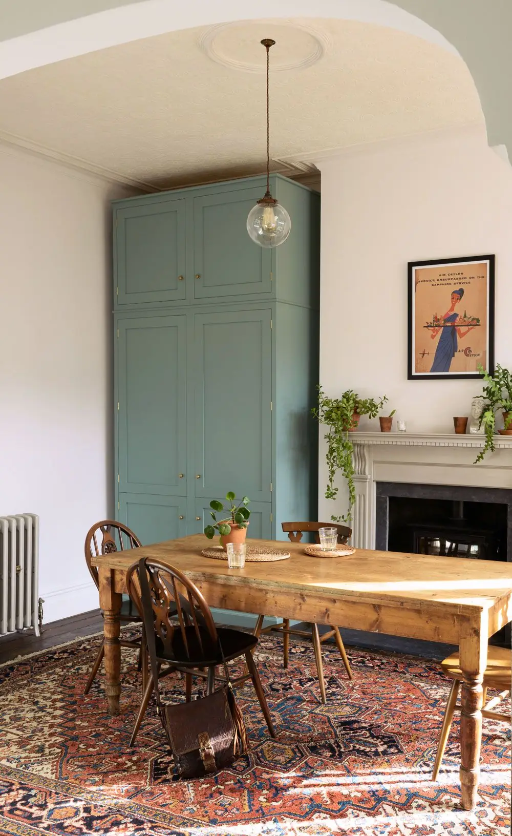
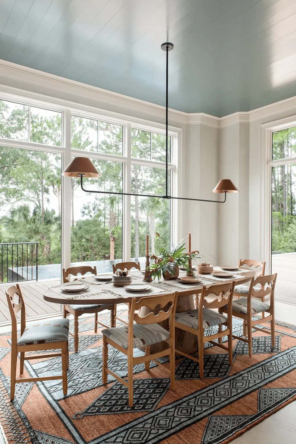
Kitchen and Dining Room
Provence Blue is an exquisite option for contemporary kitchens. Experts love the idea of traditional green-blue cabinets accentuated by golden hardware. First, ensure your kitchen receives plenty of natural light, which will make this French blue tone glow. As designers say, going with a delicate green-blue is a go-to solution instead of opting for the same gray year after year.
Simultaneously, we invite you to admire the grandeur of a large dining room with walls painted in soothing veggie blue. Painting the ceiling is an original design idea and a perfect solution for making an overly large room feel comfortable.
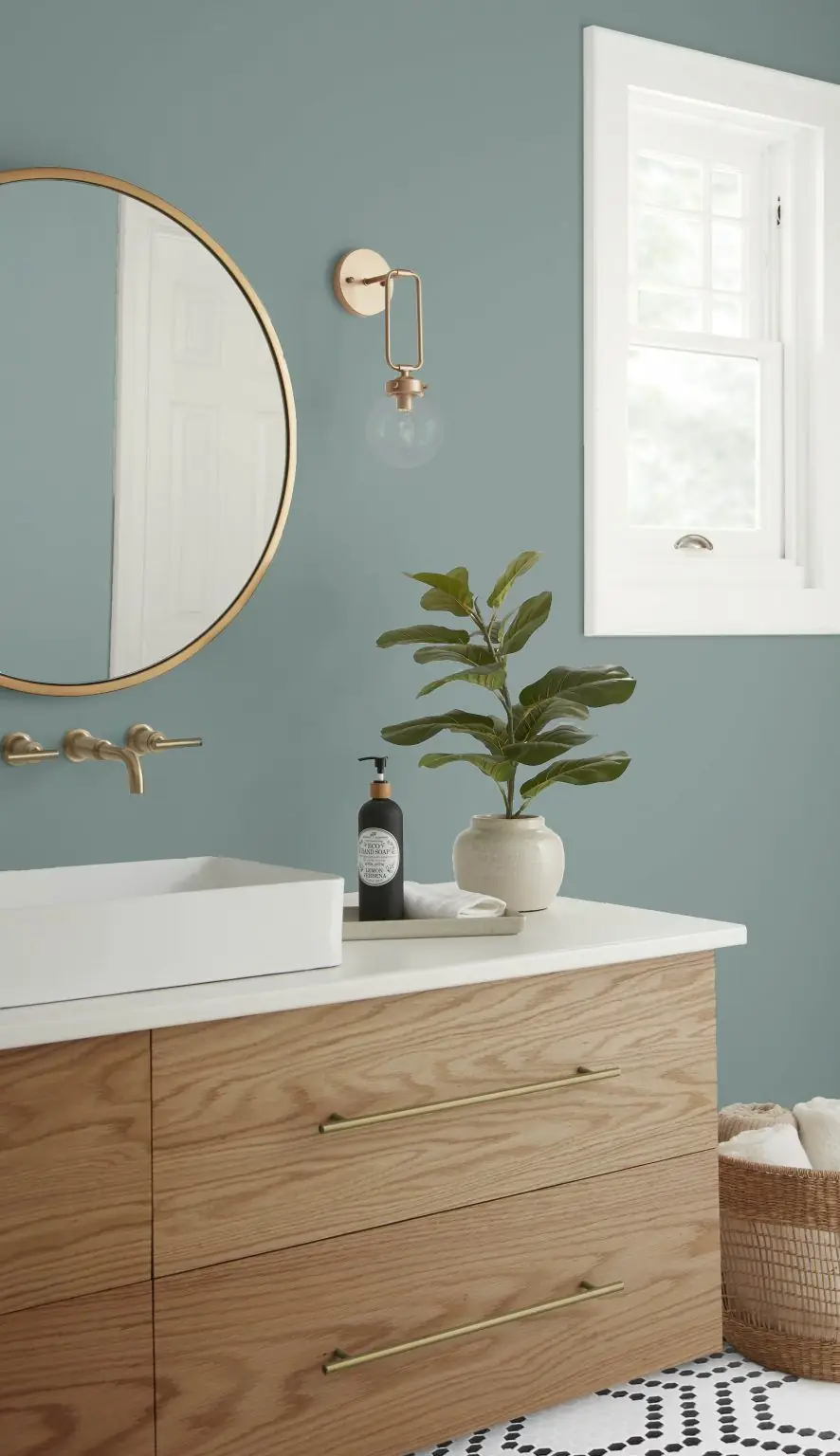
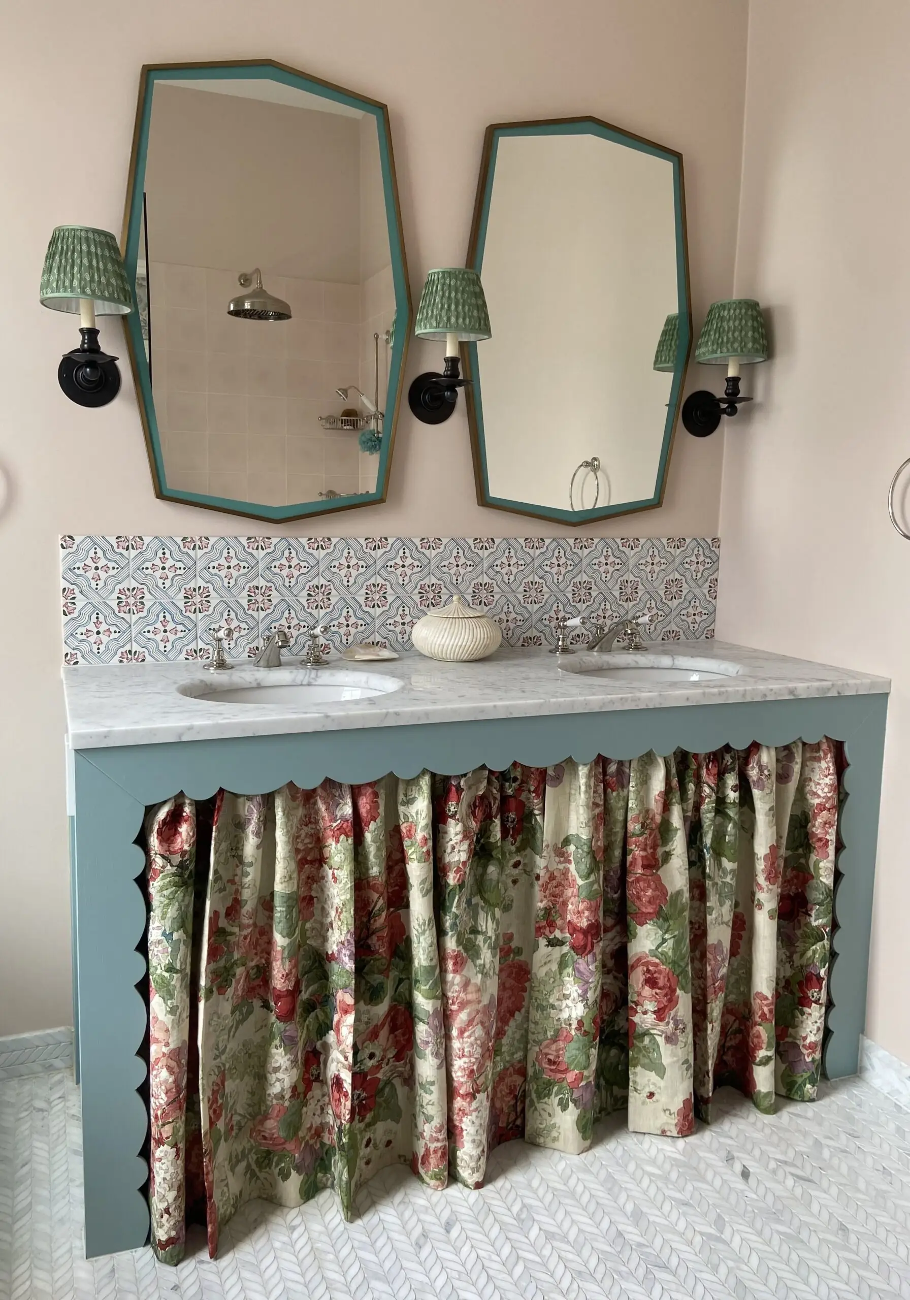
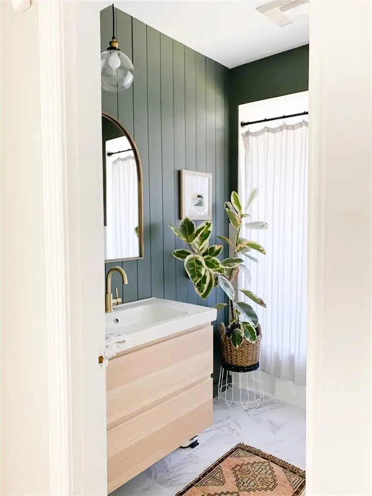
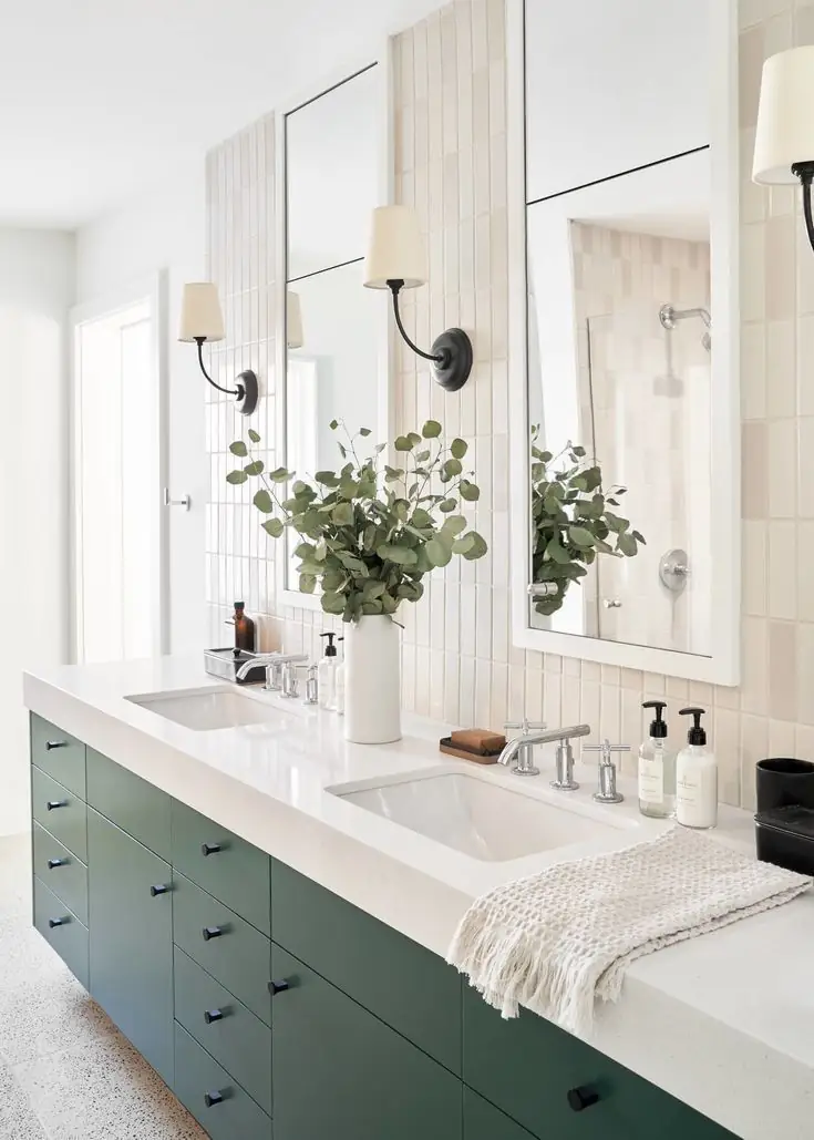
Bathroom
Don’t overdo the decor in the bathroom if you choose Provence Blue. The color will speak for the entire design idea. It can either be green-blue wall paneling or a green-blue vanity. The secret is to combine this deep tone with light, soft neutrals. For hardware, think gold or black.
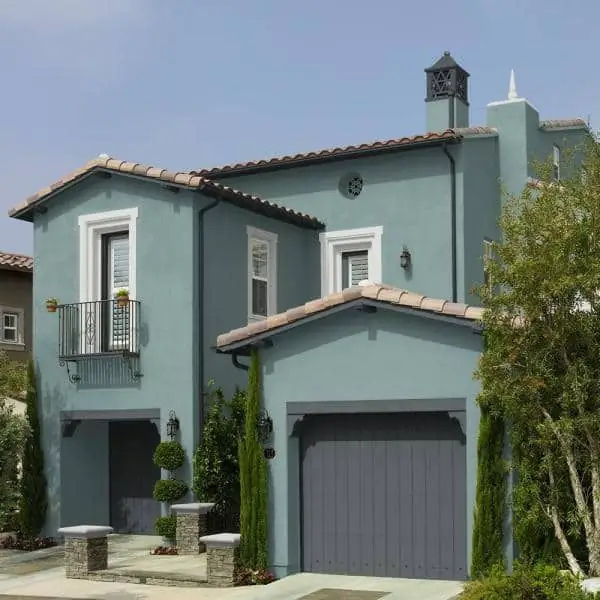
Use of Provence Blue in Exterior Design
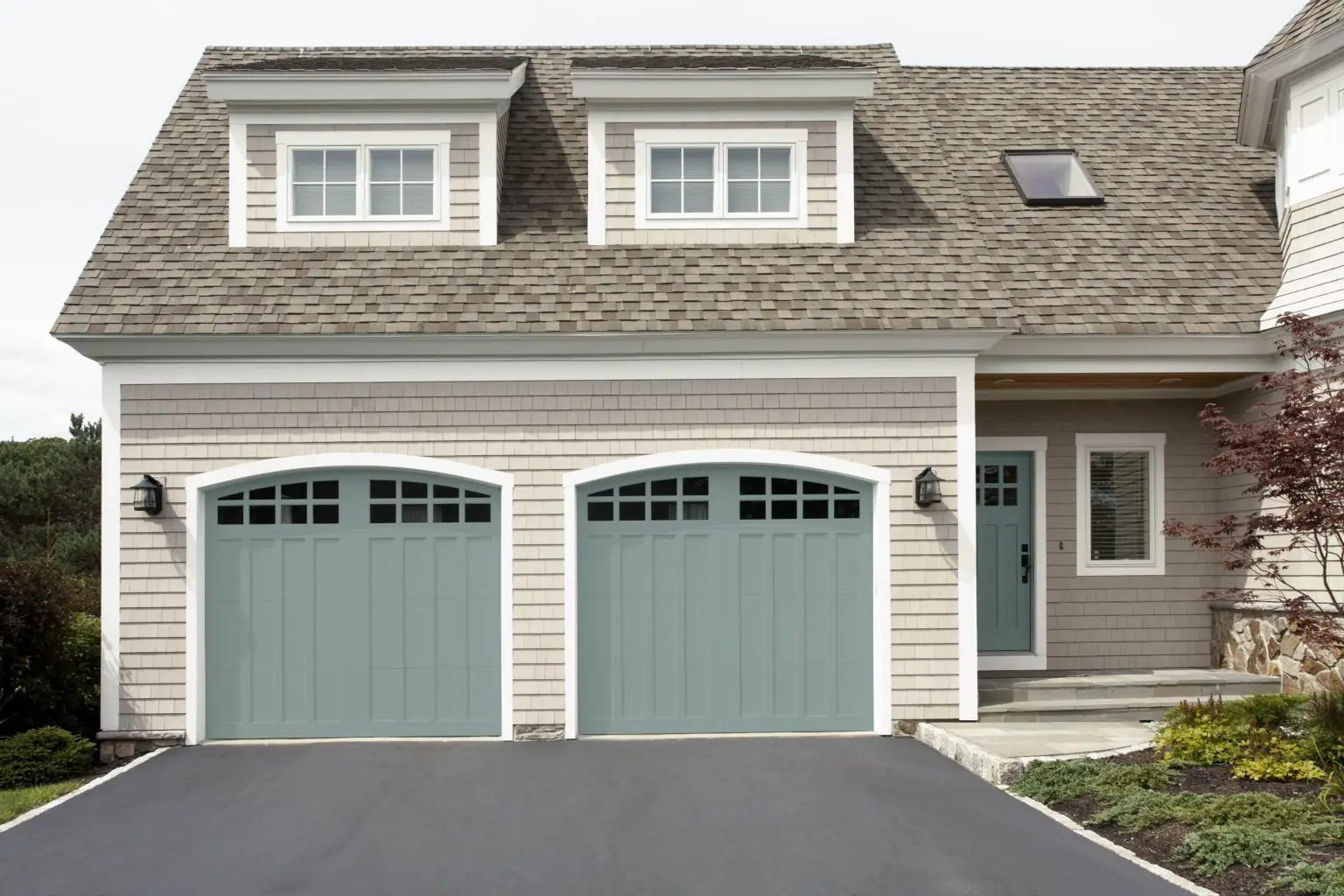
Provence Blue is a no-fail color option for your exterior. Make a catchy statement and paint your house exterior walls in this confident and formal blue. The great news is that this paint color seamlessly blends with the surrounding greenery. Next, you can consider this organic green-blue on the front door or garage door combined with a light and warm neutral for exterior walls. Everybody will keep asking you what color this is.
Behr’s mainstream green-pigmented Provence Blue paint color is the kind of blue shade with a story to tell. Emanating strong feelings of calmness and tranquility inspired by the French Provence, this meaningful paint color will add beauty to any detail in your home.
Closest Cross-Brand Equivalents
The absolute closest scientific color matches for Provence Blue across top paint brands.