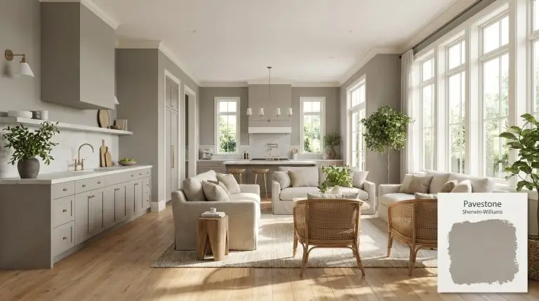
Pavestone SW 7642
Sherwin-WilliamsSherwin-Williams Pavestone (SW 7642) is a medium-depth, warm greige that perfectly balances beige and gray. With an LRV of 32, it offers a substantial, cozy presence without overwhelming a space, making it an excellent choice for exteriors, cabinetry, and inviting living areas.
| Temperature | Warm |
|---|---|
| Primary Undertone | Warm beige |
| Hidden Undertones | Subtle green in certain natural light, cool gray hints |
| Best Exposures | South-facing, East-facing, or rooms with abundant natural light |
| Best For | Exterior siding, accent walls, kitchen cabinetry, living rooms, trim and molding |
Hackrea Review
Pavestone is an incredibly versatile medium-depth greige that brings a grounded, earthy sophistication to any space. It avoids the starkness of cooler grays while maintaining enough depth to make architectural features pop. We love it for its reliability, though you should always test it for sneaky green flashes in certain lighting.Architectural Strategies for a Warm Gray
Exterior Siding and Trim
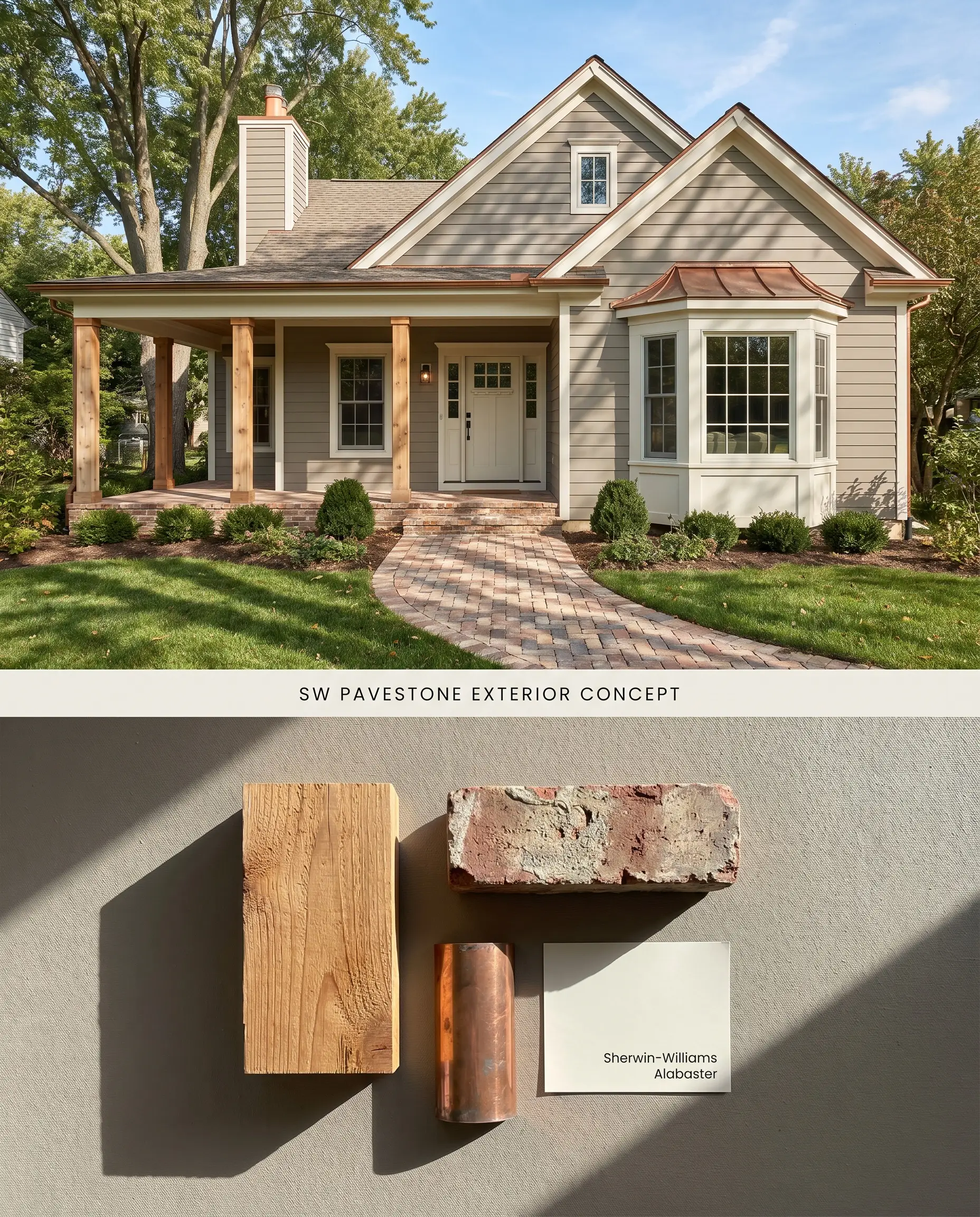
Pavestone’s LRV 32 absorbs intense ultraviolet rays, preventing the washed-out aesthetic that plagues lighter exterior siding colors. The warm beige base anchors the facade against natural landscaping, while a subtle green undertone harmonizes directly with surrounding foliage.
Accent Walls
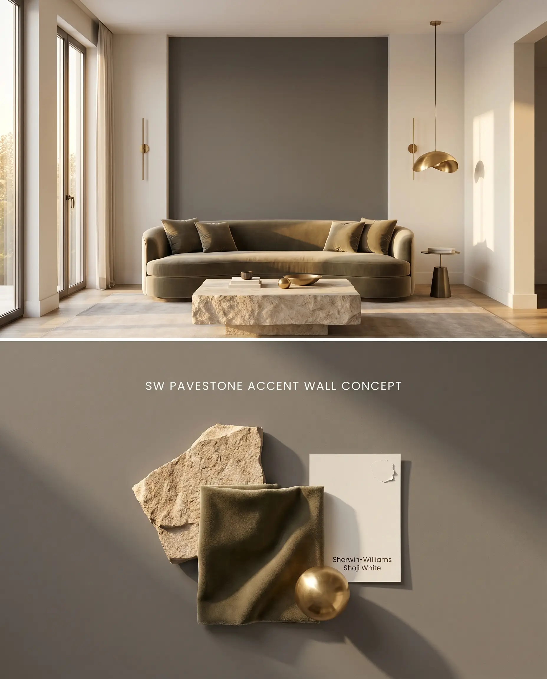
Concentrating this medium-depth neutral on a single focal wall grounds expansive spaces without visually enclosing the room. The earthy undertones recede when placed opposite large windows, pulling the eye through the architectural features.
Kitchen Cabinetry
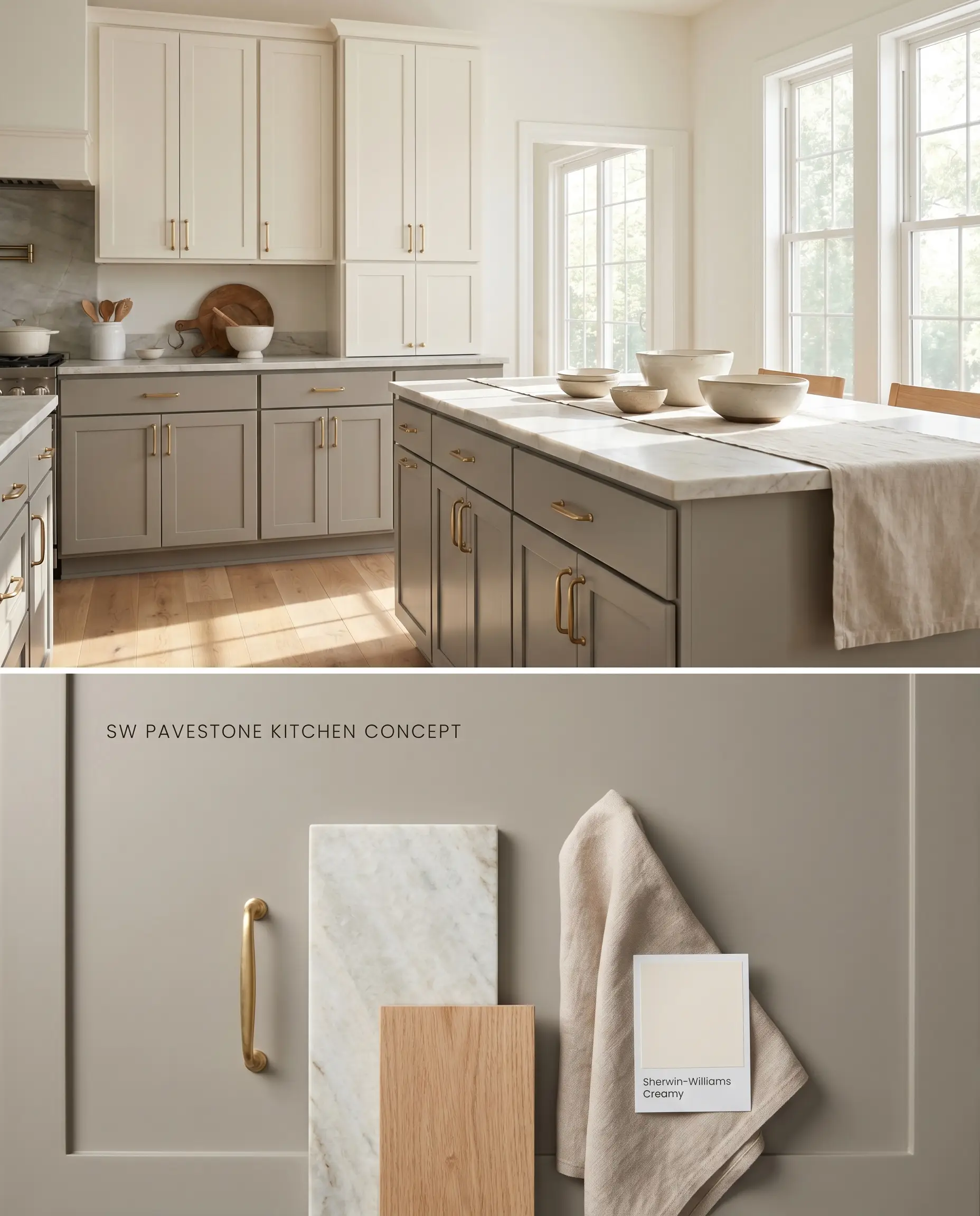
Applied to millwork, this kitchen cabinetry paint transforms lower units into a grounding visual anchor below creamy uppers. The color mass stabilizes the visual weight of the room, bridging the gap between natural oak flooring and polished stone countertops.
Living Rooms
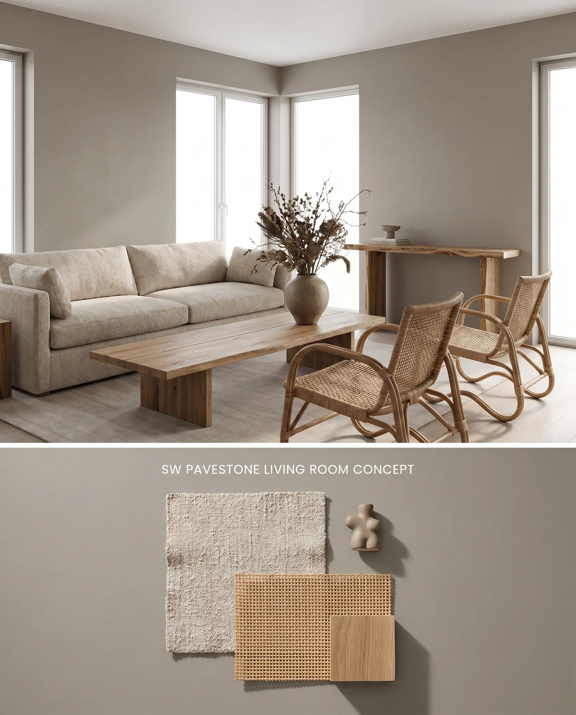
Wrapping a well-lit living room in Pavestone SW 7642 cultivates an enveloping, tailored atmosphere. The matte wall texture interacts with ambient light to highlight the subtle green undertone, softening the transition between the walls and natural wood furnishings.
Bedrooms
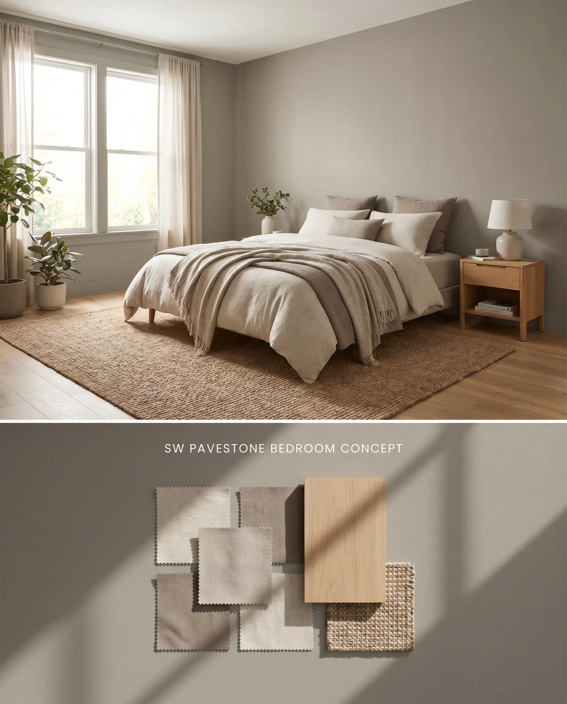
In bedrooms flooded with natural light, this greige paint absorbs shadows and creates a restorative retreat. A uniform primer ensures the color applies evenly over patched drywall, allowing the rich beige base to radiate warmth rather than appearing dense or muddy.
You can apply wallpapers, paints, etc. on walls and see how they look in various interiors.

Analyzing Medium-Depth Neutral Alternatives
Sherwin-Williams Pavestone SW 7642 vs. Benjamin Moore Revere Pewter HC-172
Revere Pewter (LRV 55.12) reflects significantly more light, functioning as a true transitional greige, whereas Pavestone SW 7642 (LRV 32) operates as a denser color mass. In rooms with moderate light, Revere Pewter maintains a luminous quality, but in intense Southern exposure, Pavestone SW 7642 holds its depth without washing out. Reserve Revere Pewter for standard living spaces and deploy Pavestone SW 7642 when anchoring large, sun-drenched exteriors or cabinetry.
Sherwin-Williams Pavestone SW 7642 vs. Sherwin-Williams Acier SW 9170
Acier SW 9170 shares the exact same light reflectance value as Pavestone SW 7642 but diverges sharply in its undertone profile. Acier SW 9170 leans into a cooler, slate-like gray, completely lacking the earthy, warm beige base that defines Pavestone SW 7642. Specify Acier SW 9170 for modern, industrial spaces featuring concrete and cool metals, and utilize Pavestone SW 7642 for transitional spaces rich in natural wood tones and creamy whites.
Sherwin-Williams Pavestone SW 7642 vs. Sherwin-Williams Dorian Gray SW 7017
Dorian Gray SW 7017 (LRV 39) sits slightly lighter on the spectrum and projects a more traditional, straightforward gray appearance. Pavestone SW 7642 contains a distinct, subtle green undertone that activates during a natural light shift, making it more responsive to exterior landscaping. Choose Dorian Gray SW 7017 for interior spaces where a predictable, neutral backdrop is required, and select Pavestone SW 7642 for exteriors or rooms where natural light can highlight its complex earthy undertones.
Sherwin-Williams Pavestone Technical FAQs
Yes, in specific natural lighting conditions, the earthy undertones in Pavestone SW 7642 can present a subtle green shift. This effect is most pronounced when the paint reflects surrounding exterior foliage or when illuminated by warm Southern light.
In cool, North-facing light, Pavestone SW 7642 loses its warm beige base and shifts entirely into its gray structural core. This lighting condition strips the color of its warmth, making the space feel notably colder and more industrial.
Its LRV of 32 prevents the color from bouncing excessive light, eliminating the washed-out effect common with lighter exterior paints. It maintains its structural color mass and depth even under direct, intense ultraviolet exposure.
Creamy whites like Sherwin-Williams Alabaster SW 7008 or Creamy SW 7012 provide the necessary warmth to harmonize with the beige base of Pavestone SW 7642. Stark, icy whites will clash, making the trim appear harsh and disconnected from the wall color.
Similar Paint Colors
Same Brand
Cross-Brand Equivalents