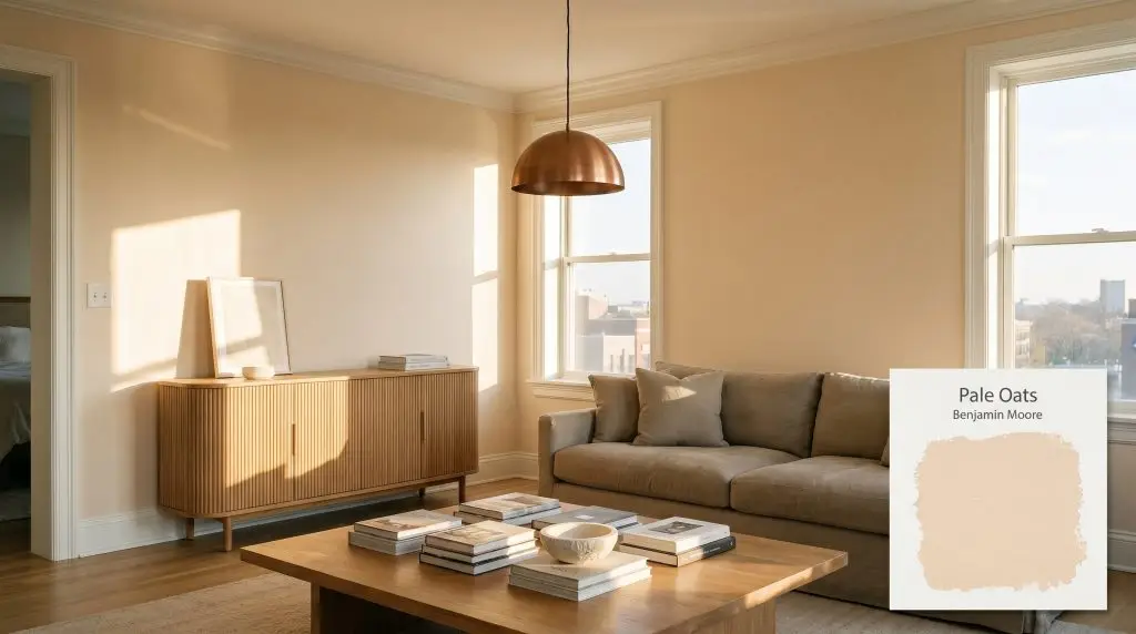
Pale Oats 2166-60
Benjamin MooreBenjamin Moore Pale Oats (2166-60) is a warm, delicate peach pastel with subtle apricot and yellow-pink undertones. With a high LRV of 74.34, it acts as a buoyant, light-reflecting off-white that brings a soft, inviting glow to interior spaces.
Paint Technical Profile
| Color ID / SKU | 2166-60 |
| HEX Code | #F9DEC3 |
| Light Reflectance (LRV) | 74.34 |
| Use | Interior |
| Best Exposures | South, West |
| Best For | Nurseries, Powder Rooms, Breakfast Nooks |
Benjamin Moore Pale Oats: Mastering the Art of the Grown-Up Pastel
For many design enthusiasts, the word “peach” triggers an immediate reflex to run in the opposite direction. We often associate it with dated, overly saturated rooms that feel more like a retro time capsule than a curated modern home. Benjamin Moore Pale Oats completely shatters that preconceived notion.
This specific color is a masterclass in restraint, offering the glowing warmth of a traditional peach without the overwhelming visual weight. It acts as a highly refined warm off-white, casting a gentle, sunlit radiance across your walls even on the gloomiest of afternoons.
By treating this buoyant hue as a foundational layer rather than a mere accent, you can fundamentally shift the energy of a room. It provides a soft, tactile backdrop that makes natural materials and thoughtful furnishings simply sing.
Benjamin Moore Pale Oats: Undertones & LRV
If you are wondering whether this paint leans warm or cool, Benjamin Moore Pale Oats is definitively warm. It completely bypasses the sterile, icy feel of standard whites, injecting a space with a subtle, inviting temperature. To understand exactly how it achieves this glow, we have to look closely at its underlying color structure.
Sitting at a light reflectance value (LRV) of 74.34, this architectural finish is highly reflective and incredibly efficient at bouncing natural sunlight around a room. This specific number is your design advantage, as it allows the paint to illuminate smaller or shadow-prone spaces beautifully. It retains just enough pigment to hold its own against bright windows, ensuring it never washes out into an uninspired, glaring white.
Lighting Effects & The Chromatic Profile
Because this pastel peach relies on such delicate micro-nuances, it physically responds to the shifting angles of the sun. As the day progresses, the color will subtly change its temperature and personality depending on the exposure of your room.
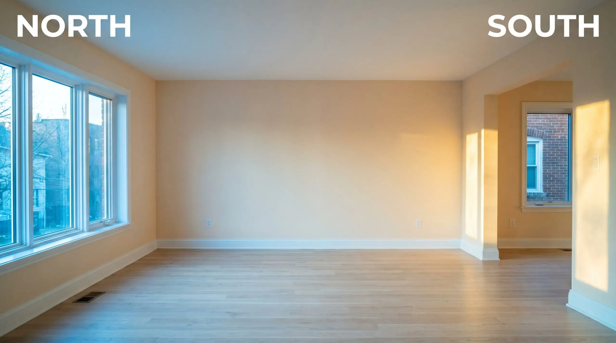
When testing this color, swap your standard overhead bulbs immediately. Never judge a subtle peach under harsh daylight LEDs, as the blue spectrum will clash with the paint’s natural warmth and make it look surprisingly muddy. Always test with a soft white or warm white bulb to see its true potential.
Hackrea Pro-Tip (The Bulb Strategy)
Popular Architectural Applications
Moving beyond the theoretical data, the true magic of this hue is discovered when it is applied to real-world architecture. Because it operates as a luminous, warm neutral, it offers incredible flexibility across a variety of domestic spaces. Here is how to maximize its potential.
Nurseries & Play Spaces
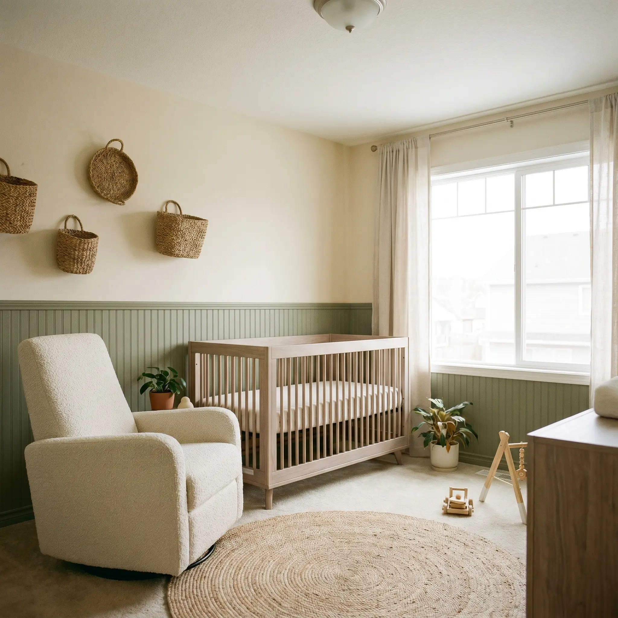
It is incredibly tempting to default to a standard, sugary pink when designing a room for a new arrival. However, modern parents are increasingly seeking out sophisticated alternatives that a child can easily grow into. By using Pale Oats, you establish a joyful, comforting atmosphere that feels grounded rather than overly sweet.
Consider a half-wall application where the lower portion features beadboard paneling painted in a soft, earthy sage green, while the upper walls carry the glowing peach. This creates a beautifully grounded horizon line in the room. Pair this combination with bleached walnut cribs, a textured bouclé glider, and woven wall baskets to achieve a serene, Soft Minimalism aesthetic.
Morning Breakfast Nooks
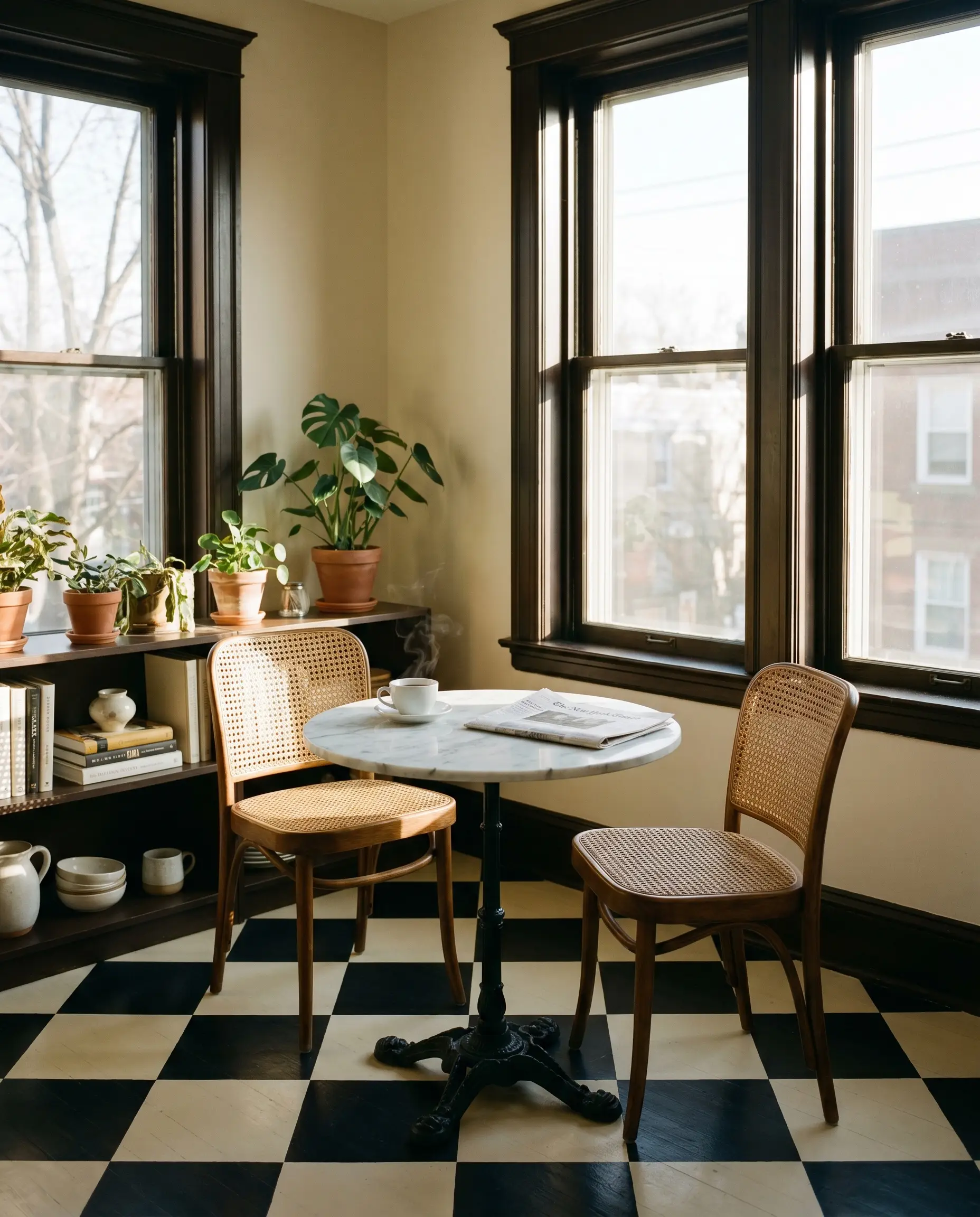
East-facing dining spaces are the perfect candidates for this color, as they naturally catch the cool, crisp morning light. The paint absorbs those early rays and warms them up, making your morning coffee routine feel incredibly inviting.
Instead of leaning into a predictable farmhouse style, push the architecture toward a chic, Postmodern bistro vibe. Paint the window sashes and surrounding trim in a rich espresso brown to create a sharp, graphic frame against the soft walls. Anchor the space with a marble-topped bistro table, vintage cane-backed chairs, and a checkerboard painted floor to balance the paint’s inherent sweetness with striking, geometric contrast.
High-Impact Powder Rooms
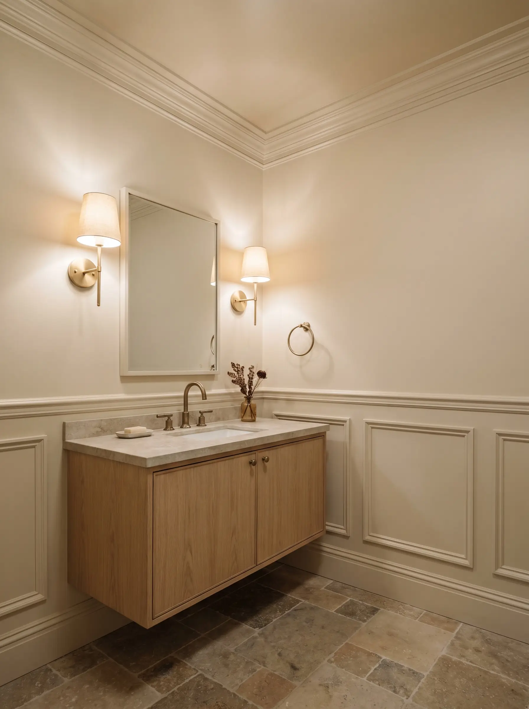
Small, windowless bathrooms are often treated as afterthoughts, but they are actually brilliant canvases for testing out an enveloping color. Because the reflective nature of this hue is so high, it prevents tight quarters from feeling visually restrictive.
To elevate a standard builder-grade bathroom, install classic wainscoting and drench the entire space—trim, walls, and ceiling—in the exact same finish. Introduce tumbled limestone floor tiles and a floating oak vanity to bring in crucial organic texture. Finish the room with unlacquered brass sconces, as the living metal will patina beautifully over time and perfectly complement the subtle apricot notes.
Welcoming Guest Retreats
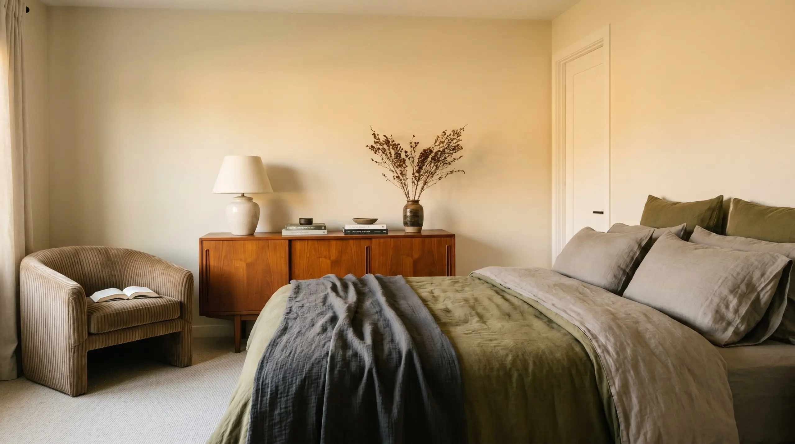
A guest bedroom should instantly communicate comfort and hospitality to your weekend visitors. Wrapping the room in this sunlit shade creates a cocooning effect that feels both luxurious and entirely unpretentious.
Avoid pairing this wall color with bedding or drapery that features stark, cool-toned pinks or vibrant magentas. The conflicting temperatures will fight for dominance, making the walls look unintentionally yellowed.
Clash Warning (The Textile Trap)
Instead, style the bed with layers of washed linen in earthy tones like olive, warm greige, and soft charcoal. Add a vintage mid-century teak credenza and a plush, ribbed velvet armchair in the corner to give your guests a tactile, highly curated retreat. The rich wood grains and textured fabrics will stabilize the lightness of the walls, resulting in a perfectly balanced, high-end sanctuary.
Styling Benjamin Moore Pale Oats: Material & Color Pairings
This specific hue thrives on intentional contrast, requiring thoughtful material pairings to keep it from floating away into a purely pastel aesthetic. Rather than relying on stark, graphic black lines to hold its shape, this gentle peach prefers to be grounded by rich, tactile textures and deeper, muted companion colors.
Creating the Perfect Architectural Boundary
When selecting a trim color, the goal is to create a seamless, atmospheric transition rather than a jarring, high-contrast border. Benjamin Moore Cloud White OC-130 is an exceptional choice for the baseboards and crown molding. It shares a similarly soft, warm undertone that allows the apricot base of the walls to glow without feeling boxed in.
If you prefer a slightly creamier, more traditional transition, Sherwin-Williams Alabaster SW 7008 provides a beautiful, muted boundary. It visually melts into the peach, establishing a relaxed, sun-drenched envelope that feels incredibly cohesive.
Tactile Finishes & Hardware Selections
To elevate this warm off-white, you must introduce materials that provide visual weight and organic texture.
The Companion Palette
Curated Aesthetic Concepts
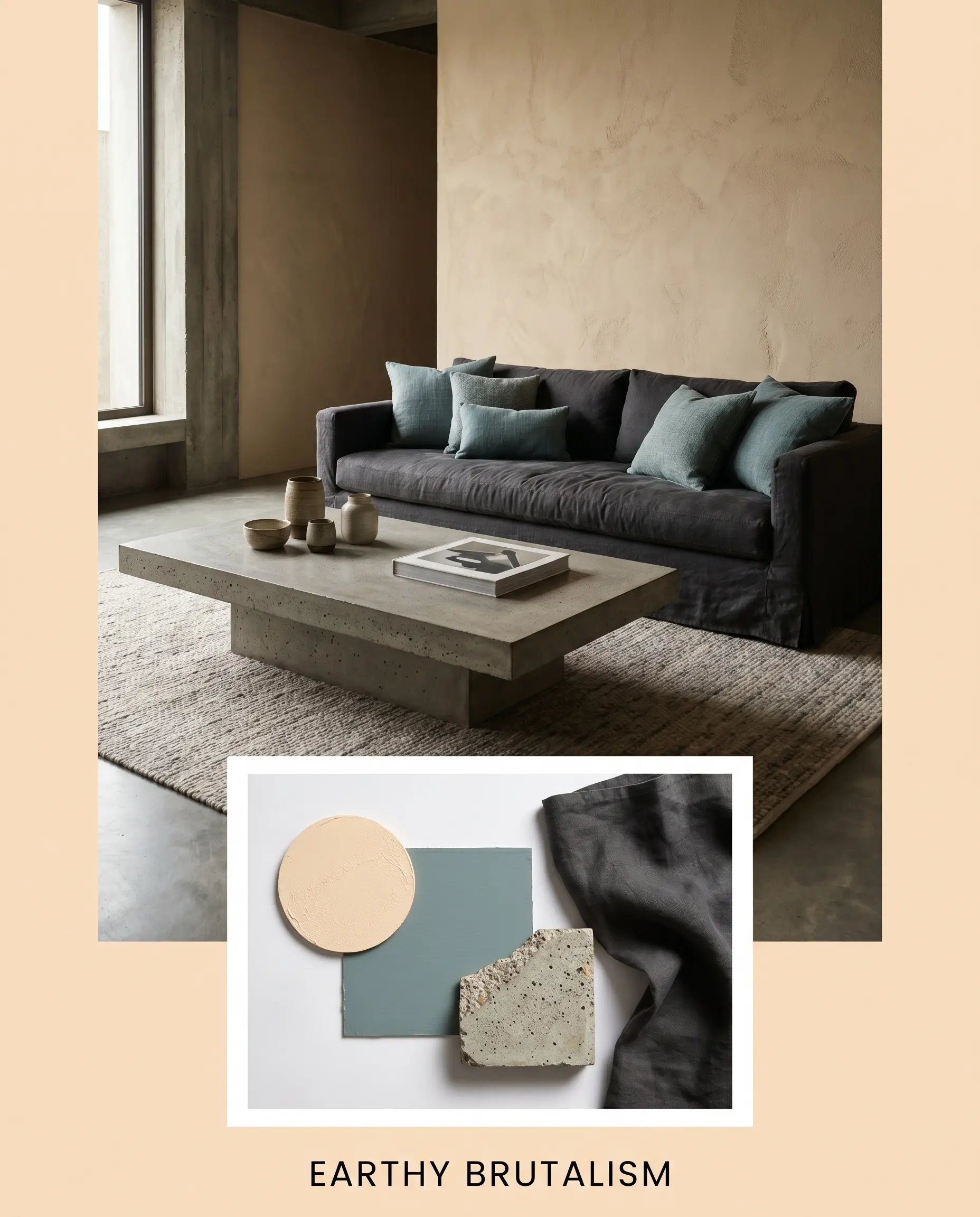
Earthy Brutalism This concept completely subverts the traditional pastel stereotype by introducing heavy, unapologetic textures. We anchor the glowing walls with a brutalist, poured-concrete coffee table and a slipcovered sofa in a deep charcoal linen. By introducing accent pillows in Sherwin-Williams Moody Blue, we establish a moody, weighted energy that makes the soft apricot walls feel incredibly architectural and intentional.
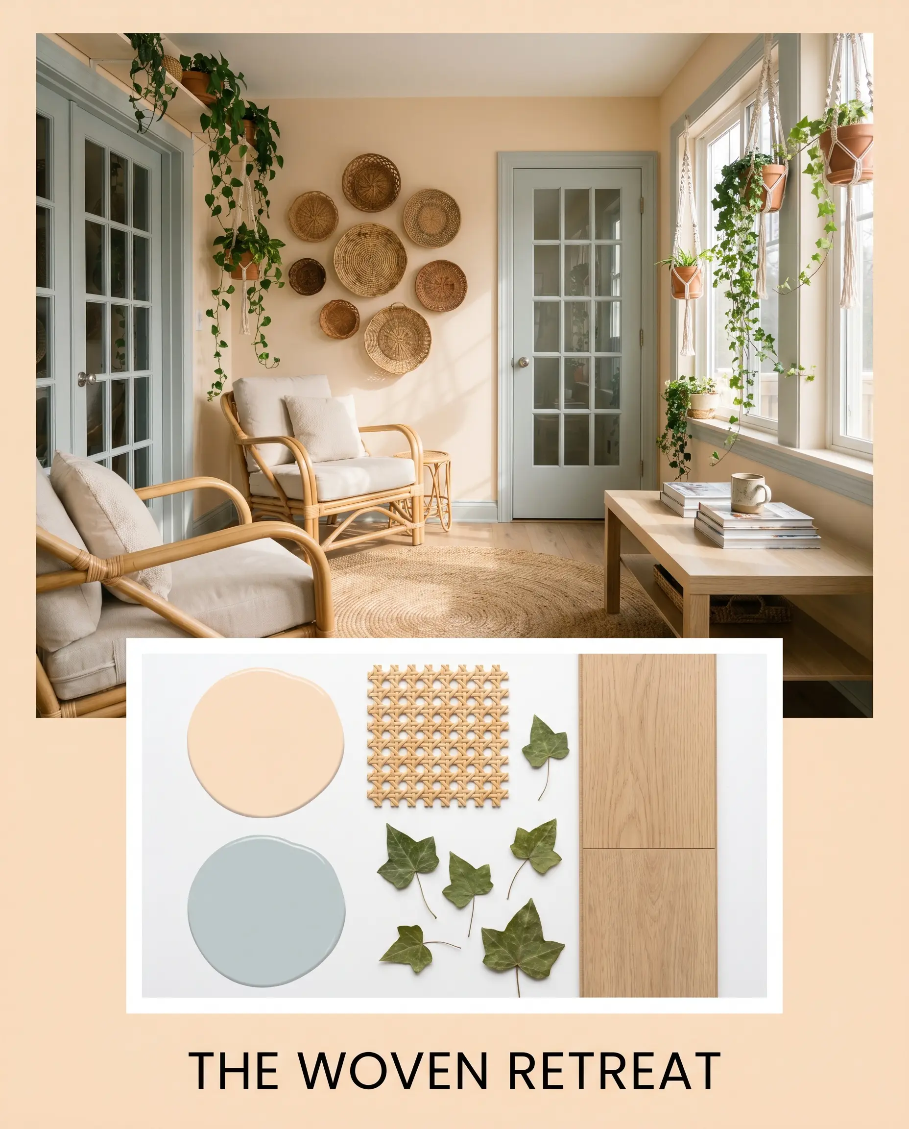
The Woven Retreat Focusing on serenity and organic flow, this palette leans into a relaxed, sun-baked atmosphere. The walls are softened further by the introduction of rattan seating, woven wall baskets, and trailing ivy that adds a vital layer of organic green. To keep the warmth in check, we paint the interior doors in Benjamin Moore Smoke, providing a gentle, cooling breeze to the visual landscape.
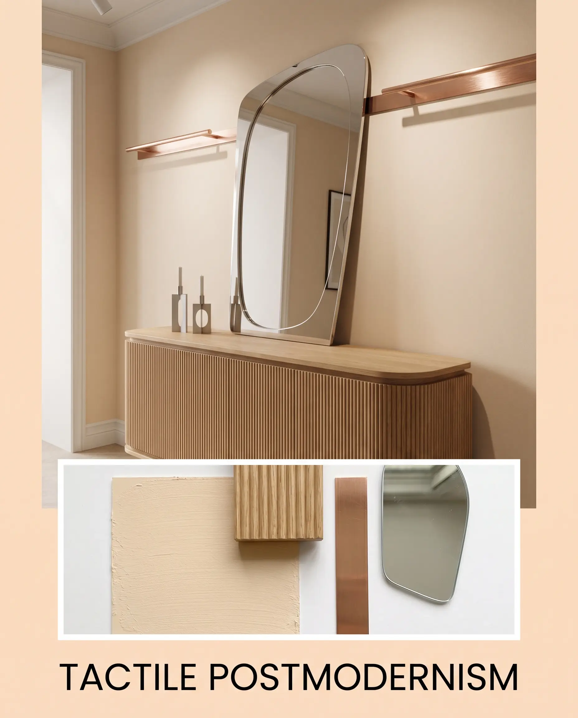
Tactile Postmodernism For a more graphic, design-forward approach, this aesthetic plays with shape and subtle metallic shine. We utilize a fluted oak console to introduce rigid, linear texture against the soft wall color. The styling is finished with brushed copper gallery rails, an asymmetrical leaning mirror, and minimalist candlesticks, creating an engaging, gallery-like vibe that feels highly curated.
Navigating Undertones: Head-to-Head Comparisons
There are specific architectural scenarios—like a heavily shaded northern exposure or a room flooded with conflicting wood tones—where this particular peach might lose its footing. When the lighting threatens to muddy the color or push it too far into an unwanted territory, comparing it against its closest rivals is the best way to confidently pivot your design plan.
Benjamin Moore Pale Oats vs. Benjamin Moore Flawless AF-320
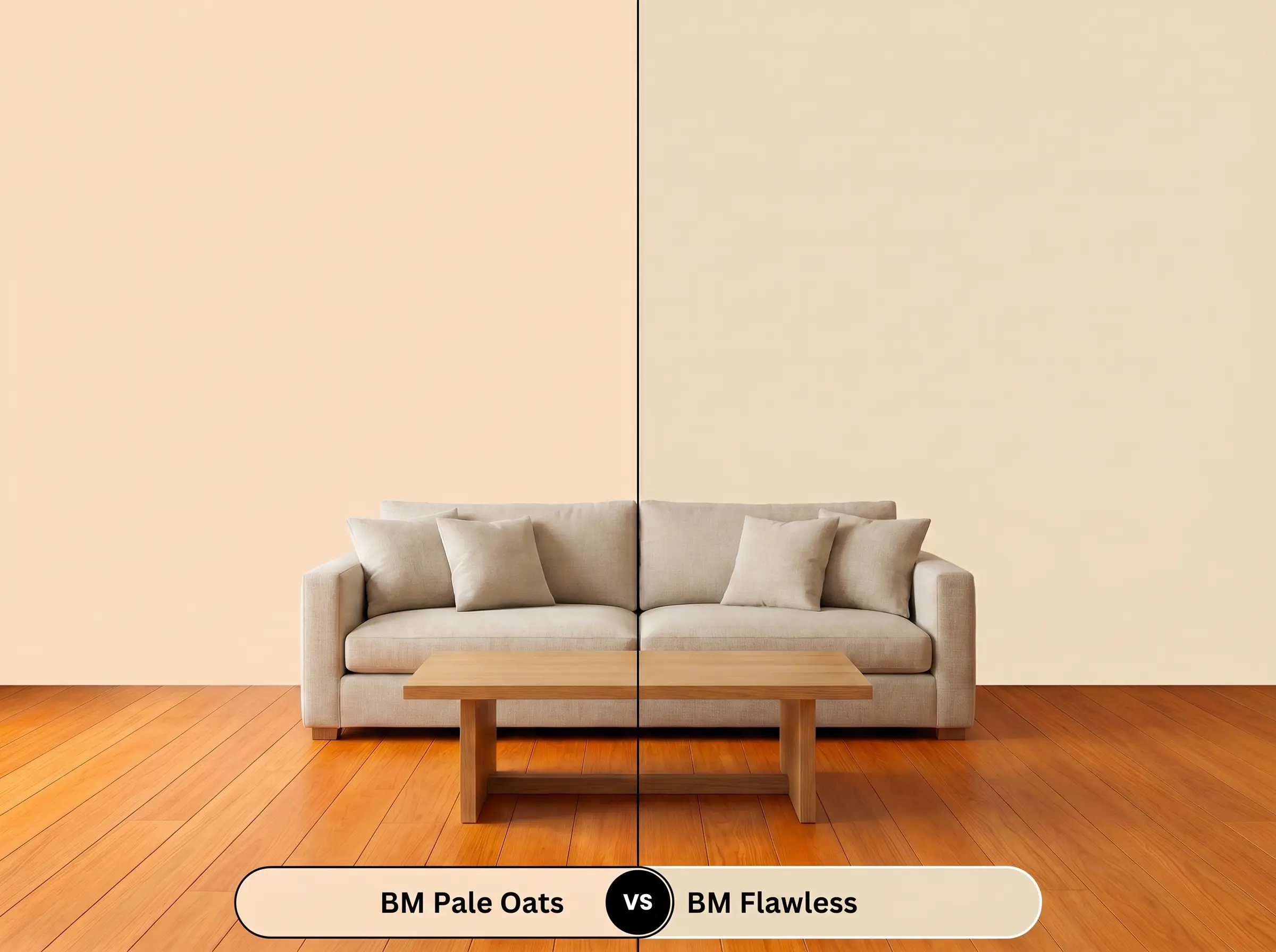
If you are styling a space with intensely warm, orange-toned wood floors, you might find that the pinkish cast of our primary color begins to clash. Benjamin Moore Flawless AF-320 strips away that delicate pink, relying instead on a much more pronounced, golden-yellow base. If you need a warm neutral that leans heavily into a sunny, golden glow rather than a soft apricot, then Flawless is the superior choice to harmonize with those stubborn wood tones.
Benjamin Moore Pale Oats vs. Sherwin-Williams Creamery SW 6358
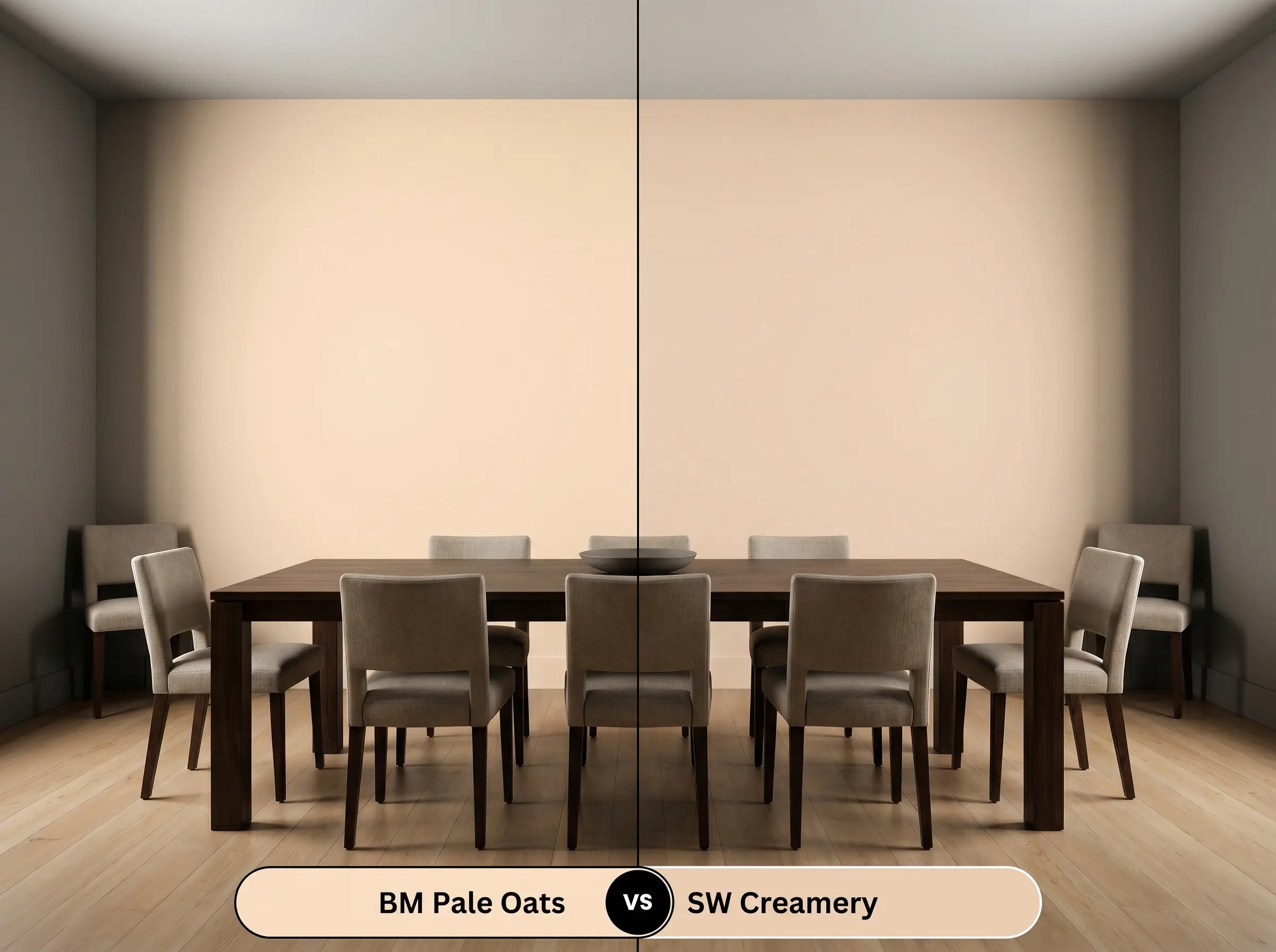
Sometimes, a room simply cannot handle the saturation of a true pastel. Sherwin-Williams Creamery SW 6358 operates as a much more traditional, creamy off-white with only a whisper of peach buried in its profile. If you love the idea of a warm, inviting glow but are terrified of the walls reading as distinctly pink or orange, Creamery provides a much safer, highly versatile alternative that still brings warmth to a shadowy space.
Exploring Alternative Hues and Brand Matches
Whether you need a color with just a fraction more intensity to anchor a massive, vaulted ceiling, or you simply need to color-match at a different local hardware store, knowing your alternatives is crucial.
Same-Brand Variations
Cross-Brand Matches
Execution Strategy: Getting the Finish Right
Transitioning from the design concept to the physical application requires an understanding of how light interacts with paint sheen. The way this delicate color dries on the wall will completely dictate its final aesthetic success.
Do not attempt to paint this color directly over a dark or heavily saturated wall. Because of its high light reflectance value, the old color will aggressively bleed through, muddying the delicate apricot base. Always apply a high-quality, bright white primer first to ensure the true, glowing undertones are perfectly preserved.
Hackrea Design Secret (The Primer Mandate)
Achieving a professional, flawless finish with this depth of color typically requires two full coats over a primed surface. Be highly mindful of “flashing”—those frustrating, visible roller marks that occur when you press too hard or stretch the paint too thin. Keep a wet edge on your roller and apply the paint generously but evenly to guarantee a smooth, velvety envelope.
Frequently Asked Questions
Because small windows restrict natural light, the shadows can actually mute the vibrant apricot base and pull forward its pinkish-beige nuances. To prevent it from feeling like a heavy, dusty pink, ensure you layer in warm artificial lighting and highly reflective accents like brushed copper to keep the color buoyant.
Direct, intense afternoon sunlight will aggressively amplify the golden-yellow undertones of this paint, making it appear much brighter and more saturated than it looks on the swatch. If you want a subtle exterior accent, this exposure might make it too vibrant, but it works beautifully if you are aiming for a joyful, welcoming entry.
Pairing this warm hue with a cool, icy gray marble creates a very difficult aesthetic tension. The conflicting temperatures will fight each other, often making the marble look sterile and the paint look unintentionally yellowed; it is much better paired with warm stones like tumbled limestone or soapstone.
Thanks to its high light reflectance value and inherent warmth, this color effectively mimics the feeling of natural sunlight. Wrapping a windowless space in this hue eliminates the cavernous, restrictive feeling of small rooms, creating a highly comforting and visually expansive environment.
The Final Verdict on Benjamin Moore Pale Oats
Benjamin Moore Pale Oats is a brilliant, highly adaptable architectural tool for those who want to inject genuine warmth into their home without committing to a heavy, overwhelming color. It is the perfect solution for homeowners looking to soften the rigid edges of modern architecture or bring a sunlit, tactile glow to a north-facing, shadowy room. When paired with organic textures like fluted oak, tumbled limestone, and washed linen, it sheds any outdated pastel stereotypes and emerges as a deeply sophisticated, curated backdrop.
This paint will actively fight against any finishes that lean heavily into icy, cool-toned grays or stark, blue-based whites. If your home features cool gray luxury vinyl plank flooring, stark white marble with blue veining, or icy chrome hardware, this delicate apricot will instantly look discordant and muddy. The conflicting temperatures create an uncomfortable visual friction, stripping the peach of its elegant glow and making your expensive hard finishes look surprisingly sterile. Always surround this hue with complementary warm tones, earthy neutrals, and living metals to ensure a cohesive, high-end result.
Clash Warning (The Temperature Conflict)