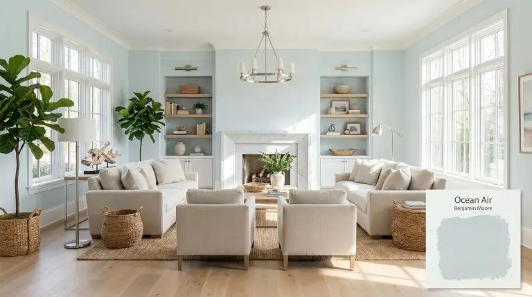
Ocean Air 2123-50
Benjamin MooreBenjamin Moore Ocean Air (2123-50) is a breezy, light blue-green paint color with an LRV of 71.84. Known for its soothing, spa-like quality, it balances a cool blue base with subtle green undertones, making it an ideal choice for coastal-inspired interiors, bedrooms, and bathrooms.
| Temperature | Cool |
|---|---|
| Primary Undertone | Blue |
| Hidden Undertones | Green and a subtle gray cast |
| Best Exposures | South-facing or East-facing |
| Best For | Coastal living rooms, serene bedrooms, spa-like bathrooms, laundry rooms, beadboard and shiplap accents |
Hackrea Review
Ocean Air is a quintessential coastal hue that delivers a refreshing, airy feel without looking like a nursery blue. Its subtle green-gray cast provides just enough sophistication for adult spaces, though it can lean a bit icy in north-facing rooms. It is a highly dependable choice for creating a tranquil retreat.Architectural Applications for a Spa-Like Atmosphere
Coastal Living Rooms
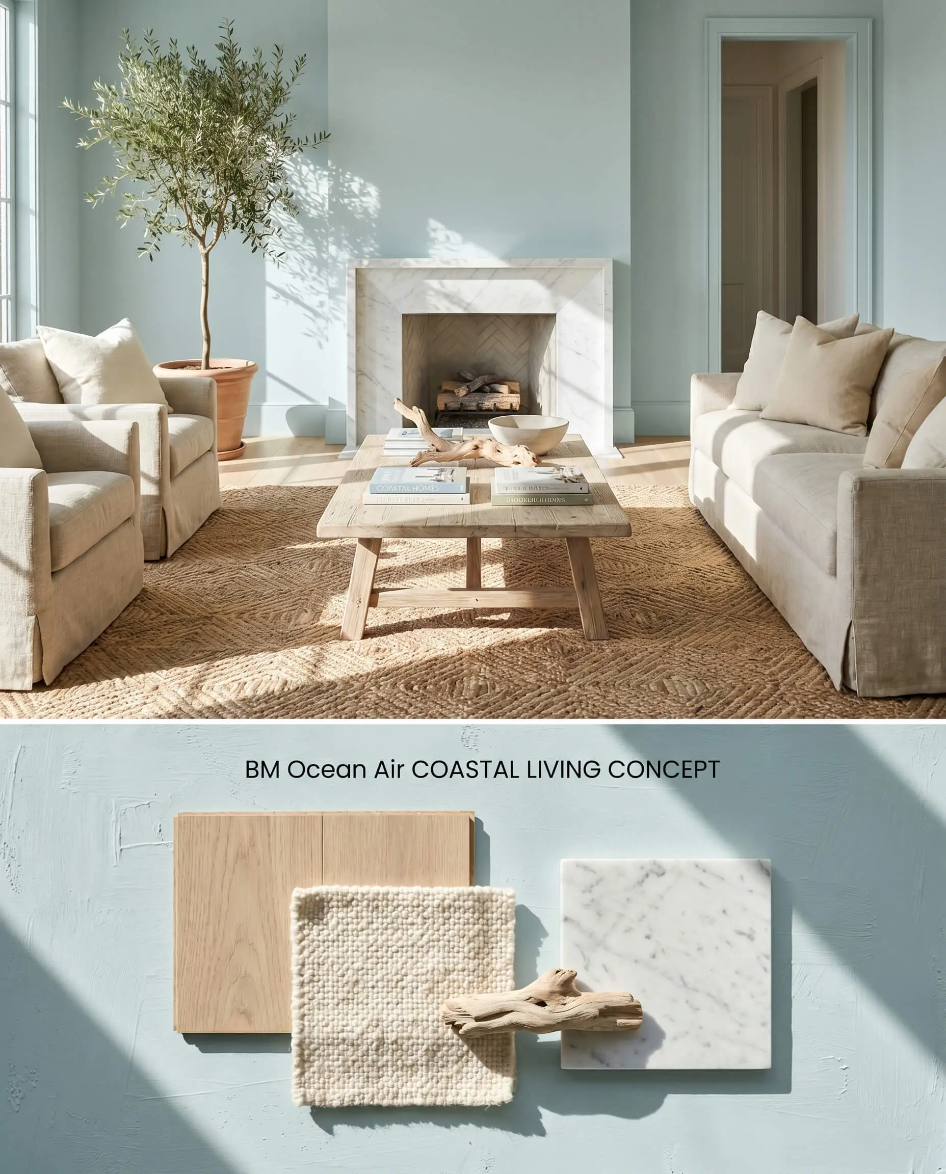
In expansive spaces bathed in natural light reflection, this blue-green pastel establishes a crisp, breathable foundation. The high LRV 71.84 actively expands the spatial boundaries, while the cool undertones require grounding through tactile, organic textures to prevent an overly sterile environment.
Serene Master Bedrooms
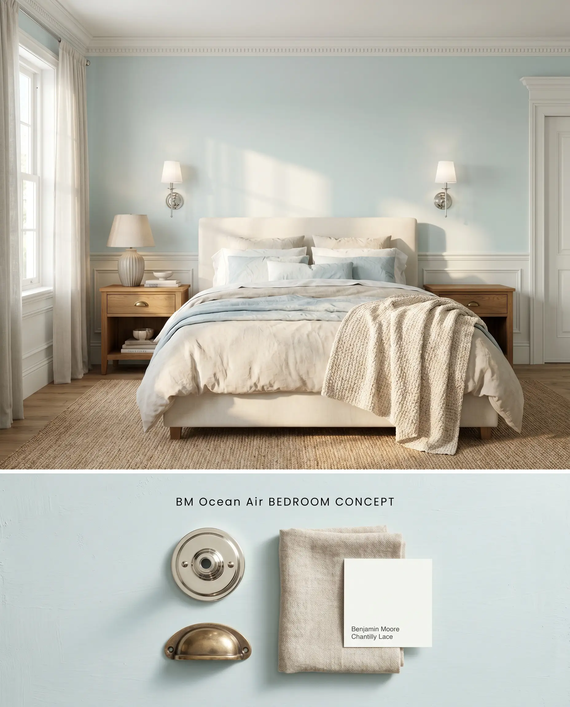
This aqua tint operates as a restorative architectural backdrop when isolated from conflicting warm wood tones. Transitioning over previously dark bedroom walls requires a high-hiding primer to protect the delicate chromatic profile from muddying.
Spa-Like Bathrooms
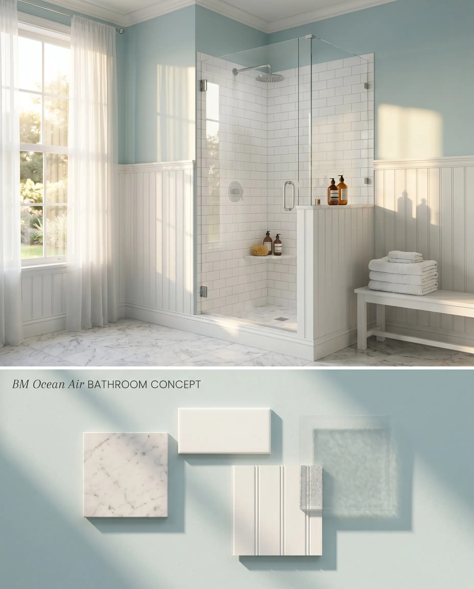
Applying this high-LRV hue to all four walls in a compact, highly illuminated space creates an aggressive bounce effect that intensifies the aqua saturation. Strategic application on a single focal wall or upper half-wall mitigates this reflection while preserving the intended aesthetic. You must strictly avoid windowless bathrooms, where the lack of natural light flattens the color structure into a muddy gray-blue low-light trap.
Laundry Rooms & Mudrooms
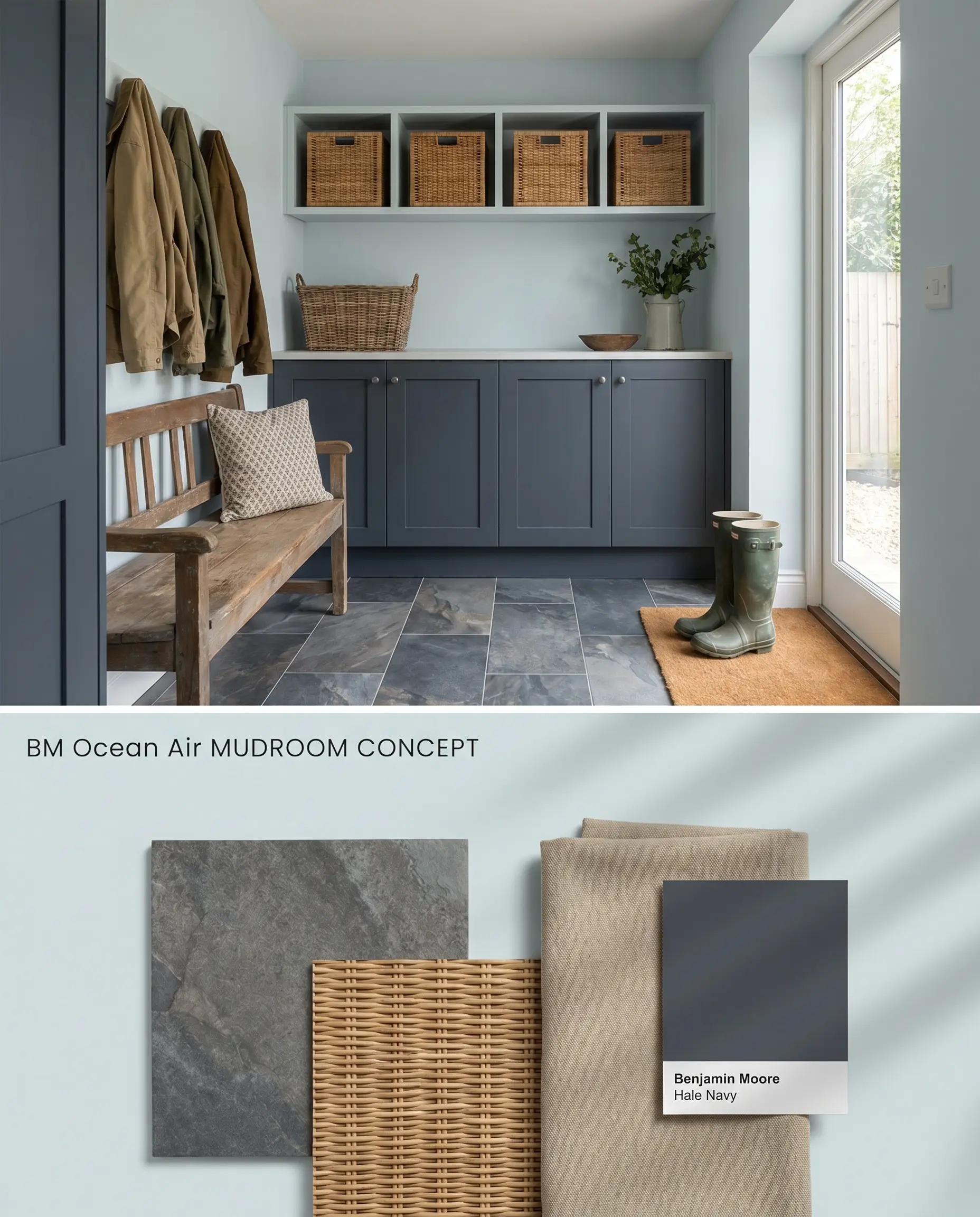
Utilitarian zones benefit from the visual expansion provided by this Benjamin Moore Color Preview collection staple. The inherent brightness lifts cramped quarters, provided the room receives adequate natural light to prevent the architectural finish from flattening.
Beadboard and Shiplap Accents
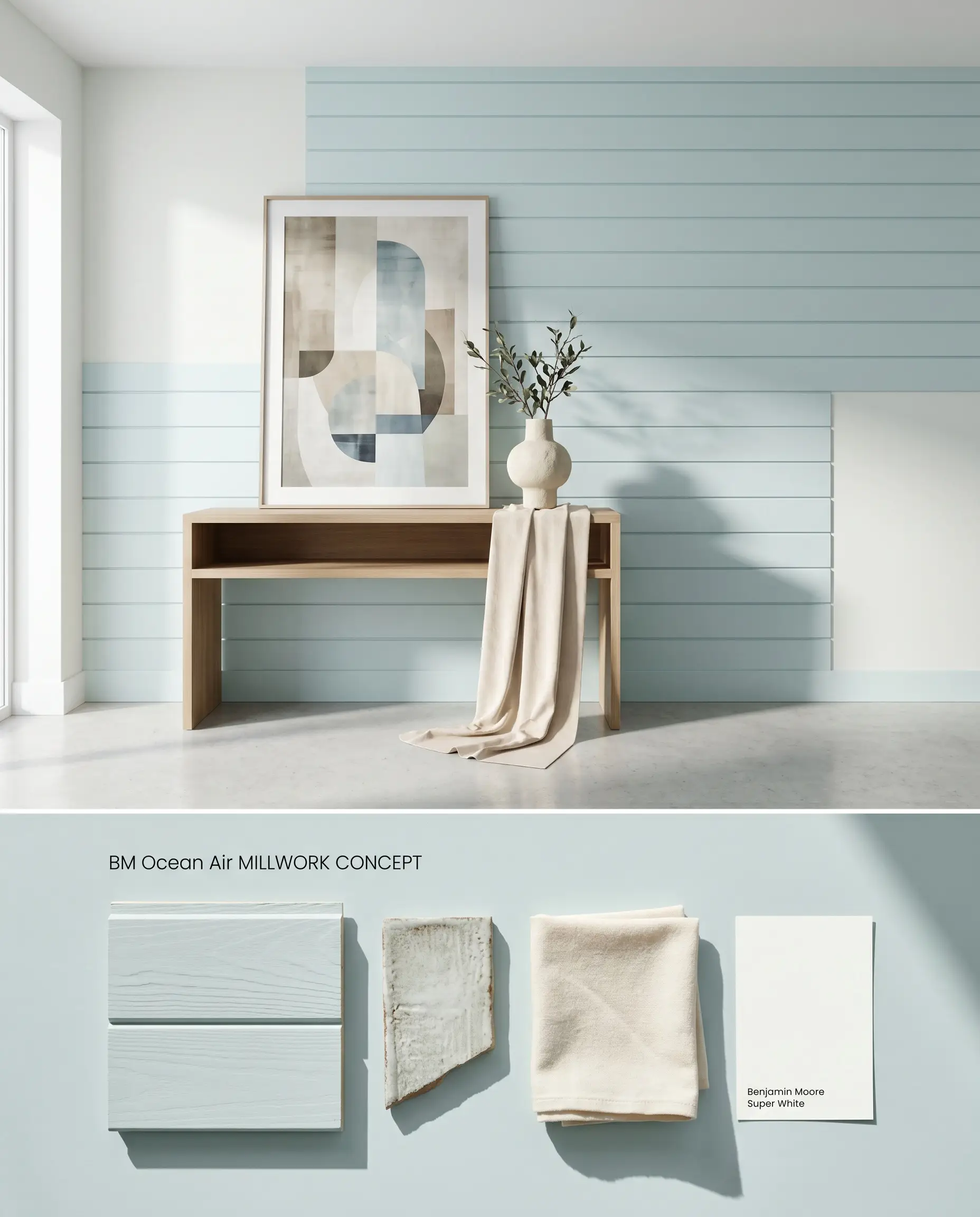
Coating textured millwork in this blue-green pastel transforms a flat architectural element into a dimensional focal point. The physical grooves of a shiplap accent cast micro-shadows that deepen the perceived color value, offering rich contrast against stark white drywall.
You can apply wallpapers, paints, etc. on walls and see how they look in various interiors.

Comparative Color Theory: Benjamin Moore Ocean Air vs. Industry Rivals
Benjamin Moore Ocean Air vs. Sherwin-Williams Sea Salt SW 6204
Sherwin-Williams Sea Salt SW 6204 operates with a significantly denser gray-green base, pulling it further from the traditional pastel category and closer to a muted neutral. While Ocean Air leverages its 71.84 LRV to project a clear, breezy aqua tint, Sea Salt absorbs more light, resulting in a subdued, earthy tone that resists the icy flash common in North-facing rooms. Specify Sea Salt for spaces requiring a grounded, sophisticated neutral, and deploy Ocean Air when the architectural goal demands a crisp, luminous coastal aesthetic.
Benjamin Moore Ocean Air vs. Sherwin-Williams Window Pane SW 6210
Both hues occupy the light blue-green spectrum, but Sherwin-Williams Window Pane SW 6210 leans noticeably warmer with a stronger yellow-green influence. Under warm afternoon sunlight, Ocean Air shifts into a balanced seafoam, whereas Window Pane can read almost entirely mint. Reserve Window Pane for cooler, Northern exposures that need artificial warming, and utilize Ocean Air in Southern exposures where its cooler blue undertones can effectively regulate intense natural light.
Benjamin Moore Ocean Air vs. Farrow & Ball Borrowed Light 235
Farrow & Ball Borrowed Light 235 is a strict, ethereal pale blue completely devoid of Ocean Air’s green undertone. Borrowed Light reacts to low light by maintaining its silvery-blue integrity, avoiding the muddy gray-blue low-light trap that degrades Ocean Air in windowless spaces. Utilize Borrowed Light in shaded corridors or spaces with prominent honey oak, where Ocean Air would harshly clash, and reserve Ocean Air for sun-drenched rooms that activate its complex blue-green structure.
Technical FAQs and Color Temperature Shifts
Yes, in crisp, North-facing light, the cool undertones are amplified, causing the architectural finish to flash slightly icy or ‘baby blue’. To counteract this, utilize the color in Southern exposures where the green base becomes prominent.
Ocean Air clashes aggressively with dominant, warm orange wood tones like honey oak, which emphasize the cool blue and create a disjointed aesthetic. It pairs best with crisp white trims and light, natural white oak floors.
Warm Western or Southern afternoon sunlight pulls the green base forward, neutralizing the icy blue flash. This specific lighting condition gives the paint a balanced, true seafoam appearance.
While it can be used externally, its high 71.84 LRV means it will wash out significantly under direct sunlight, appearing almost stark white. If used on a front door, it requires a shaded porch or an East-facing orientation to maintain its aqua tint.
Similar Paint Colors
Same Brand
Cross-Brand Equivalents