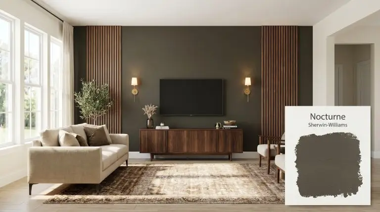
Nocturne SW 9520
Sherwin-WilliamsSherwin-Williams Nocturne (SW 9520) is a deep, moody brown-gray with subtle olive and bronze undertones. With an LRV of 8, this dark neutral acts as a dramatic, earthy anchor that brings sophisticated warmth to cabinets, accent walls, and exterior trim.
| Temperature | Warm |
|---|---|
| Primary Undertone | Charcoal Brown |
| Hidden Undertones | Soft olive green and bronze |
| Best Exposures | South-facing or West-facing |
| Best For | Living Room Accent Walls, Kitchen Cabinets, Moody Bedrooms, Built-in Bookcases, Exterior Trim |
Hackrea Review
Nocturne is an incredibly sophisticated alternative to harsh blacks or flat grays. Its earthy, olive-brown depth gives it a lived-in richness that feels both historic and modern. It is a designer favorite for creating intimate, moody spaces without feeling cold or sterile.Architectural Applications for Sherwin-Williams Nocturne
Living Room Accent Walls
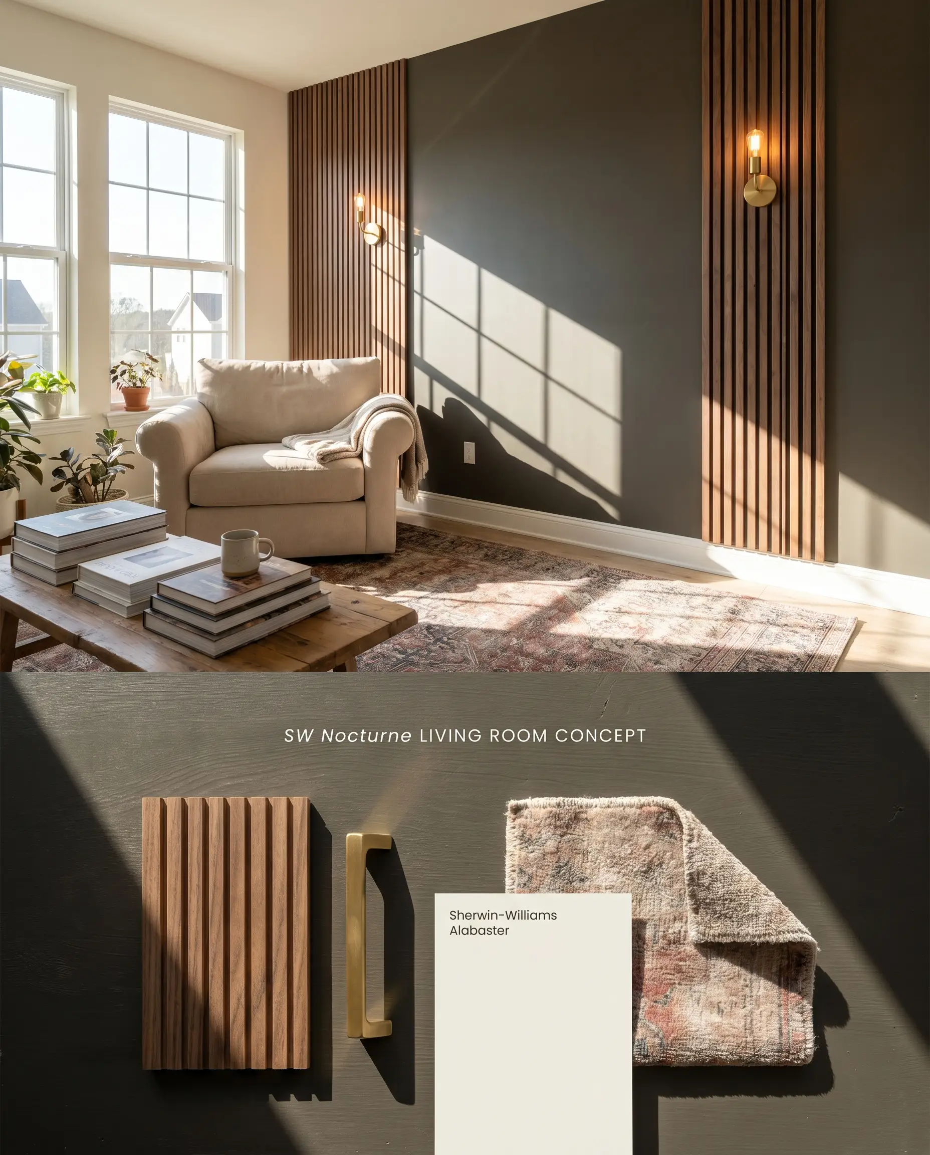
By localizing this dark charcoal brown to a single focal plane, you ground the room’s visual weight without triggering its aggressive light-absorbing tendencies. The deep base recedes physically, pushing the flanking creamy white walls forward to expand the perceived footprint. Utilizing a single wall mitigates the risk of enclosing the space entirely, allowing you to anchor a fireplace or media console while maintaining ambient light reflection on the adjacent surfaces.
Kitchen Cabinets
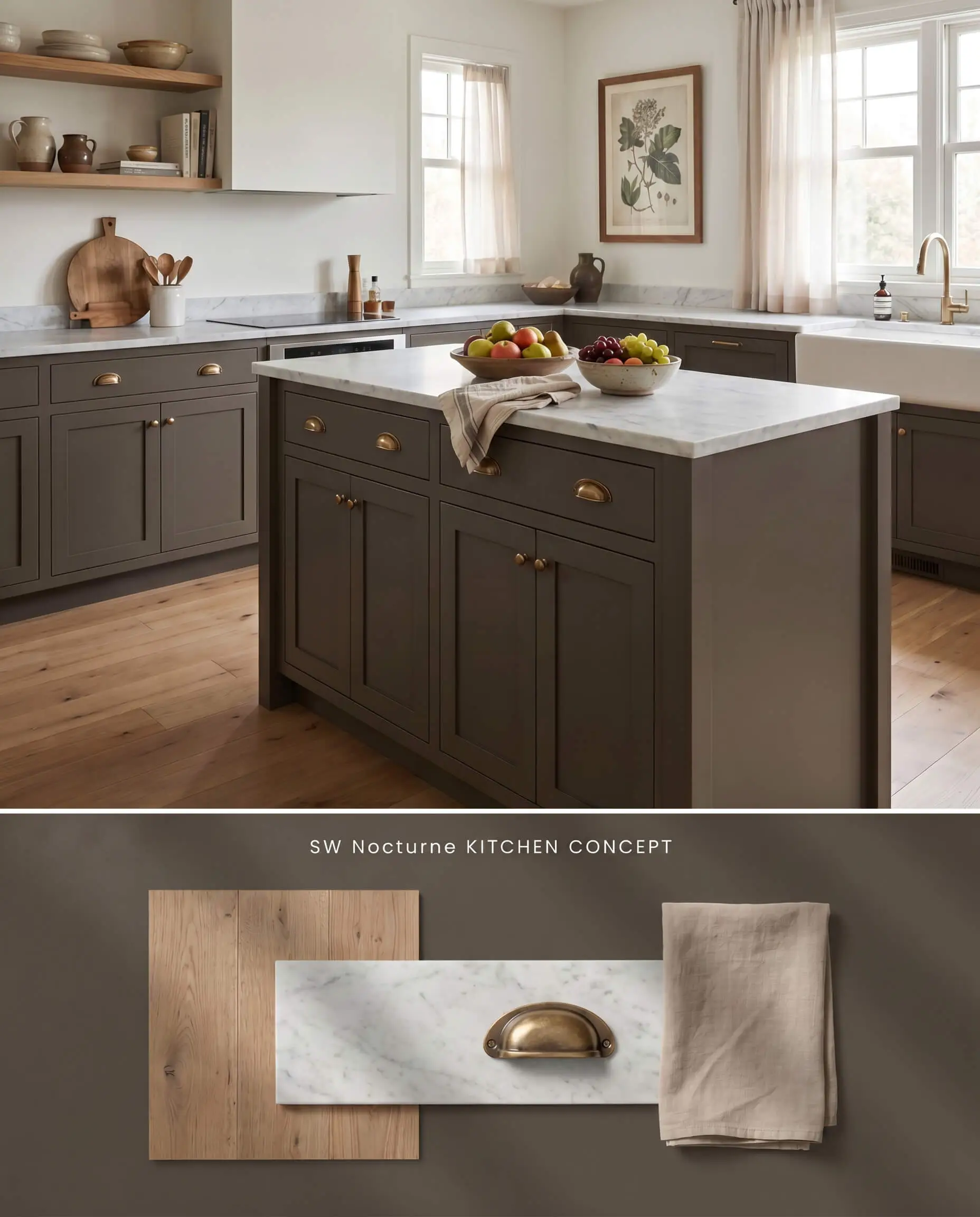
Applying this earthy brown-gray to lower cabinetry anchors the kitchen island with a dense, furniture-like permanence. The olive undertone bridges the gap between natural oak flooring and honed stone countertops, neutralizing the clinical feel of modern stainless appliances. Because this shade pairs exceptionally well with natural wood tones, it serves as an ideal transitional material between a wooden floor and a lighter stone work surface.
Moody Bedrooms
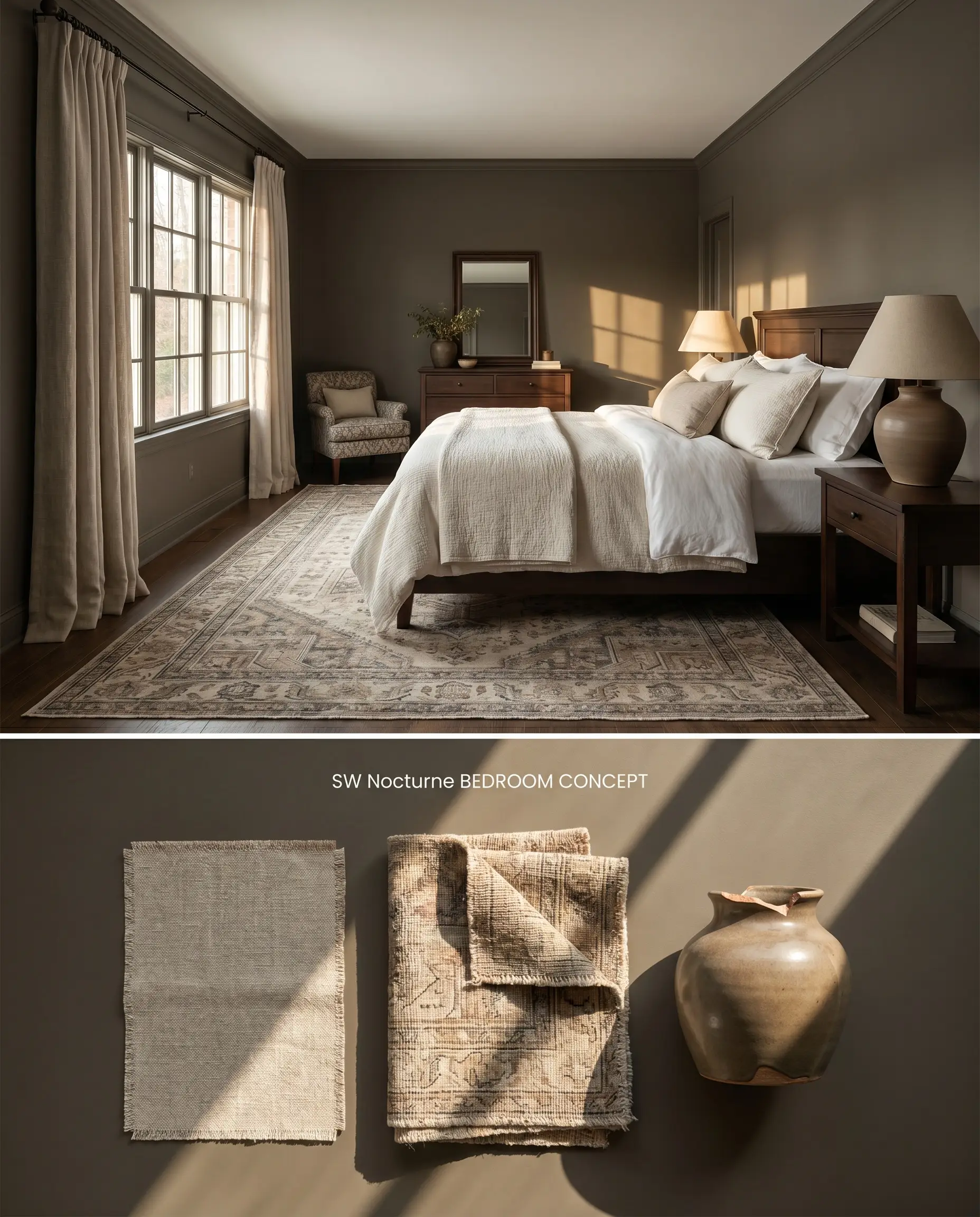
Wrapping a well-lit sleeping quarter in this enveloping shade leverages its LRV 8 to absorb ambient bounce, lowering the visual noise of the room. The color structure reads as a protective, deep charcoal, provided the space receives adequate daytime illumination to prevent the walls from flattening into a dead black. You must strictly avoid using this application in windowless rooms or poorly lit spaces, as the nuanced undertones require active light to remain visible.
Built-in Bookcases
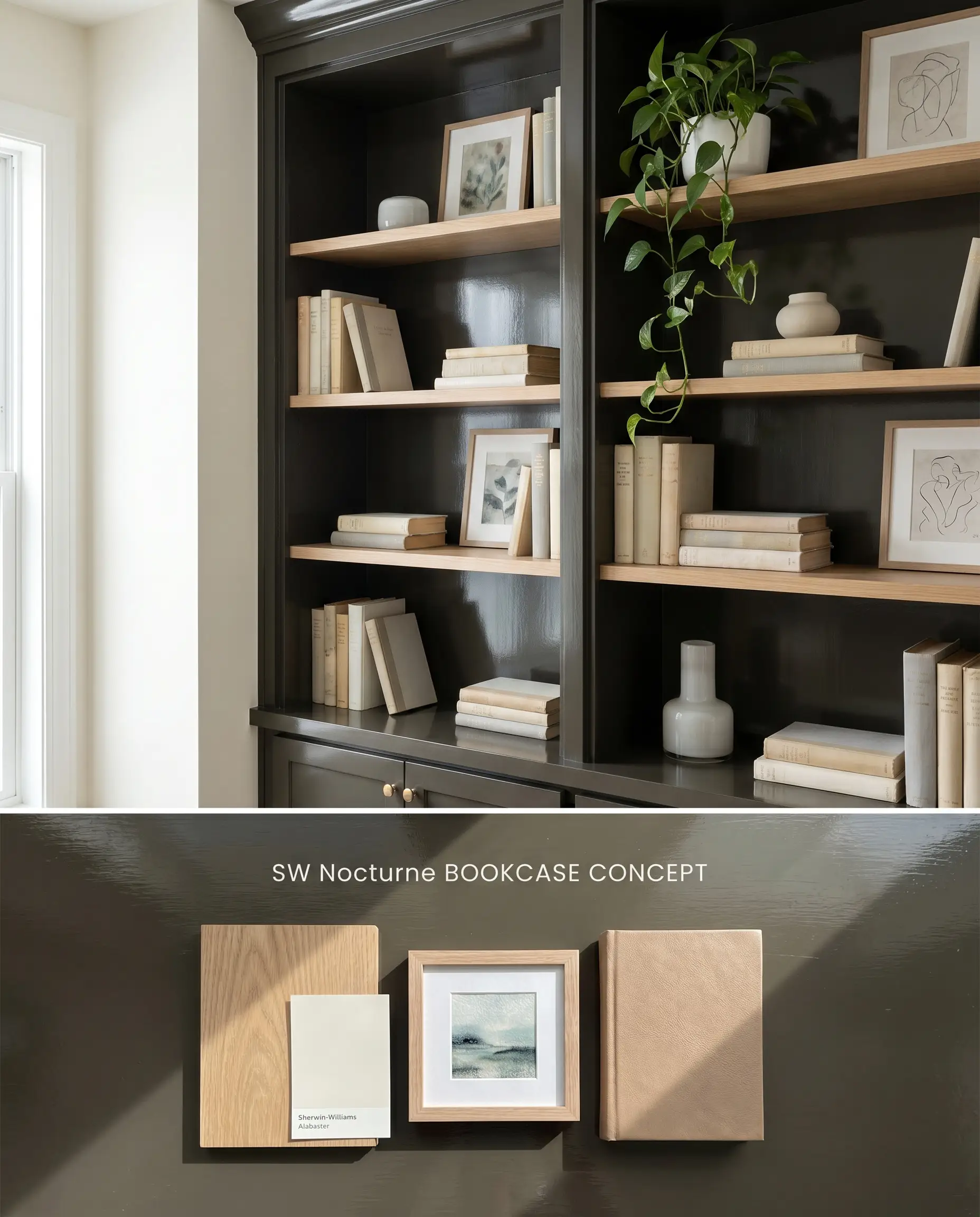
Coating millwork in this shade transforms standard shelving into a recessed architectural void, allowing curated art and lighter bindings to pop against the dark backdrop. The olive and brown notes provide a richer, more organic framing than a standard stark black. You must actively avoid styling these shelves with pink-toned beige objects, as they will aggressively clash and muddy the earthy base of the paint.
Exterior Trim
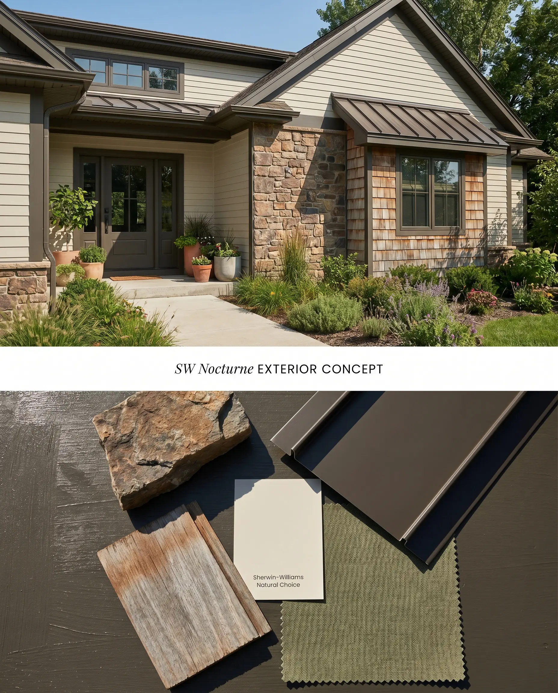
On exteriors, this moody neutral acts as a grounding anchor for natural stone facades and cedar shakes. Natural sunlight washes out interior depth, so the deep base retains its contrast without turning stark or industrial. The bronze cast integrates seamlessly with organic landscaping, softening the transition between the home’s architecture and the surrounding foliage.
You can apply wallpapers, paints, etc. on walls and see how they look in various interiors.

Chromatic Profile Comparisons
Sherwin-Williams Nocturne vs. Sherwin-Williams Tungsten SW 9515
Tungsten SW 9515 operates as a cooler, more industrial gray, lacking the organic bronze cast present in Sherwin-Williams Nocturne. In a North-facing room, Tungsten SW 9515 shifts toward a sterile blue-gray, while Sherwin-Williams Nocturne flashes its signature green-brown. Specify Tungsten SW 9515 for modern, concrete-heavy spaces, but rely on Sherwin-Williams Nocturne to bridge natural wood tones and creamy whites.
Sherwin-Williams Nocturne vs. Benjamin Moore Green Grove 2138-20
Green Grove 2138-20 is an overt, saturated forest green, whereas Sherwin-Williams Nocturne is a dark charcoal brown that merely hides an olive undertone. If you want a definitive green statement that holds its hue in low light, choose Green Grove 2138-20. If you need a shifting, earthy brown-gray that reads as a neutral shadow, Sherwin-Williams Nocturne is the correct architectural choice.
Sherwin-Williams Nocturne vs. Sherwin-Williams Enduring Bronze SW 7055
Enduring Bronze SW 7055 shares a similar earthy DNA but sits noticeably lighter on the LRV scale, reflecting more ambient light. Enduring Bronze SW 7055 leans warmer and distinctly more brown in all lighting conditions. Reserve Sherwin-Williams Nocturne for high-contrast focal points where maximum light absorption is required, and use Enduring Bronze SW 7055 when you need a softer transition against mid-tone woods.
Technical Color Structure FAQs
In crisp, North-facing light, the hidden olive and bronze notes will actively amplify, causing the hue to flash green-brown. If you are trying to avoid green undertones, you must shift the application to a South-facing room where it reads as a deep charcoal or rich chocolate.
No, its earthy base and olive undertone pair exceptionally well with natural wood tones, grounding the red and orange frequencies in the wood. However, it will clash aggressively with pink-toned beiges or stark, cool whites.
Due to its ultra-deep chromatic profile, you must use a dark gray tinted primer, specifically Sherwin-Williams P-5 or P-6. This prevents the underlying wall color from grinning through and ensures full opacity in two topcoats.
Because it is a complex brown-gray rather than a pure carbon black, it tends to weather more naturally, softening into an earthy tone rather than turning chalky. Using an ultra-premium exterior urethane will lock in the color structure and resist UV degradation.
Similar Paint Colors
Same Brand
Cross-Brand Equivalents