Naperon No. 315
Farrow & BallFarrow & Ball Naperon (No. 315) is a warm, worn terracotta with distinct peachy clay undertones. Inspired by the origins of the word 'apron', this comforting shade boasts an LRV of 42, offering a grounded, familiar feel that radiates cozy sophistication in both traditional and modern spaces.
Farrow & Ball Naperon: Capturing the Soul of Sun-Baked Clay in Modern Homes
Some pigments simply refuse to sit flat on a wall. Farrow & Ball Naperon is one of those rare, transformative shades that instantly builds a sense of age and texture the moment it leaves the brush.
Rooted in a historic Porphyry Pink base, this shade physically changes the atmosphere of a room, turning standard drywall into something that feels remarkably close to sun-baked plaster.
It offers a rich, earthy chromatic profile that wraps a space in quiet, Mediterranean warmth without overwhelming the senses. If you are looking to step away from sterile neutrals, this peachy clay delivers a highly sophisticated, tactile foundation for your interior architecture.
Farrow & Ball Naperon: Temperature, Undertones & LRV
Farrow & Ball’s Naperon is definitively a warm color, radiating the comforting, sun-drenched energy of a worn terracotta. Instead of presenting as a harsh, aggressive rust, it relies on a very specific genetic makeup to remain incredibly soft and approachable.
With a light reflectance value of 42, this shade functions as a substantial, mid-tone architectural finish. It possesses enough visual weight to absorb light and create a beautifully enveloping shadow, yet it will not turn your space into a dark enclosure.
You can apply wallpapers, paints, etc. on walls and see how they look in various interiors.

The Chameleon Factor: How Light Alters This Peachy Clay
Because of its nuanced clay structure, this pigment reacts dramatically to shifting light sources and shadows throughout the day.
Architectural Applications for a Worn Terracotta
The true brilliance of this peachy clay lies in its ability to dictate the mood of a room through its tactile, earthy presence. Here is how to harness its warmth across different architectural spaces.
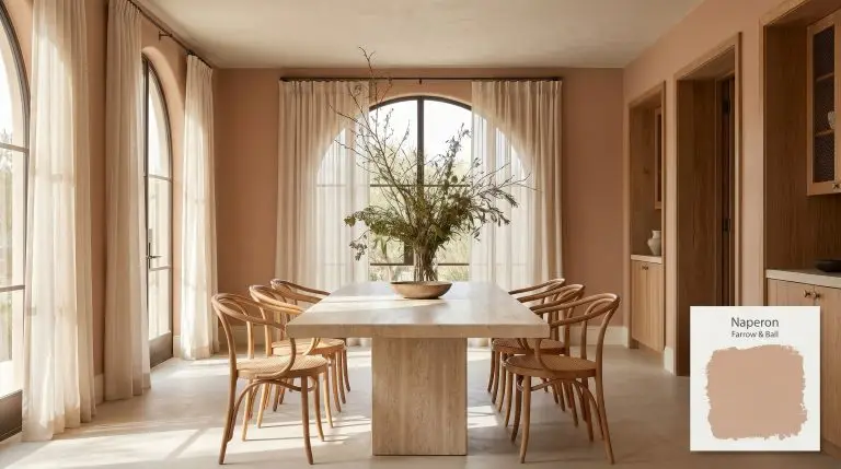
Dining Rooms
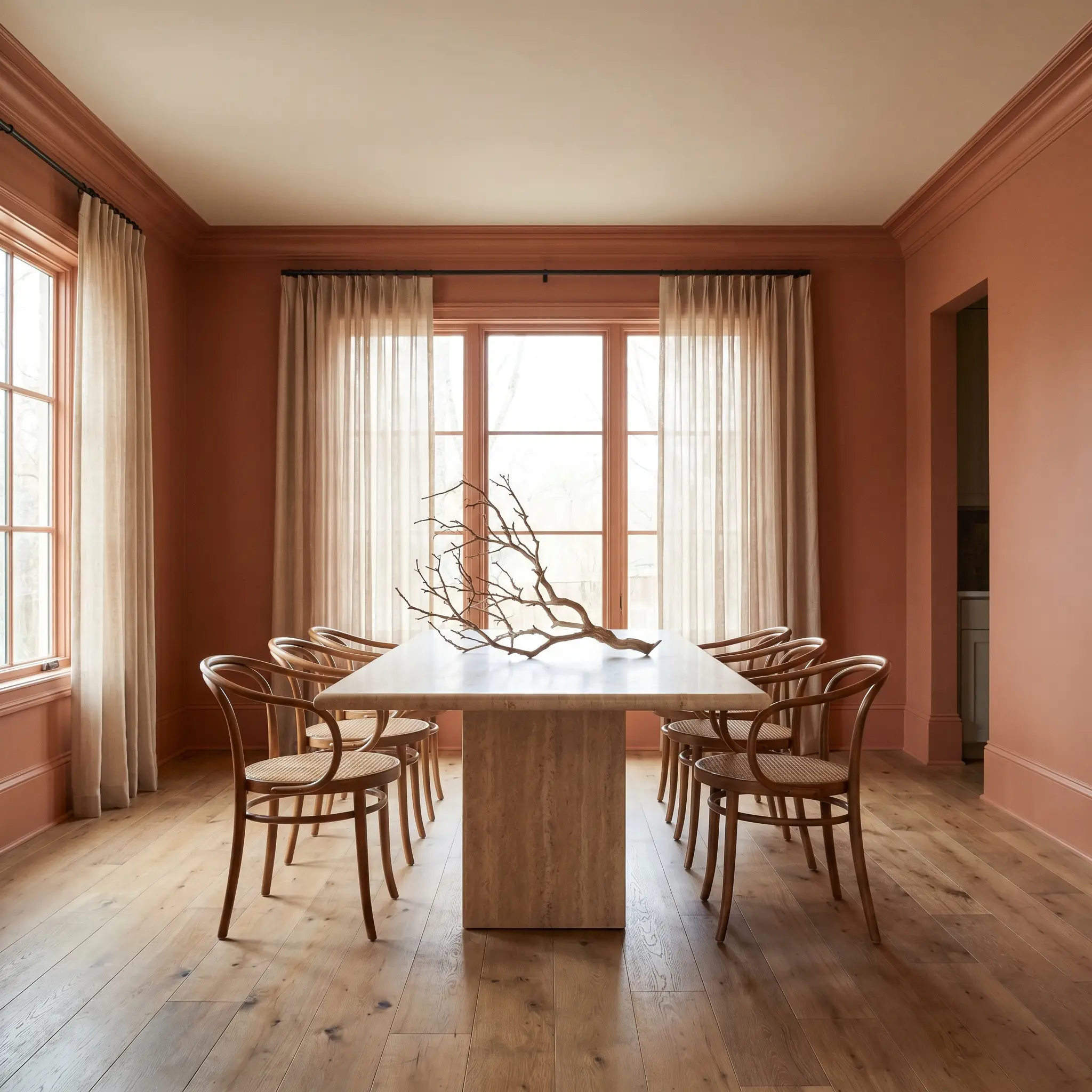
This pigment is exceptionally suited for dining spaces where you want to foster an intimate, lingering atmosphere for evening gatherings. Applying a color drenching technique—taking the terracotta across the walls, baseboards, and crown molding—creates a seamless, highly tailored envelope.
Pair this immersive backdrop with a honed travertine pedestal table and bentwood chairs to lean into a sophisticated, organic modern aesthetic.
If a fully saturated room feels too intense, paint the walls in this earthy hue but carry a complementary white, like Stirabout, onto the ceiling to maintain a sense of vertical lift.
Hackrea Design Secret (The Ceiling Strategy)
Layer in sheer voile drapery and an oversized branch centerpiece to soften the room’s acoustics and add a touch of wild, natural texture.
Hallways and Entryways
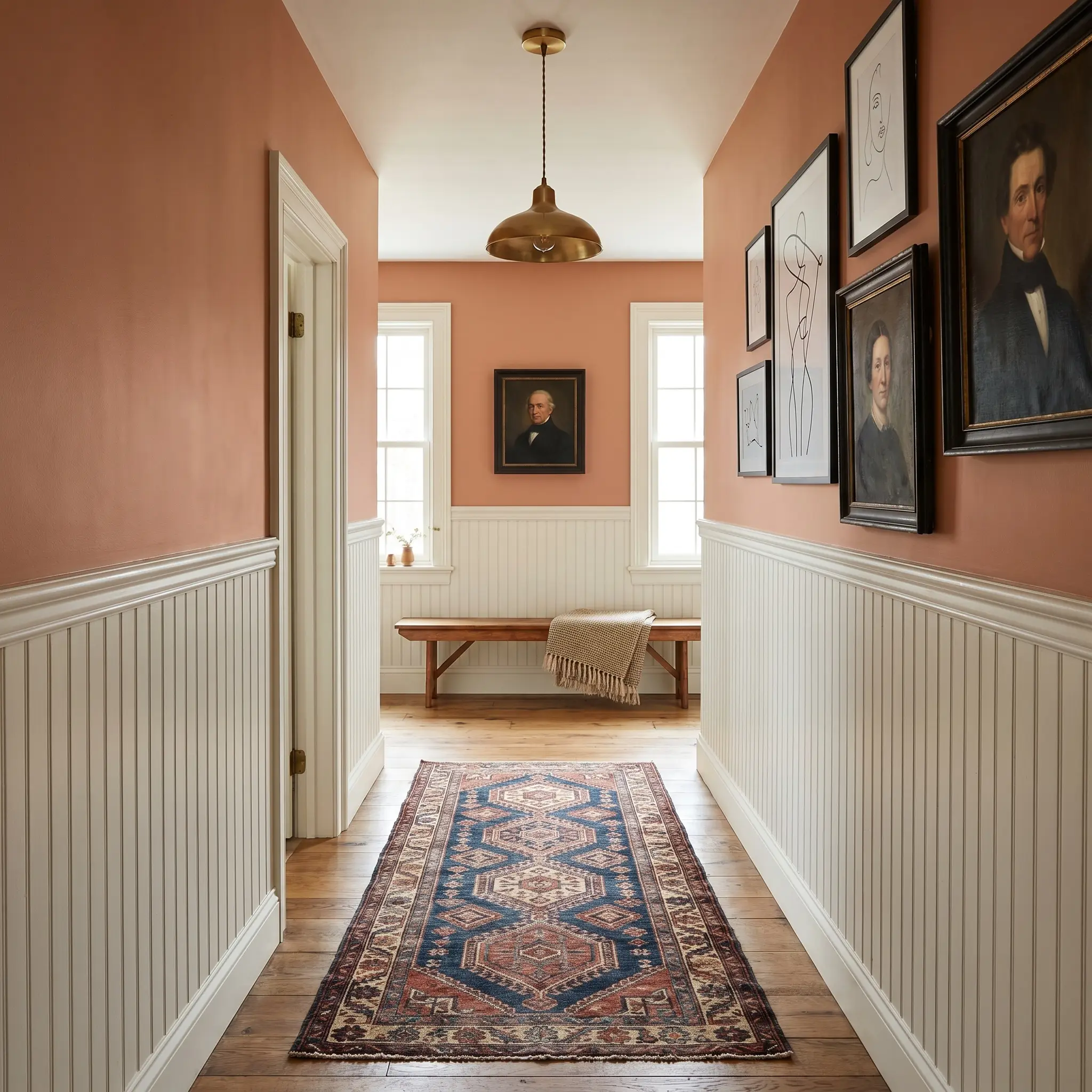
Transitional spaces often suffer from a lack of personality, but a mid-tone clay instantly establishes a welcoming, curated narrative the moment you open the front door. This shade thrives in narrow corridors, especially when paired with classic beadboard or picture molding applied to the lower half of the wall.
Use the upper portion of the wall to display a gallery of vintage portraiture or minimalist line art, allowing the red-orange hue to act as a vibrant matting for the artwork. Root the space with a vintage, block-print runner rug and an unlacquered brass pendant light.
Kitchen Cabinetry
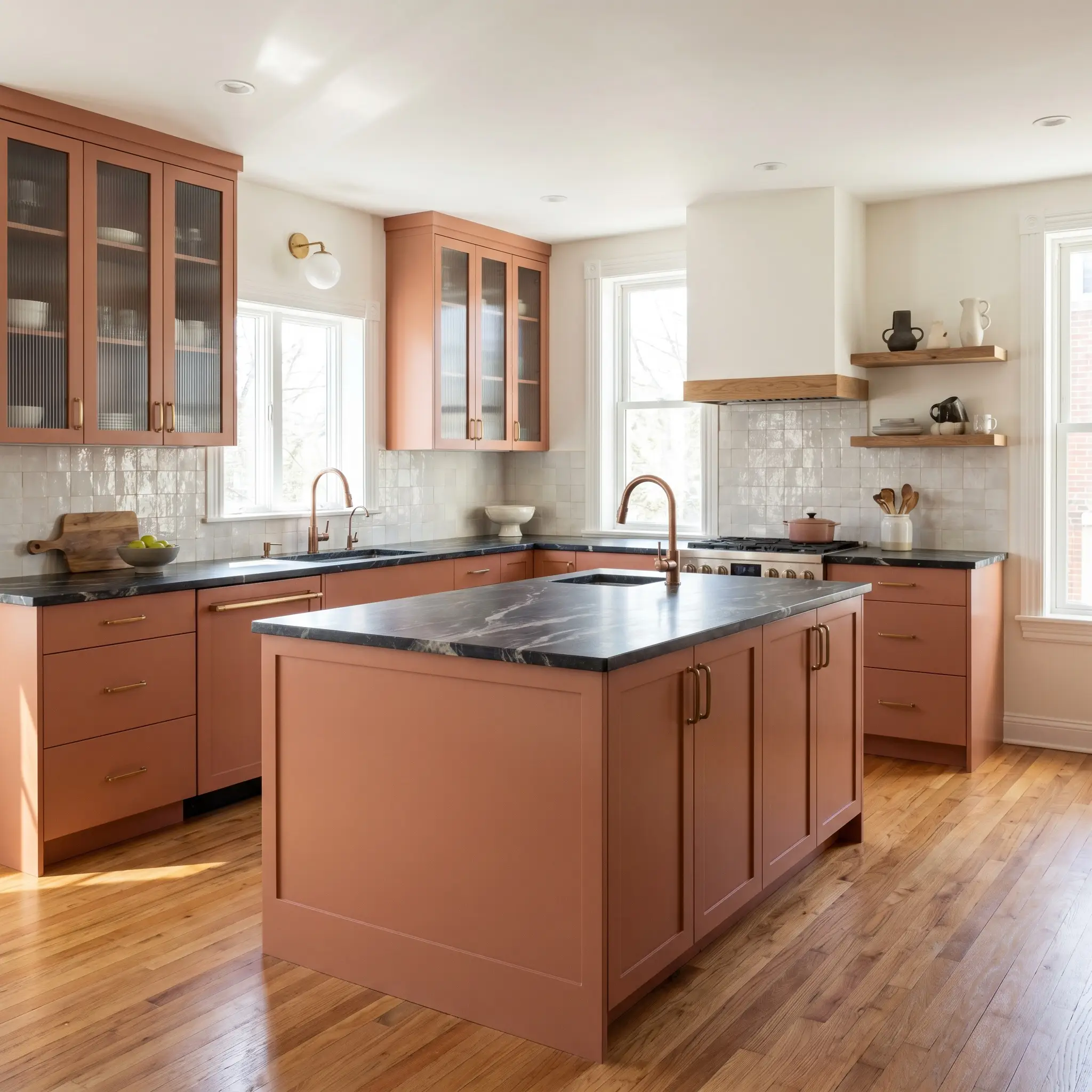
For those tired of stark white kitchens, painting lower cabinets or a central island in this muted terracotta introduces a robust, centering energy. It pairs flawlessly with strikingly veined soapstone countertops and fluted glass upper cabinets, striking a balance between heritage charm and contemporary sleekness.
Avoid polished chrome hardware, which can feel too icy and clinical against the peachy undertones; instead, opt for patinated copper or brushed brass pulls to seamlessly integrate with the warmth.
Clash Warning (Hardware Selection)
Incorporate a zellige tile backsplash and floating reclaimed oak shelves to complete a tactile, highly functional culinary workspace.
Cozy Snugs and Living Rooms
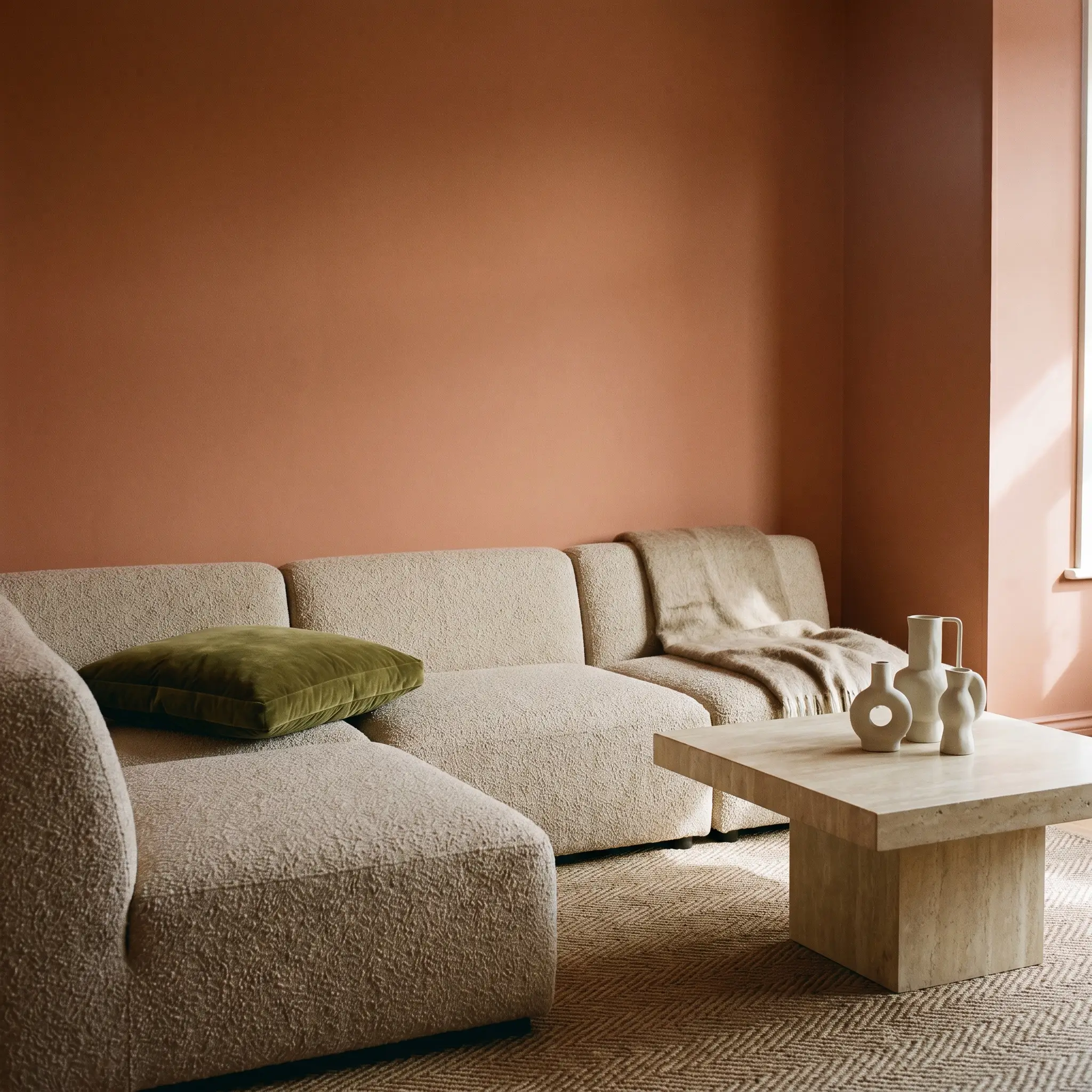
In rooms dedicated to unwinding, this shade acts as a visual stabilizer, wrapping the seating area in a comforting, sun-baked embrace. It creates a stunning backdrop for low-profile modular seating upholstered in nubby boucle or substantial linen.
Introduce contrasting textiles, such as an olive green velvet floor cushion or an alpaca throw, to play against the warm, earthy chromatic profile. Styling the room with a plinth coffee table and a cluster of sculptural ceramics enhances the relaxed, globally inspired atmosphere without requiring massive architectural changes.
Powder Rooms
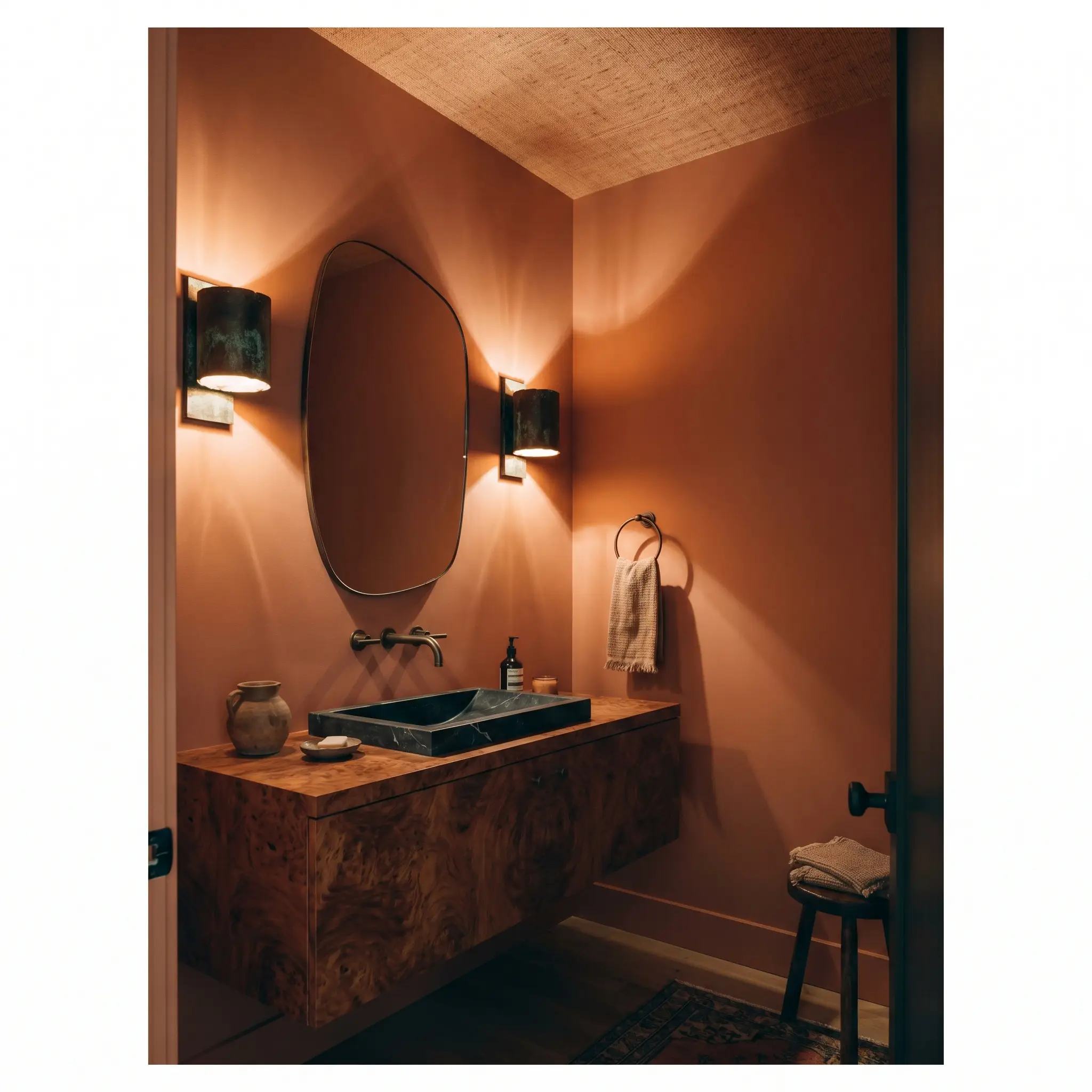
Small, windowless half-baths are the perfect canvas for committing fully to this shade’s enveloping nature. Paint the walls and ceiling to mimic the feeling of stepping into a secluded, Mediterranean-inspired sanctuary.
Install a floating vanity crafted from burl wood and mount oxidized bronze sconces directly onto the painted drywall to create a rich, moody shadow play. Finish the look with an asymmetrical mirror and a textured grasscloth ceiling treatment to maximize the sensory experience for your guests.
Curating the Room: Best Pairings for Naperon
This red-orange hue requires surrounding elements that either lean into its sun-baked warmth or offer a highly structured, muted contrast to keep it from feeling overly casual. It thrives when bordered by soft, tonal bleeds rather than stark, icy boundaries.
Trim & Baseboards
Hardware, Wood & Material Pairings
Coordinating Colors
Designer Mood Boards
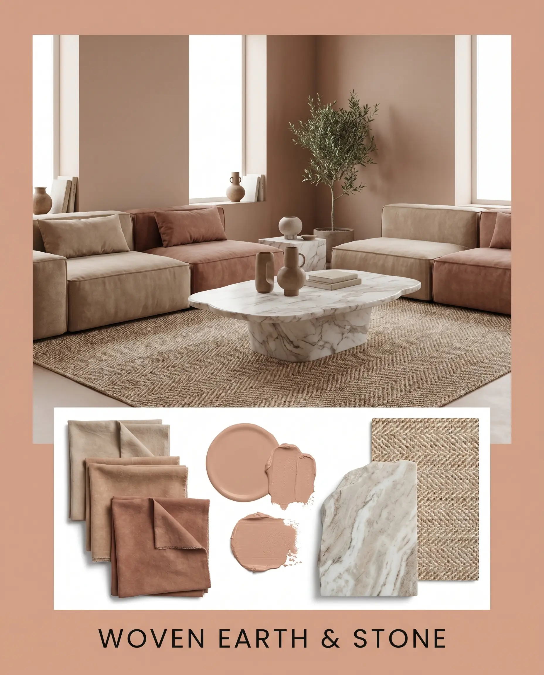
Woven Earth & Stone This palette channels a grounded, tactile serenity by pairing the muted terracotta walls with low-profile modular seating and a striking honed marble coffee table. Layering in stonewashed cotton throws and a vintage, subtle herringbone rug softens the architectural lines, creating a deeply enveloping, organic atmosphere. The interplay between the matte stone and the warm pigment invites a quiet, meditative energy that feels both raw and highly tailored.
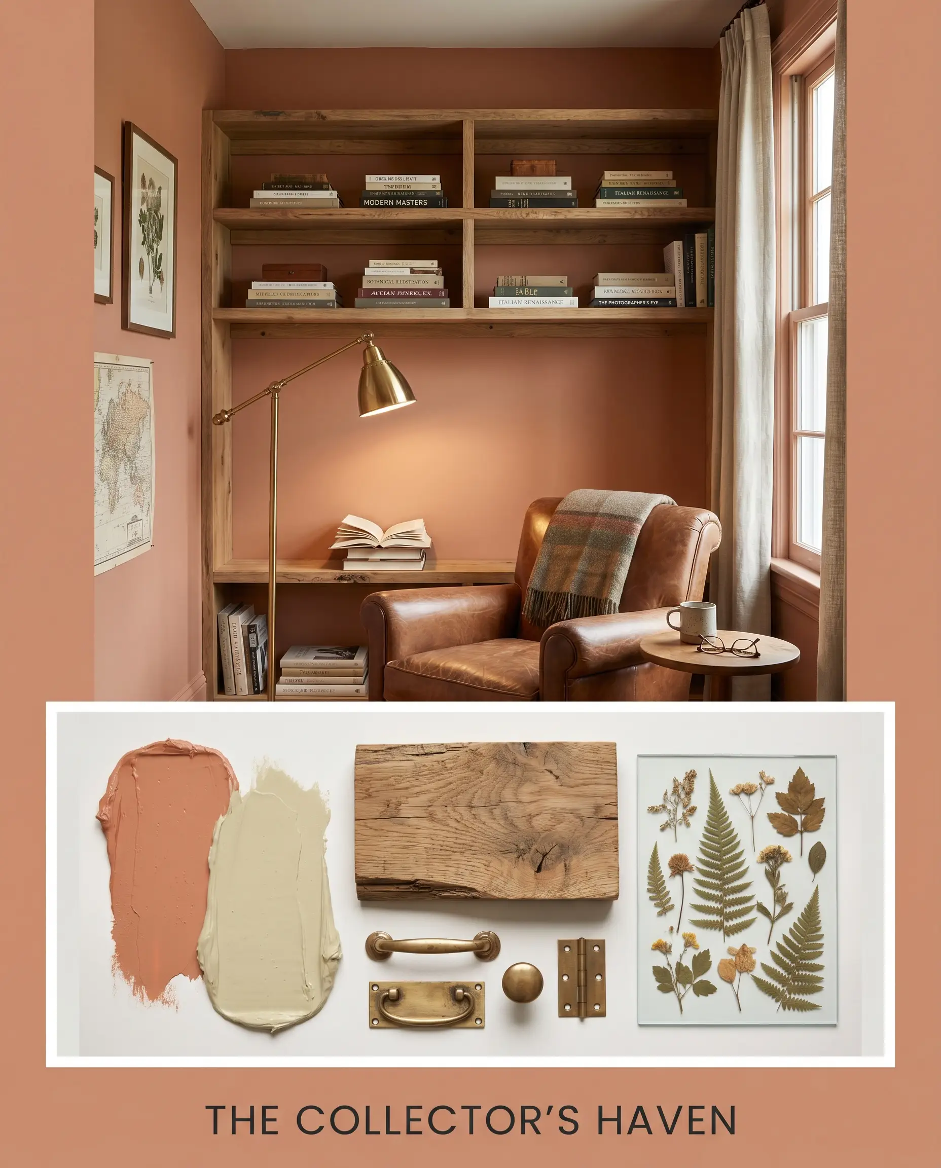
The Collector’s Haven Built around the dynamic tension between warm and cool, this aesthetic uses accents of Olive Oil green and unlacquered brass lighting to frame the peachy walls. Styling the space with stacked art books on reclaimed oak shelving and a gallery of botanical pressings introduces a curated, intellectual mood. The rich, aged finishes interact with the vibrant wall color to produce a room that feels historically significant yet effortlessly contemporary.
Navigating the Terracotta Spectrum: Comparative Color Theory
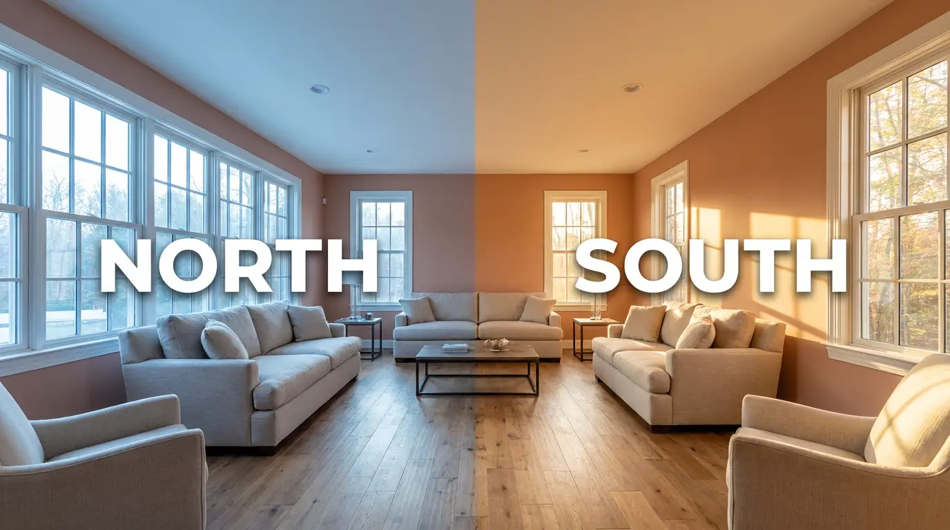
Selecting the perfect earthy hue often comes down to the specific directional lighting of your home. If your space lacks abundant natural light or faces north, certain pigments will lose their glow, making a comparative analysis essential for a successful application.
Farrow & Ball Naperon No. 315 vs. Farrow & Ball Red Earth No. 64
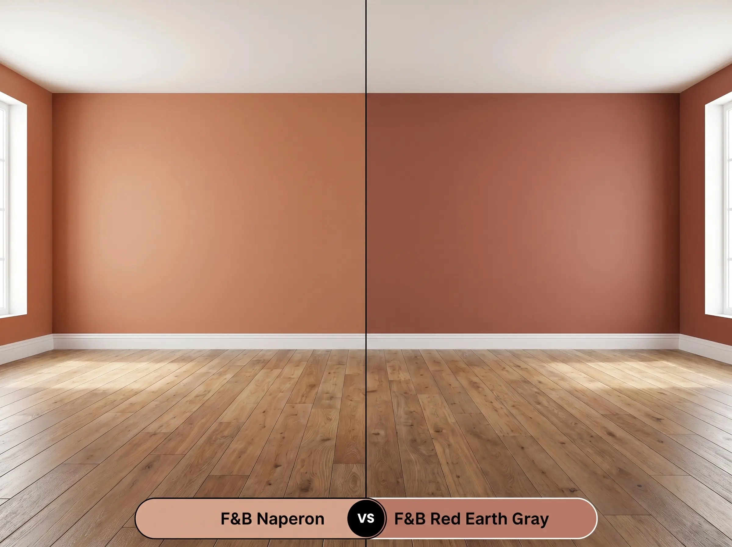
Red Earth carries a significantly more intense, fiery red base, giving it a bolder, more vivid presence on the wall. If your room receives intense, direct afternoon sun, then Red Earth may turn overly aggressive and vibrant, whereas Naperon will maintain a softer, more muted profile. Choose the latter when you want the textural illusion of plaster without the dominant visual weight of a true red.
Farrow & Ball Naperon No. 315 vs. Farrow & Ball Setting Plaster No. 231
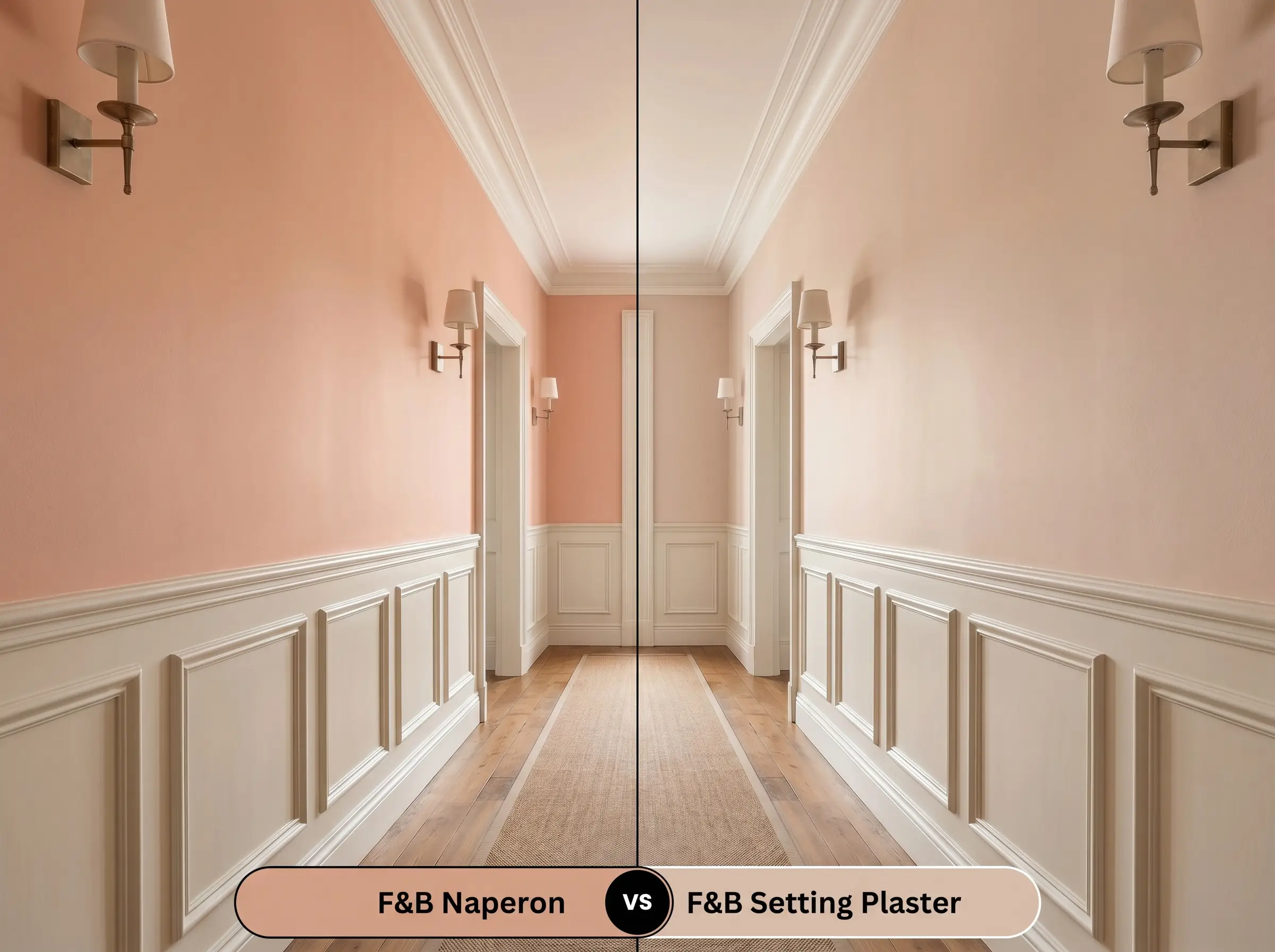
Setting Plaster is a legendary dusty pink that leans heavily into a yellow undertone, making it feel slightly lighter and more delicate. If you are working with a dimly lit space and want a soft, barely-there blush, then Setting Plaster is the safer choice. However, if your architecture requires a more substantial, grounded color with a distinct red-orange hue, the deeper LRV of Naperon No. 315 provides the necessary structural weight.
Exploring Alternatives: Similar Shades and Brand Matches
You might find yourself needing a slightly different variation of this Mediterranean warmth to better suit your home’s unique lighting, or perhaps you require a cross-brand alternative for logistical reasons.
Farrow & Ball Alternatives
Cross-Brand Equivalents
Achieving the Finish: Application and Technical Strategy
Transitioning this specific pigment from a color swatch to a flawless architectural feature requires strict attention to the technical details of the painting process.
The Sheen Strategy
Primer and Coverage Requirements
To accurately build the depth of this red-orange hue, you must use a Mid Tones primer to prevent the underlying drywall from washing out the pigment. Achieving a professional, fully opaque finish requires two generous coats applied with a high-quality microfiber roller.
Because highly pigmented, matte terracottas absorb light so uniformly, any uneven roller pressure will result in visible “flashing” or streaking. Always maintain a wet edge and roll from ceiling to floor in one continuous motion to ensure a flawless, suede-like surface.
Hackrea Pro-Tip (Preventing Roller Flashing)
Frequently Asked Questions
Because of its underlying peachy clay structure, intense southern exposure will amplify the red-orange base, making it read significantly warmer and more vibrant. To ground this effect, pair it with matte, light-absorbing materials like reclaimed oak or dark soapstone.
The Dead Flat sheen physically absorbs more ambient light, pushing the color to look slightly deeper, richer, and more akin to historic plaster. Estate Emulsion has a faint, 2% sheen that bounces a tiny fraction of light, making the pigment feel ever so slightly lighter and more airy.
Its LRV of 42 gives it enough reflective quality to wrap a narrow space beautifully without turning it into a dark enclosure. To ensure the color drenching feels intentional rather than heavy, install warm brass sconces to create pools of light that highlight the rich pigment.
You must use a Mid Tones primer to establish a stable, neutral base that won’t distort the color’s warmth. Using a stark white primer will force you to apply three or more coats to stop the underlying brightness from washing out the terracotta’s depth.
The Architectural Verdict
Farrow & Ball Naperon is an exceptional architectural tool for homeowners seeking to inject soulful, historic warmth into their interiors. It excels in spaces that crave a tactile, enveloping energy, performing brilliantly in organic modern dining rooms, curated entryways, and layered, eclectic living spaces. This pigment is perfect for those who want to move beyond safe neutrals and embrace a sophisticated, sun-baked aesthetic that feels both grounded and deeply inviting.
While this peachy clay is remarkably versatile, it is fundamentally incompatible with ultra-cool, blue-leaning grays and stark, icy white fixtures. Placing this warm terracotta directly against a frosty gray sofa or bright, polished chrome hardware creates a jarring visual tension that saps the life out of the paint, leaving it looking muddy rather than vibrant. If your home’s existing hard finishes lean heavily toward the cool, industrial side of the spectrum, this specific pigment will fight its surroundings rather than elevating them.
Clash Warning (The Cool Gray Conflict)