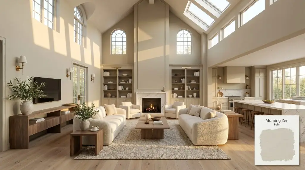
Behr Morning Zen is a warm, mid-tone sage green with an LRV of 60. It features a soothing gray-green base heavily influenced by subtle yellow and olive undertones, making it an earthy, grounded choice for calming interior spaces.
Will Morning Zen clash with your room?
Paint Technical Profile
| Color ID / SKU | S380-2 |
| HEX Code | #cbcdb9 |
| Light Reflectance (LRV) | 60 |
| Temperature | Warm |
| Primary Undertone | Sage Green |
| Hidden Undertones | Yellow, Olive, And Warm Gray |
| Use | Interior, Exterior |
| Best Exposures | North or East |
| Best For | Bedrooms, Bathrooms, Kitchen Cabinets, Living Rooms, Home Offices |
Morning Zen Digital Design Concept Boards
Behr Morning Zen in Restful Sleeping Quarters
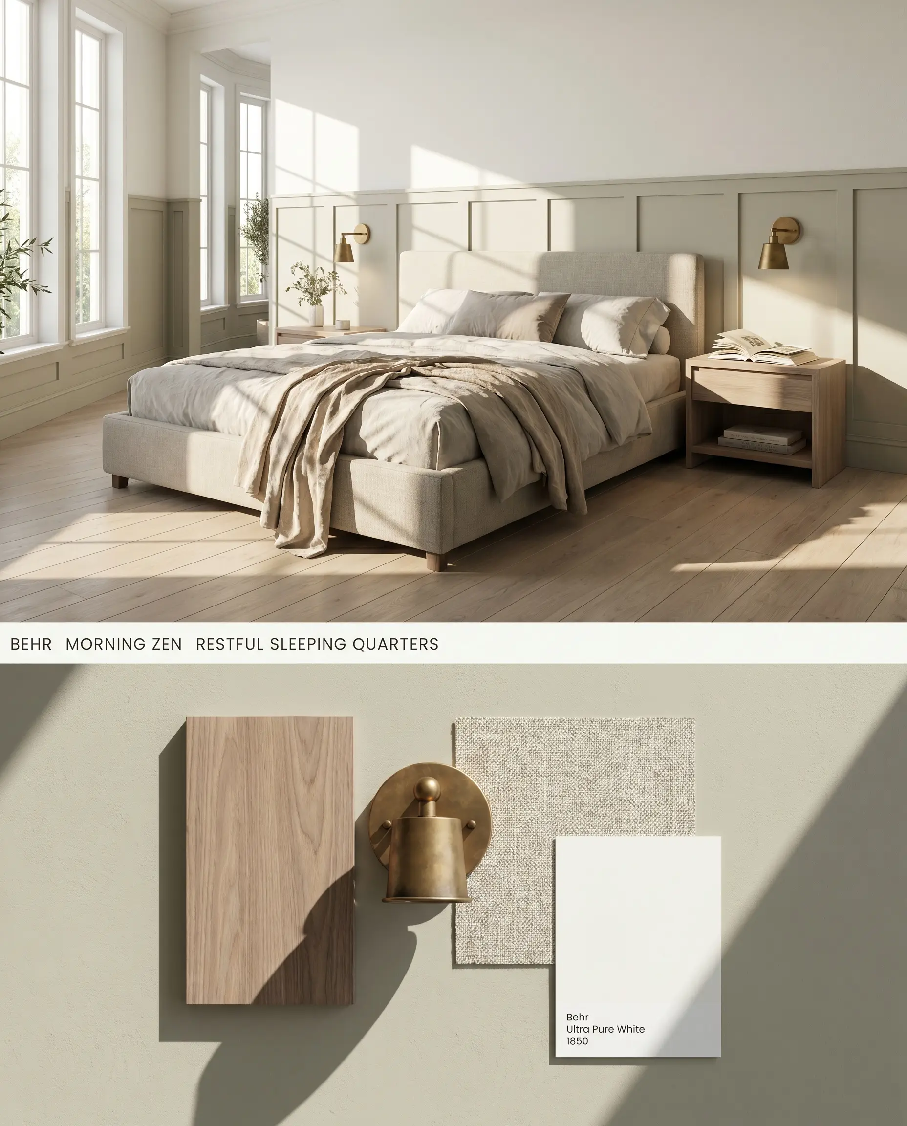
This gray-green formulation anchors primary suites by absorbing bright morning light without reflecting a sterile chill. Utilizing it as a wainscoting application mitigates its high bounce effect, keeping the upper walls airy while grounding the bed frame. Pairing this hue with wide-plank white oak flooring avoids the severe clash warnings associated with orange-toned woods.
Biophilic Design in Washrooms
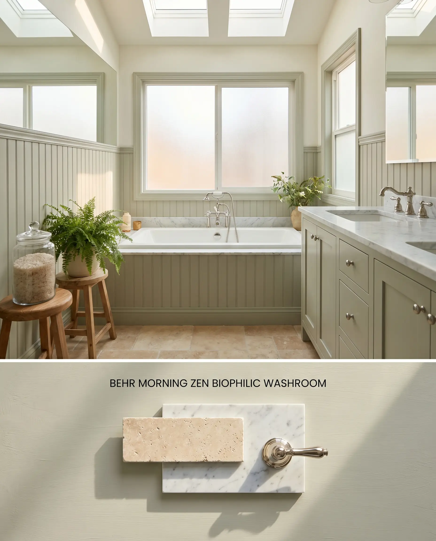
Strict architectural parameters apply here: this earthy palette requires expansive windows or skylights, as windowless layouts immediately pull out a flat, muddy gray undertone. When flooded with natural light, the warm green structure bridges the gap between cold porcelain fixtures and organic textures. Applying it to beadboard rather than full walls prevents the color from overwhelming a tight floor plan.
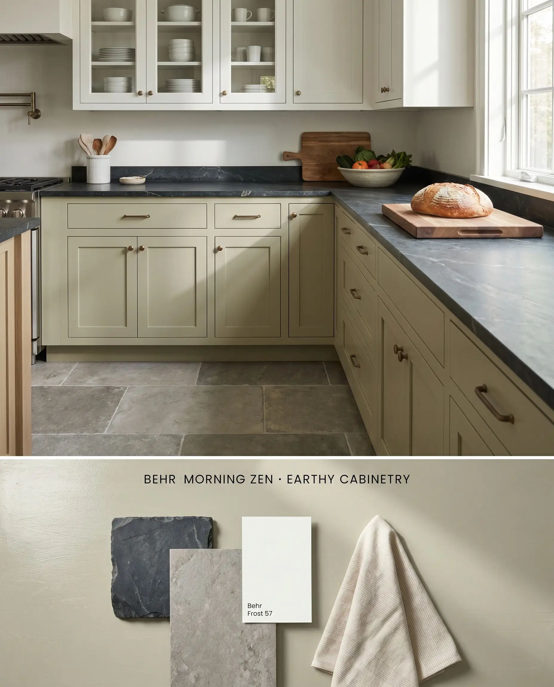
Earthy Palette Cabinetry Applications
Will Morning Zen work with your specific lighting, floor, or furniture?
Deploying this mid-tone neutral on lower cabinetry grounds the kitchen island while resisting the visual fatigue of darker forest greens. Because the color reflects surrounding hues, the flooring must be a cool-toned stone or white-washed wood rather than honey oak to prevent an intense visual clash. The olive undertones thrive against crisp, white upper cabinets, stretching the perceived ceiling height.
Morning Zen S380-2 as a Mid-Tone Neutral Anchor
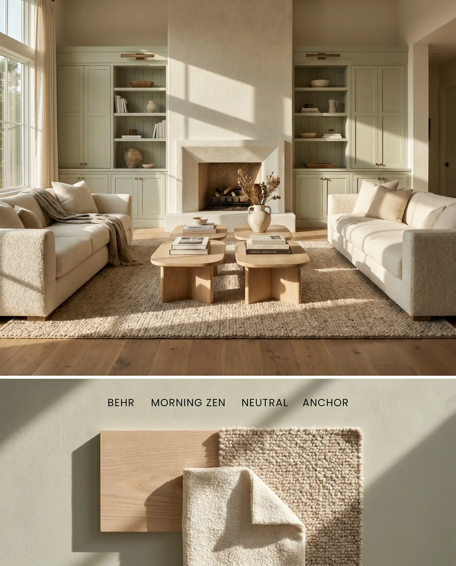
In large gathering spaces, this warm green acts as a sophisticated backdrop, provided the room receives ample daylight to prevent the chromatic profile from collapsing into a drab gray. To counteract the hue’s tendency to bounce light inconsistently across archways, use it on a single focal wall behind a fireplace or custom built-ins. Because touching up this specific mid-tone requires exact sheen matching to avoid flashing, utilizing a highly durable finish from the start is mandatory.
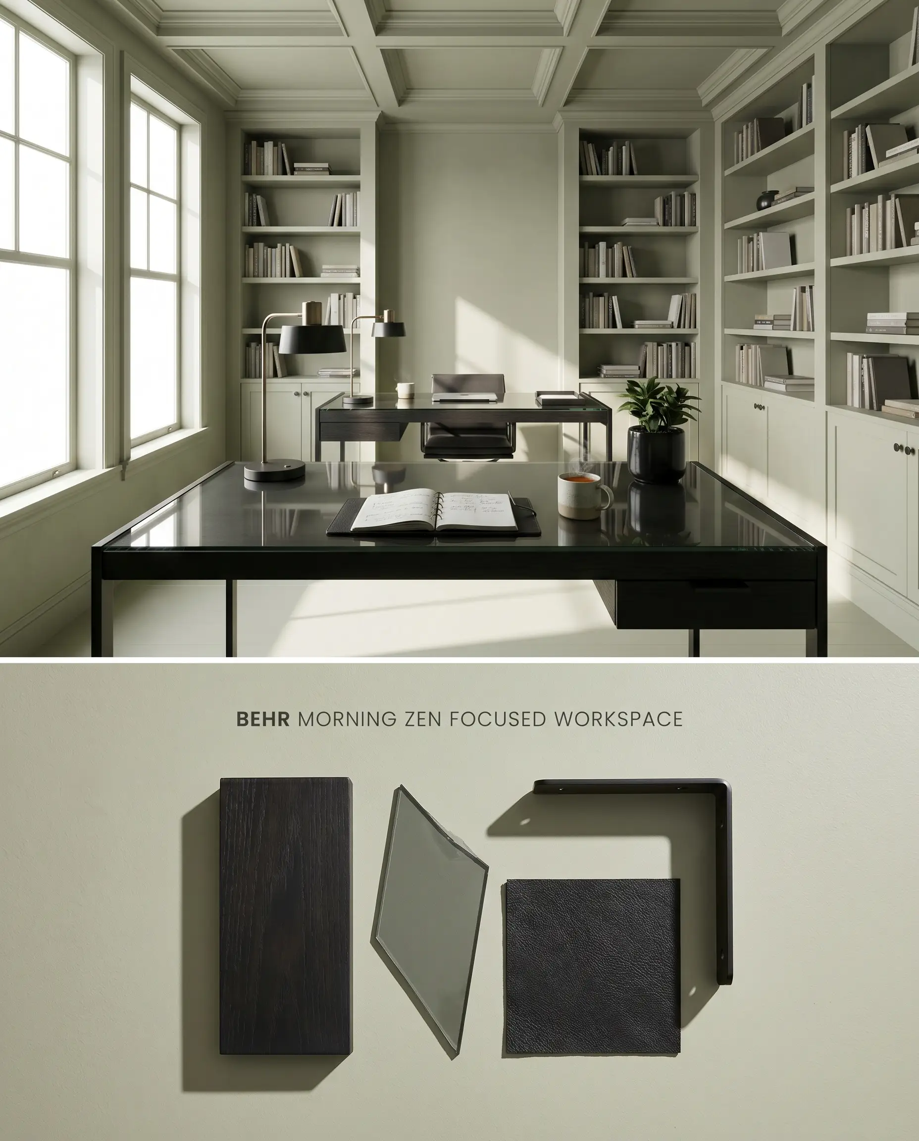
Crafting a Focused Workspace with Silvery Green
Will Morning Zen work with your specific lighting, floor, or furniture?
This sage green variation lowers visual fatigue during long hours of screen time, making it an ideal choice for focused workspaces. Painting the built-in bookshelves and the ceiling in the same hue envelops the space, but this technique requires large windows to activate the hidden olive undertones. Matte black metal accents slice through the soft silvery green, providing necessary structural contrast.
Head-to-Head Chromatic Profile Comparisons
Behr Morning Zen S380-2 vs. Sherwin-Williams Liveable Green SW 6176
Behr Morning Zen S380-2 (LRV 60) and Sherwin-Williams Liveable Green SW 6176 (LRV 61) occupy an almost identical reflectance bracket, but their base formulations diverge under specific exposures. Liveable Green carries a cooler, more pronounced gray-brown undertone that stabilizes in Northern light, making it a safer choice for rooms with indirect sun. Conversely, Behr Morning Zen possesses a stronger yellow-olive core that requires the intense warmth of Southern or Western exposure to prevent it from reading as a muddy silver-gray. Select Sherwin-Williams for shaded spaces and Behr for sun-drenched rooms where the organic green can fully activate.
Behr Morning Zen S380-2 vs. Benjamin Moore Soft Fern 2144-40
Will Morning Zen work with your specific lighting, floor, or furniture?
Benjamin Moore Soft Fern 2144-40 (LRV 56) offers a deeper, more saturated sage green experience compared to the lighter, more mutable Behr Morning Zen S380-2. Soft Fern contains less gray in its base, meaning it maintains its green identity even in moderately lit spaces, bypassing the low-light trap that plagues the Behr formulation. However, in smaller rooms or spaces with overwhelming Southern light, Soft Fern can feel too intense, making Morning Zen the superior architectural finish when you need a highly reflective neutral to bounce light efficiently.
Technical Color FAQs
Yes, the intense, warm light from a Southern exposure amplifies the hidden yellow and olive undertones in Morning Zen. This pushes the color away from a silvery sage and closer to a warm yellow-green, requiring cool-toned furnishings to balance the room.
Yes, this specific paint reflects surrounding colors easily and will severely clash with honey oak or orange-toned wood floors. The opposing color temperatures create visual friction, so it is best paired with cool-toned stones, white-washed woods, or dark ebonized finishes.
In low-light or windowless areas, the earthy green structure falls flat, allowing the gray cast to dominate the finish. This results in a muted, muddy silvery-gray appearance, which is why this color should be strictly reserved for well-lit, sun-drenched spaces.
Room Compatibility & Clashes Diagnoses
Hackrea's reports evaluating the compatibility of Morning Zen in real rooms.East-Facing Bedroom
"The earthy sage undertones of the paint complement the warm wood floors effortlessly, while contrasting black furnishings ground the palette for a balanced, tranquil atmosphere."
Paint Aesthetic & Practical Analysis
| Profile | Analysis | |
|---|---|---|
| Aesthetic | Morning Zen by Behr is an incredibly versatile sage green that strikes a beautiful balance between earthy warmth and modern neutrality. Its complex gray-green chromatic profile makes it highly adaptable, though its yellow undertones require careful lighting consideration to prevent it from skewing too warm. | |
| The Coverage Catch | Standard coverage; for optimal one-coat hide, professional painters recommend tinting this shade specifically into the Behr Dynasty or Marquee lines. | |
| The Lighting Shift | In low-light or windowless rooms, the gray cast takes over, making it look like a muted silvery-gray. In bright South or West-facing light, the yellow and olive undertones become highly prominent, pushing it closer to a warm yellow-green. | |
| The Clash Warning | This hue reflects surrounding colors easily. It can clash or reflect heavily off orange-toned wood floors, honey oak cabinets, or bright adjacent decor (like blue accents), altering its perceived tone. | |
| The Bounce Effect | Due to its mid-tone LRV and complex base, it can bounce light from adjacent walls, occasionally causing the color to look slightly different from one side of an archway or room to the other. | |
| The Low Light Trap | Without adequate natural light, the earthy green structure can fall flat, leaning into a muddy or muted gray rather than a fresh sage. | |
| The Touch Up | It is generally user-friendly, but like many mid-tone greens, touching up requires exact sheen matching to avoid flashing. |
Closest Cross-Brand Equivalents
The absolute closest scientific color matches for Morning Zen across top paint brands.