Marblehead Gold HC-11
Benjamin MooreBenjamin Moore Marblehead Gold (HC-11) is a rich, versatile shade of golden yellow with muted amber and earthy ochre undertones. Part of the Historical Colors collection, it brings a timeless, warm glow to both traditional interiors and craftsman exteriors.
| Temperature | Warm |
|---|---|
| Primary Undertone | Amber |
| Hidden Undertones | Earthy ochre and subtle green |
| Best Exposures | South, West, East |
| Best For | Craftsman exteriors, dining rooms, porch ceilings, kitchen cabinets, accent walls |
Hackrea Review
Marblehead Gold is a fantastic, grounded yellow that avoids the 'neon' trap thanks to its earthy ochre base. It is a designer favorite for historic homes and porch ceilings, though it demands ample natural light to prevent its amber cast from turning muddy.Architectural Applications for Benjamin Moore Marblehead Gold
Historic or Craftsman Exteriors (Body or Front Door)
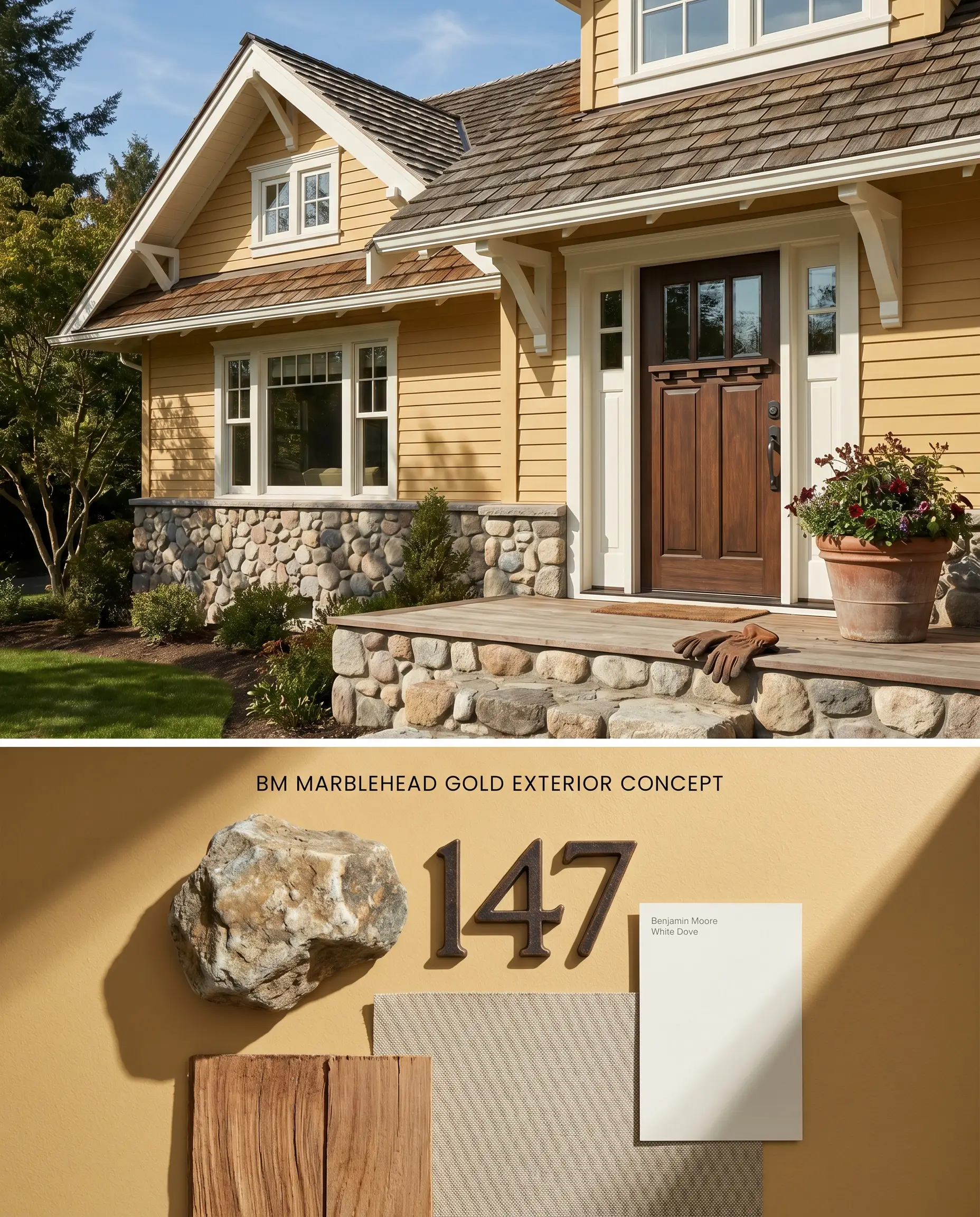
The earthy ochre base of this golden yellow grounds the architectural massing of a craftsman exterior, preventing the facade from overexposing under direct sunlight. Pairing it with deep, muted greens and natural stone masonry physically bridges the transition between the built environment and the surrounding landscape.
Dining Rooms
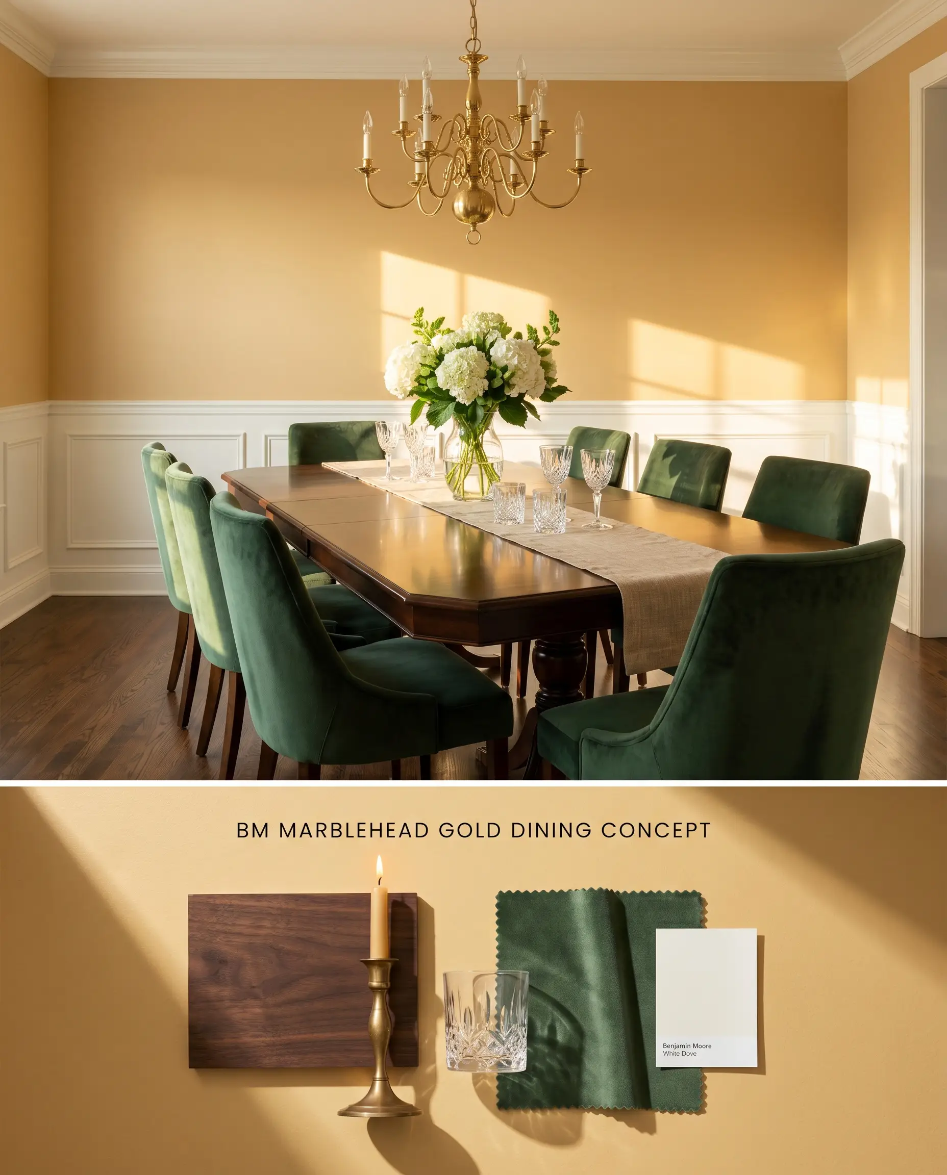
In formal dining spaces flooded with natural light, the amber undertones of Marblehead Gold project a warm, enveloping glow that enhances the visual density of dark, cool-toned wood furniture. The wall color acts as a luminous backdrop, allowing brass fixtures and cut crystal to refract light across the room without rendering the space sterile.
Porch Ceilings
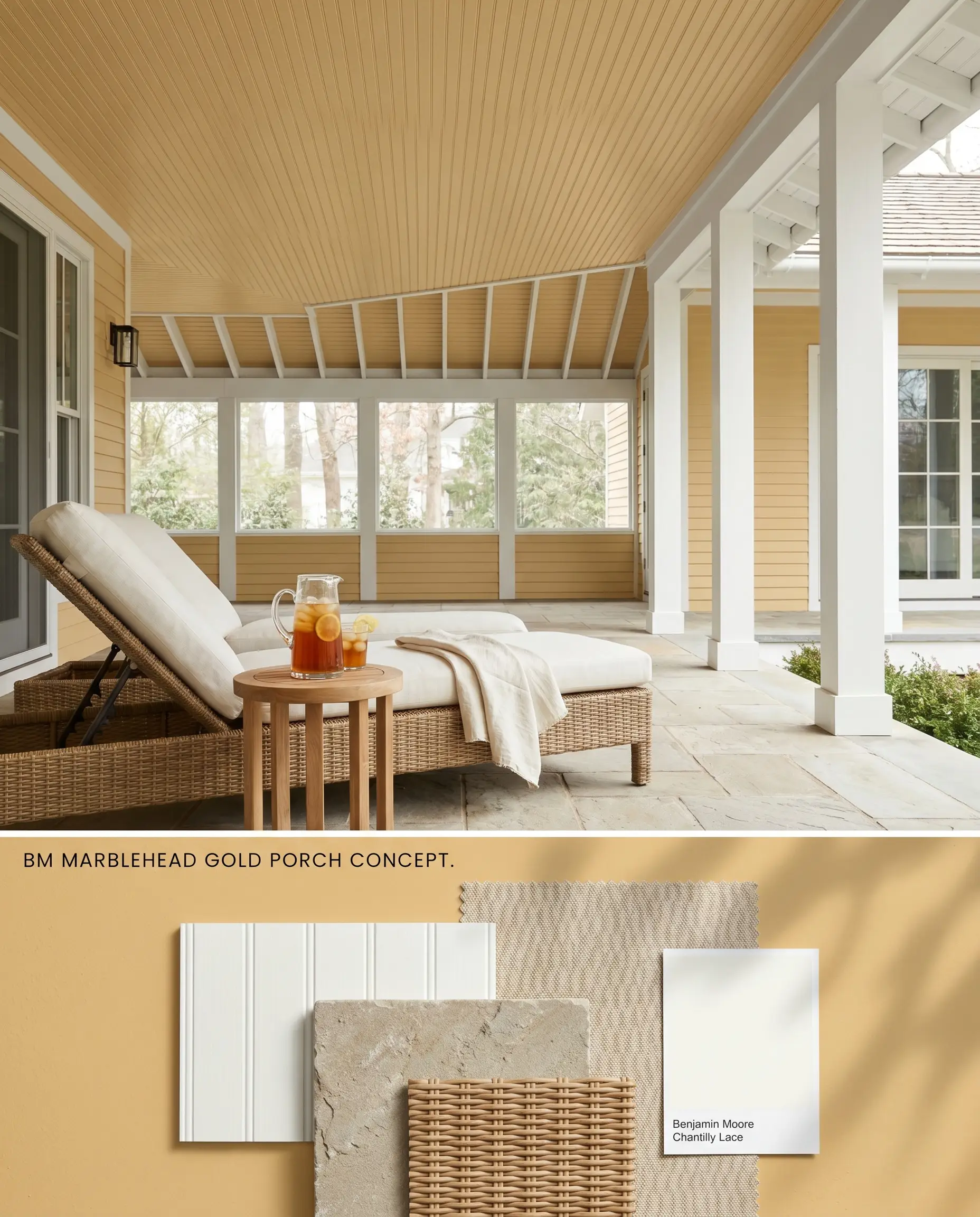
Applying a muted gold to a porch ceiling draws the eye upward, visually expanding the overhead plane by mimicking the atmospheric light of a receding sunset. This application requires a flat finish to absorb scattered light, preventing a bounce effect that would otherwise amplify the yellow into an aggressive neon reflection.
Kitchen Cabinets
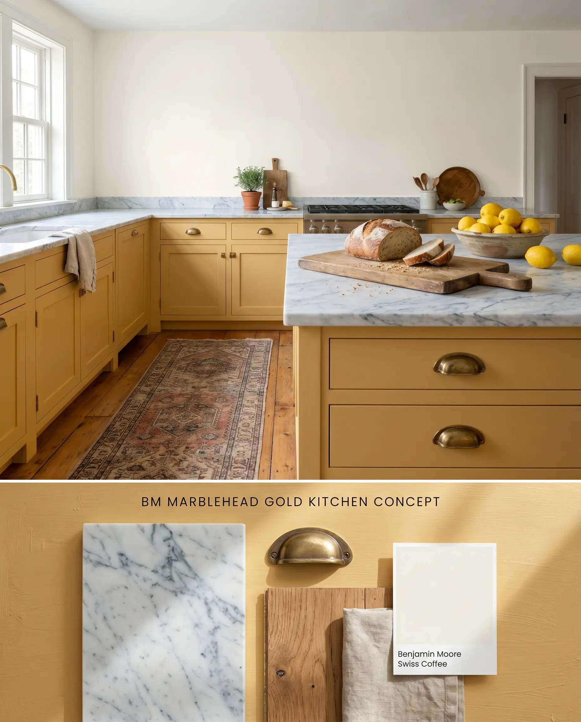
Utilizing this shade on lower cabinetry anchors the kitchen with a historical, grounded weight while reflecting enough ambient light to keep the workspace legible. To counteract the coverage catch inherent to yellow paints, a tinted primer ensures the final enamel coat reads true to its LRV 55.07 without flashing or striping.
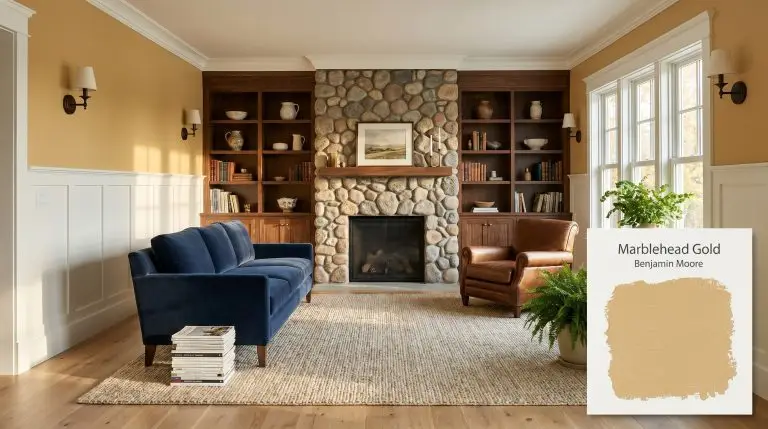
Accent Walls
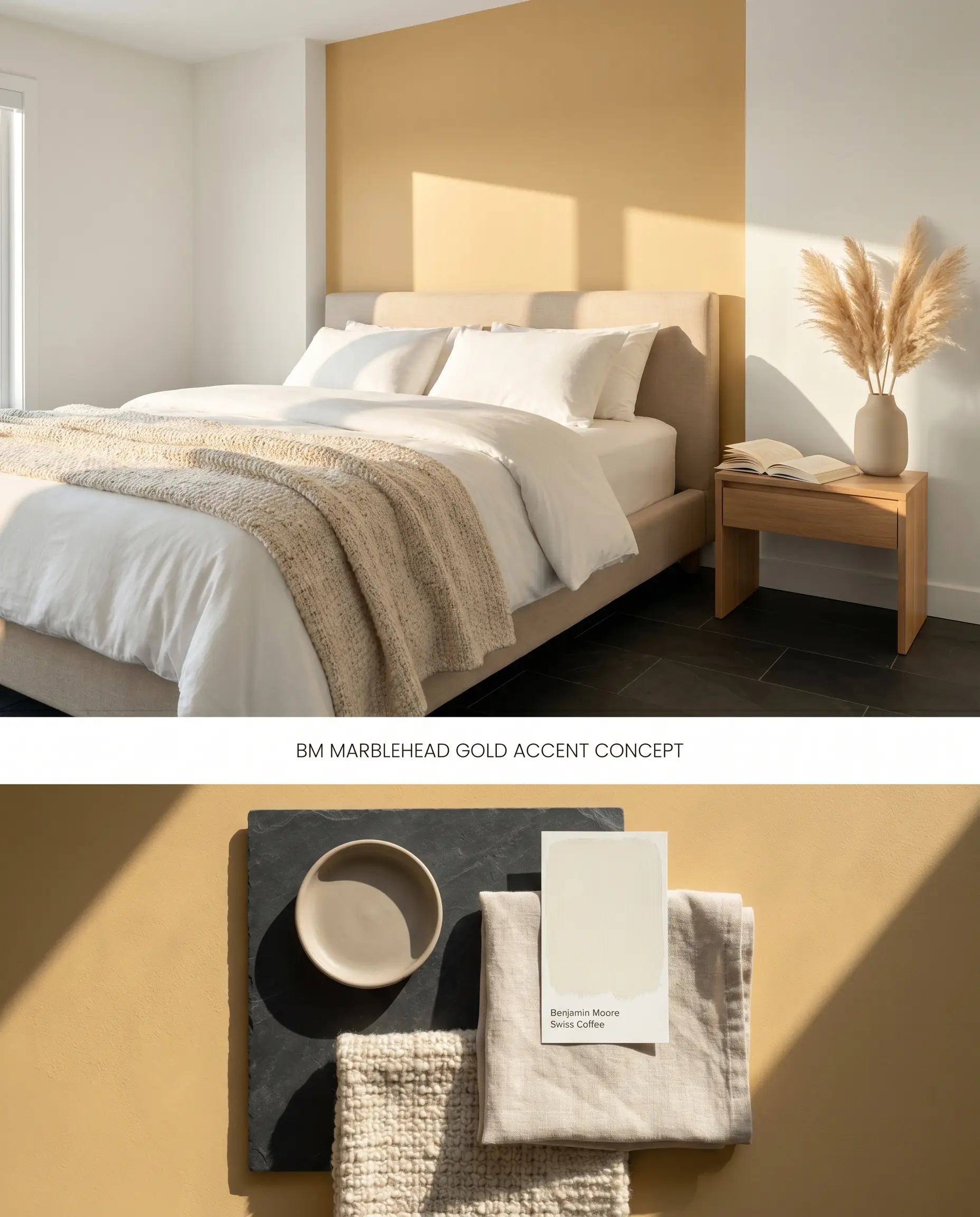
Limiting Benjamin Moore Marblehead Gold to a single focal wall controls its high-energy bounce effect, directing warmth into the room without overwhelming the visual field. This targeted application is highly effective behind a bed frame or fireplace, especially when flanked by cool, contrasting neutrals that temper the amber undertones.
You can apply wallpapers, paints, etc. on walls and see how they look in various interiors.

Evaluating the Chromatic Profile Against Rival Golds
Benjamin Moore Marblehead Gold HC-11 vs. Benjamin Moore Stuart Gold HC-10
Benjamin Moore Stuart Gold HC-10 carries a significantly higher LRV and leans closer to a traditional, sunny yellow, lacking the earthy ochre depth of Marblehead Gold HC-11. In rooms with intense southern exposure, Stuart Gold can become glaringly bright and reflective, while Marblehead Gold absorbs the excess light, maintaining its structural integrity as a warm neutral. Reserve Stuart Gold for spaces needing maximum light reflection, and deploy Marblehead Gold when architectural grounding and historical weight are required.
Benjamin Moore Marblehead Gold HC-11 vs. Sherwin Williams New Colonial Yellow SW 2853
Sherwin Williams New Colonial Yellow SW 2853 presents a cleaner, less complex yellow base, making it less susceptible to the muddy, greenish-brown shift that plagues Marblehead Gold HC-11 in north-facing light. However, Marblehead Gold’s inclusion in the Historical Colors collection provides a muted, aged quality that pairs superiorly with rustic masonry and historic exterior trim. Specify New Colonial Yellow for dim interiors where clarity is needed, but rely on Marblehead Gold for exterior facades and brightly lit, heritage-focused spaces.
Technical Considerations & Application FAQs
Yes, without adequate warm light, the earthy brown and green undertones dominate the chromatic profile, causing the color to read as a flat, greenish-brown. It is strictly recommended for south or west-facing rooms that provide sufficient natural illumination to activate its golden warmth.
Crisp, clean whites like Benjamin Moore Chantilly Lace OC-65 or soft, warm whites like White Dove OC-17 provide the necessary contrast without introducing clashing pink or stark, cool gray undertones.
Yes, the yellow-orange tones in honey oak wood aggressively compete with the golden yellow base of Marblehead Gold, creating a visually overwhelming and unstructured space. Pair it instead with deep walnut, dark slate, or very pale white oak to maintain architectural balance.
Yellow paints inherently suffer from a coverage catch, often requiring a high-quality tinted primer followed by at least two topcoats. While Gennex Color Technology improves hide, a tinted primer remains mandatory to prevent a patchy, uneven finish.
Similar Paint Colors
Same Brand
Cross-Brand Equivalents