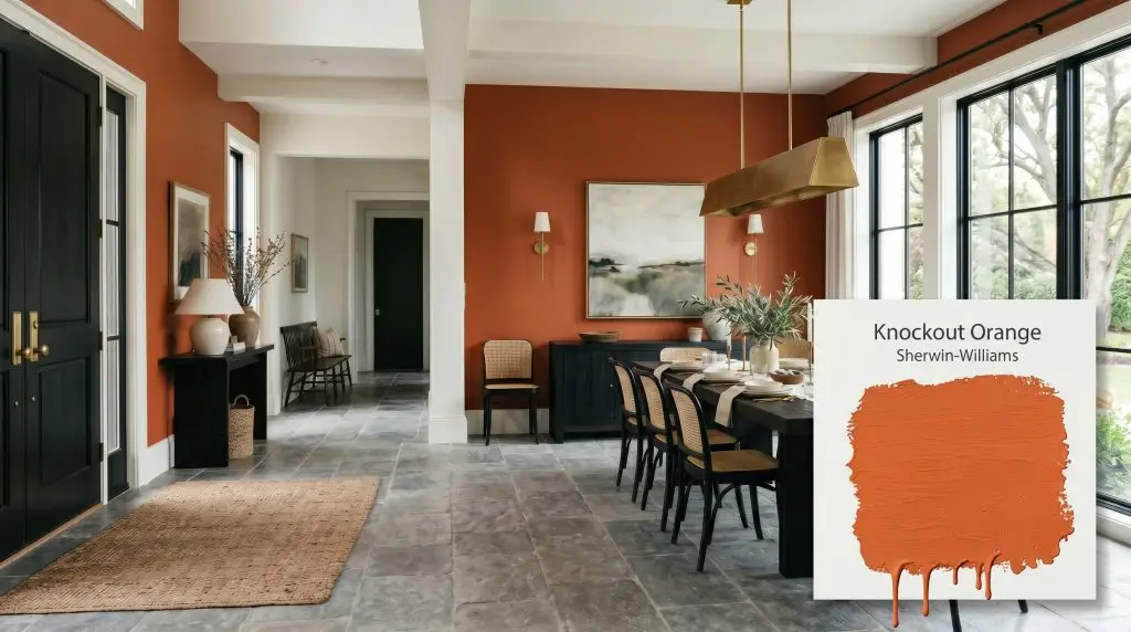
Knockout Orange SW 6885
Sherwin-WilliamsSherwin-Williams Knockout Orange (SW 6885) is a vibrant, saturated warm orange with subtle red-brown undertones. With an LRV of 28, it absorbs a moderate amount of light, making it an intensely energizing and grounding hue perfect for bold accent walls, front doors, and creative spaces.
Paint Technical Profile
| Color ID / SKU | SW 6885 |
| HEX Code | #E16F3E |
| Light Reflectance (LRV) | 28 |
| Use | Interior, Exterior |
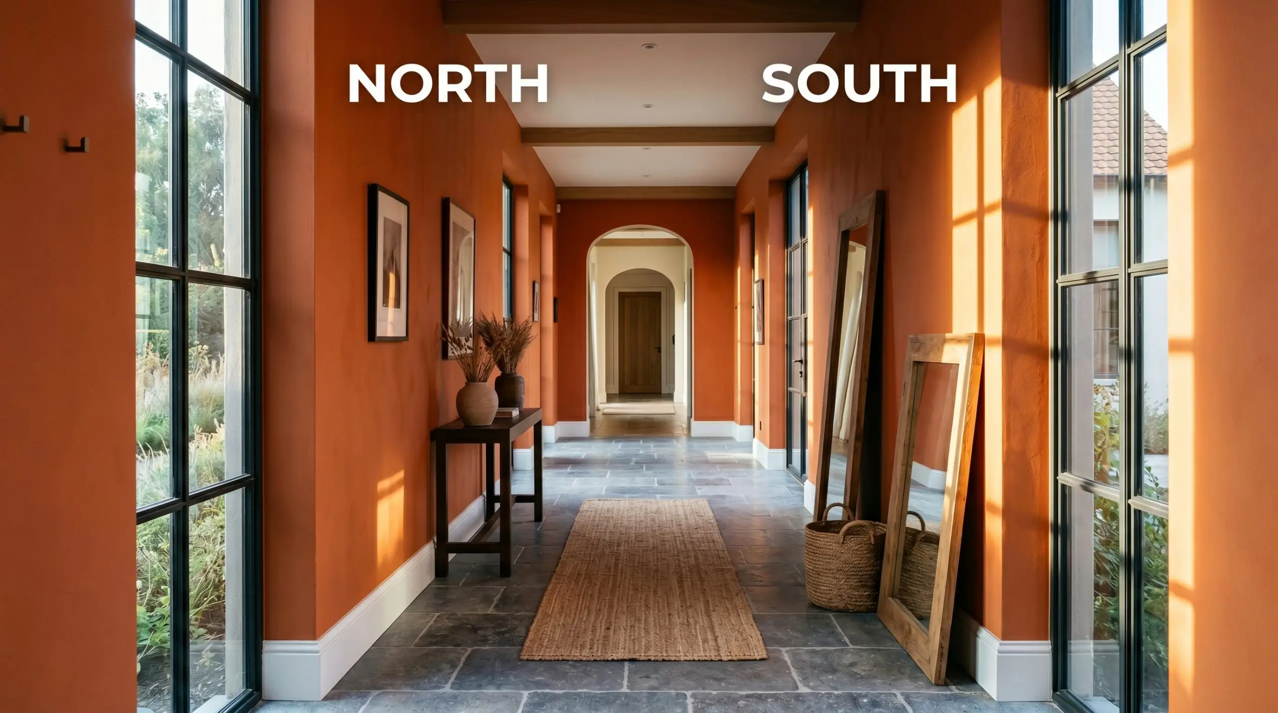
| Best Exposures | North-facing or East-facing |
| Best For | Accent walls, dining rooms, home offices, exterior doors |
Sherwin-Williams Knockout Orange: Crafting a Bold, Unapologetic Statement Space
Designing with a vivid warm orange is a high-stakes curatorial decision. You want an energizing, unapologetic environment that stimulates conversation and radiates warmth, but you are likely terrified of accidentally creating a space that resembles a fast-food lobby or a seasonal novelty display.
Sherwin-Williams Knockout Orange (SW 6885) is the antidote to those fears. This is not a flat, juvenile citrus. It is a deeply complex, highly saturated shade that demands architectural respect and sophisticated styling. When utilized with precise intentionality, this high-chroma color creates a bespoke, enveloping atmosphere that feels incredibly elite.
The Color DNA of SW Knockout Orange
To successfully wield this shade, you must understand the pigment makeup driving its behavior. Its core DNA relies on a delicate balance between intense color saturation and grounding earthy notes.
At an LRV of 28, this shade sits firmly in the medium-dark category. If you are unfamiliar with understanding its light reflectance value, know that SW 6885 absorbs a massive 72% of the light that hits it. It will never bounce illumination around a room. Instead, it possesses a heavy visual weight that actively pulls walls inward, creating a highly compressed, intimate, and advancing spatial effect.
Lighting Effects & The Tonal Profile
The quickest way to ruin a high-chroma color is to ignore your light source. The red-brown foundation of this paint makes it highly reactive, shifting its atmospheric tension depending on the sun’s directional exposure.
To avoid an overstimulating environment, never rely on a single, harsh overhead light source with this shade. Layered, ambient lighting at 3000K is mandatory to control its intensity.
Hackrea Pro-Tip
Spatial Flow and Room Applications
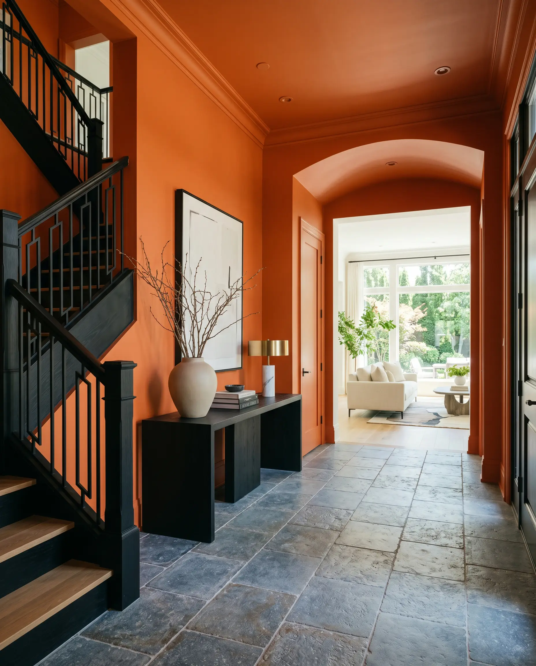
Moving from raw color data to tangible interior environments requires a strategic shift. Because this shade actively advances toward the viewer, it demands spaces that benefit from psychological compression and high energy. It craves purposeful boundaries and fails spectacularly when applied aimlessly across vast, unbroken drywall.
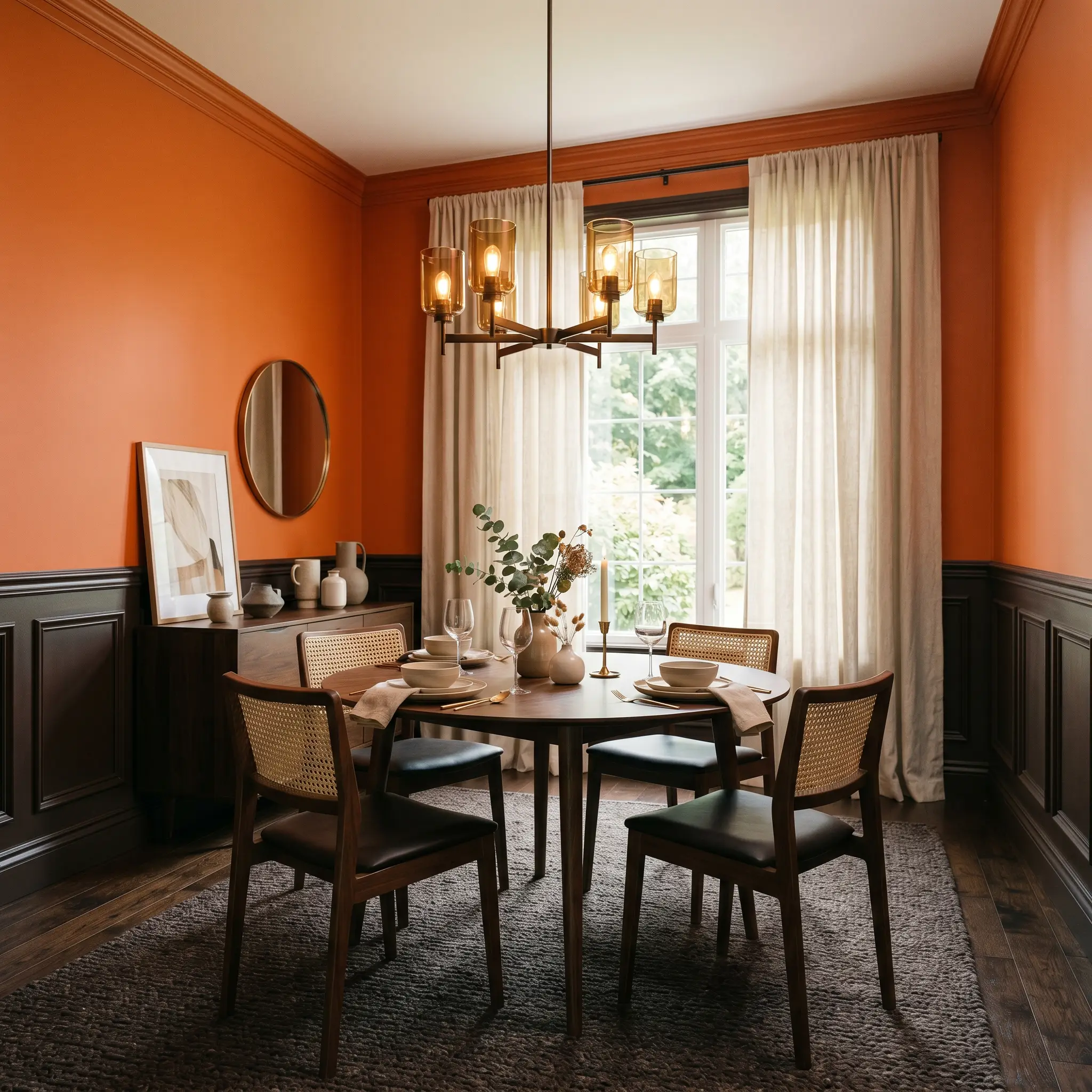
Designing the Dining Room
This is where the shade thrives. Dining spaces inherently benefit from a sense of intimate enclosure and stimulated conversation. By wrapping the walls in this deep, earthy orange, you create a glowing, candle-lit atmosphere that feels both historic and highly curated. Balance the visual weight with rich, dark wainscoting or grounding area rugs. Allow the rich pigment to serve as a dramatic backdrop for sculptural lighting fixtures and heavy tableware.
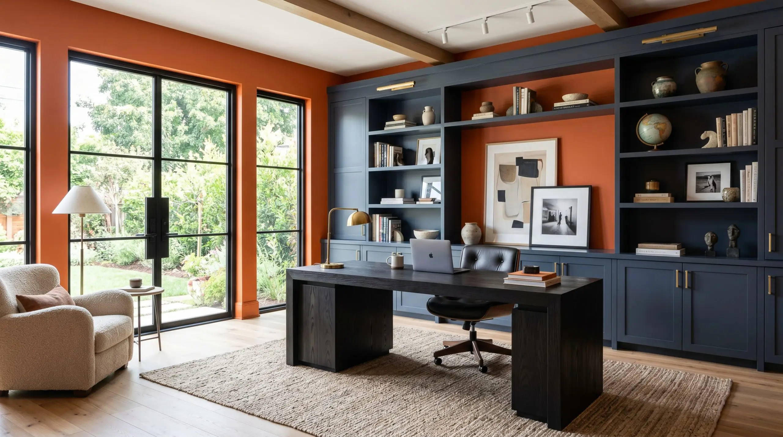
Energizing the Home Office
A workspace requires focus, but it also benefits from creative stimulation. Applying this shade here establishes a dynamic, high-energy perimeter. Do not wrap all four walls if the room is small and windowless, as the visual weight will quickly become suffocating. Instead, utilize it strategically behind built-in bookshelves or as a focal anchor behind a monolithic desk. The warmth of the paint pairs beautifully with the structured lines of modern office furniture.
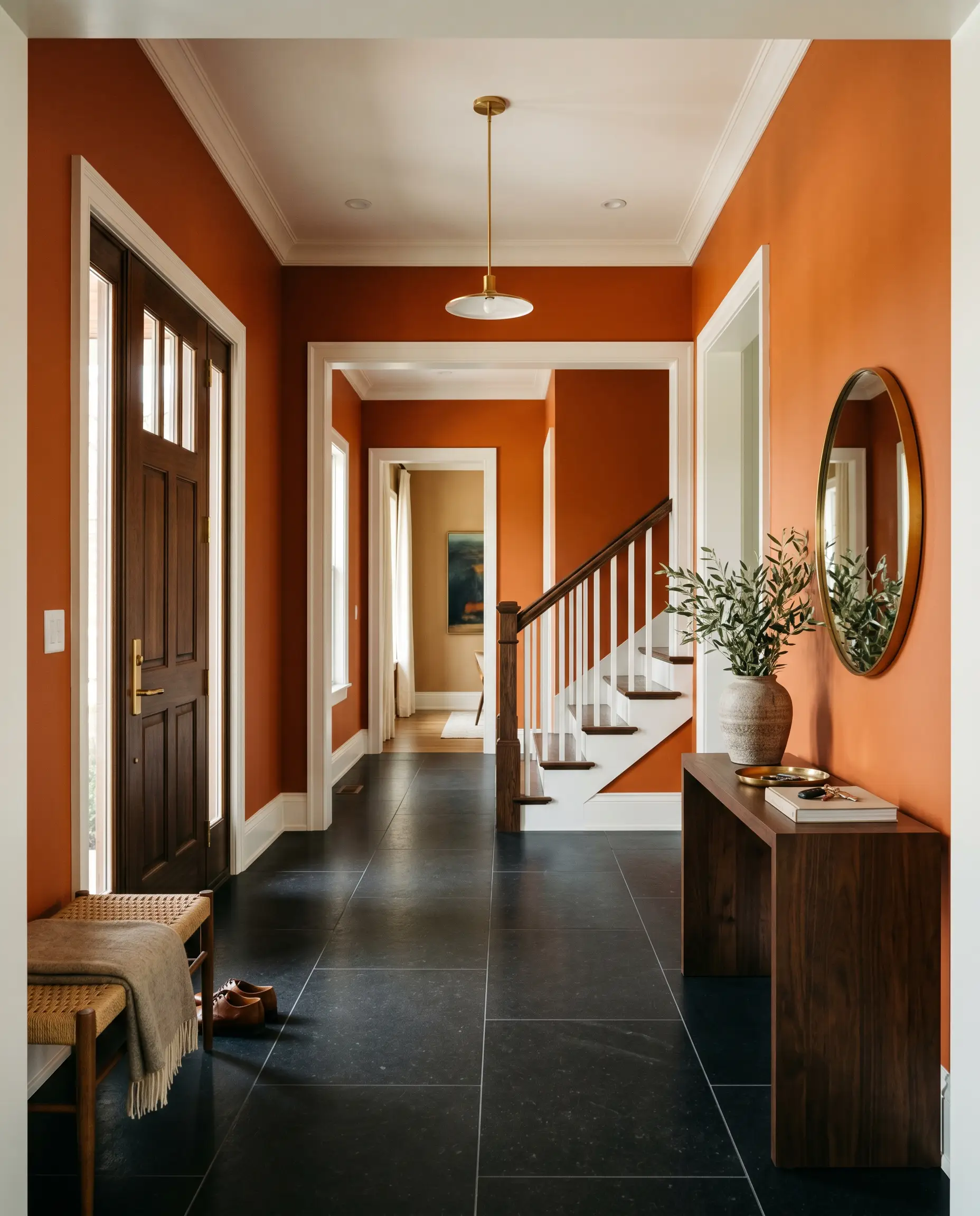
Curating the Entryway
An entryway must declare a thesis for the rest of the home. Using this saturated tone in a foyer creates a profound sense of arrival. The immediate psychological warmth greets guests with unapologetic confidence. Because entryways are transitional spaces, the intense color saturation acts as a brilliant palate cleanser before transitioning into softer, neutral living areas.
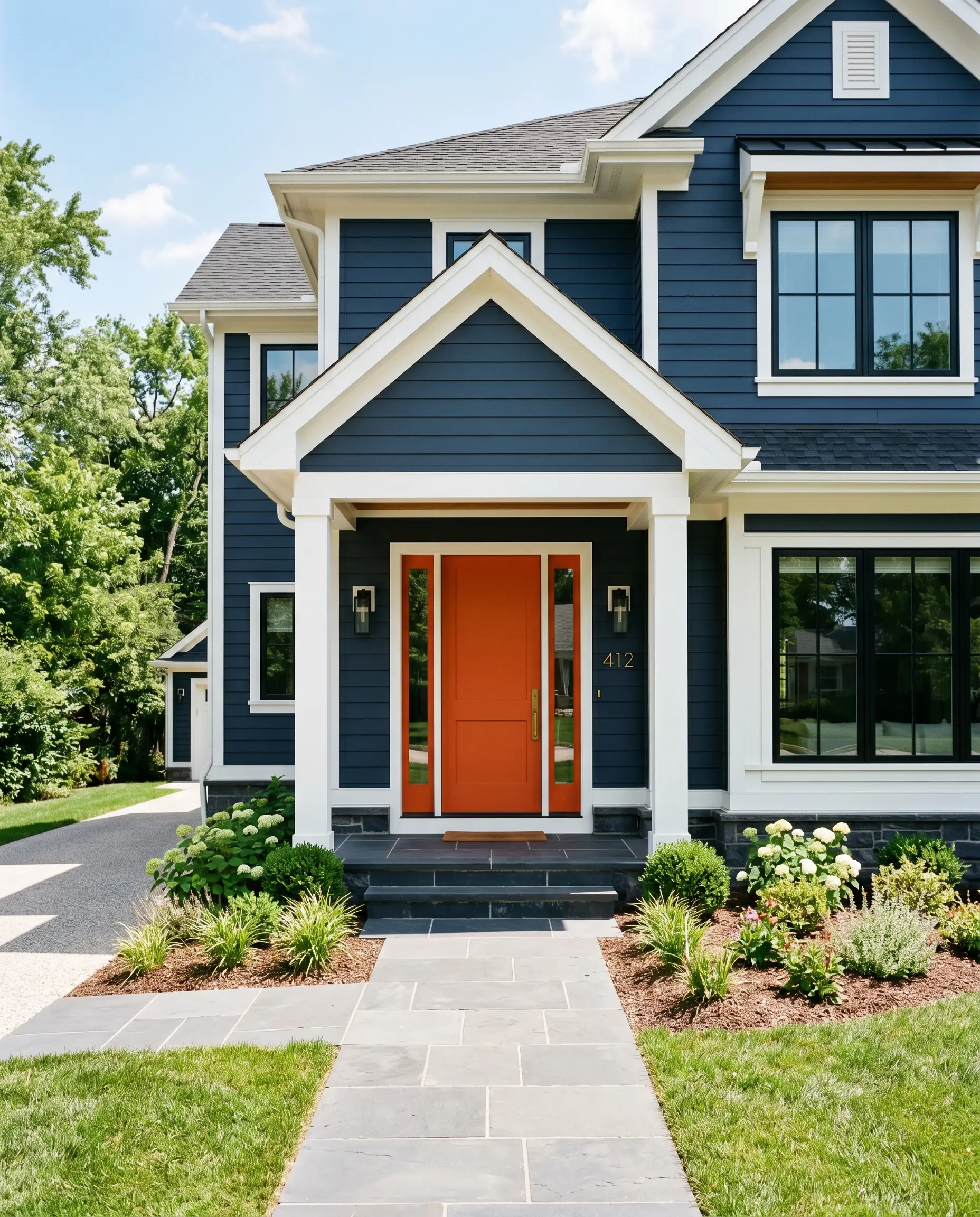
Architectural Exterior Details
When pushed outside, the intense natural light will wash out a significant portion of the color’s depth. This makes it a phenomenal candidate for high-impact exterior accents. If you are exploring how to paint a statement front door, this shade provides a brilliant split-complementary contrast against deep navy or charcoal siding. It demands crisp, clean architectural lines to frame its fiery energy.
Signature Design Ideas & Inspiration
This paint achieves its highest potential when applied to precision architectural features rather than standard drywall boxes. It requires a fearless curatorial hand to manipulate its heavy visual weight and intense chroma.
High-Gloss Lacquered Ceilings
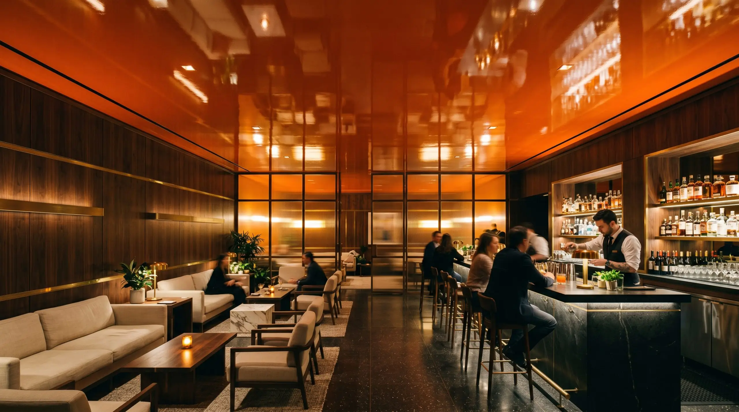
Imagine a moody, dark-paneled library or a sophisticated cocktail lounge. Applying this shade to the ceiling in a brilliant, mirror-like high-gloss finish creates spectacular architectural tension. The reflective sheen counteracts the color’s natural tendency to absorb light, while the fiery pigment draws the eye upward. This technique creates a glowing canopy that feels incredibly avant-garde, reflecting the ambient glow of low-placed table lamps.
Defining Transitional Arches
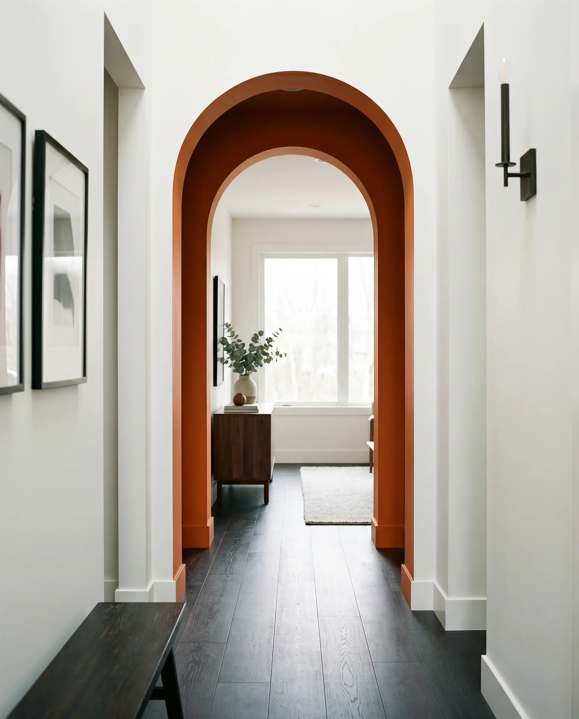
Use this heavy, advancing tone to carve out structural thresholds. Painting the interior casing of a deep architectural archway or a narrow transitional corridor establishes a distinct visual boundary. As you walk from a bright, neutral living space through the deeply saturated, warm corridor, the sudden atmospheric compression creates a highly intentional, sensory journey before releasing you into the next room.
Brutalist Concrete Courtyards
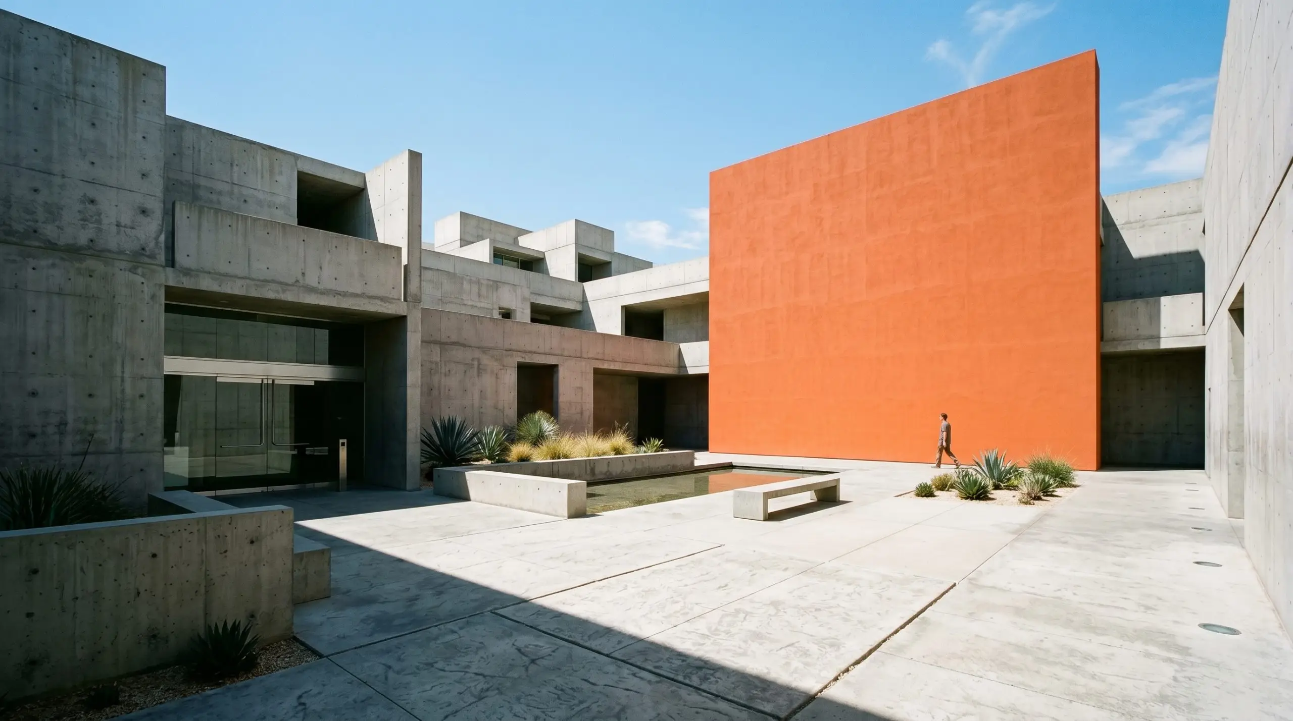
In high-end exterior applications, this shade is a brilliant tool for softening rigid, modern architecture. Apply it to a single, monolithic accent wall within a poured concrete courtyard. The cold, austere nature of brutalist concrete acts as the perfect foil to the paint’s earthy terracotta warmth. The sharp contrast between the raw gray stone and the vivid warm orange creates a cutting-edge, gallery-like exterior environment.
The Asymmetrical Color Block
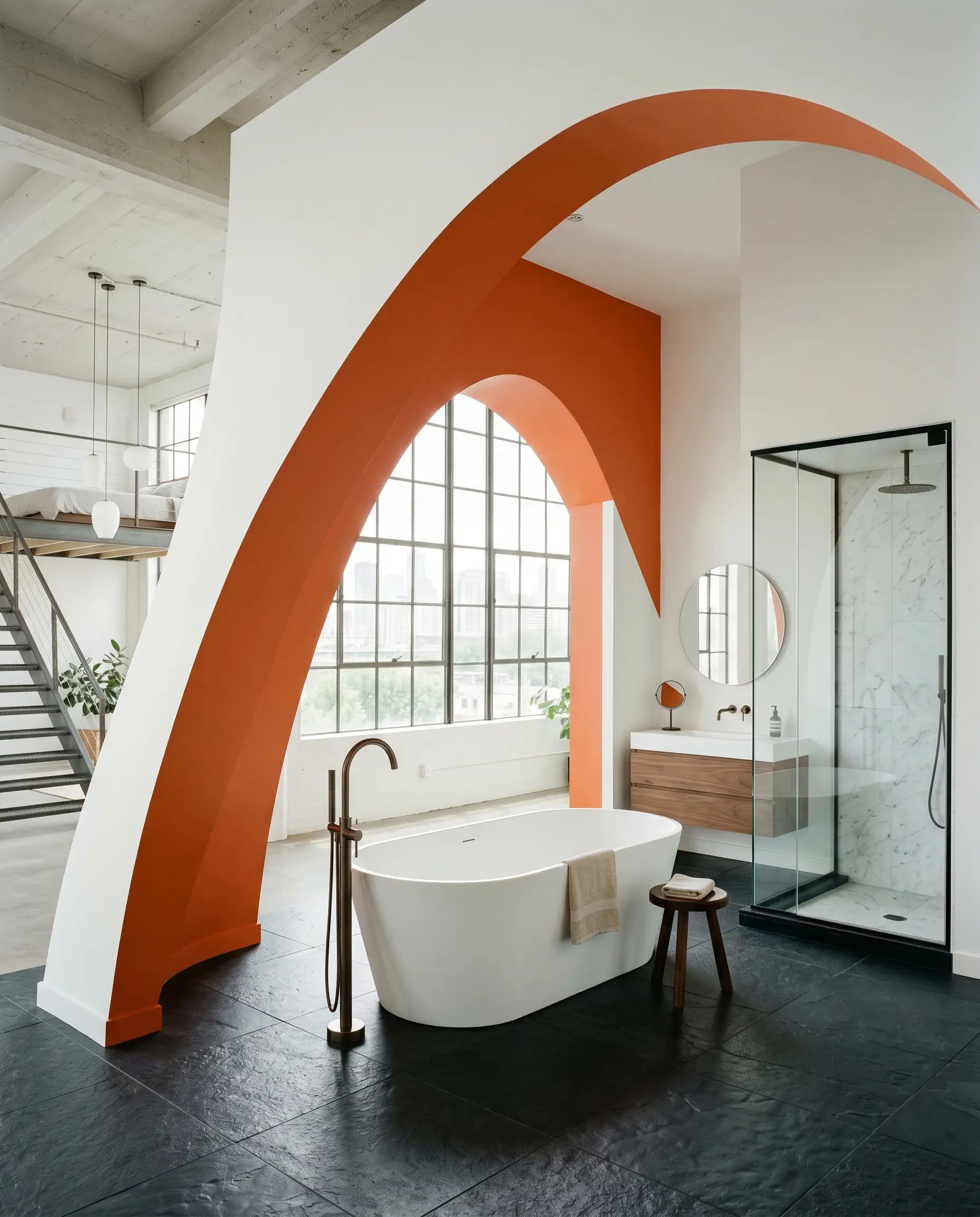
Instead of relying on a traditional, dated accent wall, use this shade to paint functional, asymmetrical geometric blocks that frame specific structural elements. Paint a sweeping, floor-to-ceiling arch behind a freestanding soaking tub, or wrap the color around a sharp corner to visually separate an open-concept loft into distinct zones. The sharp contrast against a neutral background turns the paint itself into a piece of modern, large-scale artwork.
The Pairings & Accents Guide
A paint’s success is dictated entirely by its surrounding ecosystem. This specific vivid warm orange demands extremely sharp, high-contrast borders to contain its energy, alongside deeply tactile, light-absorbing materials to ground its fiery nature.
Sharp Trim & Baseboards
Bespoke Tactile Finishes
To shatter the predictable loop of standard wood and generic fabrics, you must introduce materials that actively dialogue with this paint’s earthy red-brown base.
Coordinating Palette Logic
Curated Mood Boards
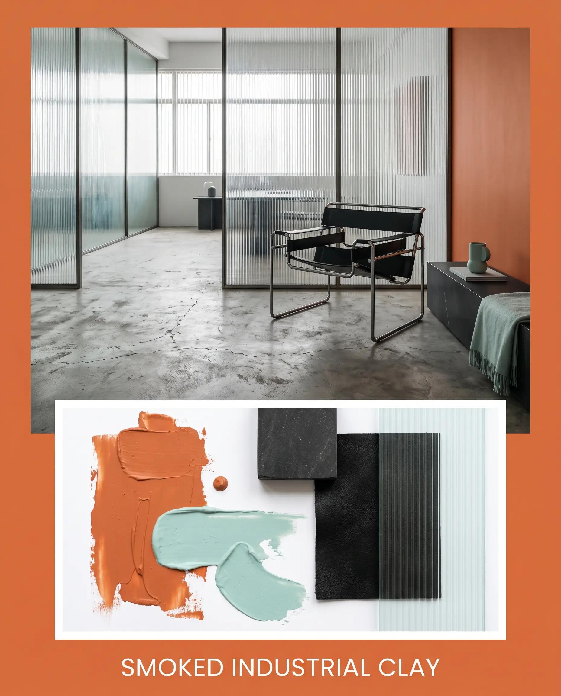
Smoked Industrial Clay: This aesthetic relies on the sharp collision between vivid warmth and cold, industrial materiality. The architectural framework features poured concrete floors and fluted glass partitions, grounded by the muted aqua tones of SW Aqueduct. A rigid, black leather Bauhaus chair and heavily veined honed black basalt tables anchor the space. The visual tension here is sharp, urban, and highly disciplined.
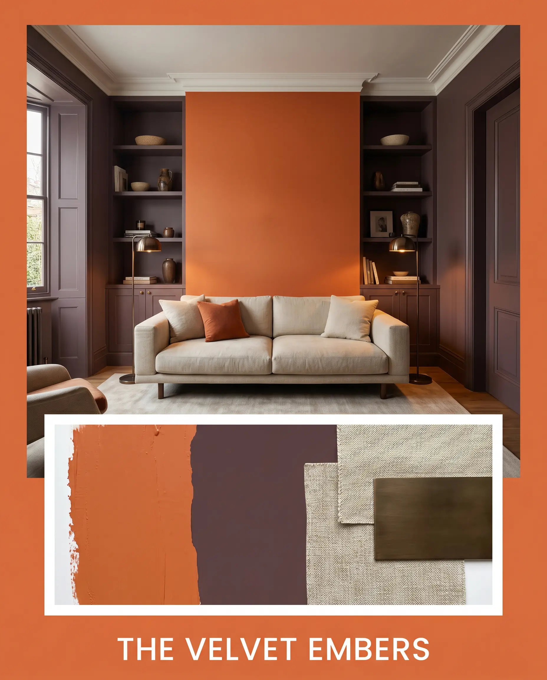
The Velvet Embers: A study in deep, atmospheric compression and tactile luxury. Farrow & Ball Brinjal wraps the secondary architectural elements, creating a dark, bruised backdrop that allows the earthy orange to glow. The styling demands low-slung, heavy-weight Belgian linen sofas and smoked bronze floor lamps. The emotional resonance is intimate, hushed, and profoundly sophisticated, relying entirely on light-absorbing matte surfaces.
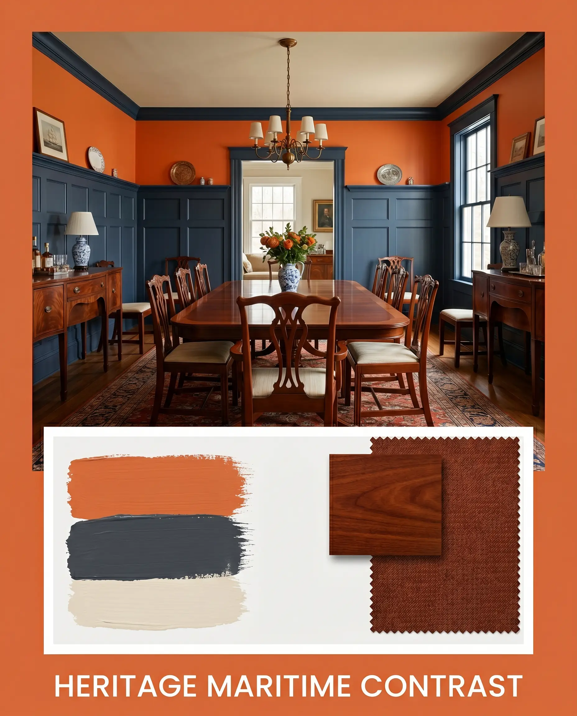
Heritage Maritime Contrast: This palette leverages a classic, high-end split-complementary relationship. Benjamin Moore Hale Navy is applied to traditional, heavy wainscoting, while SW Neutral Ground provides a soft, breathable ceiling plane. The vivid warm orange is used strategically above the chair rail. The styling incorporates polished mahogany silhouettes, vintage maritime oil prints, and rich wool rugs, resulting in a space that feels historically rooted yet boldly modern.
Head-to-Head Comparisons
When a specific lighting scenario or fixed architectural element threatens the success of your primary choice, a forensic comparison against rival shades is mandatory.
Sherwin-Williams Knockout Orange vs. Sherwin-Williams Obstinate Orange
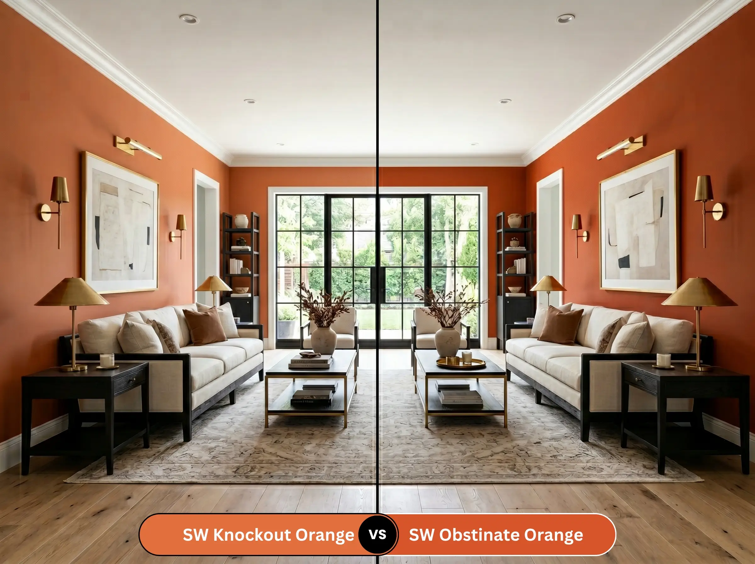
Obstinate Orange strips away the grounding red-brown undertones found in SW 6885, resulting in a much cleaner, louder, and more primary citrus hue. If your space features heavily shaded, cool northern light, Obstinate Orange will cut through the gloom more effectively. However, in a sun-drenched southern room, Obstinate Orange risks crossing the line into a juvenile, neon aesthetic, whereas the earthy base of our primary shade maintains its sophisticated composure.
Sherwin-Williams Knockout Orange vs. Benjamin Moore Tangelo
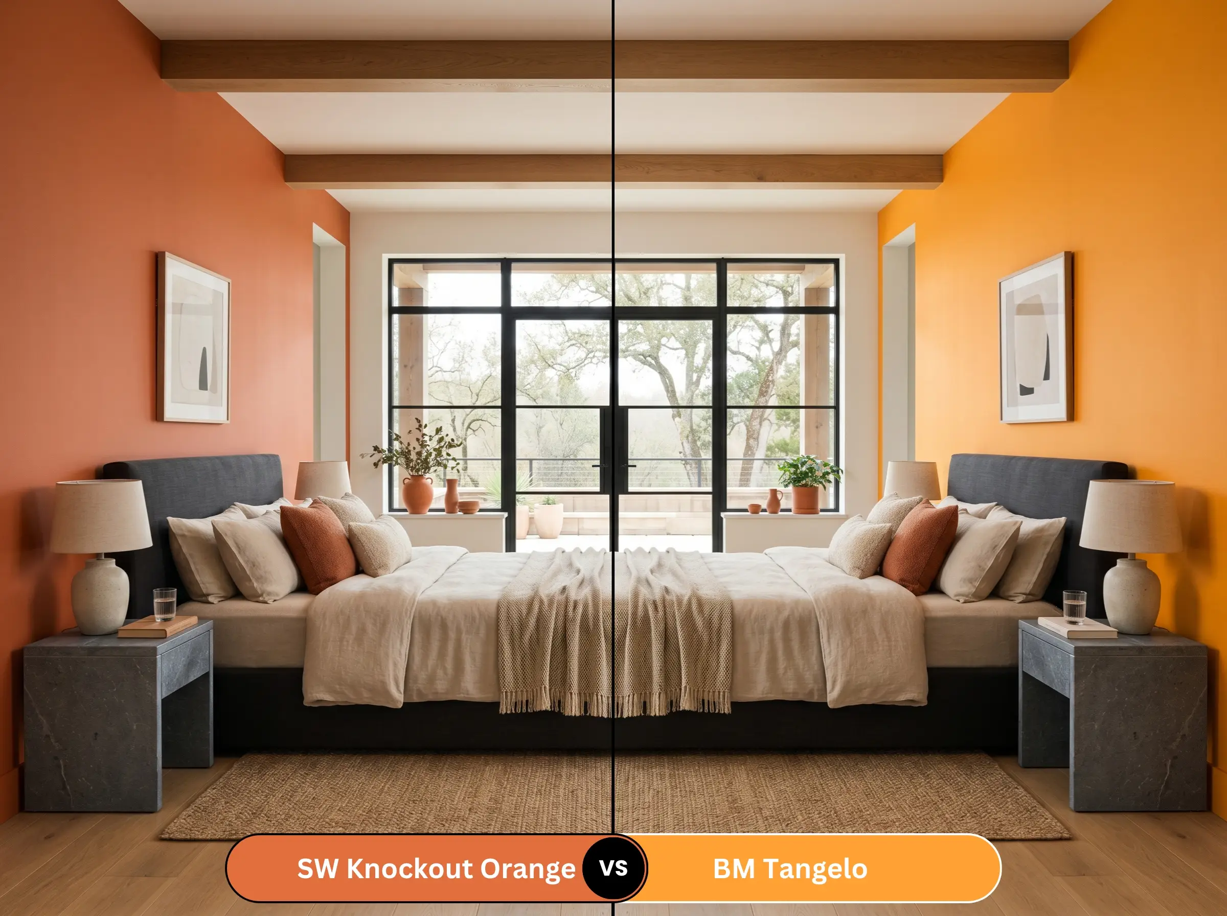
Tangelo leans noticeably further into a softer, pink-leaning coral territory. It possesses a higher LRV, meaning it will bounce slightly more light and feel less heavy on the walls. If you are designing a space that requires a playful, tropical warmth rather than a deep, baked clay intensity, Tangelo is the safer choice. Choose SW 6885 only when you specifically desire the heavy, advancing drama of a terracotta-infused shade.
Similar Colors & Brand Equivalents
Navigating microscopic shifts in depth and undertone is essential for perfect color matching.
Same-Brand Alternatives
Cross-Brand Matches
Practical Application & DIY Advice
Executing a flawless finish with a high-chroma, medium-dark paint requires strict adherence to professional application standards.
The Dynamic Sheen Guide
Primer Strategy
You cannot simply roll this color over standard white drywall. A deep, high-chroma shade requires a high-quality, tinted gray primer. The gray base stops light from penetrating through the orange layers and reflecting off the white wall underneath, ensuring you achieve the true, rich saturation without a patchy appearance.
Coverage & Touch-Ups
Expect to apply a minimum of two generous coats, and often three, to achieve perfect opacity. Be hyper-aware of “flashing” (visible roller lap marks). Because it is a dark, saturated color, any inconsistencies in your rolling technique will catch the light. Touch-ups are notoriously difficult with this depth; if a wall gets damaged, you will likely need to repaint the entire plane from corner to corner.
Frequently Asked Questions
Yes, the intense direct sunlight in a south-facing room will aggressively amplify the yellow-red hues. It will appear exceptionally fiery and lean noticeably toward a vibrant, tomato-red orange during peak afternoon hours.
A higher sheen, such as semi-gloss or high-gloss, will significantly amplify the vibrancy. The reflective surface bounces the harsh exterior sunlight, making the color appear sharper, louder, and more dynamic than it would in a flat finish.
It is highly risky. Because it absorbs 72% of light and visually advances, wrapping a windowless room in this shade will create a severe sense of enclosure. You must counteract this with brilliant, layered artificial lighting and highly reflective surfaces like oversized mirrors and polished stone.
Under crisp 4000K LED lighting, the color maintains its truest, most accurate saturation. The cool, clean light prevents the red-brown undertones from muddying the finish, allowing the vivid warm orange to read as sharp and highly energized.
Final Verdict & Expert Warnings
Sherwin-Williams Knockout Orange (SW 6885) is an elite architectural tool designed for those who want to curate a space with unapologetic confidence and profound visual warmth. Its absolute best application is within intimate, enclosed spaces—like dining rooms or deeply layered home offices—where its heavy visual weight can create a glowing, sophisticated, and highly compressed atmosphere. It perfectly elevates Mid-Century Modern spaces, Brutalist environments, or deeply moody, historic interiors that rely on high contrast.
Clash Warning: This paint will ruthlessly destroy the aesthetic of a room if forced to interact with the wrong fixed elements. You must meticulously avoid pairing it with yellow-toned woods like golden oak or unstained pine, as the competing warm undertones will create a visually toxic, vibrating clash. Furthermore, keep it far away from cool, gray-veined Carrara marble or icy, blue-toned glass tiles, as the severe temperature disparity will make the orange look muddy and the stone look cheap. Finally, banish any polished brass or highly reflective gold hardware; the combination will instantly drag the space into a dated, theatrical aesthetic that feels deeply unrefined.