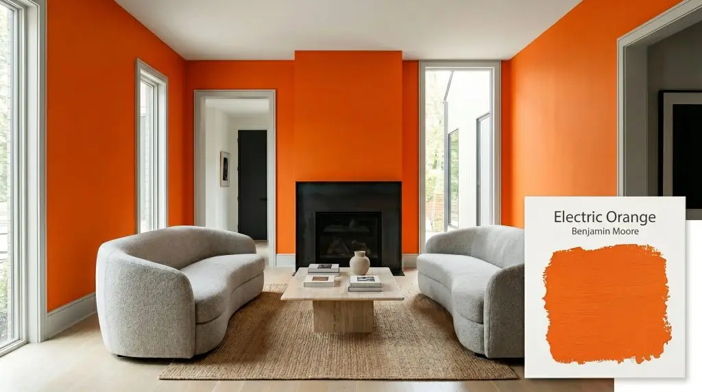
Electric Orange 2015-10
Benjamin MooreBenjamin Moore's Electric Orange (2015-10) is a bold, highly saturated mid-tone orange with a Light Reflectance Value of 28.61. This vibrant hue carries a subtle black undertone that grounds its intense energy, making it an ideal choice for dramatic interior accent walls and creative spaces.
Paint Technical Profile
| Color ID / SKU | 2015-10 |
| HEX Code | #F0701A |
| Light Reflectance (LRV) | 28.61 |
| Use | Interior |
| Best Exposures | North or East |
| Best For | Dining rooms, powder rooms, accent walls, creative studios |
Benjamin Moore Electric Orange: The Architect’s Secret to Energizing Modern Spaces
Orange is notoriously intimidating in residential design, often dismissed as too vibrant or stubbornly retro. Yet, when you examine Benjamin Moore Electric Orange, you discover a brilliant exercise in pigment restraint. This isn’t a neon novelty; it is a highly saturated architectural finish that fundamentally alters the energy and visual warmth of a room.
By balancing intense vibrancy with a hidden, stabilizing cast, this hue offers a sophisticated pathway for homeowners who want to embrace bold color without sacrificing elegance.
Benjamin Moore Electric Orange: Undertones & LRV
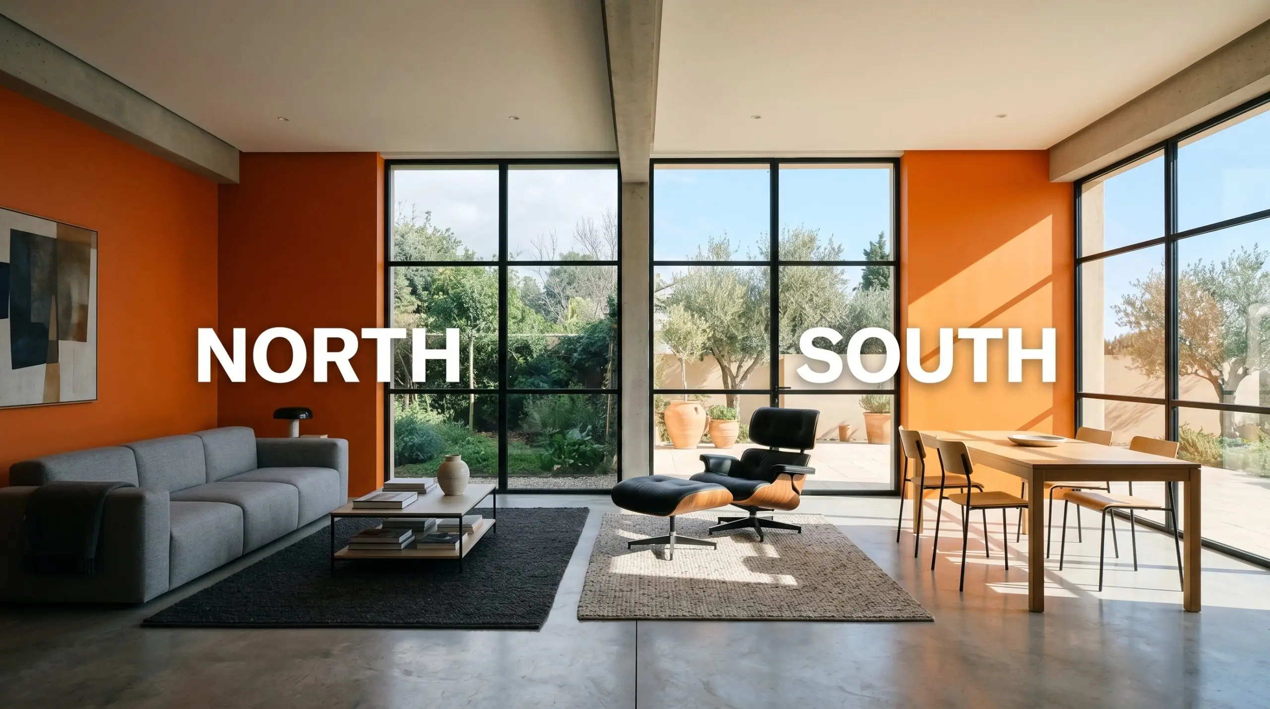
Homeowners constantly ask if a vibrant color like this pulls uncomfortably hot or surprisingly muted once it hits the wall. The reality is that this mid-tone orange is intensely, undeniably warm, but it carries a structural secret that keeps it from spiraling out of control. It relies on a very specific chromatic profile to maintain its balance.
With a luminance rating (LRV) of 28.61, this specific shade absorbs a substantial amount of light rather than bouncing it around the room. It sits firmly in the mid-to-dark reflectance range, ensuring it holds its rich saturation in sun-drenched spaces while demanding careful placement in shadowed corners.
The Chameleon Factor: Lighting Interactions
Because of its nuanced base, this color refuses to remain static throughout the day. The way natural and artificial light hits the surface dramatically shifts its tone and overall mood.
Executing the Vision: Popular Applications
Taking a saturated hue from a tiny swatch to a full-scale room application requires strategic restraint and intentional pairings. Here is how to harness the intense energy of this color across different zones in your home.
Lively Dining Spaces
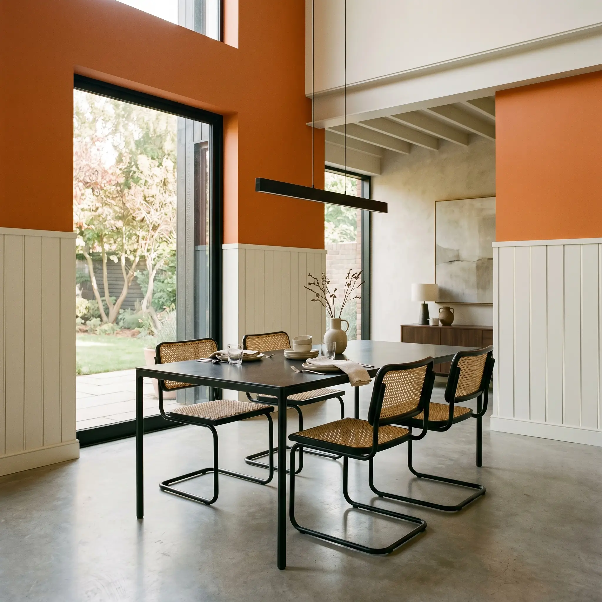
A traditional dining room label often conjures images of formal, stuffy wainscoting, but this shade thrives when you break those rules. Applying Electric Orange to the upper half of a wall, paired with crisp white board and batten below, creates a high-contrast, modern environment. This is the perfect backdrop for lively family dinners or late-night entertaining.
To balance the intense warmth, introduce cooler, industrial materials into the room’s styling. Pair the vibrant walls with a sleek blackened steel dining table or a custom terrazzo buffet. Soften the hard edges with tactile seating, like worsted wool slipcovers or woven cane chairs, to keep the room feeling approachable rather than severe.
Contemporary Powder Rooms
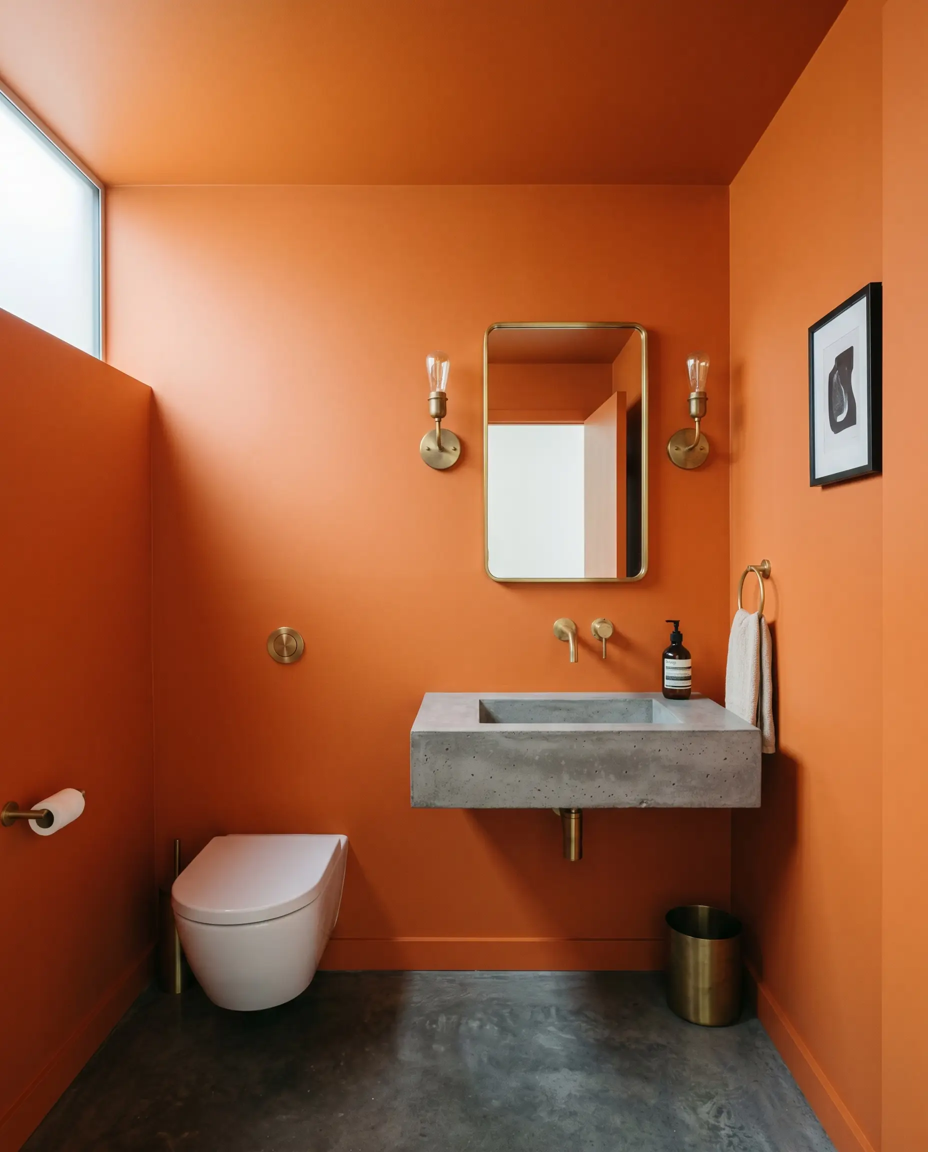
Small, windowless spaces are brilliant testing grounds for light-absorbing colors. Instead of defaulting to the predictable dark-and-moody jewel box aesthetic, use this mid-tone orange to create an unexpected, high-energy industrial vibe. Wrapping the walls and ceiling in this shade creates a seamless, enveloping warmth that feels incredibly intentional.
When wrapping a small space in a highly saturated warm tone, your vanity lighting becomes critical. Avoid overly warm 2700K bulbs here, as they will turn the room into an overwhelming sauna; instead, opt for crisp 3000K-3500K fixtures to keep the color reading clean and modern.
Hackrea Pro-Tip (The Lighting Balance)
Elevate the tight quarters by installing a floating poured concrete sink and unlacquered brass wall sconces. The raw, matte texture of the concrete beautifully offsets the vibrant wall color, while the brass fixtures will slowly patina, adding a layer of lived-in luxury.
Energized Creative Studios
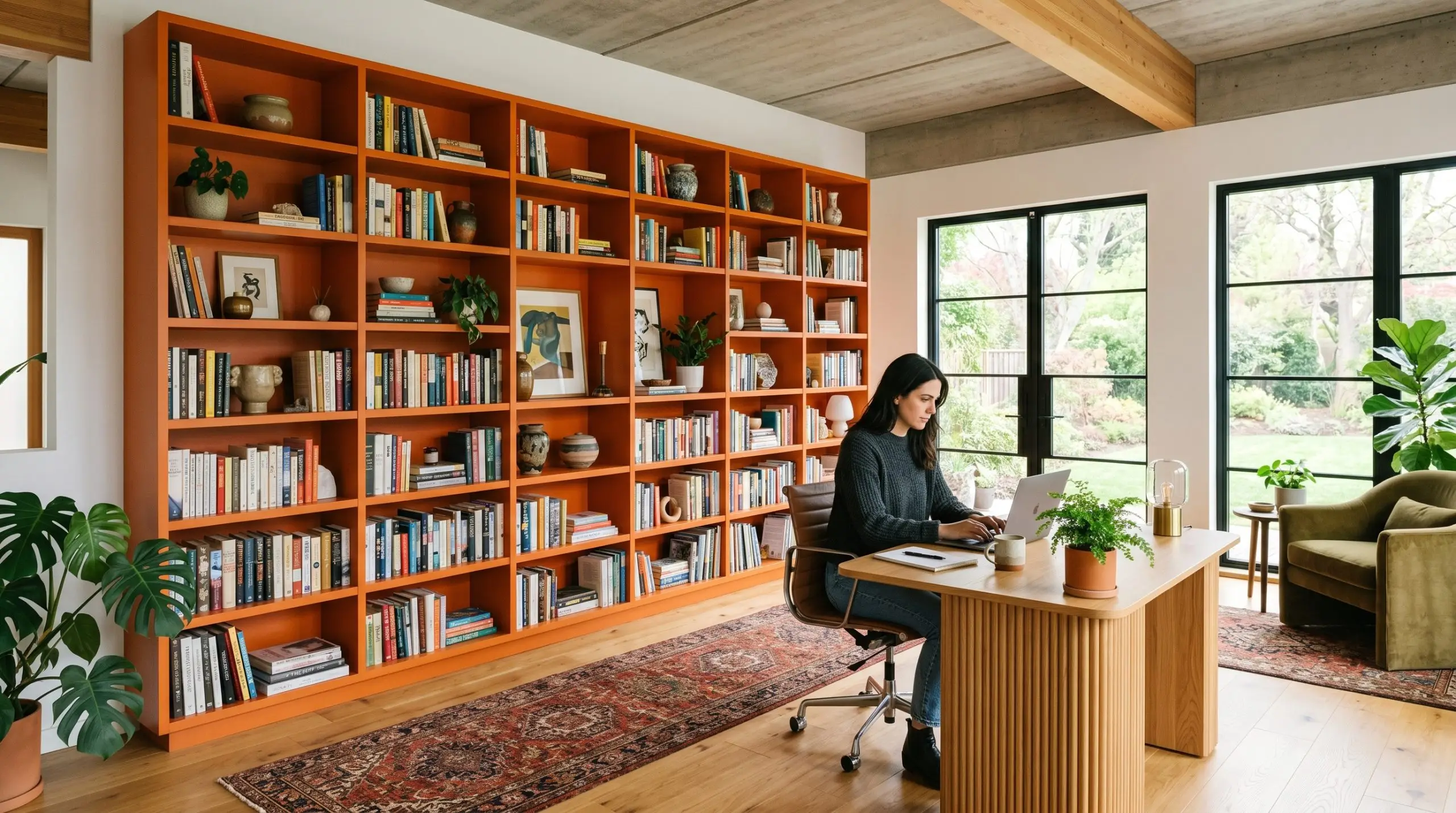
For a graphic designer or a remote worker needing daily inspiration, a sterile white home office is an uninspiring trap. Utilizing Benjamin Moore’s Gennex Color Technology ensures this shade remains remarkably rich, making it an ideal candidate for custom painted built-ins. Coating a massive wall of bookcases in this fiery hue instantly establishes a focal point that stimulates creativity and focus.
Keep the rest of the room’s architecture relatively quiet to let the cabinetry shine. Style the vibrant shelves with minimalist ceramic vases, stacked coffee table books, and trailing pothos plants. Finish the space with a low-profile fluted oak desk and a vintage Persian runner to introduce organic textures that soften the room’s intense energy.
Architectural Accent Zones
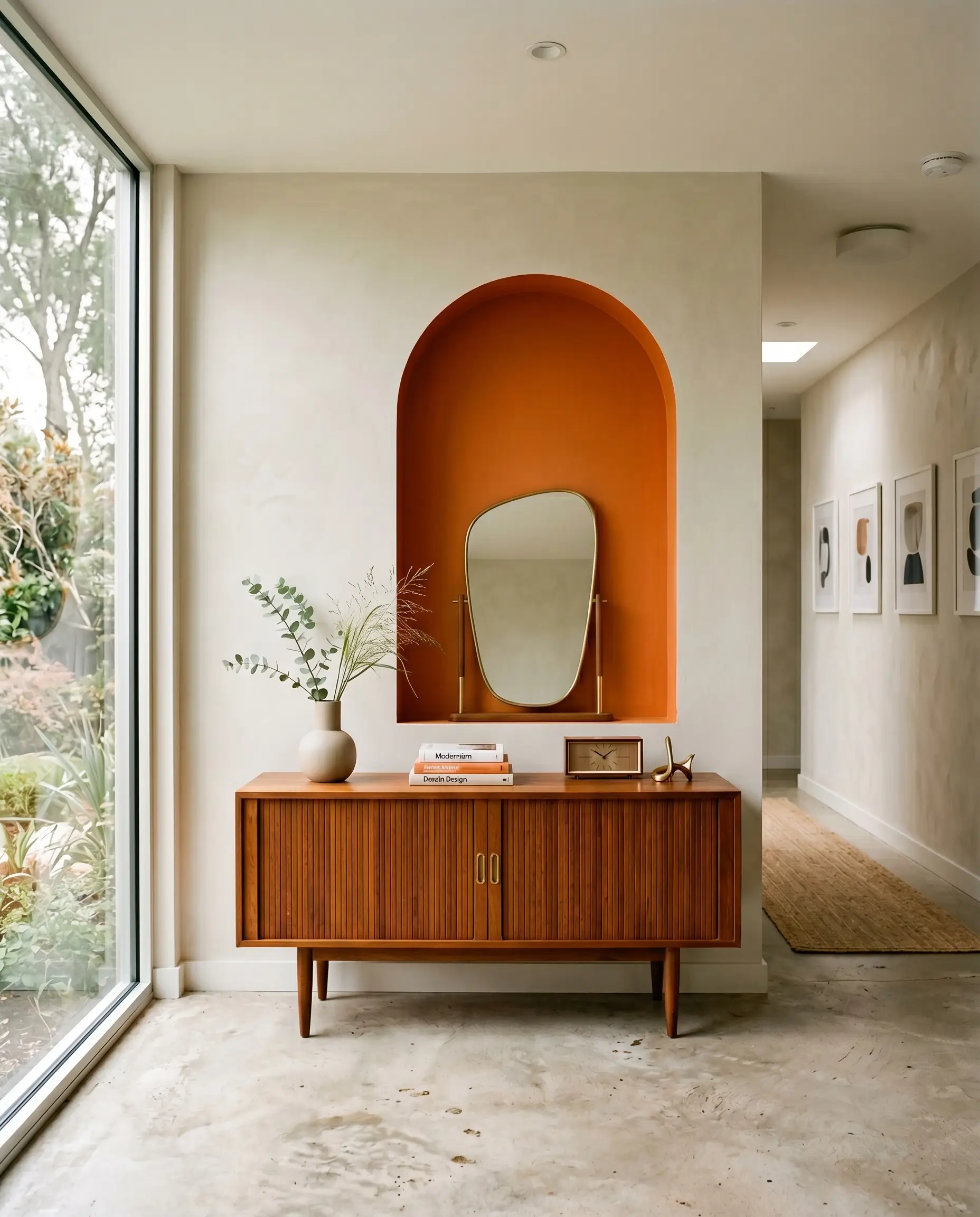
The concept of a flat, randomly painted accent wall is dated, but using color to highlight specific architectural features is a timeless design strategy. If you have an arched doorway, a recessed niche, or a transom window, painting the interior of that feature creates a brilliant moment of structural contrast. This technique gives an apartment dweller or a suburban renovator a high-impact transformation without committing to a full room of orange.
Place a mid-century teak sideboard directly in front of the color-blocked zone to warm up the arrangement. You can then style the surface with an asymmetrical mirror and oversized botanical branches. The rich wood tones of the furniture will harmonize beautifully with the earthy, black-tinted base of the paint.
High-Impact Interior Doors
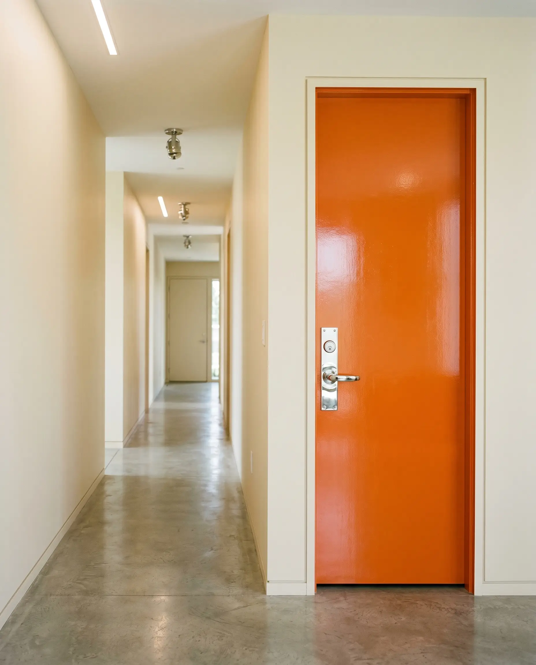
When a hallway feels endless and uninspired, painting the interior doors is a clever, cost-effective way to redefine the visual flow. Coating a standard bedroom or closet door in this saturated tint turns a purely functional element into a curated piece of art. It creates a striking transition as you move through the home.
To maximize the impact, use a high-gloss finish on the door while keeping the surrounding walls in a flat, muted sage or warm cream. Upgrade the standard builder-grade doorknobs to heavy, polished chrome or hammered copper hardware. This simple material swap elevates the entire installation, making a standard hollow-core door feel incredibly bespoke.
Curating the Palette: Best Pairings for Electric Orange
This highly saturated pigment requires decisive boundaries to hold its fiery shape, thriving when pushed against contrasting tones rather than blending into similar warm hues. When you surround it with the right structural elements, the color stops feeling wild and starts feeling intentionally curated.
Millwork & Baseboard Strategies
The trim you select will completely alter how this vibrant shade behaves within the architecture of your home.
Tactile Elements & Hardware
The physical materials you bring into the space dictate the final aesthetic language of the room.
The Secondary Color Palette
To build a cohesive home, you need secondary colors that either cool down the fire or lean into its organic nature.
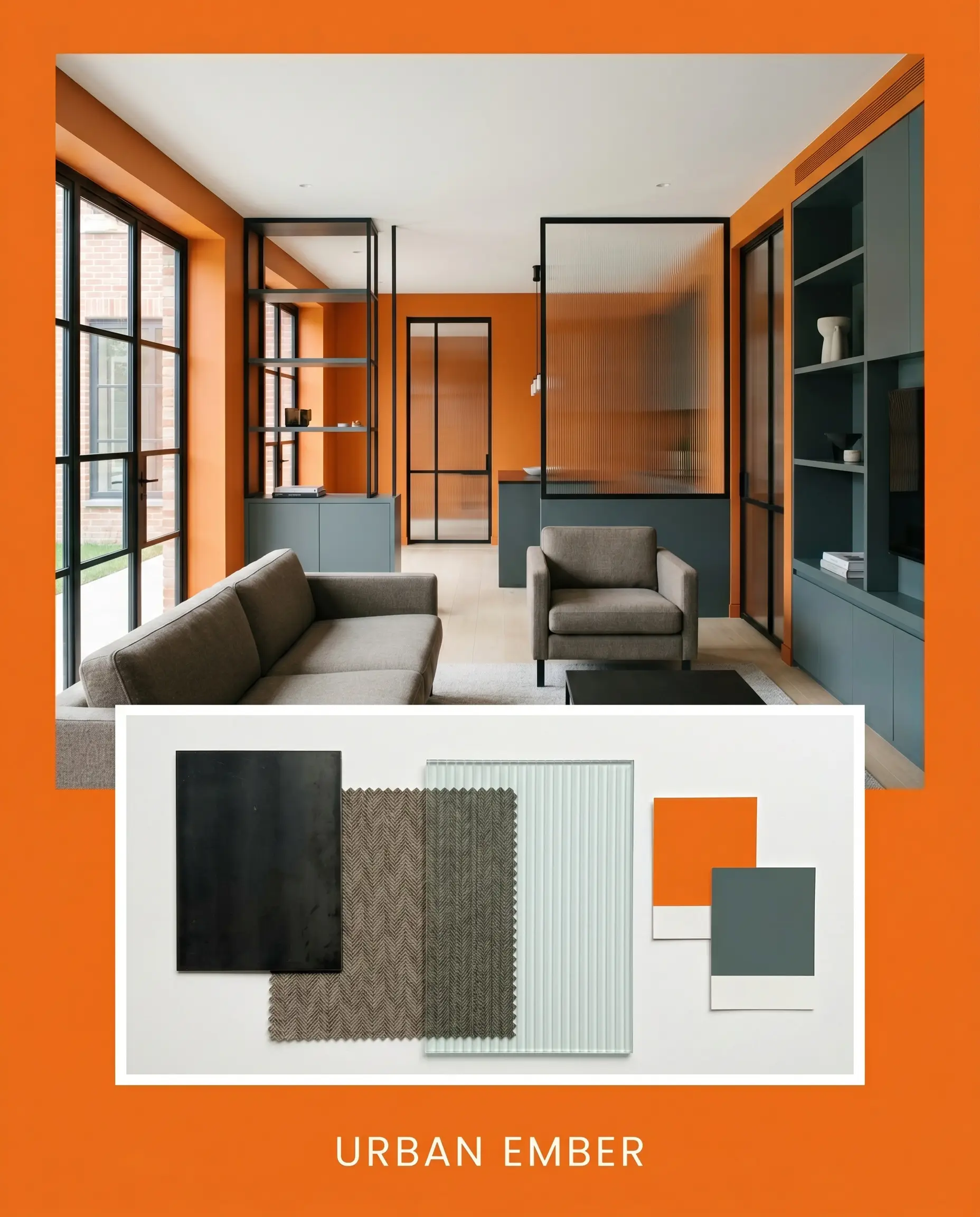
Curated Room Aesthetics
Here is how these individual ingredients synthesize into distinct, fully realized aesthetics for your home.
Urban Ember This look combines the stark contrast of blackened steel framing with the tactile softness of worsted wool seating. By introducing Farrow & Ball Inchyra Blue on adjacent built-ins, the fiery walls are instantly cooled and modernized. The addition of reeded glass partitions keeps the energy flowing while maintaining a sleek, contemporary edge.
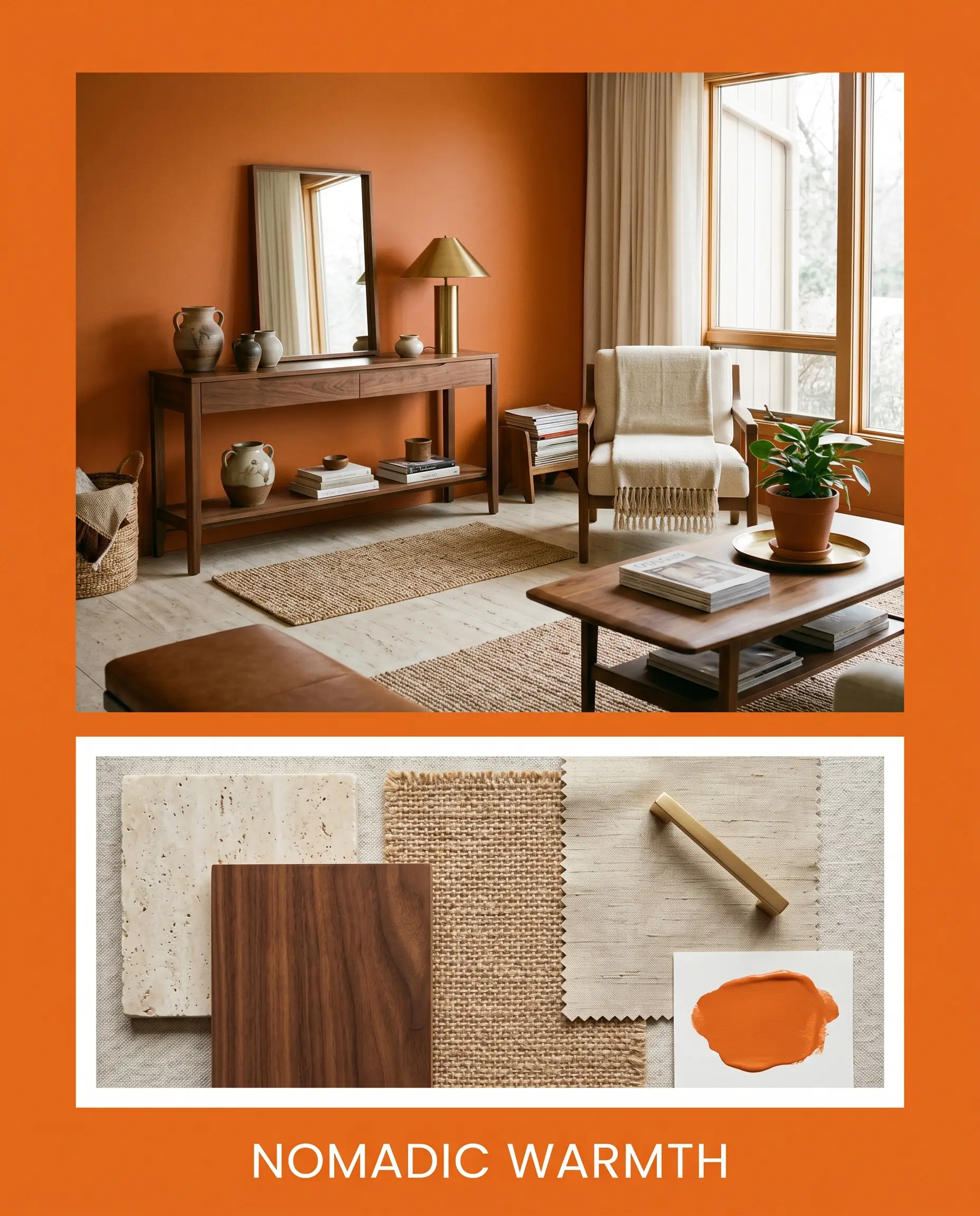
Nomadic Warmth Lean into the organic nature of the paint’s hidden dark cast by pairing it with honed travertine surfaces and rich walnut wood tones. Layering woven jute rugs and raw silk textiles softens the visual impact, creating a highly textural, inviting environment. Unlacquered brass lighting fixtures serve as the aspirational focal point, gleaming warmly against the vibrant backdrop.
Comparing Electric Orange: Technical Shade Matchups
Sometimes a home’s specific lighting exposure or architectural era demands a slight pivot away from your initial color choice. If your space receives intense southern light, this particular shade might radiate too much heat, prompting a search for something differently calibrated.
Benjamin Moore Electric Orange vs. Sherwin-Williams Navel SW 6887
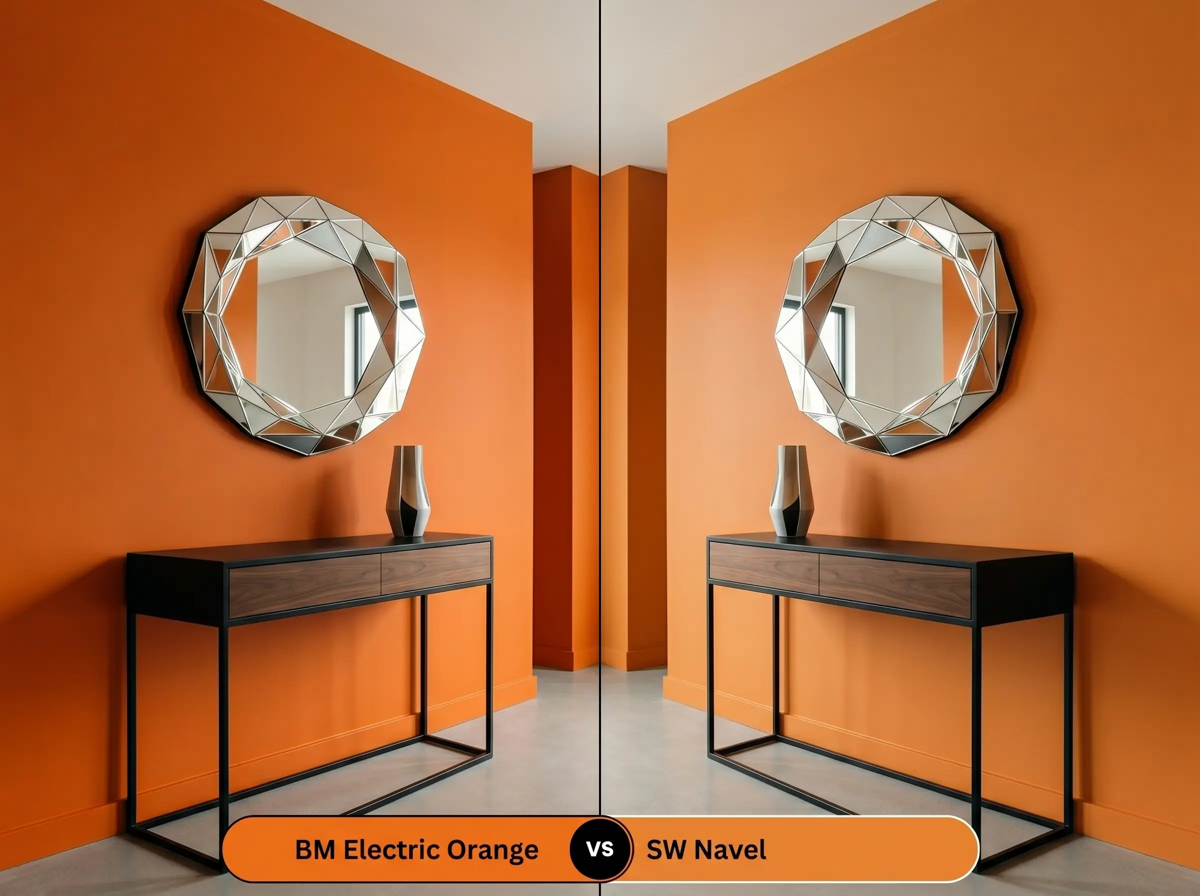
Sherwin-Williams Navel is slightly cleaner and less earthy than its competitor. If your room lacks natural light and you need a pure, unadulterated pop of color, Navel maintains its brightness beautifully. However, if you prefer a tone that feels slightly more organic and less like a primary color, the Benjamin Moore option provides that crucial subtle shadowing.
Benjamin Moore Electric Orange vs. Benjamin Moore Orange Burst 2015-20
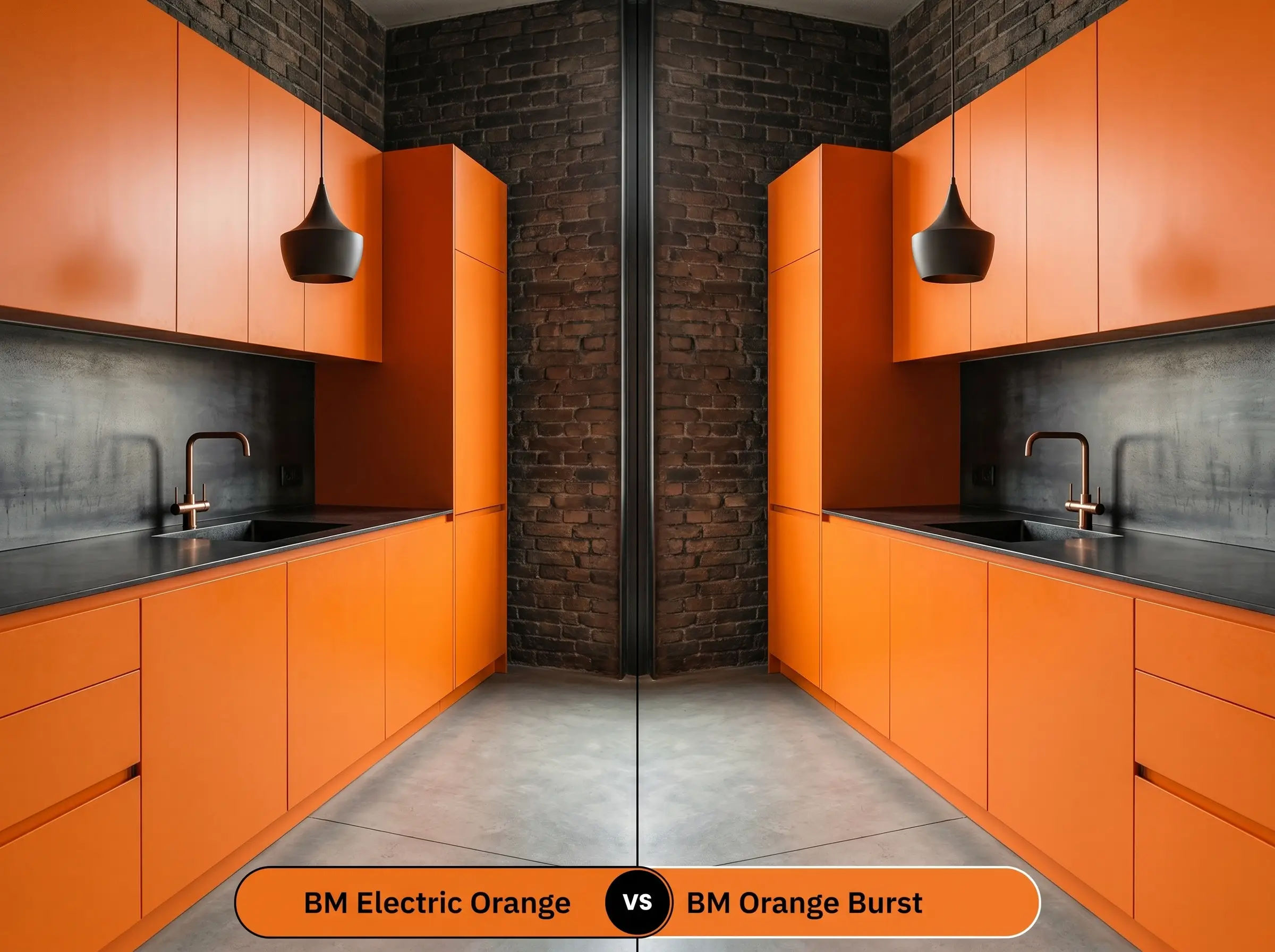
Benjamin Moore Orange Burst leans slightly more yellow, reading closer to a true tangerine on the wall. If you are pairing the paint with warm oak floors, Orange Burst might harmonize more seamlessly with the wood’s golden tones. Conversely, Electric Orange offers a richer, more reddish-orange intensity that stands up brilliantly to cooler, industrial elements.
Exploring Alternatives to This Fiery Hue
You might find that once you test a sample, the color feels just a fraction too bright or slightly too intense for your specific square footage. These alternatives offer nuanced shifts in reflectance and warmth to help you dial in the exact aesthetic you need.
Next-Door Neighbors in the Fan Deck
Cross-Brand Matches
Professional Execution: Putting Electric Orange on the Wall
Transitioning from a beautiful concept to a flawless physical reality requires strict attention to the application process. Saturated colors are notoriously unforgiving during the painting phase, demanding the right finishes and preparation to succeed.
The Dynamic Sheen Guide
Primer Strategy & Coverage
To achieve full opacity with a rich mid-tone like this, a standard white primer will inevitably lead to a frustrating, streaky application. You must use a high-quality primer tinted to a medium-gray base, which helps the vibrant pigment establish its true richness in fewer coats.
Even with a tinted base, anticipate applying at least two to three coats for a professional, uniform finish.
Saturated colors are highly prone to “flashing,” where roller marks or touched-up areas dry with a slightly different sheen. To avoid this visible inconsistency, always maintain a wet edge while rolling and never spot-touch a wall once it has fully dried; instead, repaint the entire wall corner-to-corner.
Hackrea Pro-Tip (The Flashing Warning)
Frequently Asked Questions
Because highly saturated orange and red pigments are notoriously susceptible to UV degradation, this specific formula will fade and chalk rapidly when exposed to direct sunlight. It is best reserved for interior spaces where the lighting environment can be controlled.
Rather than feeling overly frantic or neon, the subtle dark cast provides a stabilizing, earthy quality that makes the tight space feel intentionally enveloping and warm. It creates a cozy, jewel-box effect rather than a jarring visual experience.
A medium-gray tinted primer is absolutely essential for this level of chromatic intensity. The gray base prevents the bright orange from washing out, allowing the true richness of the color to develop fully in just two to three coats.
Applying this warm, advancing tone to a ceiling will immediately draw the eye upward while making the ceiling plane feel much closer to the floor. It is a brilliant architectural trick to make a vast, echoing room feel intimate and connected.
The Final Verdict on Benjamin Moore Electric Orange
Benjamin Moore Electric Orange is a brilliant exercise in controlled vibrancy, perfect for homeowners who want to inject undeniable energy into their daily routines. Its greatest strength lies in its hidden dark cast, which elevates it from a simple primary color to a sophisticated, architectural finish. This rich tone thrives in contemporary and industrial spaces, particularly when used to highlight custom cabinetry, dynamic dining rooms, or unexpected transitional zones.
While its warmth is captivating, this highly saturated hue is not universally adaptable and requires careful placement to avoid visual fatigue. You should actively avoid pairing this shade with yellow-leaning wood tones like golden oak or knotty pine, as the competing warm undertones will clash and make the entire room feel uncomfortably hot and dated. Additionally, using it in spaces meant for serene relaxation, such as primary bedrooms, can overstimulate the eye and disrupt the intended restful atmosphere. Instead, reserve this fiery pigment for active, engaging areas where its vibrant personality can truly shine.