Dovetail SW 7018
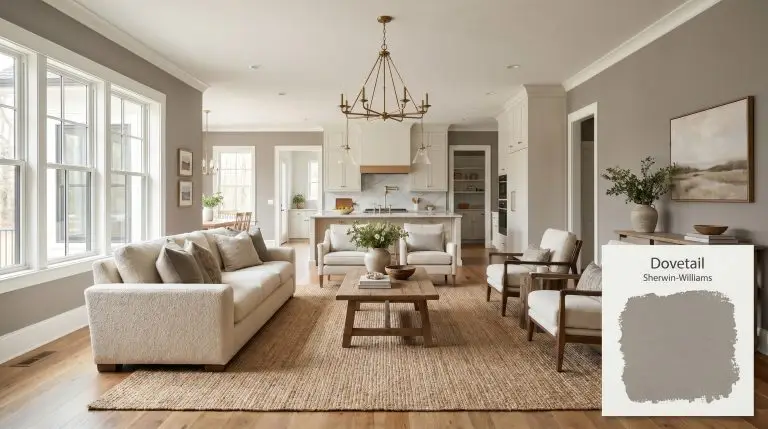
Sherwin-WilliamsSherwin-Williams Dovetail (SW 7018) is a sophisticated, medium-to-dark warm gray paint color with an LRV of 26. Grounded by brown and taupe undertones, it strikes a beautiful balance between earthy and modern, making it highly versatile for both interiors and exteriors.
| Temperature | Warm-neutral |
|---|---|
| Primary Undertone | Brown and Taupe |
| Hidden Undertones | Subtle green or yellow depending on lighting |
| Best Exposures | South, West, East |
| Best For | Kitchen cabinets, home exteriors, accent walls, bathroom vanities, living room walls |
Hackrea Review
Dovetail is a powerhouse neutral that brings significant depth without tipping into the harshness of a true charcoal. We love it for grounding kitchen islands or adding curb appeal to exteriors, provided you have the natural light to support its lower LRV.Architectural Applications & Styling Recipes for Sherwin-Williams Dovetail
Kitchen Cabinets and Islands
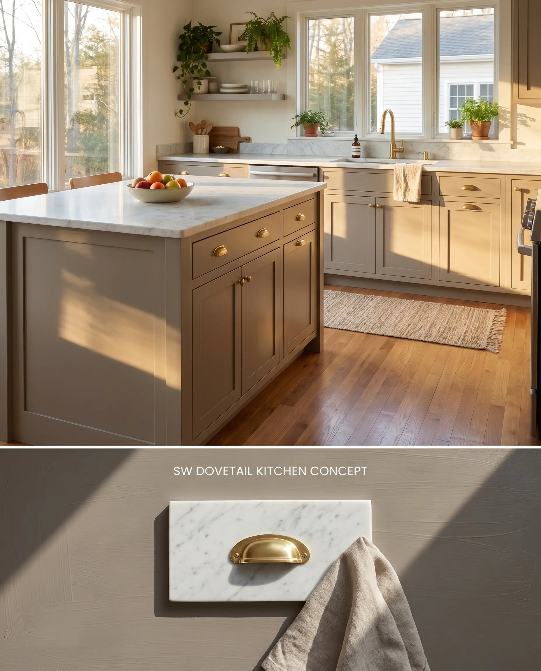
Anchoring a kitchen island with this warm gray creates physical weight at the center of the room. Its taupe undertones actively bridge the thermal gap between cool stone countertops and warm hardwood flooring by reflecting the ambient warmth of the wood. Using it on lower cabinetry grounds the layout while allowing lighter upper cabinets to recede optically.
Home Exteriors (Siding and Trim)
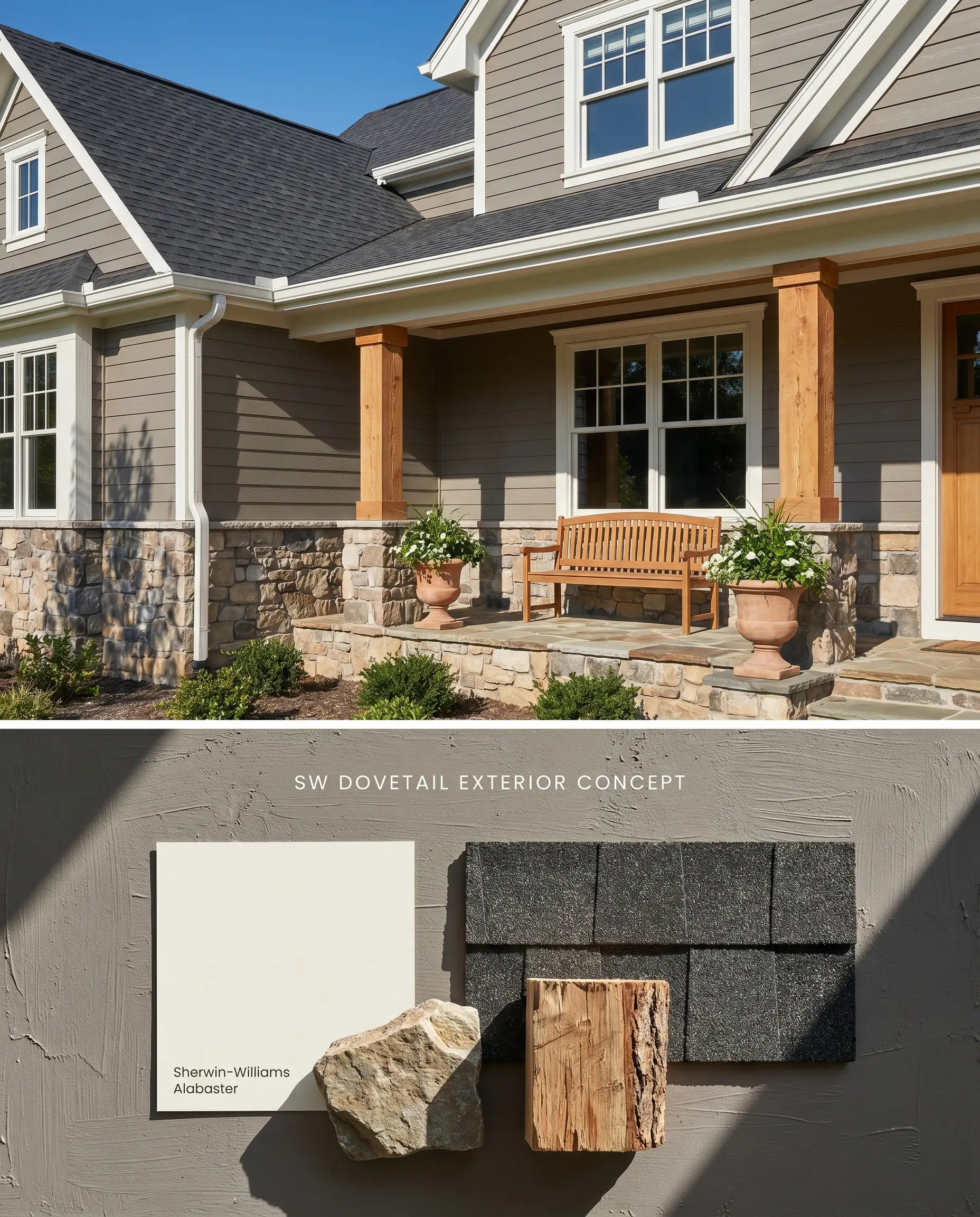
Under direct ultraviolet exposure, the physical pigments in exterior siding painted this shade reflect enough light to shift the color from a dark shadow into a medium-toned greige. The inherent color depth prevents the facade from optically washing out against bright skies. It grounds the exterior architecture when layered against natural stone foundations or raw timber columns.
Accent Walls in Living Rooms
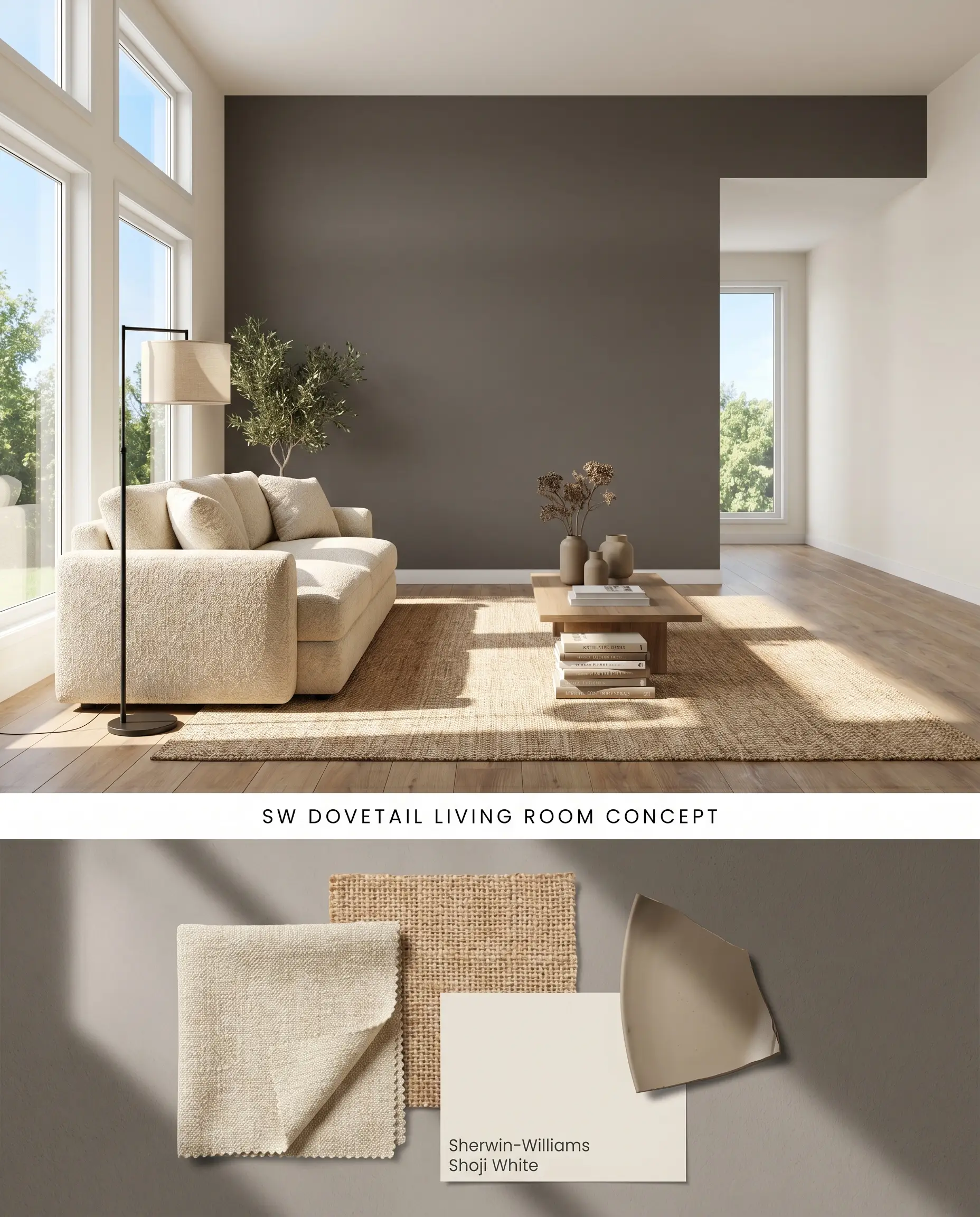
Applying this shade to a single focal wall defines the architecture of an open-concept space without creating a low-light trap. The flat finish absorbs ambient glare from televisions or large windows, allowing the taupe undertones to project a soft, structural presence. This application visually pushes the wall back, expanding the perceived footprint of the room.
Bathroom Vanities
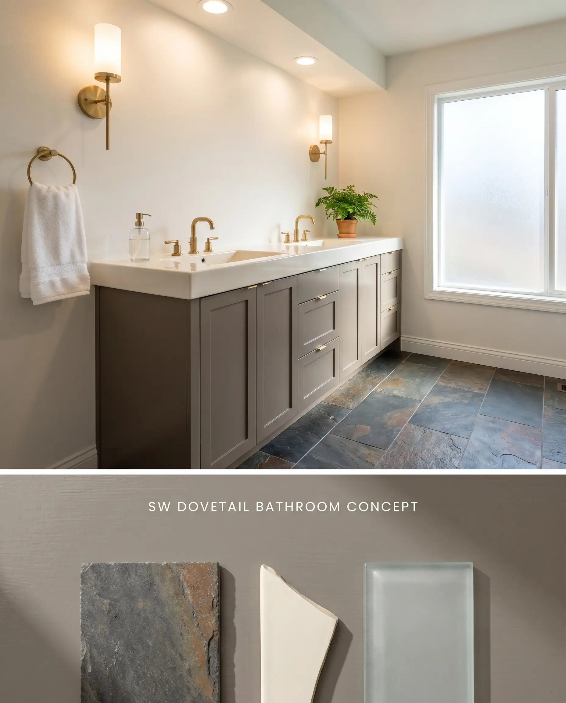
Applying this Sherwin-Williams greige to a vanity introduces immediate structural contrast against standard porcelain fixtures. The yellow/brown hue family interacts with warm-toned bathroom lighting to neutralize the optical sterility of white sinks. It requires careful tile coordination, as the undertones will actively fight against the wrong stone.
Dining Rooms with Ample Natural Light
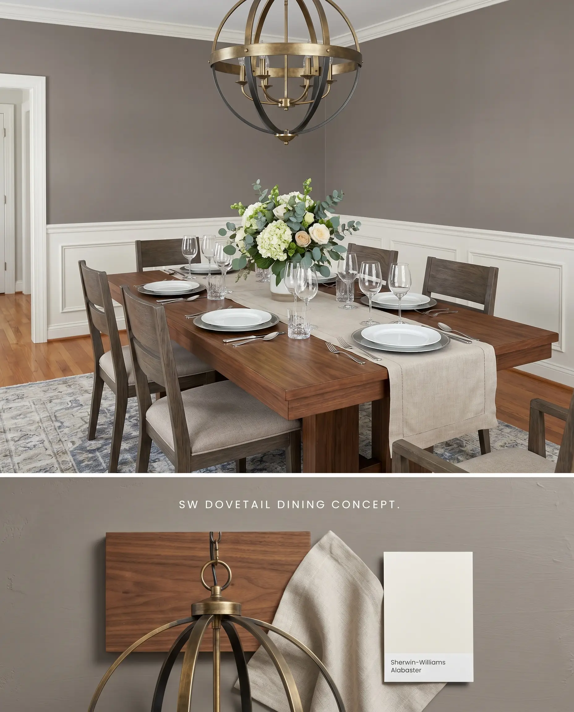
Wrapping a dining room in this mid-tone color creates a tailored envelope that shifts dynamically as the sun moves. By utilizing its exceptional hide coverage, DIYers can achieve a seamless, rich backdrop that anchors a large dining table. The LRV 26 rating ensures the walls absorb enough light to make metallic chandeliers and sconces physically pop against the dark ground.
You can apply wallpapers, paints, etc. on walls and see how they look in various interiors.

Comparative Color Theory: Mid-Tone Grays and Greiges
Sherwin-Williams Dovetail SW 7018 vs. Sherwin-Williams Dorian Gray SW 7017
Sherwin-Williams Dorian Gray SW 7017 (LRV 39) reflects significantly more light and leans cooler than Dovetail. In a space lacking intense natural illumination, Dorian Gray maintains a recognizable gray presence, whereas Dovetail absorbs the light and reads much darker. Specify Dorian Gray for transitional living spaces with average light, and reserve Dovetail for high-contrast cabinetry or sun-drenched exteriors.
Sherwin-Williams Dovetail SW 7018 vs. Benjamin Moore Chelsea Gray HC-168
Benjamin Moore Chelsea Gray HC-168 (LRV 22) drops the reflectance slightly and possesses a distinct olive-green undertone, anchoring it firmly in the green-gray category. Dovetail sits squarely in the yellow/brown hue family, projecting a taupe-leaning warmth. Utilize Chelsea Gray when working with red-toned brick or terracotta tiles to neutralize the red, but deploy Dovetail when coordinating with natural oak or warm walnut floors.
Sherwin-Williams Dovetail SW 7018 vs. Sherwin-Williams Gauntlet Gray SW 7019
Sherwin-Williams Gauntlet Gray SW 7019 (LRV 17) drops the reflectance value drastically, creating a much deeper, moodier charcoal presence. While both share the warm, taupe-leaning DNA, Gauntlet Gray requires substantial architectural lighting to avoid absorbing all the visible light in a room. Deploy Dovetail on interior accent walls where mid-tone contrast is needed, and push to Gauntlet Gray for striking exterior trim or high-gloss front doors.
Technical FAQs
No. In cool, North-facing light, it loses its taupe warmth and reads as a straightforward, traditional cool gray, but its strong yellow/brown base prevents it from shifting into purple or blue territories.
It pairs exceptionally well with warm-toned woods. The yellow and brown undertones in the paint physically harmonize with the golden hues in honey oak, creating a cohesive, earthy palette.
Direct ultraviolet light washes out the darker shadows, causing the paint to reflect more light and appear as a soft, medium-toned warm gray rather than a dark, oppressive shade.
Yes. With an LRV of 26, this color absorbs a significant amount of ambient light. In spaces lacking adequate illumination, it will read as flat, drab, and structurally oppressive.
Similar Paint Colors
Same Brand
Cross-Brand Equivalents