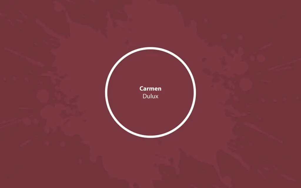
Carmen S02F8
DuluxA deep, saturated burgundy inspired by the wine color that will add stylish fragrance and luxe to your home, both inside and outside.
Paint Technical Profile
| Color ID / SKU | S02F8 |
| HEX Code | #7d3840 |
| Light Reflectance (LRV) | 10 |
| Use | Interior, Exterior |
Carmen (Dulux): What Color Is, Review, and Use
It’s not a secret for anybody that red is the on-trend tone of the season. Both the fashion and design worlds embrace this color to the fullest. While reds in their original form – bright and stimulating are not liveable in large doses, deeper variations are a go-to option in contemporary design. Burgundy is a very promising shade of red. Whether as an accent or primary color in a space, violet-red delivers sophistication and a home feeling. If you keep pace with the latest color trends and want to try the popular burgundy color in your home, start with a time-tested one – the beautiful Carmen paint color from Dulux.
Carmen Paint Color Features
We cannot help but start with the appealing name of this paint color. It has Spanish and Hebrew origins, meaning “garden”, “orchard”, and “vineyard” – no wonder a wine red paint color was given the name Carmen. This deep red shade has so much saturation despite its dark color base. At times romantic, inspired by the past, and replicating a modern accent red, the violet-red from Dulux is one of the most sought-after colors in interior and exterior design. While colorists recommend integrating it as a statement wall or furniture, more designers are embracing the idea of an all-burgundy palette. The rich pigmentation in Carmen by Dulux allows for an array of design ideas that will bring visual appeal to the interior.
Carmen: Is It Warm or Cold?
We can all agree that Carmen cannot be even slightly associated with the cool side. Almost all red variations are warm, especially this deep burgundy, which resembles a glass of recently poured red wine enjoyed in the company of the French Provence landscape. In the RGB value (red-green-blue concentration), the red one wins through without question. This proves one more time that Carmen is a warm paint color.
How Does Lighting Affect Carmen?
Even a confident color like Carmen takes different turns under various lighting conditions. For instance, in a room with north-facing windows, the bluish natural light casts a foggy veil on the red shade, bringing a subtle violet-blue undertone to the surface. This color gets richer in the warm natural light that floods south-exposed spaces. Here, Carmen has a glowing, earthy red color base. A cherry-fragrance burgundy will delight your eyes where sun rays bathe a painted surface.
We warn you that a dark red like this will feel much more muted and deeper at night in the lack of artificial lighting. Decorate the space with enough wall sconces, floor lamps, and pendants to preserve the saturation and avoid a daunting effect.
Carmen LRV
We were impressed to find out that Carmen is that dark, given its catchy coloration. It has a Light Reflectance Value of 10, reflecting 10% of the light it receives. Unsurprisingly, designers don’t recommend it in small rooms with no access to natural light. Even if you go for the trending moody palette with all walls painted burgundy, make sure there is enough natural or artificial lighting. Otherwise, you risk achieving an overly dark color palette.
Carmen Undertones
According to colorists, this dark and juicy red tone has gray undertones and a hint of subtle violet. Well, it wouldn’t be the color it is without a dash of grape violet. Every undertone knows its way around red when the proper lighting enters the game.
Similar Colors
Let’s go through the top red paint colors, similar to the gorgeous Carmen from Dulux. Other paint brands also decided to take part in this selection.
Coordinating Colors
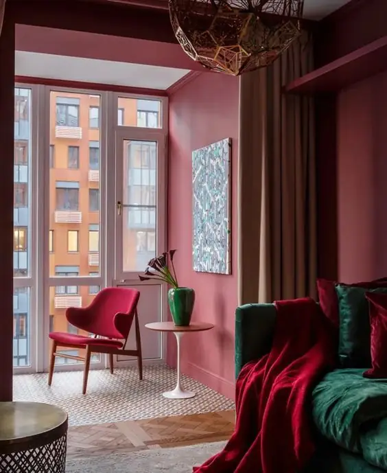
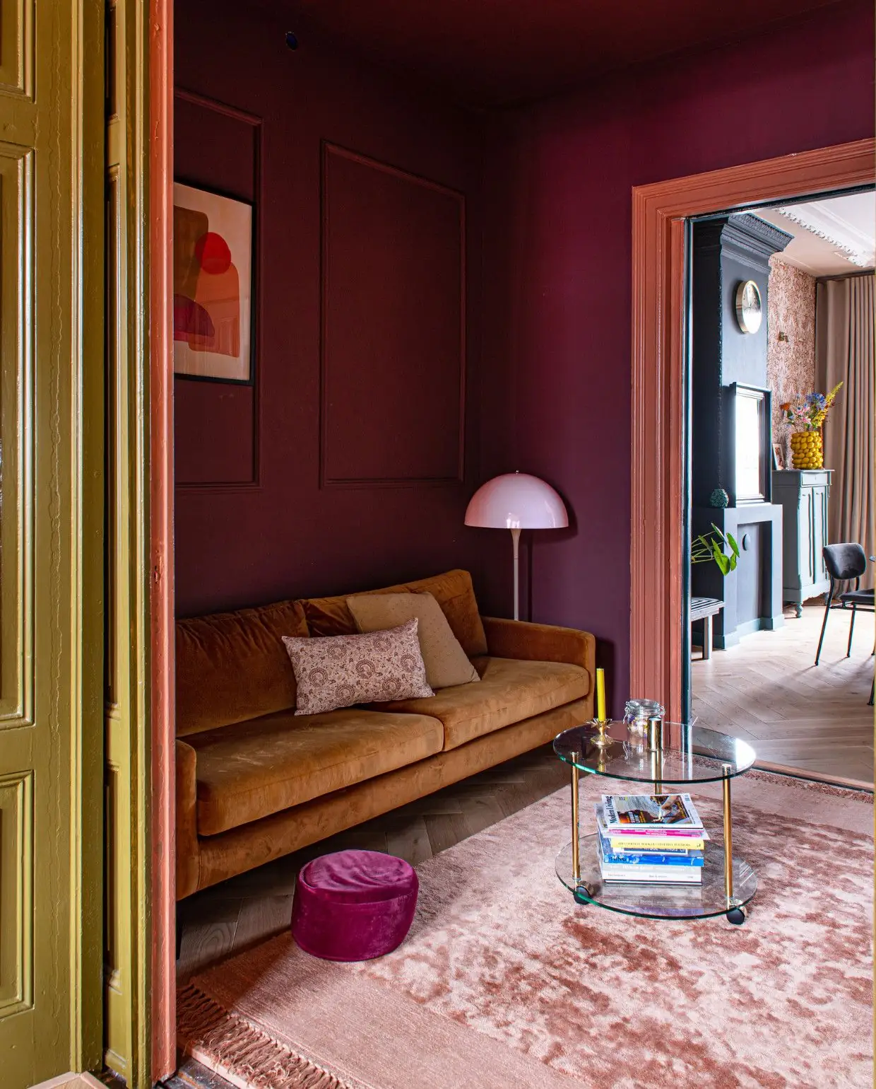
Given the fact that Carmen by Dulux is a more or less accent color, it would be wise to pair it with neutrals. Experts suggest soft neutrals that stand out next to the lavish red. Grays, light pinks, and soft corals all work. Still, if you feel the need for a contrast, think of combining Carmen with green or blue. Here are a few expert-recommended options:
Use of Carmen in Interior Design
Using red in interior design may seem challenging. Yet, knowing some styling tips is enough to add luxury and charm to an overly neutral color code or opt for a fully colorful palette. What materials work best with Carmen? What design style to choose? How do we integrate this burgundy in different rooms? All this and the best ways to style Carmen are as follows.
A Pop of Burgundy
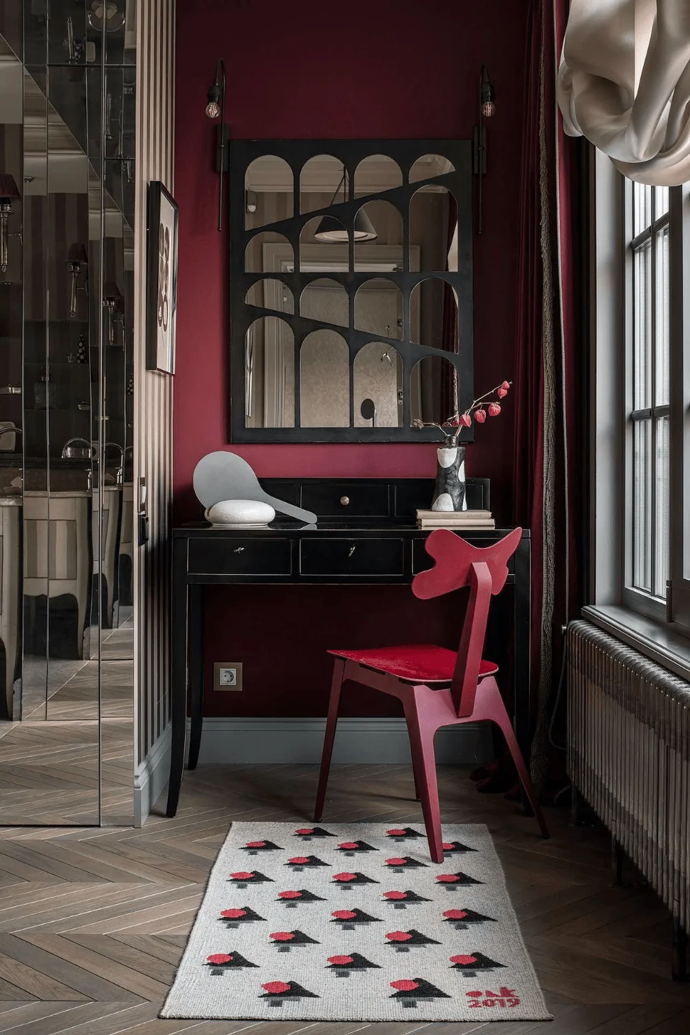
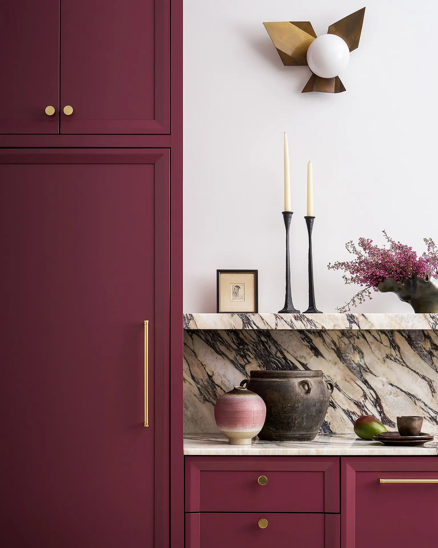
Uplift your mood and elevate the interior design with the smallest dash of red color. For instance, a burgundy bookcase, accent wall, vanity, kitchen cabinet, or architectural features will add expensiveness to a soft, neutral color palette. By the way, any design style will accept it.
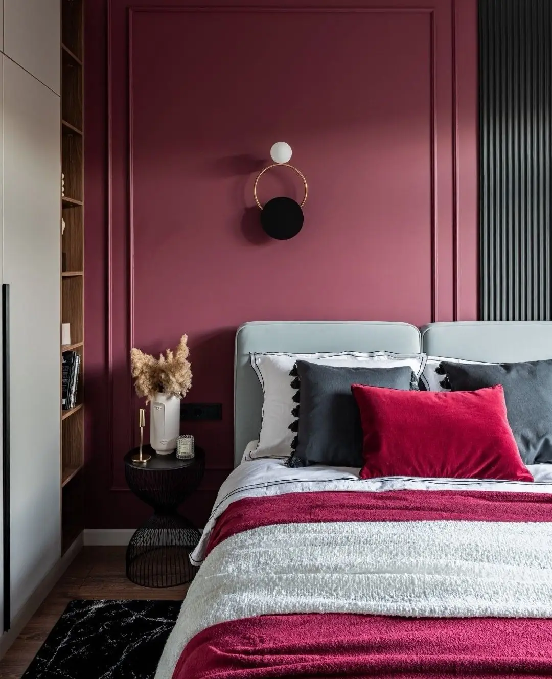
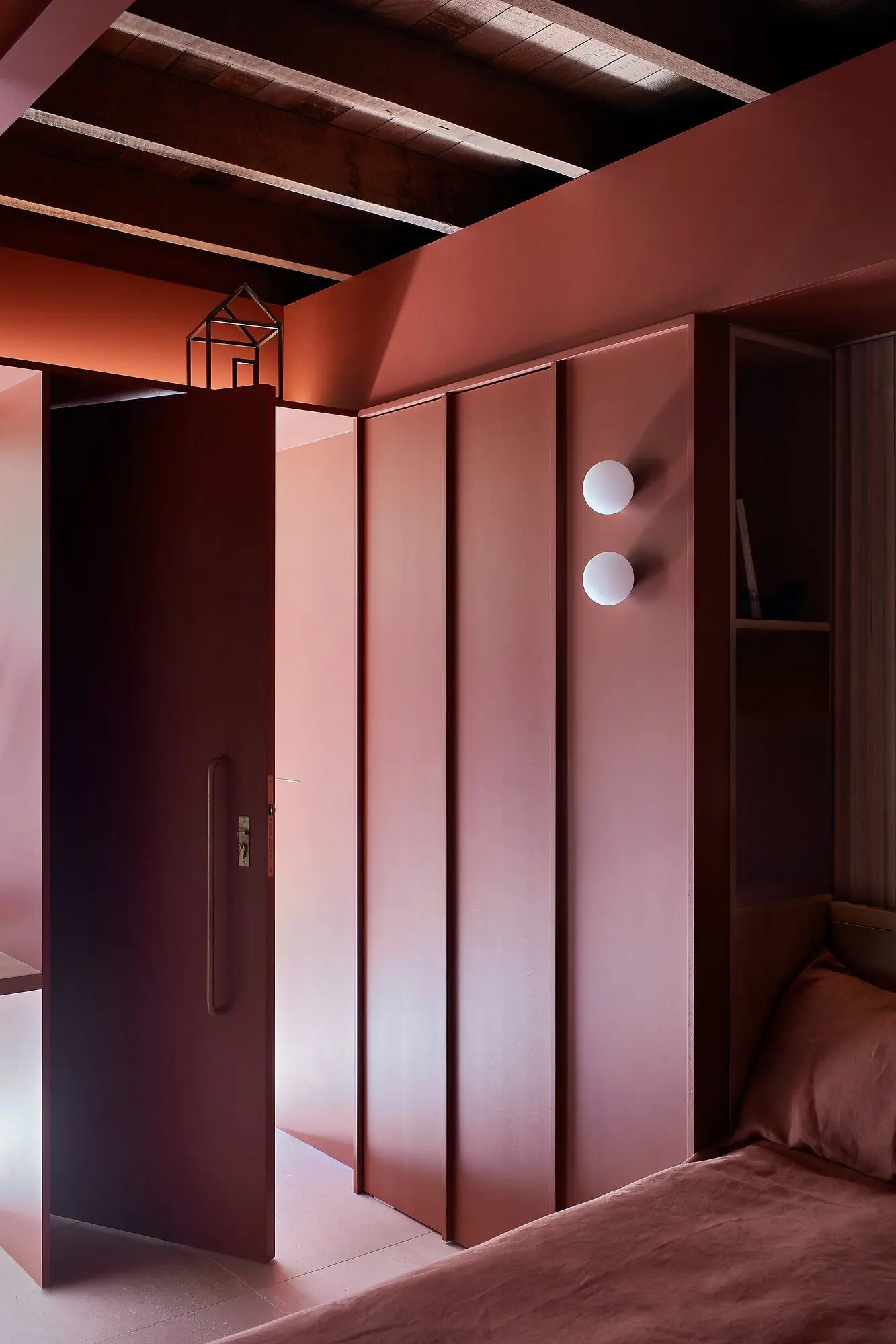
All Red
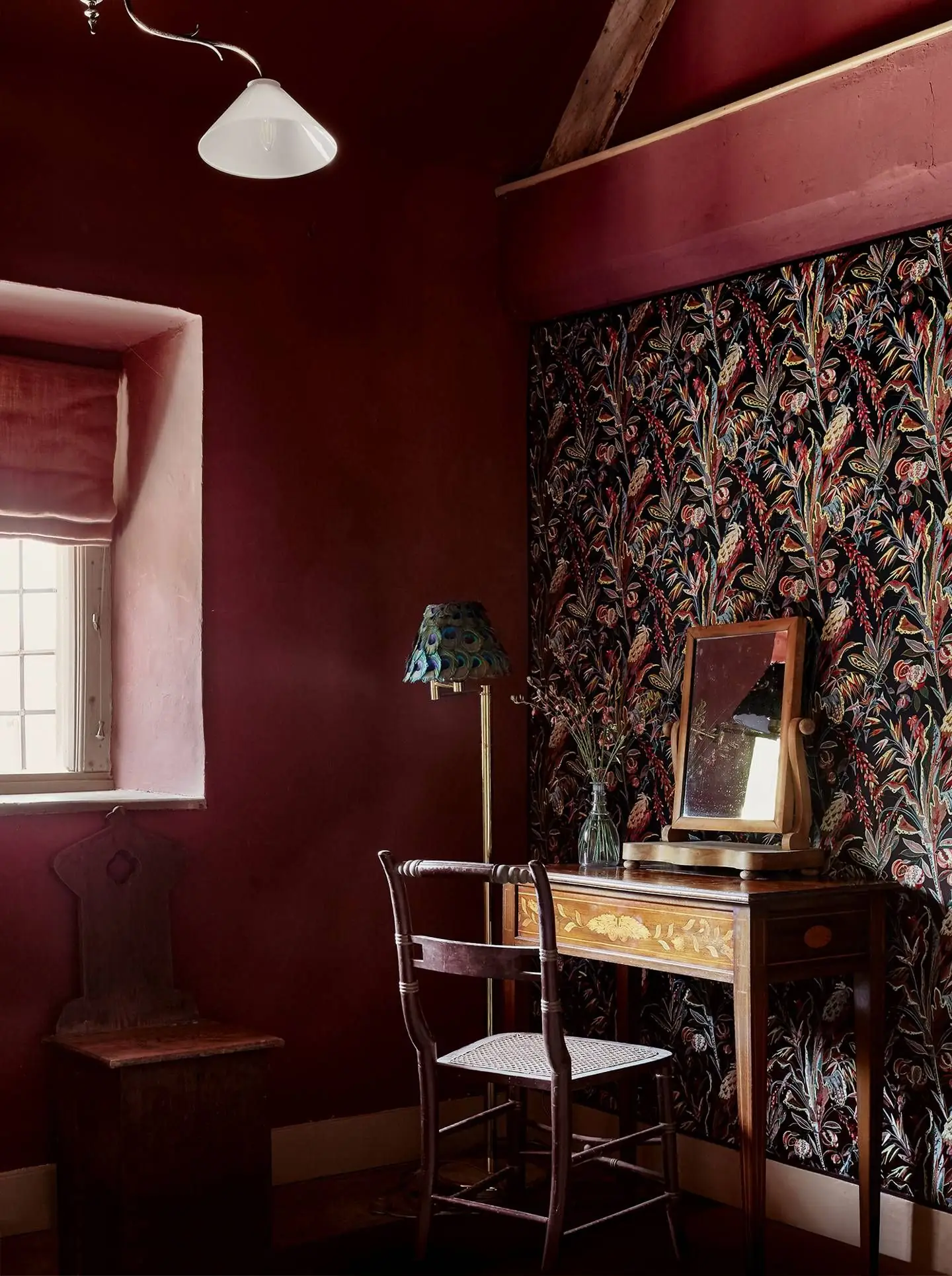
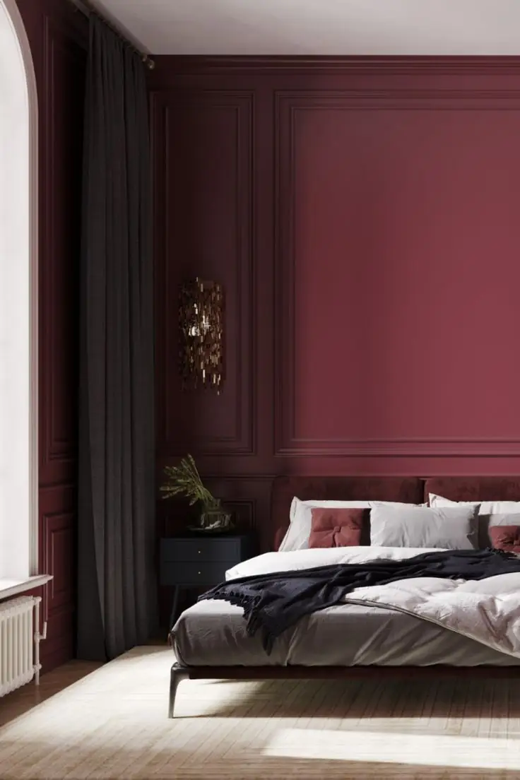
Don’t be afraid to experiment with bold colors. This design season is the right time for more expression. Think of an all-burgundy scheme if you like a moody, chic vibe, especially in the bedroom. Still, don’t forget about lighting. Carmen pairs well with neutrals, wood, and golden accents.
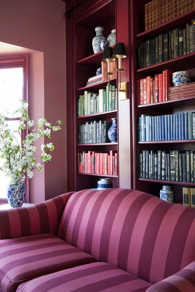
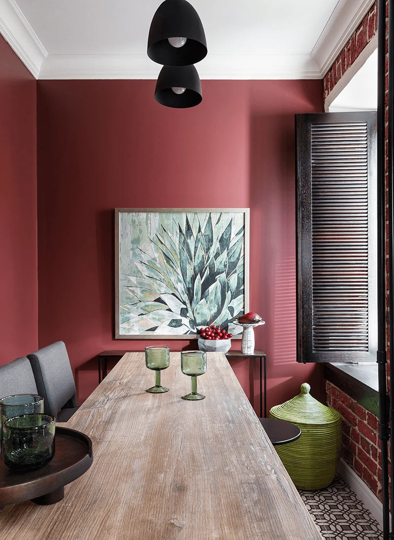
Living Room
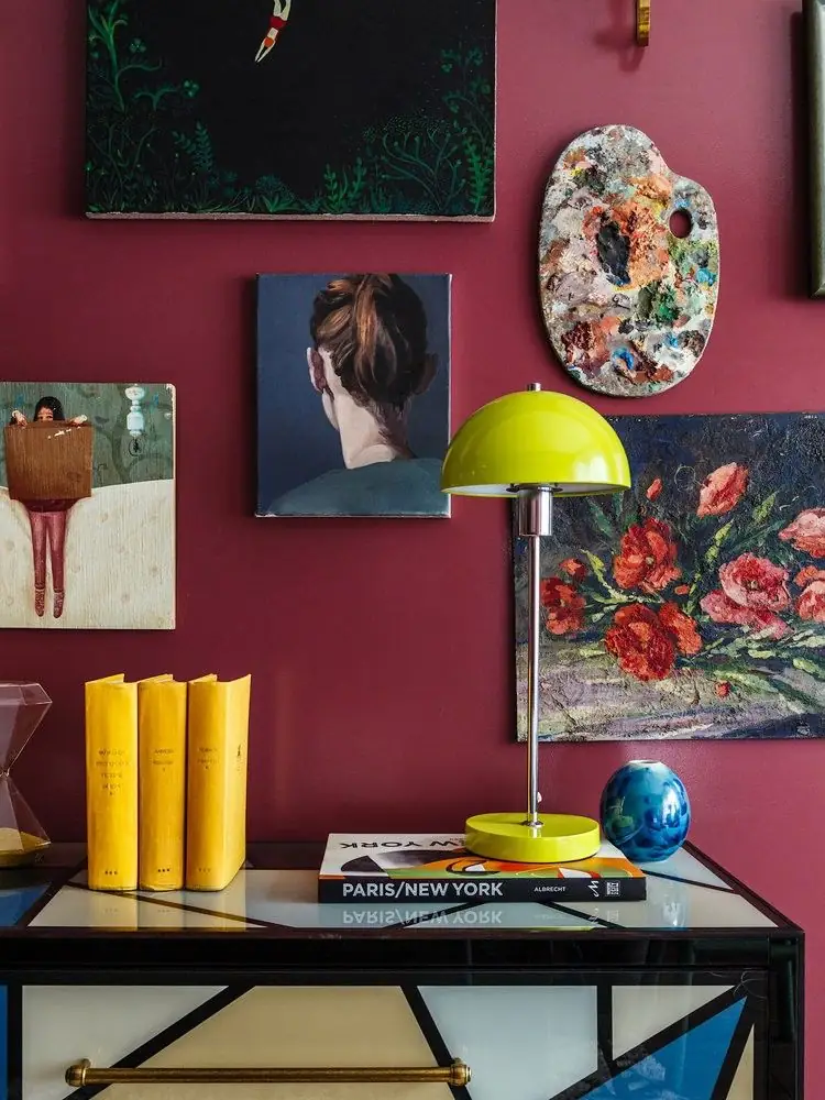
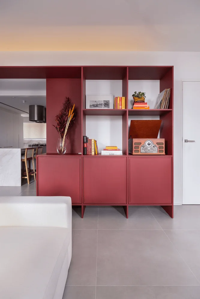
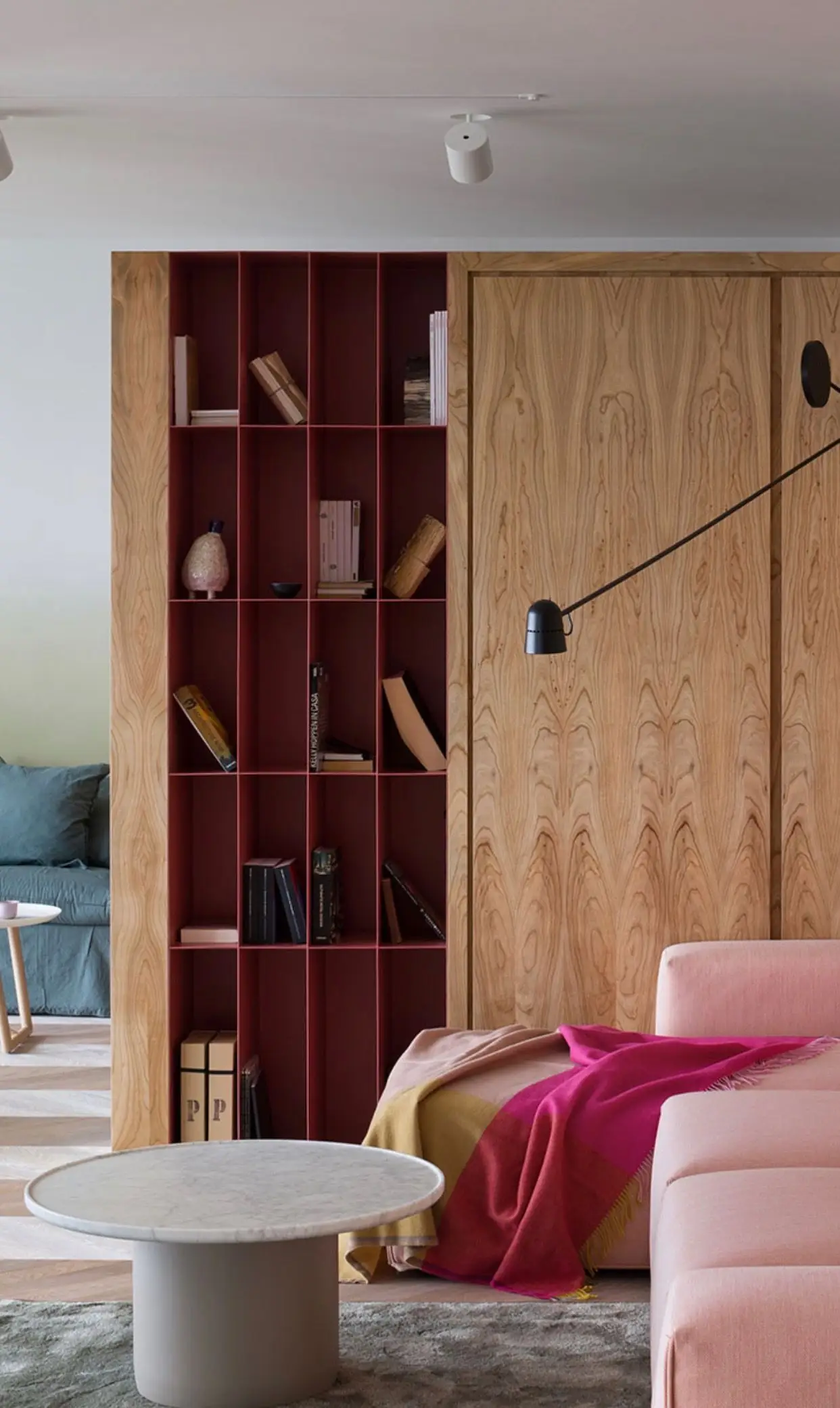
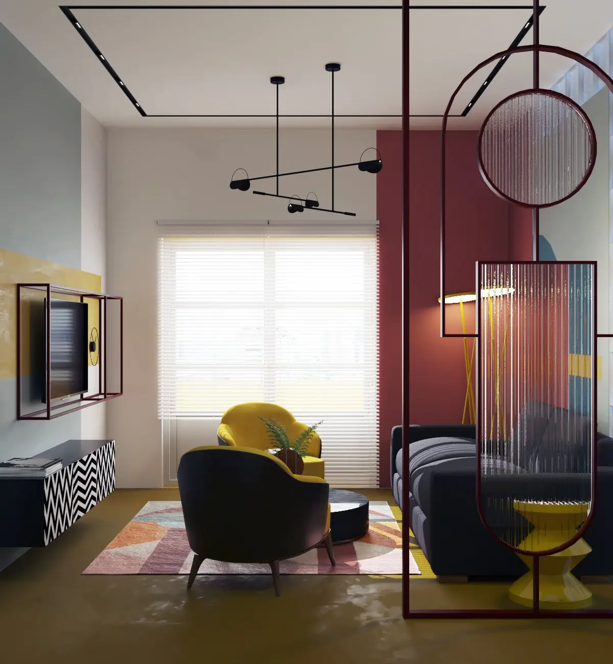
Let your creativity run free in the company of Carmen from Dulux and set an engaging ambiance in the lounge zone. You can enliven the color palette with a burgundy accent wall or bookcase. Or, ensure an intimate and cozy vibe with an all-burgundy scheme for comfy weekend movie sessions.
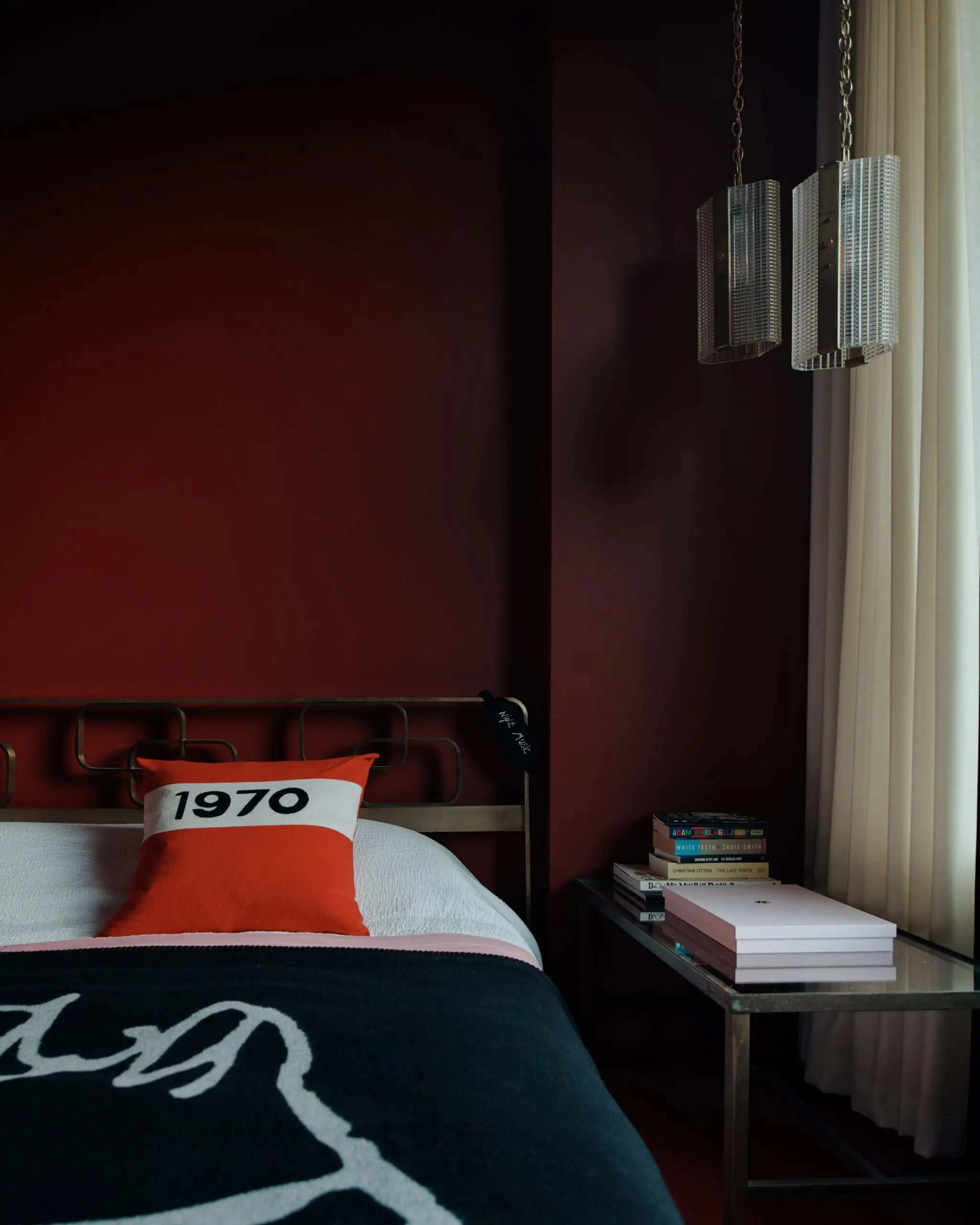
Bedroom
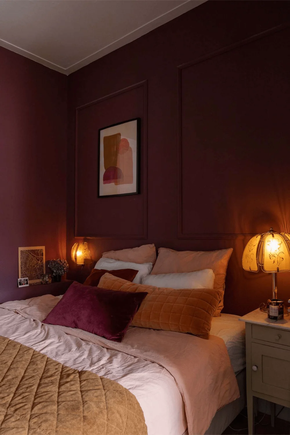
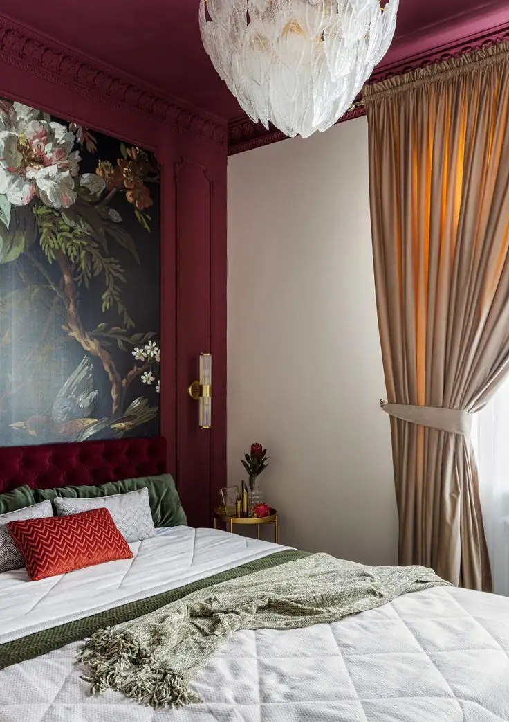
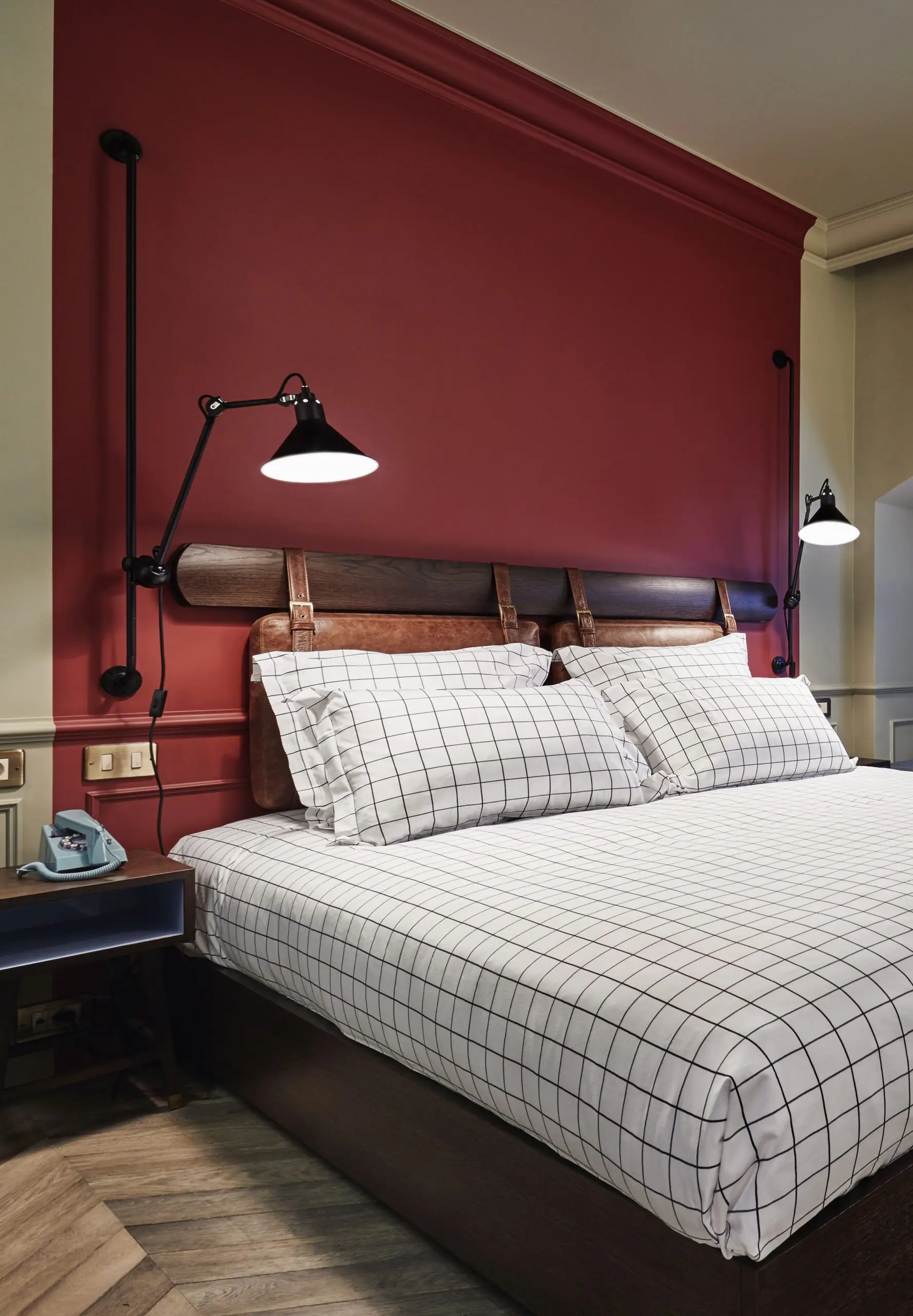
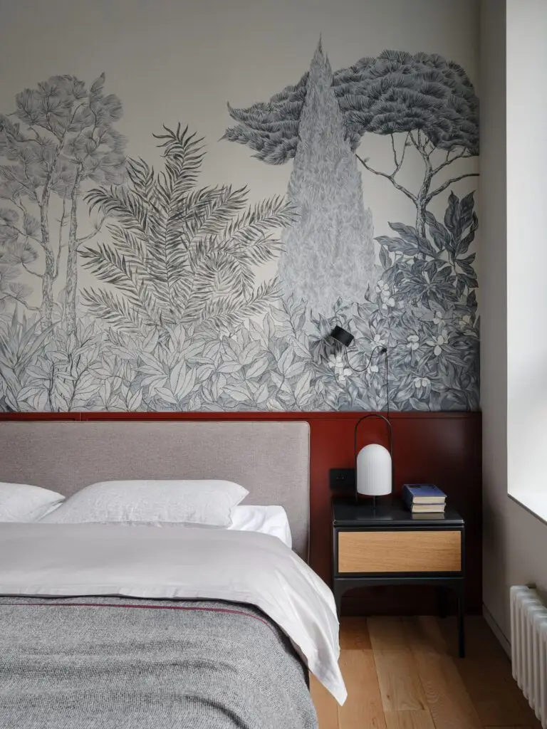
Carmen is one of the best paint colors for the bedroom, where you can feel free to paint with color. It can be an all-burgundy bedroom or a catchy accent to update the bedroom design. Besides, you should know that burgundy is an expensive-looking color that will add luxury to the most minimalist bedroom.
Kitchen
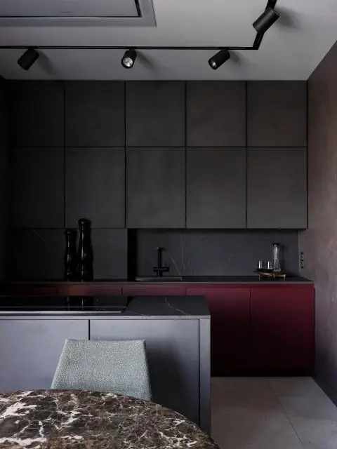
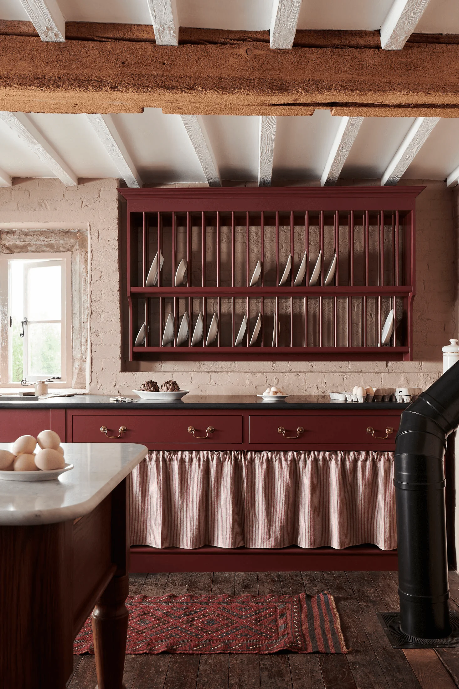
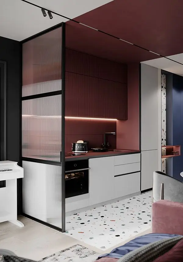
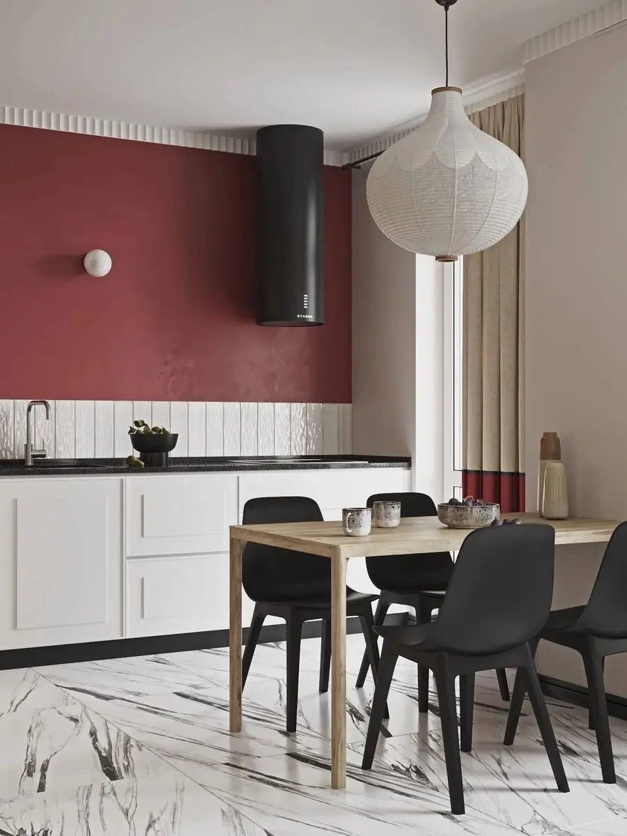
Violet-red is a popular kitchen color. Of course, it mainly suits cabinets. Light neutrals, blacks, and grays look great next to burgundy cabinets. You’ll be impressed to see the same shade of red in traditional, cottage-like kitchens as well as ultra-modern kitchens. Don’t limit yourself when it comes to color.
Bathroom
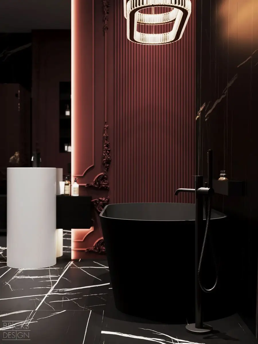
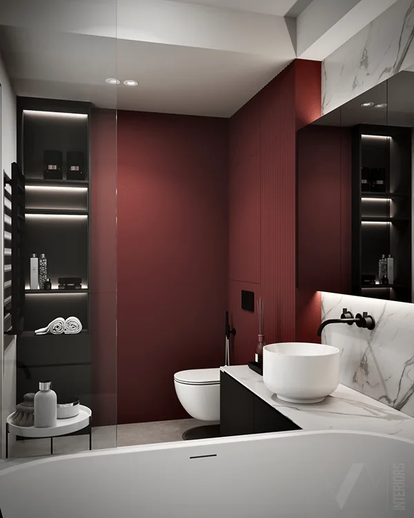
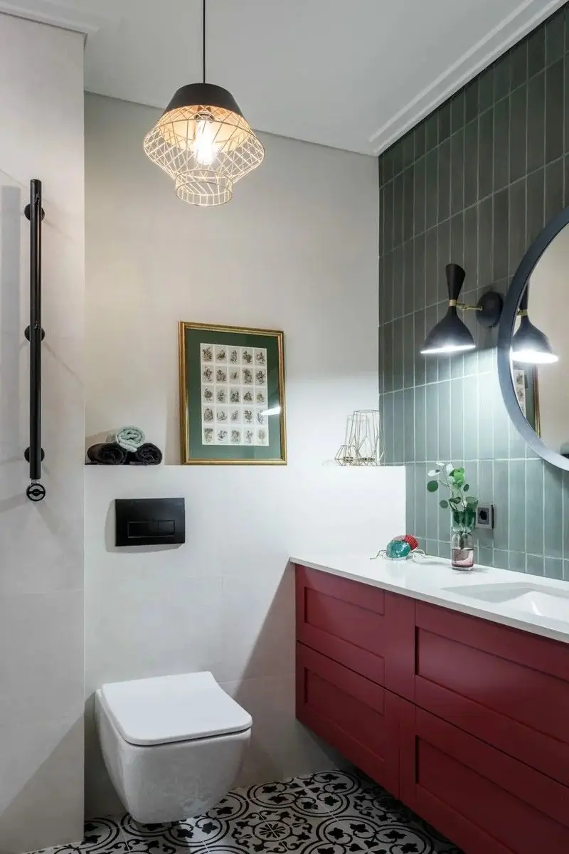
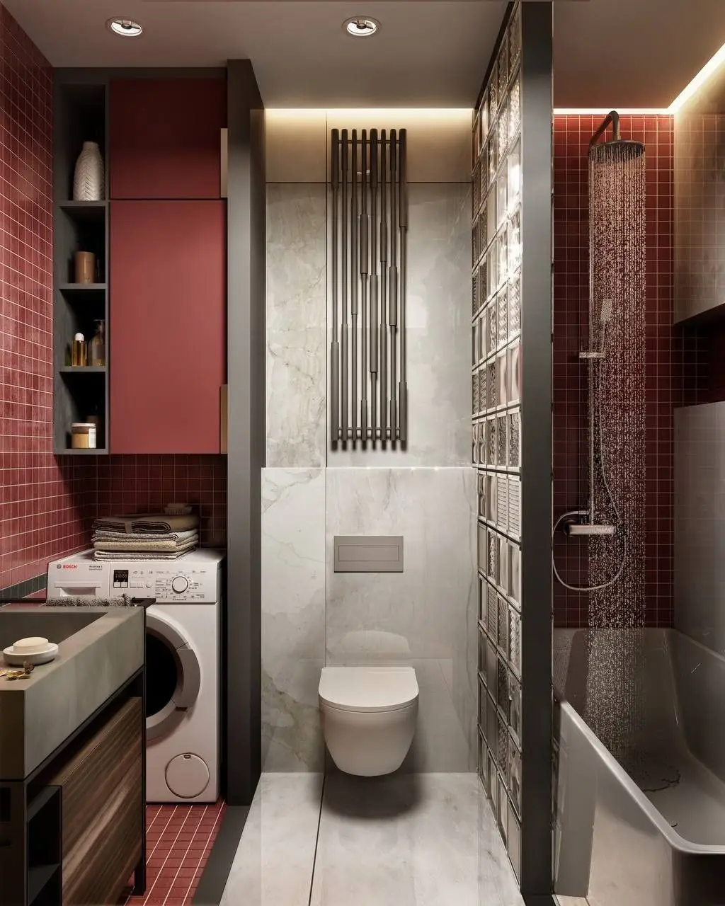
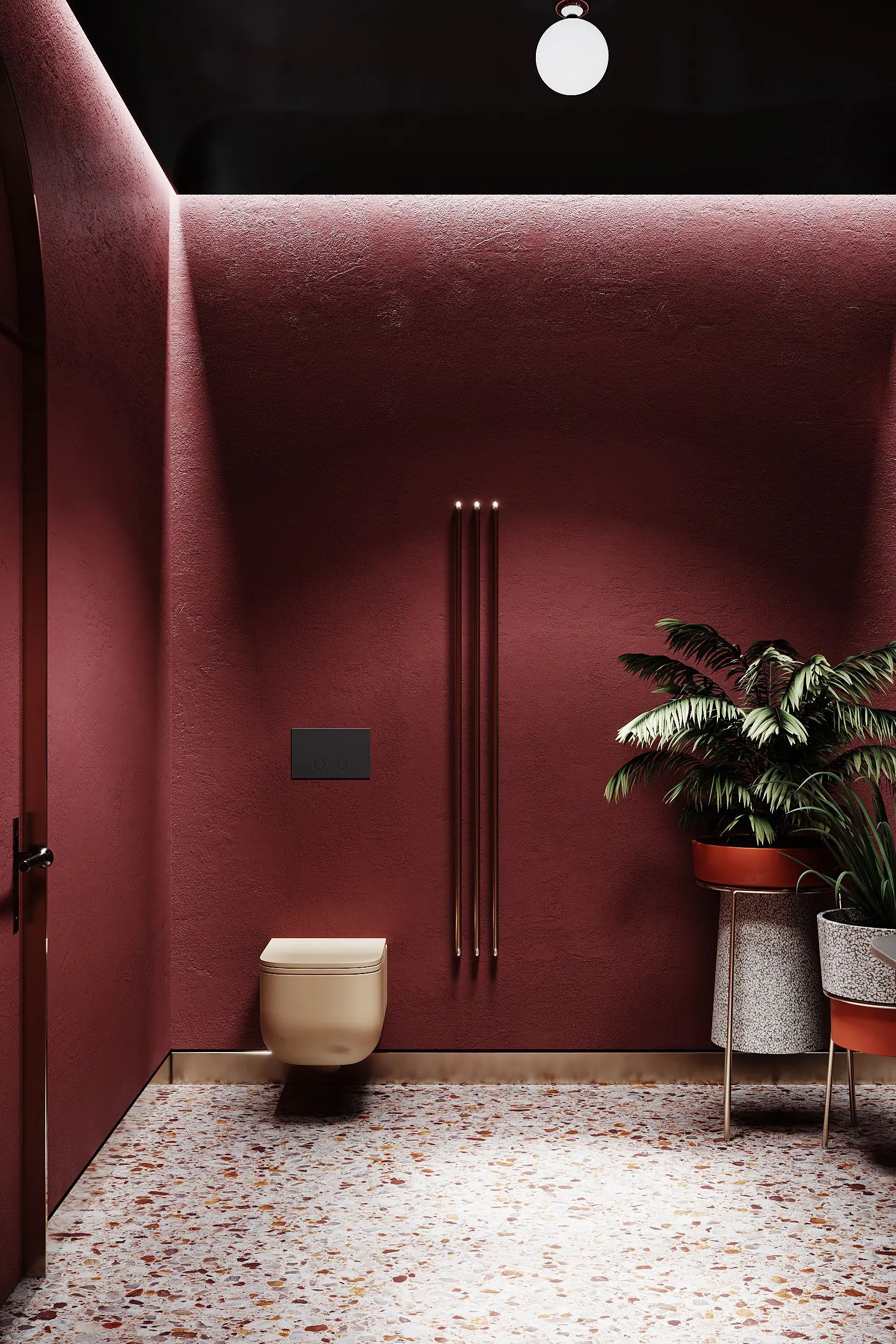
Carmen may seem too deep for smaller spaces like the bathroom, yet a perfect approach to design is the key. Add burgundy accents, and this utilitarian space will turn into the most luxury bathroom. Surround your daily routine with a sumptuous shade of red.
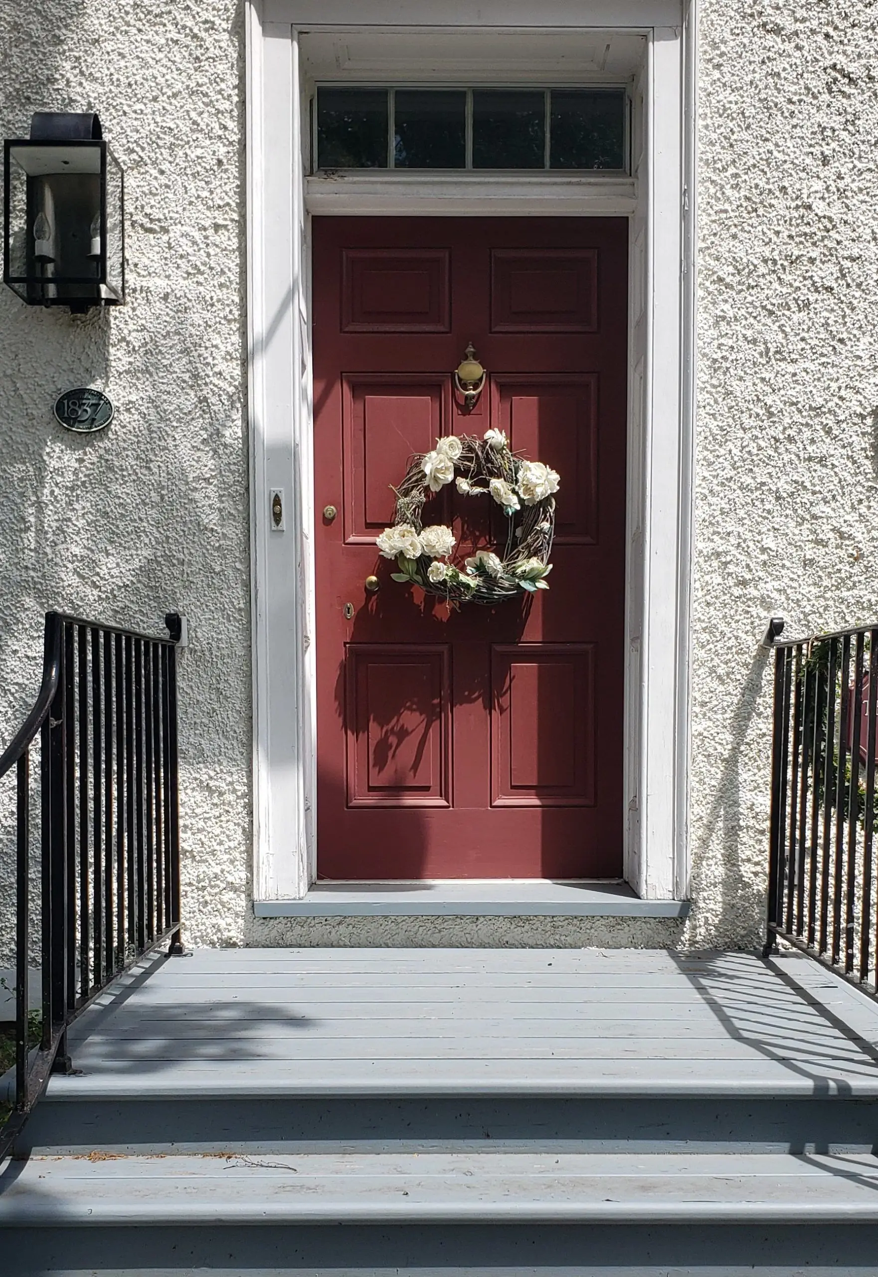
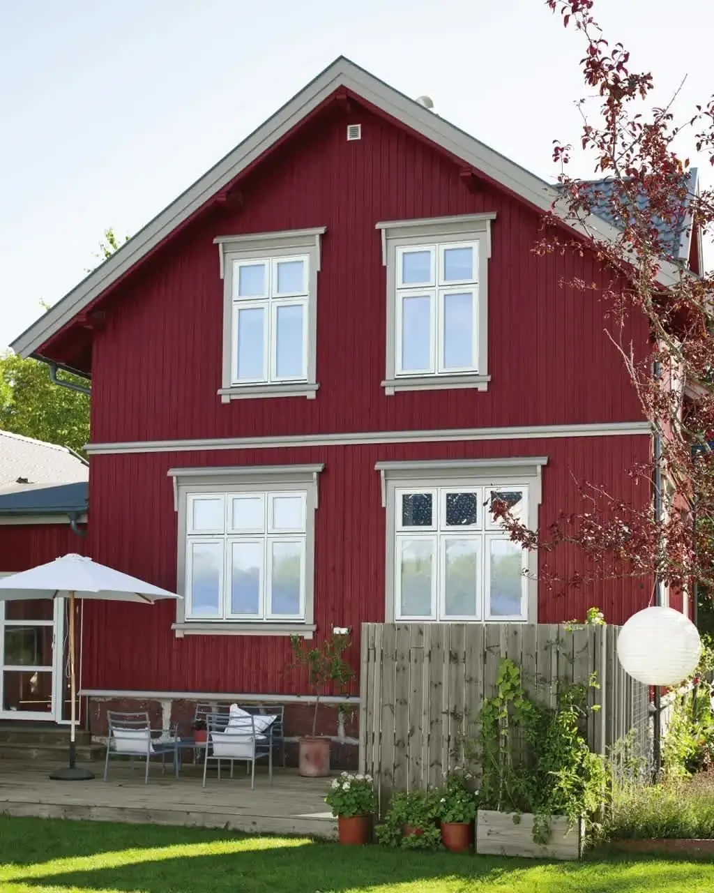
Use of Carmen in Exterior Design
Opt for a catchy exterior paint color to stand out in the neighborhood. Additionally, Carmen by Dulux is confident, elegant, and timeless, and it will add exclusiveness to the exterior design. Experts agree that Carmen looks good both on the walls and the front door.
The Carmen paint color from Dulux is an impressively courageous shade of red. Inspired by the wine color, this rich and saturated violet-red brings together a handful of luxurious features – perfect to elevate your home’s design.