A rather dark shade of blue dominated by cool notes, which the presence of gray is responsible for, and radiating an appealing softness due to its rather pastel appearance.
Try Adirondack Blue paint in a room with Hackrea Visualizer
Adirondack Blue (Behr N480-5): what color is, review, and use
If you have been with us for a long time, you have probably noticed that we have not referred this often to blue shades. Although not that many on our list, which we tend to expand, once we review a particular shade of this kind, it means it is really special. This is the case with the newly discovered color Adirondack Blue from Behr. The name itself implies a mystery, an inspiring backstory, a source of beauty. What is it actually traced to?
Adirondack Blue is a fabulous shade of soothing blue, which may seem a rather cool yet intense gray with blue undertones. Its name is no less impressive than the shade itself. Inspired by the Adirondack mountain range that finds itself in the northeastern part of New York state, this shade of blue replicates amazingly the far-reaching mountain peaks surrounded by slight particles of fog. As strange as it may sound, such scenery indeed reflects this magical color that hypnotizes with its grandeur.
Let’s get back to our reality. Among other things, Adirondack Blue is a popular shade, which should not be mistaken with another pearl of this kind – Favorite Jeans SW 9147 from Sherwin Williams. The latter is a bit lighter, although the balance of undertones is preserved. Nevertheless, they are unique and behave differently within the interior and exterior. Let’s break down Behr’s N480-5 shade into pieces and analyze each in part!
Adirondack Blue paint color features
Adirondack Blue is a rather dark shade of blue dominated by cool notes, which the presence of gray is responsible for, and radiating an appealing softness due to its rather pastel appearance. It feels like a modern breath of fresh air, quite imposing due to its intense hidden scents but undoubtedly pleasing to the eye. As usual, there are factors that affect its appearance so that this shade can feel at times exceptionally fresh and at others – quite accentuated yet within limits.
You can apply wallpapers, paints, etc. on walls and see how they look in various interiors.

Adirondack Blue: is it warm or cold?
A shade inspired by the mountain peaks cannot go any other way than spread particles of cool air, if not even cold, all over the space. Still, its quite pale base cannot help but radiate a few notes of softness, the kind that fills the space with a pleasant feeling of ease. One should consider that the exquisitely refreshing features of this shade are the result of gray prevalence. As already mentioned, the color itself seems like a shade of gray, but once you compare its sample with an actual gray, you get convinced of its belonging to the blue category.
How does lighting affect Adirondack Blue?
The more light the space receives, the fresher Adirondack Blue feels. Once the amount of light is limited, this shade gets entirely covered by a coldish gray veil. What about an ideal environment with balanced lighting conditions? Well, this color reaches its best level, replicating an intense shade of blue with a hint of cool gray. Actually, its hidden particles are so intense that it acquires a particular kind of depth.
Adirondack Blue LRV
After the description we have already made, it is clear as day that Adirondack Blue has a relatively low light reflectance value. But… This is when it surprises us again. The LRV for this shade is 23, which means that it is still able to reflect a particular amount of light under good lighting conditions. This phenomenon can be witnessed particularly in south-facing rooms bathed by great amounts of daylight, making this color put on a considerably lighter mask.
Adirondack Blue undertones
This beautiful shade from Behr is devoid of any other undertones but a hint of gray that takes the form of a foggy surface, preserving the rather stately look and impressively contemporary feel for this color. The balance of these undertones also offers this color a pastel appearance, although quite intense, which can be noticed only in particular conditions.
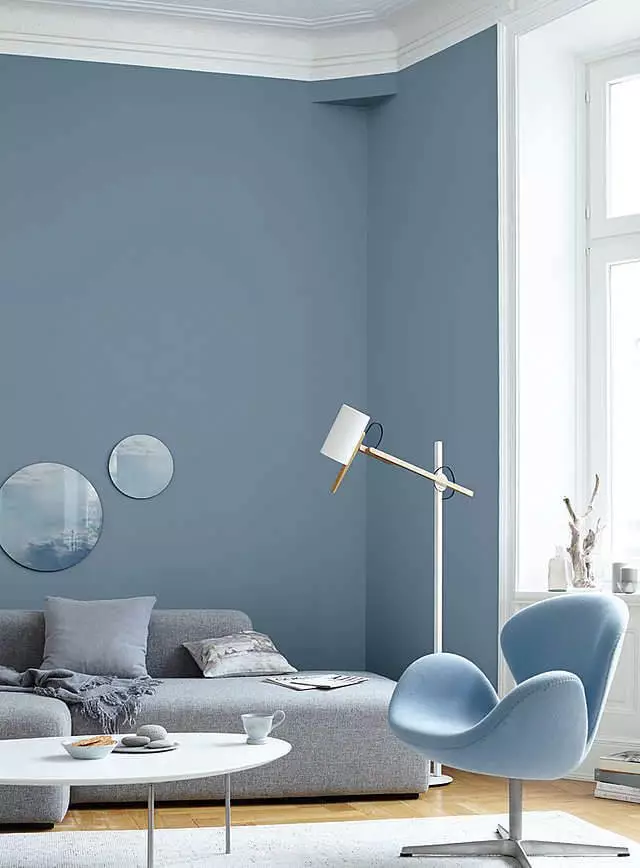
Similar colors
This color can be witnessed in nature at particular times and under appropriate conditions, which adds enough uniqueness to call it original. Nevertheless, soothing shades that involve the pairing of blue with gray are many, each being of outstanding beauty and flair. The same Behr offers a wide range of variations in this sense, but no less exceptionally impressive are shades of this kind at other paint manufacturers. Let’s discover them one by one!
Coordinating colors
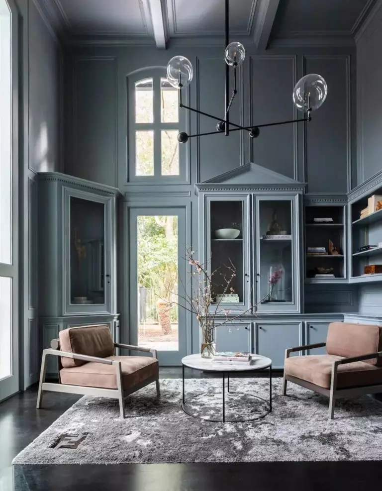
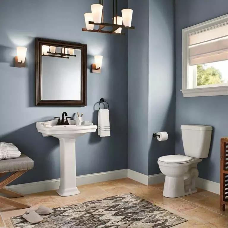
Although its impressive depth and mysterious combination of undertones reveal themselves differently in particular situations, Adirondack Blue is happy to cooperate with a wide range of shades. It is ready to offer a hint of freshness to darker shades, balance the rich undertones of bold accents, and even play with the soothing variations of the latter. As usual, experts from Behr have prepared an entire list of colors that go with Adirondack Blue. Let’s take a look!
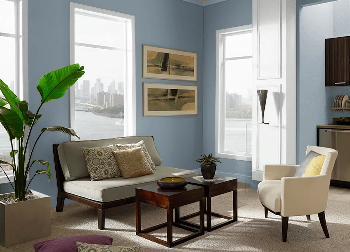
Use of Adirondack Blue in interior
As we have already mentioned, Adirondack Blue feels like a contemporary breath of fresh air, which means that it refreshes a particular style till it reaches a contemporary level, breathing new life in traditional settings and adding an extra modern touch to the newest style variations. As noticed in the list of coordinating colors for this shade, Adirondack Blue is quite versatile, making it a perfect option for any style. Let’s see how it works in practice!
Sleek contemporaneity
Pick a style you want, add a bit of Adirondack Blue, and redefine your interior. A tiny splash of this shade on the walls will elevate any style to the next level. It is a perfect background for dark wood vintage elements, a standout companion for classic white pieces of furniture, extremely cooperative with the bold accents of eclectic settings, and impressively friendly towards other soothing shades within functional arrangements. Sometimes, it is even enough to go with an all-blue makeover using this shade to embrace the contemporary state to the fullest.
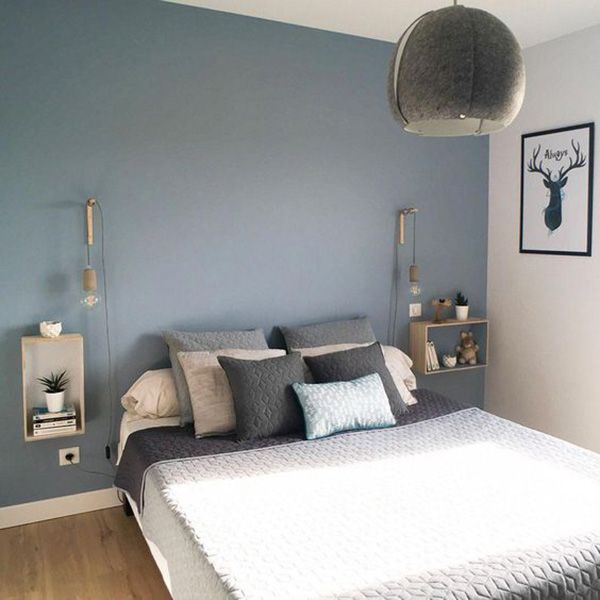
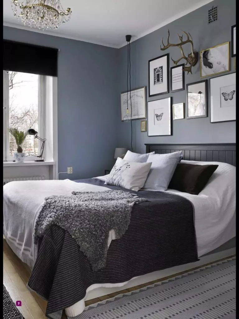
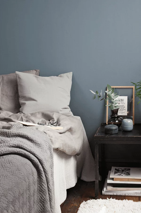
Bedroom
When applied to the bedroom, this shade acquires a whole new appearance, and its deep notes spread a sense of serenity all over the space. This is what spaces like this require – a reliable feel of safety and peace with oneself. How do you work with this color in your bedroom? Well, there are a few ways, each implying painting the walls. As regards the rest, you can go with white as a matching partner and set a balanced combination of two contrasts for a modern feel, play with wooden texture to add a splash of comfort to an overly formal environment, or add a few bold accents or rather their pastel variations for visual interest.
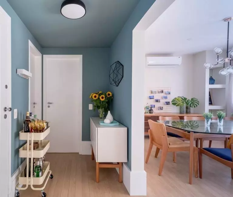
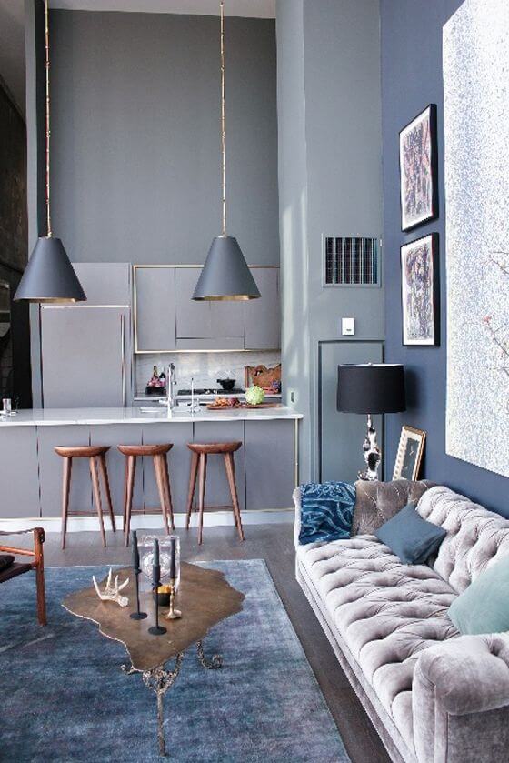
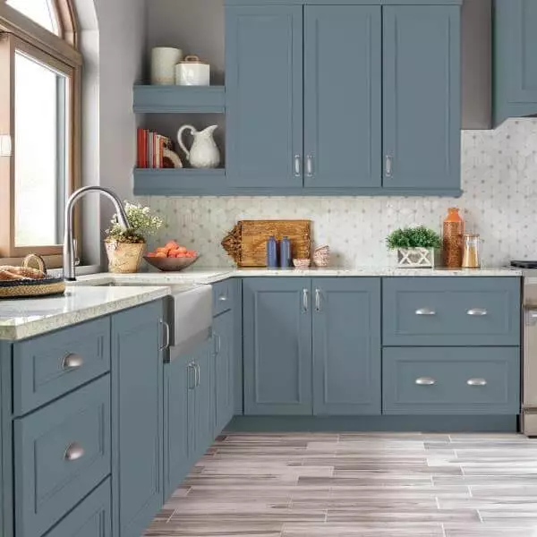
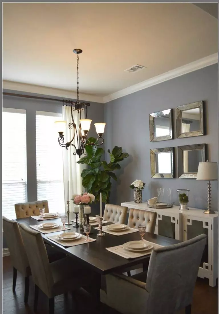
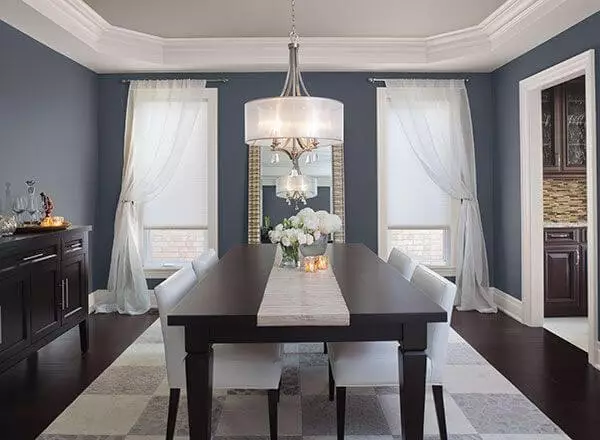
Kitchen and dining room
Although working well with various styles, the kitchen is where Adirondack Blue acquires a whole new meaning. This appealing shade of blue becomes a perfect complement for traditional-style kitchens, particularly when applied to cabinets. Add a few units of steel or copper, and this space will bloom in a whole new way.
Once we enter the dining room, we are free to use this shade of blue within any style, considering it for the walls and opting for either rustic pieces of furniture in their natural beauty or contemporary units that put an accent on functionality.
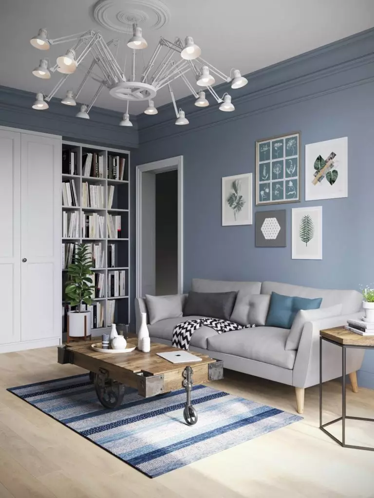
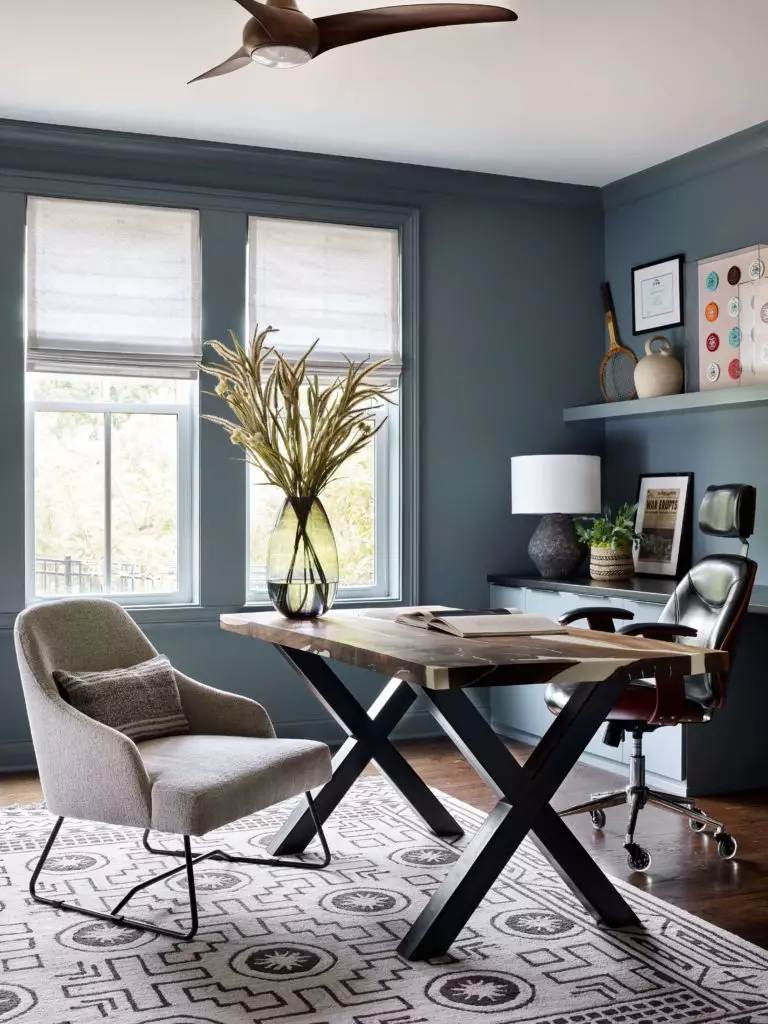
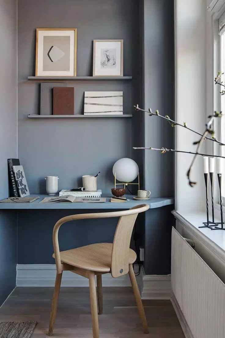
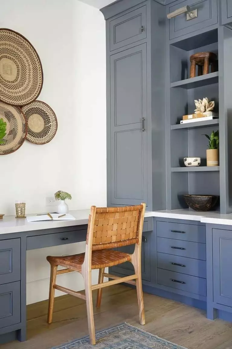
Home office
It seems this fantastic blue adapts to every space in part. When applied to the home office, it instantly becomes a source of reflection and a safe barrier from the outside world, much appreciated within spaces that require concentration. You can either paint the walls, go with a white background and opt for blue cabinets, or decide on an all-blue makeover. In a room in which this color is part of the design, there is no place for other things than a full work environment and space to go through your deepest thoughts.
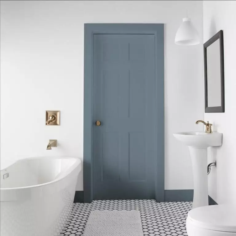
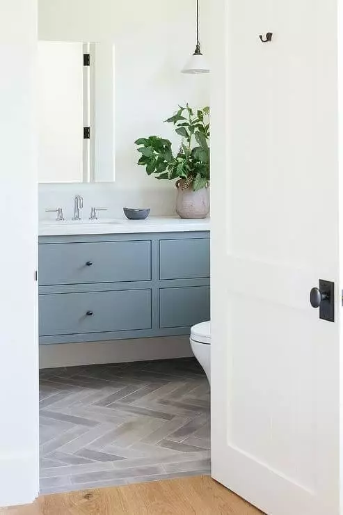
Bathroom
The irreplaceable combination between Adirondack Blue and a crispy shade of white is the definition of contemporaneity itself. Go with such a pairing in your bathroom, and the imposing feel of a modern environment will simply become a defining feature of this space. Whether you choose this shade of blue for the walls or the cabinets, going with white for the other element, the result will not disappoint you. Here is a trick from designers: add a pot with an indoor plant and ensure the integrity of the overall composition.
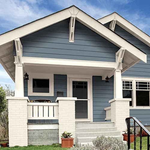
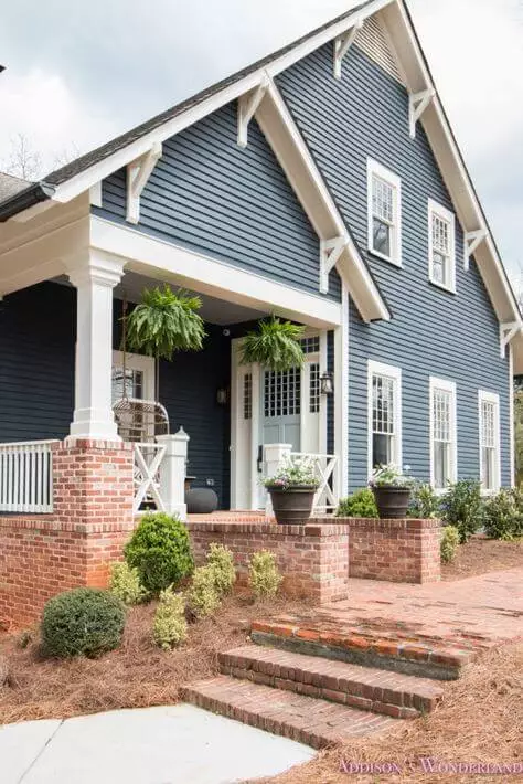
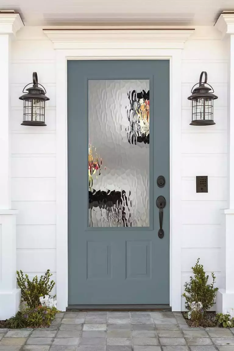
Use of Adirondack Blue for house exterior
This is the exact shade that a contemporary house exterior cannot simply go without. Bold enough to stand out yet soothing enough to keep it stately, Adirondack Blue is the new favorite when it comes to painting the house walls. It is no surprise that the best companions in this sense are either the white paint or wooden texture, which should be considered for the door and shutters. On the other hand, a light-colored house would benefit to the fullest from a front door painted in this shade of blue, adding a splash of drama and visual interest to a seemingly simple design.
The Adirondack Blue N480-5 paint color from Behr can be rarely witnessed in nature, although still present, making it even more unique. If you are looking for a nature-inspired shade with a neutral base and an original dramatic effect to add individuality to your interior and exterior, this particular color from Behr is your true companion.
