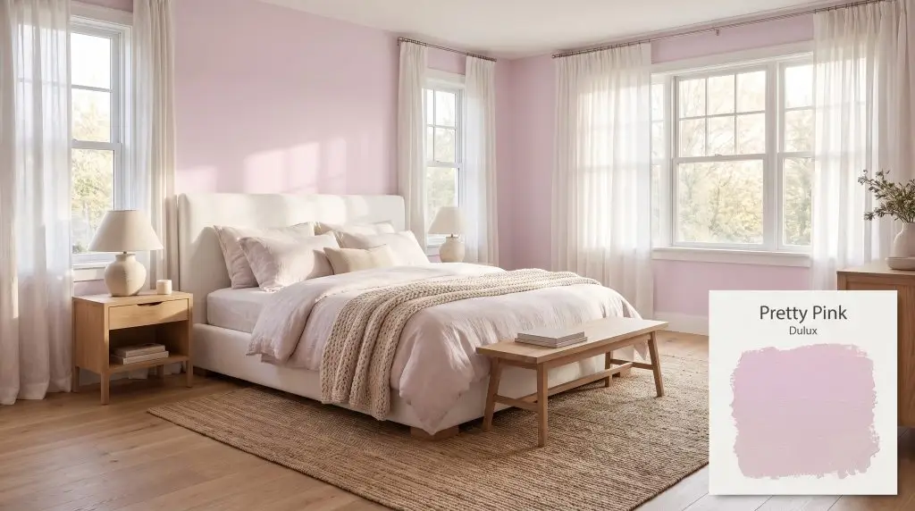
Dulux Pretty Pink is a soft, muted lilac-pink with subtle purple undertones. This gentle, warm pink brings a calming, romantic feel to any room, making it an excellent choice for bedrooms and nurseries.
Will Pretty Pink clash with your room?
Paint Technical Profile
| HEX Code | #E4D2E2 |
| Light Reflectance (LRV) | 69 |
| Temperature | Warm |
| Primary Undertone | Pink |
| Hidden Undertones | Purple |
| Use | Interior |
| Best Exposures | North, East |
| Best For | Bedrooms, nurseries, powder rooms, accent walls, feminine home offices |
Digital Visualizations & Applications Explore curated design concepts and coordinating palettes.
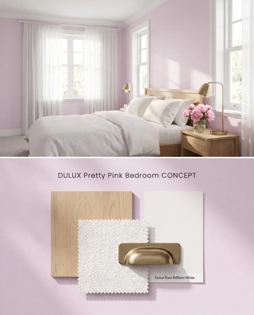
Digital visualization: This soft pastel hue applied to bedroom walls, paired with brushed brass and fresh peonies.
Design Specifications
- Lighting Exposure:Soft morning sunlight filtering through sheer drapes
- Trim Recommendation:Pure Brilliant White
- Key Materials:Light oak wood, white boucle fabric, brushed brass
- Vibe:Romantic and serene
- Styling Pro Tips:Layer textured linens and add a vase of fresh pink peonies
Complementary Paint Colors
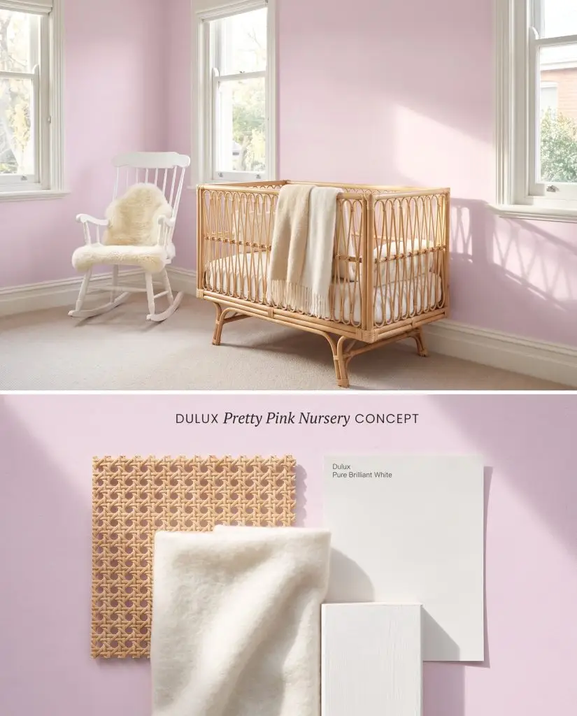
Color test: A gentle pink tone warming up a nursery space accented by natural woven textures.
Design Specifications
- Lighting Exposure:Gentle, bright daylight filling the room
- Trim Recommendation:Pure Brilliant White
- Key Materials:Natural rattan, soft white wool, white painted wood
- Vibe:Gentle and uplifting
- Styling Pro Tips:Incorporate natural woven textures to ground the pastel walls
Complementary Paint Colors
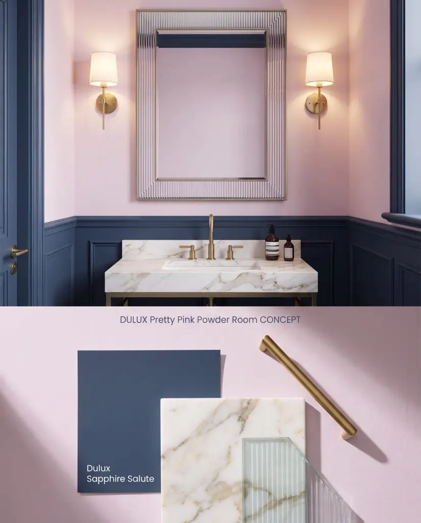
Concept board: Elegant rosy upper walls contrasting beautifully with deep navy wainscoting and brushed brass fixtures.
Design Specifications
- Lighting Exposure:Warm, flattering vanity wall sconce lighting
- Wainscoting Color:Sapphire Salute
- Key Materials:Calacatta gold marble, brushed brass, fluted glass
- Vibe:Sophisticated and dramatic
- Architectural Style:Transitional elegance
Complementary Paint Colors

Design mock-up: A warm blush focal wall catching afternoon sun, complemented by natural rattan and terracotta elements.
Design Specifications
- Lighting Exposure:Warm afternoon sun casting long shadows
- Main Wall Color:Egyptian Cotton
- Key Materials:Natural rattan, natural linen, terracotta
- Vibe:Earthy and inviting
- Styling Pro Tips:Use trailing greenery to bridge the transition between the accent wall and main walls
Complementary Paint Colors
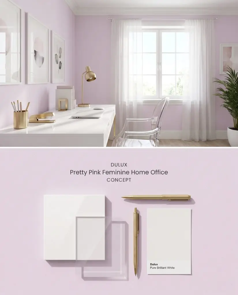
Material study: A crisp pastel backdrop highlighting a sleek white lacquer desk and brushed gold accessories.
Design Specifications
- Lighting Exposure:Crisp, clear daylight from a large window
- Trim Color:Pure Brilliant White
- Key Materials:White lacquer, clear acrylic, brushed gold
- Vibe:Chic and productive
- Styling Pro Tips:Keep the desk surface minimal and glossy to reflect natural light
Complementary Paint Colors
Room Compatibility & Clashes Diagnoses
Hackrea's reports evaluating the compatibility of Pretty Pink in real rooms.No compatibility tests for Pretty Pink yet.
Be the first to see how this color reacts to your space. Run a free architectural diagnostic now.