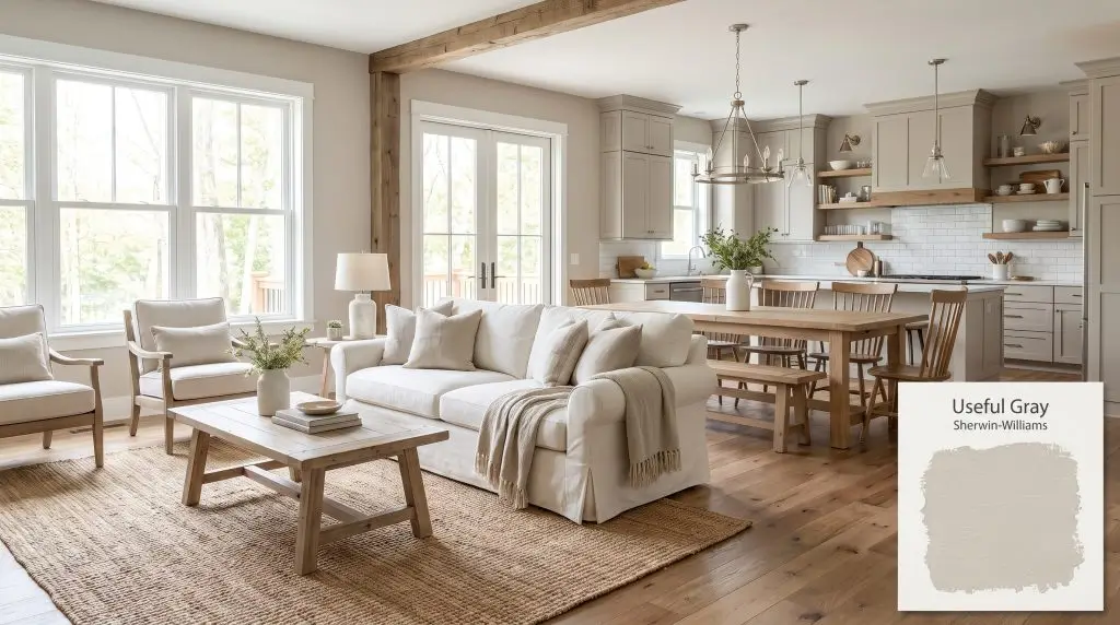
Useful Gray SW 7050
Sherwin-WilliamsSherwin-Williams Useful Gray (SW 7050) is a sophisticated, warm greige with subtle green and yellow undertones. This highly versatile, light-to-medium neutral promotes a calm, inviting atmosphere, making it a favorite for home staging and open-concept interiors.
Paint Technical Profile
| Color ID / SKU | SW 7050 |
| HEX Code | #CFCABD |
| Light Reflectance (LRV) | 59 |
| Temperature | Warm |
| Primary Undertone | Greige |
| Hidden Undertones | Green, Yellow |
| Use | Interior, Exterior |
| Best Exposures | North, East |
| Best For | Living rooms, home staging, open-concept areas, home offices |
Real-World Inspiration Be the first to upload a real photo of Useful Gray!
No Photos Yet
Includes +20 First Upload Bonus!
Real Experiences
Insights from people who have used Useful Gray.No reviews yet
Be the first to share your experience with Useful Gray.
Earn 15 points instantly!
Digital Visualizations & Applications Explore curated design concepts and coordinating palettes.
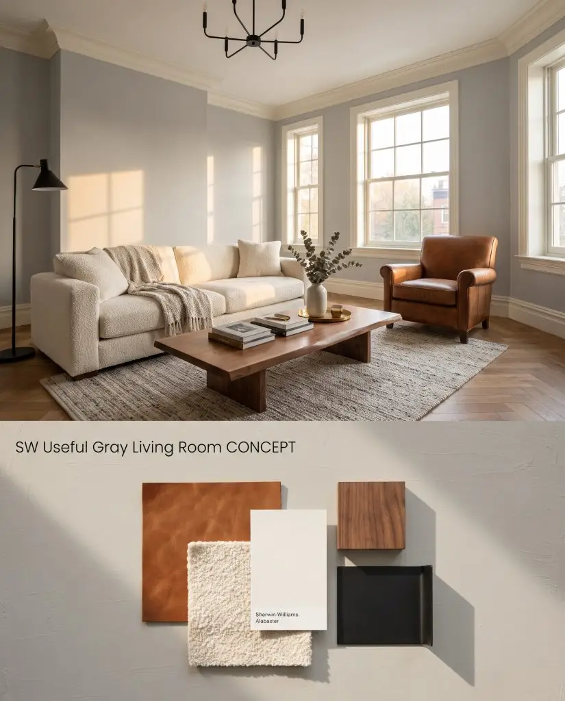
Digital color test: A warm greige wall application contrasting beautifully with rich cognac leather and matte black fixtures.
Design Specifications
- Lighting Exposure:Warm late afternoon golden hour
- Trim Recommendation:SW Alabaster
- Key Materials:Cognac leather, bouclé upholstery, walnut wood
- Hardware Finishes:Matte black
- Flooring:Medium-tone oak planks
Complementary Paint Colors
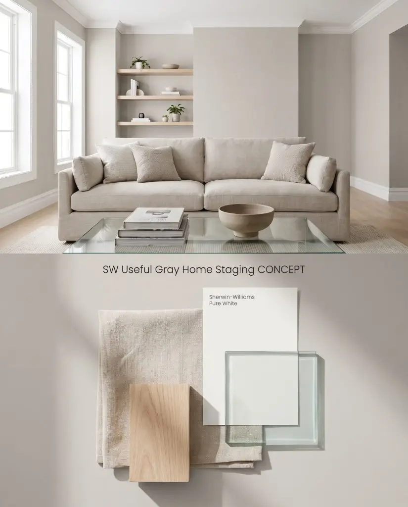
Staging visualization: This versatile neutral tone paired with minimal glass and light ash wood shelving.
Design Specifications
- Lighting Exposure:Bright, even studio-like natural light
- Trim Recommendation:SW Pure White
- Key Materials:Neutral linen sofa, glass coffee table, light ash wood
- Styling Pro Tips:Keep surfaces minimal with only a stack of art books and a simple ceramic bowl
- Vibe:Universally appealing and spacious
Complementary Paint Colors
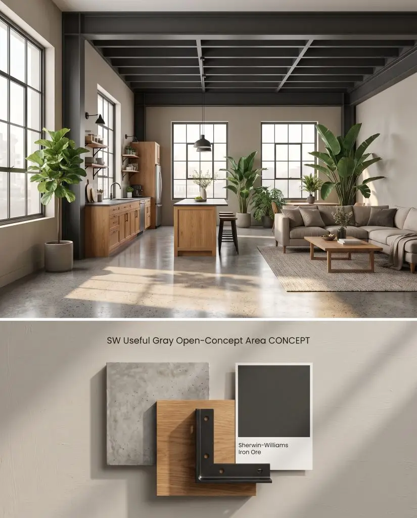
Material board: A balanced warm gray hue highlighting exposed structural elements and black steel architectural accents.
Design Specifications
- Lighting Exposure:Morning natural light from large windows
- Coordinating Colors:SW Iron Ore
- Key Materials:Polished concrete floors, warm oak cabinetry, black steel accents
- Architectural Style:Soft modern industrial
- Styling Pro Tips:Use oversized indoor plants to bridge the living and dining zones
Complementary Paint Colors
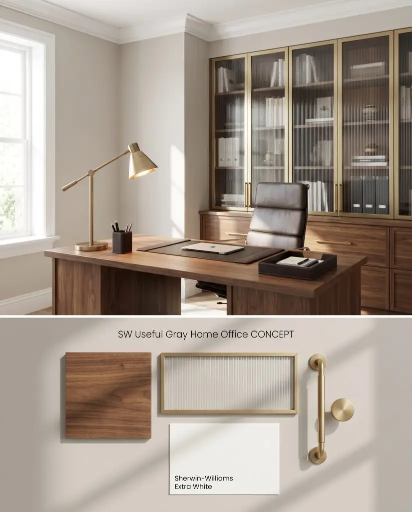
Palette visualization: A focused greige backdrop enhancing a solid walnut desk and sophisticated brushed brass lighting.
Design Specifications
- Lighting Exposure:Task-focused ambient daylight
- Trim Recommendation:SW Extra White
- Key Materials:Walnut desk, ribbed glass, brushed brass desk lamp
- Styling Pro Tips:Incorporate leather desk accessories for an executive touch
- Vibe:Productive and refined
Complementary Paint Colors
Closest Cross-Brand Equivalents
The absolute closest scientific color matches for Useful Gray across top paint brands.