The Designer’s Guide to Two-Color Bedroom Walls: Palettes, Proportions, and Placements
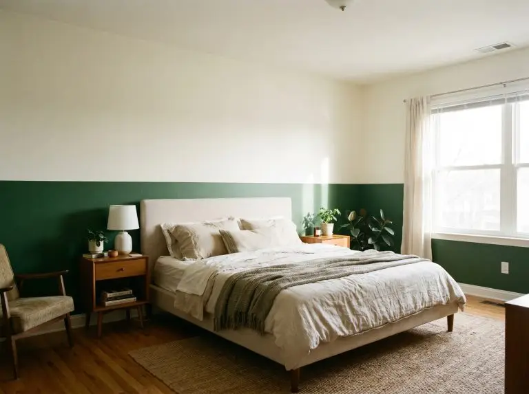
When executing a two color combination for bedroom walls, most people obsess over the swatches and completely ignore the architecture. Choosing the right hues is only half the battle; the true mark of high-end design lies in the physical placement of the transition line. We are bypassing basic color wheel rules today to focus strictly on spatial application, light reflectance, and finish.
Paint is the most cost-effective architectural illusion available, provided you respect the geometry of the room.
The Cardinal Rule of Two-Tone Walls: Establish Your Transition Line
A two-color combination fails without a logical, physical boundary. The eye requires a definitive break to process dual tones without the space feeling chaotic. Utilizing existing architectural features like wainscoting, picture rails, or crown molding provides an immediate stopping point. If your bedroom is a plain drywall box, you must create that architecture yourself. Use a laser level to snap a crisp, artificial horizon line at either 36 inches (traditional dado height) or 12 inches below the ceiling (picture rail height). Always consider Light Reflectance Value (LRV) during this step; the color with the lower LRV—the darker shade—should almost always sit on the bottom to visually ground the room.
- Tape Removal Timing: Pull the painter’s tape while the second coat is still slightly tacky to prevent peeling the cured film.
- Crisp Line Sealing: Run a microscopic bead of paintable clear caulk along the tape edge before painting to seal the boundary for a razor-sharp transition line.
- Roller Nap Selection: Professional installers require a 3/8-inch woven microfiber roller for flat walls to avoid heavy stippling that ruins a bespoke finish.
The Dado Division: Grounding the Bedroom with Lower-Third Color
The classic half-painted wall is rarely cut perfectly in half. Professional spatial color blocking relies on the 1/3 to 2/3 ratio. The lower third receives a darker, weightier color, while the upper two-thirds open up the visual ceiling height with a lighter tone.
Inky Navy & Crisp Plaster White
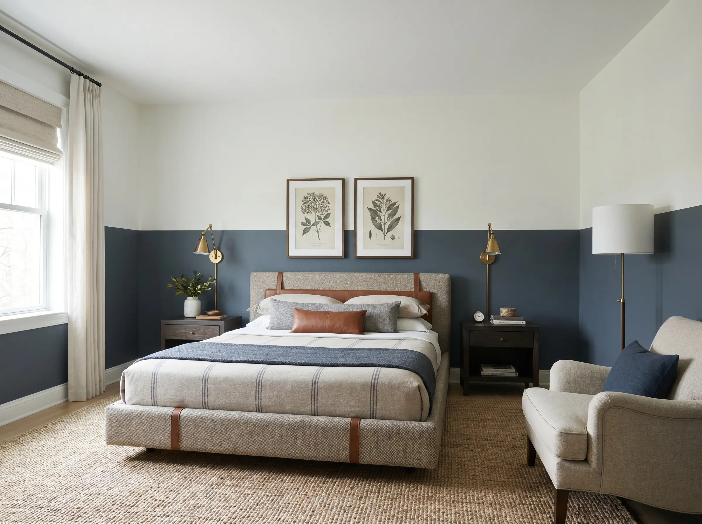
Anchor the bottom third of the room with a heavy, light-absorbing navy to instantly ground the space. The crisp plaster white on the upper two-thirds maximizes ambient light reflection, keeping the room feeling expansive rather than cave-like.
- The Vibe: Classic transitional luxury with a tailored, masculine edge.
- Lower Third Color: Farrow & Ball Hague Blue Satin Enamel.
- Upper Two-Thirds Color: Benjamin Moore Chantilly Lace Dead-Flat.
If your room faces North, avoid stark whites with blue undertones on the upper half, as the cool natural light will turn your crisp two-tone wall into a frigid, sterile expanse.
Designer Secret
Muted Olive & Warm Greige
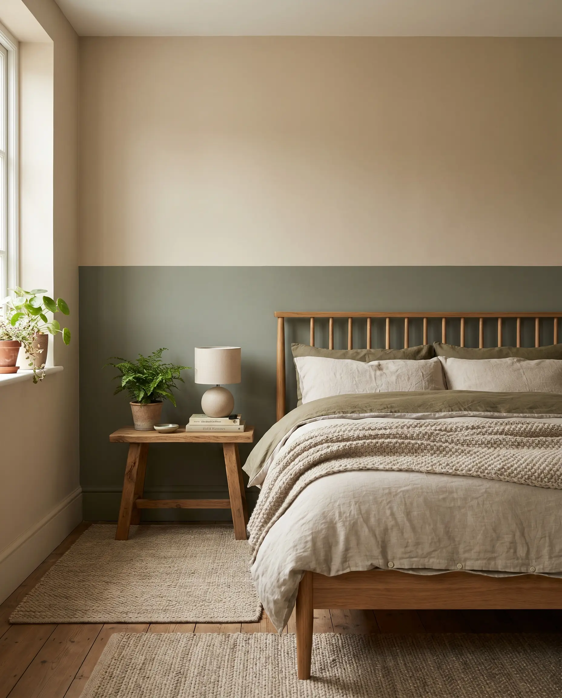
This combination uses muddy, yellow-based greens to pull the outdoors inside without relying on artificial-looking primary shades. The warm greige upper half softens the transition line, creating a seamless, earthy gradient that feels naturally enveloping.
- The Vibe: Grounded, biophilic, and effortlessly organic.
- Lower Third Color: Sherwin-Williams Rosemary Eggshell.
- Upper Two-Thirds Color: Sherwin-Williams Accessible Beige Flat Matte.
Rich Aubergine & Faded Parchment
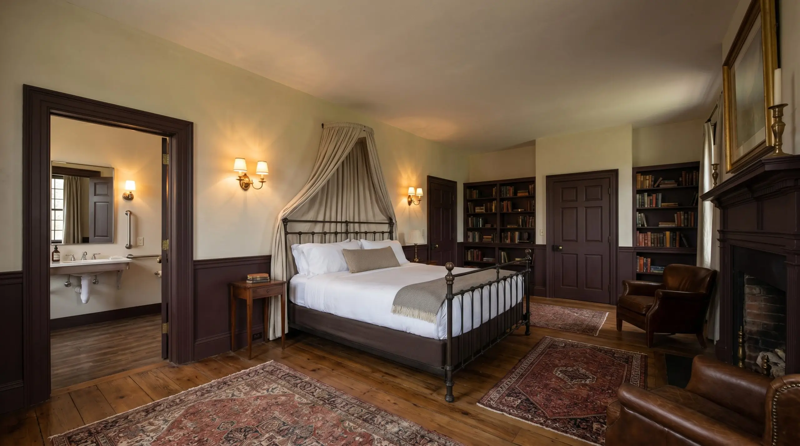
Deploying a deep, red-violet aubergine on the lower wall provides immense visual weight, mimicking the richness of historic mahogany wainscoting. The faded parchment top half balances the drama, offering a soft, aged backdrop for brass sconces or framed art.
- The Vibe: Moody, intellectual, and deeply historic.
- Lower Third Color: Benjamin Moore Caponata Satin Enamel.
- Upper Two-Thirds Color: Farrow & Ball School House White Dead-Flat.
Earthy Terracotta & Soft Oat
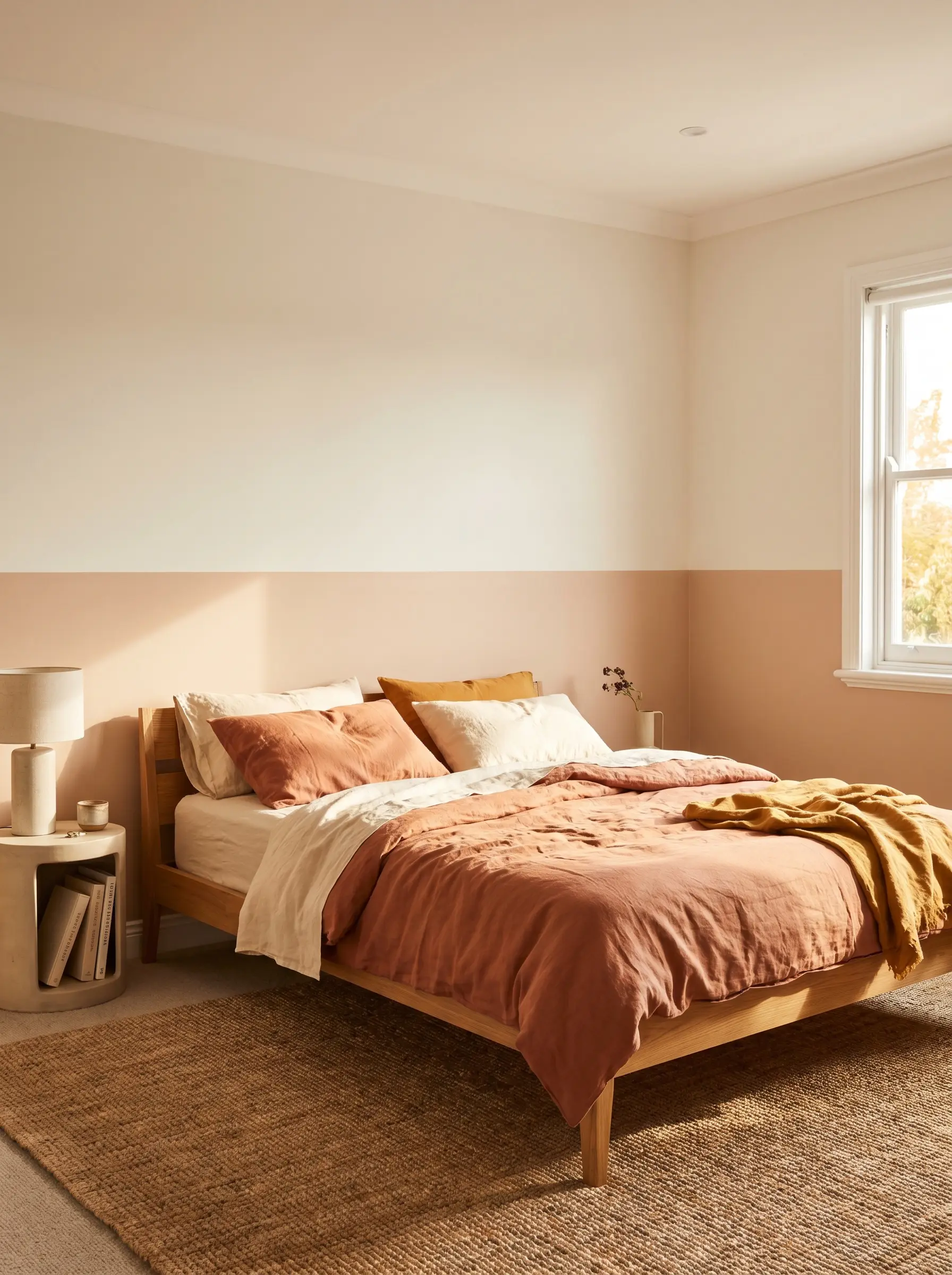
A baked terracotta lower wall radiates physical warmth and anchors a timber or upholstered bed frame beautifully. Pairing it with a soft oat tone above prevents the red undertones from dominating the room, maintaining a relaxed, sun-drenched aesthetic.
- The Vibe: Sun-baked, textural, and casually refined.
- Lower Third Color: Portola Paints El Mirage Roman Clay.
- Upper Two-Thirds Color: Benjamin Moore Swiss Coffee Eggshell.
The Architectural Color Block: Creating Zones & Headboards
Two-color combinations do not need to wrap the entire room perimeter. Spatial color blocking creates localized architectural interest in plain, drywall-heavy bedrooms. By painting a large geometric shape—like a structural arch or an oversized rectangle directly behind the bed—you establish a powerful visual headboard and zone the space without sacrificing total square footage.
Charcoal Gray & Muted Mustard
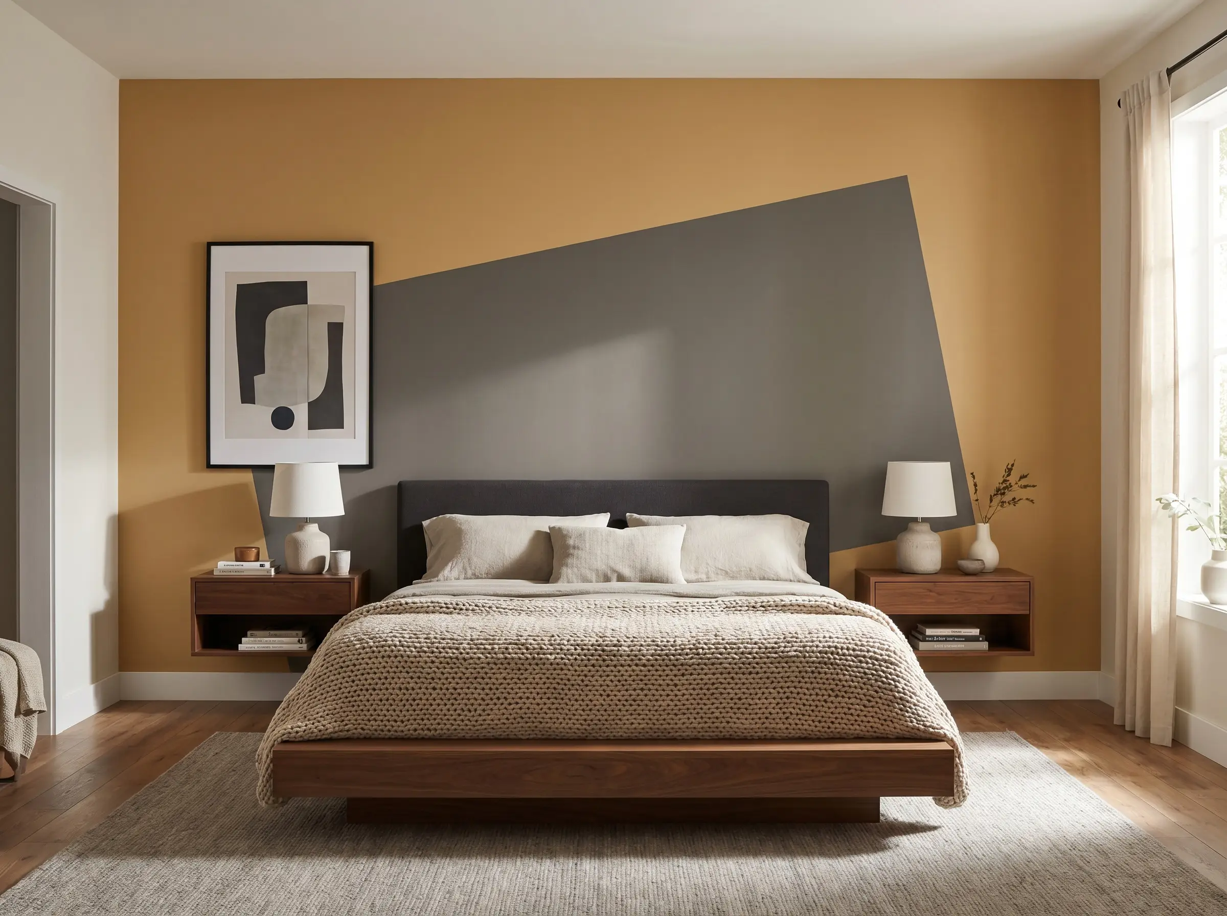
Paint a massive, asymmetrical charcoal rectangle behind the bed, offsetting it against a muted mustard base wall. This high-contrast pairing immediately defines the sleeping zone and provides a sharp, graphic backdrop that demands attention.
- The Vibe: Bold, graphic, and highly curated.
- Base Wall Color: Farrow & Ball India Yellow Dead-Flat.
- Color Block Shape: Benjamin Moore Kendall Charcoal Eggshell.
Forest Green & Raw Plaster
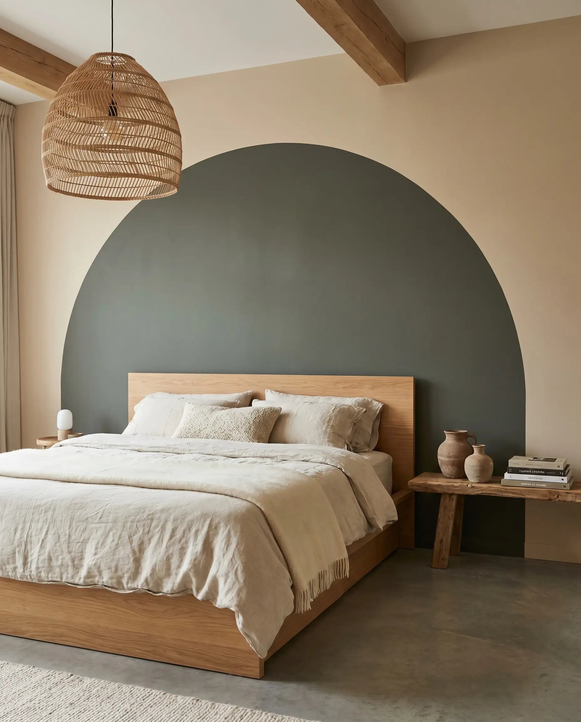
A sweeping forest green arch painted directly over a raw plaster-toned wall creates a striking focal point that simulates custom millwork. The deep green absorbs light, pushing the wall backward visually, while the plaster tone keeps the surrounding perimeter light and airy.
- The Vibe: Sculptural, modern, and slightly rugged.
- Base Wall Color: Portola Paints Feather Limewash.
- Color Block Shape: Sherwin-Williams Pewter Green Flat Matte.
When painting organic curves or arches, trace your shape with a flexible piece of baseboard trim rather than a string, ensuring a perfectly smooth radius before you apply the darker contrast color.
Hackrea Styling Tip
Terracotta Red & Blush Pink
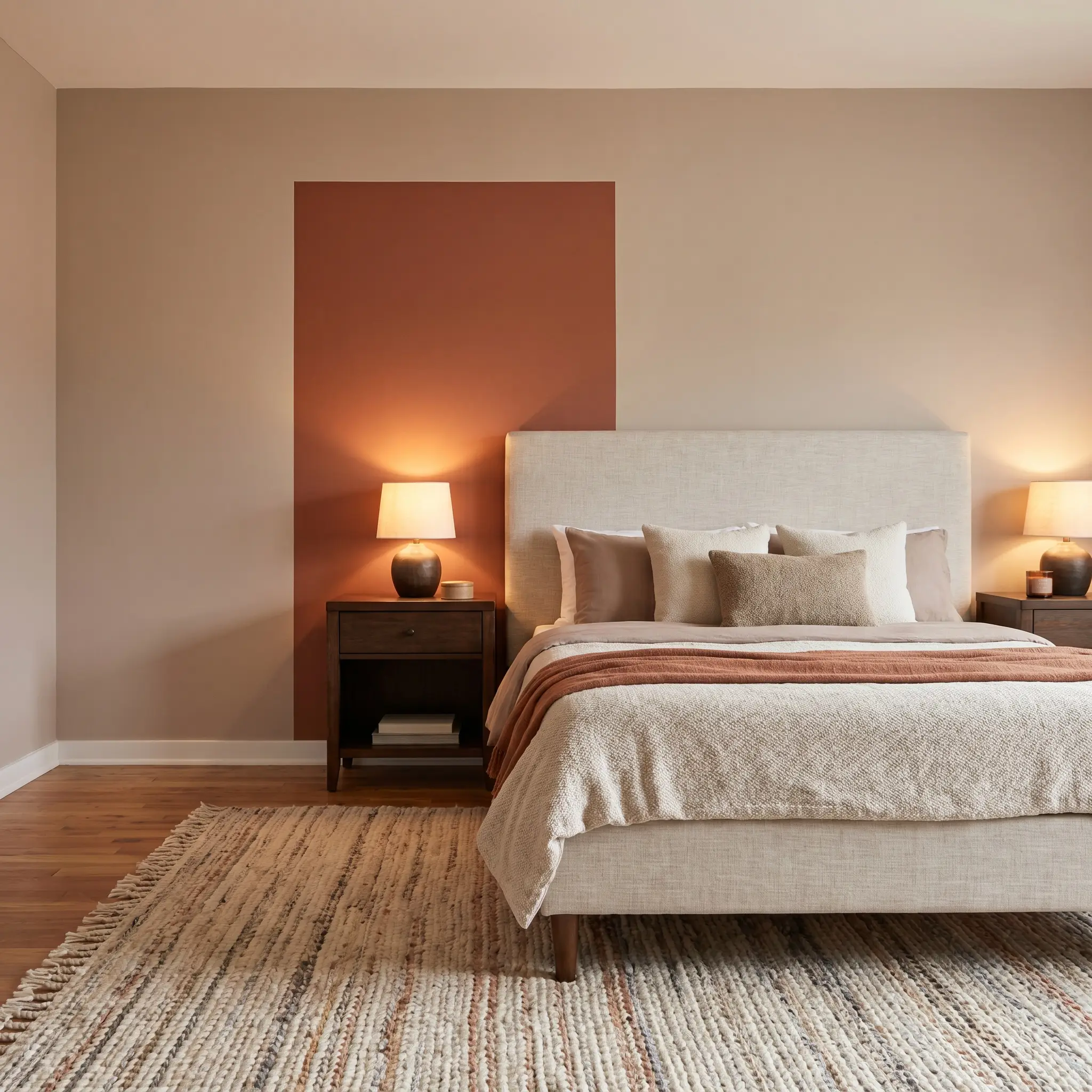
Extend a terracotta red block vertically behind two nightstands, cutting sharply against a soft blush pink field. This tonal blocking frames the furniture perfectly, turning basic bedside tables into intentional, built-in architectural features.
- The Vibe: Warm, tonal, and deeply inviting.
- Base Wall Color: Farrow & Ball Setting Plaster Dead-Flat.
- Color Block Shape: Benjamin Moore Audubon Russet Eggshell.
Deep Teal & Burnt Sienna
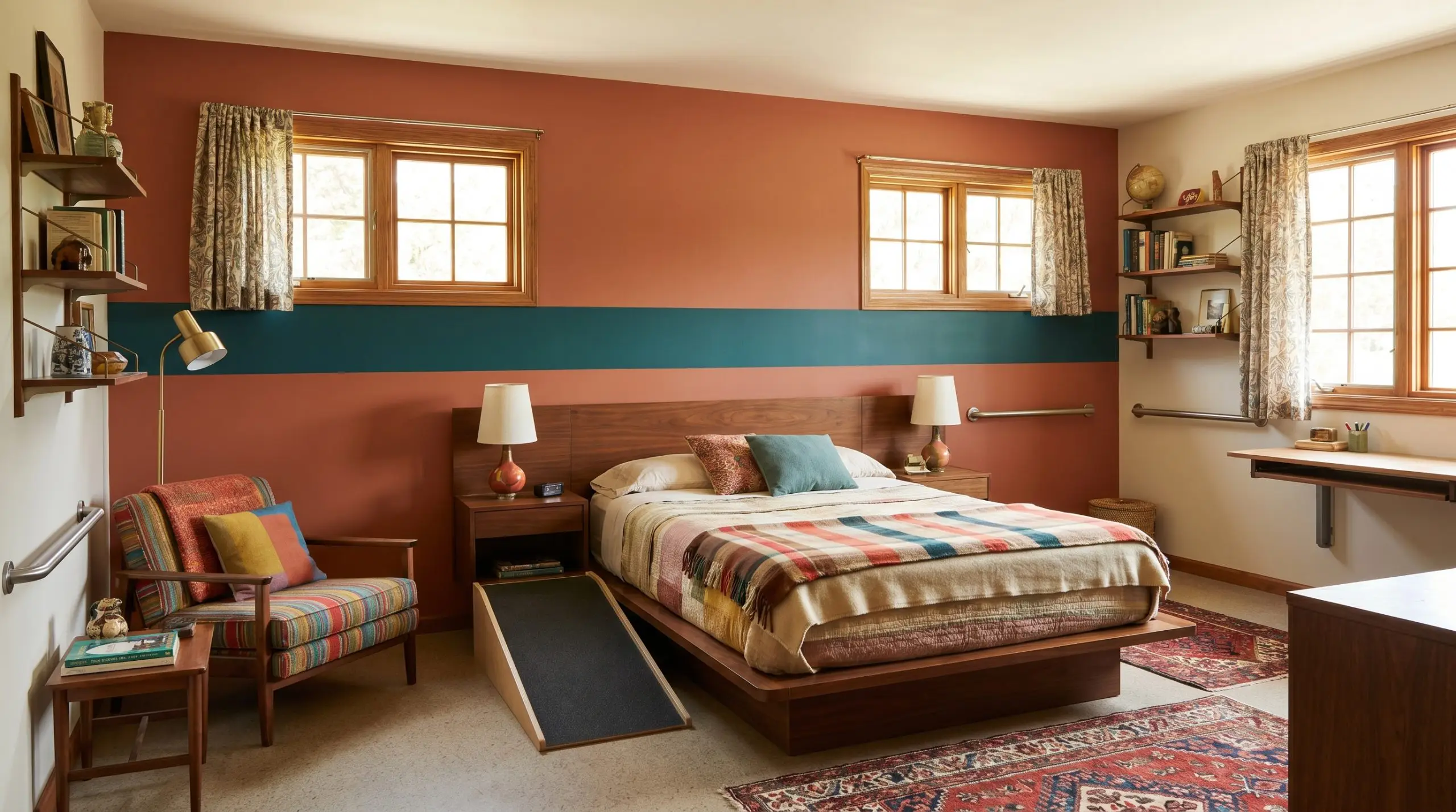
Run a horizontal band of deep teal across the middle of a burnt sienna wall to intersect the headboard and window frames. This aggressive, mid-century-inspired contrast stretches the room horizontally, tricking the eye into perceiving a wider footprint.
- The Vibe: Retro-inspired, energetic, and structurally daring.
- Base Wall Color: Sherwin-Williams Cavern Clay Flat Matte.
- Color Block Shape: Benjamin Moore Dark Teal Satin Enamel.
The Wrapped Ceiling: Immersive Dual-Tone Contrast
The default bright white ceiling is a massive missed opportunity for spatial manipulation. By pulling the wall color up onto the ceiling, or dropping a dark ceiling color down the top 12 inches of the wall, you eliminate the harsh upper transition line. This technique physically lowers a cavernous ceiling, creating a cozy, tent-like effect that feels highly bespoke.
Chocolate Brown & Soft Linen
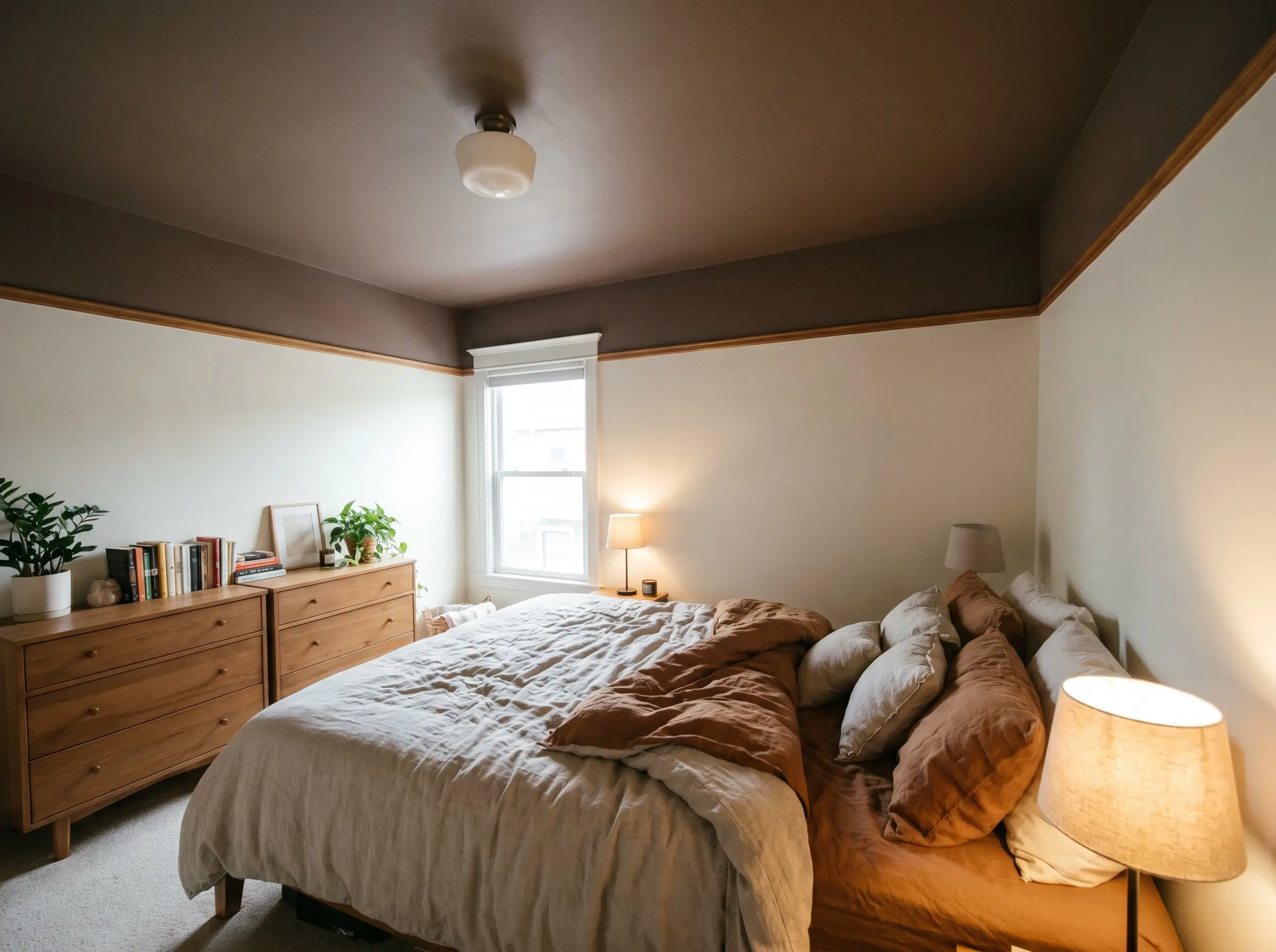
Drop a rich chocolate brown ceiling down the top 12 inches of the wall to meet a soft linen tone at a picture rail. This heavy upper canopy compresses the visual height of the room, making a large, sterile bedroom feel instantly intimate and secure.
- The Vibe: Rich, enveloping, and securely intimate.
- Ceiling & Upper 12″ Color: Farrow & Ball London Clay Dead-Flat.
- Lower Wall Color: Benjamin Moore White Dove Eggshell.
Slate Blue & Warm Silver
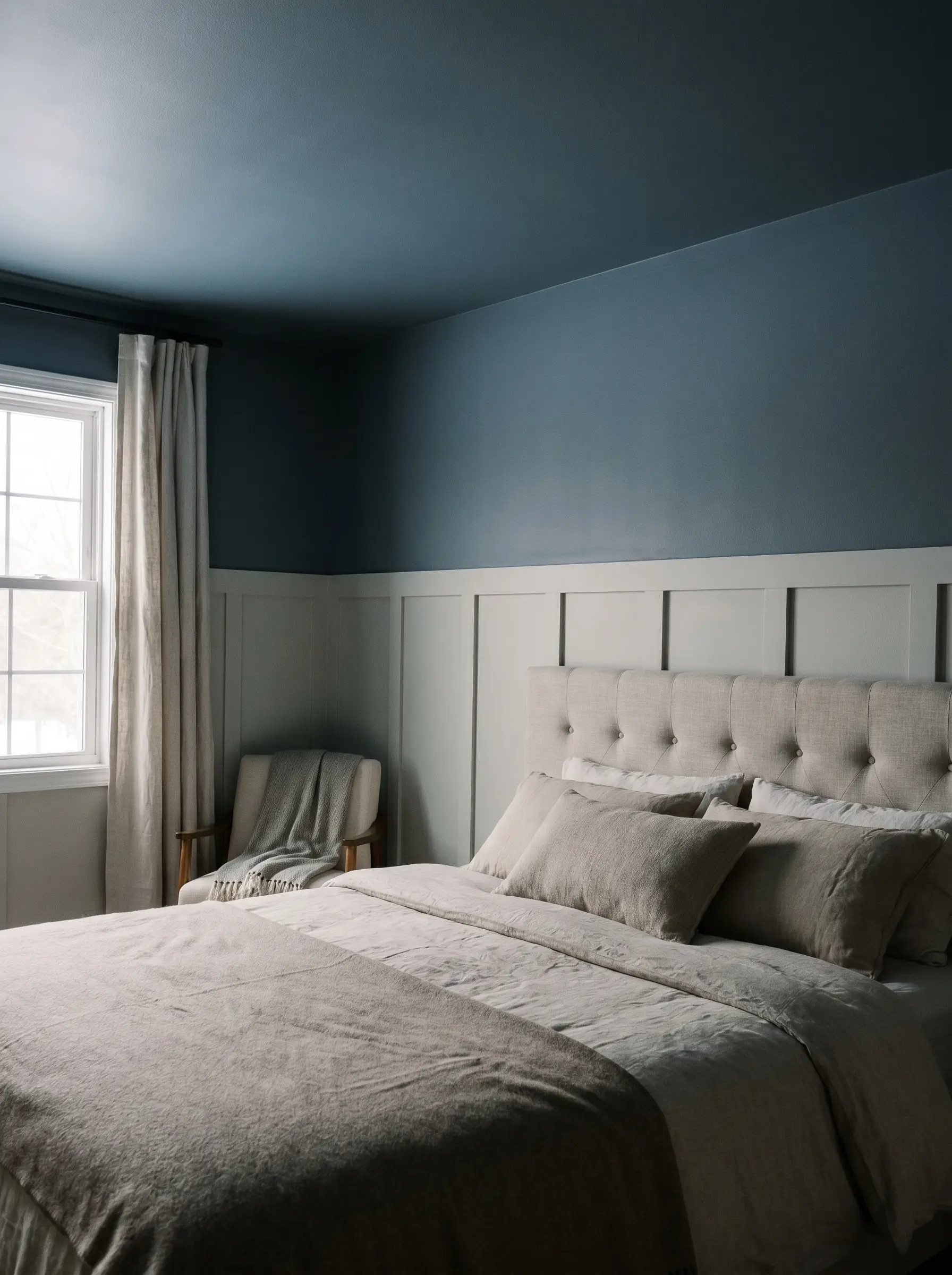
Wrap the entire ceiling and upper walls in a muted slate blue, meeting a warm silver wainscoting below. The cool blue overhead mimics the twilight sky, receding slightly while still providing a distinct, moody atmosphere.
- The Vibe: Calm, atmospheric, and quietly luxurious.
- Ceiling & Upper Wall Color: Sherwin-Williams Slate Tile Dead-Flat.
- Lower Wainscoting Color: Benjamin Moore Stonington Gray Satin Enamel.
Dusty Plum & Chalk White
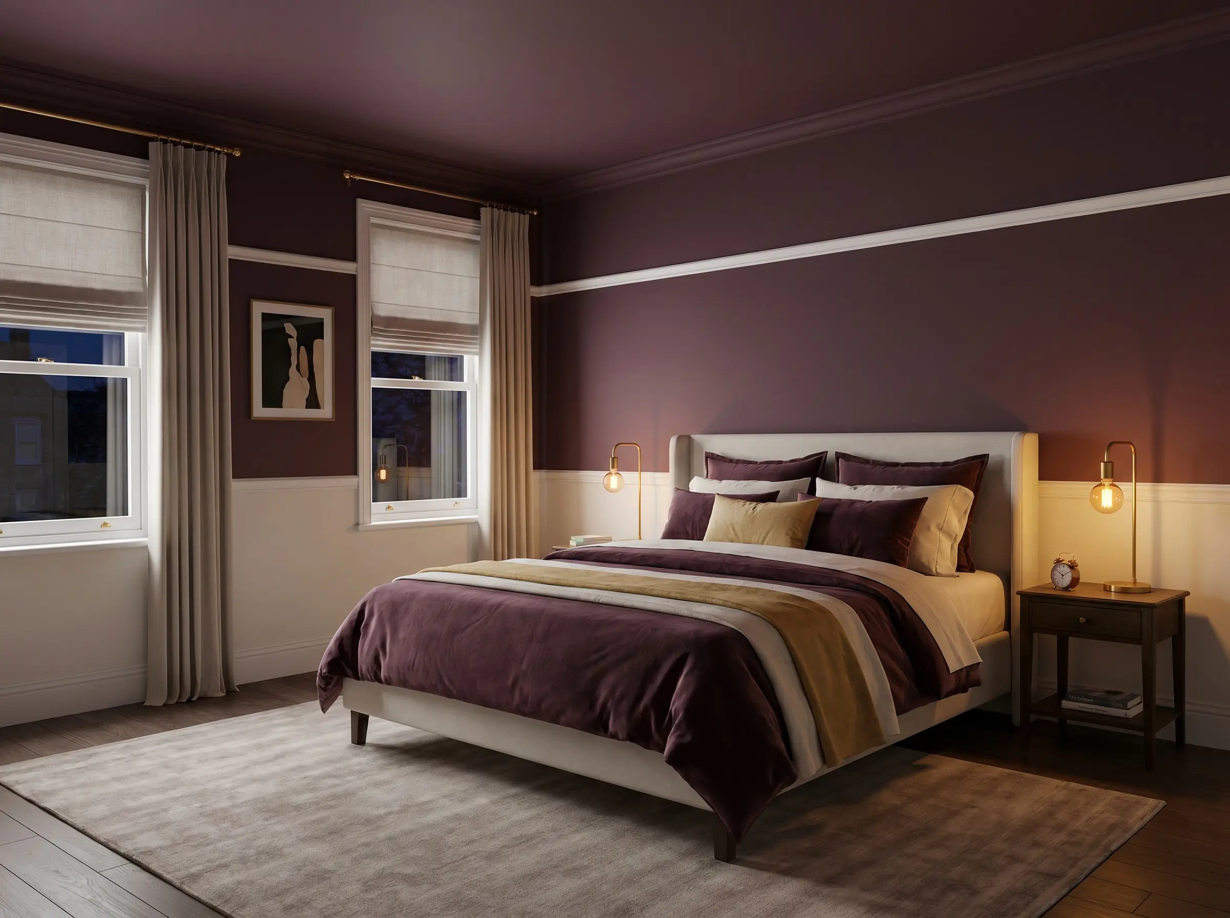
Coat the ceiling in a dusty plum and carry it down the walls to meet a crisp chalk white dado line. The heavy plum absorbs artificial night light beautifully, turning the upper half of the room into a velvety canopy.
- The Vibe: Decadent, tailored, and undeniably upscale.
- Ceiling & Upper Wall Color: Farrow & Ball Brinjal Dead-Flat.
- Lower Dado Color: Sherwin-Williams Pure White Satin Enamel.
Always specify an ultra-flat or dedicated ceiling paint formulation when putting dark colors overhead. Any sheen on a dark ceiling will highlight drywall seams and roller marks, completely ruining the high-end illusion.
Application Warning
The Tonal Layer: Subtle Monochromatic Pairings
For spaces that demand subtlety, tonal layering offers a sophisticated alternative to stark contrast. Choosing two colors from the exact same color family—typically two shades apart on a paint swatch—creates immense depth without jarring the eye. Because the hues are nearly identical, the physical texture and light reflectance of the finishes must do the heavy lifting to separate the zones.
Pale Sage & Deep Pine
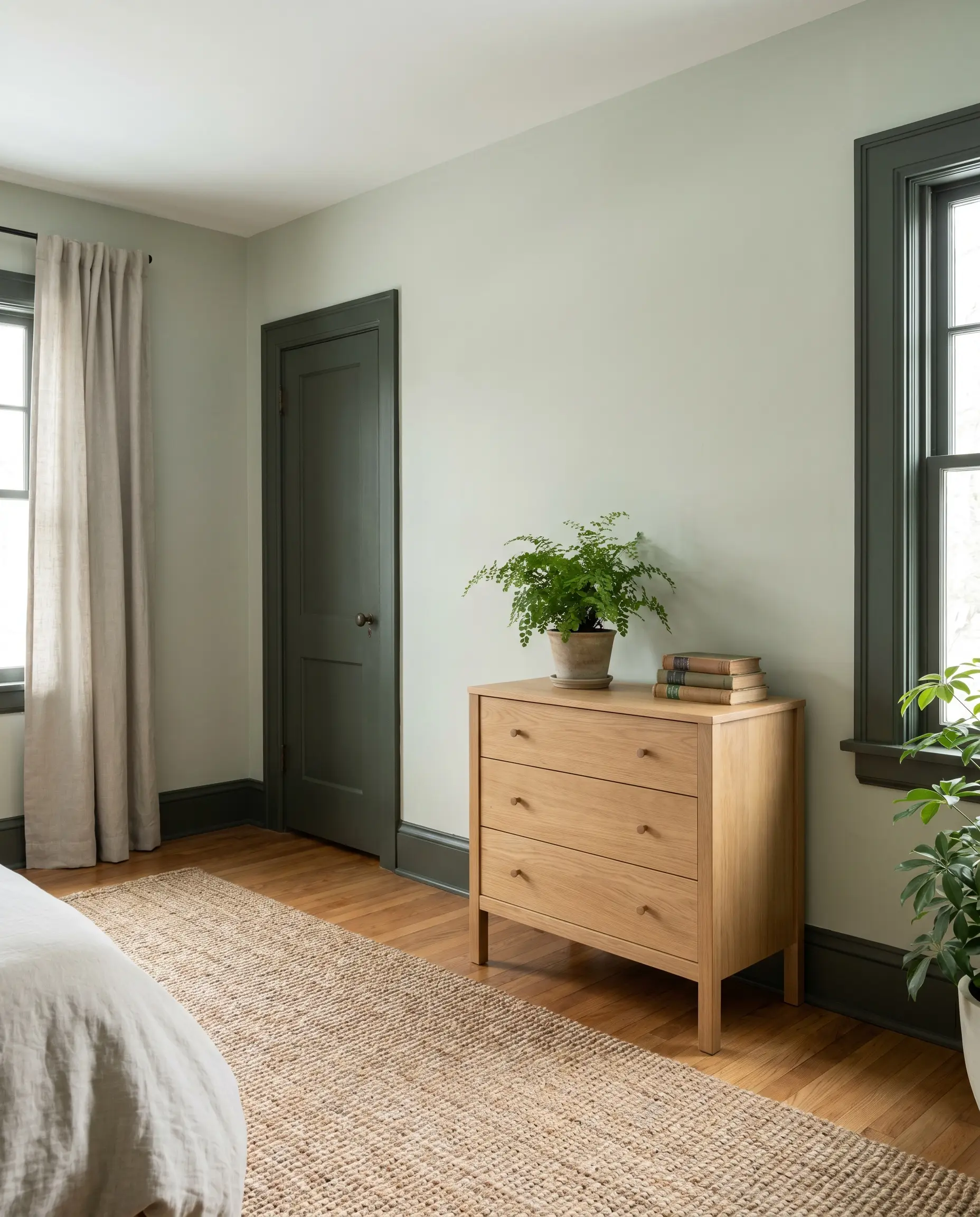
Pair a pale sage wall with deep pine green trim and doors to create a layered, forest-floor aesthetic. The subtle shift in depth allows the architecture to stand out naturally without relying on aggressive, contrasting lines.
- The Vibe: Restorative, lush, and seamlessly integrated.
- Primary Wall Color: Sherwin-Williams Sea Salt Flat Matte.
- Trim/Accent Color: Sherwin-Williams Ripe Olive High-Gloss Trim.
Light Greige & Warm Mushroom
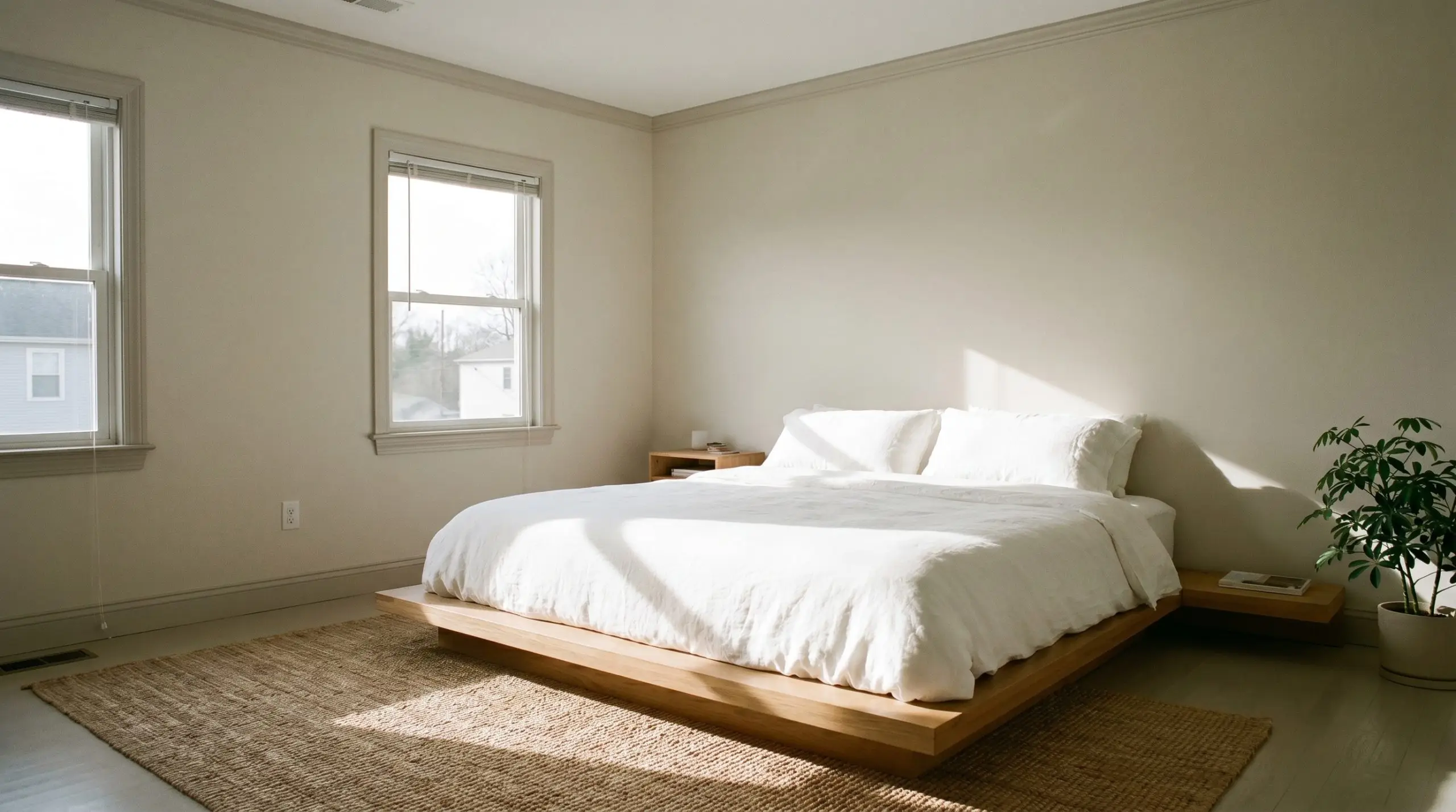
Apply a flat light greige to the primary walls and a slightly deeper warm mushroom to the baseboards and window casings. This low-contrast pairing relies entirely on the interplay of shadows, producing a deeply calming, minimalist environment.
- The Vibe: Serene, stripped-back, and architecturally quiet.
- Primary Wall Color: Benjamin Moore Pale Oak Dead-Flat.
- Trim/Accent Color: Benjamin Moore Revere Pewter Satin Enamel.
Soft Lavender & Deep Muted Mauve
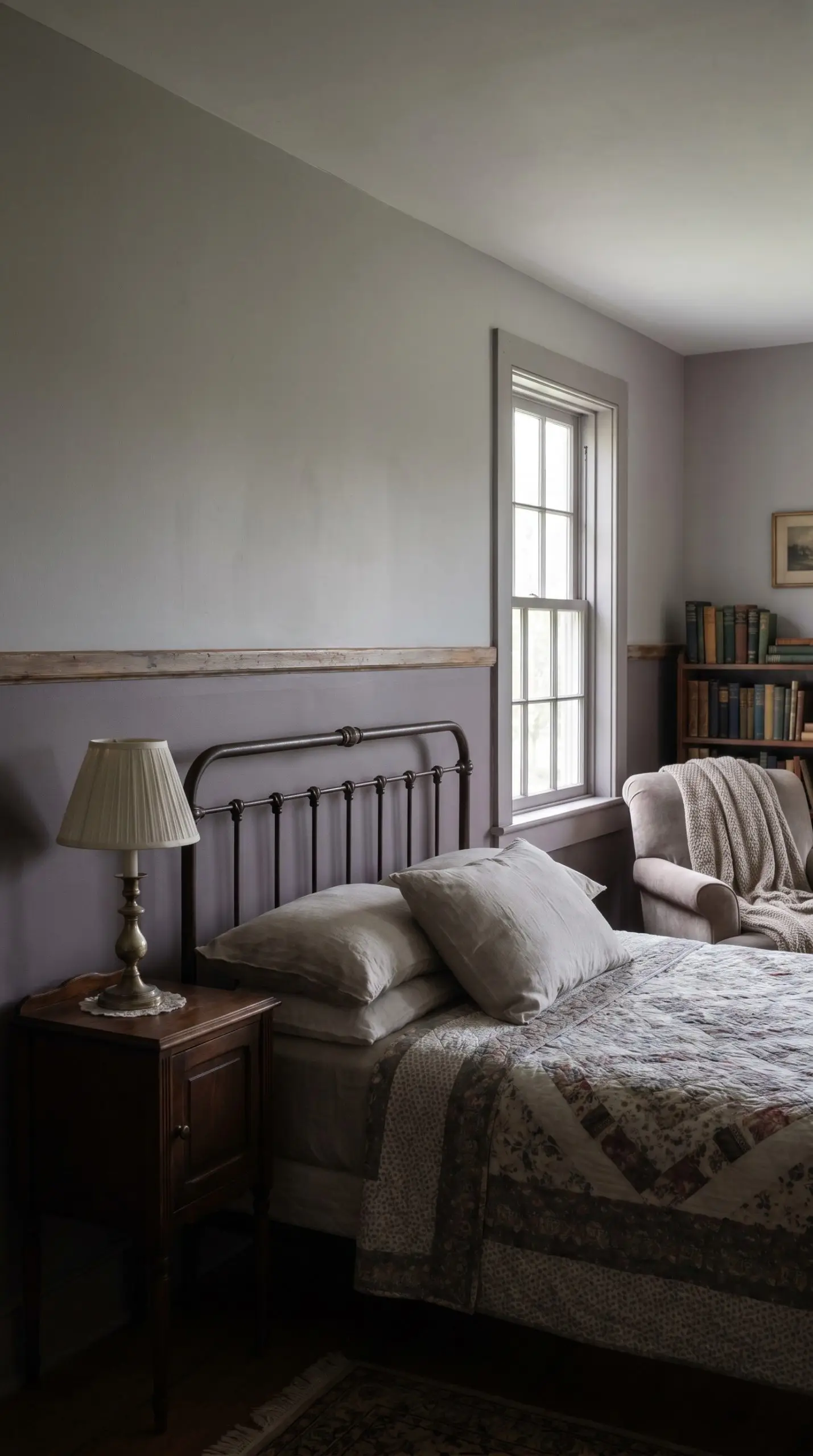
Layer a soft lavender upper wall over a muted mauve lower section to create a sophisticated, grown-up take on purples. The muddy undertones in both shades prevent the room from feeling juvenile, resulting in a beautifully muted, dusty elegance.
- The Vibe: Soft, historically rooted, and quietly romantic.
- Upper Wall Color: Farrow & Ball Calluna Dead-Flat.
- Lower Wall Color: Farrow & Ball Brassica Eggshell.
Creamy White & Limewash Putty
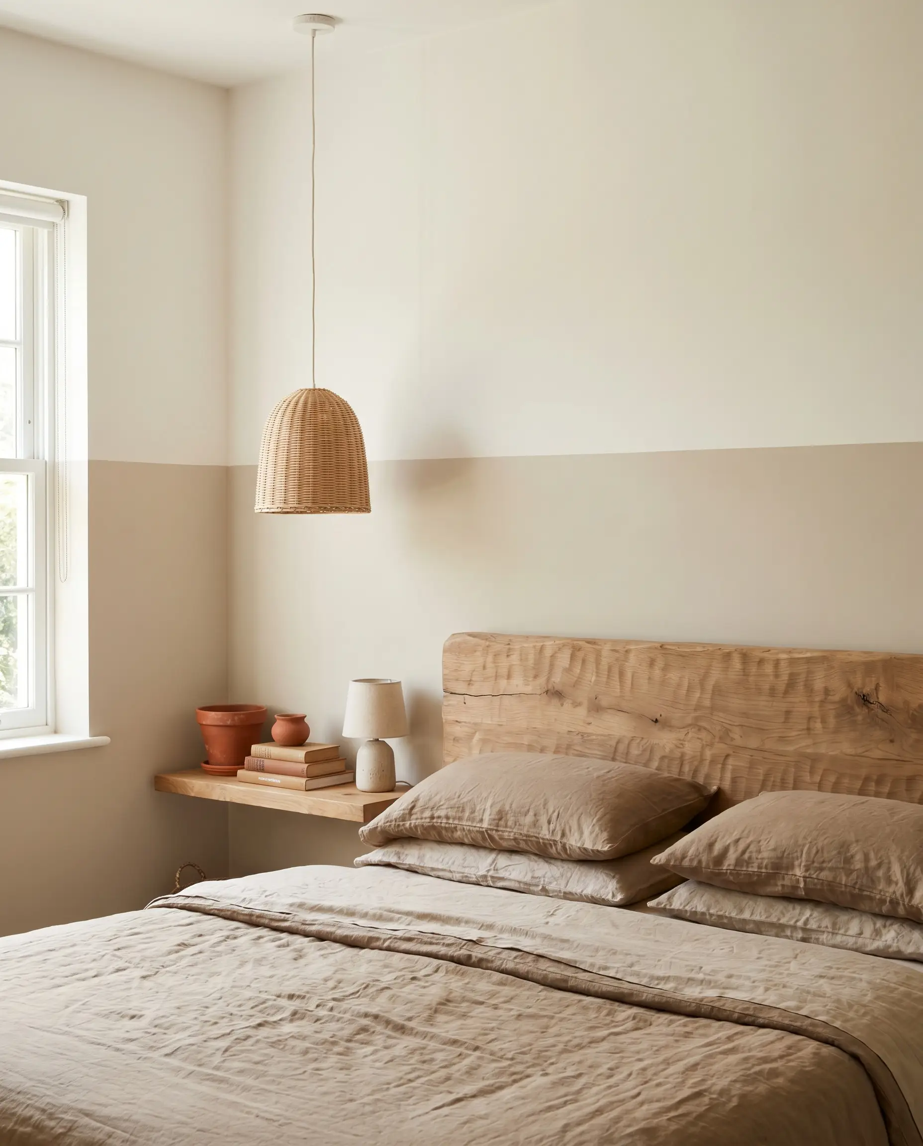
Coat the lower half of the room in a textured limewash putty, meeting a creamy white upper wall. The raw, chalky movement of the wash against the smooth upper paint provides a tactile contrast that feels incredibly expensive.
- The Vibe: Tactile, artisan-crafted, and luminous.
- Lower Wall Color: Portola Paints Roman Clay in ‘Kensington’ Textured.
- Upper Wall Color: Sherwin-Williams Alabaster Flat Matte.
The High-End Finish: Why Paint Sheen Matters as Much as Color
The most meticulously selected hues will look cheap if you ignore light reflectance. How a surface bounces natural light dictates its perceived quality. You must strictly control your sheens—never place two glossy finishes next to each other, and rely on dead-flat paints to hide drywall imperfections while using satin or gloss to highlight structural transitions.
| Wall Finish | Accent/Trim Finish | Visual Effect | Best For (Budget Tier) |
|---|---|---|---|
| Dead-Flat | Satin Enamel | Crisp contrast with zero glare | Accessible Luxury |
| Limewash / Roman Clay | Flat Matte | Tactile depth against smooth plaster | High-End DIY |
| Eggshell | High-Gloss Trim | Traditional millwork simulation | Bespoke Heritage |
Final Considerations Before You Tape the Walls
The physical realities of your bedroom will alter how these colors perform. Always paint large swatches of both colors directly onto the wall and observe them at three distinct intervals: cool morning light, warm afternoon sun, and under your artificial night light. Trust your aesthetic instincts, respect the architecture of your space, and commit to the transition line with absolute confidence. The tape, the roller, and the exact sheen you choose are the true tools of high-end spatial design.