The Curator’s Guide: How to Decorate with Posters Like a Grown-Up
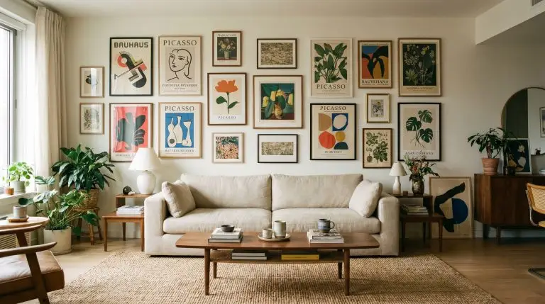
The shift toward bold, intentional walls is defining 2026 interiors, leaving bare drywall looking unfinished and sterile. If you are researching interior decorating using posters, you likely want to inject high-impact graphics into your home without reverting to the dorm-room days of thumbtacks and curled paper edges. The good news is that the difference between a transient college apartment and a highly curated European flat is rarely the poster itself—it is the contextual styling, the architectural framing, and the spatial execution.
By embracing a high-low mix philosophy, you can source highly accessible art and apply premium styling mechanics to achieve an expensive, bespoke aesthetic. You do not need a five-figure art budget to build a room that feels culturally plugged-in and sophisticated. You simply need to treat your paper prints with the exact same reverence as an original oil painting.
Here are 24 specific curatorial strategies to transform accessible prints into high-end statements.
Sourcing & Curation: Upgrading from Mass-Market to Curated
Moving away from generic big-box store prints to highly specific, niche categories instantly upgrades a room’s baseline aesthetic before you even purchase a frame.
Hunt for Authentic Museum Exhibition Posters
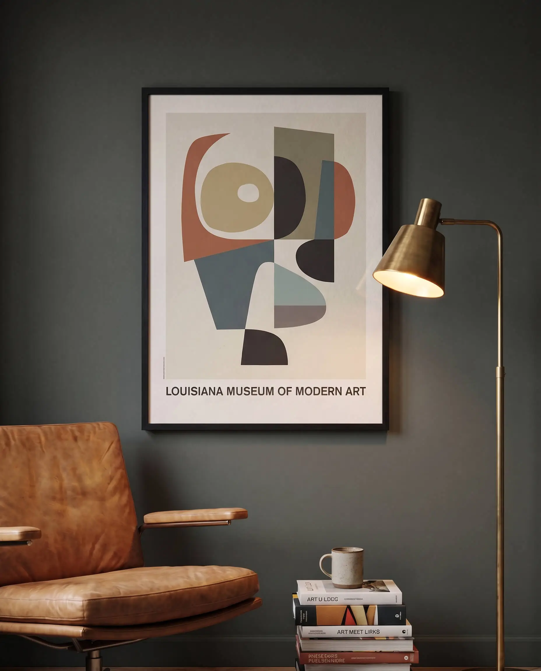
Exhibition posters from institutions like the Louisiana Museum of Modern Art or Tate Modern offer undeniable graphic impact and cultural experience. They seamlessly blend beautiful typography with iconic art, establishing a sophisticated, well-traveled atmosphere that demands attention.
- Vibe: Cultured, worldly, intellectual.
- Key Materials: Matte cotton-rag paper, vintage stock.
- Paint Recommendation: Farrow & Ball Studio Green for a moody, gallery-inspired backdrop.
- Sourcing Pro-Tip: Search online archives or secondary markets like 1stDibs and eBay for out-of-print, vintage exhibition runs.
Source Independent Typographic Prints
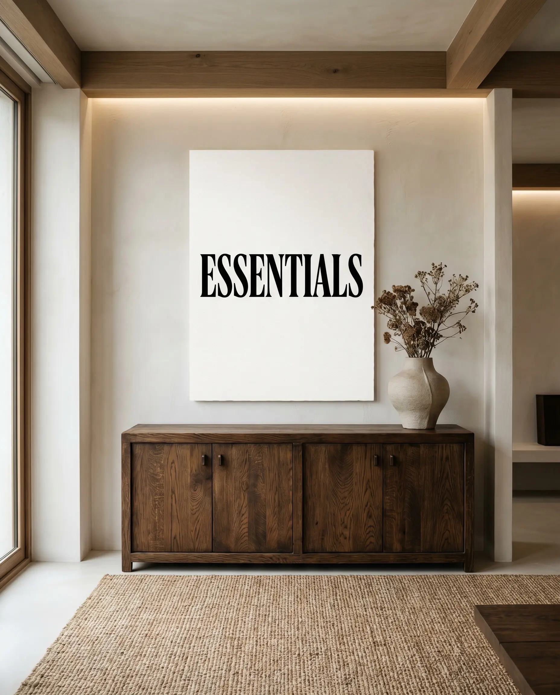
Serif typography posters act as a necessary visual palate cleanser for the eyes in complex, layered interiors. The heavy reliance on negative space makes them work beautifully in minimalist or Japandi spaces that already feature heavy textures and complex rugs.
- Vibe: Sleek, modern, restrained.
- Key Materials: Crisp white heavyweight paper, stark black ink.
- Styling Pro-Tip: Hang these above visually heavy furniture pieces to balance the room’s proportions.
Use Botanical and Scientific Lithograph Reproductions
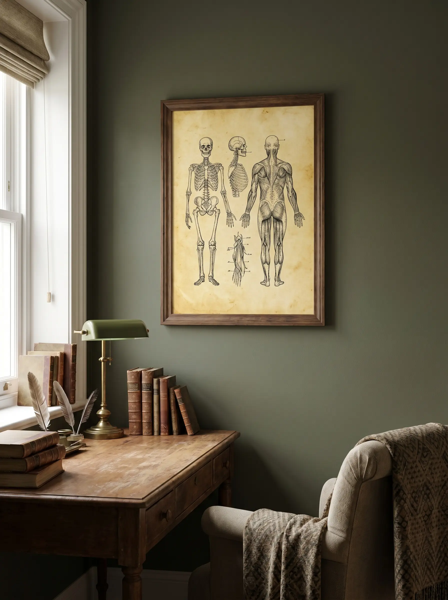
Vintage botanical or anatomical posters add a fascinating layer of historical curiosity to traditional, dark academia, or eclectic spaces. Their intricate linework and muted, aged tones invite viewers to step closer and examine the tactile details of the illustration.
- Vibe: Scholarly, eclectic, historically grounded.
- Key Materials: Aged parchment, sepia inks.
- Paint Recommendation: Benjamin Moore Dark Olive to pull out the natural greens.
Embrace Architectural Blueprints and Brutalist Sketches
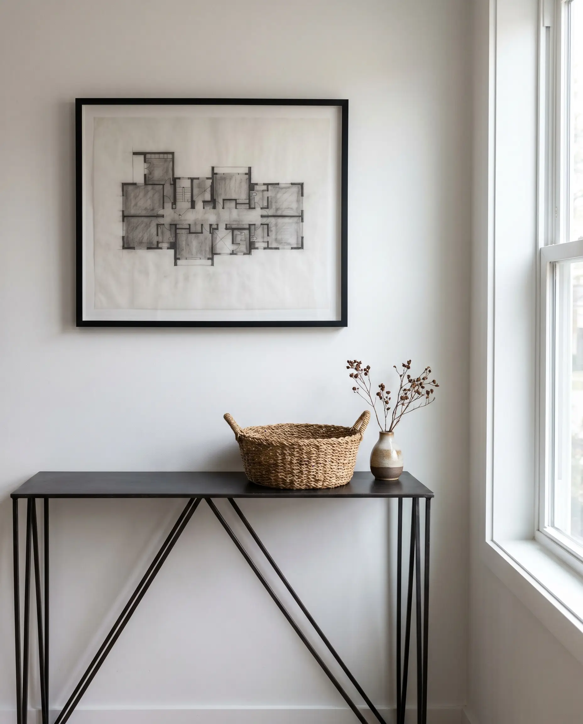
Posters featuring concrete structures, mid-century floor plans, or brutalist geometry bring a masculine, highly structured edge to soft interiors. This 2026 trend perfectly anchors a home office or entryway by introducing rigid, architectural lines.
- Vibe: Structured, industrial, masculine.
- Key Materials: Vellum, grayscale printing, charcoal tones.
- Placement Idea: Display above a delicate, spindly console table to create sharp visual tension.
Seek Out Vintage European Travel Posters
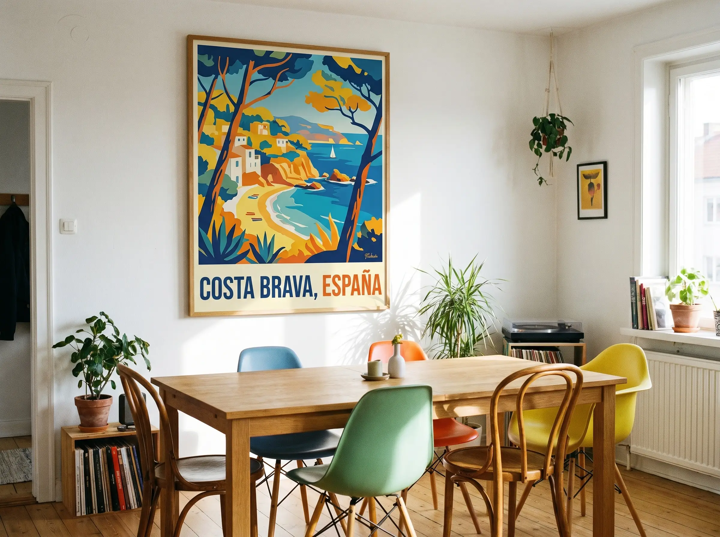
High-quality reproduction or original travel posters inject vibrant, Mediterranean warmth and nostalgia without skewing juvenile. They offer saturated hues that anchor a room’s palette while suggesting a life well-traveled.
- 1920s Art Deco: Geometric, bold typography, luxurious transportation themes.
- 1950s Mid-Century: Stylized, optimistic, vibrant Mediterranean coastlines.
- 1970s Graphic: Psychedelic colors, abstract landscapes, high-contrast layouts.
The Architecture of Framing: Making Paper Look Bespoke
Framing is where the accessible luxury magic happens; a $20 poster housed in a well-proportioned frame reads like a $500 gallery piece. Understanding the structural mechanics of frames dictates whether your art looks mass-produced or impeccably tailored.
| Framing Strategy | Pros | Cons | Ideal Budget Fit |
|---|---|---|---|
| Standard Pre-Made Frames | Highly affordable, readily available, easy to swap art seasonally. | Fixed sizes limit passe-partout options, often use cheap reflective plastic glazing. | Entry-level accessible luxury; best when upgrading the glazing yourself. |
| Custom Framing | Bespoke sizing, premium material options (burl, smoked oak), flawless matting ratios. | Significantly higher cost, longer lead times. | High-low mix; investing a heavy budget into the architecture of the frame for a budget print. |
Float-Mount Posters for a High-End Gallery Illusion
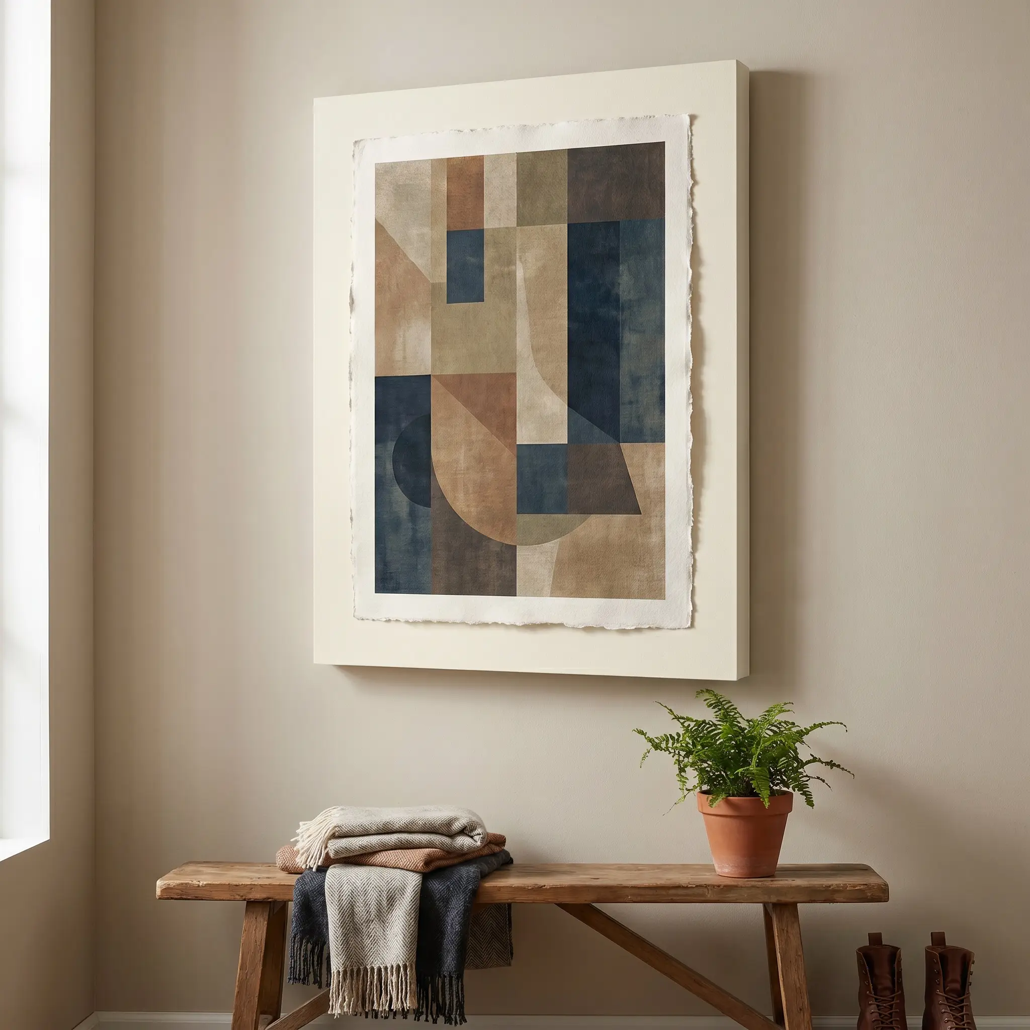
Instead of trapping the artwork behind a mat, mounting the poster directly on top of the mat board exposes its raw, tactile edges. This advanced technique creates a subtle physical drop shadow that instantly signals a bespoke, custom build.
- Vibe: High-end gallery, intentionally raw.
- Key Materials: Acid-free foam core, archival hinging tape.
- Color Match: Match the backing board exactly to the wall color for a floating effect.
Use Oversized Passe-Partout (Matting) for Small Posters
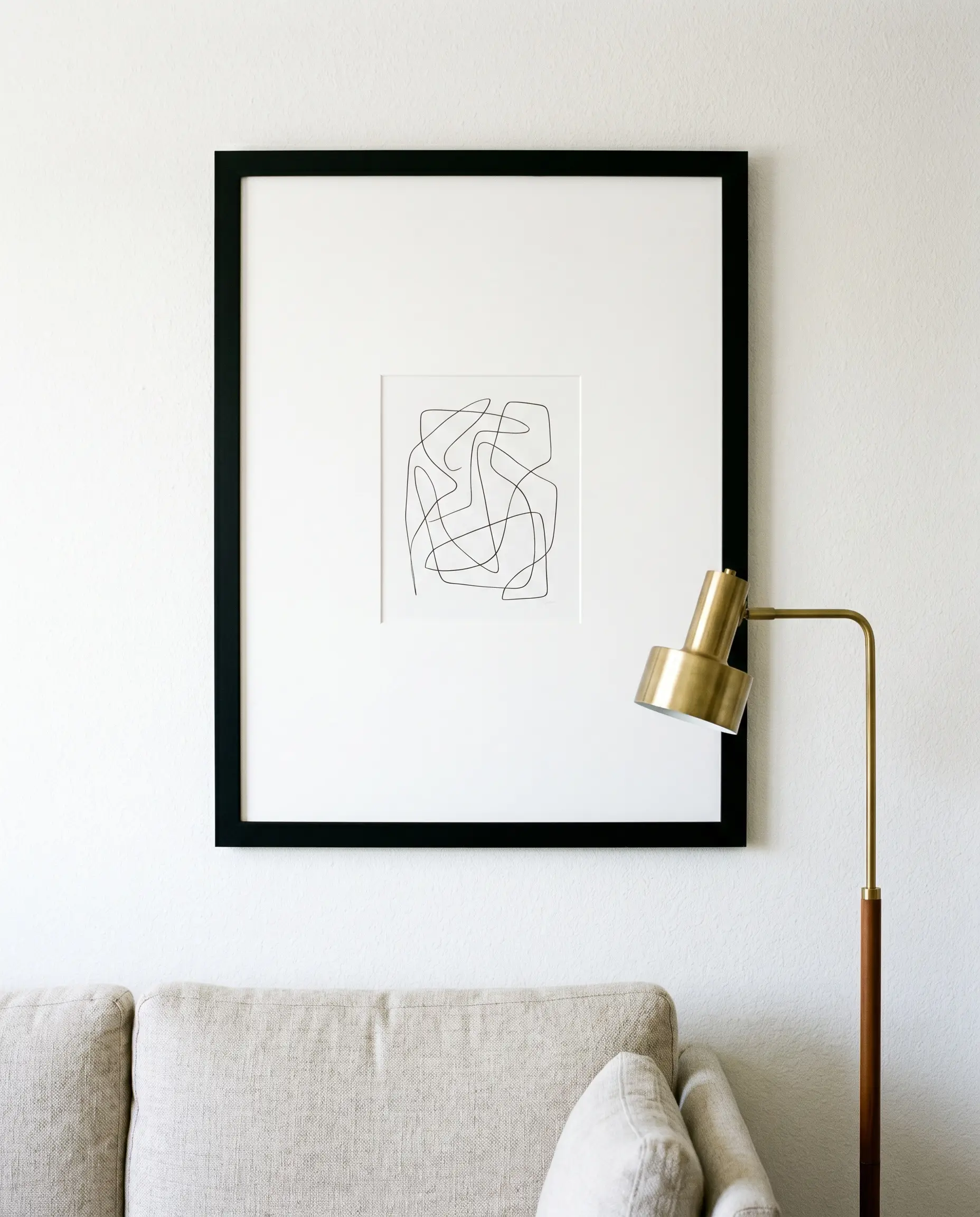
Placing a modest print inside a massive frame with a thick, custom-cut white passe-partout is a brilliant spatial illusion trick. The dramatic negative space commands attention and forces the eye directly into the artwork, making cheap prints look incredibly expensive.
- Vibe: Minimalist, editorial, dramatic.
- Key Materials: 8-ply archival white mat board.
- Dimension Rule: Always use an 8×10 print inside an 18×24 frame to achieve the correct curatorial ratio.
Contrast Modern Graphics with Burl Wood Frames
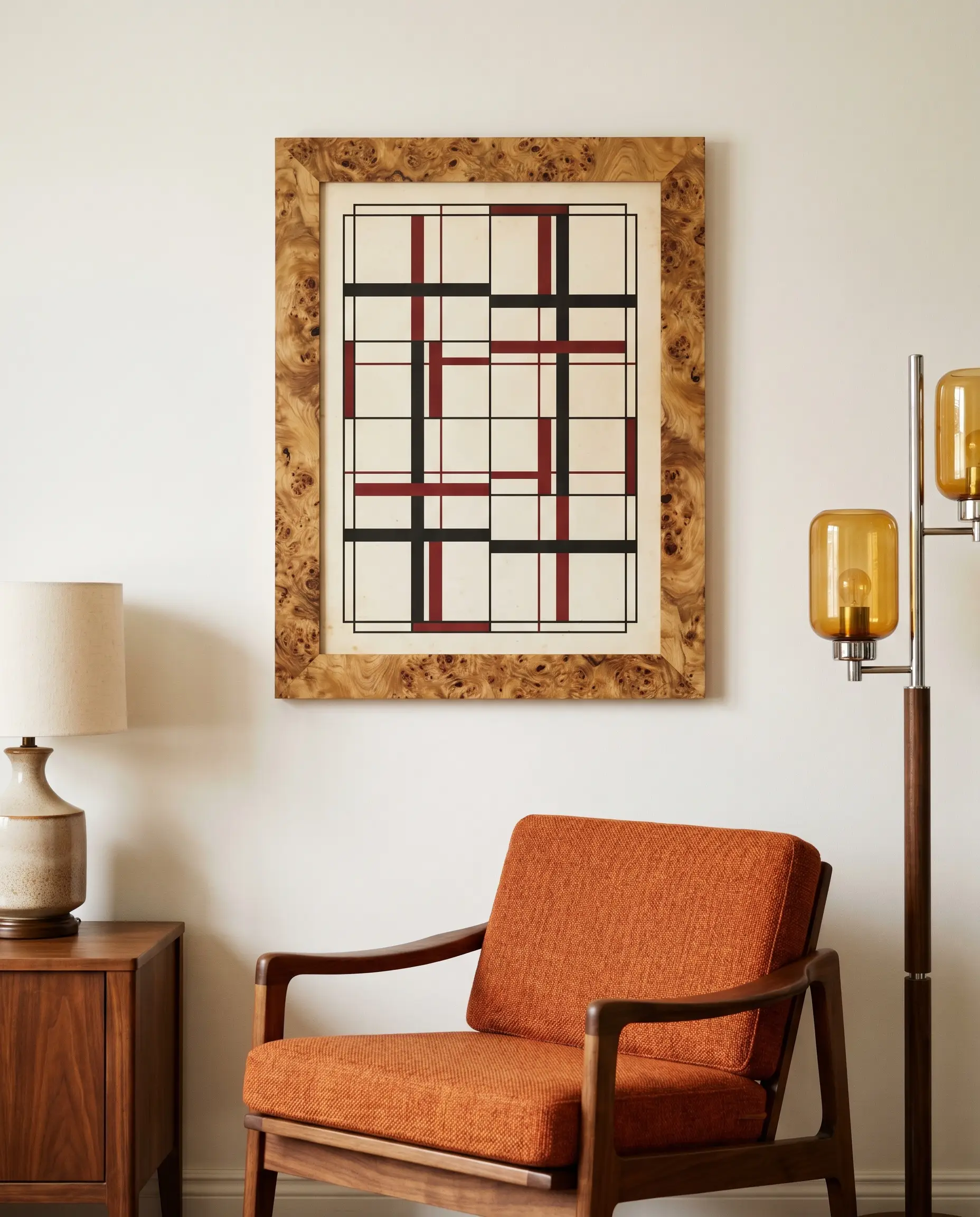
Burl wood adds chaotic, organic texture that completely disrupts the predictability of standard framing. Pairing this highly active wood grain with a rigidly structured, minimalist poster creates an elite, high-tension design moment.
- Vibe: Sophisticated, warm, slightly 1970s revival.
- Key Materials: Olive ash burl, walnut burl veneer.
- Styling Pro-Tip: Keep the surrounding wall relatively bare to let the frame’s texture breathe.
Pair Vintage Art with Sleek Brushed Steel
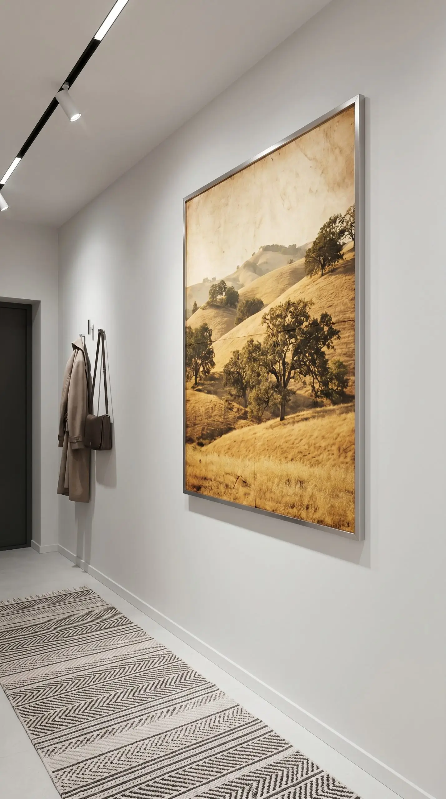
Taking a warm, aged vintage poster and housing it in a cold, brushed steel or aluminum frame is an exceptional styling move. This unexpected juxtaposition prevents vintage art from looking dusty or overly traditional.
- Vibe: Postmodern, sharp, unexpected.
- Key Materials: Thin-profile brushed aluminum, stainless steel.
- Paint Recommendation: Sherwin-Williams Pure White for a crisp, stark background.
Ditch Standard Glass for Non-Glare Museum Acrylic
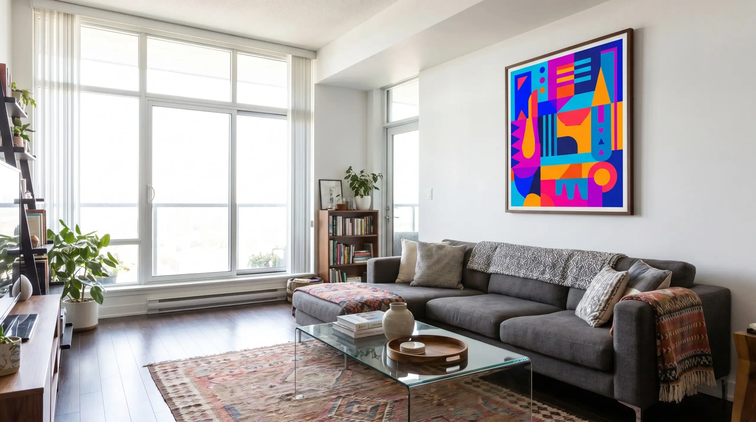
Big-box frames notoriously use cheap, highly reflective plastic that obscures the artwork under any natural light. Upgrading just the glazing to non-glare acrylic allows the poster’s colors to remain deep, saturated, and visible from any angle.
You can buy standard, budget-friendly frames and order custom-cut museum acrylic online for a fraction of the cost of full custom framing. This single upgrade transforms the piece’s perceived value.
Curator’s Secret
- Vibe: Professional, invisible, high-clarity.
- Key Materials: UV-filtering non-glare acrylic.
- Styling Pro-Tip: Crucial for posters hung directly opposite large windows.
Match the Frame Color to the Wall for a Monochromatic Look
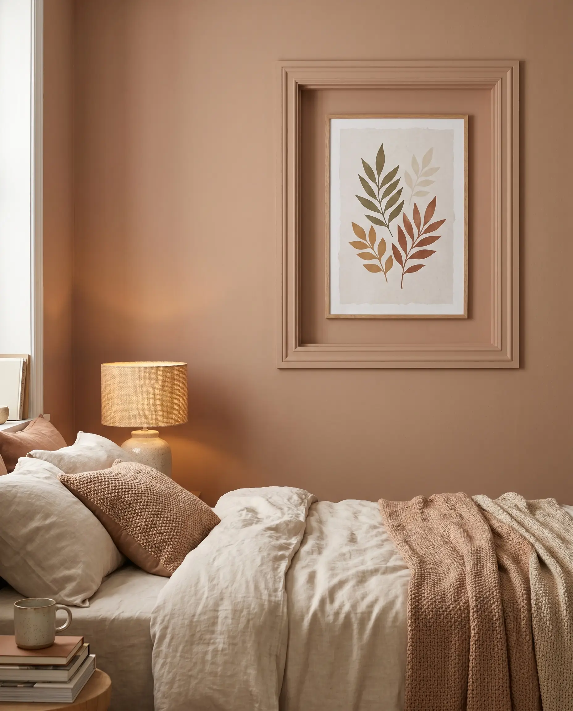
Painting your wooden frames the exact same color as your walls makes the artwork appear as if it is organically floating within the architecture. This seamless, color-drenched approach is perfectly suited for the 2026 trend of enveloping, warm neutral spaces.
- Vibe: Immersive, bespoke, subtle.
- Key Materials: Unfinished wood frames, interior latex paint.
- Paint Recommendation: Sherwin-Williams Redend Point for a warm, terracotta-beige monochromatic wrap.
Spatial Layouts: Where and How to Hang Them
Hanging art perfectly centered at eye level on a blank wall is merely the baseline of interior decorating. Elite curatorial styling actively plays with the room’s architecture, gravity, and asymmetry to create dynamic visual interest.
Lean Oversized Posters on the Floor for Casual Luxury
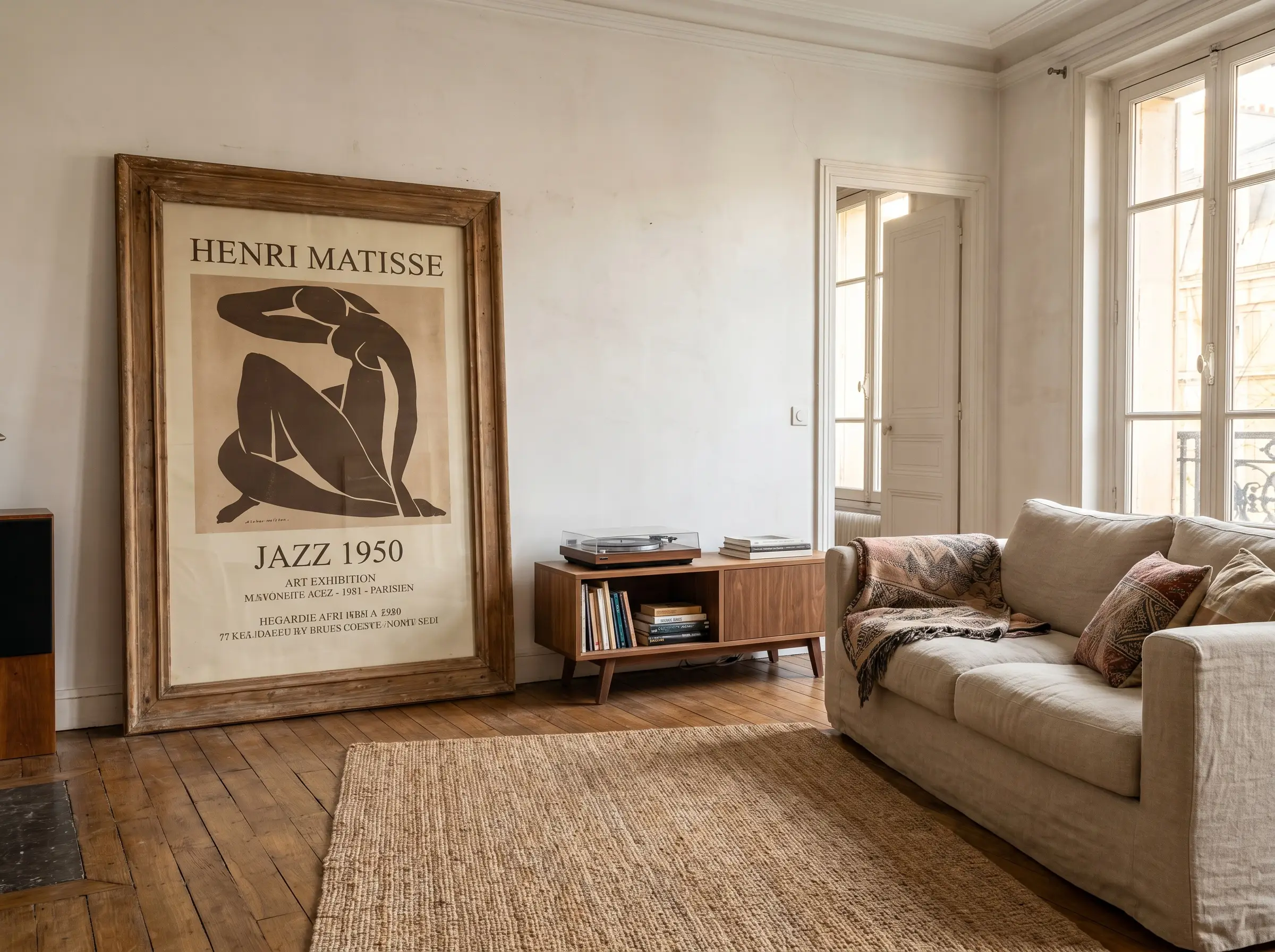
Buying massive frames, bypassing the hammer entirely, and casually leaning them against the wall exudes a relaxed, Parisian apartment aesthetic. This technique grounds the room’s visual weight and feels effortlessly chic rather than rigidly planned.
This technique absolutely requires massive, oversized frames (A1 size or larger). Leaning small 8×10 frames on the floor looks like forgotten clutter, not intentional design.
Scale Warning
- Vibe: Bohemian luxury, effortless, transient.
- Key Materials: Oversized solid wood frames, heavy glass to prevent slipping.
- Placement Idea: Lean against a bare wall next to a low-profile sofa or media console.
Layer Framed Posters on an Oak Picture Ledge
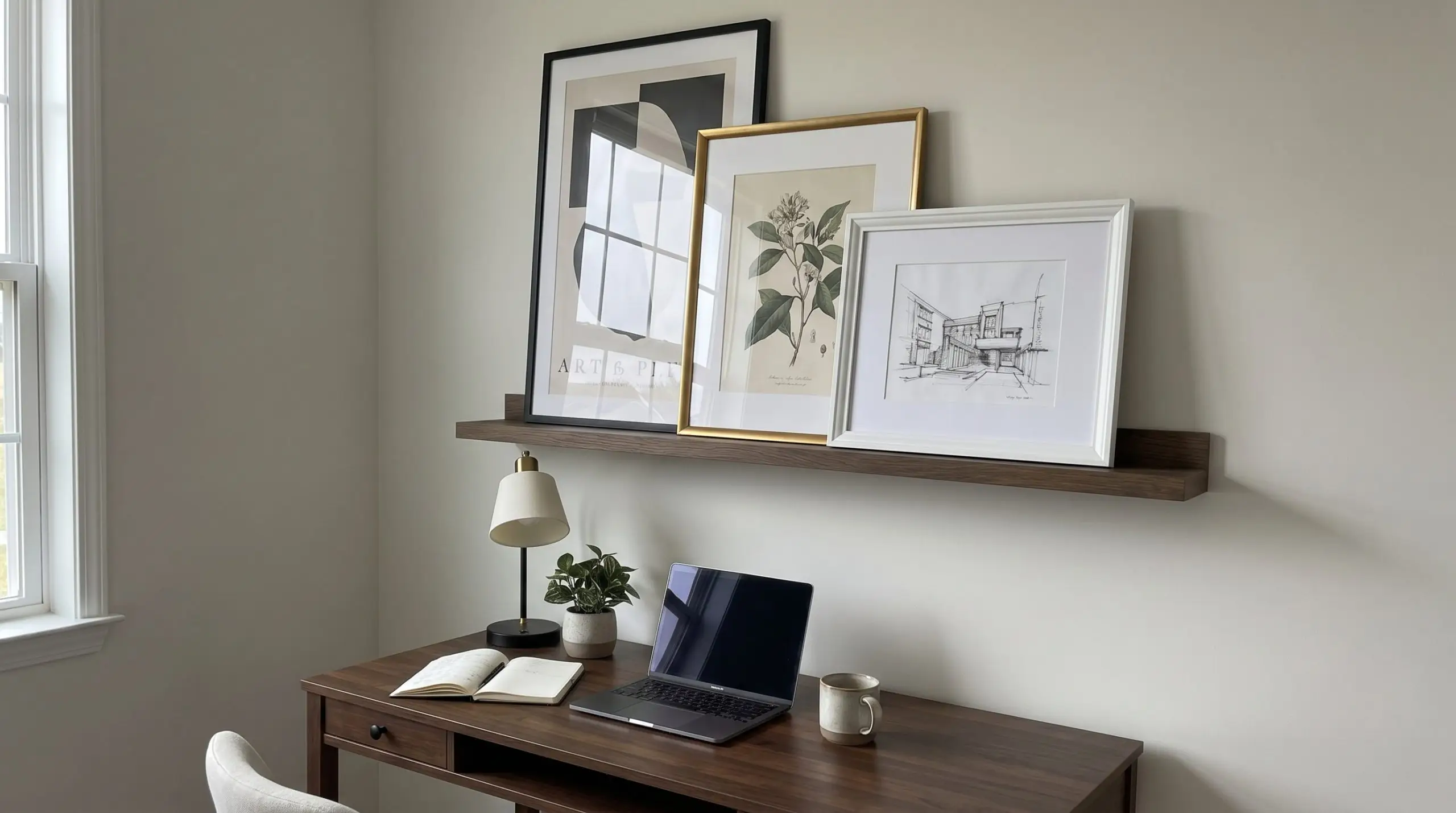
Installing a smoked oak picture ledge allows for a flexible, non-committal layout that can be updated seasonally. The trick to making this look curated rather than messy is to actively overlap three to four posters of varying heights and frame thicknesses.
- Vibe: Dynamic, casual, collected.
- Key Materials: Smoked oak floating ledge, mixed-profile frames.
- Layout Command: Explicitly overlap the edges of the frames to create tangible visual depth.
Create an Asymmetric Gallery Wall Around a TV
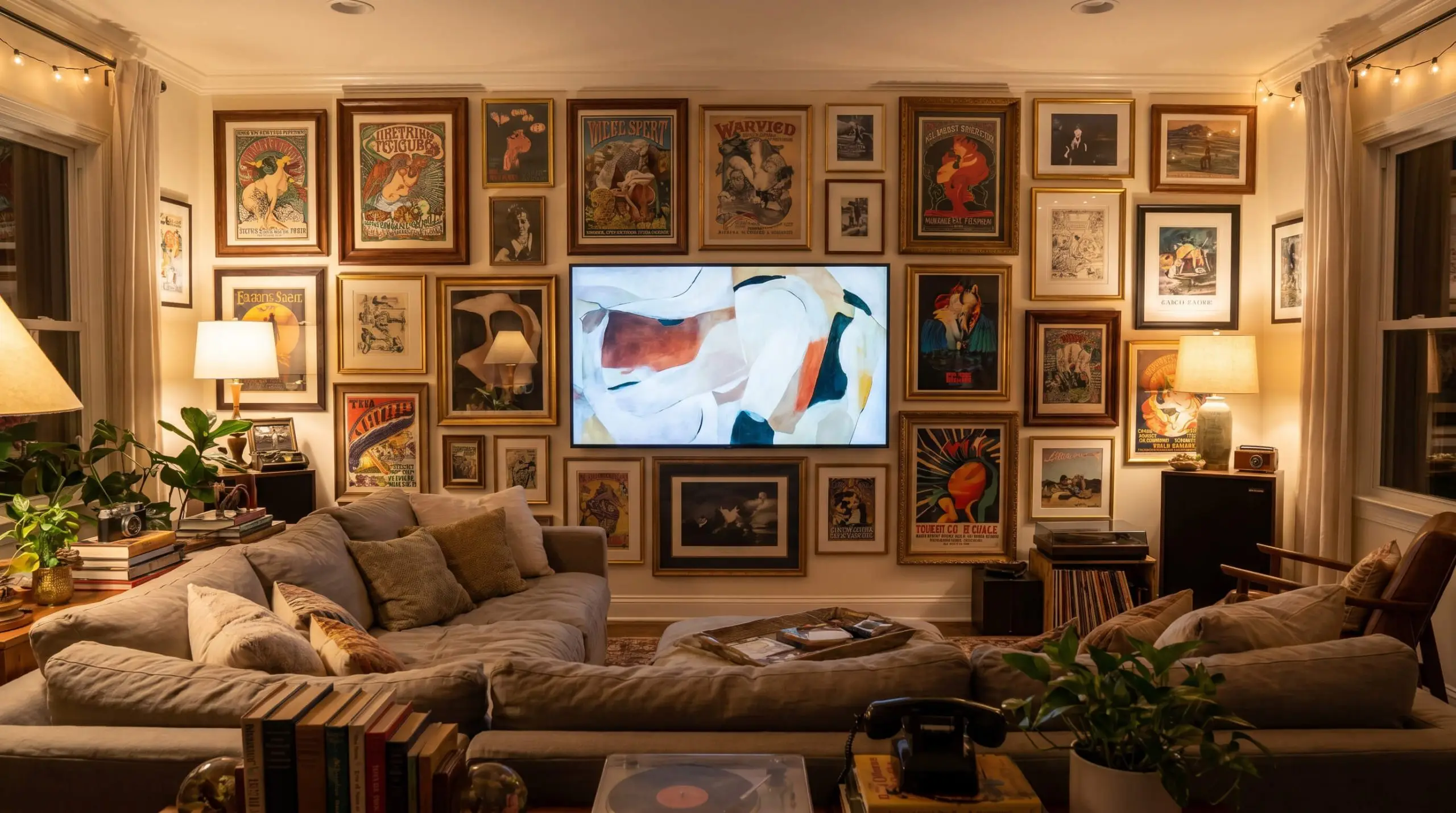
Instead of forcing a rigid grid, use an organic, asymmetrical arrangement of posters to camouflage the aggressive black void of a television screen. This sprawling layout integrates the technology into the room’s overall aesthetic narrative.
- Vibe: Lived-in, organic, camouflaged.
- Key Materials: Mixed media posters, varying frame finishes.
- Rule of Thumb: Do mix frame thicknesses and colors to build character; Don’t align the edges perfectly with the TV frame, which only highlights the screen.
Anchor a Jewel Box Nook with a Singular Bold Print
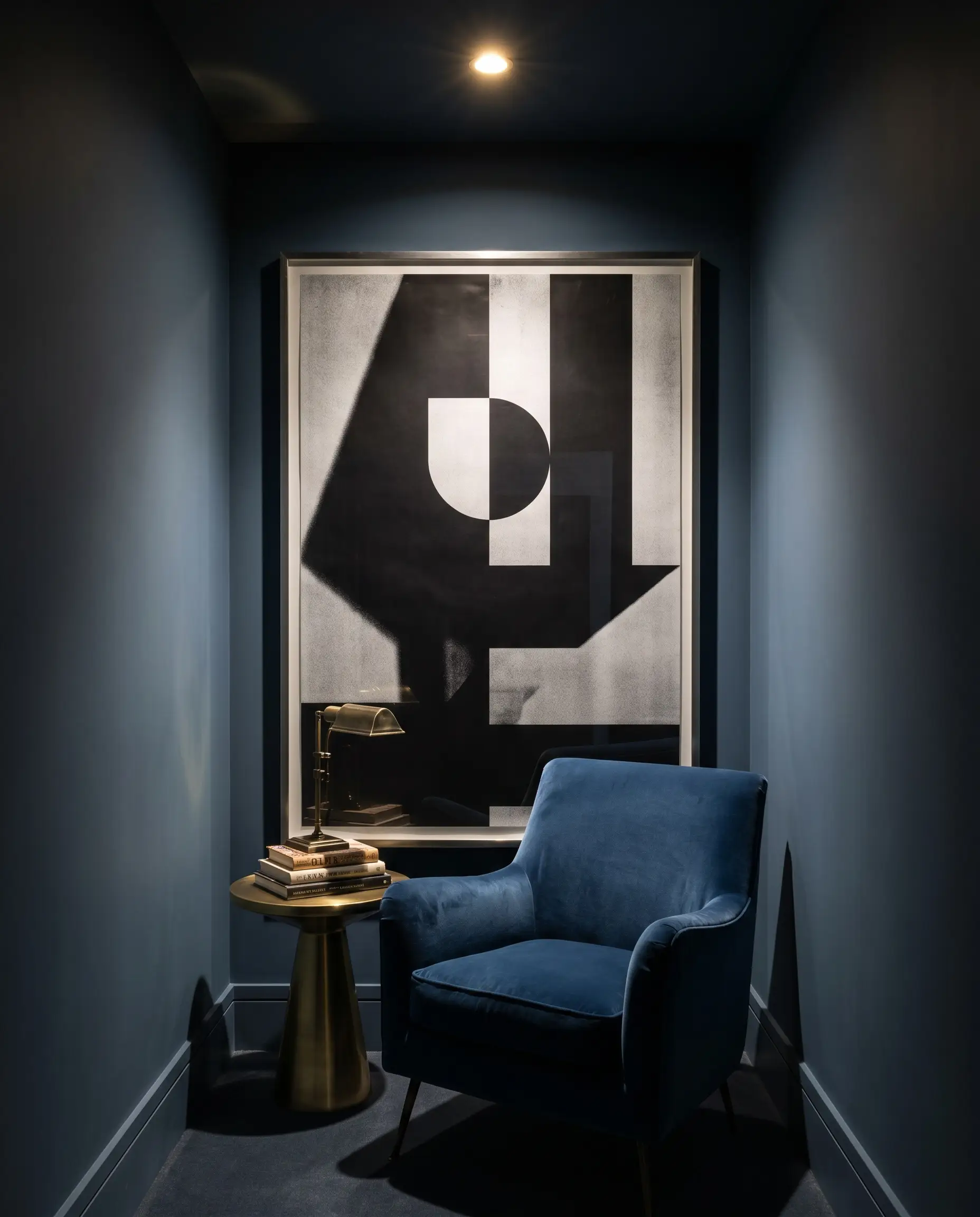
A jewel box nook—a small, highly saturated, windowless space like a dark powder room or a transitional reading alcove—requires a strong focal point. Using one massive, high-contrast poster to completely dominate the wall space creates a stunning, immersive moment.
- Vibe: Dramatic, theatrical, enveloping.
- Key Materials: High-contrast graphic prints, thin metal frames.
- Paint Recommendation: Farrow & Ball Hague Blue to create the dark jewel-box effect.
Hang Tall Vertical Posters in Narrow Hallway Transitions
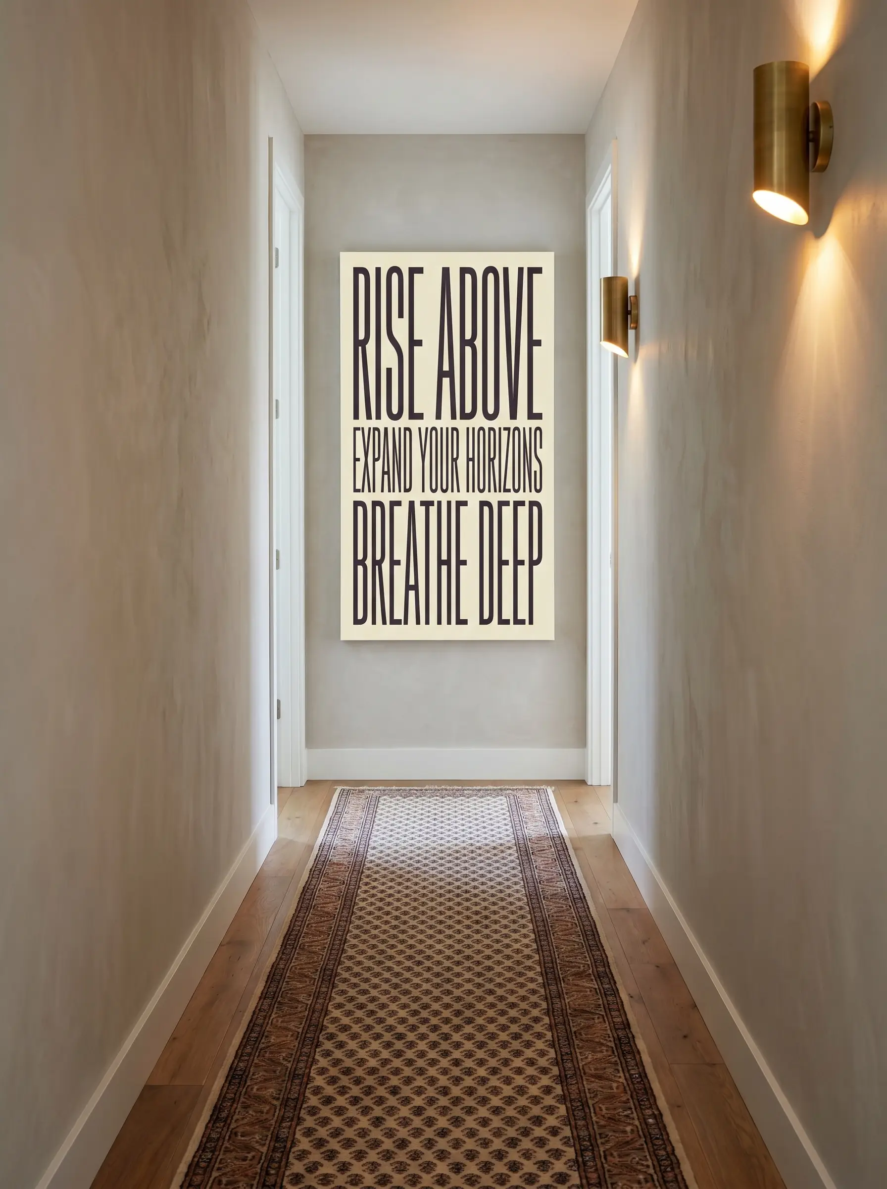
Dead architectural zones, like the ends of narrow hallways, are prime real estate for spatial manipulation. Utilizing panoramic or unusually tall, thin posters in these areas successfully draws the eye forward and elongates the perceived height of the ceiling.
- Vibe: Architectural, expansive, intentional.
- Key Materials: Custom panoramic frames, vertical typographic prints.
- Styling Pro-Tip: Ensure the center of the vertical print hits exactly at eye level.
Suspend Unframed Canvas Posters with Magnetic Wood Hangers
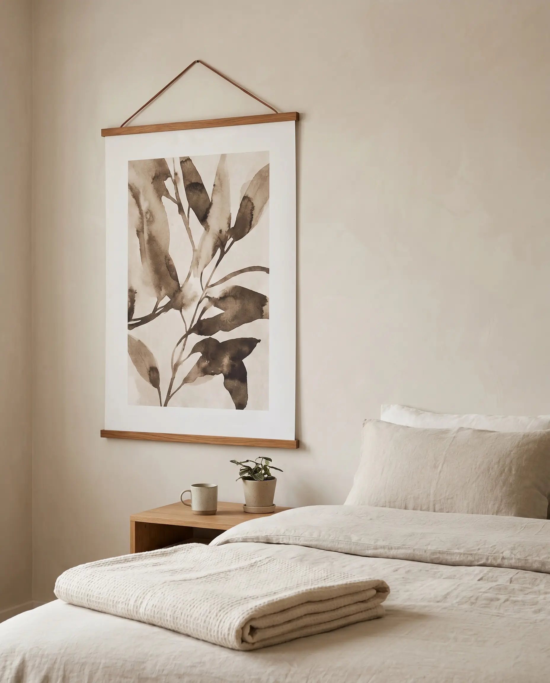
For thick cotton-rag paper or canvas posters, utilizing teak or oak magnetic hangers is the only acceptable way to display unframed art as an adult. It feels highly intentional, leans into Japandi minimalism, and protects the integrity of the paper without the damage of pins or tape.
- Vibe: Japandi, minimalist, tactile.
- Key Materials: Solid teak magnetic bars, leather hanging cords.
- Best Paired With: Heavyweight canvas reproductions or vintage pull-down maps.
Pattern Drenching: Hang Posters Directly Over Wallpaper
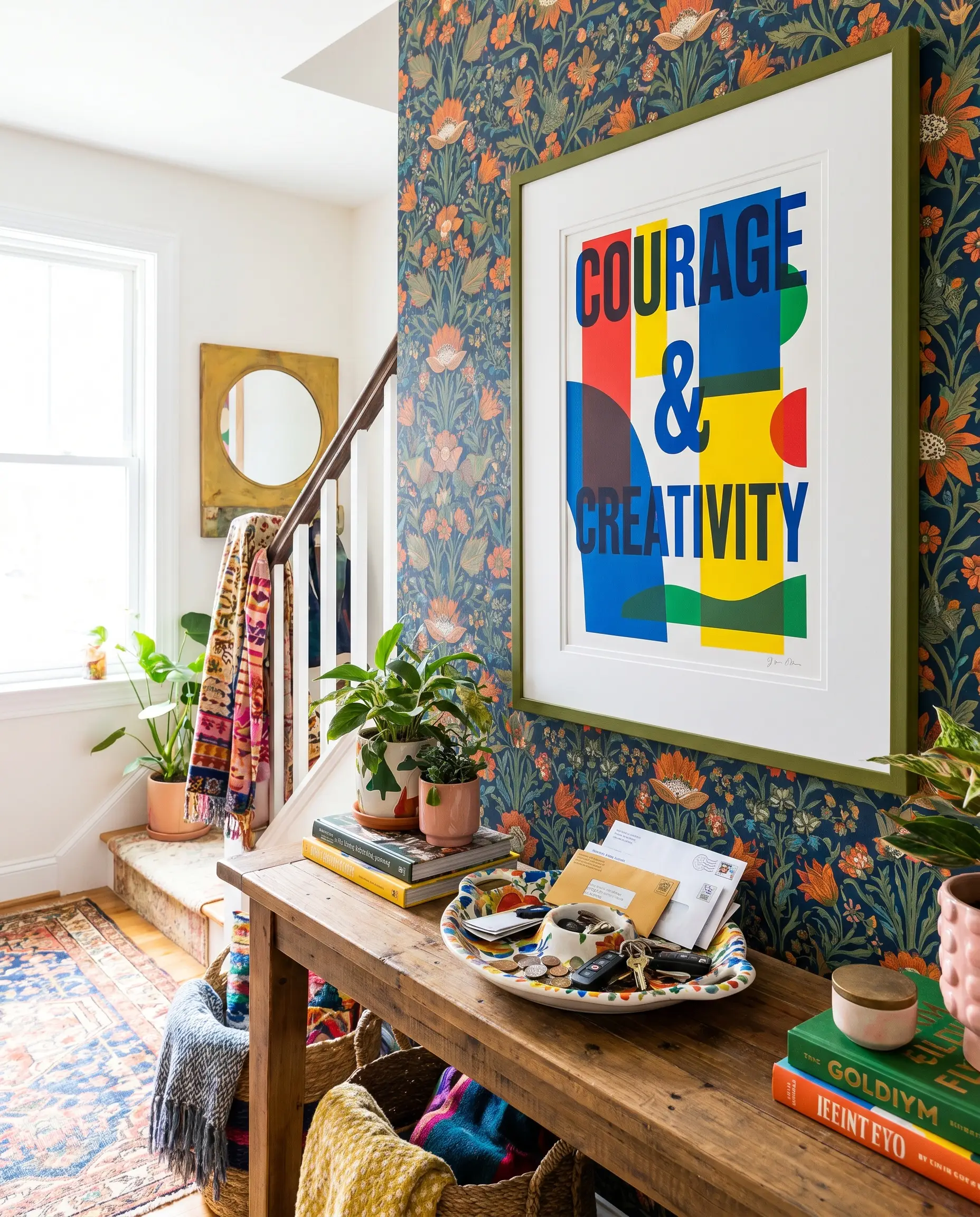
Do not shy away from the maximalist trend of hanging highly graphic posters directly over intricately patterned wallpaper. The secret to ensuring the art doesn’t get lost in the chaos is using a thick, stark white mat to provide necessary visual breathing room.
- Vibe: Maximalist, brave, layered.
- Key Materials: Bold wallpaper, extra-wide 8-ply matting.
- Styling Pro-Tip: Pull one minor accent color from the wallpaper and match the poster’s frame to it.
Styling Context: Integrating Posters with Room Elements
A framed poster never exists in a vacuum. Styling context is the final layer of curation, determining exactly how your flat artwork interacts with the lighting, textiles, and three-dimensional objects sharing its spatial footprint.
Contrast Flat Paper with Sculptural Wall Sconces
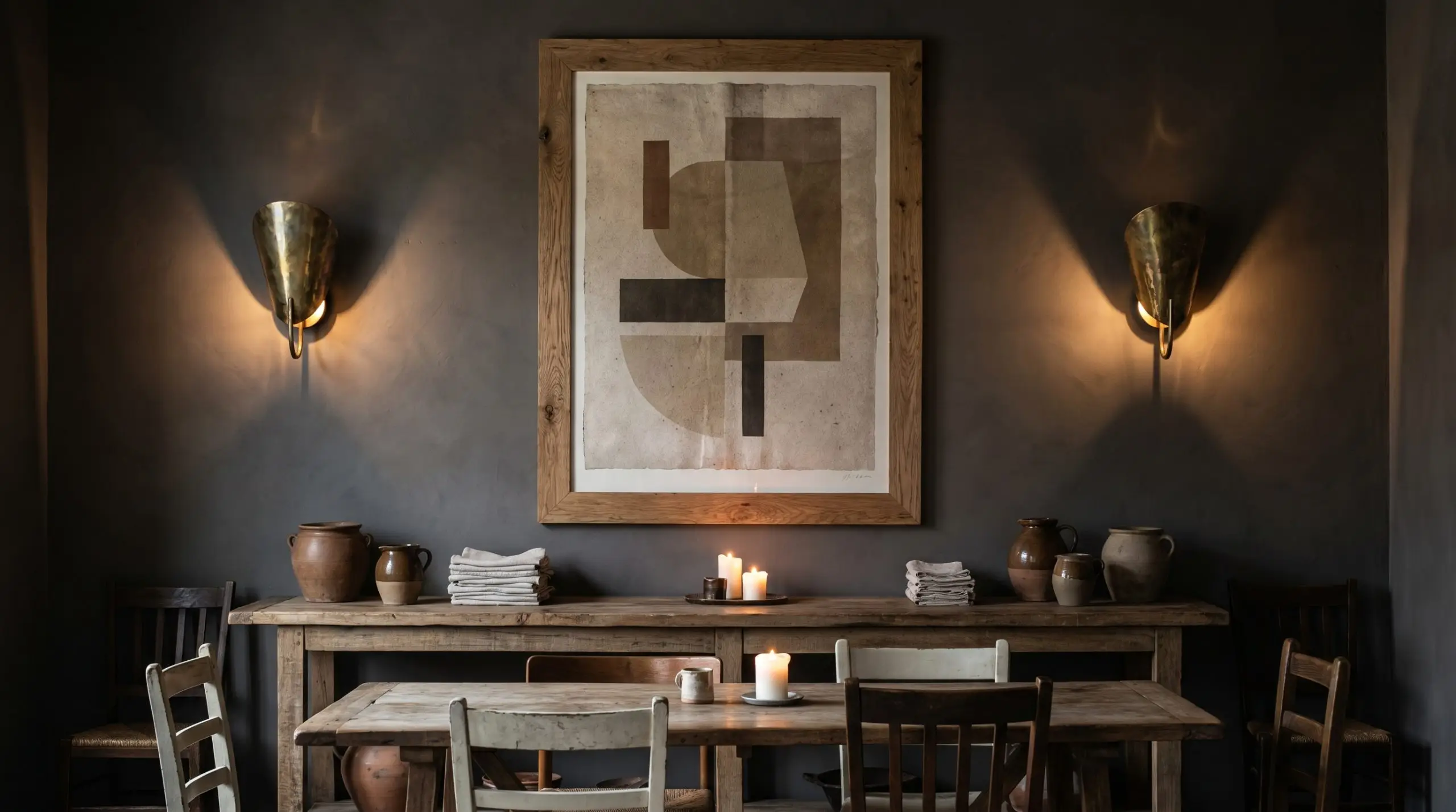
Flanking a large, two-dimensional poster with sculptural, organic wall sconces introduces vital three-dimensional geometry to the wall. The subsequent interplay of light and shadow physically integrates the flat paper into the room’s broader architecture.
- Vibe: High-end hospitality, moody, architectural.
- Key Materials: Aged brass or matte plaster sconces.
- Styling Pro-Tip: Mount sconces precisely halfway up the vertical length of the frame for perfect balance.
Pair Typography Posters with Organic Ceramics
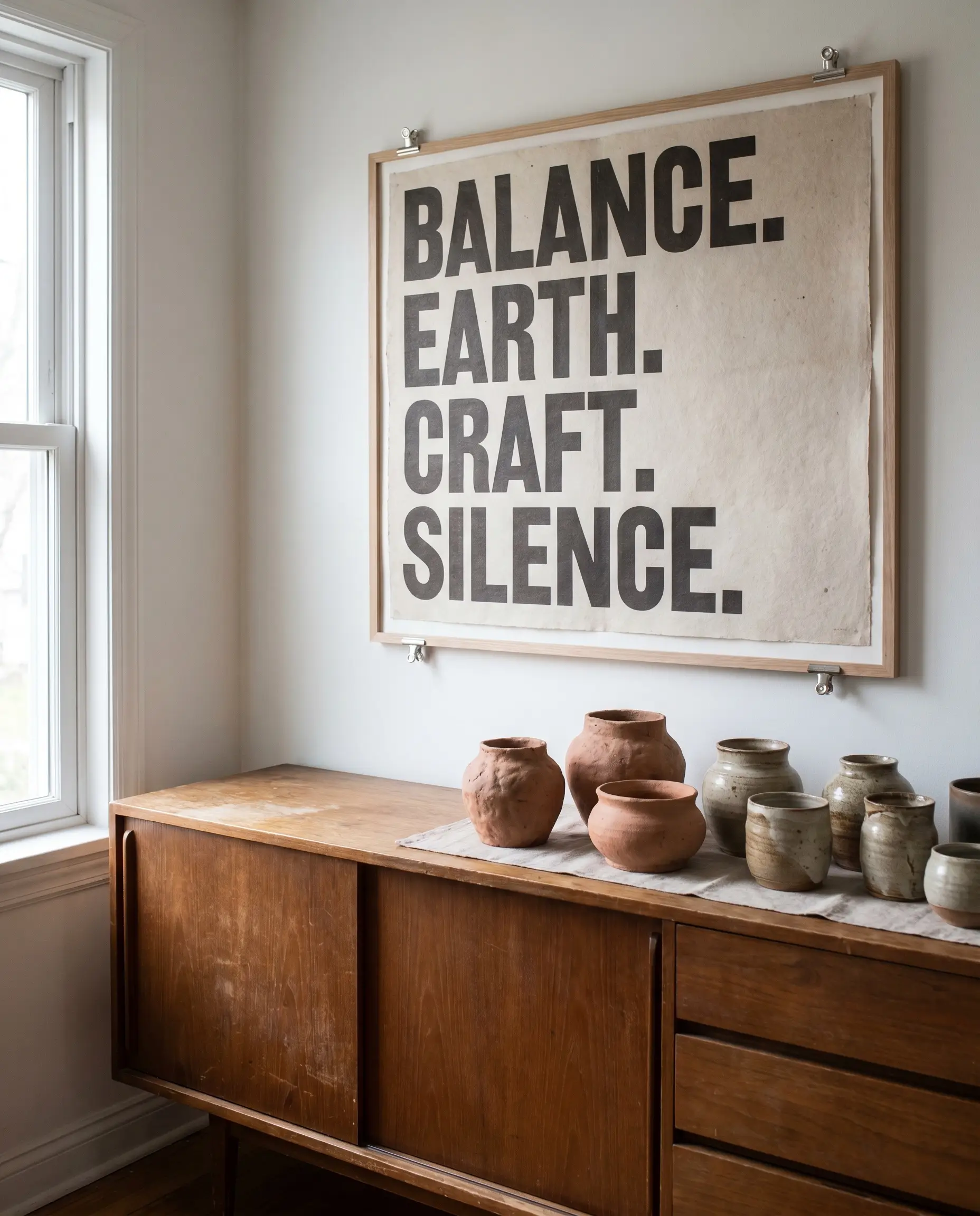
When hanging a rigid, text-heavy poster over a credenza, the sharp angles of the font demand a counterbalance. Styling the surface below it with lumpy, wabi-sabi ceramics creates a beautiful visual tension between hard graphic lines and soft, organic clay.
- Vibe: Balanced, tactile, grounded.
- Key Materials: Unglazed terracotta, hand-thrown stoneware.
- Styling Pro-Tip: Off-center the ceramics slightly to the left or right of the poster to avoid stiff symmetry.
Break Up Wainscoting by Overlapping the Molding
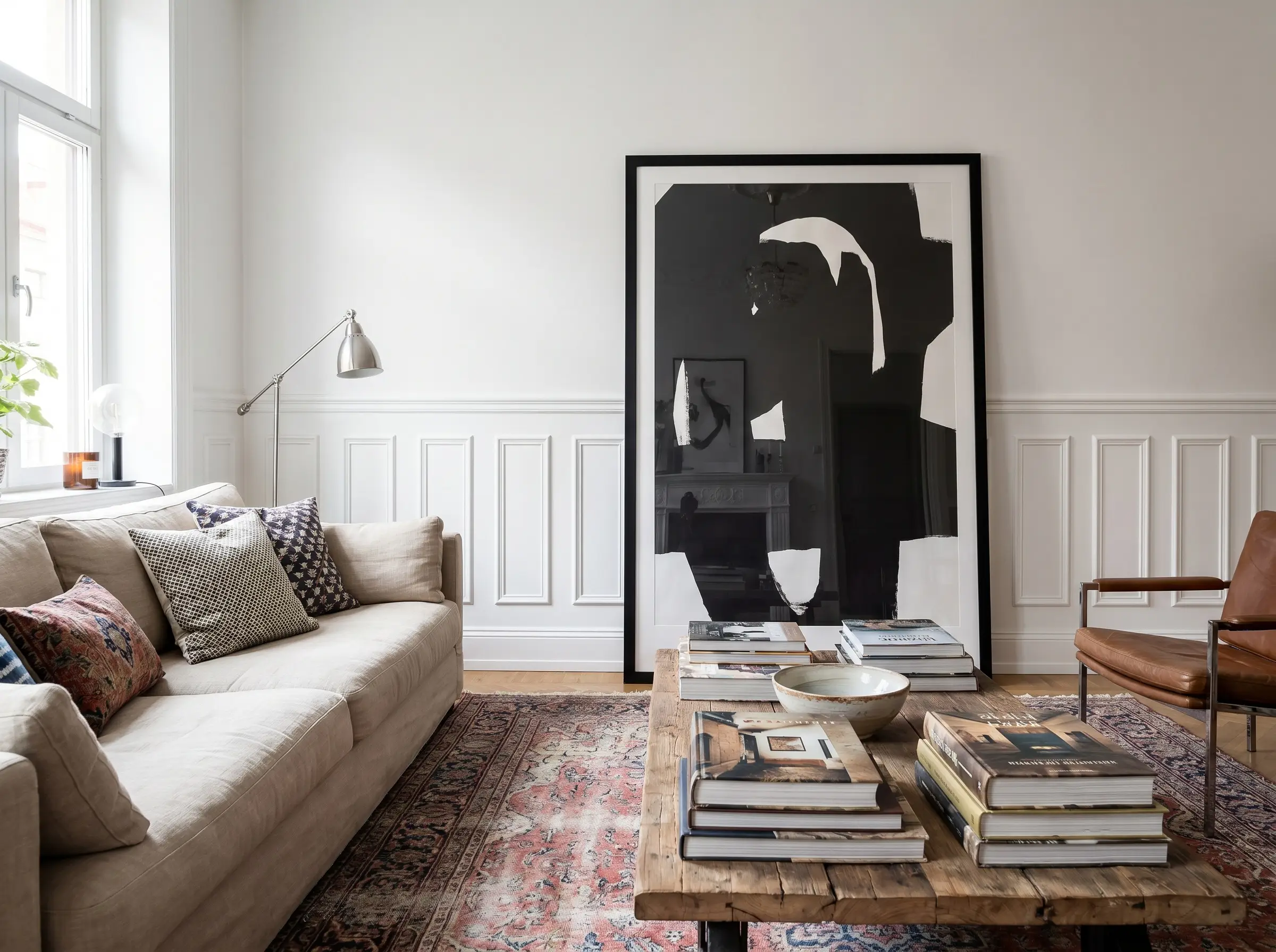
Resist the urge to perfectly center small posters inside the negative space of wall paneling. Hanging a large, oversized poster so it intentionally and unapologetically overlaps the wainscoting molding is a daring, designer-level move that feels decidedly modern and less stuffy.
- Vibe: Rebellious, modern traditional, confident.
- Key Materials: Oversized frames, traditional millwork.
- Installation Note: Use a small wooden spacer block behind the top of the frame so it hangs perfectly plumb against the molding.
Use Posters to Echo Your Accent Chair’s Upholstery
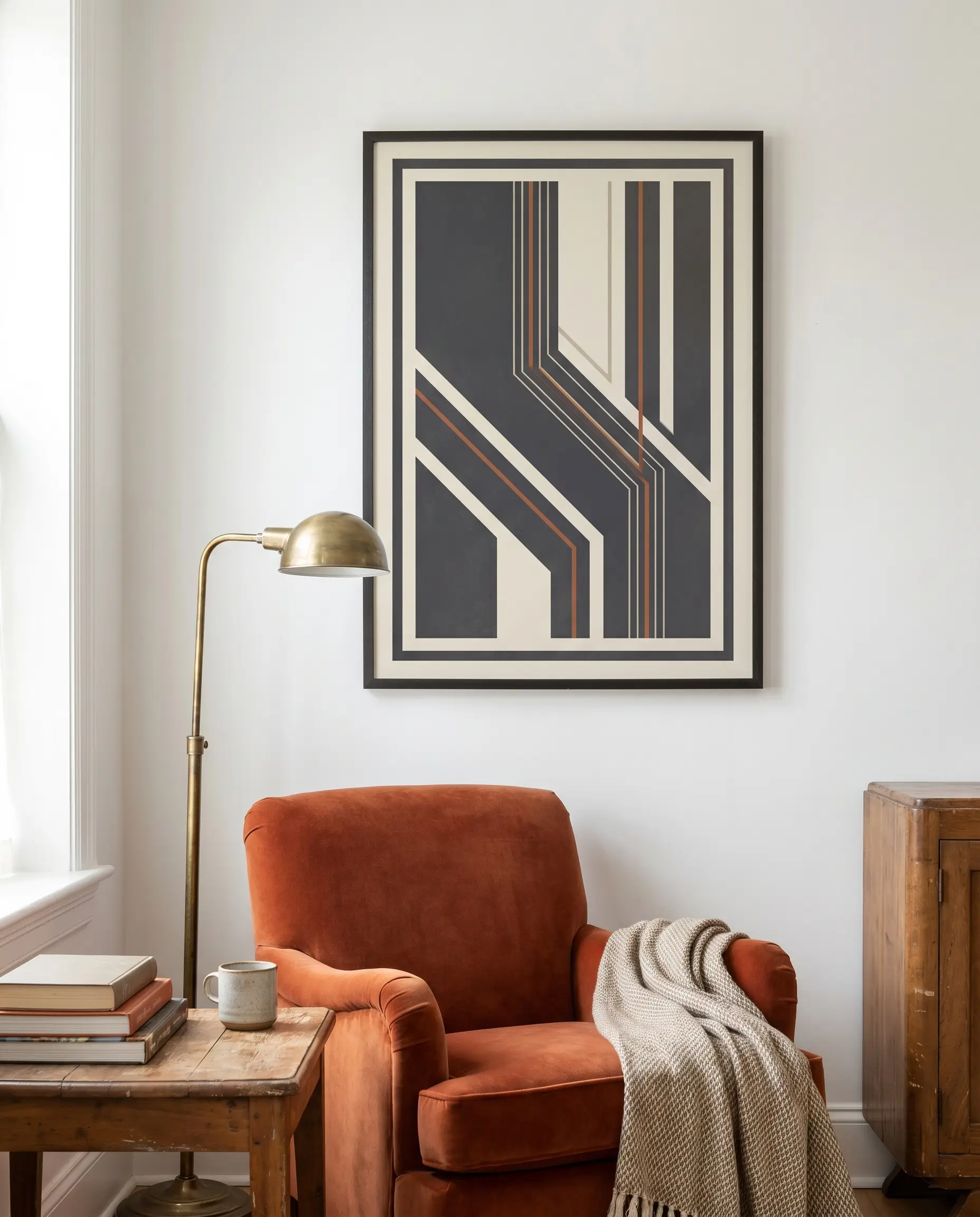
You can instantly tie a room’s disparate elements together by utilizing basic color theory between your art and textiles. Pull a minor, secondary hue from the poster’s ink and match it directly to a sumptuous fabric in the room, like a velvet accent chair.
- Vibe: Cohesive, tailored, deliberate.
- Key Materials: Velvet, bouclé, linen upholstery.
- Styling Pro-Tip: Never match the poster’s primary background color to the chair; always use a subtle accent shade to avoid looking overly themed.
Illuminate Statement Posters with Brass Picture Lights
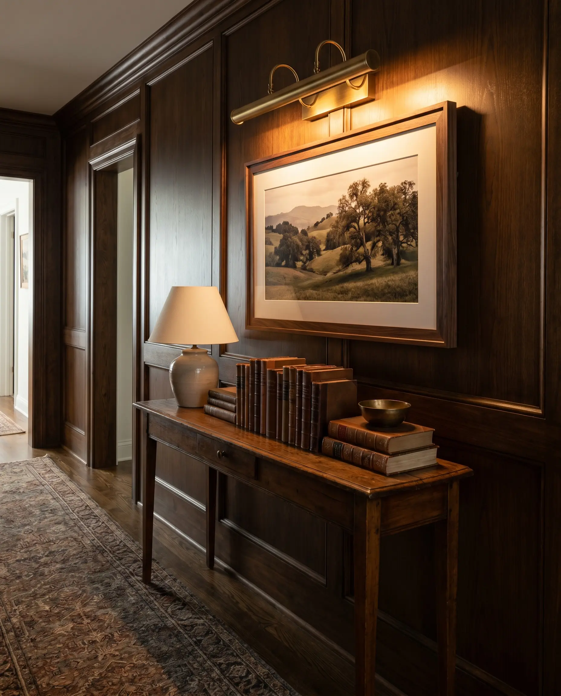
Applying classic fine-art lighting techniques to accessible prints instantly tricks the brain into perceiving the poster as a high-value asset. Installing a sleek brass picture light directly above the frame washes the paper in a warm glow, mimicking an exclusive gallery setting.
- Vibe: Heritage, sophisticated, curated.
- Key Materials: Unlacquered brass, warm LED bulbs (2700K).
- Accessible Luxury Tip: Renters can utilize battery-operated, remote-controlled LED picture lights to achieve this look without hardwiring.
Mix Framed Posters with 3D Objects (Mirrors and Masks)
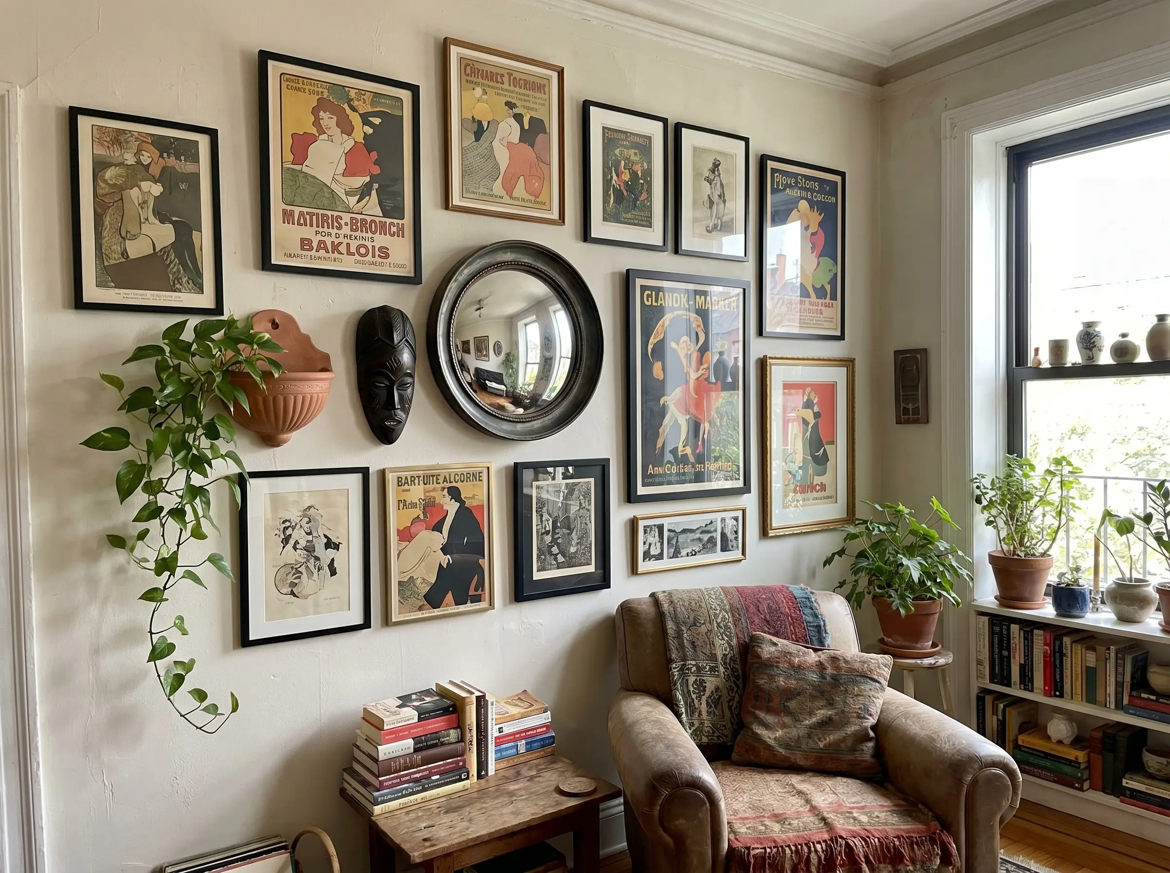
A sprawling gallery wall composed entirely of flat, rectangular posters can quickly feel stagnant and heavily two-dimensional. You must break up the rigid grid by integrating rounded, three-dimensional objects that protrude into the room’s airspace.
- Round Convex Mirrors: Reflects light and breaks up straight lines.
- Carved Wooden Masks: Introduces deep, organic shadows and cultural texture.
- Trailing Pothos Plants: Adds living, asymmetrical movement to static frames.
The Curator’s Final Walkthrough: Elevating Your Walls
Posters are not a design compromise; they are a legitimate, highly versatile medium for modern interiors. When executed with precision, spatial awareness, and proper framing mechanics, accessible prints command the same respect as original canvas works. You now possess the curatorial playbook to transform flat paper into bespoke architectural moments.
Select just one framing technique or spatial layout from this guide and upgrade a print you already own this weekend. Whether you are ordering a custom oversized passe-partout or leaning a massive vintage exhibition poster against your baseboards, the difference is in the details. Share your newly curated setups in the comments below or tag Hackrea on social media so we can celebrate your walls.