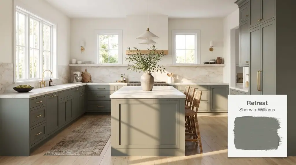
Sherwin-Williams Retreat (SW 6207) is a muted, medium-dark green-gray paint color. With an LRV of 21, it acts as a moody, grounding neutral that shifts between sage, slate, and blue-gray depending on the lighting conditions.
Will Retreat clash with your room?
Paint Technical Profile
| Color ID / SKU | SW 6207 |
| HEX Code | #7A8076 |
| Light Reflectance (LRV) | 21 |
| Temperature | Cool |
| Primary Undertone | Gray |
| Hidden Undertones | Blue, Sage Green |
| Use | Interior, Exterior |
| Best Exposures | South, West |
| Best For | Kitchen cabinets, exterior siding, primary bedrooms, accent walls |
Retreat Digital Design Concept Boards
Kitchen Cabinets
Will Retreat work with your specific lighting, floor, or furniture?
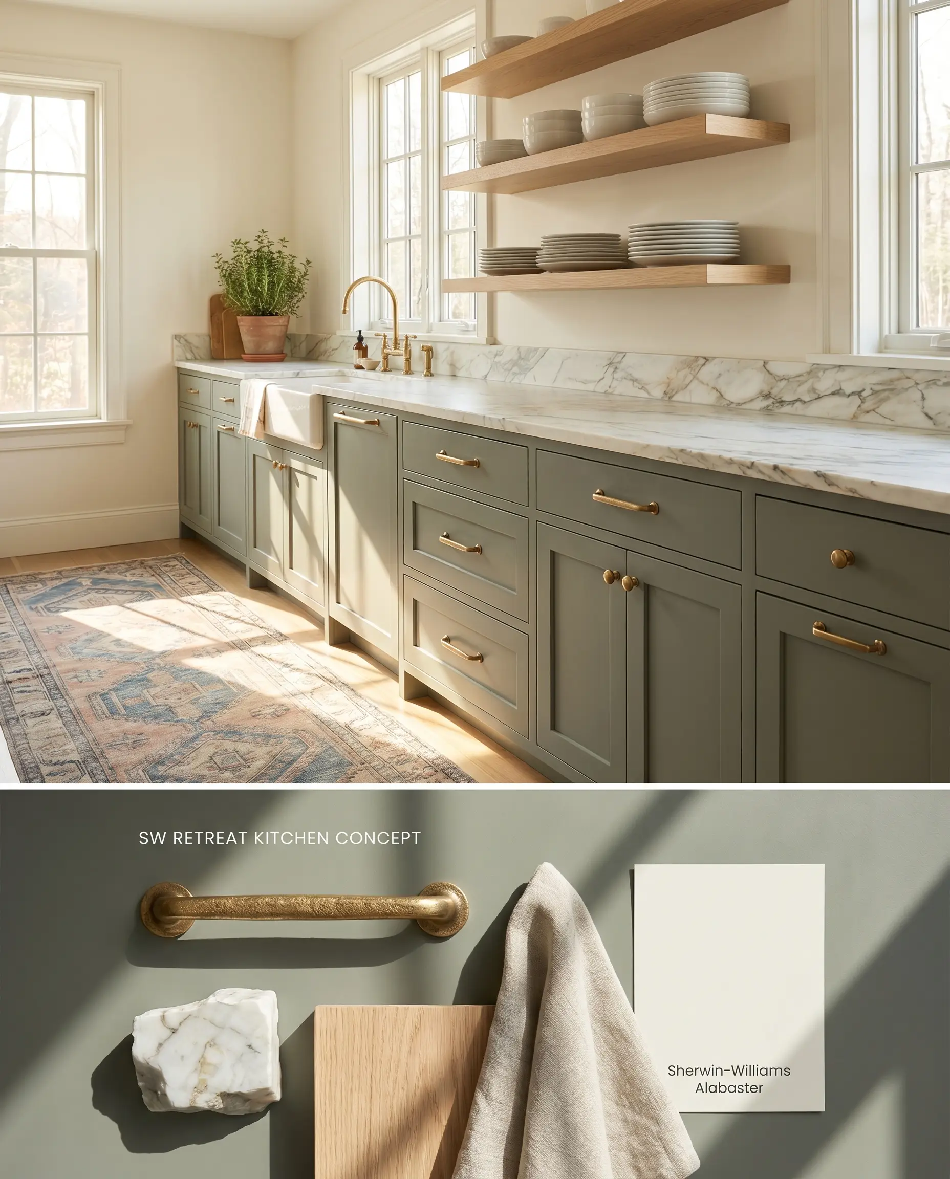
Retreat anchors lower cabinetry with a grounding, moody earthy tone that prevents expansive kitchens from feeling sterile. Its low light reflectance absorbs the glare of under-cabinet LEDs, while the subtle blue-gray shift contrasts effectively against warm, organic materials like unlacquered brass and rift-sawn white oak.
Exterior Siding & Trim
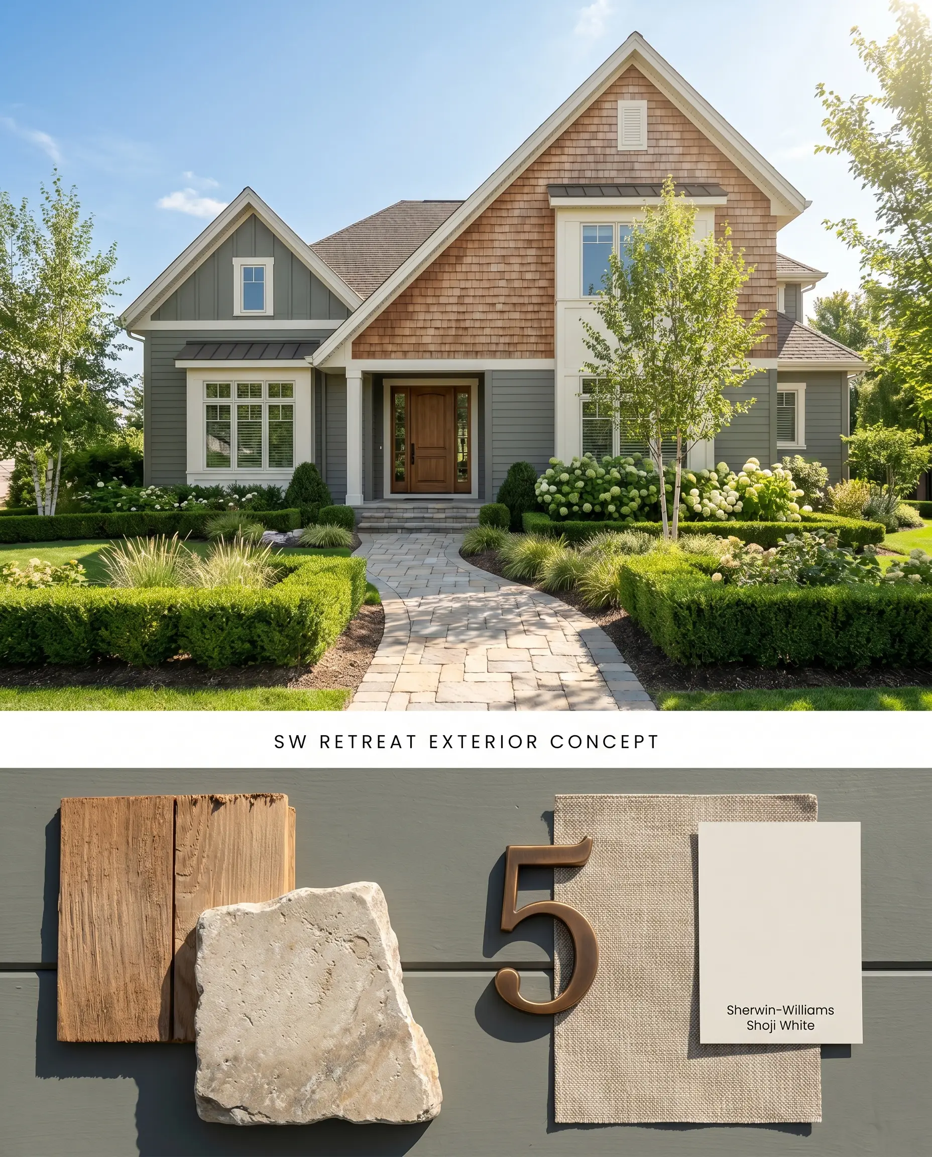
This green-gray neutral excels on exteriors because natural sunlight washes out its depth, making it appear slightly lighter and highly tailored rather than imposing. The paint’s natural light reactivity dictates that it will read distinctly green-gray on sunny days and lean into a cooler, slate-like tone under overcast skies.
Primary Bedrooms
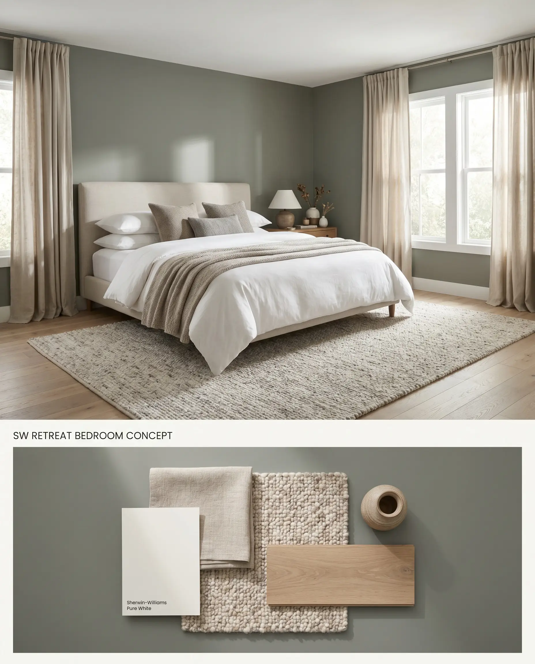
Applying this chromatic profile to bedroom walls envelops the room in a grounded, organic shade that promotes rest. To prevent the LRV 21 rating from turning the room into a low light trap, the surrounding textiles and flooring must introduce significant brightness and tactile variation.
Accent Walls
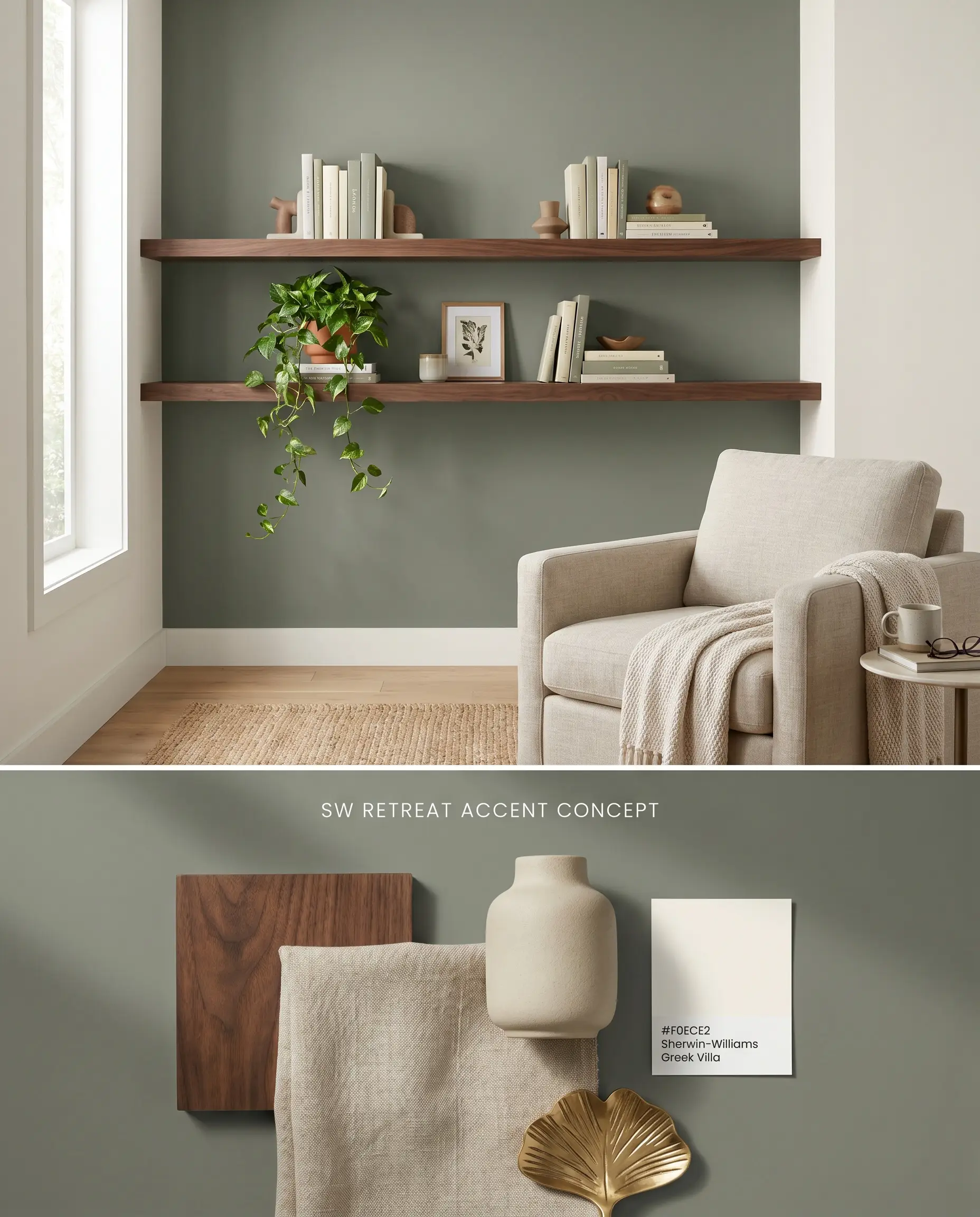
Confining Retreat to a single focal wall allows you to harness its depth without compromising the overall brightness of a space. This targeted application works specifically well behind beds or living room built-ins where the color acts as a receding backdrop for lighter furnishings.
Bathroom Vanities
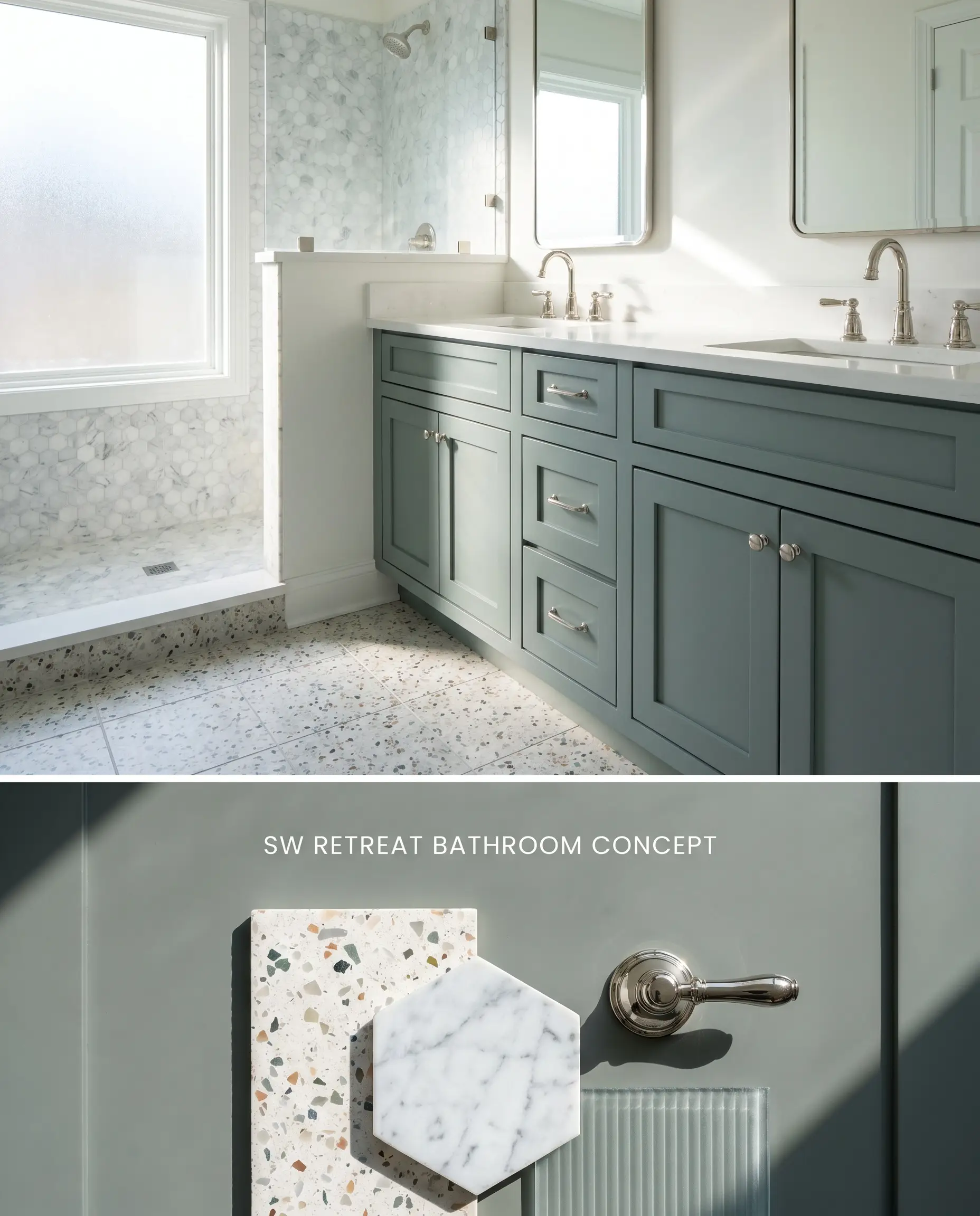
A vanity painted in this moody earthy tone grounds a bathroom dominated by hard, reflective tile and mirror surfaces. Due to its light-absorbing properties, this application is strictly forbidden in windowless spaces where the pigment flattens into a dark shadow.
Evaluating the Chromatic Profile: Head-to-Head Comparisons
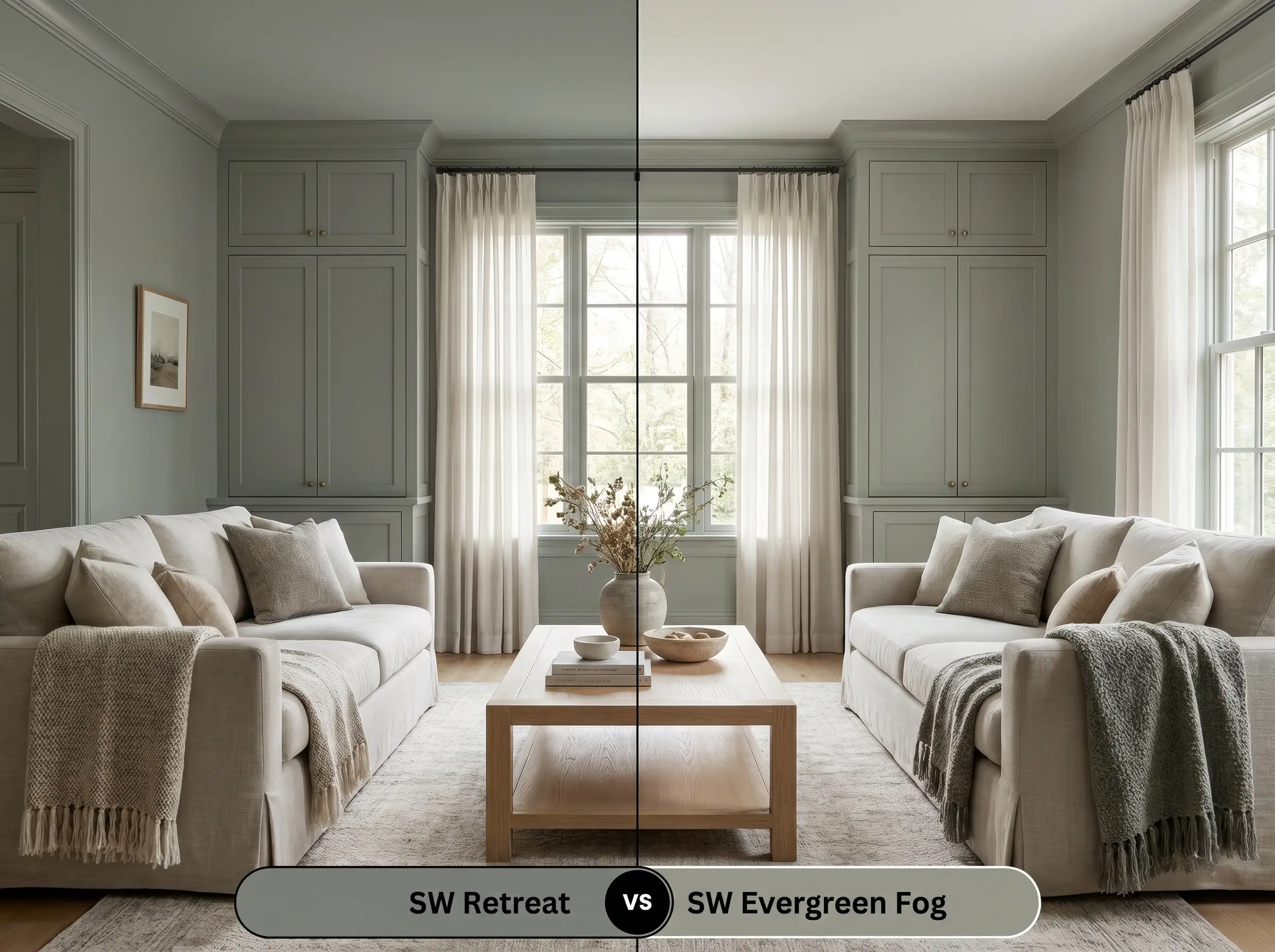
Sherwin-Williams Retreat vs. Sherwin-Williams Evergreen Fog SW 9130
Will Retreat work with your specific lighting, floor, or furniture?
Evergreen Fog carries an LRV of 30, making it noticeably lighter and more forgiving in spaces with average natural light. Retreat possesses a stronger blue undertone, whereas Evergreen Fog leans distinctly into a warmer, softer sage. Specify Evergreen Fog for moderately lit living rooms needing a gentle wash of color, and reserve Retreat for brightly lit exteriors or high-contrast cabinetry where you need a firmer, more grounded anchor.
Sherwin-Williams Retreat vs. Sherwin-Williams Dried Thyme SW 6186
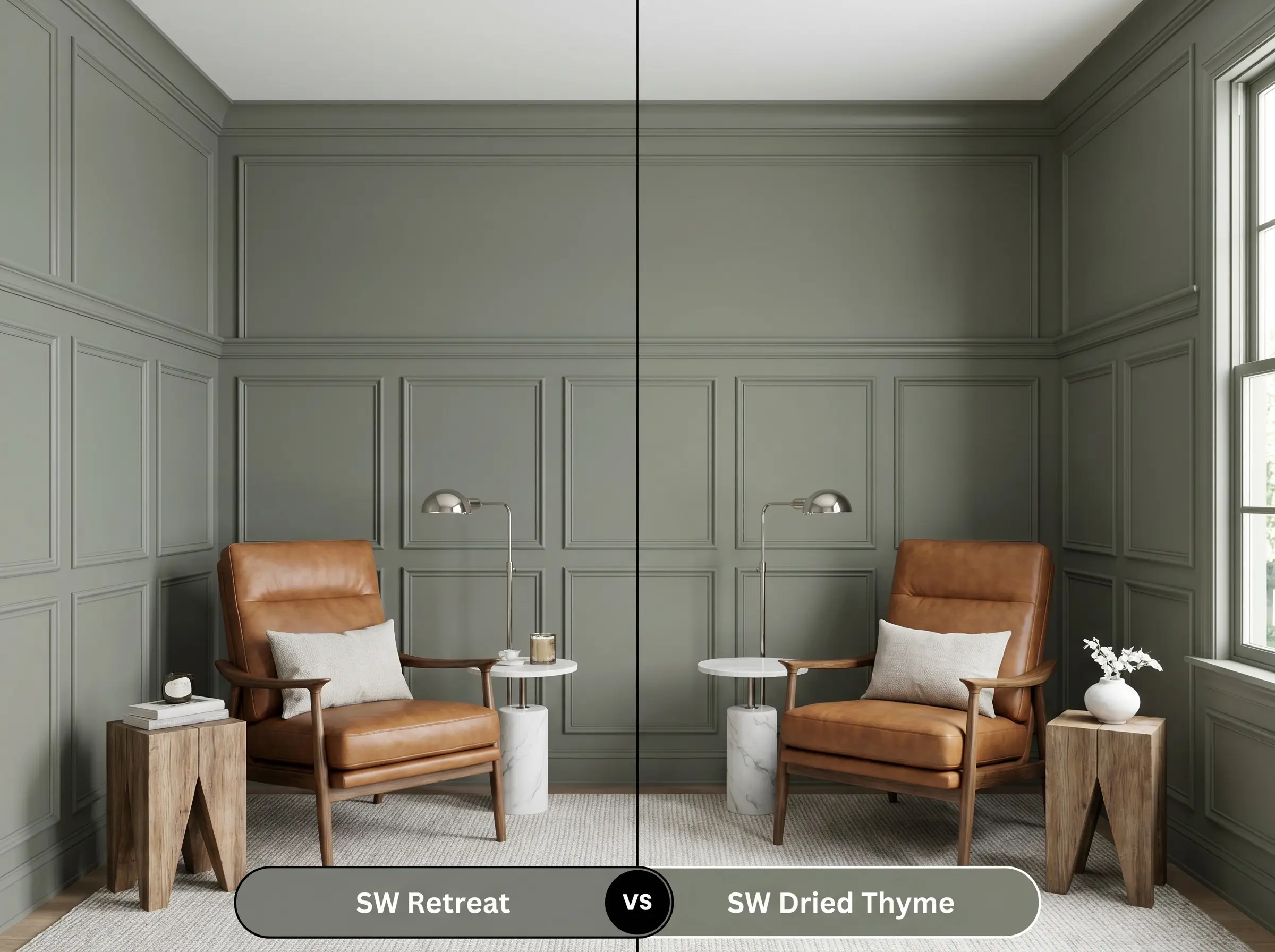
Dried Thyme shares the exact same light reflectance value as Retreat but differs significantly in its undertone composition. Dried Thyme is a warmer, more olive-toned green, whereas Retreat features a prominent blue-gray shift. Choose Dried Thyme for rooms furnished with warm leathers and rustic woods, and deploy Retreat in spaces featuring crisp white marbles, polished nickel, and cooler architectural elements.
Sherwin-Williams Retreat vs. Benjamin Moore Antique Pewter 1560
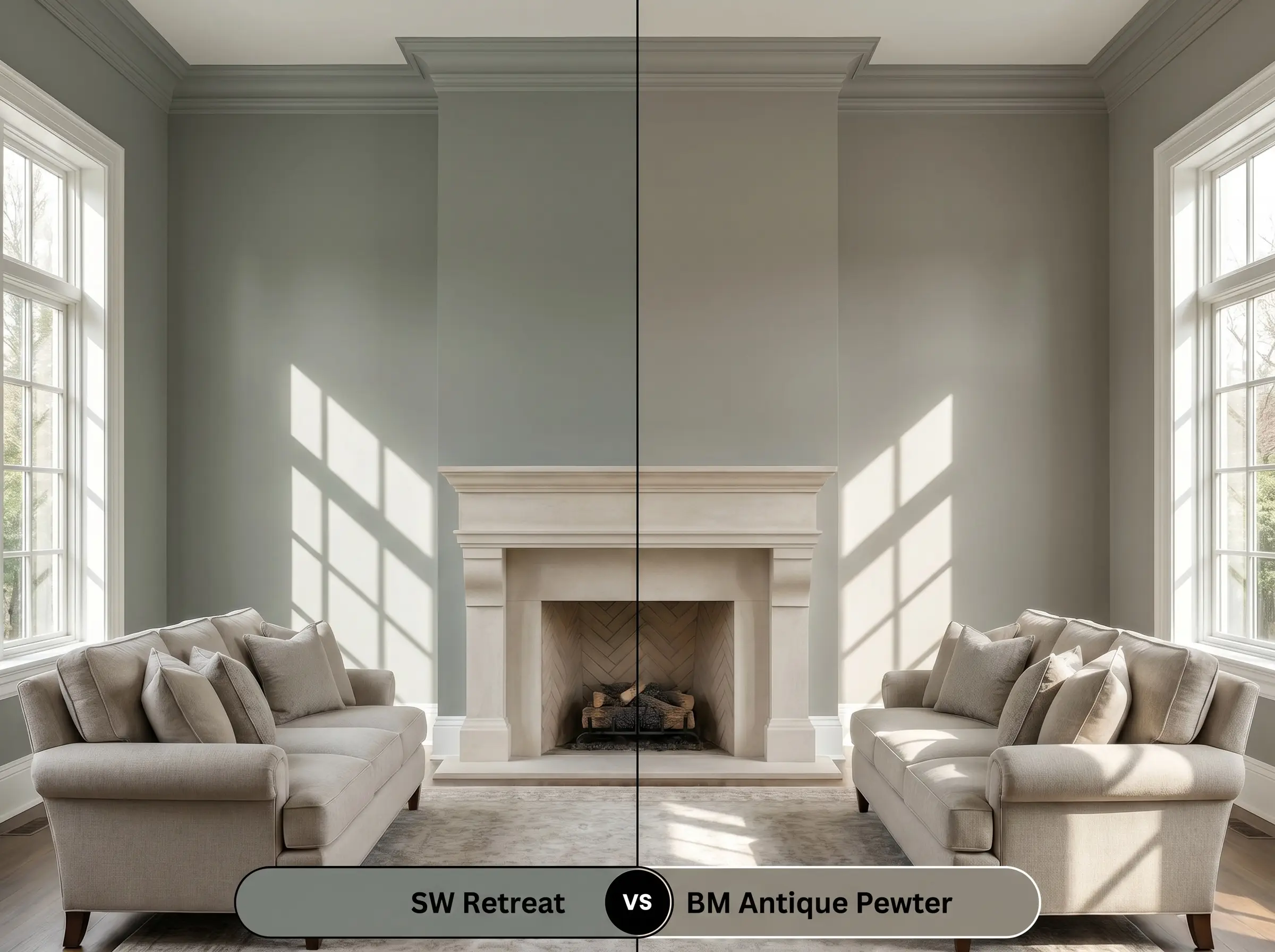
Will Retreat work with your specific lighting, floor, or furniture?
Benjamin Moore Antique Pewter operates in a very similar depth bracket but presents a slightly muddier, more muted gray-green profile. Retreat maintains a cleaner, more pronounced blue-green flash when struck by direct sunlight. Antique Pewter is the safer choice for historic renovations requiring a highly subdued, aged patina, while Retreat excels in transitional or contemporary spaces where its natural light reactivity can be showcased.
Light Reactivity & Undertone FAQs
Yes, the cooler ambient temperature of North-facing light amplifies the paint’s blue-gray shift. To counteract this effect, integrate warm artificial lighting and unlacquered brass fixtures to restore visual balance.
Absolutely. Operating as a low light trap with an LRV of 21, the paint absorbs most available light in windowless spaces, causing the walls to feel cramped and shadowy.
The green-gray neutral tone provides a highly effective complementary contrast to the red and orange hues inherent in brick masonry, balancing the exterior warmth without visual clashing.
Yes, bright or highly saturated accents will overwhelm its muted, earthy nature. It pairs best with soft whites, warm metals, and organic wood tones to maintain architectural harmony.
Room Compatibility & Clashes Diagnoses
Hackrea's reports evaluating the compatibility of Retreat in real rooms.No compatibility tests for Retreat yet.
Be the first to see how this color reacts to your space. Run a free architectural diagnostic now.
Real-World Inspiration
We have 3 photos of Retreat applied to Walls.
Explore contexts across: Kids Room in Natural Indirect.
Unlock Retreat Gallery
Join Hackrea to unlock 1 real photo instantly. Upgrade to a Contributor to unlock the full 3-photo gallery.
Create a Free AccountPaint Aesthetic & Practical Analysis
| Profile | Analysis | |
|---|---|---|
| Aesthetic | Retreat is a sophisticated, earthy chameleon. It brings a grounded, calming presence to a room without feeling overwhelmingly green. Its heavy gray influence makes it highly versatile, though its low LRV means it demands adequate lighting to prevent the chromatic profile from feeling too heavy. | |
| The Lighting Shift | Highly reactive to natural light. Users on Houzz report it shifting between blue-green, green-gray, and blue-gray depending on whether the sky is sunny or cloudy. | |
| The Clash Warning | While it pairs beautifully with white trim and brass, users on Reddit's r/HomeDecorating warn against pairing it with overly bright or saturated accent colors, which can overwhelm its muted, earthy nature. | |
| The Low Light Trap | With an LRV of 21, it sits at the very bottom edge of the medium-depth range. In windowless rooms or low light, it absorbs significant light and can easily cross into dark, heavy territory. |