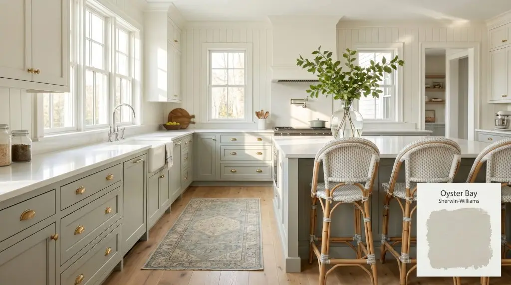
Sherwin-Williams Oyster Bay SW 6206 is a medium-depth, cool-toned gray-green paint color with distinct slate blue undertones. With an LRV of 44, it provides a grounded, earthy aesthetic that shifts between green and blue depending on the lighting.
Will Oyster Bay clash with your room?
Paint Technical Profile
| Color ID / SKU | SW 6206 |
| HEX Code | #AEB3A9 |
| Light Reflectance (LRV) | 44 |
| Temperature | Cool |
| Primary Undertone | Green |
| Hidden Undertones | Slate Blue And Soft Gray |
| Use | Interior, Exterior |
| Best Exposures | South-facing or West-facing |
| Best For | Kitchen Cabinets, Bedrooms, Bathrooms, Exterior Siding, Home Offices |
Oyster Bay Digital Design Concept Boards
Kitchen Cabinets (Coastal & Farmhouse styles)
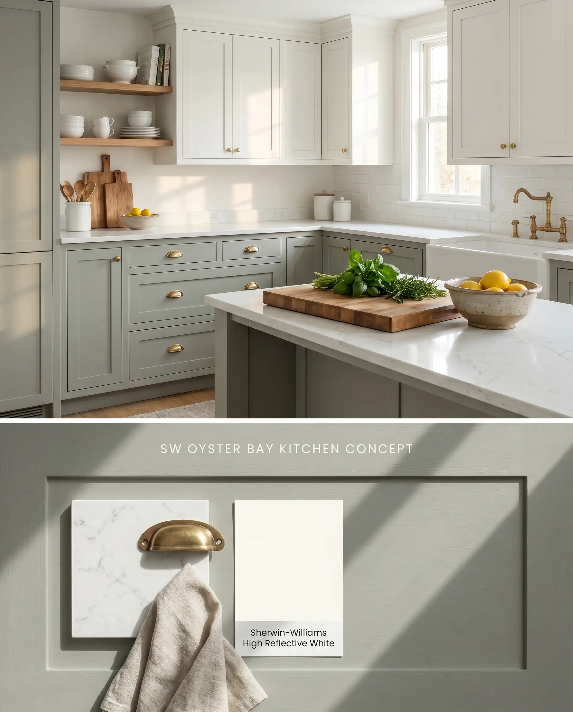
Applying this medium-depth neutral to lower cabinetry anchors the kitchen by absorbing ambient light, providing a grounded visual weight against lighter upper walls. The slate blue undertones activate when paired with crisp white quartz countertops and unlacquered brass hardware, pulling the metallic warmth forward while neutralizing the cool stone. To prevent the blue from flashing unevenly, the complex chromatic profile requires two full coats over any existing builder-grade finishes.
South-Facing Bedrooms
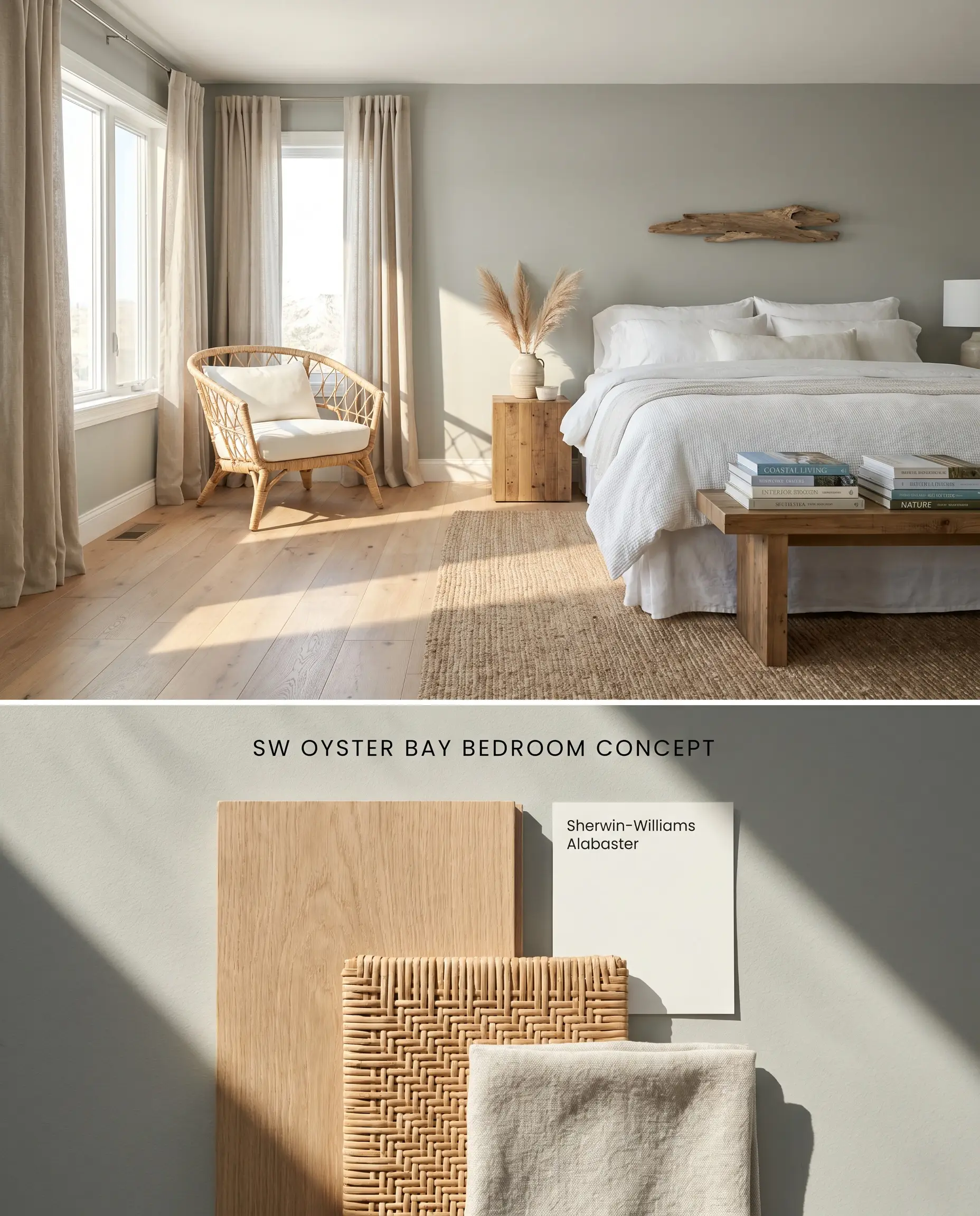
Intense south-facing light amplifies the organic green base of this hue, preventing it from leaning cold or sterile. The color structure actively absorbs harsh afternoon rays, softening the room’s perimeter and reducing glare on surrounding hard surfaces. Pairing the walls with textured linen drapery and wide-plank white oak flooring enhances the coastal farmhouse palette by layering dry, matte materials that diffuse light evenly.
Exterior Siding & Stucco
Will Oyster Bay work with your specific lighting, floor, or furniture?
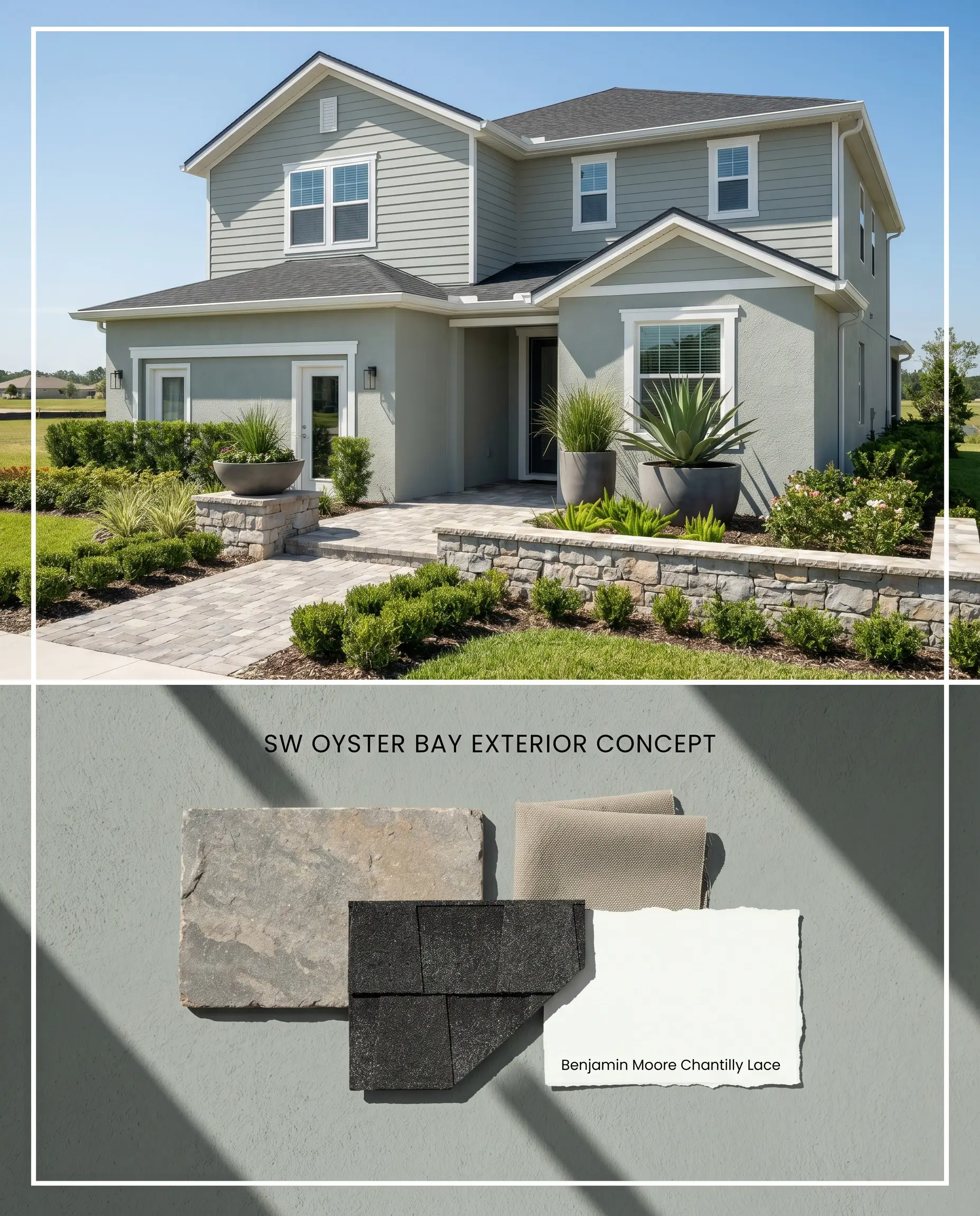
On expansive exterior elevations, the LRV of 44 prevents the facade from looking washed out under direct UV exposure. The gray-green architectural finish bridges the transition between manicured landscaping and natural stone hardscaping, physically grounding the structure into its environment. You must strictly avoid pairing this siding color with warm orange-red brick accents, as the opposing color temperatures will clash and destabilize the exterior palette.
Spa-Like Bathrooms
Will Oyster Bay work with your specific lighting, floor, or furniture?
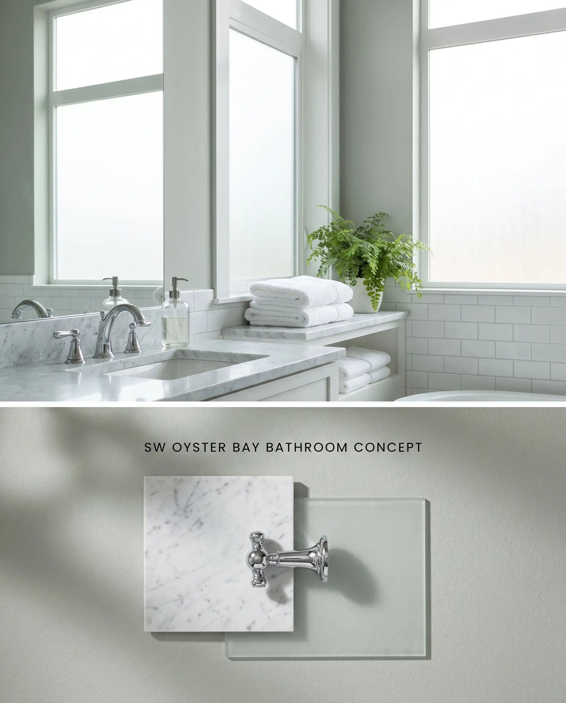
This hue establishes a spa-like aesthetic by interacting with the reflective surfaces of glazed ceramic tiles and polished plumbing fixtures, actively cooling the room’s visual temperature. Applying this color in windowless interior powder baths is strictly forbidden; the lack of natural photons traps the color, turning it into a flat, moody slate blue. When deployed in well-lit ensuites, it pairs exceptionally well with cool-toned Carrara marble, avoiding the discordant clash seen with peachy travertine tiles.
Home Offices
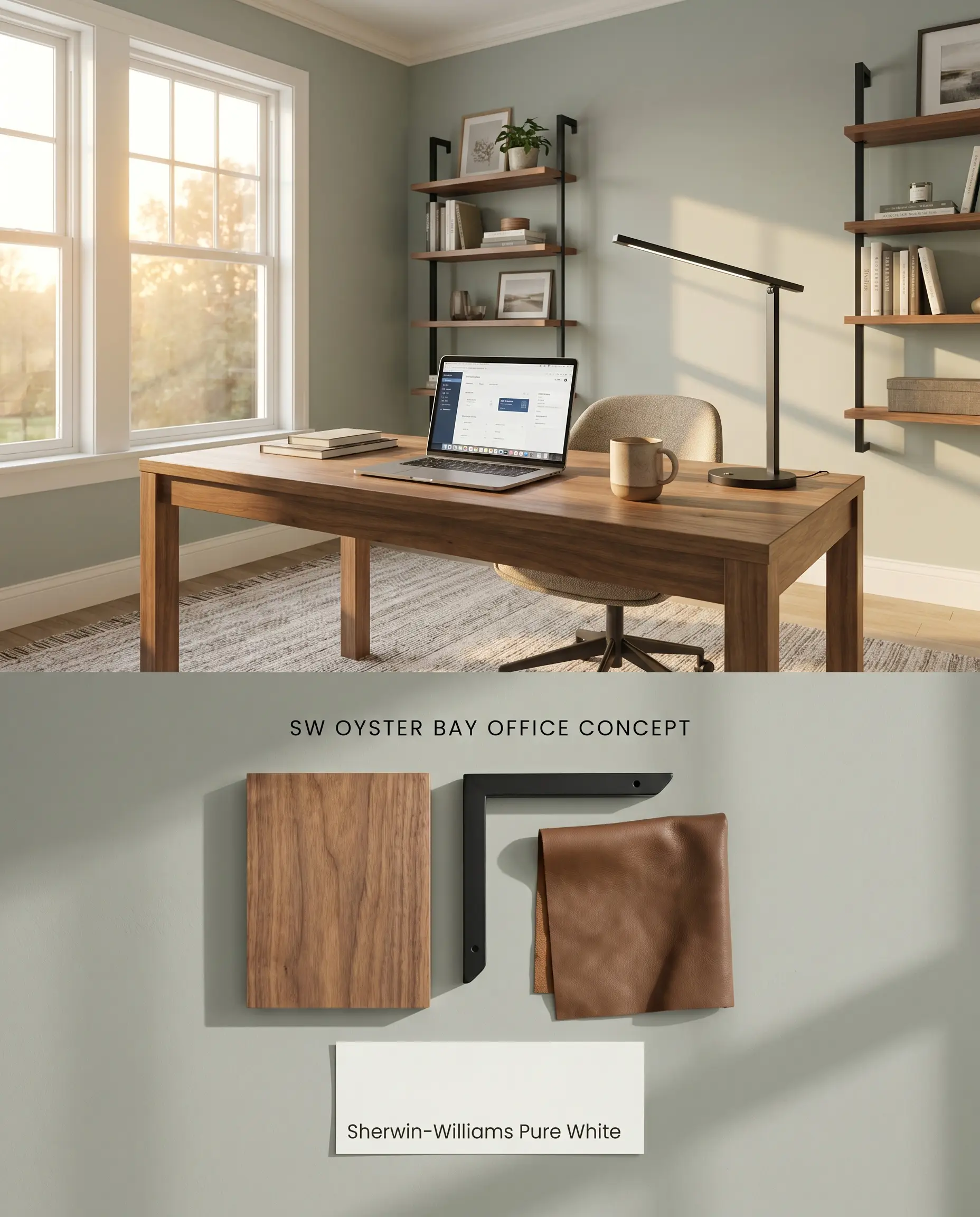
Wrapping a home office in this medium-depth neutral reduces eye strain by absorbing excess screen glare and ambient light bounce. The color establishes a focused, grounded perimeter that contrasts sharply against natural walnut desks and matte black shelving brackets. Because touch-ups on this specific chromatic profile flash noticeably in higher sheens, any drywall repairs must be painted corner-to-corner to maintain a uniform architectural plane.
Sherwin-Williams Oyster Bay SW 6206 vs. Rival Neutrals
Sherwin-Williams Oyster Bay SW 6206 vs. Sherwin-Williams Sea Salt SW 6204
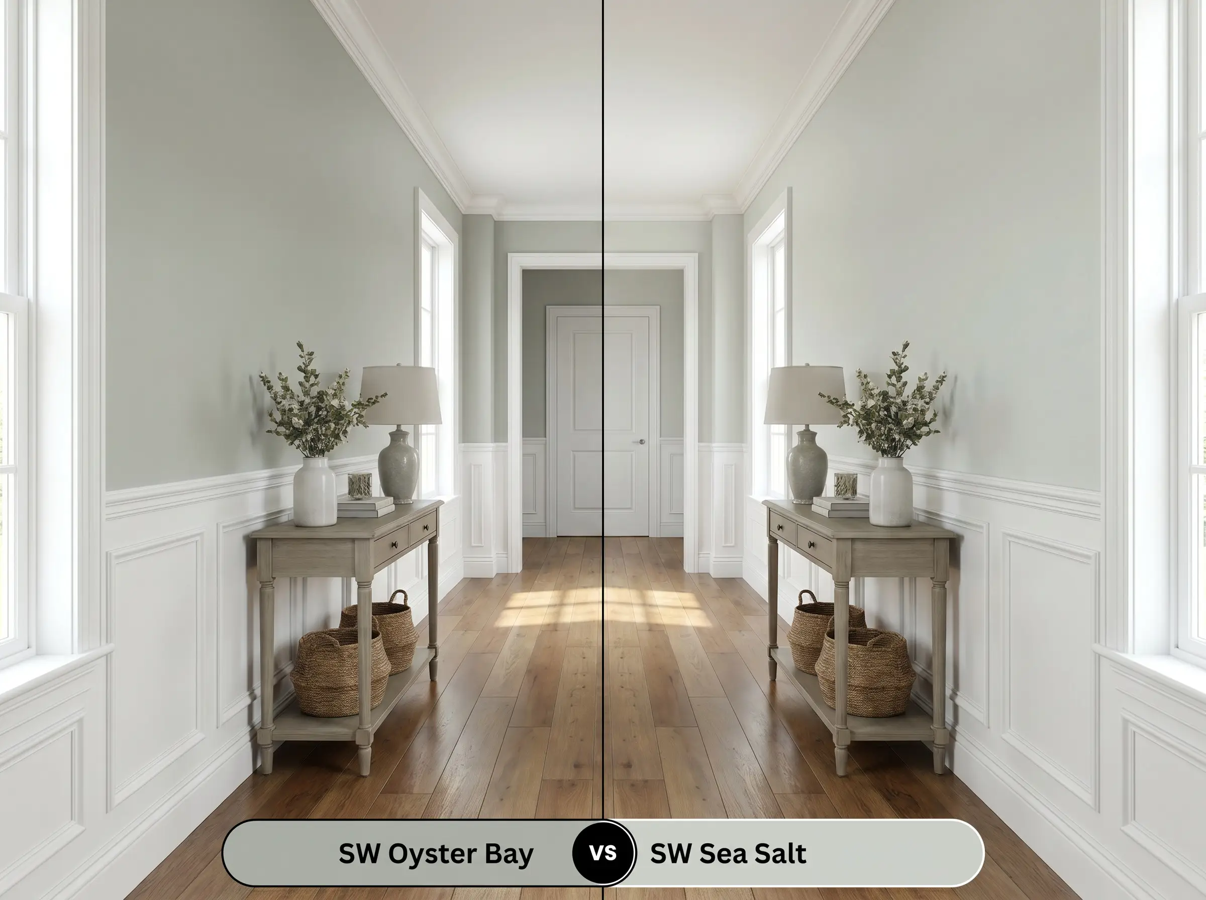
With an LRV of 63, Sherwin-Williams Sea Salt operates as an airy, reflective pastel, bouncing light across the room and expanding spatial perception. Sherwin-Williams Oyster Bay SW 6206 (LRV 44) functions as a structural, light-absorbing anchor that pulls walls inward. Specify Sea Salt for dark, narrow hallways requiring illumination, and deploy Oyster Bay on wainscoting or lower cabinetry where visual gravity is required.
Sherwin-Williams Oyster Bay SW 6206 vs. Sherwin-Williams Evergreen Fog SW 9130
Will Oyster Bay work with your specific lighting, floor, or furniture?
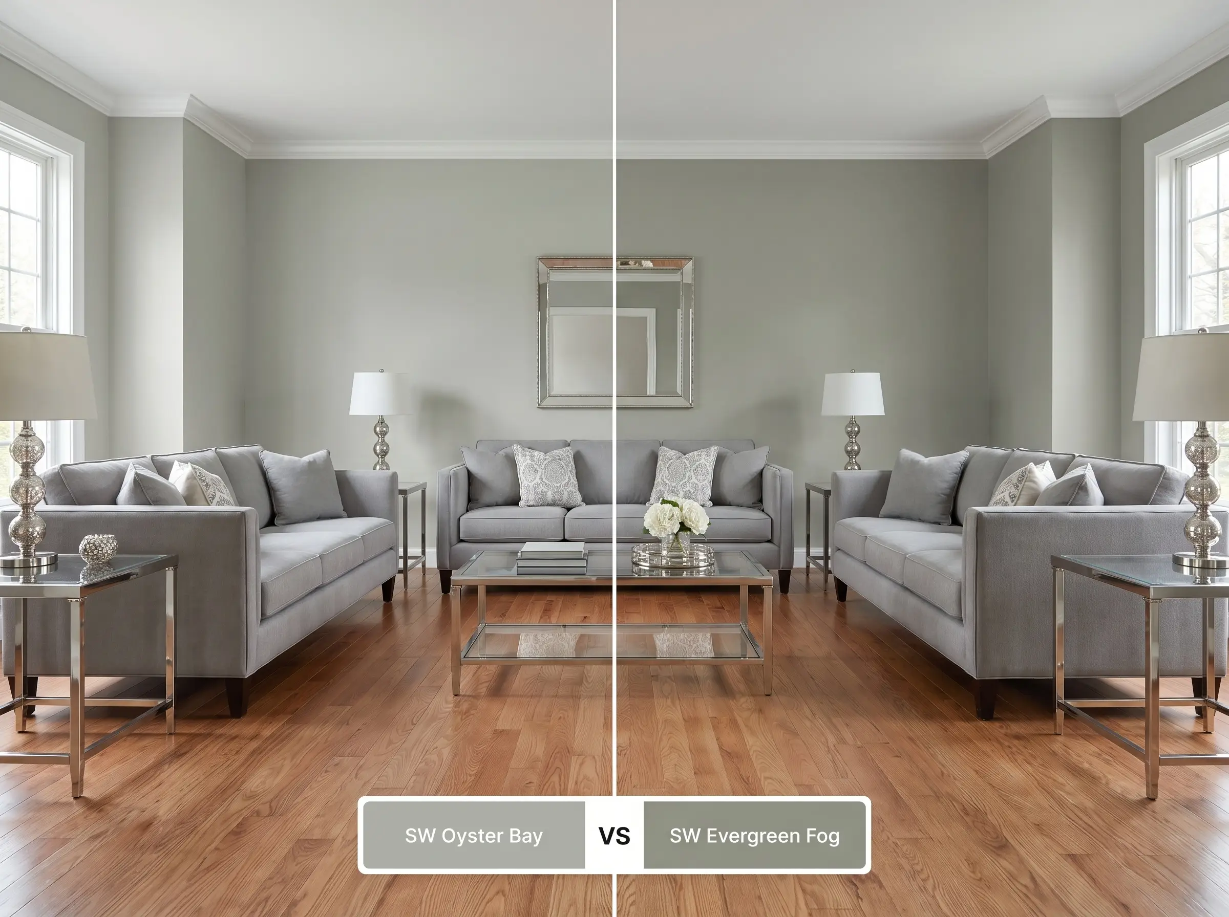
Sherwin-Williams Evergreen Fog SW 9130 (LRV 30) possesses a denser yellow-brown base, pushing it firmly into the warm, earthy woodland category. Sherwin-Williams Oyster Bay relies on prominent slate blue undertones, keeping its temperature noticeably cooler and more coastal. Select Evergreen Fog when pairing with warm, rustic materials like red oak or terracotta, and reserve Oyster Bay for crisp, cool-toned environments featuring marble and polished nickel.
Sherwin-Williams Oyster Bay SW 6206 vs. Benjamin Moore Fieldstone 1558
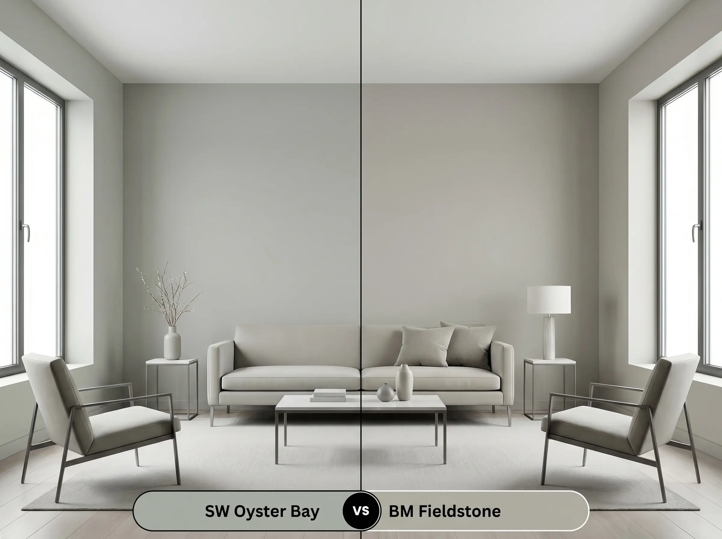
Benjamin Moore Fieldstone 1558 (LRV 42.18) is a true green-gray that lacks the distinct blue flashes present in Oyster Bay’s chromatic profile. In north-facing rooms, Oyster Bay will aggressively shift toward baby blue, while Fieldstone maintains a steadier, albeit darker, gray-green stance. Utilize Fieldstone in challenging, cool-light exposures to avoid unpredictable blue shifts, while leveraging Oyster Bay in south-facing rooms to activate its complex coastal tones.
Architectural Color FAQs
Yes, in north-facing or densely shaded rooms, the organic green base recedes dramatically. The cool, indirect light amplifies the slate blue undertones, often causing the paint to flash a surprisingly strong baby blue or flat slate gray.
The cool, green-blue chromatic profile creates severe visual friction against warm orange, peach, and red tones. Avoid pairing it with peachy travertine tiles, red oak cabinets, or warm orange-red brick exteriors to maintain architectural harmony.
With an LRV of 44, it holds its depth under harsh UV exposure without washing out or appearing chalky. The intense sunlight highlights its green warmth, making it an excellent bridge between the home’s facade and surrounding natural landscaping.
In spaces lacking natural photons, such as windowless interior powder baths, the color loses its organic green warmth entirely. It becomes a low-light trap, shifting into a flat, moody slate blue that can make the space feel constricted.
Room Compatibility & Clashes Diagnoses
Hackrea's reports evaluating the compatibility of Oyster Bay in real rooms.No compatibility tests for Oyster Bay yet.
Be the first to see how this color reacts to your space. Run a free architectural diagnostic now.
Paint Aesthetic & Practical Analysis
| Profile | Analysis | |
|---|---|---|
| Aesthetic | Oyster Bay is a sophisticated, chameleon-like hue that elevates coastal and farmhouse spaces. While its gray-green base is deeply calming, homeowners must be prepared for its strong tendency to lean blue in cooler lighting. | |
| The Coverage Catch | With an LRV of 44, Oyster Bay provides solid coverage, but its complex chromatic profile often requires two full coats over lighter builder-grade whites to prevent the blue undertones from flashing unevenly. | |
| The Lighting Shift | In north-facing light or heavily shaded rooms, the green base recedes dramatically, causing the color to flash a surprisingly strong baby blue or slate gray. | |
| The Clash Warning | Homeowners on design forums frequently report that this hue clashes terribly with peachy travertine tiles, red oak cabinets, and warm orange-red brick exteriors. | |
| The Bounce Effect | Thanks to its medium depth, it absorbs light rather than bouncing it aggressively, keeping the room feeling grounded rather than neon. | |
| The Low Light Trap | In windowless rooms like interior powder baths, it can lose its organic green warmth and turn into a flat, moody slate blue. | |
| The Touch Up | Because of its medium-depth color structure, touch-ups may flash noticeably if applied in a satin or semi-gloss sheen. It is best to paint corner-to-corner for repairs. |
Closest Cross-Brand Equivalents
The absolute closest scientific color matches for Oyster Bay across top paint brands.