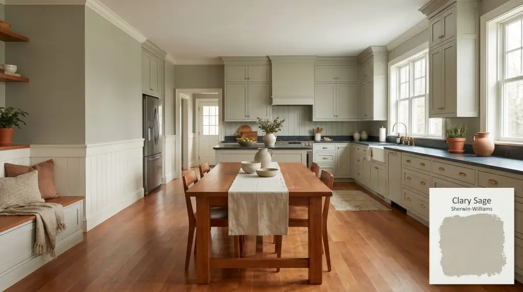
Sherwin-Williams Clary Sage (SW 6178) is a soothing, mid-tone sage green with warm yellow and subtle gray undertones. With an LRV of 41, it strikes the perfect balance between depth and brightness, making it an incredibly versatile, earthy hue for both interiors and exteriors.
Will Clary Sage clash with your room?
Paint Technical Profile
| Color ID / SKU | SW 6178 |
| HEX Code | #ACAD97 |
| Light Reflectance (LRV) | 41 |
| Temperature | Warm/Neutral |
| Primary Undertone | Yellow |
| Hidden Undertones | Gray, Earthy Olive |
| Use | Interior, Exterior |
| Best Exposures | North-facing, East-facing |
| Best For | Kitchen cabinets, historic exteriors, dining rooms, bedrooms, wainscoting accents |
Clary Sage Digital Design Concept Boards
Shaker-style kitchen cabinets
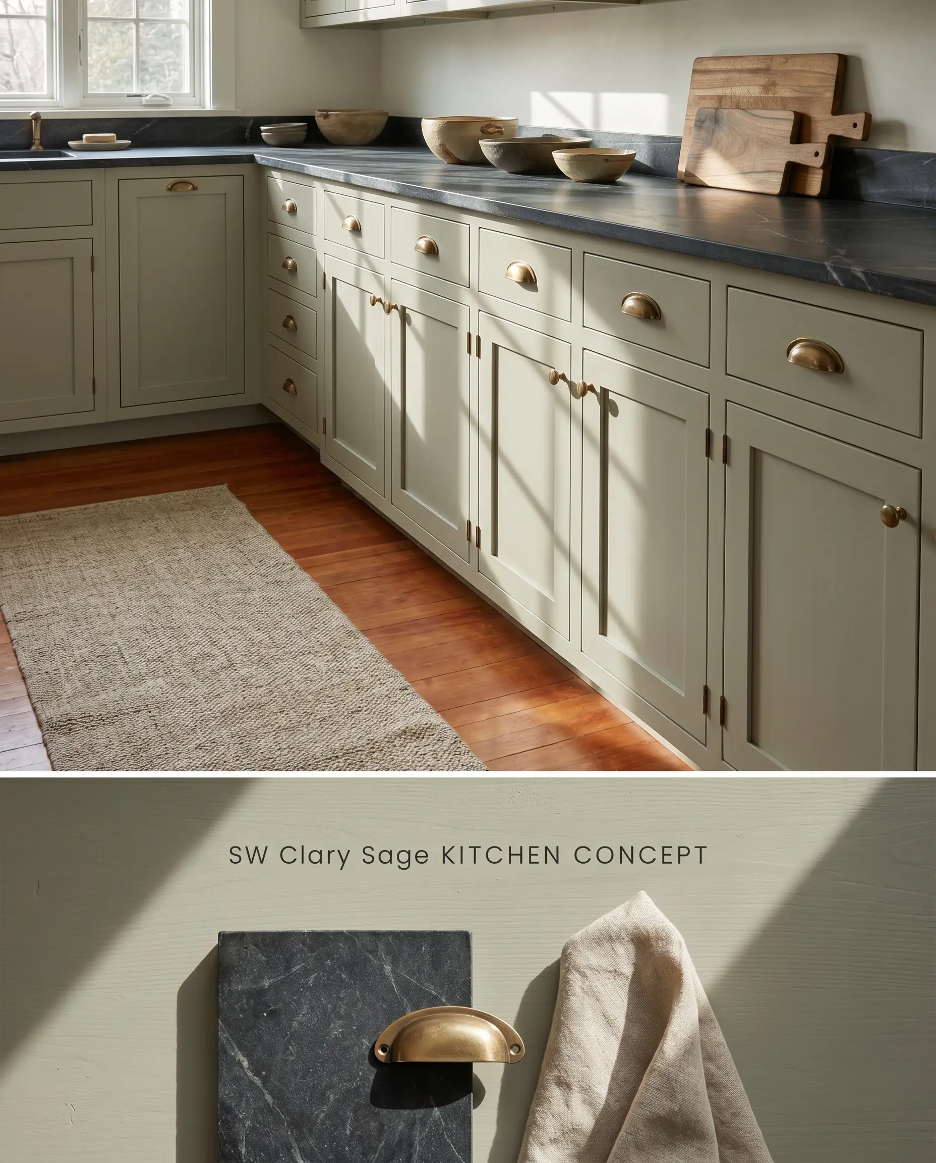
The warm base of this mid-tone sage grounds the linear geometry of Shaker profiles, absorbing ambient light to soften the transition between lower cabinetry and upper wall expanses. When applied over deeply grained wood, a high-quality tinted primer is strictly required to prevent the yellow-gray cast from flashing through the topcoat. Furthermore, because satin and semi-gloss finishes on millwork will flash noticeably during touch-ups, this pigment requires precise feathering to maintain a seamless surface.
Historic bungalow and craftsman exteriors
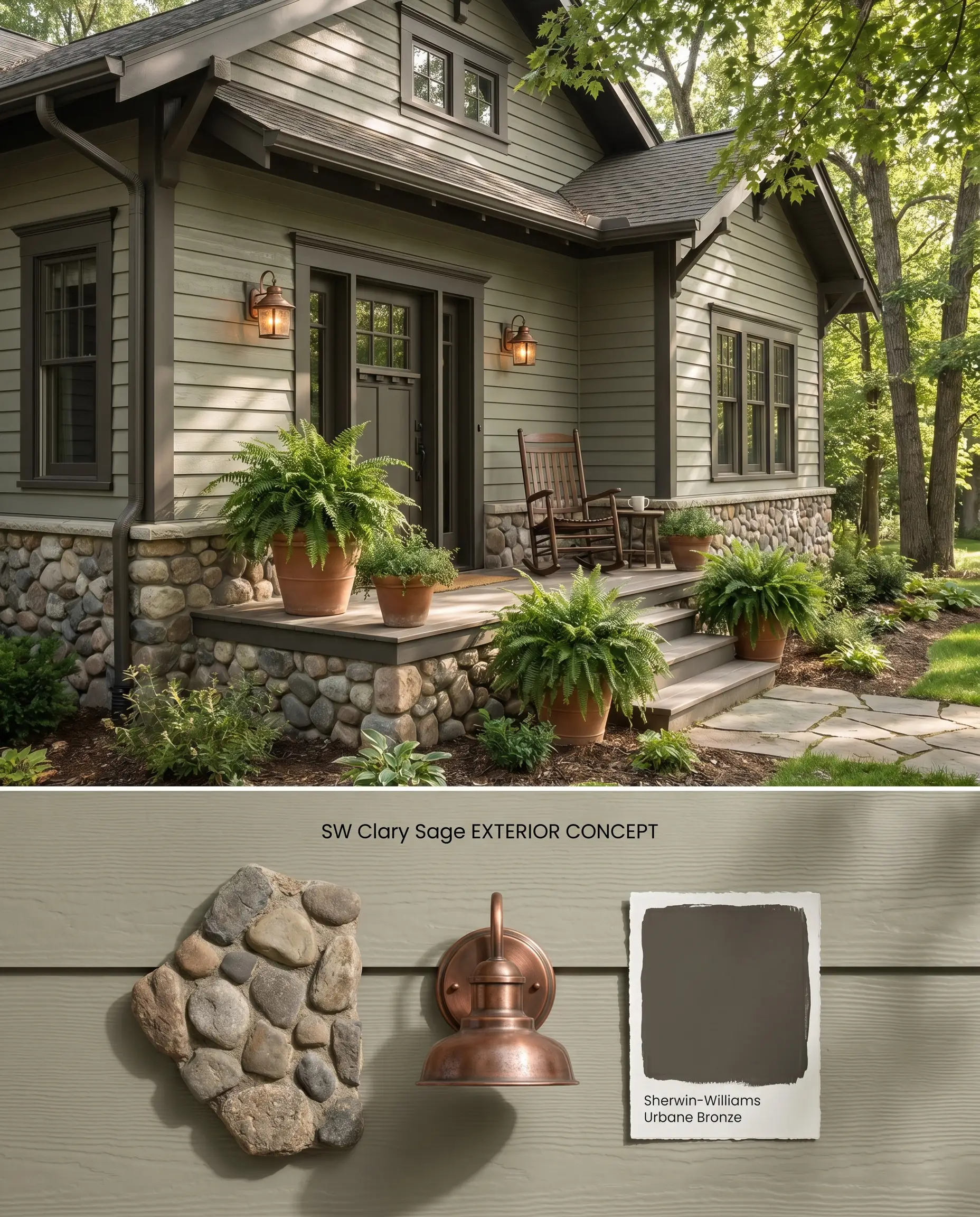
On exterior siding, intense UV exposure strips away the muted tint of this earthy green hue, risking a sharp, minty bounce effect. To anchor the chromatic profile, you must physically ground the elevation with dense, light-absorbing masonry like tumbled river rock, clinker brick, or deeply saturated trim.
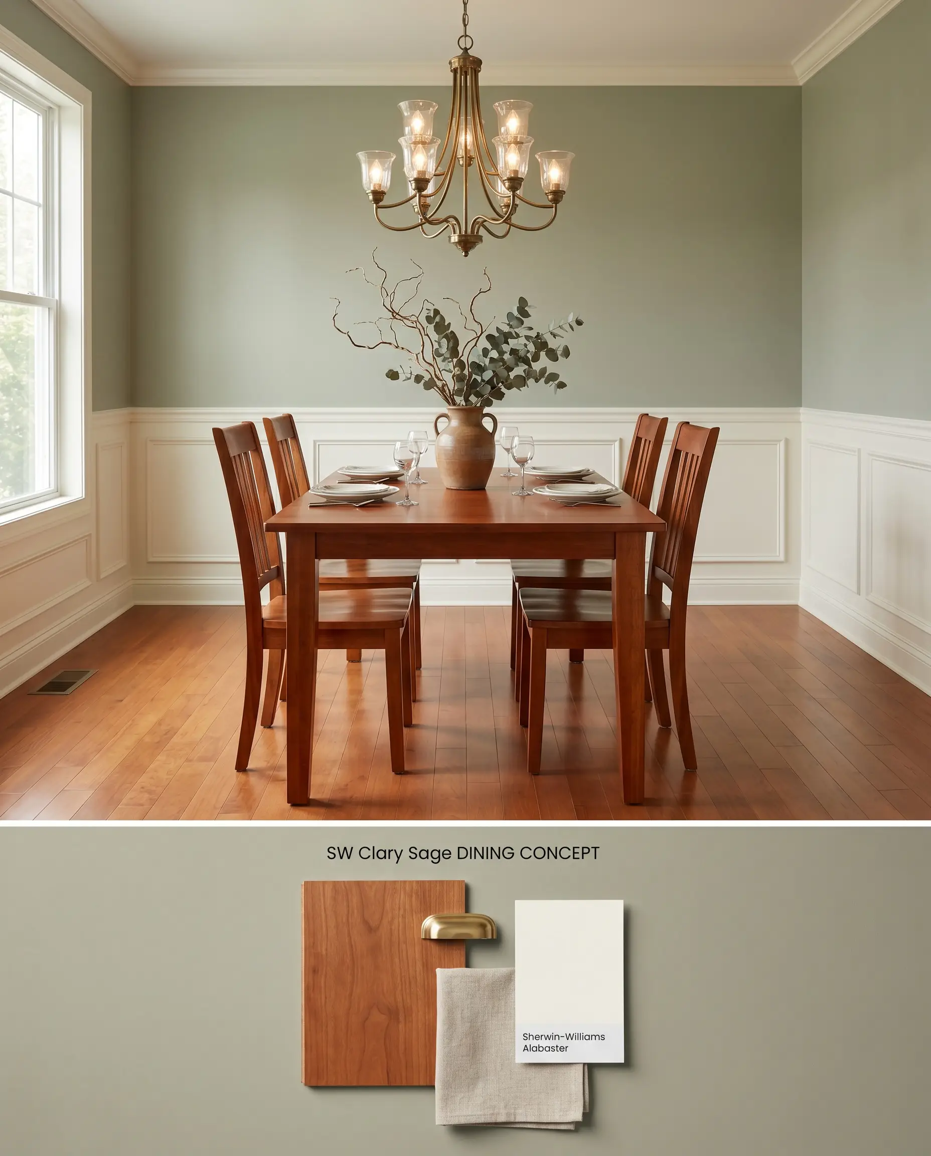
Dining rooms featuring crisp white wainscoting
Will Clary Sage work with your specific lighting, floor, or furniture?
The LRV of 41 provides enough color saturation to create a sharp structural contrast against lower millwork, pushing the walls back to expand the perceived width of the room. Because stark, cool whites turn this organic color structure dirty, the wainscoting requires a creamy, warm-toned white to bridge the transition.
Cozy, nature-inspired bedrooms
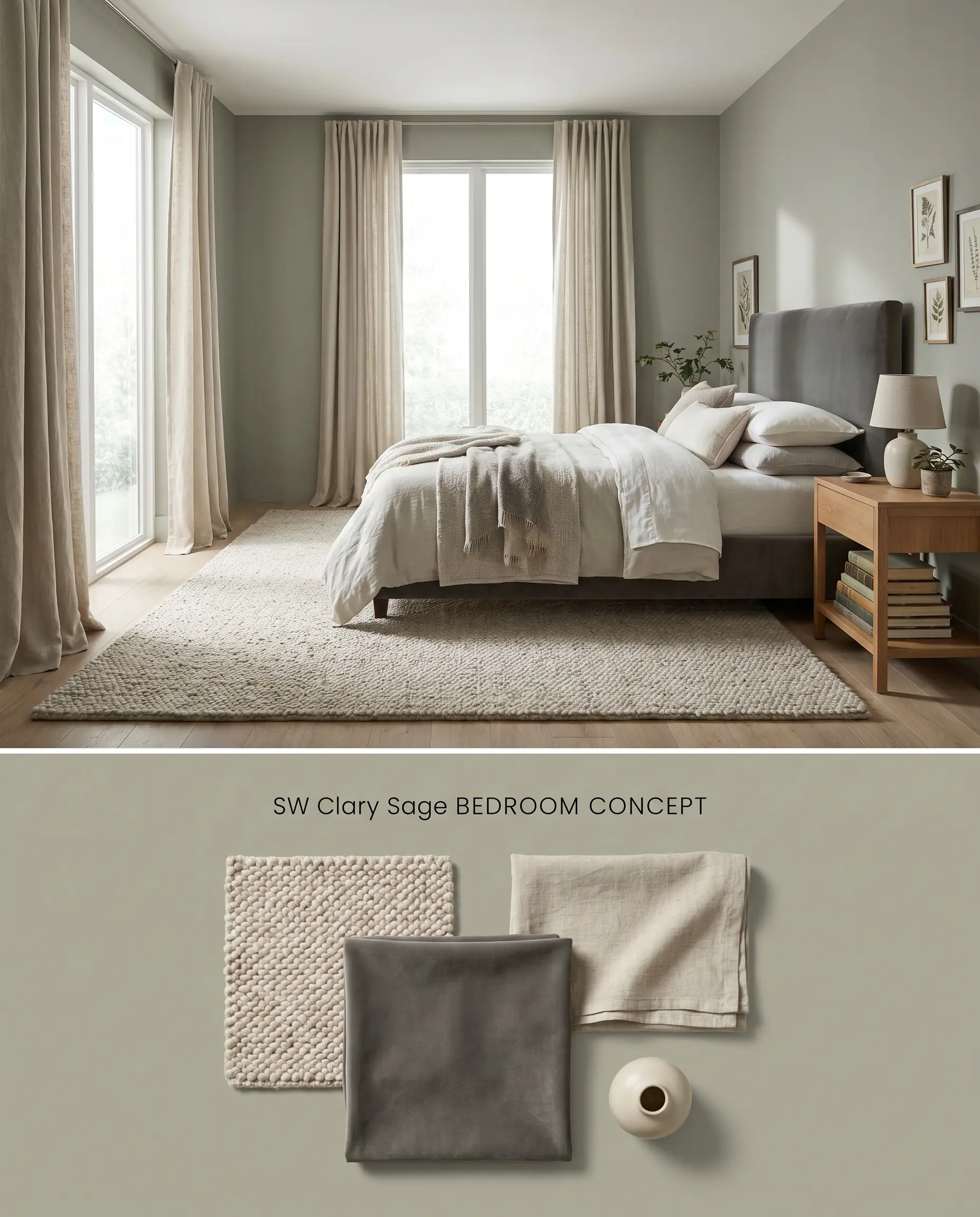
This mid-tone sage absorbs natural light reflection in a way that visually lowers the ceiling and pulls the walls inward, creating a dense, enveloping perimeter. The yellow-gray cast acts as a thermal bridge, warming up the room without relying on aggressive reds or oranges.
Living rooms with warm wood flooring
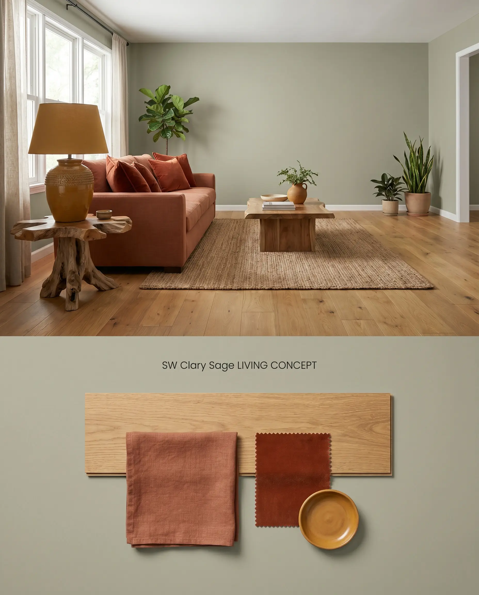
The yellow undertones embedded in this paint physically lock into the amber and red grains of golden oak and cherry floors, creating a seamless, monochromatic warmth from floor to ceiling. The earthy green hue balances the visual weight of the wood, preventing the space from feeling top-heavy.
Comparative Color Theory: Mid-Tone Greens vs. Industry Alternatives
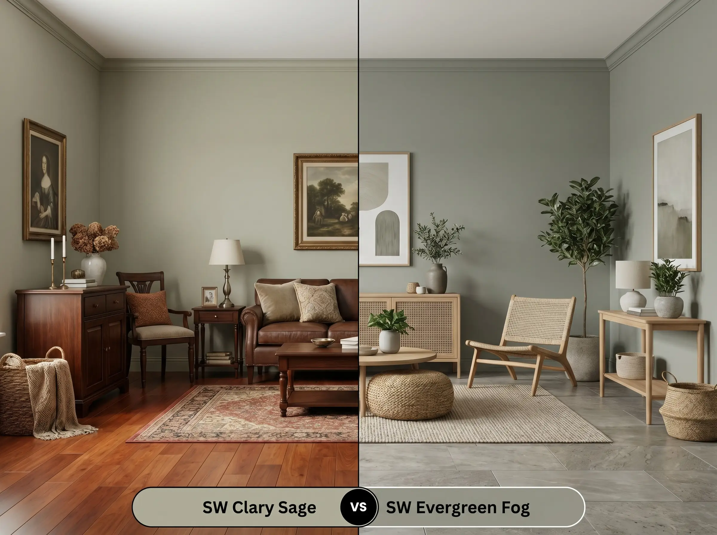
Sherwin-Williams Clary Sage SW 6178 vs. Sherwin-Williams Evergreen Fog SW 9130
Will Clary Sage work with your specific lighting, floor, or furniture?
Sherwin-Williams Evergreen Fog SW 9130 (LRV 30) is significantly darker and leans into a cool gray-blue base, stripping away the yellow warmth found in Clary Sage. In North-facing rooms, Evergreen Fog drops into a moody, shadowed forest green, whereas Sherwin-Williams Clary Sage retains just enough yellow to project a soft, herbal warmth. Specify Evergreen Fog for high-contrast, modern organic spaces relying on cool natural stone, and reserve Clary Sage for traditional interiors built around warm cherry or oak flooring.
Sherwin-Williams Clary Sage SW 6178 vs. Benjamin Moore Saybrook Sage HC-114
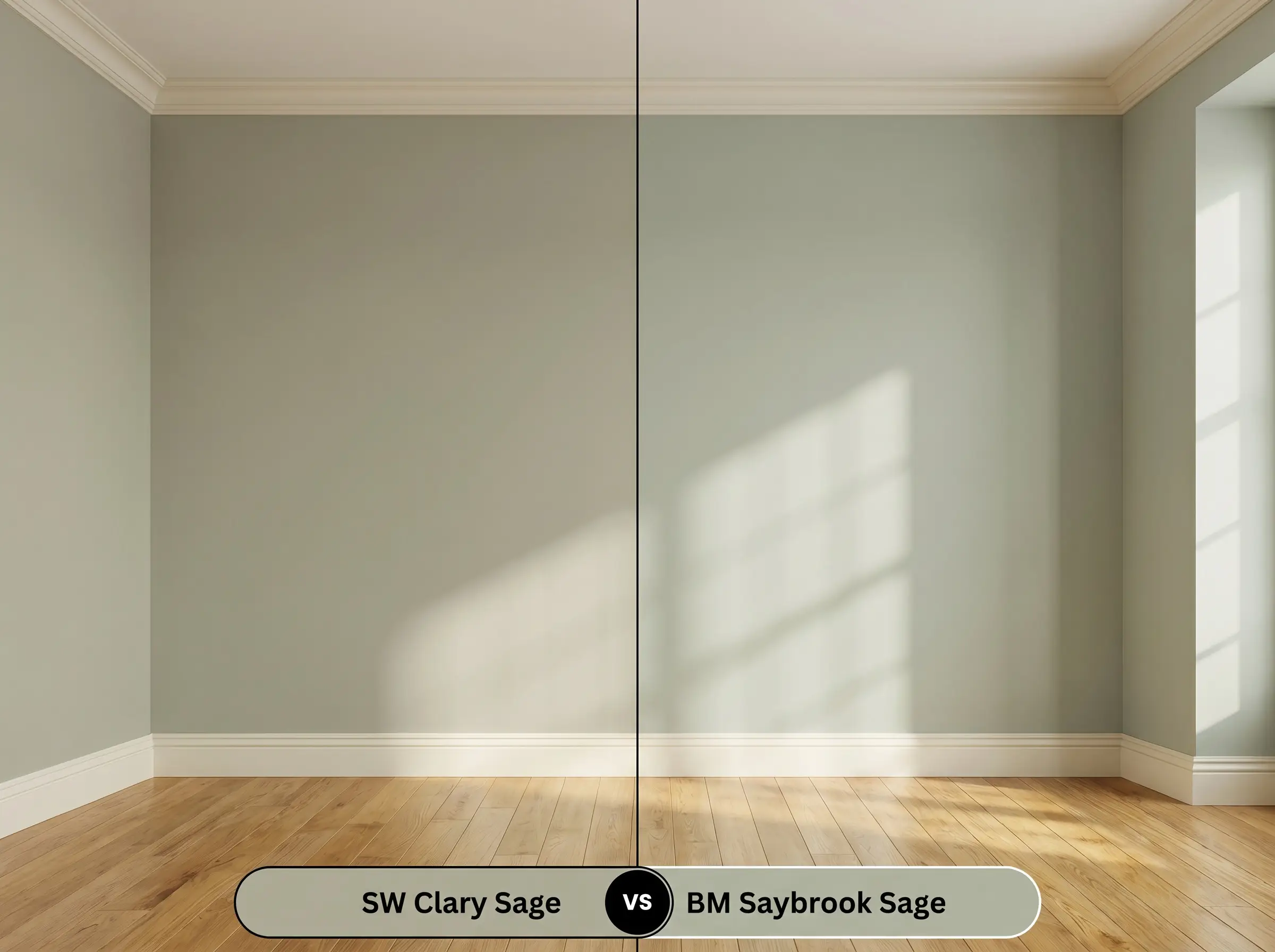
Benjamin Moore Saybrook Sage HC-114 (LRV 45) reflects more light and carries a distinct silvery-blue undertone that actively fights against warm wood tones. When placed in Southern light, Saybrook Sage neutralizes into a crisp, cool green, while the yellow-gray cast of Clary Sage amplifies, risking a slightly muddy, yellow-green read. Choose Saybrook Sage to cool down a sun-drenched, south-facing room, but deploy Clary Sage when you need to bridge the gap between golden oak floors and creamy white trim.
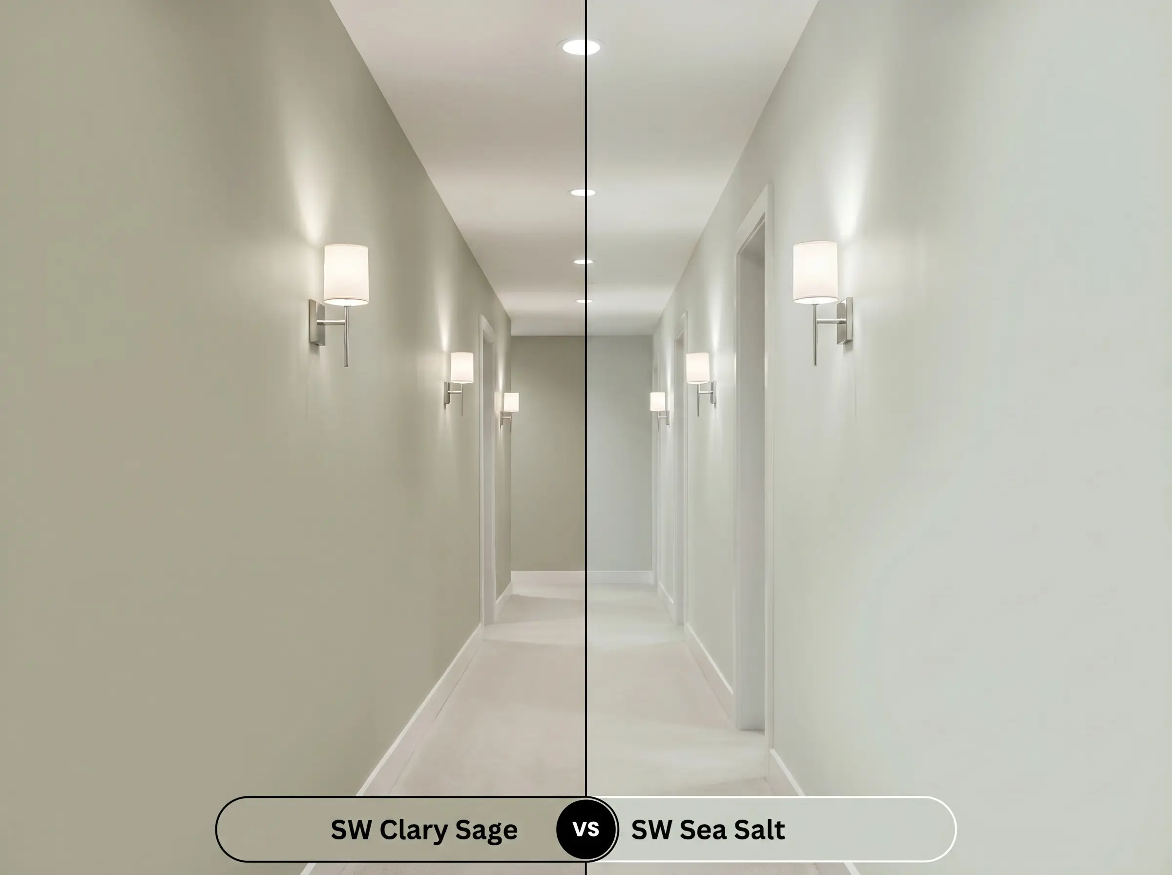
Sherwin-Williams Clary Sage SW 6178 vs. Sherwin-Williams Sea Salt SW 6204
Will Clary Sage work with your specific lighting, floor, or furniture?
Sherwin-Williams Sea Salt SW 6204 (LRV 63) operates as a high-reflectance chameleon, bouncing between pale green, blue, and gray depending on the angle of the sun. Sherwin-Williams Clary Sage is a committed, mid-tone structural color that absorbs light and anchors a room’s perimeter. If you are dealing with a low-light space or a windowless hallway, Sea Salt will maintain a bright, airy architectural finish, whereas Clary Sage will trap the shadows and fall flat into a dull olive.
Technical Specifications & Application FAQs
Yes, direct sunlight washes out the graying agents, causing the paint to bounce a bright, minty green. To counter this effect, ground the exterior elevation with dense stone, brick, or deeply saturated trim to anchor the color.
In cool, north-facing light, the gray cast dominates, producing a subdued, earthy sage. In intense southern or western light, the yellow undertones amplify, often shifting the hue into a muddy yellow-green.
No, it pairs exceptionally well with warm woods because its yellow base naturally harmonizes with amber and red grains. However, it will clash sharply with cool gray luxury vinyl plank flooring.
This happens when the paint is applied over deeply grained or dark wood cabinets without a high-quality tinted primer, allowing the wood’s tannins and the paint’s yellow base to flash through. Intense afternoon sunlight will also exaggerate this yellow-green shift.
Room Compatibility & Clashes Diagnoses
Hackrea's reports evaluating the compatibility of Clary Sage in real rooms.Living Room with Red Brick Fireplace
"The herbal undertones form a classic complementary harmony with the brick and oak, but low ambient lighting paired with a commercial drop-ceiling risks casting the mid-tone paint into shadowed dinginess."
North-Facing Kitchen
"Cool northern exposure mutes the herbal warmth of this green, while integrated stark white appliances and tile counters create jarring contrast lines against mid-tone cabinetry."
Real Experiences 1
Insights from people who have used Clary Sage.Paint Aesthetic & Practical Analysis
| Profile | Analysis | |
|---|---|---|
| Aesthetic | Clary Sage is one of Sherwin-Williams' most reliable earthy greens. It brings a grounded, organic warmth to spaces without feeling overly neon. While it can flash slightly yellow-green in intense southern light, its gray base generally keeps the chromatic profile beautifully muted and sophisticated. | |
| The Coverage Catch | Standard coverage, but DIYers note that when applied to heavily grained surfaces or dark wood cabinets, a high-quality tinted primer is essential to prevent the yellow base from flashing through. | |
| The Lighting Shift | In intense, direct Southern or Western light, the yellow undertones amplify, sometimes causing the hue to read as a 'yellow-green' or slightly muddy (as noted in Houzz forums). In cooler North-facing light, the gray cast dominates, making it a much more subdued, earthy sage. | |
| The Clash Warning | Avoid pairing with stark, cool whites which can make the color structure look dirty. It pairs beautifully with warm woods like golden oak and cherry floors, but can clash with cool gray luxury vinyl plank flooring. | |
| The Bounce Effect | When used on exteriors, direct sunlight washes out the graying agents. Several homeowners reported it looking unexpectedly 'minty' or 'Christmas green' outside if not grounded by earthy stone, brick, or dark trim. | |
| The Low Light Trap | In windowless rooms or hallways, the LRV of 41 isn't quite high enough to carry the color, causing the architectural finish to fall flat and read as a heavy, muted olive. | |
| The Touch Up | When used in a satin or semi-gloss finish on kitchen cabinets, touch-ups can flash noticeably. The color's depth requires careful feathering to maintain a seamless look. |