Parchment OC-78
Benjamin MooreBenjamin Moore Parchment (OC-78) is a soft, muted peach-beige off-white. With an LRV of 79.94, it provides a warm, sophisticated glow that shifts gracefully between pale flesh, vintage cream, and subtle yellow depending on your room's lighting.
| Temperature | Warm |
|---|---|
| Primary Undertone | Peach |
| Hidden Undertones | Pink, yellow, and occasionally green |
| Best Exposures | North, East, South |
| Best For | Living rooms, bedrooms, bathrooms, nurseries, and dark hallways |
Hackrea Review
Parchment is a highly underrated chameleon. It brings a cozy, vintage warmth to any space without feeling heavy. While its shifting undertones require careful testing, it rewards you with a luminous, elegant glow that standard beiges simply cannot match.Architectural Applications and Spatial Recipes
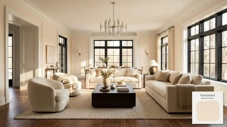
Living Rooms
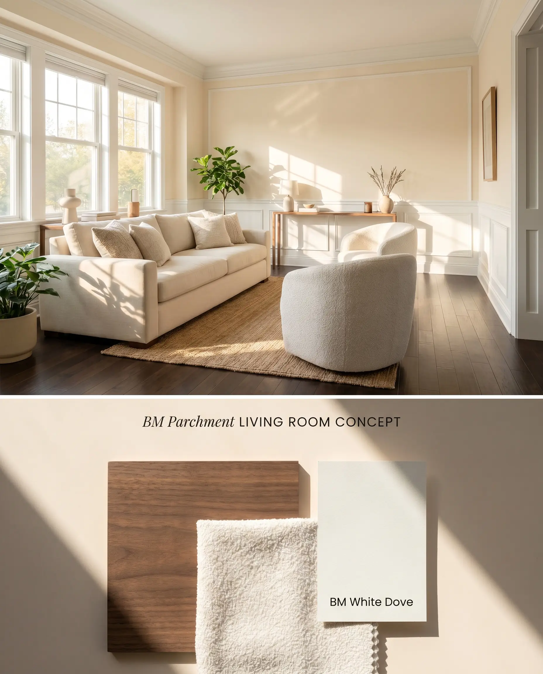
South-facing light amplifies the muted peach undertones of Benjamin Moore Parchment OC-78, creating a luminous glow that bounces light efficiently across the space. To prevent the high light reflectance value (79.94) from intensifying into an overly pink hue, ground the room with rich walnut or matte black architectural finishes rather than cool grays. Avoid red oak flooring entirely, as it will pull unexpected green or pink casts from the paint’s hidden base.
Bedrooms
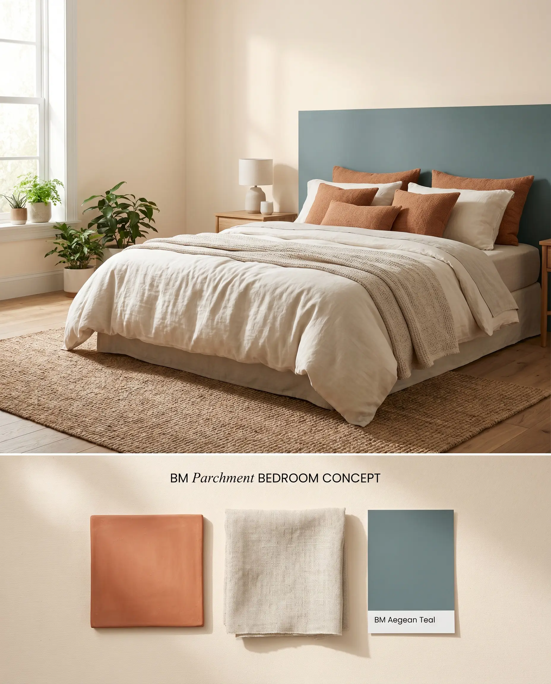
The warm off-white profile of this color thrives in morning eastern exposure, reading as a vintage cream before softening into a blush beige by afternoon. Pairing this color with textured, natural linens absorbs excess light reflection, stabilizing the chromatic profile. Because the color is user-friendly for touch-ups, it functions well in spaces where minor scuffs from furniture movement occur.
Bathrooms
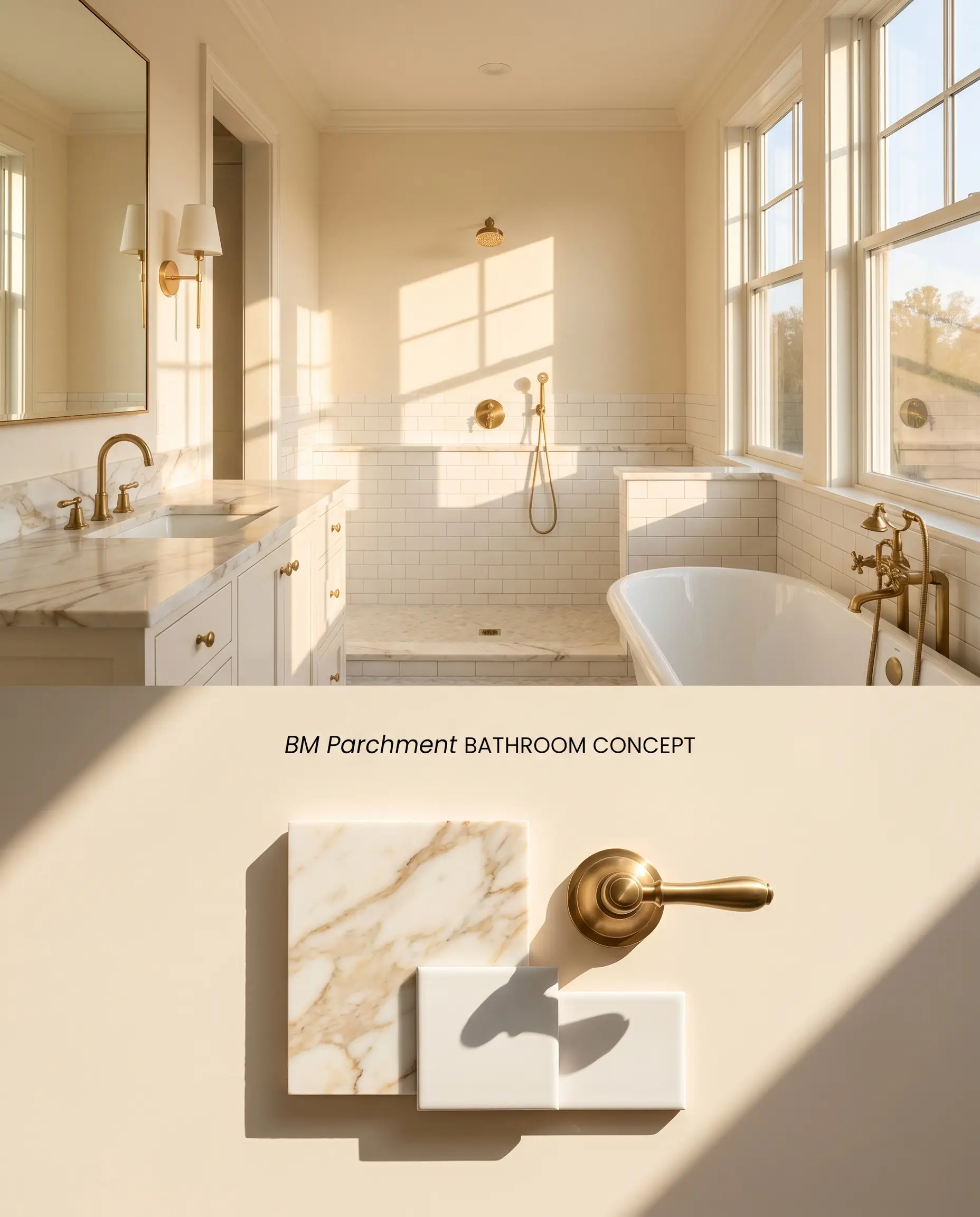
This color requires significant natural light to avoid falling flat into a faded, muddy yellow. In a sun-drenched washroom, the subtle flesh tone qualities of Benjamin Moore Parchment OC-78 warm up stark white subway tile and polished nickel fixtures. Cool-toned gray veining in marble should be kept to a minimum to prevent a temperature clash.
Nurseries
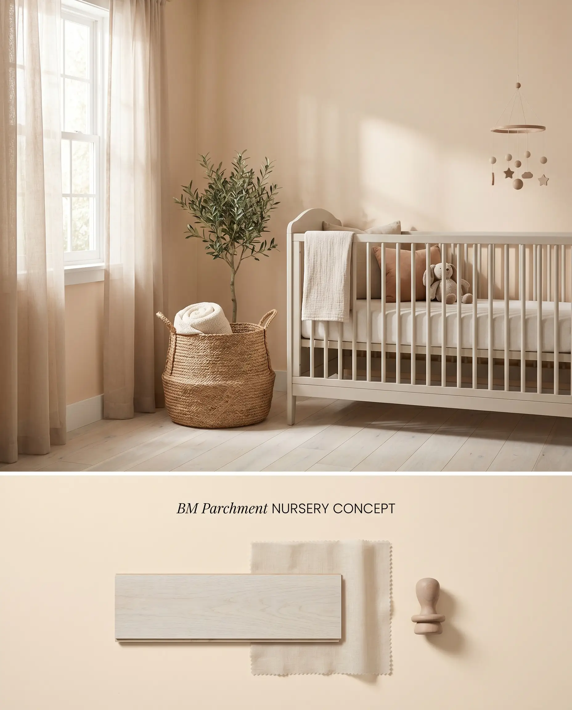
The delicate color structure provides a soft, enveloping warmth without the starkness of a pure white. Because high-saturation toys and rugs can reflect competing hues onto these walls, stick to a muted, earthy palette to keep the undertones controlled. If applying this light off-white over a dark or highly saturated previous color, a high-quality tinted primer is mandatory to prevent the old shade from bleeding through.
Dark Hallways (A Strict Warning)
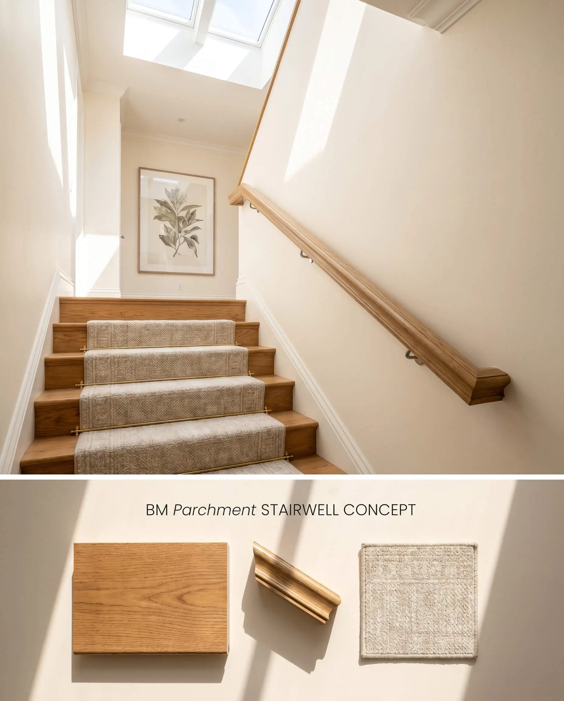
Benjamin Moore Parchment OC-78 is strictly forbidden in dark or windowless hallways. Without adequate natural light to activate its warm off-white base, the color loses its luminous glow and collapses into a dull, ‘sad beige’. Shift this application to sunlit transitional spaces where the paint can properly reflect ambient light.
You can apply wallpapers, paints, etc. on walls and see how they look in various interiors.

Benjamin Moore Parchment OC-78 vs. Farrow & Ball Tallow No. 203
Farrow & Ball Tallow No. 203 is a pale cream with a distinct pink and rose undertone, while Benjamin Moore Parchment OC-78 relies on a subtle peach and yellow base. Tallow holds its warmth slightly better in lower light due to Farrow & Ball’s complex pigmentation, whereas Parchment requires high natural light to avoid looking flat. Specify Tallow when you want a deliberate, soft pink glow in a bedroom, and reserve Parchment for sunlit living spaces where you want a vintage cream that leans peach.
Benjamin Moore Parchment OC-78 vs. Benjamin Moore Gentle Cream OC-96
Benjamin Moore Gentle Cream OC-96 is a traditional, stable beige with less risk of flashing pink or mint green. Parchment has a higher LRV (79.94) and a more volatile chromatic profile that reacts aggressively to red oak floors and cool grays. Deploy Gentle Cream for spaces with mixed wood tones or north-facing light, and specify Benjamin Moore Parchment OC-78 only when you have abundant southern light and can strictly control the surrounding warm-toned architectural elements.
Technical Color Behavior FAQs
Yes, in cooler north-facing light, the color structure can unexpectedly flash a subtle mint green or pinkish-flesh tone. It requires warm southern or western light to maintain its intended peach-beige appearance.
Absolutely. Red oak floors amplify its hidden green and pink casts, while the yellow-dominant tones in honey oak clash with its delicate peach base.
Under warm artificial bulbs, the peach undertones bounce off the walls and intensify, making the room feel noticeably warmer and more pink-toned. In poor or dim artificial lighting, however, it loses its luminous glow and falls flat.
It is generally too warm and peach-leaning for stark, cool-toned modern minimalism. It clashes with the cool gray furnishings and stark white elements typically found in those architectural styles.
Similar Paint Colors
Same Brand
Cross-Brand Equivalents