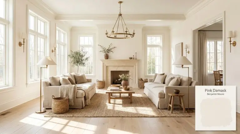
Pink Damask OC-72
Benjamin MooreBenjamin Moore Pink Damask (OC-72) is a highly sophisticated, warm off-white with a delicate blush pink undertone. Rather than reading as a traditional pastel, it acts as a luminous neutral that infuses spaces with a gentle, elegant warmth, perfect for bedrooms and living areas.
| Temperature | Warm |
|---|---|
| Primary Undertone | Soft Pink / Blush |
| Hidden Undertones | Subtle peach, orange, and a hint of beige |
| Best Exposures | North-facing or East-facing |
| Best For | Master Bedrooms, Nurseries, Living Rooms, Bathrooms, Kitchen Cabinets |
Hackrea Review
Pink Damask is an absolute triumph for those who want just a whisper of color. It avoids the sickly-sweet trap of traditional pinks, offering a grown-up, sophisticated blush that feels both modern and timeless. It is an exceptional architectural finish for creating serene, elevated spaces.Architectural Applications for Benjamin Moore Pink Damask OC-72
Master Bedrooms
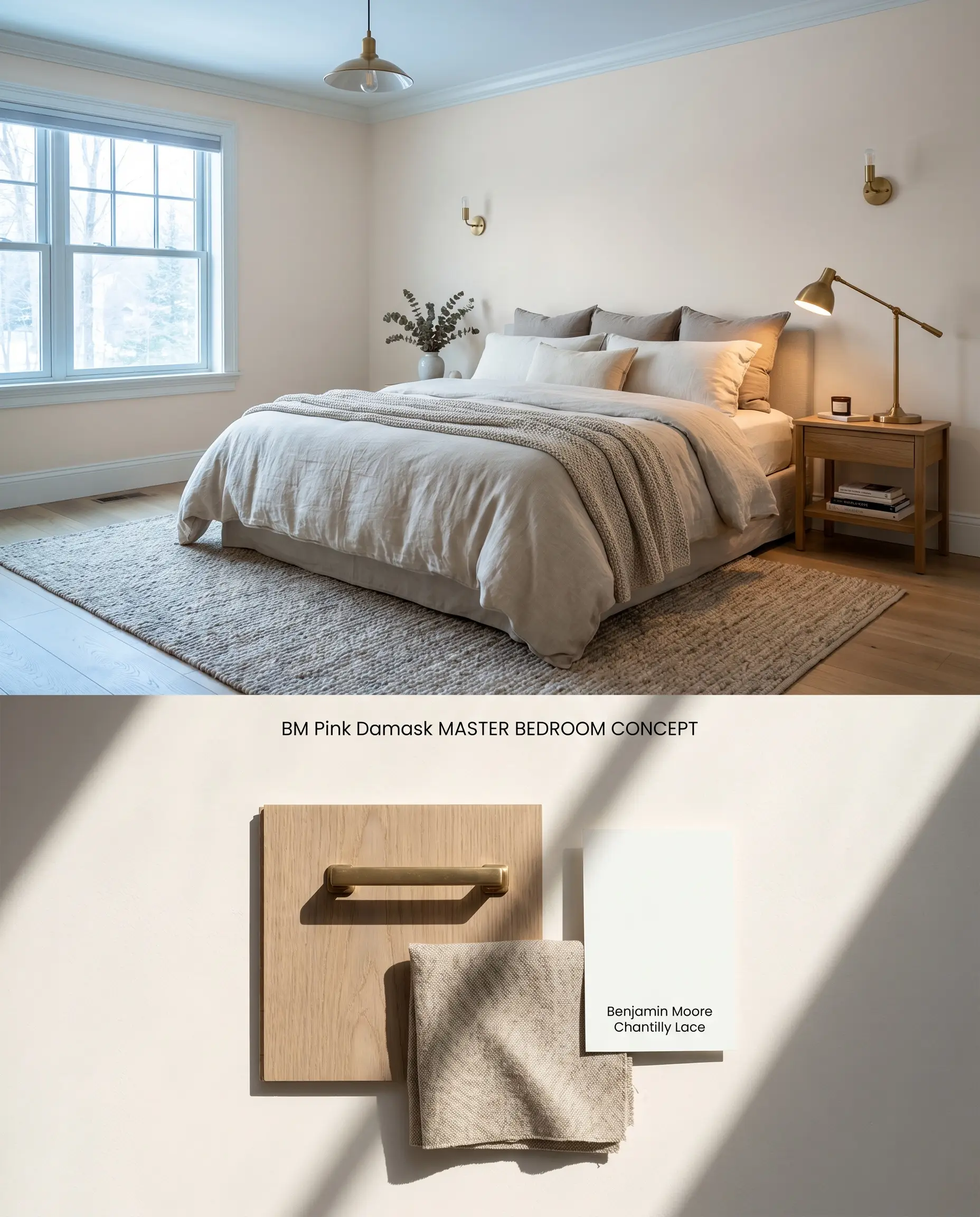
In spaces requiring a soft, sophisticated neutral, this shade provides a gentle thermal shift without overwhelming the architecture. The blush undertones remain grounded when paired with warm, natural textiles, avoiding the juvenile sweetness of traditional pastels.
Nurseries
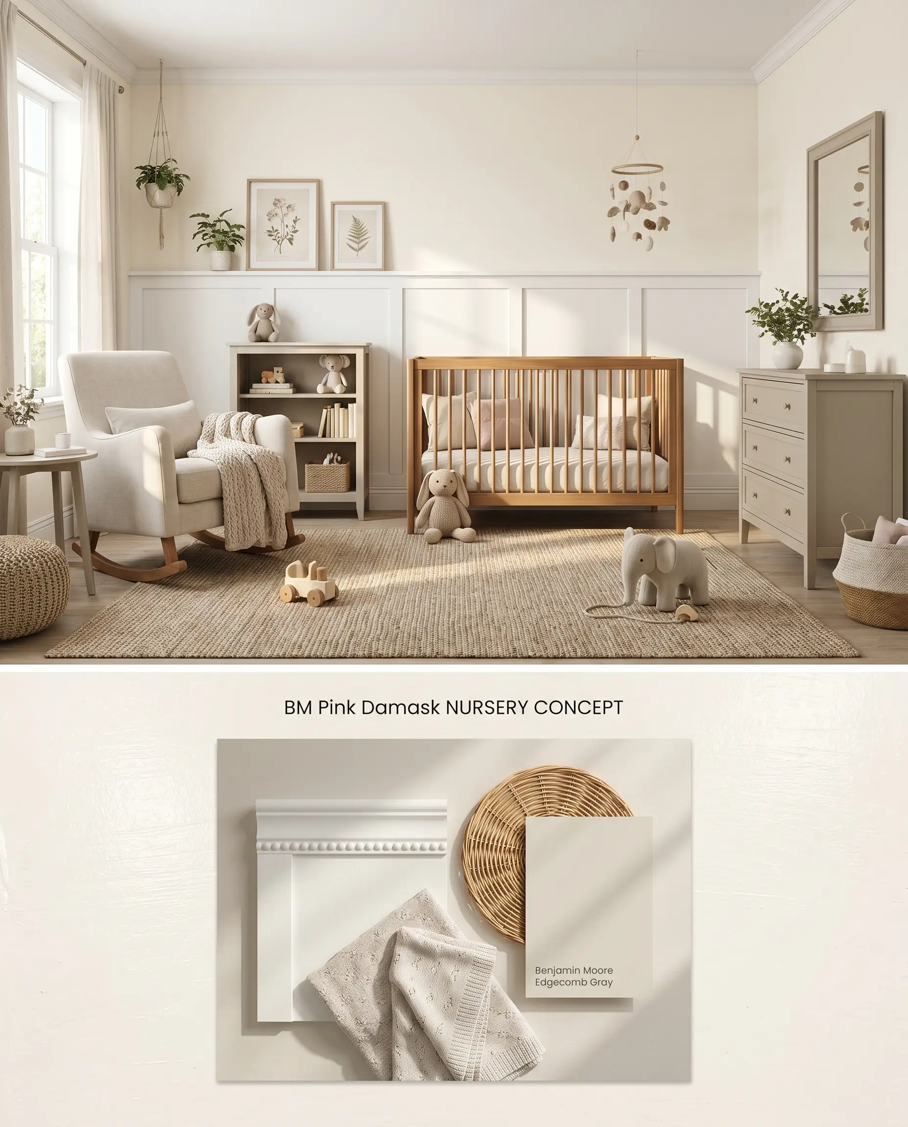
Functioning as a refined millennial pink alternative, this color adapts to evolving room designs long past the infant years. Its high light reflectance value of 85.46 ensures the room retains a spacious, airy volume even with minimal square footage.
Living Rooms
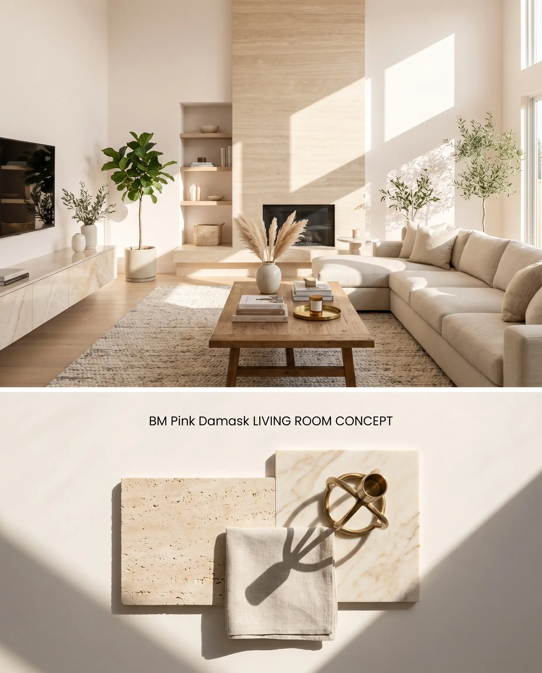
Expanding this chromatic profile across large, open-concept walls requires careful attention to natural light direction and interior design layout. The color temperature actively responds to solar heat, warming up significantly as the sun arcs across the sky.
Bathrooms
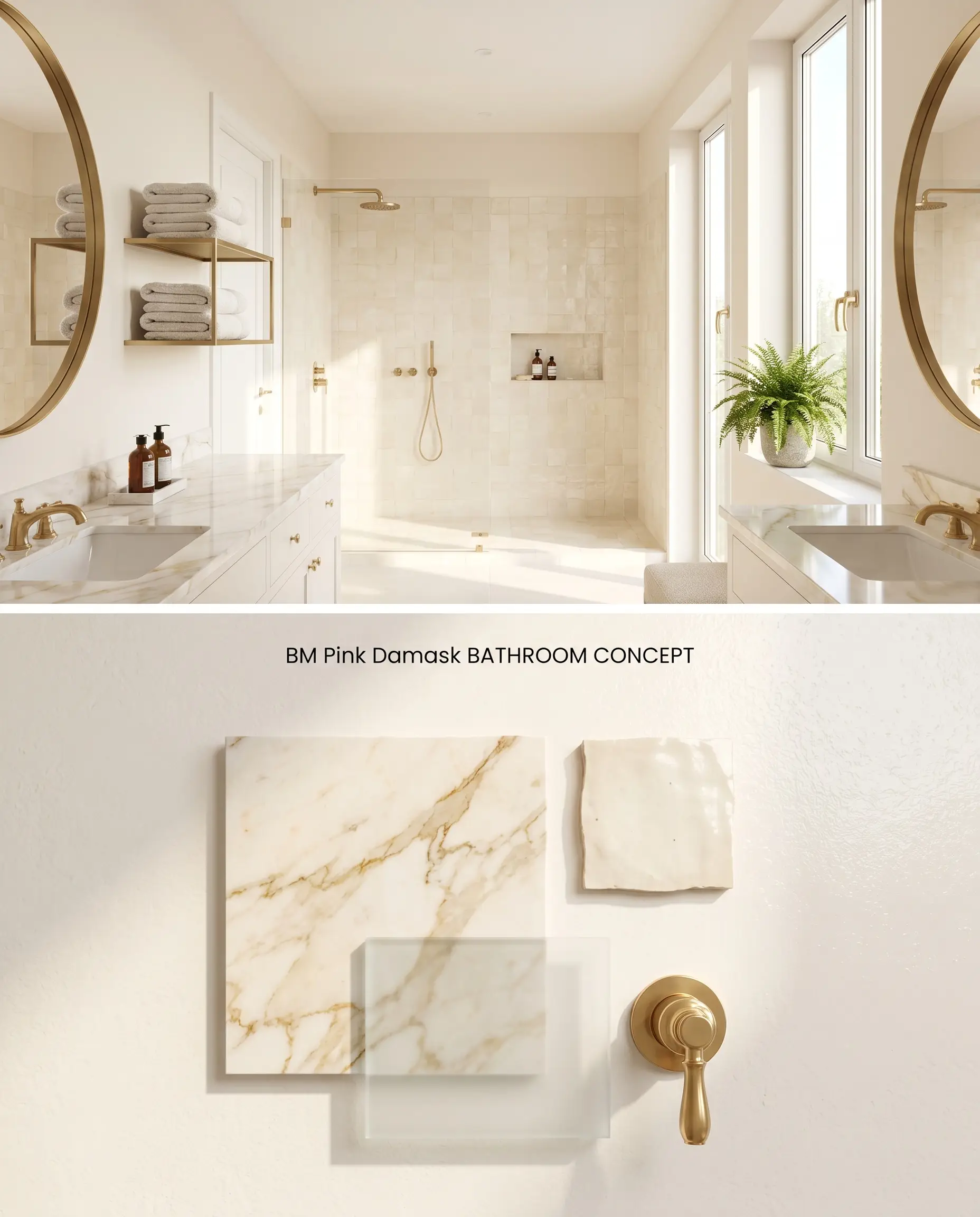
This shade transforms sterile, cold washrooms into flattering, warm environments, provided there is ample exterior glazing. It must strictly be kept out of windowless layouts where the lack of natural photons flattens the pigment into a muddy beige.
Kitchen Cabinets
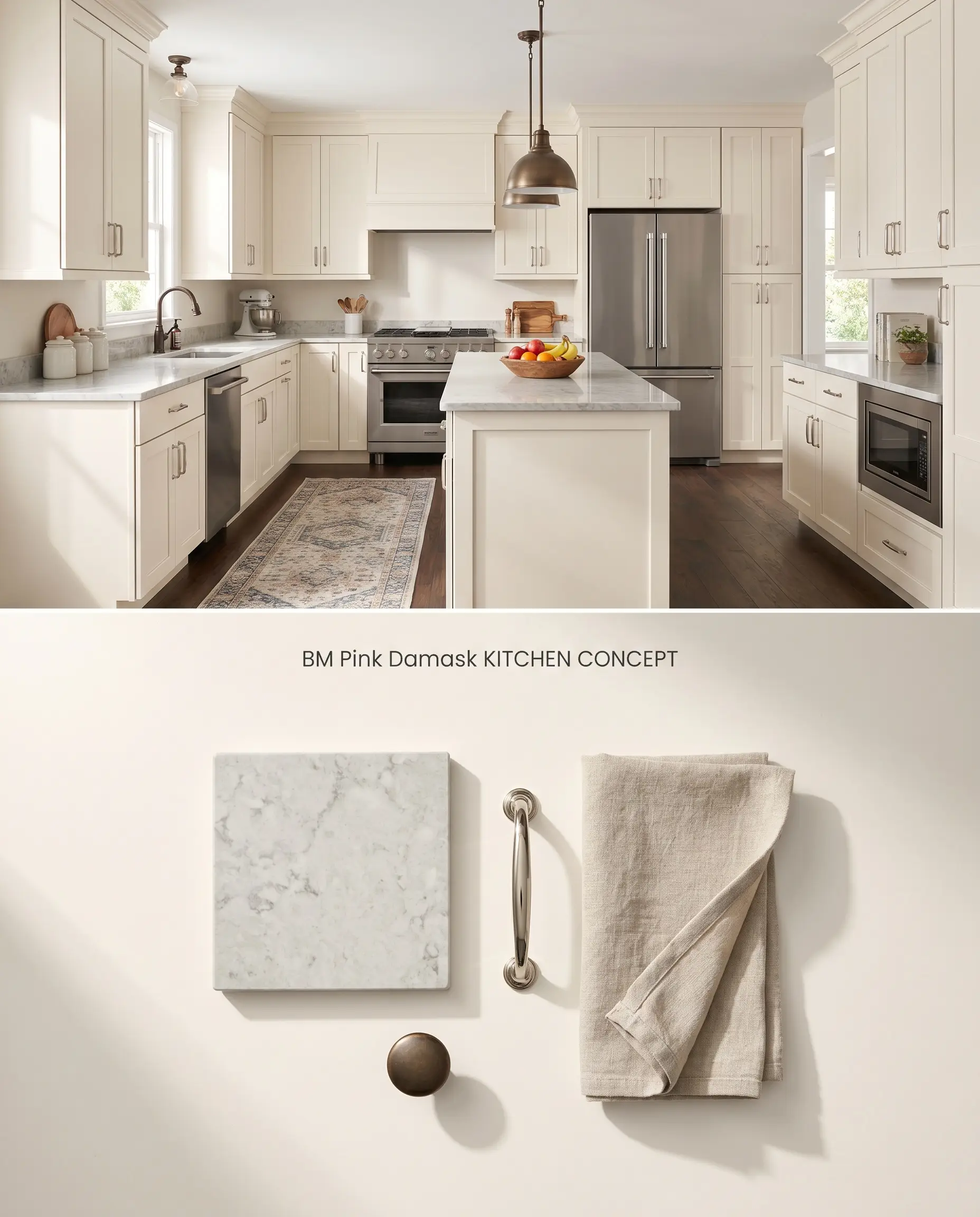
Applying this delicate tone to cabinetry injects immediate warmth into utilitarian spaces, softening the hard lines of stone counters and stainless appliances. A high-quality tinted primer is mandatory when covering dark or highly saturated existing wood to prevent the underlying tone from bleeding through and muddying the finish.
You can apply wallpapers, paints, etc. on walls and see how they look in various interiors.

Color Theory: Pink Damask OC-72 vs. Industry Alternatives
Benjamin Moore Pink Damask OC-72 vs. Benjamin Moore Pink Bliss 2093-70
Benjamin Moore Pink Bliss 2093-70 possesses a lower LRV and a cooler, more undeniable pink base, lacking the neutralizing beige elements found in Pink Damask. When applied in North-facing light, Pink Bliss retains its pastel identity, whereas Pink Damask shifts toward a warm off-white. Specify Pink Bliss for intentional, saturated color statements, and reserve Pink Damask for subtle architectural warmth.
Benjamin Moore Pink Damask OC-72 vs. Sherwin Williams Intimate White SW 6322
Sherwin Williams Intimate White SW 6322 carries a slightly deeper saturation level with more pronounced peach undertones. In South-facing rooms, Intimate White SW 6322 will aggressively project orange hues, while Pink Damask maintains a higher light reflectance value, keeping the space brighter. Utilize Intimate White SW 6322 to close in and cozy up large, expansive rooms, and deploy Pink Damask to maximize volume in tight quarters.
Benjamin Moore Pink Damask OC-72 vs. Farrow & Ball Setting Plaster No. 231
Farrow & Ball Setting Plaster No. 231 is a profoundly darker, earthier tone with a muddy, historic yellow-ochre base that mimics aged architectural finishes. Pink Damask is highly reflective and airy by comparison. Choose Setting Plaster No. 231 for low-light studies or moody dining rooms where deep shadows enhance its complexity, as Pink Damask will fall flat and dingy in those exact same dim conditions.
Technical FAQs: Benjamin Moore Pink Damask
Yes, intense afternoon light and Southern exposure will amplify its peach and orange undertones, shifting it from a warm off-white to a noticeably pink hue.
Yes, stark cool grays and yellow-heavy wood tones force the delicate pink cast to read as overly fleshy or dingy. Pair it instead with warm greiges, matte white oak, or creamy natural stone.
Without adequate natural light, the paint loses its subtle blush characteristics entirely and flattens into a muddy, uninspiring beige.