Cityscape SW 7067
Sherwin-WilliamsSherwin-Williams Cityscape (SW 7067) is a sophisticated, medium-dark gray paint color with an LRV of 22. It features deep green and subtle greige undertones, giving it a moody yet grounded presence that works beautifully on kitchen islands, bathroom vanities, and home exteriors.
| Temperature | Cool-leaning neutral |
|---|---|
| Primary Undertone | Green-gray |
| Hidden Undertones | Subtle greige and faint blue-green |
| Best Exposures | South-facing, West-facing |
| Best For | Bathroom vanities, kitchen islands, exteriors, feature walls, moody bedrooms, home offices |
Hackrea Review
Cityscape is an absolute powerhouse for those who want a gray with actual depth. It avoids the icy, sterile trap of standard grays by leaning into a rich, moody green cast. It is elegant, dramatic, and perfectly suited for modern or transitional spaces.Architectural Recipes for Sherwin-Williams Cityscape
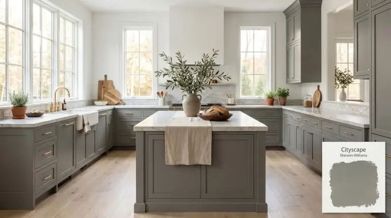
Kitchen Islands & Lower Cabinetry
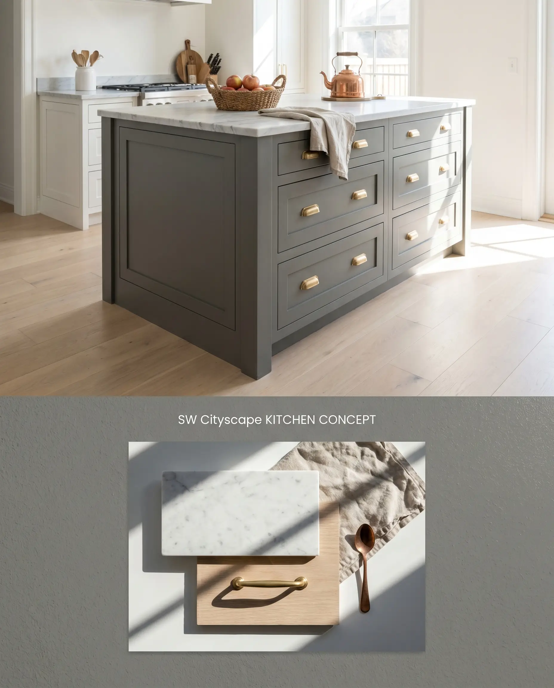
Grounding an airy kitchen requires a shade with substantial visual weight to anchor the sightline below the countertops. Sherwin-Williams Cityscape provides this grounding force while its subtle green undertones act as a bridge to natural stone veining, preventing the millwork from reading as a stark, industrial void. Pairing this moody gray with pale, wide-plank white oak flooring ensures the darker cabinetry absorbs ambient light without making the room feel enclosed.
Bathroom Vanities
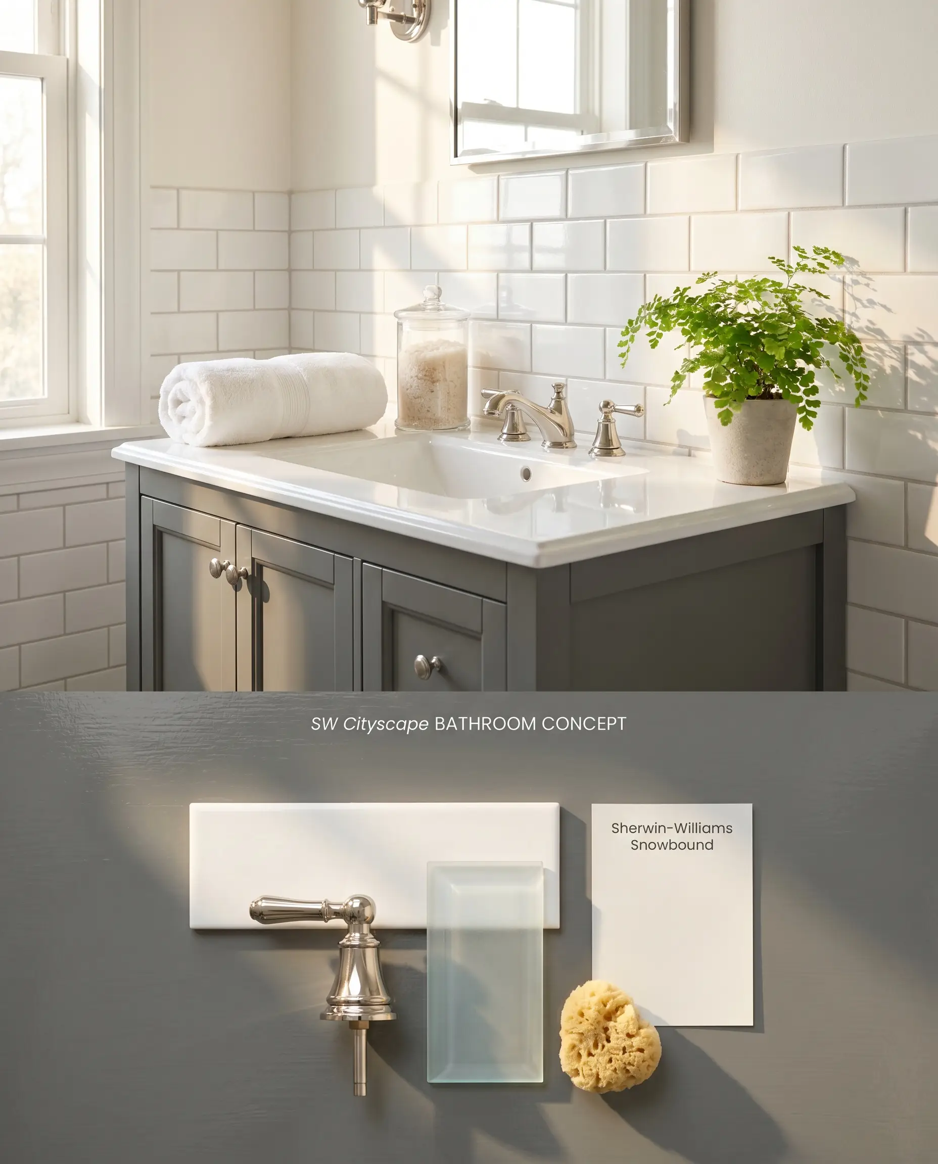
A vanity painted in this deep charcoal establishes a sophisticated focal point against highly reflective subway tile or polished porcelain. The low LRV of 22 allows the vanity to absorb excess glare from vanity sconces, softening the overall color temperature of the hard surfaces. Because windowless bathrooms strip the green undertone and render the paint flat, this application requires a layout with direct natural light.
Exterior Siding & Trim
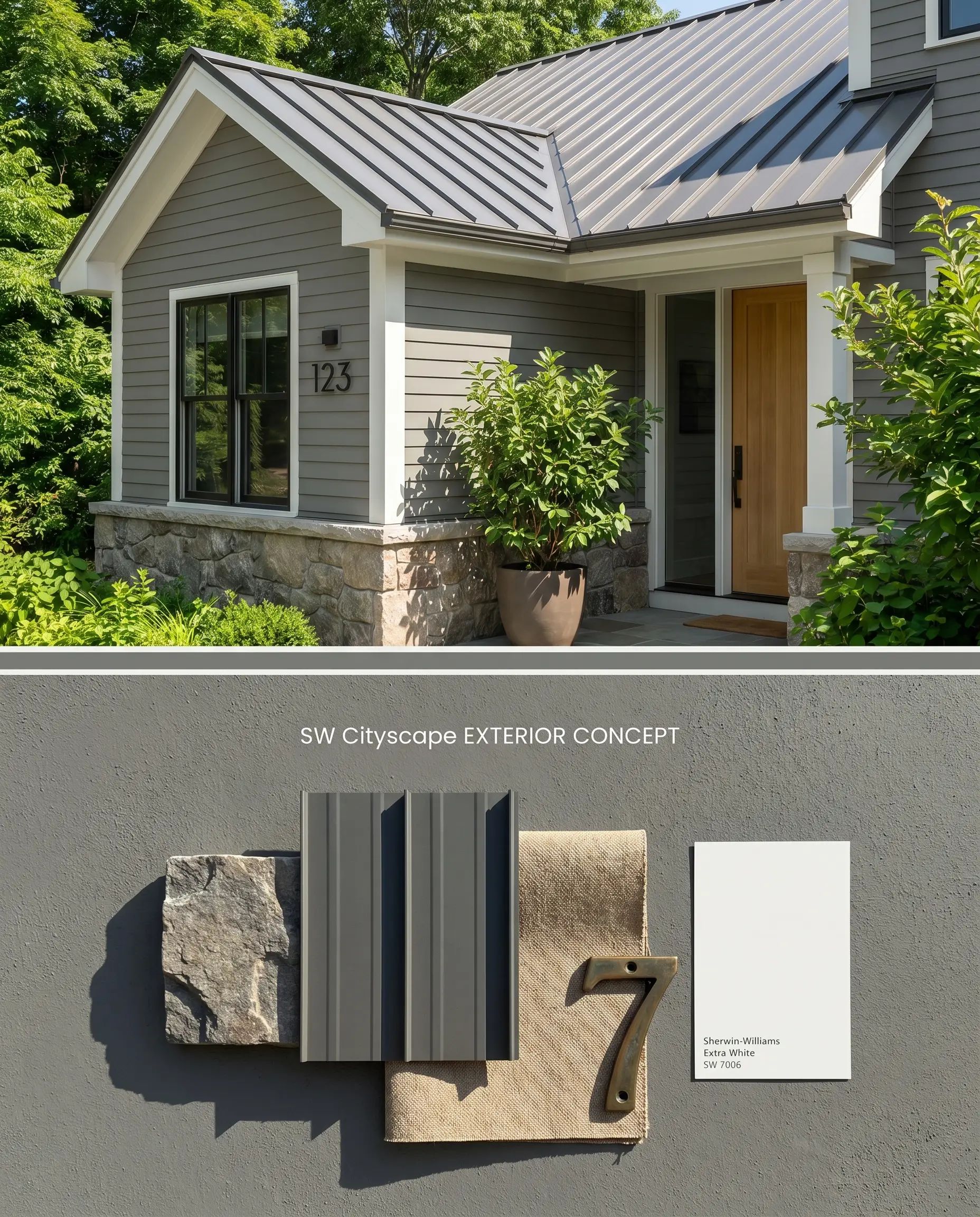
Direct sunlight dilutes the visual weight of dark colors, shifting Sherwin-Williams Cityscape from a deep charcoal to a mid-tone, nature-inspired gray. The UV exposure activates its hidden green undertones, allowing the exterior siding to organically merge with surrounding foliage and rough-cut stone foundations. High-contrast white fascia creates a rigid boundary that prevents the muted siding from blurring into the roofline.
Moody Bedrooms & Accent Walls
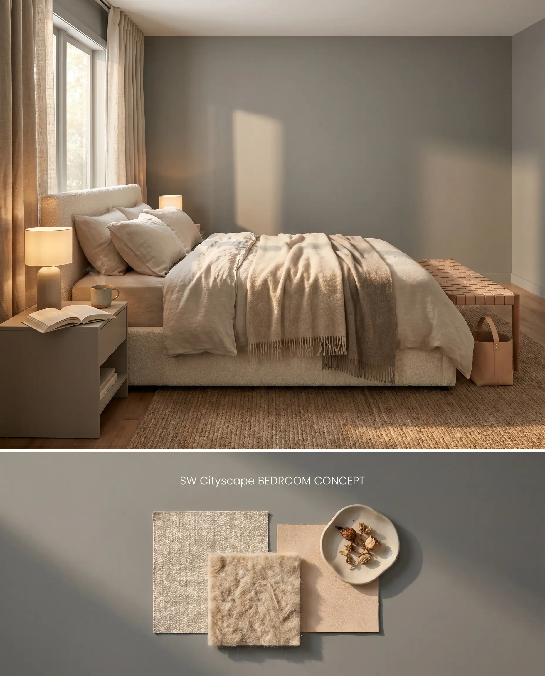
Wrapping a bedroom in a low-LRV shade physically recedes the walls, blurring the corners to create an enveloping, shadowed environment. To prevent the space from feeling like a trap for low light, incorporate highly textured, light-reflecting materials like bouclé upholstery and linen drapery. The contrast between the light-absorbing matte walls and the tactile, bright textiles maintains spatial balance.
Home Offices & Studies
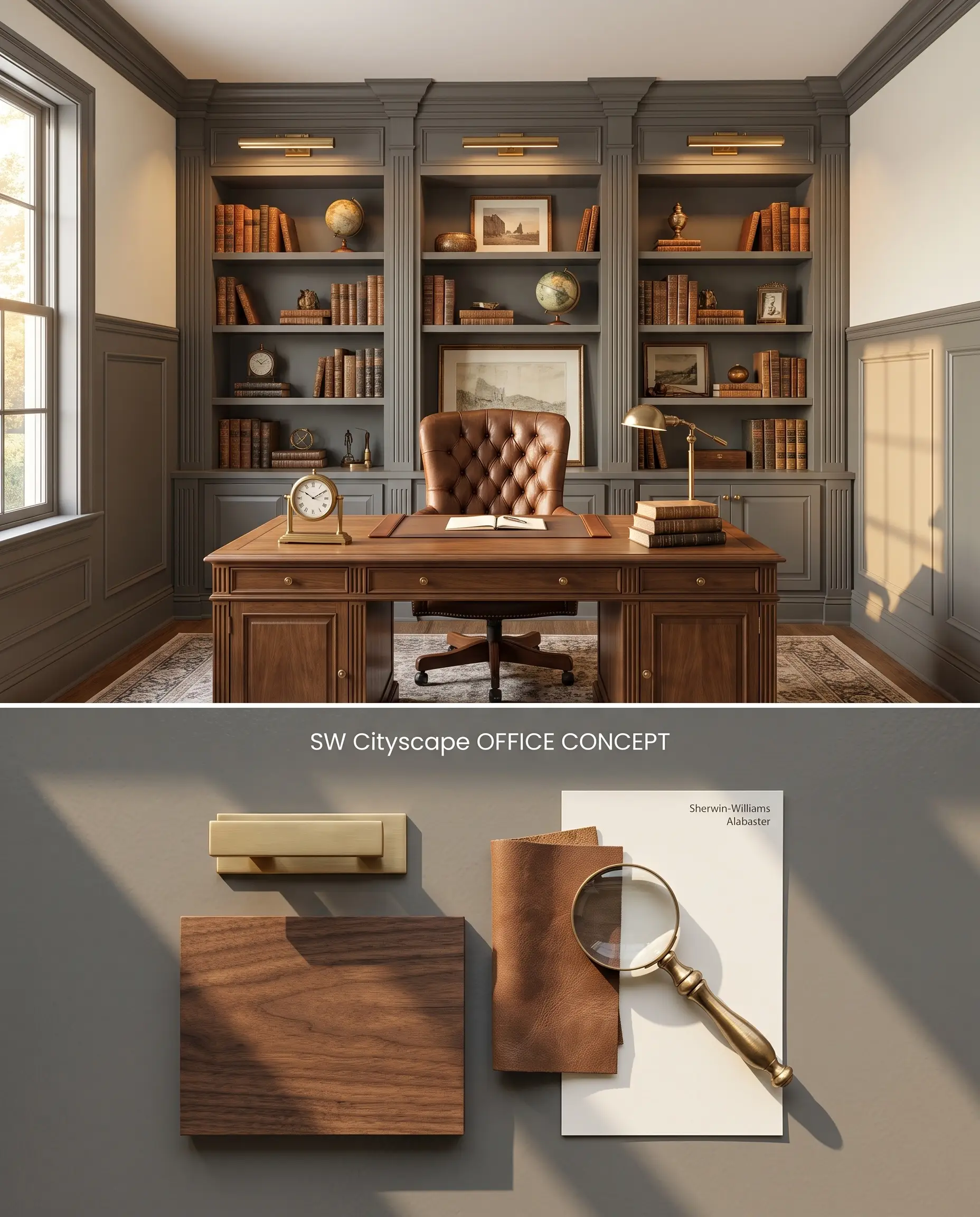
A dedicated workspace benefits from the grounded, distraction-free perimeter created by a deep gray color family. When applied to built-in bookcases or wainscoting, the shade anchors the lower half of the room, allowing the upper walls to reflect ambient light and reduce eye strain. Pairing the painted millwork with warm brass picture lighting highlights the architectural depth of the shelving.
You can apply wallpapers, paints, etc. on walls and see how they look in various interiors.

Comparative Color Theory and Visual Weight
Sherwin-Williams Cityscape SW 7067 vs. Sherwin-Williams Gauntlet Gray SW 7019
Sherwin-Williams Gauntlet Gray SW 7019 (LRV 17) is noticeably darker and leans into a warmer, browner greige undertone compared to Sherwin-Williams Cityscape SW 7067 (LRV 22). While Cityscape relies on its green base to cool down a room, Gauntlet Gray introduces earthy warmth. Choose Cityscape for South-facing rooms where you want to neutralize warm incoming light, and select Gauntlet Gray for cooler, North-facing spaces that require a subtle injection of brown to prevent the walls from reading as concrete.
Sherwin-Williams Cityscape SW 7067 vs. Sherwin-Williams Attitude Gray SW 7060
Sherwin-Williams Attitude Gray SW 7060 (LRV 20) shares a similar depth but commits entirely to a dominant green-bronze undertone, shedding the neutral charcoal identity of Cityscape. In identical lighting, Attitude Gray will visibly read as a muted green, whereas Cityscape maintains its status as a moody gray that only flashes green under specific conditions. Specify Attitude Gray when designing a nature-inspired exterior siding palette, but rely on Cityscape for transitional style interiors where a more neutral backdrop is required.
Sherwin-Williams Cityscape SW 7067 vs. Benjamin Moore Cinder AF-705
Benjamin Moore Cinder AF-705 acts as a cooler, more traditional charcoal with distinct blue-purple undertones, directly contrasting the green base of Cityscape. When placed next to warm wood tones, Cinder’s cool blue notes will starkly separate from the wood, while Cityscape’s green will attempt to harmonize. Utilize Cinder in ultra-modern spaces featuring cool metals and glass, and deploy Cityscape in modern farmhouse designs that incorporate natural oak and brass.
Technical Application FAQs
Yes, the cool indirect light of a North-facing room strips away Cityscape’s softening green undertones. This lighting condition causes the paint to read as a much stonier, flatter charcoal.
Yes, the green undertones in Cityscape sit opposite red on the color wheel, actively amplifying the pink and red tones in cherry or mahogany. This interaction creates a stark, vibrating contrast that often results in a dated aesthetic.
Direct sunlight on an exterior application washes out the charcoal base and pulls the hidden green undertones to the forefront. It will read significantly softer and greener outside than it does on an interior swatch.
Due to its low light reflectance and deep pigmentation, Cityscape requires a tinted gray primer or a minimum of two solid coats to achieve full opacity. Skipping this step often results in lighter base coats flashing through the final finish.
Similar Paint Colors
Same Brand
Cross-Brand Equivalents