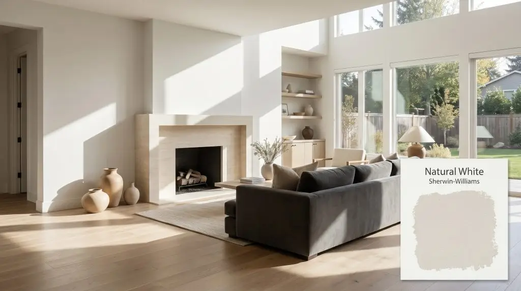
Sherwin-Williams Natural White (SW 9542) is a soft, cool-leaning off-white with an LRV of 83.3. Featuring subtle gray undertones, it provides a crisp, clean backdrop that beautifully balances warm wood tones without ever feeling stark, icy, or overly creamy.
Will Natural White clash with your room?
Paint Technical Profile
| Color ID / SKU | SW 9542 |
| HEX Code | #ECEBE8 |
| Light Reflectance (LRV) | 83.3 |
| Temperature | Cool to Neutral |
| Primary Undertone | Soft Gray |
| Hidden Undertones | Slight Violet/cool Cast |
| Use | Interior, Exterior |
| Best Exposures | South-facing, East-facing |
| Best For | Living room walls, bedroom walls, kitchen cabinets, trim and molding, ceilings, entryways |
Natural White Digital Design Concept Boards
Living Room Walls
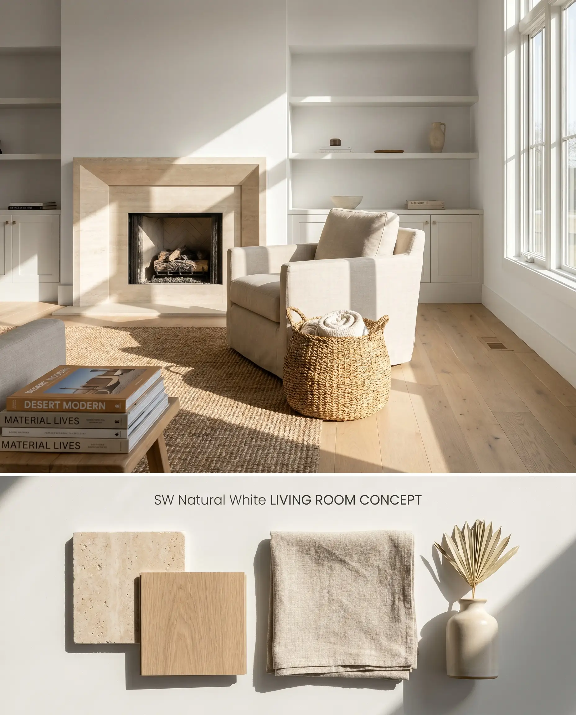
The gray base of SW 9542 Natural White grounds expansive living spaces by absorbing direct sunlight rather than reflecting it into a blinding glare. This soft white formulation provides a neutral, non-competing backdrop for textured masonry and warm wood accents. Because it is highly stable and user-friendly, touch-ups on large wall expanses blend seamlessly provided the exact same sheen is utilized.
Bedroom Walls
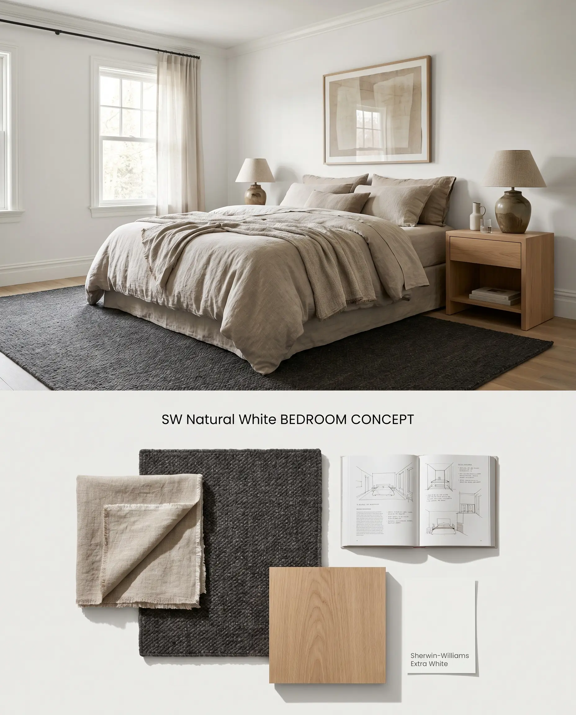
In personal quarters, this cool off-white establishes a restful, modern minimalist environment by neutralizing aggressive morning light. The 83.3 LRV ensures the room feels bright without feeling clinical, allowing linen textiles and natural fibers to dominate the visual hierarchy.
Kitchen Cabinets
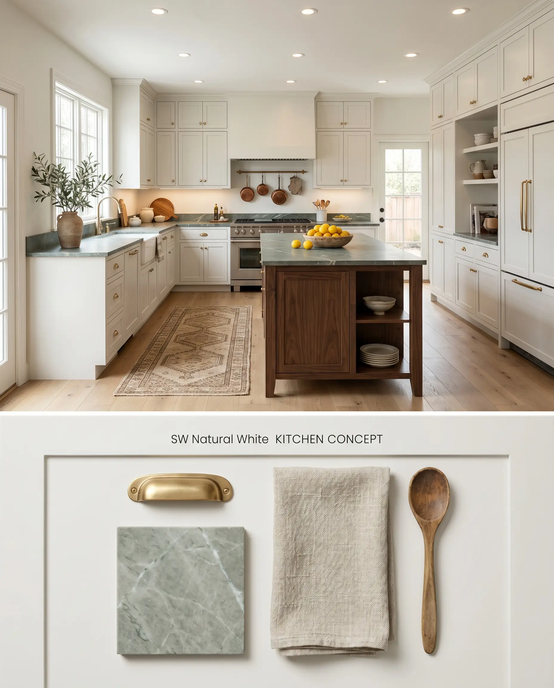
Utilizing this Emerald Designer Edition exclusive on cabinetry introduces a sophisticated, muted gray undertone that bridges the gap between stark white quartz counters and dark stained island bases. The subtle chromatic profile prevents the cabinetry from looking plastic or overly sterile under artificial task lighting.
Trim and Molding
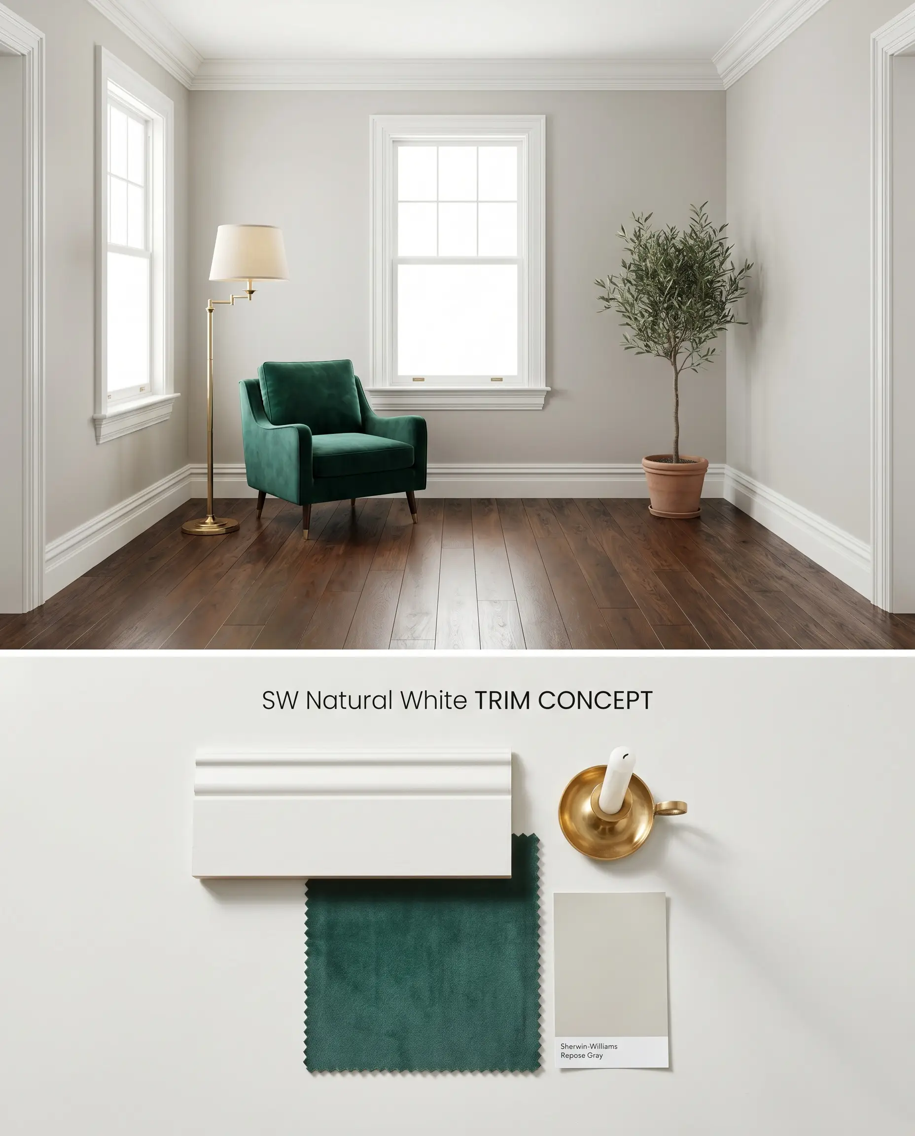
Applying SW 9542 Natural White to architectural trim provides a softer transition against mid-tone gray or greige walls than standard brilliant whites. This approach lowers the contrast ratio, creating a continuous, uninterrupted visual flow that physically expands perceived ceiling height.
Ceilings
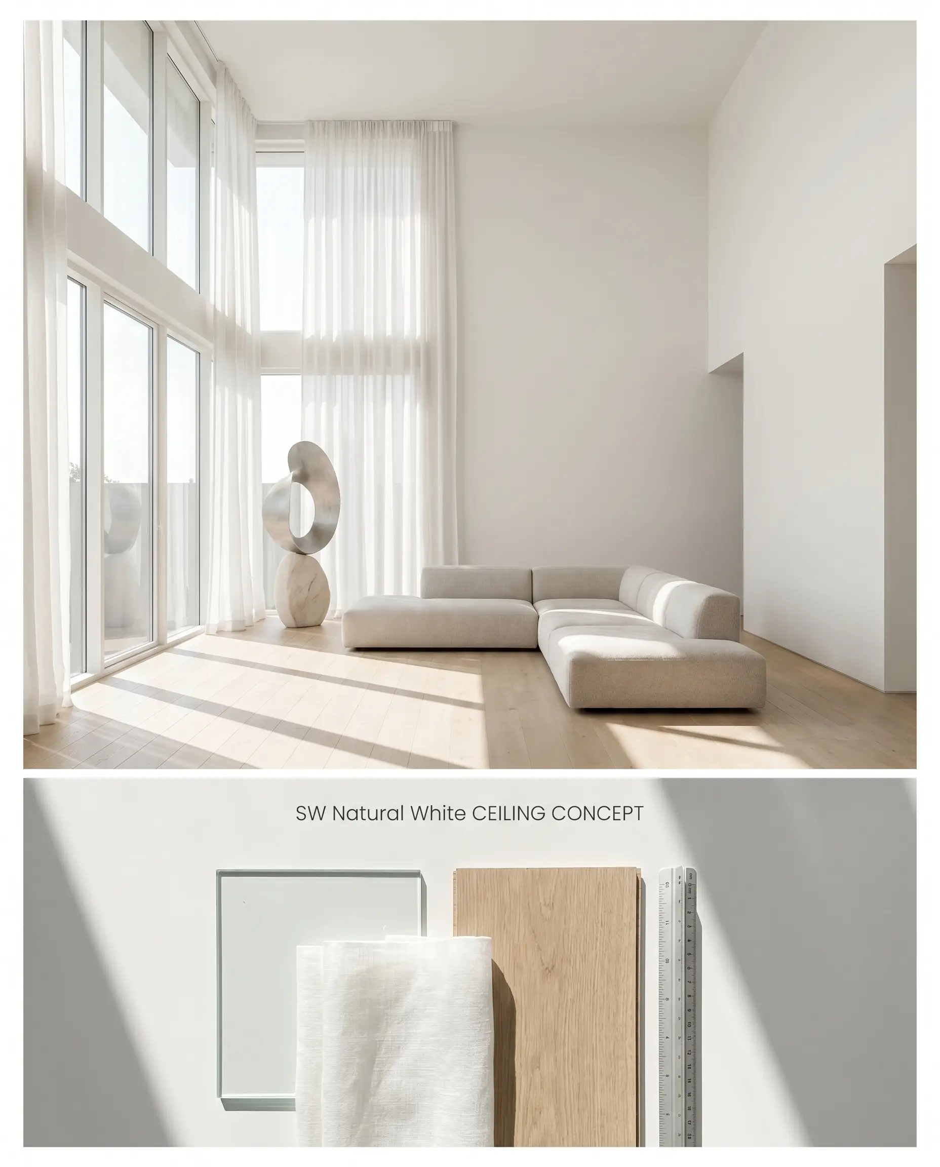
The muted gray undertones of this shade pull the ceiling down slightly, establishing a more intimate scale in rooms with soaring vertical proportions. It mitigates the stark, floating effect of pure white ceilings while maintaining enough light reflectance to keep the space illuminated.
Entryways
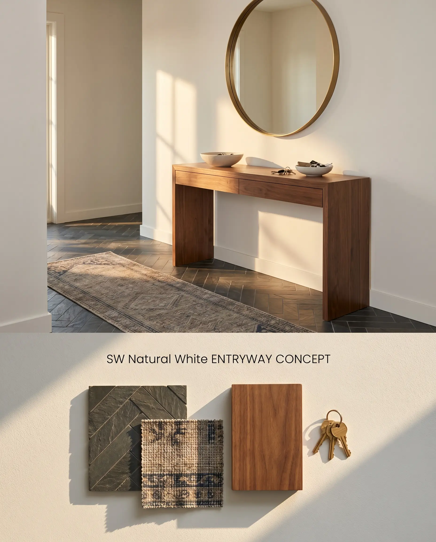
For sun-drenched foyers, this color establishes immediate architectural sophistication by reacting to shifting daylight without ever flashing icy blue. Do not apply this in dark, windowless hallways or enclosed vestibules, as the lack of ambient light traps the gray undertone, generating a shadowy, flat effect.
Sherwin-Williams Natural White SW 9542: Head-to-Head Comparisons
Sherwin-Williams Natural White SW 9542 vs. Sherwin-Williams Pure White SW 7005
Pure White SW 7005 (LRV 84) relies on a drop of black pigment to soften its appearance, making it a highly flexible, neutral white. Natural White SW 9542 (LRV 83.3) leans further into a distinct gray base, reading noticeably cooler and more muted side-by-side. Specify Pure White for transitional spaces needing a universally safe trim, but mandate Natural White when you need a wall color to actively cool down a hot, south-facing room without glare.
Sherwin-Williams Natural White SW 9542 vs. Sherwin-Williams Extra White SW 7006
Extra White SW 7006 (LRV 86) is a stark, crisp builder-grade white with a slight blue undertone, offering sharp contrast against wall colors. Natural White sits lower on the light reflectance value scale, absorbing more light and providing a softer, integrated look. Deploy Extra White when you need sharp, modern architectural definition on baseboards, and reserve Natural White for full-room wall applications where Extra White would feel clinically sterile.
Sherwin-Williams Natural White SW 9542 vs. Benjamin Moore White Dove OC-17
White Dove OC-17 (LRV 85.38) is driven by a warm, creamy yellow-gray undertone, making it highly luminous and traditional. Natural White directly opposes this with its cool, gray-dominant color temperature. Choose White Dove to bridge warm wood tones in north-facing rooms, but select Natural White to neutralize aggressive yellow afternoon sunlight in west-facing spaces where White Dove would turn excessively yellow.
Technical Specifications & FAQs
The gray base of Natural White provides a cool, neutralizing contrast that grounds warm wood ceilings and red oak floors. However, ensure the wood tones lean true brown or natural rather than yellow-orange, as the cool off-white can emphasize unwanted orange tones in the wood.
Yes. Placing Natural White directly against strongly yellow-based creams forces the gray undertones in Natural White to the surface, making the cream appear dirty and the white look flat. Always pair it with crisp, neutral whites or darker contrasting colors.
The premium Emerald Designer Edition formulation utilizes a denser pigment structure, allowing this light off-white to achieve exceptional hide and coverage in just two coats. This reduces the labor costs typically associated with applying high-LRV colors over darker existing walls.
While north-facing light enhances the gray color structure and makes Natural White read cooler and flatter, its specific pigmentation rarely flashes icy blue or purple. Instead, it creates a muted, shadowy gray effect, which is why it must be avoided in low-light or windowless spaces.
Room Compatibility & Clashes Diagnoses
Hackrea's reports evaluating the compatibility of Natural White in real rooms.No compatibility tests for Natural White yet.
Be the first to see how this color reacts to your space. Run a free architectural diagnostic now.
Paint Aesthetic & Practical Analysis
| Profile | Analysis | |
|---|---|---|
| Aesthetic | Natural White is a designer-favorite from Sherwin-Williams' Emerald Designer Edition. We love its balanced, cool-leaning profile that modernizes a space without making it feel sterile. It is the perfect sophisticated off-white for those who want to avoid yellow undertones. | |
| The Coverage Catch | As part of the premium Emerald Designer Edition, it offers exceptional hide and covers beautifully in two coats, but it comes at a significantly higher price point than standard lines. | |
| The Lighting Shift | In north-facing or cool light, the subtle gray base becomes more prominent, causing it to read slightly flatter or cooler, though it rarely flashes icy blue. | |
| The Clash Warning | Avoid pairing it directly against heavily yellow-based creams (like SW Aged White); the gray undertones in Natural White will make the cream look dingy and dated. | |
| The Bounce Effect | With an LRV of 83.3, it absorbs light gently rather than bouncing it aggressively, preventing the blinding glare common with pure whites in south-facing rooms. | |
| The Low Light Trap | In windowless rooms or hallways, the gray undertone can create a slightly muted or 'shadowy' effect rather than a crisp, bright white. | |
| The Touch Up | Highly stable and user-friendly. Because it is a light off-white in a premium finish, touch-ups blend seamlessly if using the exact same sheen. |
Closest Cross-Brand Equivalents
The absolute closest scientific color matches for Natural White across top paint brands.