Bisque 9811
Farrow & BallFarrow & Ball Bisque (No. 9811) is a warm, inviting yellowed orange with distinct coral and pink undertones. Serving as a softer, more muted alternative to Charlotte's Locks, this archival shade brings a vibrant yet earthy glow to dining rooms, woodwork, and cozy living spaces.
| Temperature | Warm |
|---|---|
| Primary Undertone | Coral |
| Hidden Undertones | Yellow and Pink |
| Best Exposures | South, West |
| Best For | Dining rooms, powder rooms, accent woodwork, front doors, dark hallways |
Hackrea Review
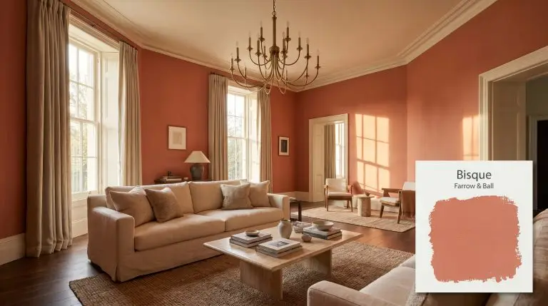
Bisque by Farrow & Ball is a stunning, sophisticated coral-orange that avoids feeling neon or overly aggressive. It’s an archival gem that brings a culinary warmth to dining spaces. However, its heavy reliance on specific lighting means you absolutely must test it in your room before committing, as it can shift dramatically from a soft peach-pink to a robust terracotta.Architectural Applications for Farrow & Ball Bisque
Formal Dining Rooms
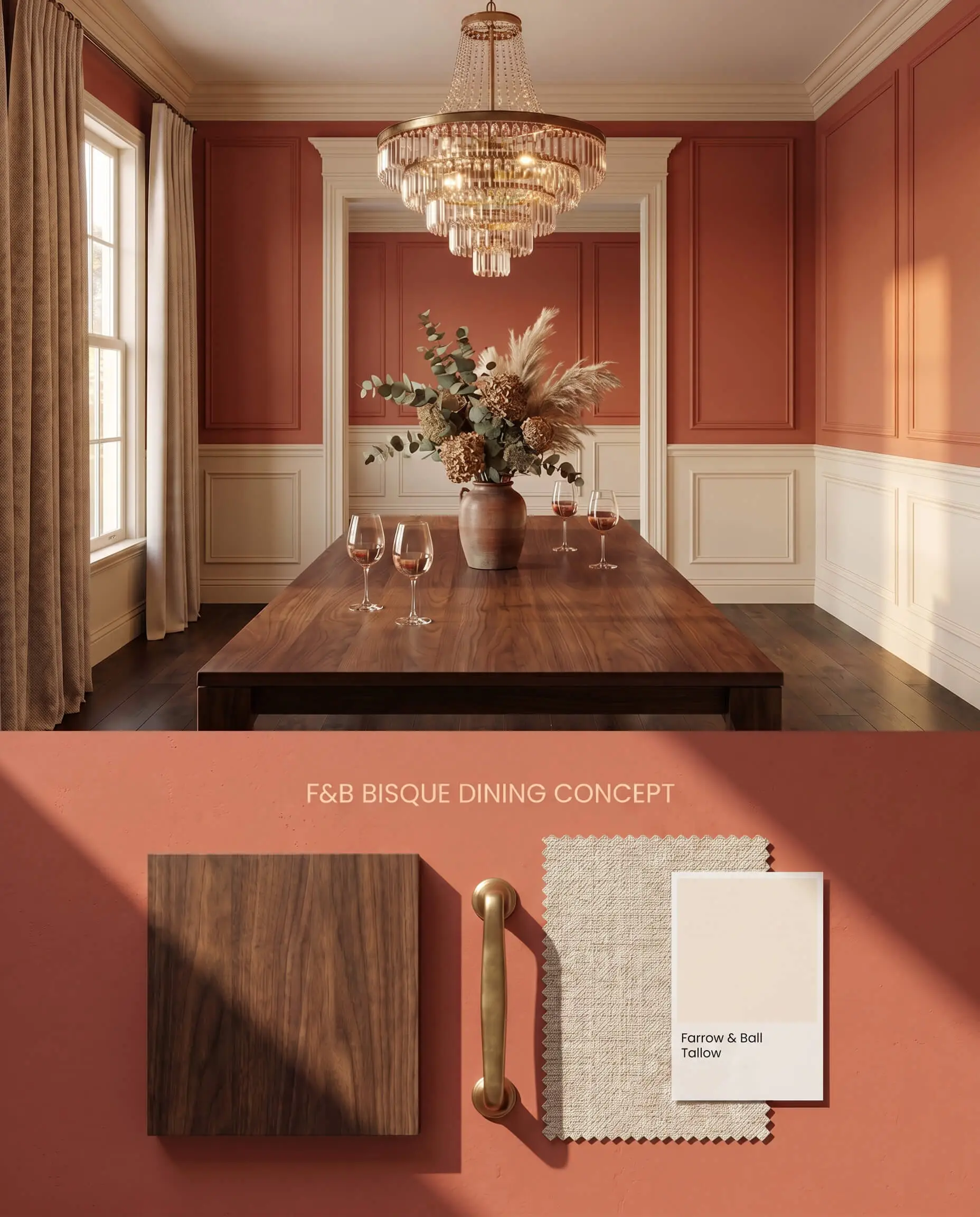
As part of the Farrow & Ball Archive collection, this pigment anchors formal dining spaces by absorbing ambient evening light and radiating a steady, yellowed orange warmth. Surrounding the room with this deep coral hue creates an intimate envelope that contrasts sharply with the sharp, reflective facets of crystal chandeliers and polished brass. The rich color structure demands a creamy, yellow-based white trim to prevent jarring visual breaks between planes.
Powder Rooms and Half Baths
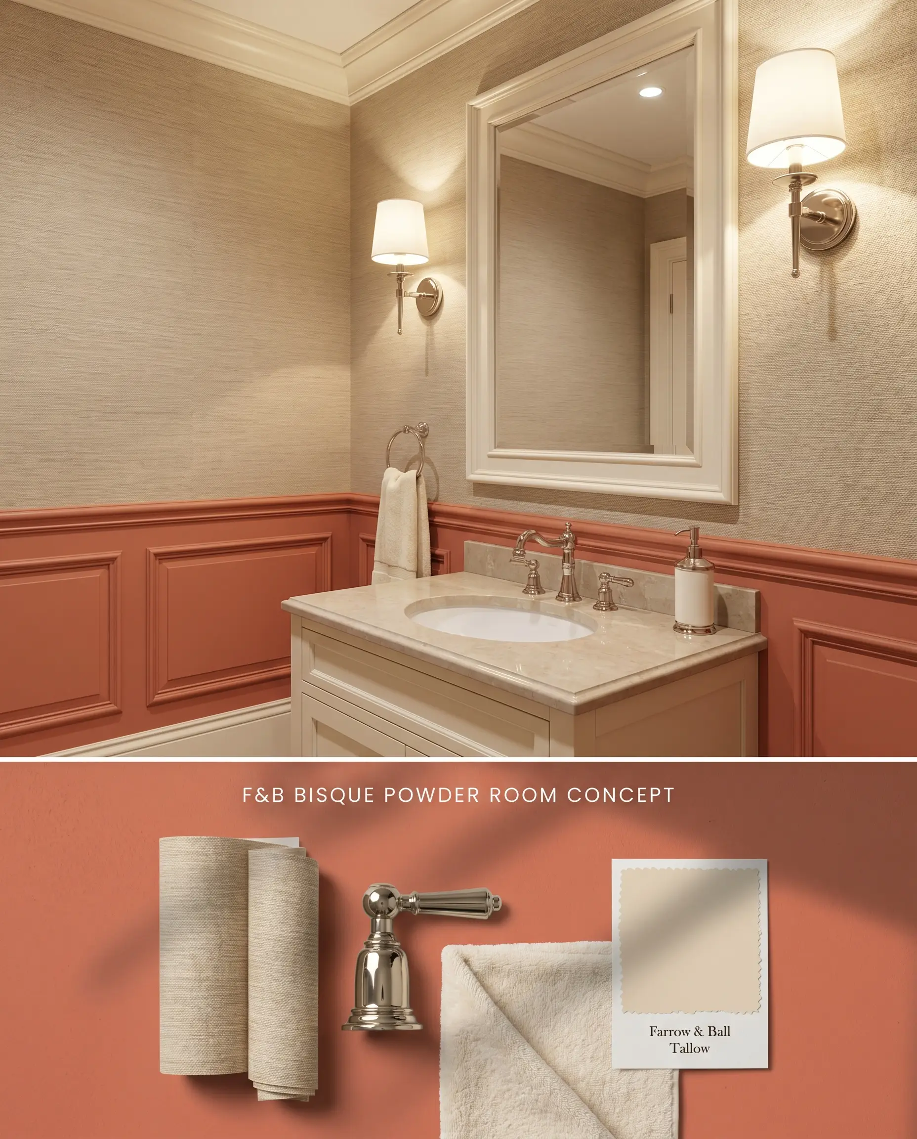
Enclosing a small powder room entirely in this shade triggers a massive bounce effect, casting an overwhelming rosy glow that severely distorts skin tones in the vanity mirror. To harness its vibrancy without the funhouse effect, restrict the paint to the lower wainscoting or the vanity cabinet itself. Grounding the upper walls with a neutral, warm wallpaper tempers the coral hue while maintaining the room’s thermal energy.
Accent Woodwork and Cabinetry
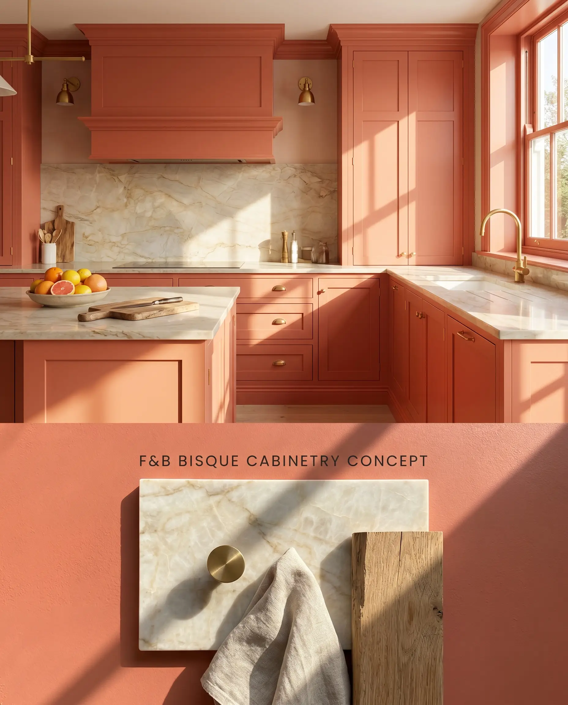
Applying this warm architectural finish to millwork transforms functional built-ins into commanding focal points. The rigid geometry of cabinetry reins in the expansive energy of the yellow-orange base, turning it into a structured, tailored design element. Pairing this deep hue with natural stone counters prevents the color from feeling overly saturated.
Front Doors (Exterior)
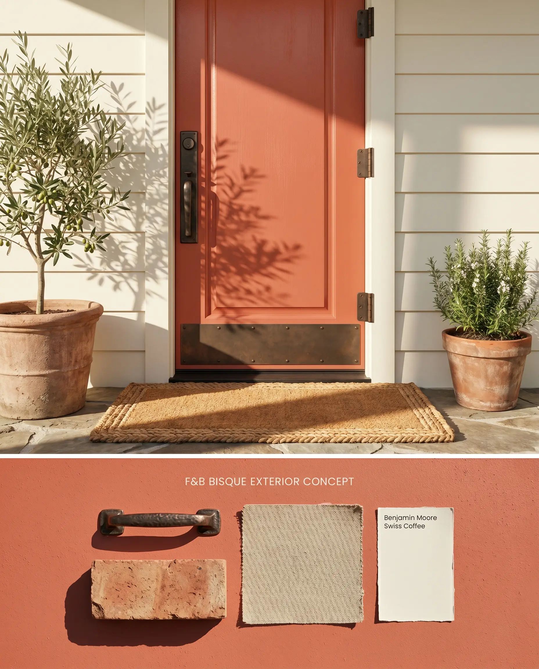
A brightly painted front door serves as a high-contrast, welcoming beacon against warm masonry or cream-painted brick. However, its chromatic profile clashes aggressively with taupe exteriors carrying green undertones, requiring careful coordination with the surrounding siding. The robust pigment relies entirely on intense natural light to prevent it from flattening into a muddy brick tone.
Dark Hallways and Entryways
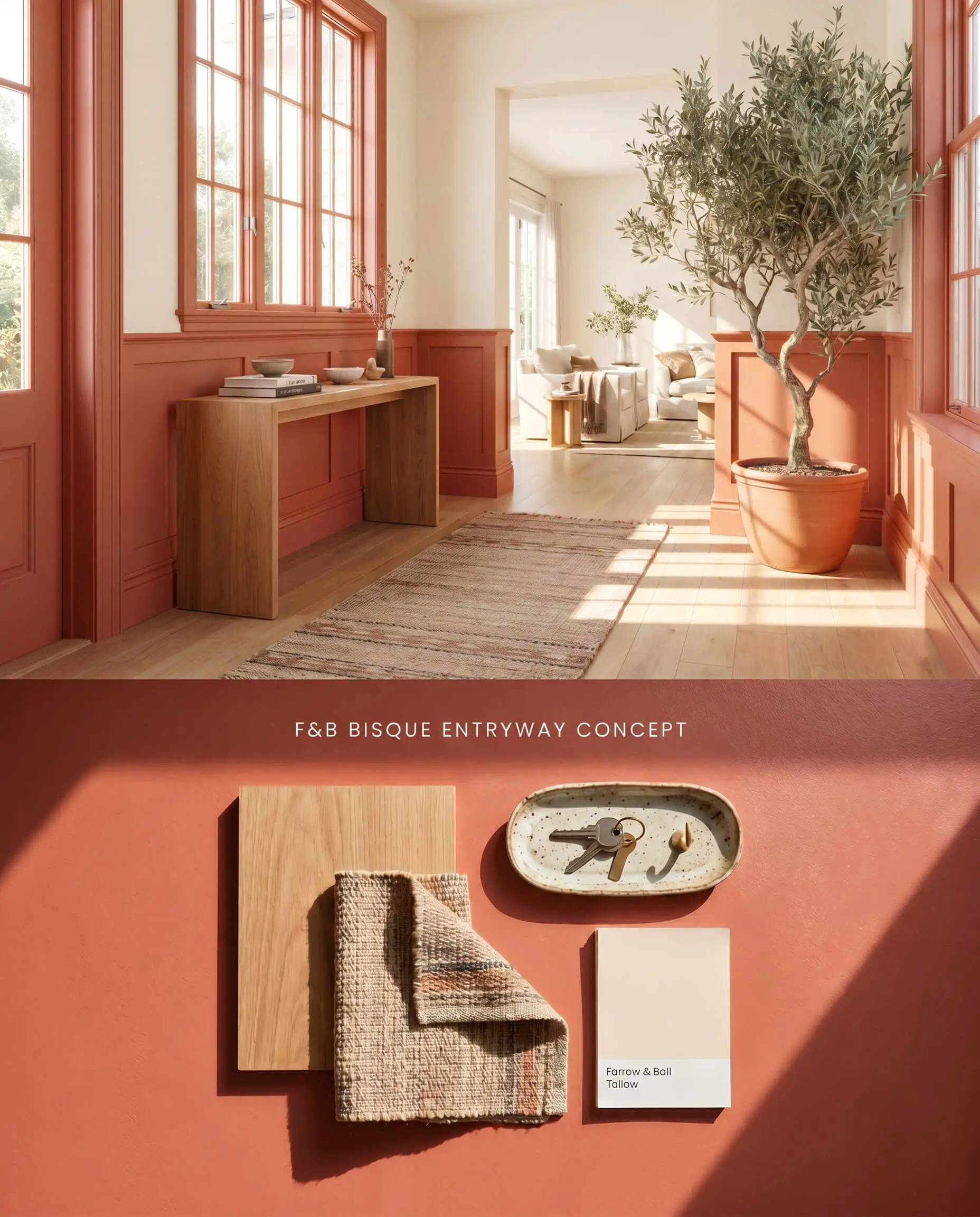
You must strictly avoid applying this color in windowless corridors or poorly lit entryways, as the lack of light causes the vibrant yellowed orange energy to dissipate into a flat, muddy brick tone. Instead, reserve this hue for sun-drenched, open-plan entryways where natural light physically activates the pigment. If you must inject warmth into a transitional space, limit the application to lower wainscoting to mitigate touch-up issues on high-traffic walls.
You can apply wallpapers, paints, etc. on walls and see how they look in various interiors.

Head-to-Head: Evaluating Warm Architectural Finishes Against Rival Pigments
Farrow & Ball Bisque vs. Farrow & Ball Charlotte’s Locks 268
Farrow & Ball Charlotte’s Locks 268 is a much deeper, fiery burnt orange compared to the lighter LRV 30 coral hue of the main subject. While the lighter pigment softens into a denser, earthy terracotta in north-facing rooms, Farrow & Ball Charlotte’s Locks 268 retains a highly aggressive, almost neon intensity regardless of the shadow cast. The subject serves as a softer Charlotte’s Locks alternative for homeowners who want the warmth of a yellowed orange without committing to a dominant, high-octane focal wall.
Farrow & Ball Bisque vs. Sherwin-Williams Rejuvenate SW 6620
Sherwin-Williams Rejuvenate SW 6620 reflects significantly more light with an LRV of 42, pulling strongly toward a clear, tropical apricot. The Farrow & Ball pigment contains a much larger dose of earthy, muted brown-pink, which grounds the color in historic architecture. Sherwin-Williams Rejuvenate SW 6620 requires less artificial lighting to maintain its energy in enclosed spaces, whereas the Farrow & Ball option will flatten into a muddy trap without substantial natural light.
Farrow & Ball Bisque vs. Benjamin Moore Tucker Orange CW-300
Benjamin Moore Tucker Orange CW-300 is a historic Williamsburg hue that leans decidedly more pumpkin, lacking the distinct coral and pink undertones hidden inside the Farrow & Ball formula. When placed next to cool, blue-based grays, Benjamin Moore Tucker Orange CW-300 creates a stark, complementary contrast, whereas the Farrow & Ball pigment clashes aggressively due to its pink-red base. Specify Benjamin Moore Tucker Orange CW-300 for traditional colonial dining rooms, but rely on the Farrow & Ball paint when pairing with creamy, yellow-based whites.
Technical FAQs: Mastering the Chromatic Profile
Yes, the cooler, blue-tinted light of a north-facing room subdues the yellow-orange base, allowing the hidden pink and coral undertones to dominate and shift the paint into a denser, earthy terracotta.
Bisque clashes aggressively with cool, blue-based grays and taupes carrying green undertones, requiring warm, yellow-based whites and creamy natural stones to remain visually balanced.
Yes, like many deep coral hues, it suffers from a coverage catch and mandates Farrow & Ball’s specific tinted primer to achieve true depth and prevent the underlying substrate from bleeding through.
The ultra-matte Estate Emulsion absorbs light, enhancing the color’s depth and chalky historical feel, but touching up scuffs is notoriously difficult without visible flashing, often requiring full wall repaints.
Similar Paint Colors
Same Brand
Cross-Brand Equivalents