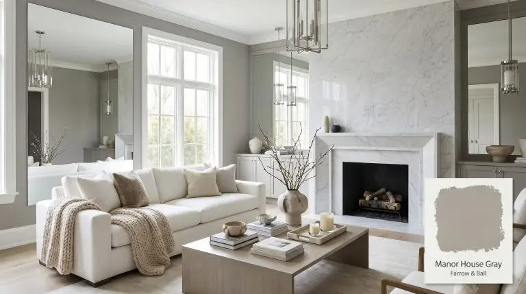
Manor House Gray 265
Farrow & BallFarrow & Ball Manor House Gray 265 is a cool, architectural mid-tone gray. With an LRV of 36, this sophisticated shade retains its depth in all lighting conditions but can reveal subtle mauve or blue undertones in cooler, north-facing light.
| Temperature | Cool to Neutral |
|---|---|
| Primary Undertone | Architectural Gray |
| Hidden Undertones | Slight mauve, violet, or blue |
| Best Exposures | South-facing, West-facing, or well-lit rooms |
| Best For | Living room walls, kitchen cabinets, bathroom vanities, bedroom walls, exterior trim |
Hackrea Review
Manor House Gray is a sophisticated, hard-edged architectural gray that brings a modern sensibility to any space. While it can lean slightly cool or show a whisper of violet in low light, its depth and character make it an exceptional choice for contemporary interiors and striking cabinetry.Styling Mid-Tone Grays in Contemporary Interiors
Living room walls
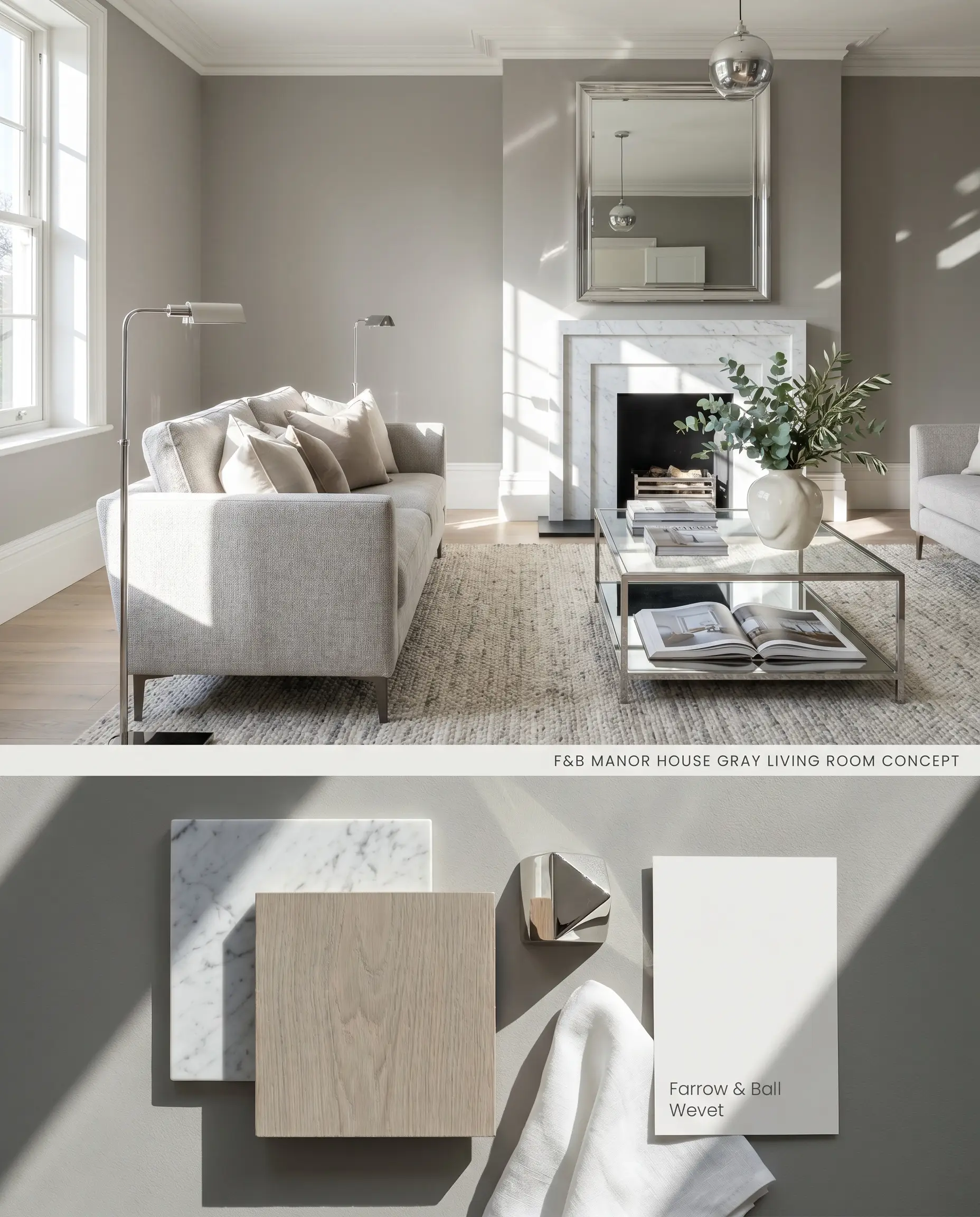
This mid-tone gray acts as an architectural neutral that grounds large, well-lit spaces without overwhelming them. Because it absorbs light, pairing it with crisp, cool-toned whites prevents the walls from feeling flat. Avoid utilizing this shade in north-facing rooms unless you intentionally want to draw out its hidden violet undertones.
Dead Flat ($$$$ (Boutique/Luxury Tier)). A multi-surface, ultra-matte finish that offers exceptional scuff resistance and washability, making it the premier choice for continuous color-drenching across living room walls.
The Consultant’s Finish
Kitchen cabinets
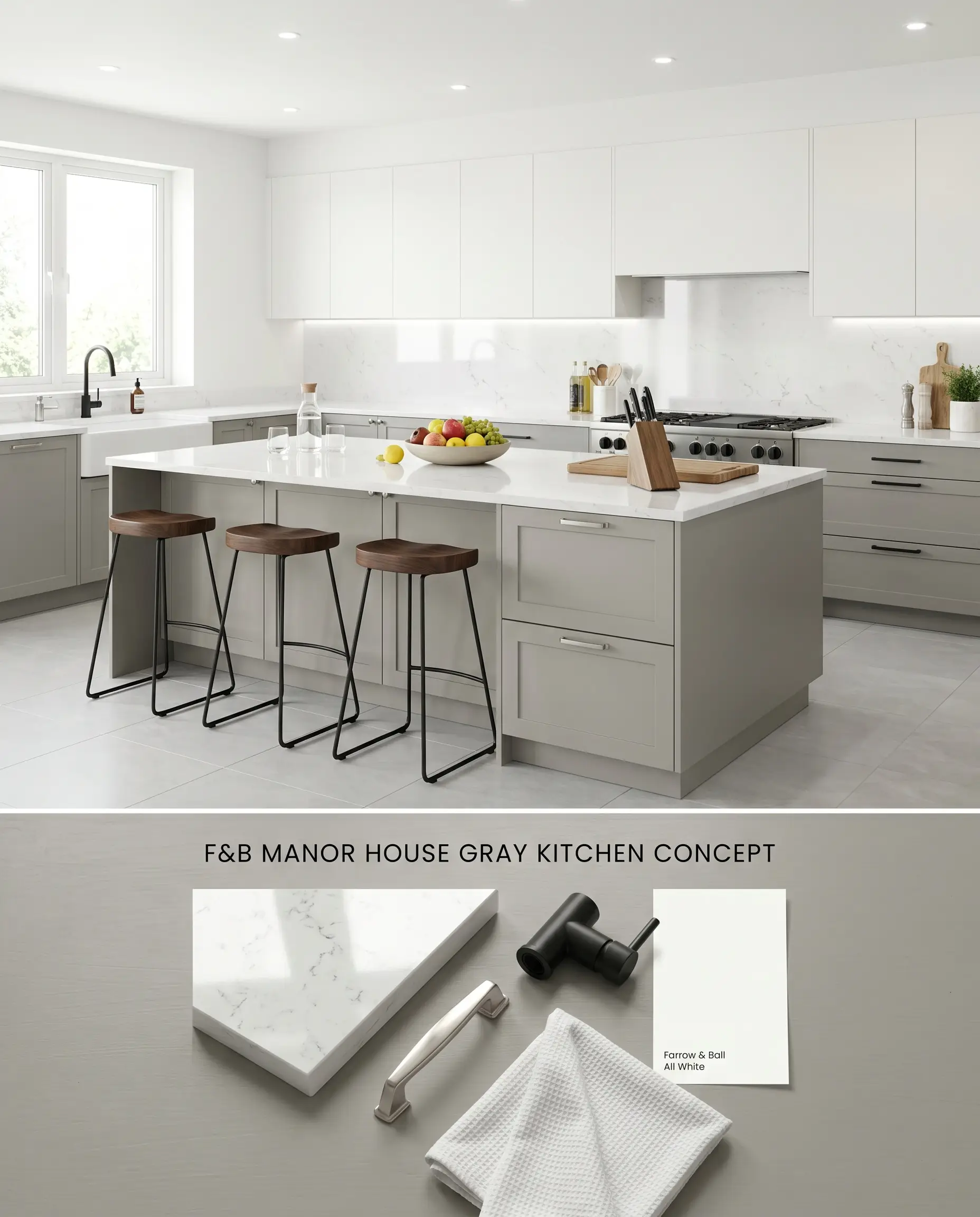
Applying this cool gray paint to millwork establishes a structured, tailored focal point against expansive white walls. The shade provides necessary visual weight for lower cabinetry or kitchen islands, contrasting sharply with bright, reflective countertops. You must use Farrow & Ball’s Dark Tones primer beneath the topcoat to ensure full color depth and prevent patchiness.
Modern Eggshell ($$$$ (Boutique/Luxury Tier)). An exceptionally durable, mid-sheen waterborne finish designed to withstand the daily wear of cabinetry, doors, and millwork, ensuring a flawless, long-lasting surface.
The Consultant’s Finish
Bathroom vanities
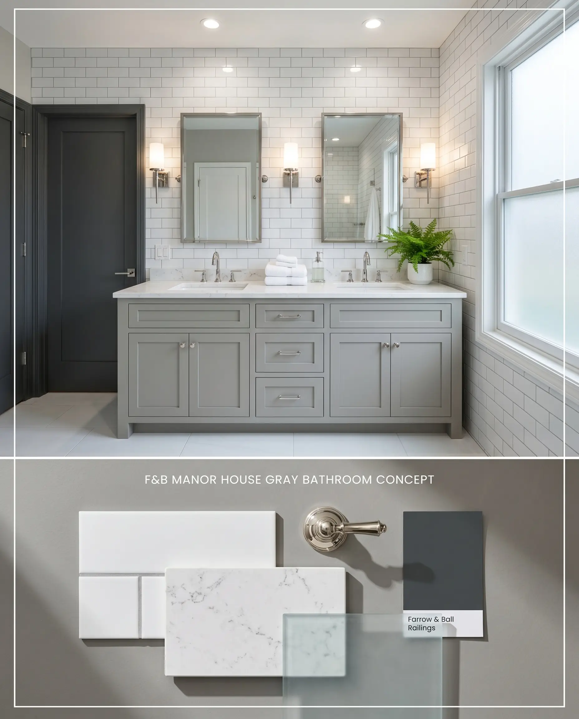
Manor House Gray transforms standard bathroom vanities into sophisticated, anchoring elements when surrounded by high-gloss tiles. The shade’s inherent coolness pairs perfectly with stark white porcelain and silver-toned plumbing fixtures. Ensure the bathroom has ample lighting, as this color will turn muddy in dark, windowless spaces without adequate illumination.
Modern Emulsion ($$$$ (Boutique/Luxury Tier)). Features a specialized mold- and water-resistant formulation that brings highly pigmented color to bathrooms without sacrificing a luxurious matte aesthetic.
The Consultant’s Finish
Bedroom walls
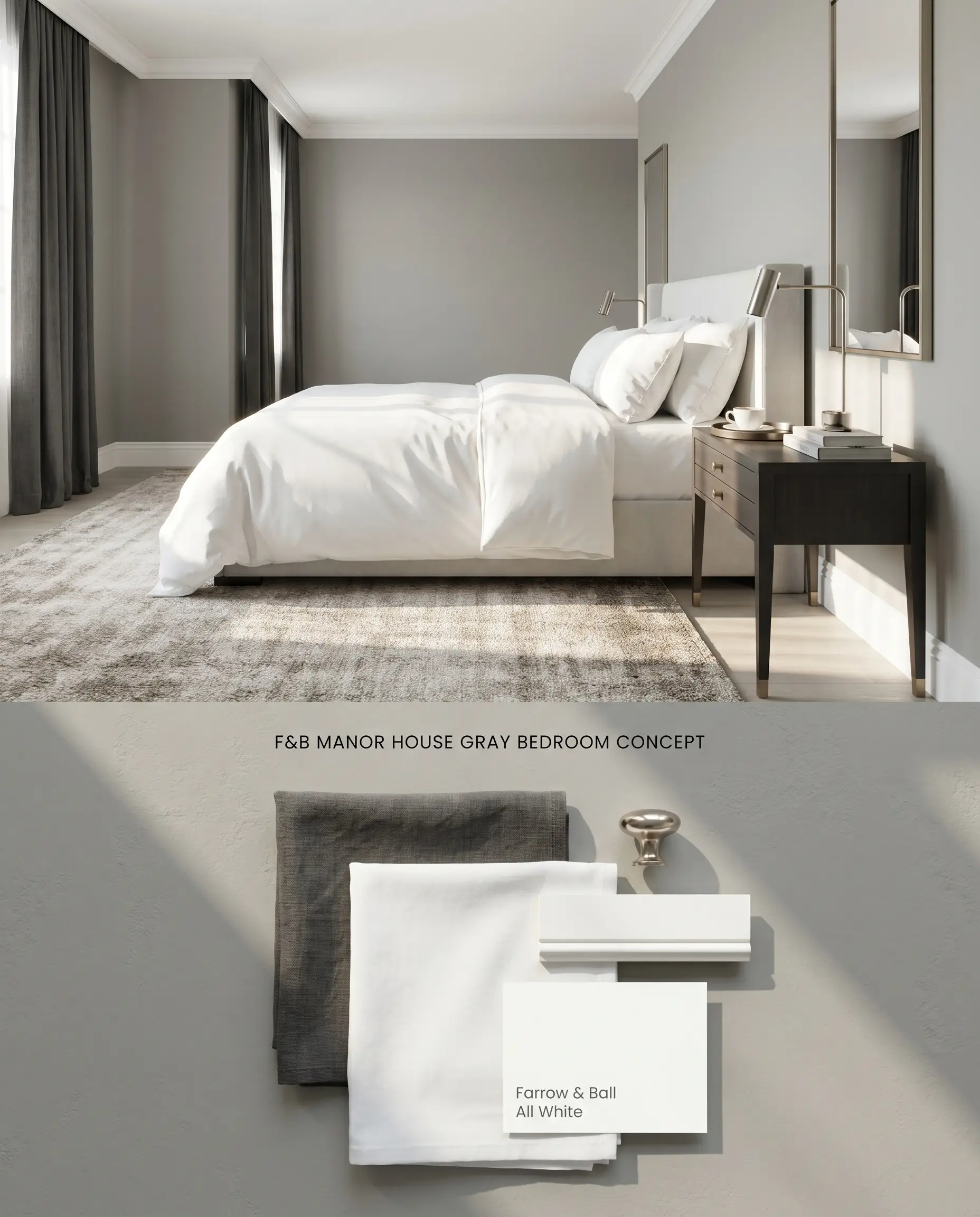
In a primary suite, this shade creates a calming, enveloping atmosphere by absorbing excess morning light. The LRV of 36 provides enough depth to make white linens and metallic accents pop sharply against the walls. To maintain a crisp aesthetic and prevent the room from feeling enclosed, paint the ceiling and trim a bright, reflective white.
Estate Emulsion ($$$$ (Boutique/Luxury Tier)). Delivers Farrow & Ball’s signature, chalky matte finish with unparalleled depth of color, perfect for master bedrooms where aesthetic impact is prioritized over aggressive scrubbing.
The Consultant’s Finish
Exterior trim
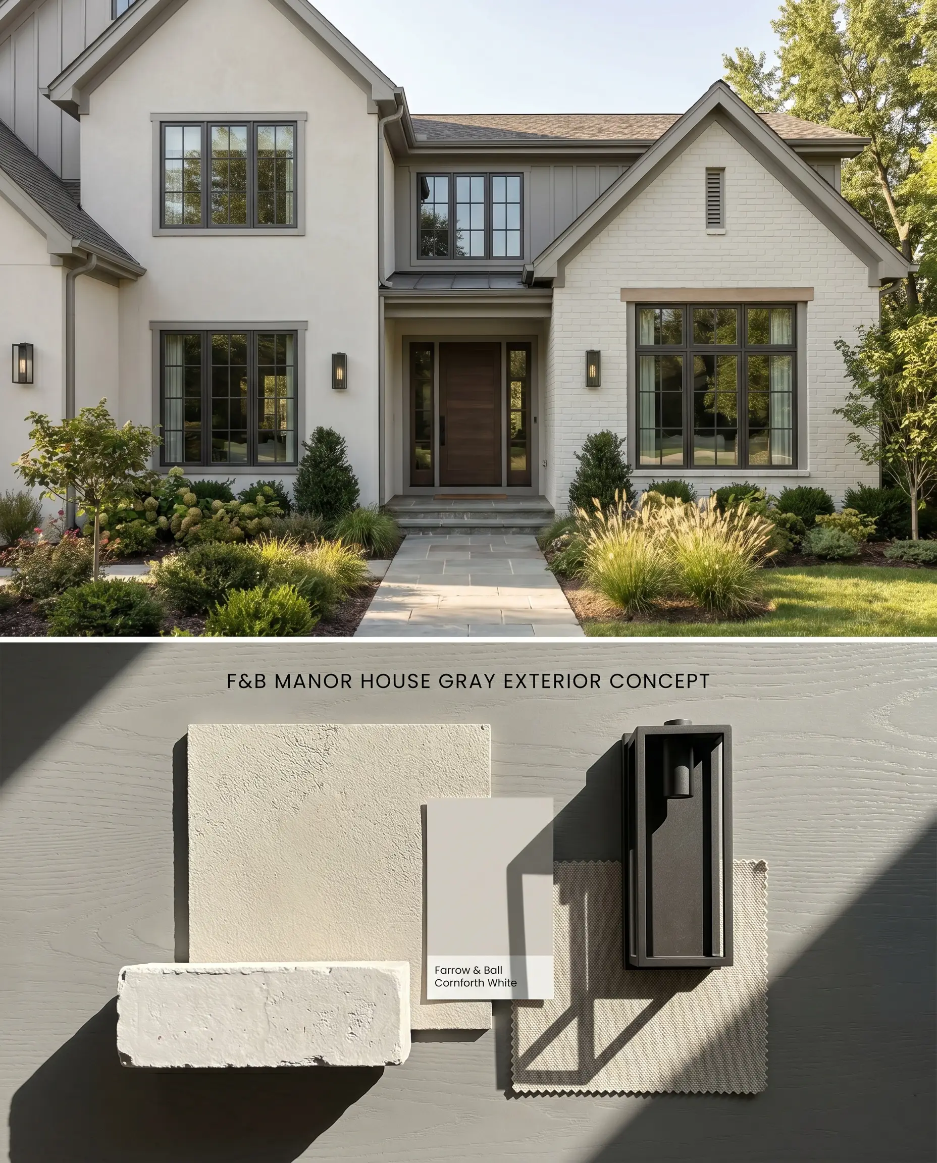
Using Manor House Gray on exterior trim defines the roofline and windows with a sharp, modern edge against lighter stucco or painted brick. Under intense direct sunlight, the color washes out slightly, appearing as a lighter, silvery mid-tone gray. It provides excellent contrast without the stark severity of a pure black trim.
Exterior Eggshell & Masonry ($$$$ (Boutique/Luxury Tier)). Highly breathable, fungal-resistant formulas that provide a flexible, durable shield against the elements, ensuring heritage colors remain vibrant outdoors.
The Consultant’s Finish
You can apply wallpapers, paints, etc. on walls and see how they look in various interiors.

Comparative Color Theory: Farrow & Ball Manor House Gray vs. Industry Alternatives
Farrow & Ball Manor House Gray vs. Farrow & Ball Plummett 272
Plummett is slightly darker and reads more industrial, with stronger blue-gray undertones compared to the cooler, slightly mauve lean of Manor House Gray. In spaces with limited natural light, Plummett will absorb more illumination and feel significantly denser. Choose Manor House Gray for residential living spaces that require a mid-tone architectural neutral, and reserve Plummett for high-contrast millwork or exterior doors where a deeper, moodier presence is required.
Farrow & Ball Manor House Gray vs. Farrow & Ball Pavilion Gray 242
Pavilion Gray is noticeably lighter and operates as a breezy, Swedish-inspired neutral, whereas Manor House Gray establishes a much firmer color structure. Pavilion Gray reflects significantly more light, making it the superior choice for north-facing rooms or narrow, windowless hallways where Manor House Gray would turn muddy. Opt for Manor House Gray only when you have abundant southern exposure and want a distinct, grounded wall color that contrasts sharply against bright white trim.
Farrow & Ball Manor House Gray vs. Benjamin Moore Storm AF-700
Benjamin Moore Storm shares a similar mid-tone gray profile but carries subtle purple-pink undertones that behave differently under artificial lighting. Manor House Gray maintains a cleaner, cooler architectural base, though it can flash blue or violet in northern light. Select Storm if you are pairing with slightly warmer, transitional textiles, but stick to Manor House Gray when designing strict, cool-toned contemporary interiors featuring Carrara marble and polished chrome.
Farrow & Ball Manor House Gray vs. Sherwin Williams Stamped Concrete SW 7655
Sherwin Williams Stamped Concrete is a denser, slightly warmer gray that lacks the chalky, light-absorbing surface tension of Farrow & Ball’s formulations. Manor House Gray requires a specialized Dark Tones primer to achieve its depth, making the Sherwin Williams alternative an easier, more forgiving option for quick contractor applications. Use Stamped Concrete for high-traffic commercial spaces or rental properties, but rely on Manor House Gray when the design relies on the nuanced, flat finish of premium Farrow & Ball Estate Emulsion in a controlled, well-lit residential setting.
Technical FAQs
Yes, in north-facing rooms or under low light, the cool architectural base of Manor House Gray can flash subtle mauve, violet, or blue. To counteract this, use 4000K LED lighting or reserve the color for south-facing rooms.
Yes, its cool, clean undertones will clash with distinctly orange-toned wood floors, saturated yellow beiges, or Tuscan tiles. Pair it instead with cool-toned white oak or dark walnut to maintain visual harmony.
Crisp, cool-toned whites like Farrow & Ball Wevet or All White provide the necessary high contrast. This sharp delineation prevents the mid-tone gray from feeling flat or muddy, especially in spaces with lower light.
Intense direct sunlight will wash out the color, making it read as a lighter, silvery mid-tone gray rather than a deep charcoal. Always use Farrow & Ball’s Dark Tones Primer underneath to maintain as much color depth and saturation as possible outdoors.
Similar Paint Colors
Same Brand
Cross-Brand Equivalents