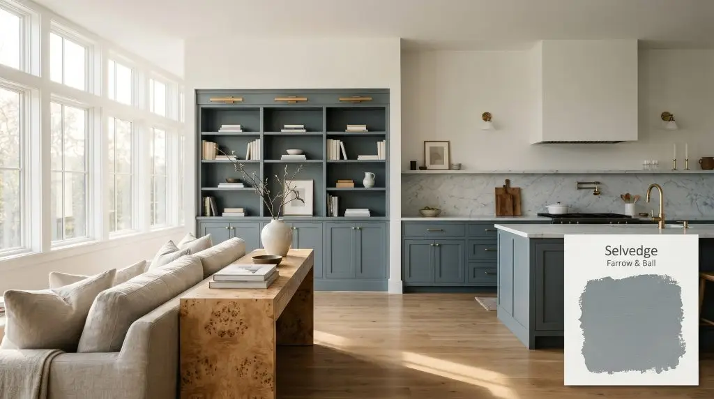
Selvedge No. 306
Farrow & BallFarrow & Ball Selvedge No. 306 is a sophisticated, medium-dark blue-gray with a subtle green micro-nuance. Inspired by the prized denim woven on a shuttle loom, this cool-toned architectural finish boasts an LRV of 26, making it ideal for creating deeply atmospheric, grounding spaces.
Paint Technical Profile
| Color ID / SKU | No. 306 |
| HEX Code | #7c8e96 |
| Light Reflectance (LRV) | 26 |
| Use | Interior, Exterior |
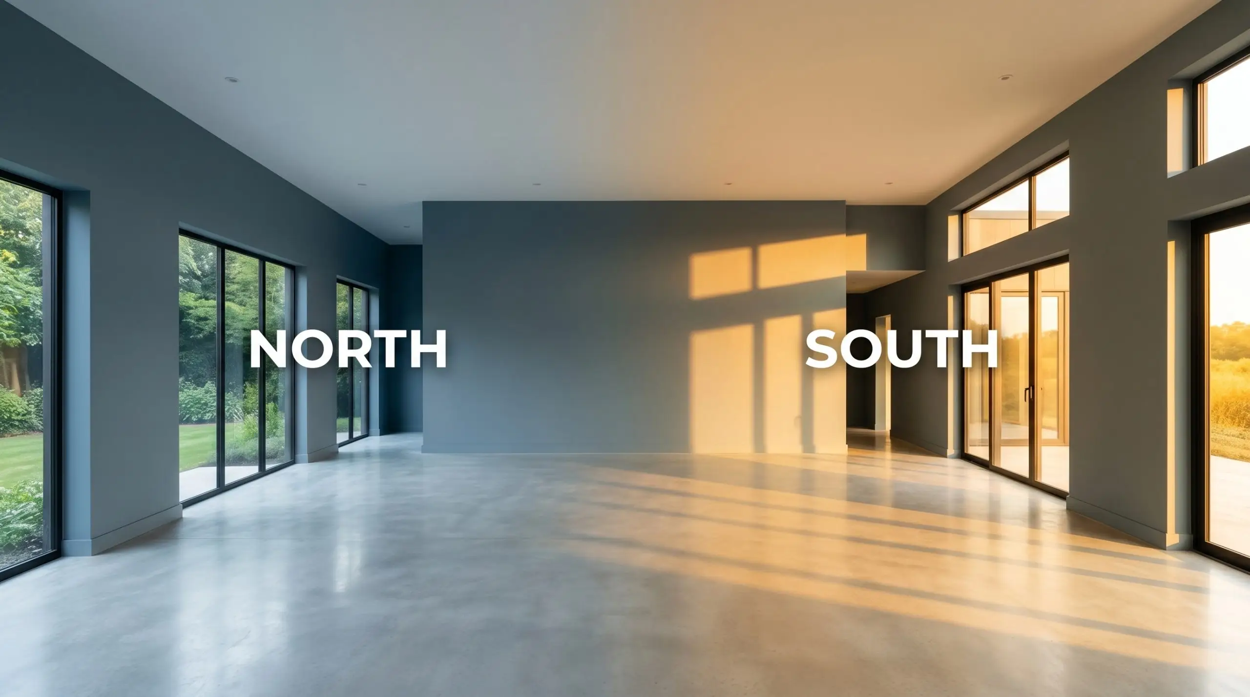
| Best Exposures | South-facing, West-facing |
| Best For | Cabinetry, wainscoting, cozy libraries, bedrooms |
Farrow & Ball Selvedge: The Slate-Blue Secret to Intimate, Bespoke Interiors
Some paint colors sit flat on a wall, while others wrap around a room like a piece of bespoke textile. Farrow & Ball Selvedge No. 306 belongs entirely to the latter category. Inspired by the highly prized, tightly woven fabric produced on a traditional shuttle loom, this shade brings an undeniable tactile quality to smooth drywall or historic plaster.
It is a color designed for those who want their walls to recede gently into the shadows, creating spaces that feel intensely personal and quietly sophisticated.
Instead of relying on stark, icy tones to make a statement, this rich pigment relies on shadow and light absorption to define the architecture of a room. Whether you are transforming a sprawling primary suite or saturating a windowless powder room, this specific blue-gray acts as a stabilizing force. It sets a beautifully moody stage that allows warm metals, natural stone, and layered fabrics to truly command attention.
Undertones & LRV of Selvedge
When homeowners first test this shade, the immediate question is always whether it will lean warm or cold on the walls. Farrow & Ball Selvedge is definitively cool. However, unlike standard builder-grade blues that can quickly turn a room into a freezing, unwelcoming cavern, this complex color is engineered with subtle internal warmth that completely alters its atmospheric effect.
To truly understand how this pigment behaves, we have to look at its structural DNA:
With a Light Reflectance Value (LRV) of 26, Selvedge No. 306 absorbs a significant amount of the light that hits it.
This means it sits firmly in the medium-dark category, pulling the walls inward rather than pushing them away. Do not expect this color to make a small room feel larger. Instead, it makes a room feel infinitely more intimate, enveloping the space in a rich, cocooning weight that instantly elevates the perceived quality of the architecture.
Lighting Effects & The Chameleon Factor
Because of its complex chromatic profile and low light reflectance, this slate-blue is highly reactive to the shifting sun. The color you paint on the wall at dawn will look noticeably different by dusk.
Understanding how the sun manipulates this shade is the secret to getting the exact aesthetic you want.
If you want to maintain the perfect balance of blue and gray after the sun goes down, swap your standard bulbs for 3000K to 3500K LEDs. This specific temperature provides a neutral wash of light that stops the green micro-nuance from aggressively taking over your walls.
Hackrea Design Secret (The Bulb Rule)
Popular Applications for Selvedge No. 306
A color with this level of light absorption requires intentional placement. Because it naturally pulls focus and defines the boundaries of a space, it shines brightest in rooms where you specifically want to cultivate an atmosphere of intimacy, focus, or quiet luxury.
Here is how to manipulate this gorgeous blue-gray across different architectural scenarios.
Kitchen Cabinetry and Islands
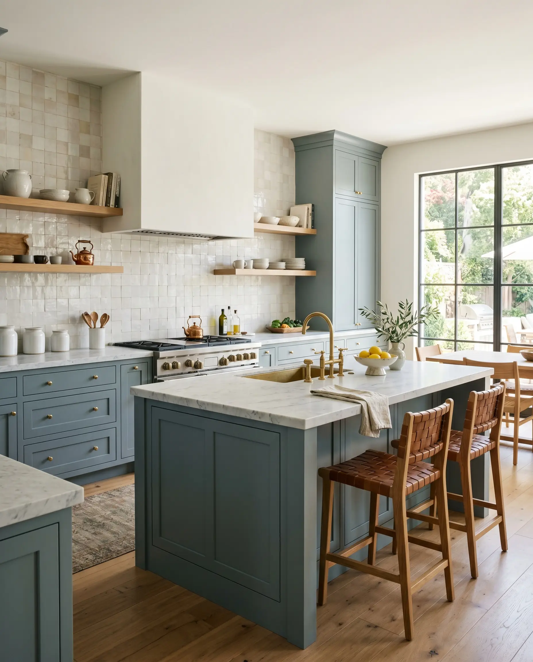
Standard white kitchens are giving way to spaces that feel more like curated living rooms, and this shade is the perfect tool for that transition. A full cabinetry application in this slate-blue instantly grounds a culinary space, giving standard millwork the presence of custom, high-end furniture. It completely removes the sterile, utilitarian edge from a hardworking kitchen.
To push this into a sleek, transitional aesthetic, pair the painted lower cabinets with honed Carrara marble countertops and unlacquered brass hardware.
The cool tones of the marble speak directly to the blue, while the living finish of the brass adds a necessary spark of warmth. If your kitchen lacks natural light, keep the upper walls crisp and light. Use a soft, neutral plaster or a warm white zellige tile backsplash to ensure the medium-dark cabinets don’t overwhelm the room’s visual balance.
Cozy Libraries and Studies
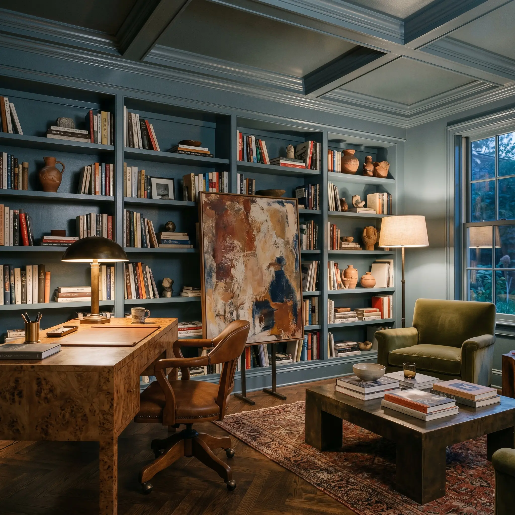
This is where you can fully embrace the cocooning nature of the color. For an evening reader or someone who works from home, a study should feel distinct from the rest of the house—a quiet, focused retreat. Color drenching the entire room—walls, built-in library shelving, crown molding, and even the ceiling—in F&B No. 306 creates an immersive, seamless environment.
By utilizing a Dead Flat finish across all surfaces, you eliminate distracting glare and enhance the tactile, fabric-like quality of the paint.
Lean into a “Modern Collector” aesthetic to keep the room from feeling like a dusty historic replica. Contrast the rich walls with a burled wood desk, a brutalist coffee table, and an oversized abstract art piece leaning on the shelves. The muted blue-gray acts as the ultimate gallery backdrop, allowing terracotta ceramics and patinated bronze lamps to truly pop against the dark architecture.
While this color pairs beautifully with wood, an entire room of dark mahogany or heavy walnut furniture against these medium-dark walls will quickly swallow all the light. Balance the visual weight by incorporating reflective surfaces like fluted glass cabinet doors or polished nickel sconces.
Clash Warning (The Heavy Wood Trap)
Primary Bedrooms
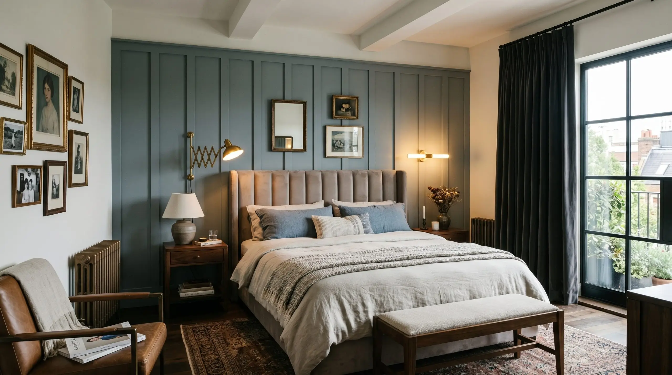
In a primary suite, the goal is often to create a restful, boutique hotel experience for a couple seeking an escape from the day. Instead of defaulting to a predictable coastal theme, use this shade to establish a sophisticated, tailored atmosphere. Applying it to a board-and-batten accent wall behind the bed provides a rich, architectural finish that centers the entire room.
Because the color is highly reactive, directional lighting becomes your best design tool here.
Install asymmetrical brass sconces flanking the bed; when turned on in the evening, the warm light will catch the hidden green undertones, casting a soft, romantic glow. Layer the space with tactile fabrics—think heavy velvet curtains, a channel-tufted headboard in a soft taupe, and stonewashed linen bedding—to soften the cool slate-blue base.
Mudrooms and Utility Spaces
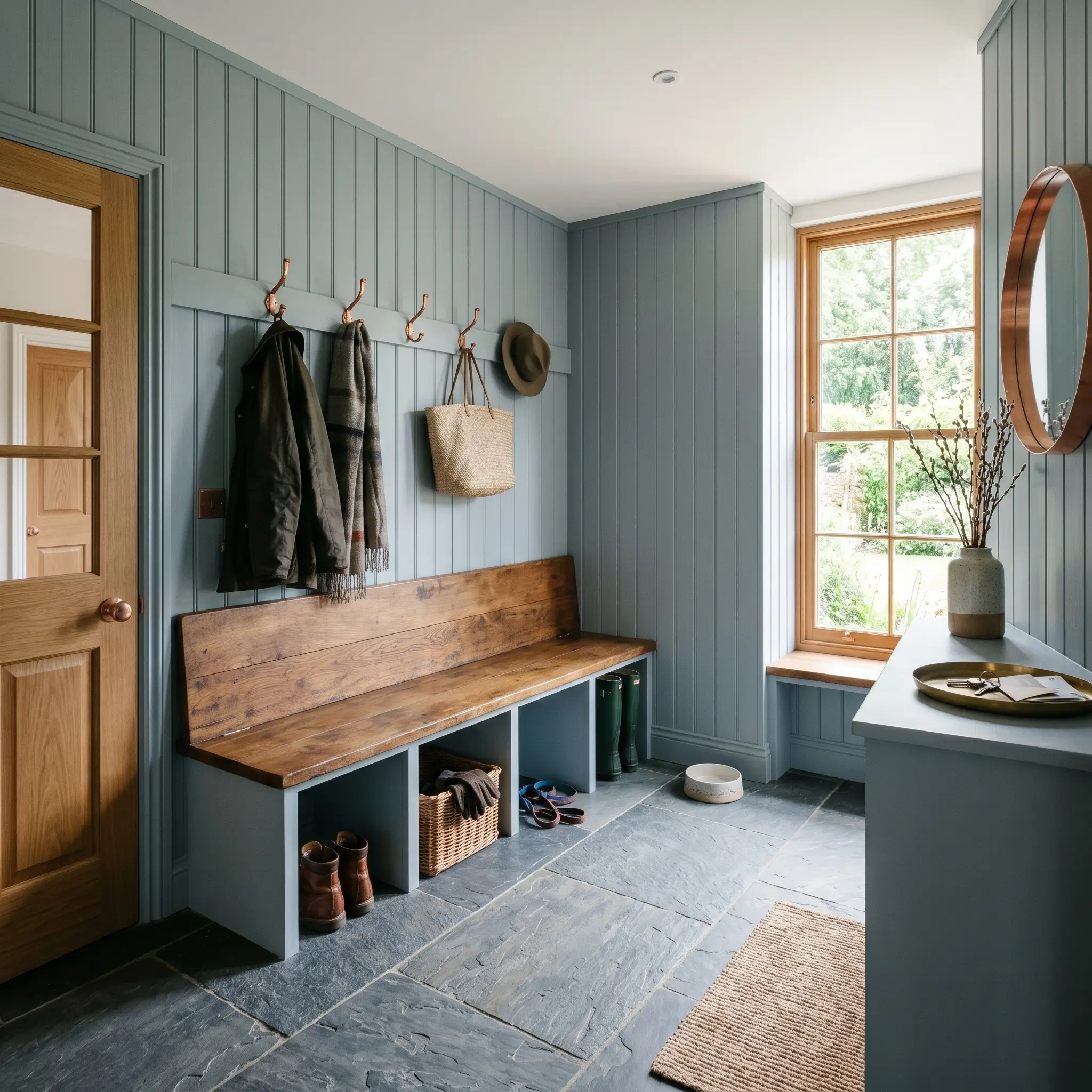
Utility spaces for active families do not have to be an afterthought. In a mudroom, this robust color transforms a purely functional drop-zone into a stunning architectural moment. Painting floor-to-ceiling beadboard paneling in this shade hides everyday scuffs and fingerprints while immediately elevating the entry experience.
To complete the look, focus on rugged, authentic materials that can handle daily wear.
Pair the painted millwork with durable cleft slate floors, a reclaimed oak bench, and burnished copper coat hooks. The organic warmth of the wood and the copper provides a brilliant, earthy contrast to the cool, moody walls, proving that highly practical spaces can still execute uncompromising design.
Coordinating Colors & Best Pairings for Selvedge
This medium-dark denim shade does not want to float alone on a wall; it actively demands tactile companions to anchor its visual weight. Depending on what you place next to it, the pigment will either sharpen into a tailored, crisp boundary or melt into a soft, atmospheric glow.
Framing the Architecture
When selecting a trim color, you are deciding exactly how you want the room’s boundaries to feel.
Curating the Tactile Palette
Building the Color Palette
Curated Aesthetic Atmospheres
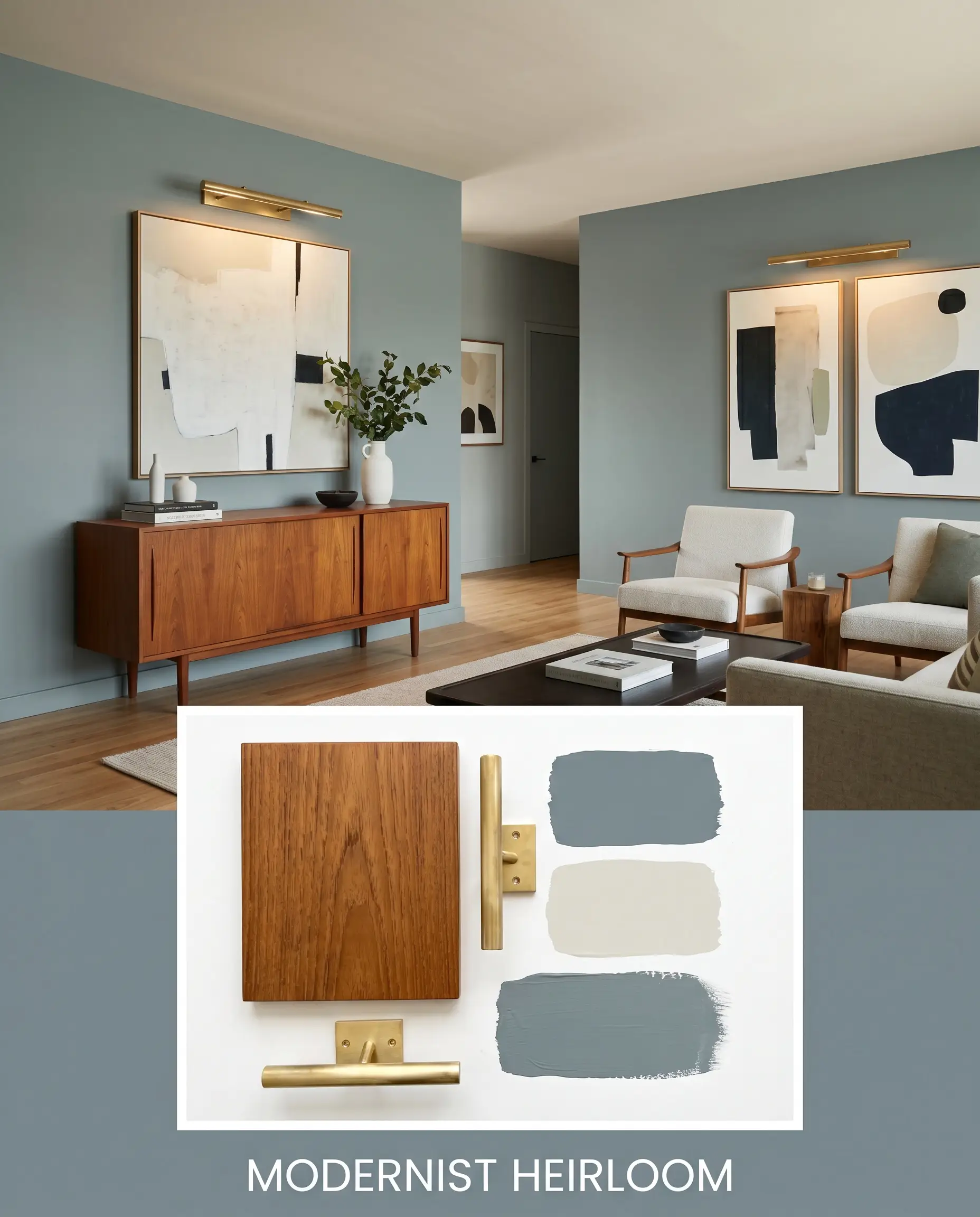
Modernist Heirloom: This aesthetic balances mid-century warmth with tailored, cool-toned architecture. The walls are grounded by the denim-blue, while a mid-century teak credenza and unlacquered brass picture lights introduce rich, organic warmth. A ceiling painted in Pale Oak softens the overhead lighting, allowing oversized abstract art to command the space with quiet confidence.
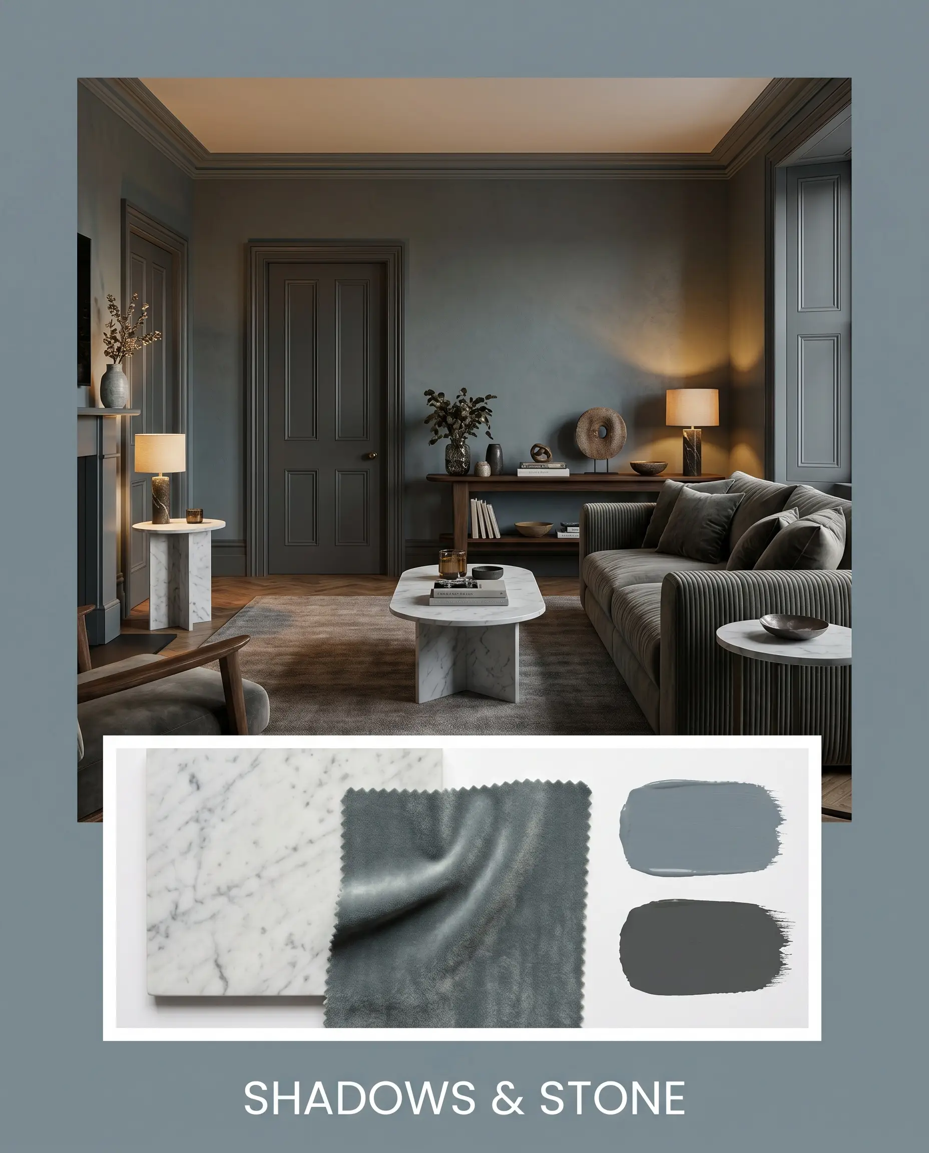
Shadows & Stone: Designed for those who crave a moody, deeply immersive environment. The slate-blue walls serve as a dramatic backdrop for honed Carrara marble side tables and a sofa upholstered in heavy velvet ribbing. Accents painted in Hopper Head push the shadows even deeper, resulting in a profoundly resonant, luxurious vibe that feels incredibly intentional.
Head-to-Head Paint Comparisons
Sometimes a color looks perfect on a swatch, but your home’s specific lighting conditions or exterior exposures demand a slight pivot. Understanding how this shade performs against its closest rivals is the only way to make a confident final decision.
Farrow & Ball Selvedge No. 306 vs. Farrow & Ball De Nimes No. 299
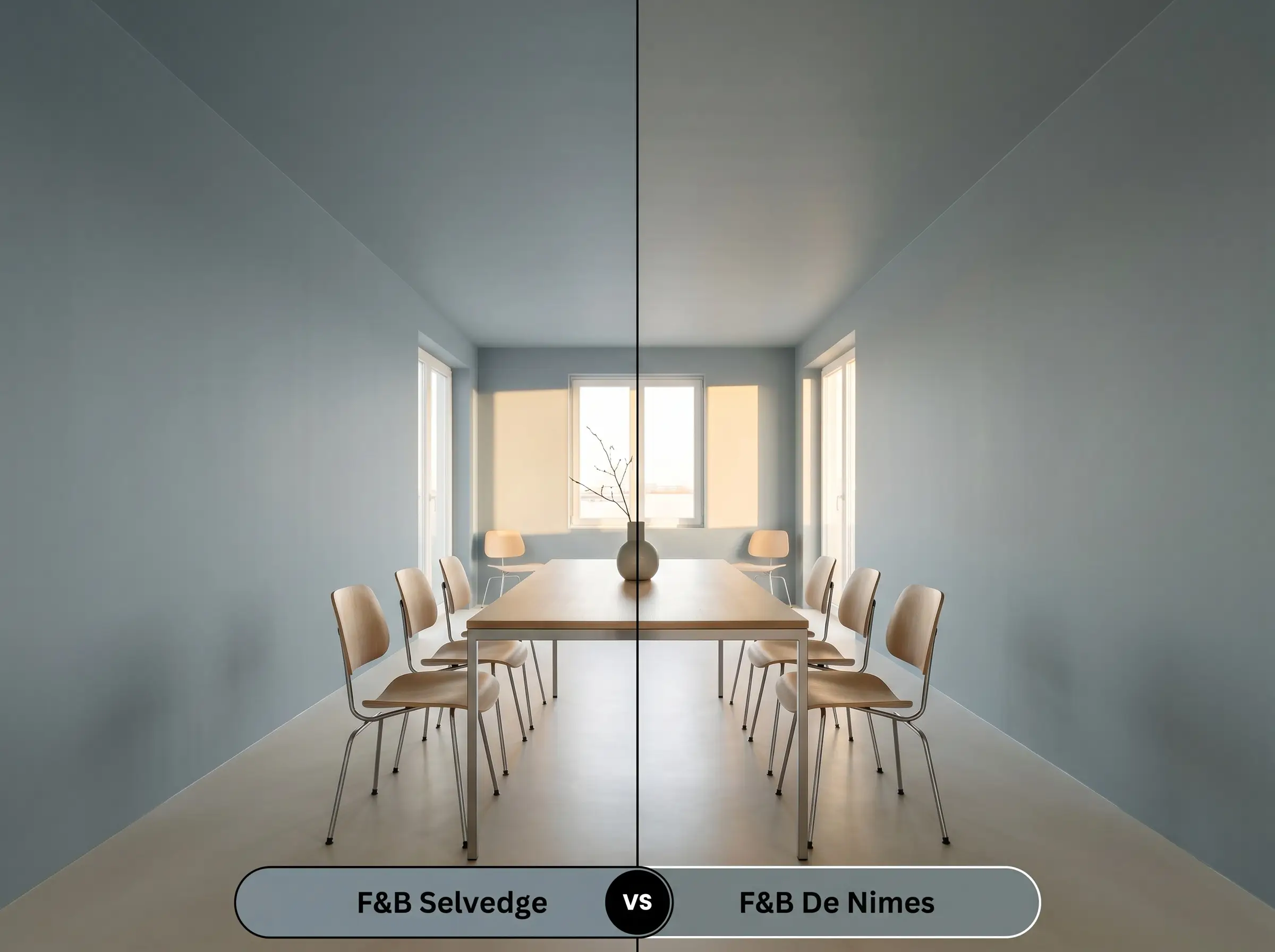
De Nimes carries a noticeably stronger green undertone and sits slightly darker on the wall. If you have a south-facing room flooded with warm light that tends to wash out subtle colors, De Nimes holds its earthy ground beautifully. However, if you want a cleaner, more tailored denim look without the heavy green influence, Selvedge is the clear winner.
Farrow & Ball Selvedge No. 306 vs. Farrow & Ball Oval Room Blue No. 85
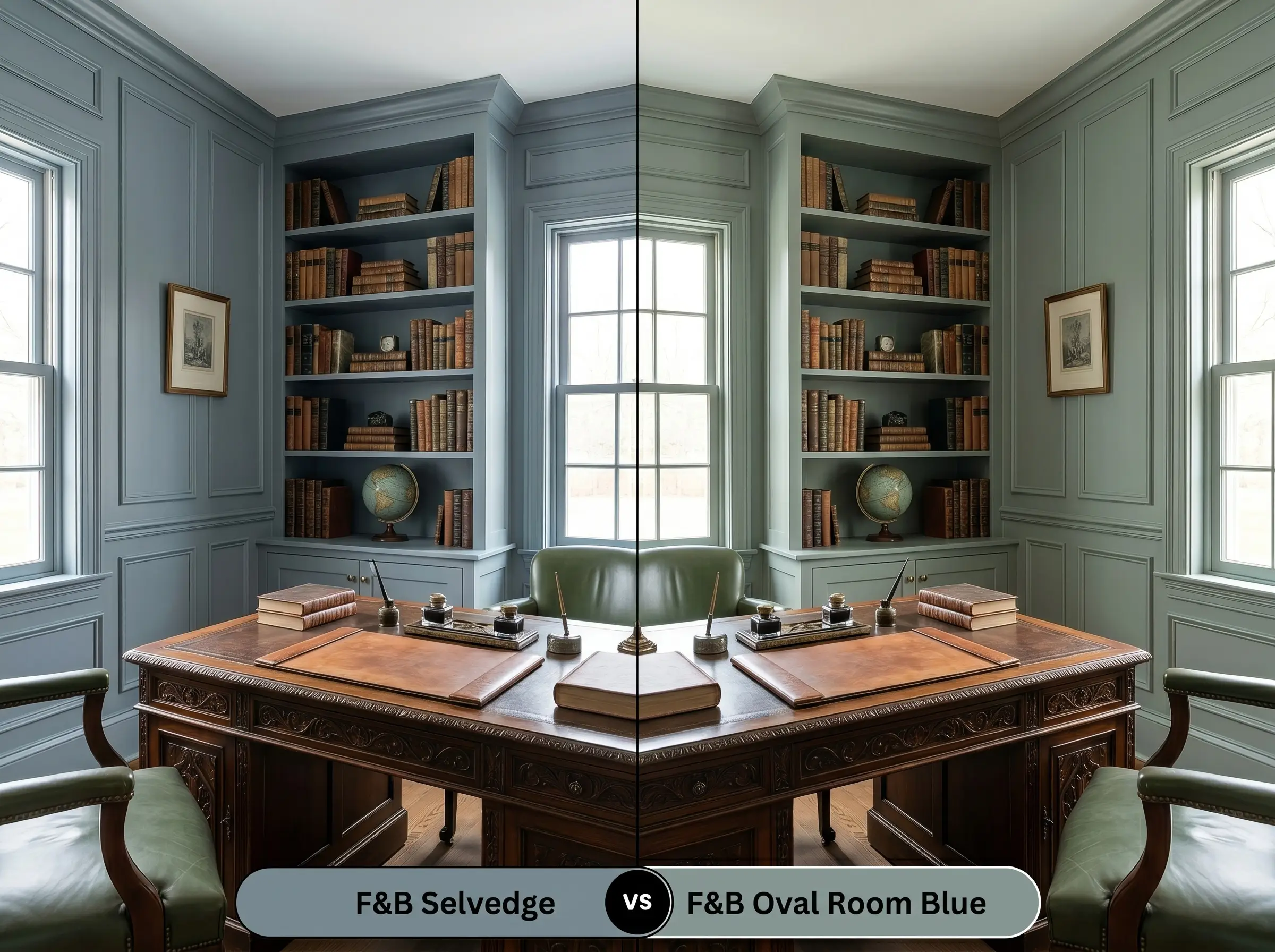
Oval Room Blue is significantly more blackened, carrying a distinctly historic, aged quality. If you are styling a space filled with heavily patinated antiques and traditional tapestries, Oval Room Blue blends effortlessly into that heritage atmosphere. If you want a fresher, more transitional edge that pairs well with modern silhouettes, stick with Selvedge No. 306.
Similar Colors & Brand Equivalents
Whether you need a slight shift in visual weight or a reliable alternative from another manufacturer, these carefully selected matches provide excellent flexibility for your project.
Same-Brand Alternatives
Cross-Brand Matches
Practical Application for Farrow & Ball Selvedge
Transitioning from design theory to the physical reality of a roller requires a clear strategy. Because this color relies heavily on its light-absorbing qualities, the sheen and preparation you choose will make or break the final aesthetic.
The Dynamic Sheen Guide
Primer Strategy & Coverage
To achieve the signature depth of Farrow & Ball Selvedge, you must start with the brand’s recommended Dark Tones Primer. Skipping the tinted primer will result in a hollow, streaky finish that lacks the rich slate-blue foundation.
Expect to apply a minimum of two generous coats for full, professional saturation.
Deep, matte colors are notoriously prone to “flashing”—visible, uneven roller marks that catch the light. To prevent this, you must maintain a wet edge while rolling and absolutely avoid the temptation to touch up partially dried spots. Let the wall dry completely before assessing if a third coat is necessary.
Hackrea Pro-Tip (The Flashing Prevention Method)
Frequently Asked Questions
Because of its low light reflectance, it will certainly deepen in windowless spaces, but the slate-blue base is strong enough to maintain its identity. To prevent it from feeling too dark, introduce highly reflective surfaces like a polished marble vanity or an oversized mirror to bounce your artificial lighting.
Red and green are complementary colors, meaning the red tones in the wood will actively force the subtle green in the paint to the surface. If you want to keep the paint looking strictly blue, it is best to avoid heavy red woods and opt for neutral white oak or ebonized finishes instead.
While modern flat finishes are highly durable, exposing this highly pigmented, light-absorbing finish to constant, heavy steam can eventually lead to subtle streaking. For high-humidity environments, upgrading to the Modern Emulsion finish provides the necessary moisture resistance while still offering a beautifully soft, matte appearance.
Intense, direct sunlight naturally washes out complex undertones, meaning the rich denim quality will absolutely soften into a lighter, more muted blue-gray outdoors. To ensure the color retains its depth over time, always use the brand’s recommended exterior primer and expect a much softer final aesthetic than you see on interior walls.
Final Verdict & Expert Warnings
Farrow & Ball Selvedge No. 306 is an incredibly sophisticated, deeply grounding color that excels in creating intimate, tailored environments. It is the perfect choice for homeowners looking to elevate transitional kitchens, moody studies, or luxurious bedrooms with a shade that feels more like a textured architectural fabric than a standard paint. When paired with warm, living metals and natural stone, it provides an unparalleled sense of quiet, curated luxury.
However, this rich shade requires a thoughtful approach to styling to truly succeed. If you attempt to pair this muted denim-blue with stark, cool-white contemporary furniture or harsh, blue-toned LED lighting, the color will instantly lose its warmth and take on a bruised, unwelcoming appearance. It relies entirely on the organic warmth of its surroundings—like rich woods, soft taupes, and brass accents—to balance its cool slate base. Give it the tactile companions it deserves, and it will effortlessly transform your home into a stunning, highly intentional retreat.
Closest Cross-Brand Equivalents
The absolute closest scientific color matches for Selvedge across top paint brands.