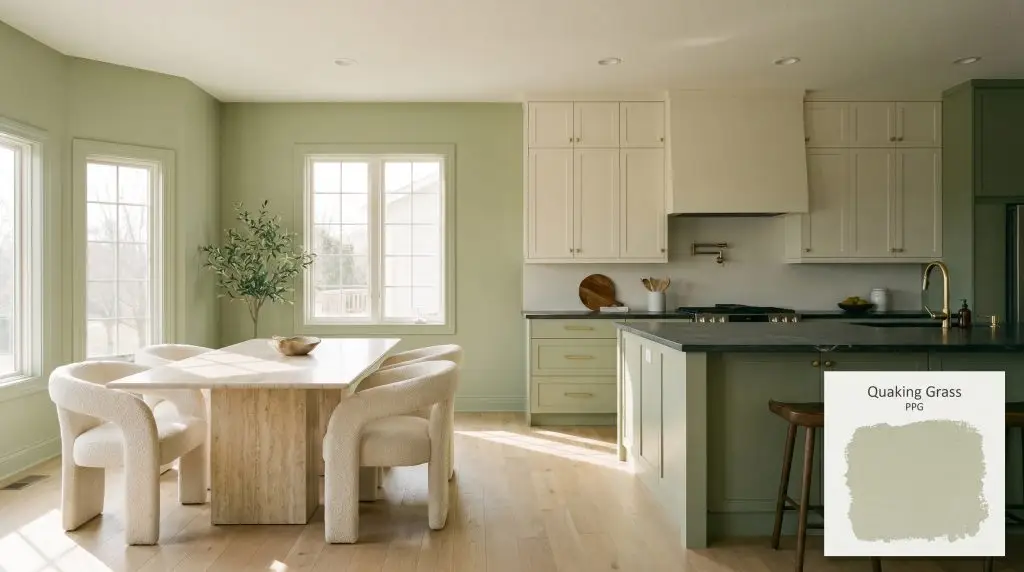
Quaking Grass PPG1121-4
PPGPPG Quaking Grass is a mid-tone, earthy yellow-green with a Light Reflectance Value of 52. Characterized by its warm, mossy undertones, this botanical hue brings organic warmth to interior spaces without feeling overly dark or heavy.
Paint Technical Profile
| Color ID / SKU | PPG1121-4 |
| HEX Code | #bbc6a4 |
| Light Reflectance (LRV) | 52 |
| Use | Interior, Exterior |
| Best Exposures | North, East, South |
| Best For | Kitchen cabinets, dining nooks, bedrooms, exterior accents |
PPG Quaking Grass: The Earthy Yellow-Green That Breathes Life Into Your Architecture
Finding a green paint that feels genuinely rooted in nature—without veering into a sterile, artificial mint—is notoriously tricky. You want a color that breathes energy into a room, but you also need it to feel sophisticated and intentional.
PPG Quaking Grass offers a brilliant solution for this exact design dilemma. This mid-tone green acts less like a standard wall color and more like a living, botanical layer within your home.
It infuses spaces with a warm chromatic profile that feels instantly welcoming. Whether you are wrapping a sunlit kitchen or coating exterior trim, PPG1121-4 delivers a beautiful organic architectural finish that adapts effortlessly to its surroundings.
Undertones & LRV of PPG Quaking Grass
Is this paint warm or cool? Quaking Grass is definitively warm.
This earthy sage leans on its golden roots to maintain a welcoming temperature across various lighting scenarios. It completely avoids the icy, hospital-like chill that plagues cooler greens.
Here is the structural breakdown of this specific hue:
With an LRV (Light Reflectance Value) of 52, this hue sits perfectly in the mid-tone pocket.
This specific number means it reflects enough light to maintain its structural integrity in average lighting. It provides a rich, saturated look on the walls while sidestepping the trap of absorbing too much light and shrinking the room.
The Chameleon Factor: Lighting Effects on PPG1121-4
Because of its complex yellow-green hue, this shade visibly shifts its temperature depending on the sun’s angle and your chosen light bulbs. Understanding natural light absorption is the key to mastering this color.
Here is exactly how it behaves throughout your home:
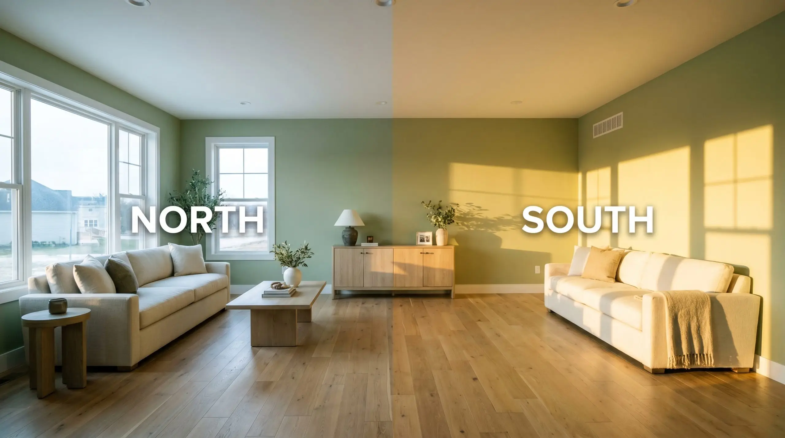
If you are using this green in a room lacking natural light, strictly avoid bulbs below 2700K. Ultra-warm, amber-toned lighting will exaggerate the golden undertones, pushing the paint closer to a muddy olive rather than a fresh botanical green. Stick to 3000K for a perfectly balanced glow.
Hackrea Pro-Tip (The Bulb Rule)
Popular Applications for PPG Quaking Grass
The beauty of a balanced, mid-tone green is its sheer versatility across your home’s floor plan. It transitions seamlessly from highly functional workspaces to restful, quiet retreats.
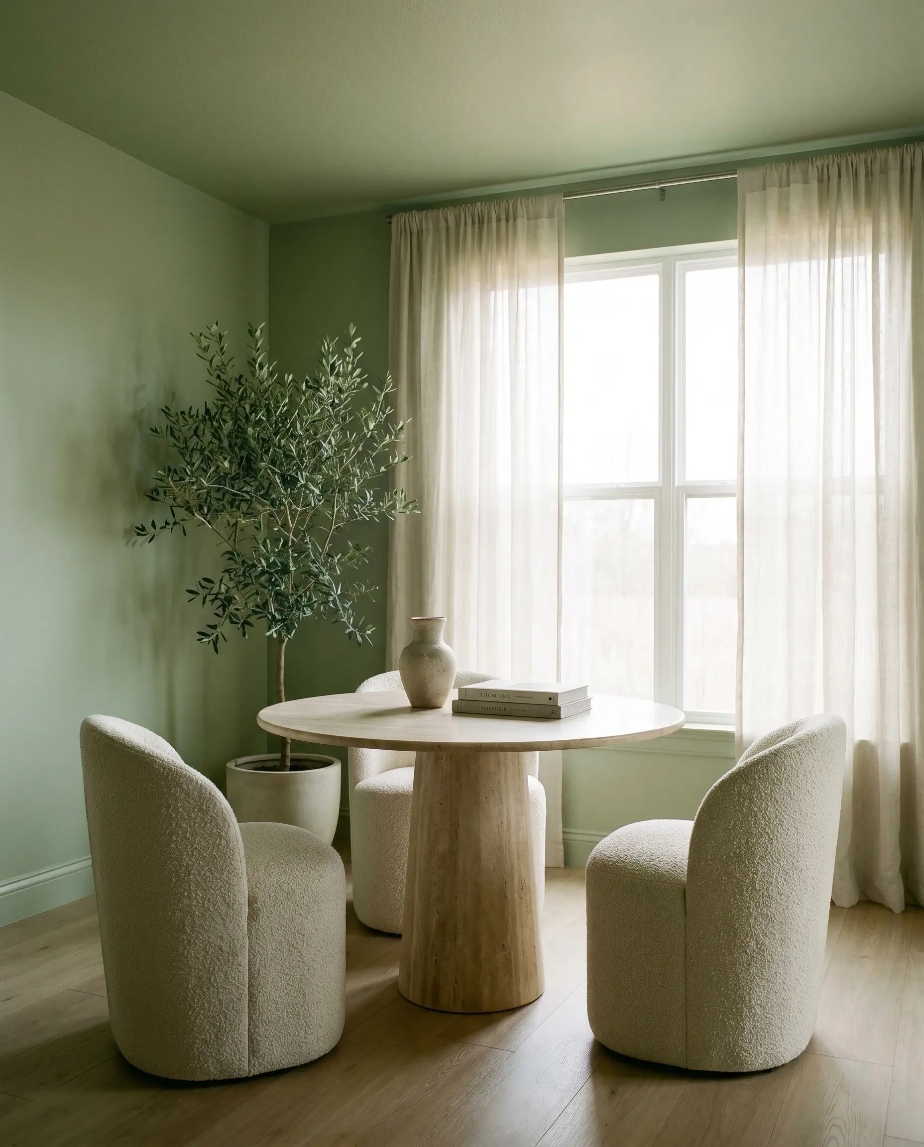
Dining Nooks
Do not assume a green dining nook must default to a rustic, cottage aesthetic. You can easily push this hue into a Modern Organic direction by color-drenching the entire alcove—walls, baseboards, and the ceiling overhead.
This technique creates a jewel-box effect that visually separates the nook from an open-concept living area.
To balance the richness of the walls, introduce highly tactile, neutral furnishings. Pair the green with a honed travertine pedestal table and curved chairs wrapped in cream boucle. The rough, porous texture of the stone and the softness of the fabric will beautifully contrast the smooth, painted millwork.
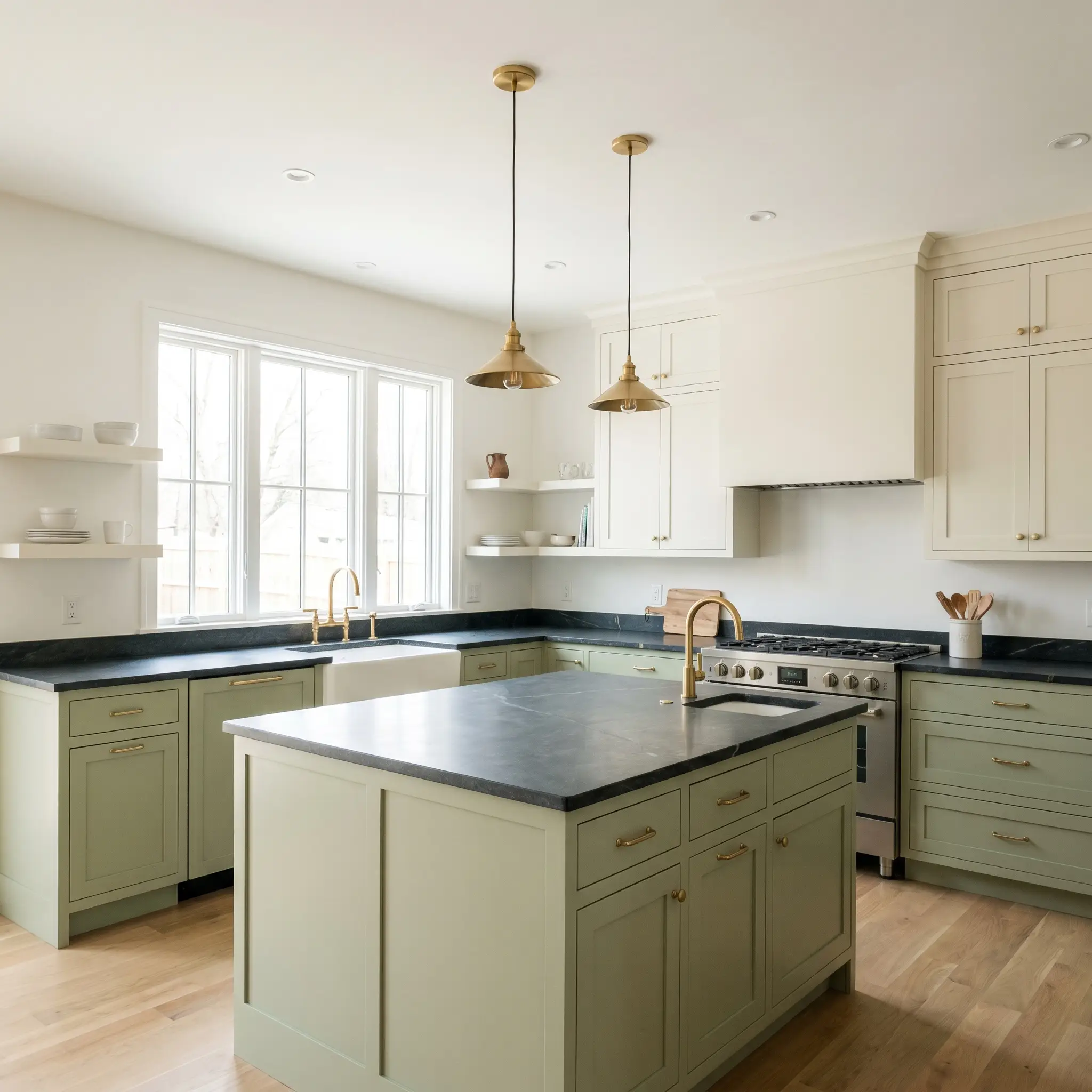
Kitchen Cabinetry
Painting your cabinets is a fantastic way to utilize this color’s durability and timeless appeal. In a busy family kitchen, this shade hides everyday scuffs far better than stark white, while still feeling incredibly fresh.
For a sophisticated Transitional aesthetic, try a two-tone approach. Secure the lower cabinets with this earthy green, and paint the upper cabinets a creamy, warm white to keep the sightlines airy.
To instantly elevate standard shaker cabinets, install unlacquered brass hardware. The living finish of the raw brass will slowly patina over time, echoing the golden undertones hidden within the paint and creating a highly custom, premium look.
Hackrea Design Secret (The Hardware Pairing)
Finish the space with honed soapstone countertops. The charcoal-black surface will visually weight the lower half of the room, allowing the green to act as a vibrant bridge between the dark counters and the bright upper walls.
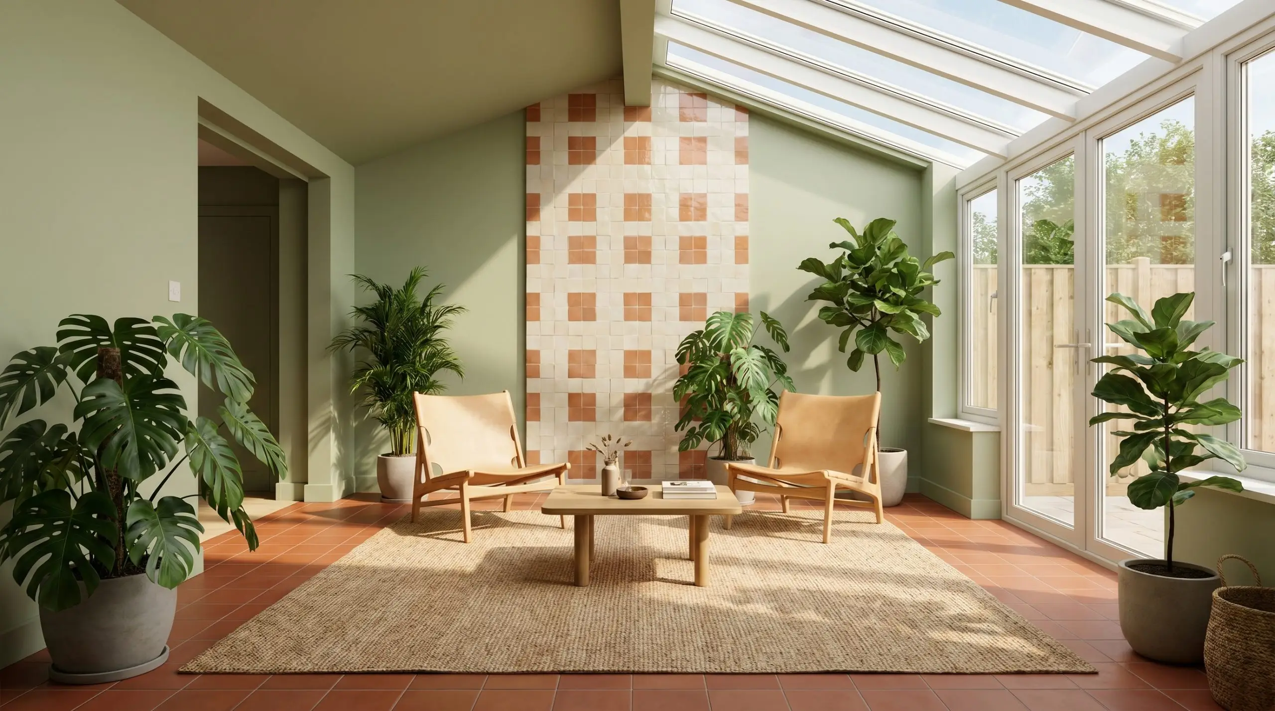
Sunrooms and Conservatories
This paint thrives in spaces flooded with natural light, making it a natural choice for sunrooms. The abundant southern exposure will pull forward the yellow-green hue, making the room feel like a direct extension of the garden outside.
Instead of filling the room with predictable wicker furniture, lean into a Minimalist Biophilic design. Lay down rich terracotta floor tiles and install glossy, imperfect zellige tiles on a single accent wall to bounce the natural light around the room.
When using a strong botanical color in a sunroom, do not match your upholstery to the walls. If you introduce green sofas or overly literal floral prints, the room will quickly feel overwhelming. Stick to a palette of warm creams, saddle leather, and natural jute to let the walls do the talking.
Clash Warning (The Overgrowth Effect)
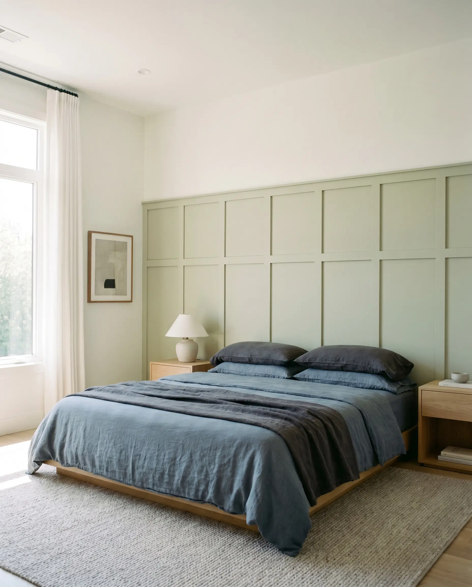
Bedrooms
In a bedroom, this color provides a deeply restful atmosphere that is perfect for unwinding after a chaotic day. Its mid-tone value strikes the ideal balance—dark enough to feel cozy at night, but bright enough to energize you in the morning.
Apply the paint directly to architectural features like a tall board-and-batten grid or classic wainscoting. Keep the upper half of the wall a soft, warm white to maintain a feeling of height in the room.
Style the bed with layers of washed linen in slate blue and charcoal gray. Flank the bed with clean-lined white oak nightstands to introduce a touch of warmth that perfectly complements the earthy sage tones on the woodwork.
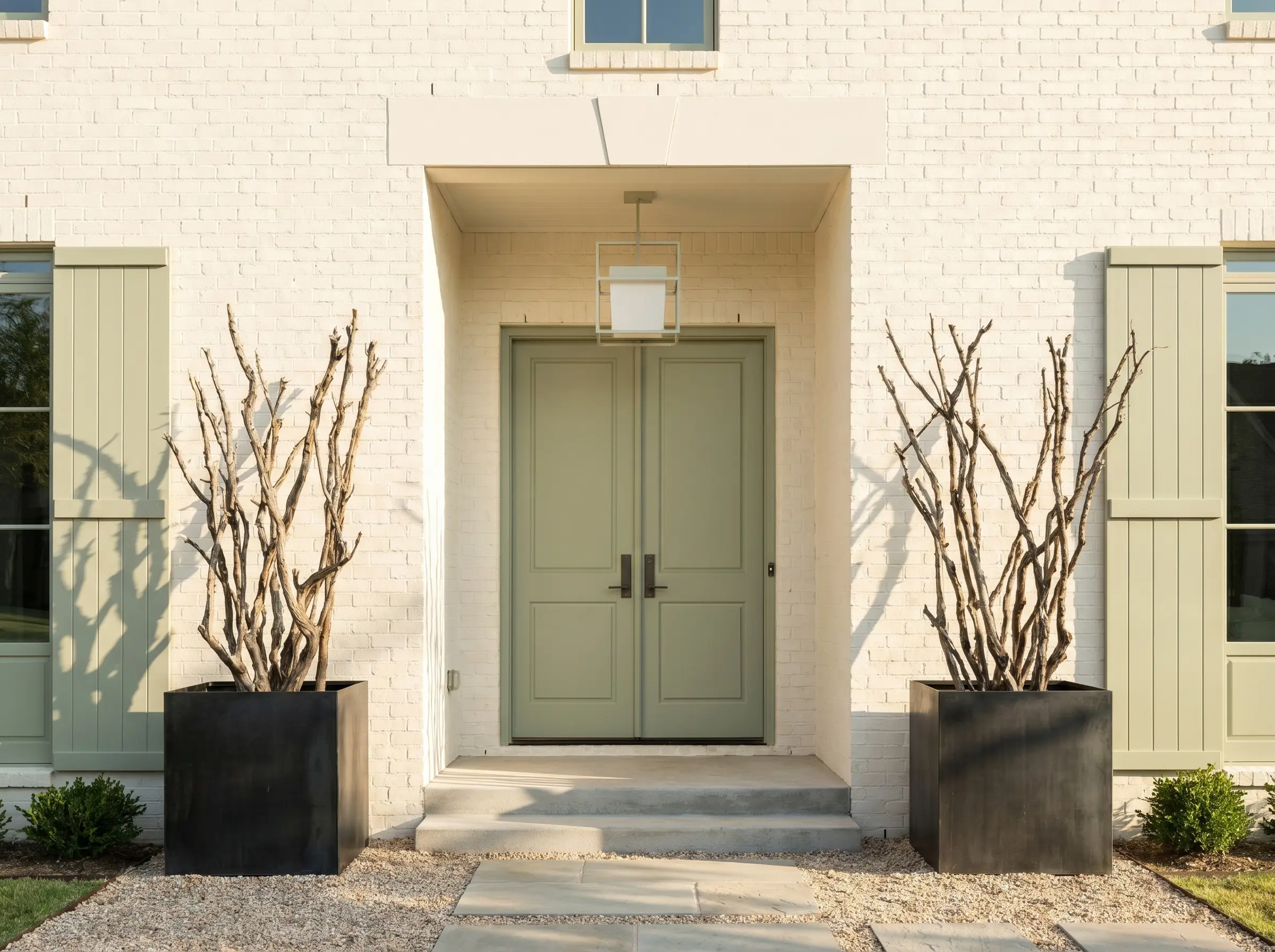
Exterior Shutters and Doors
On an exterior facade, natural sunlight will significantly wash out any paint color. Because this hue has enough depth and a solid LRV, it holds its ground beautifully outside without fading into a pastel.
It serves as a brilliant accent against warm white painted brick or smooth, modern stucco.
Painting your front door and flanking shutters this color creates an incredibly welcoming entryway. Flank the door with oversized, blackened steel planters filled with structural branches to complete the tailored, organic look.
Designing With PPG Quaking Grass: Palettes and Pairings
Because this earthy sage carries a distinct botanical color structure, it demands intentional material relationships to truly shine. It responds beautifully to textures that either sharpen its soft edges or amplify its organic warmth. The goal is to build a room that feels curated and collected, rather than simply painted.
Framing the Room with Trim and Baseboards
To create a crisp, tailored boundary that modernizes the wall color, pair this hue with Benjamin Moore Chantilly Lace (OC-65). This brilliant, clean white completely lacks yellow undertones, allowing the green to stand on its own without the trim competing for warmth.
If you prefer a seamless, atmospheric glow, opt for Sherwin-Williams Alabaster (SW 7008). The creamy, subtle warmth in this white softens the transition between the woodwork and the walls, creating a highly inviting, tonal envelope.
Tactile Materials and Hardware Integrations
To elevate this paint beyond a basic wall color, you must introduce materials that actively converse with its golden undertones. Anchor the room with a statement piece of burl wood, which naturally pulls forward the hidden yellow notes in the paint for a rich, custom aesthetic.
Balance that organic warmth by introducing blackened steel hardware or lighting fixtures. The dark, matte finish of the metal provides a sharp, contemporary edge that prevents the earthy sage from feeling overly rustic or dated.
Finally, layer the space with panels of fluted glass and upholstery in worsted wool. The glass brilliantly fractures and bounces light to keep the room feeling kinetic, while the tailored wool softens the overall visual impact, making the space feel incredibly sophisticated and lived-in.
Curating the Perfect Palette
Curated Aesthetic Concepts
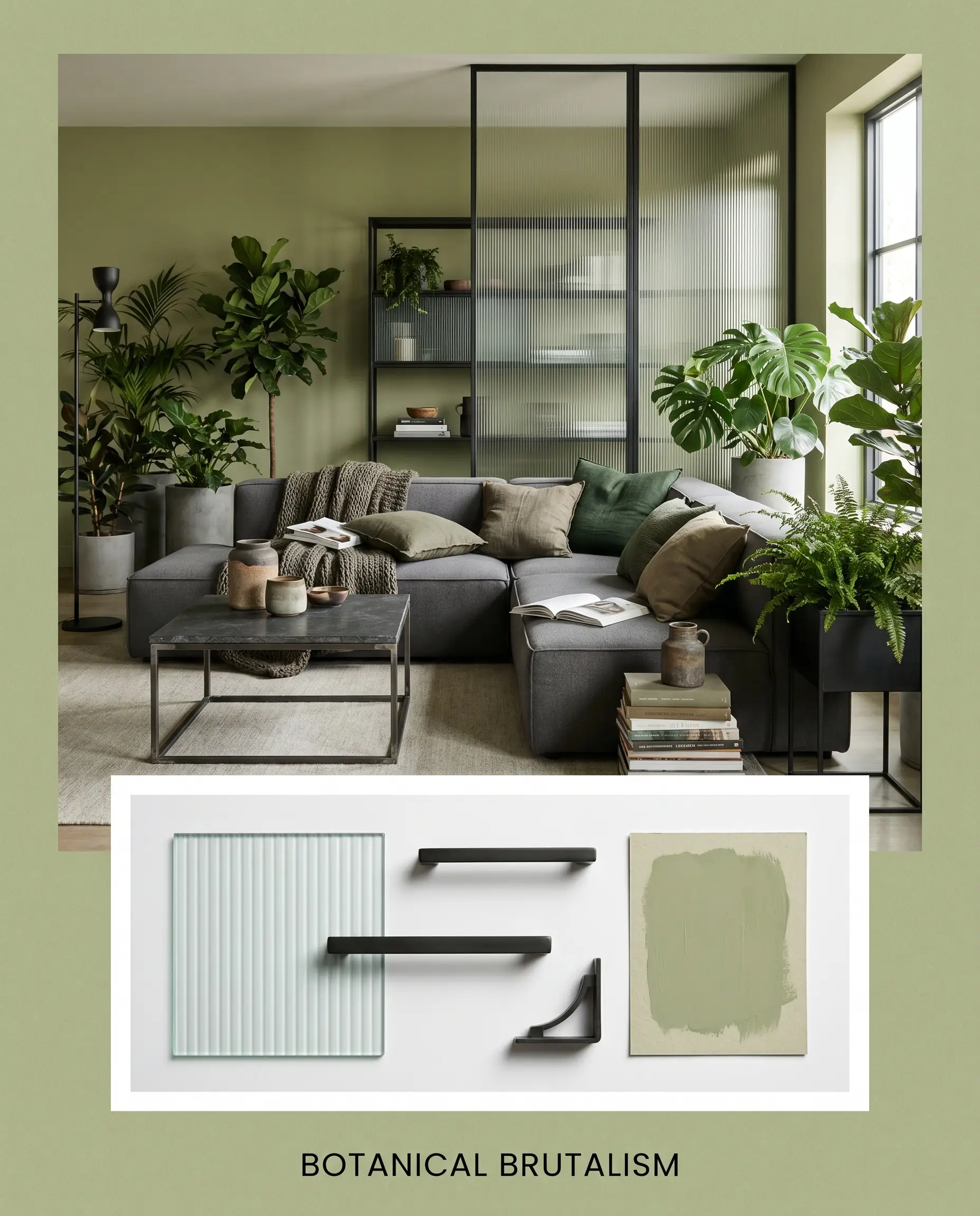
Botanical Brutalism This aesthetic uses sharp, industrial silhouettes to discipline the wilder, organic nature of the green. By pairing the painted walls with blackened steel accents and ribbed fluted glass, the energy becomes incredibly structured and modern. A sleek, low-profile modular sectional and minimalist sconces keep the mood feeling focused, intentional, and fiercely contemporary.
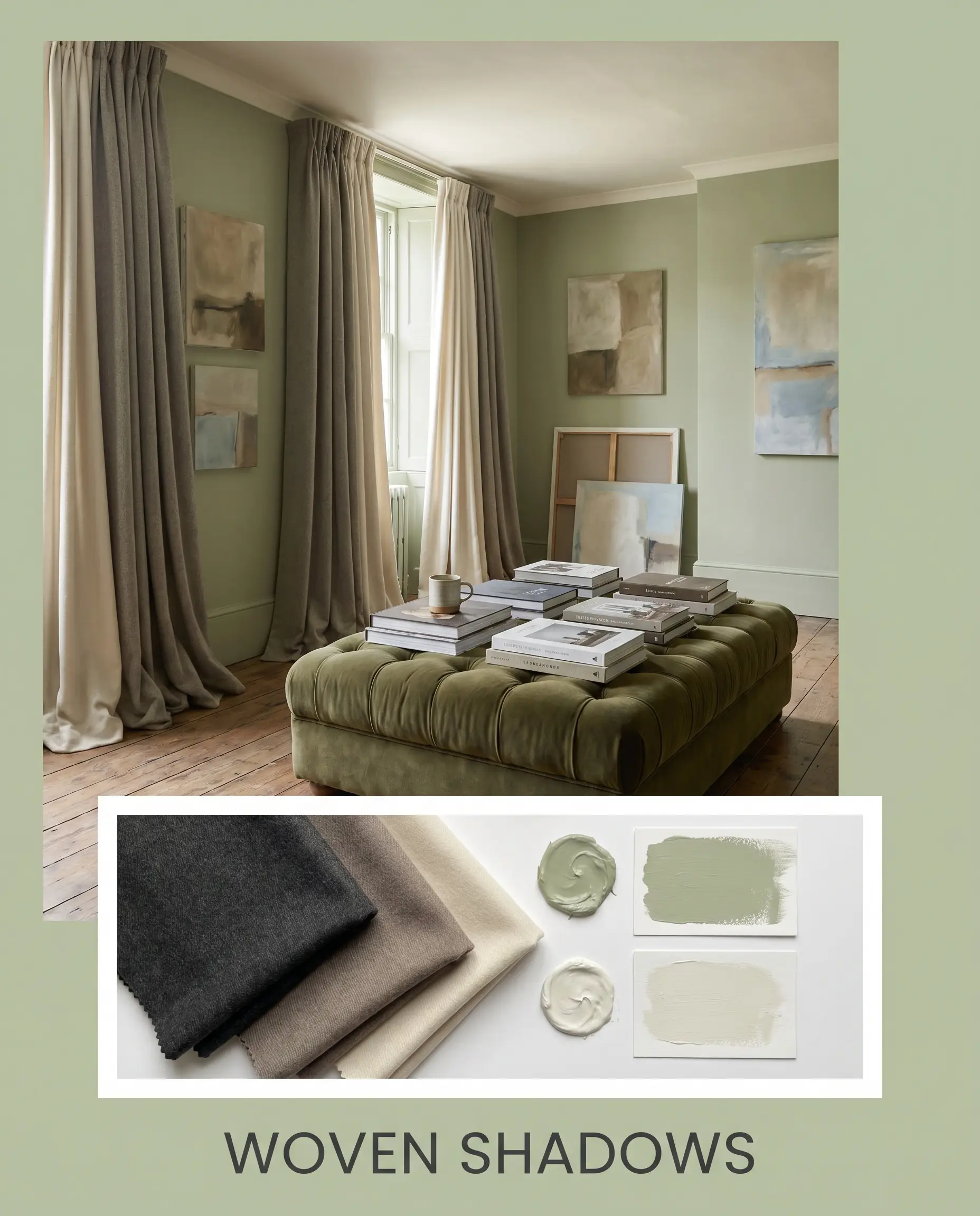
Woven Shadows Focusing on deep comfort and quiet luxury, this palette wraps the room in soothing, tactile layers. The walls are softened by expansive drapery in worsted wool, while Benjamin Moore Swiss Coffee coats the ceiling to lift the sightlines. Stacked art books, abstract canvases, and a plush, tufted ottoman create an atmosphere that feels deeply restful and quietly sophisticated.
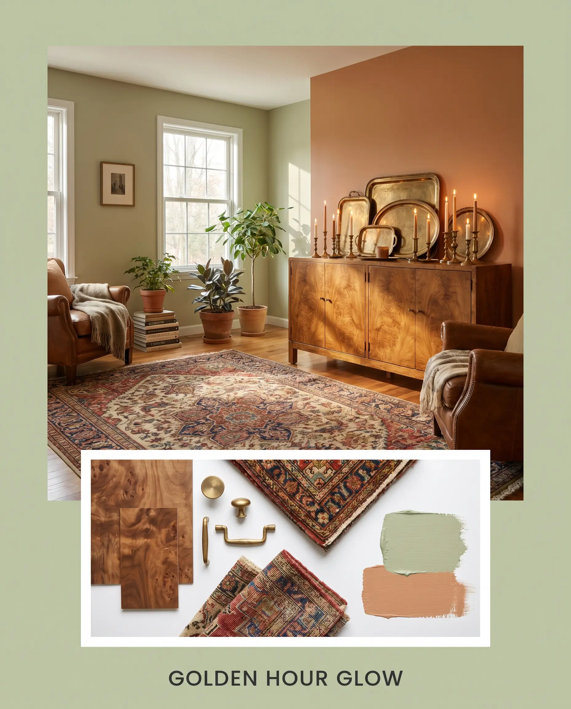
Golden Hour Glow This concept leans fully into the paint’s warm chromatic profile, evoking the rich energy of late afternoon sunlight. A bold accent of Farrow & Ball Faded Terracotta introduces a beautiful, baked warmth, while a vintage burl wood credenza anchors the layout. Styled with brass trays, taper candles, and a vintage rug, the vibe is effortlessly collected, vibrant, and endlessly welcoming.
Head-to-Head Paint Comparisons
Sometimes a specific lighting exposure or an existing permanent finish demands a slight pivot in your color strategy. If your space lacks natural light or your existing floors pull too red, a rival shade might offer better performance. Here is how this green stacks up against its closest competitors.
PPG Quaking Grass (PPG1121-4) vs. Sherwin-Williams Svelte Sage (SW 6164)
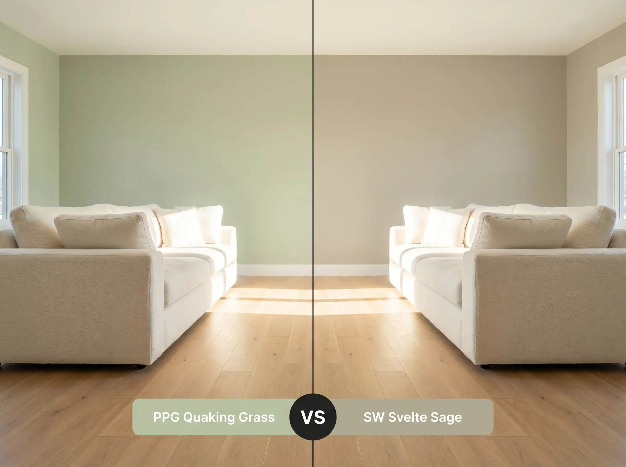
If your room receives intense, direct southern sunlight, PPG1121-4 might pull slightly too yellow for your taste. In this scenario, Sherwin-Williams Svelte Sage is often the better candidate.
Svelte Sage carries a slightly more muted, grayed-out base that actively resists turning overly vibrant in bright light. However, if you are working with a north-facing room, Quaking Grass will retain its welcoming warmth, whereas Svelte Sage runs the risk of feeling a bit chilly.
PPG Quaking Grass (PPG1121-4) vs. Benjamin Moore Saybrook Sage (HC-114)
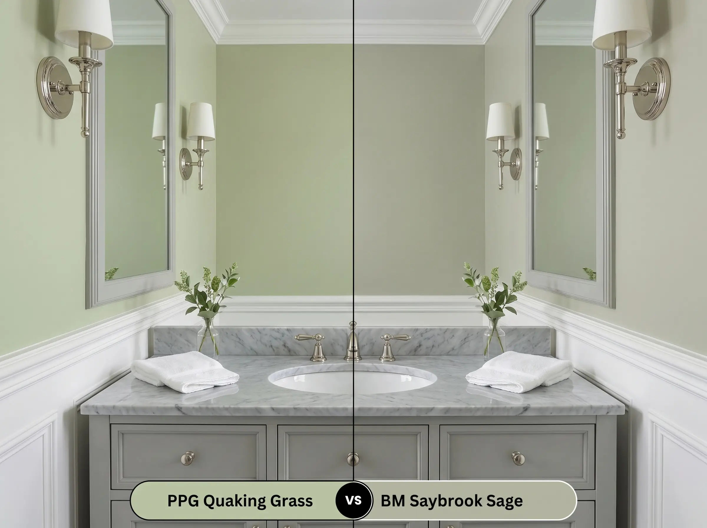
This comparison comes down entirely to the underlying color structure. Benjamin Moore Saybrook Sage features a prominent silver-gray undertone that gives it a highly refined, almost historic coolness.
If you are pairing your paint with cool-toned marble or polished nickel, Saybrook Sage bridges those materials beautifully. Conversely, if your home features warm white oak floors or unlacquered brass, the golden warmth of Quaking Grass will harmonize far better than the cooler Benjamin Moore alternative.
Exploring Brand Equivalents and Similar Hues
You might find yourself needing a shade that is just a fraction lighter for a dark corridor, or perhaps you need to match a rival brand for your contractor. Here are the most reliable alternatives to keep your project moving forward.
Alternates Within the Same Brand
Matching Rival Brands
Execution Strategies for PPG Quaking Grass
Shifting from curating your palette to actually rolling the color onto your walls requires a clear technical approach. The final aesthetic of any premium paint job is entirely dependent on the sheen you select and the preparation you put in.
Selecting the Right Sheen
Primer and Coverage Guidelines
Because this is a saturated mid-tone green, you must start with a high-quality, gray-tinted primer. A standard white primer will force you to apply extra coats to achieve true color depth, wasting both time and expensive paint.
Darker greens are notorious for “flashing”—a visual failure where the paint looks shiny and uneven in places where the roller overlapped. To avoid this, always maintain a wet edge while rolling and never press hard on a nearly dry roller to stretch the paint. Two even, generous coats will guarantee a flawless, professional result.
Hackrea Pro-Tip (The Flashing Fix)
Expect to apply exactly two coats over your tinted primer to reach the rich, mossy cast you see on the swatch. Touch-ups on this specific depth of color can be slightly tricky, so keep a small amount of the original mix sealed tightly for future scuffs.
Frequently Asked Questions
Because direct sunlight significantly washes out exterior paint, the golden undertones in this hue actually prevent it from looking like a washed-out pastel. It warms up beautifully outside, reading as a vibrant, natural green rather than an overly yellow mustard.
Without natural light to activate its warmer notes, this paint will lean heavily into its muted, earthy base. To keep the space from feeling enclosed, you must rely on warm artificial lighting (around 3000K) and pair it with highly reflective surfaces like fluted glass or polished tile.
This is actually one of the most successful pairings you can execute. The green sits opposite red on the color wheel, meaning the warmth of the brick or terracotta will beautifully amplify the botanical energy of the paint, creating a rich, sun-baked aesthetic.
To truly elevate this color, lean toward mid-tone and light woods like white oak, clear pine, or rich burl wood. These tones harmonize with the paint’s golden base, whereas dark, red-leaning woods like mahogany can sometimes clash and make the room feel dated.
The Final Verdict on This Earthy Hue
PPG Quaking Grass is a remarkably versatile, organic color that excels at bringing a sense of grounded calm to modern homes. It is the perfect choice for homeowners who want to introduce rich, botanical energy into their spaces without committing to a dark, moody forest green. Because of its balanced LRV and warm undertones, it performs brilliantly across varying light conditions, making it an ideal candidate for color-drenching cozy dining nooks, updating transitional kitchen cabinetry, or refreshing exterior facades.
However, this paint does require intentional styling to truly succeed. If your home is currently dominated by stark, cool-toned grays, icy blue textiles, or heavily red-toned cherry wood floors, this yellow-green hue will actively fight its surroundings. When placed next to distinctly cool or starkly artificial materials, the golden warmth of the paint can suddenly read as muddy rather than fresh. To avoid this clash, you must commit to a palette of warm whites, natural tactile textures, and complementary earthy tones that allow this beautiful green to thrive.