Tuscan Sunset (Dulux): What Color Is, Review, and Use
We start our paint color reviews of the Dulux’s Muse color collection with a brilliant amber shade and its melodic Italian name, Tuscan Sunset. For a start, the Muse selection comprises a beautiful gathering of vivid tones inspired by the roaring postmodern design styles of the last century. The young generation shows unprecedented attention to the ‘60s, ‘70s, and ‘80s, while those who experienced those times show a nostalgic appreciation for the retro style. In contrast with the other pearls of the Muse collection, Tuscan Sunset by Dulux is pretty balanced yet full of character and meanings. Let’s discover it in more detail!
Tuscan Sunset Paint Color Features
Tuscan Sunset is a warm amber shade gravitating between yellow and orange. Inspired by the amber material found in nature, this paint color strongly bonds with nature. Creativity, stimulation, energy, and optimism are often associated with this organic color. If your home needs more glow and comfort, Tuscan Sunset will bring it in. Resembling the sunset sky in the company of the Tuscan landscape – this color will add much warmth and composure to the interior design. The uniqueness of this ochre tone is its ability to act as an all-over wall color as well as an accent. Additionally, its resemblance to golden surfaces will enrich your home with character and taste.
You can apply wallpapers, paints, etc. on walls and see how they look in various interiors.

Tuscan Sunset: Is It Warm or Cold?
Have you ever seen natural gum on trees? It’s a translucent brown-yellow shade, so close to Tuscan Sunset from Dulux. We cannot deny that it belongs to warm colors. Colorists also operate with the RGB value – the concentration of red, green, and blue. Red surpasses green and blue with a noticeable difference, proving Tuscan Sunset is a warm paint color.
How Does Lighting Affect Tuscan Sunset?
We should warn you that Tuscan Sunset won’t look the same as on the color sample or in other homes. It’s good to know how it behaves in different conditions before committing. For instance, in a room bathed in cold natural light due to northern exposure, this orange hue will acquire a muted, gray-infused effect. However, the warm orange-yellow natural light flooding south-facing spaces will make this paint color transform into a warmer, dazzling golden shade with sparkling yellow undertones, especially on surfaces directly bathed by sun.
At night, Tuscan Sunset turns into this muted, earthy orange. Designers recommend ensuring enough artificial light sources to preserve this color’s saturation.
Tuscan Sunset LRV
The Light Reflectance Value helps us understand how dark or light a paint color is. On a scale from 0 to 100, Tuscan Sunset has an LRV of 33, bouncing around 33% of the light it receives. So, it is a medium orange leaning toward dark shades. As you can notice, this autumn orange tone reflects a specific amount of light, yet not enough to make your space look well-lit. Large windows will solve the problem; however, a slightly moody effect ensured by Tuscan Sunset, when used on all walls, doesn’t sound bad.
Tuscan Sunset Undertones
On Dulux’s website, Tuscan Sunset is part of the orange group of colors. Since it is an amber shade, we instantly understand it has yellow undertones. Still, we won’t deny – there is a solid earthy warmth hidden in this golden tone.
Similar Colors
Browns, earthy oranges, terracottas, and yellow oranges are all the rage this season. The trend promises to stay the same for a long time. We think it is worth considering other shades alike. Let’s start with paint colors similar to Tuscan Sunset from Dulux.
Coordinating Colors
Soft neutrals are the best background colors for this accent golden hue. Warm whites and airy beiges are the top options. Now, our favorite matching color, Tucan Sunset’s opposite on the color wheel – blue. You’ll enjoy the contrast to the fullest. Here are a few expert paint colors to pair with the amber shade from Dulux.
Use of Tuscan Sunset in Interior Design
Despite being a lively orange shade, Dulux’s Tuscan Sunset is an exclusive replication of earthy warmth and endless comfort. You can experience this with an all-amber palette. However, experts love using it as an accent color in neutral schemes that require a colorful update. If you’re ready to use this autumn-leaf color in your home, you probably need inspiration and expert advice. Read on!
Retro-Inspired Eclectic
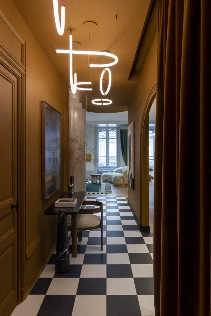
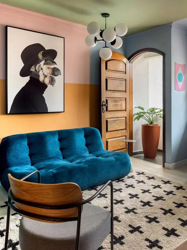
As part of a retro-inspired palette, Tuscan Sunset will serve as a flawless accent color in eclectic interiors full of colors and materials. Use this statement orange as a connection between various design styles. Pair the nostalgia for the past style with modern design ideas to personalize your home’s design with a unique concept.
Traditional Amber
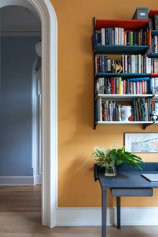
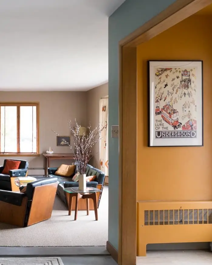
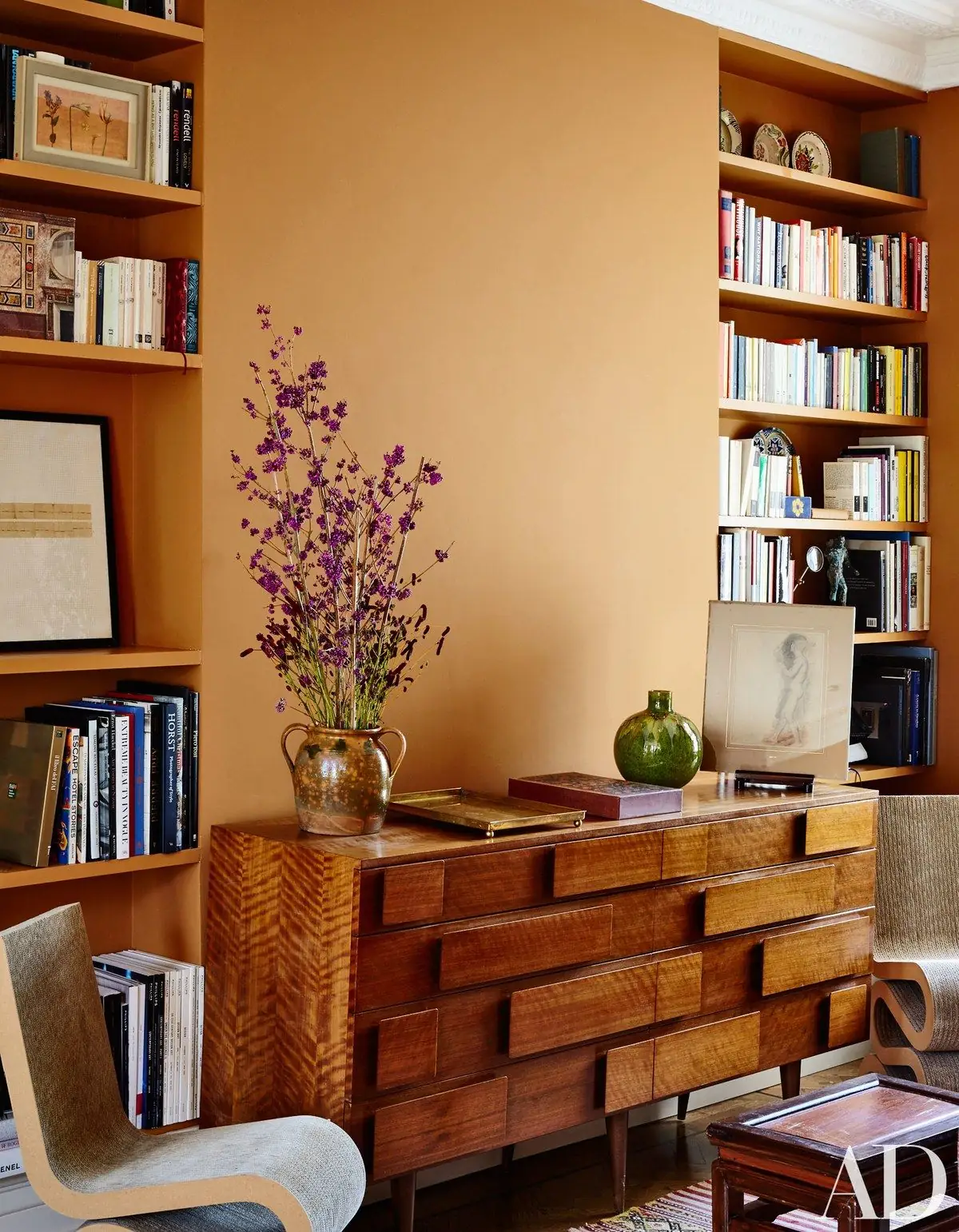
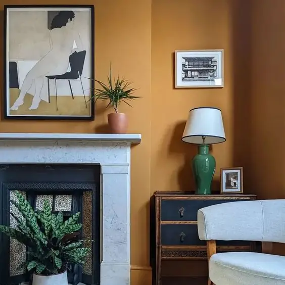
As much as Tuscan Sunset is a modern color, it also nods to tradition. Elevate your traditional interiors with a splash of energetic color like this amber. Wood furniture, beautifully carved features, printed textiles, and muted colors will bloom in the company of such an optimistic and trending orange.
Bedroom
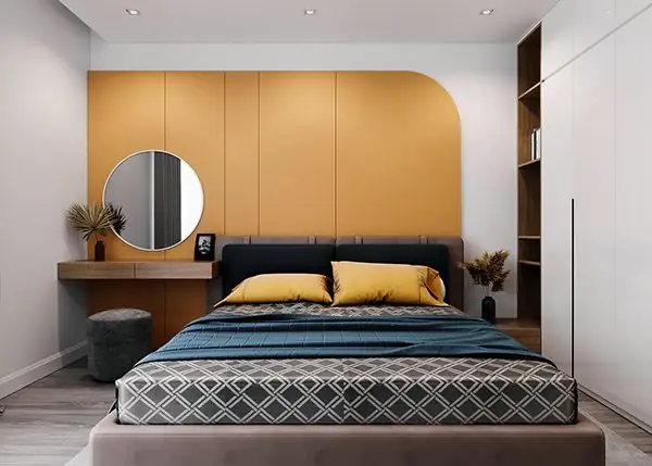
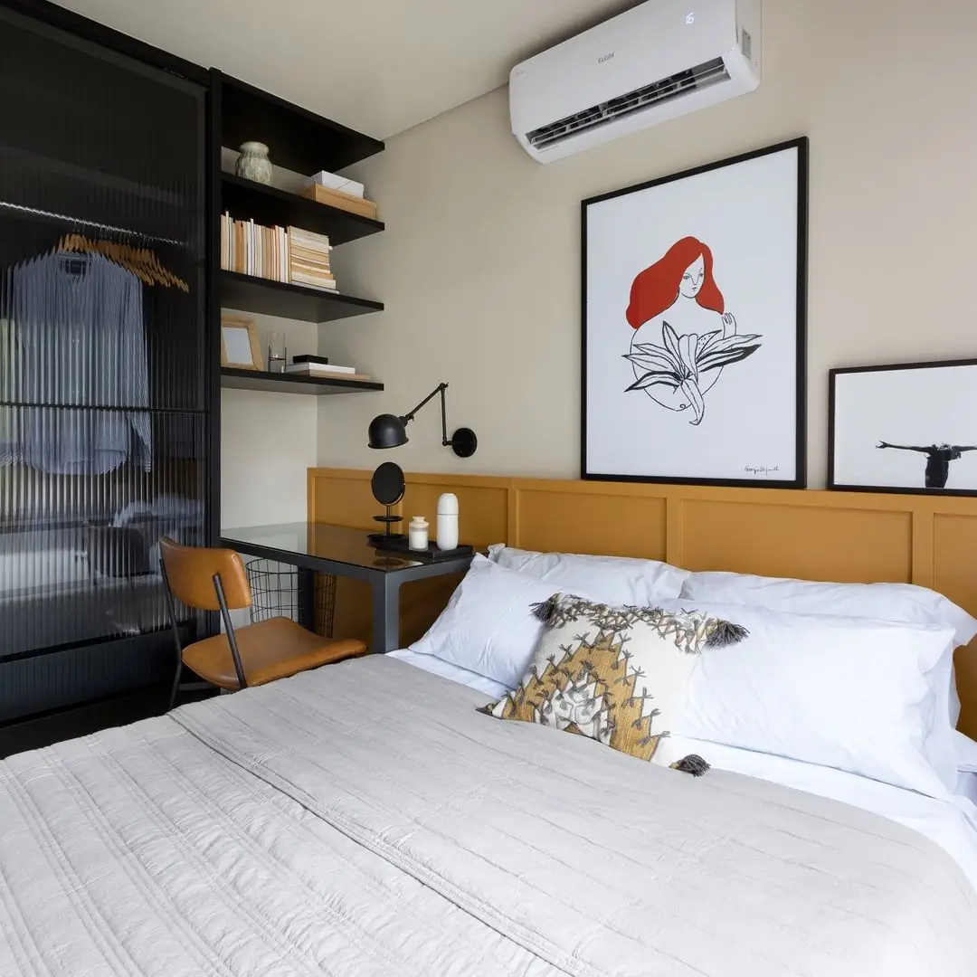
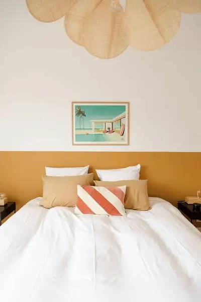
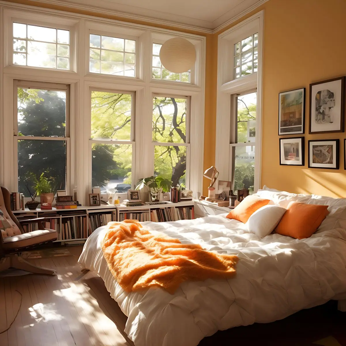
A symbol of optimism and happiness with a dash of muted calmness – Tuscan Sunset by Dulux will become your favorite color after using it in your personal space. Add it to your bedroom through tiny accents, or opt for an all-over wall painting. This autumnal color will emphasize comfort in your bedroom and make every moment feel safe and cozy.
Kitchen
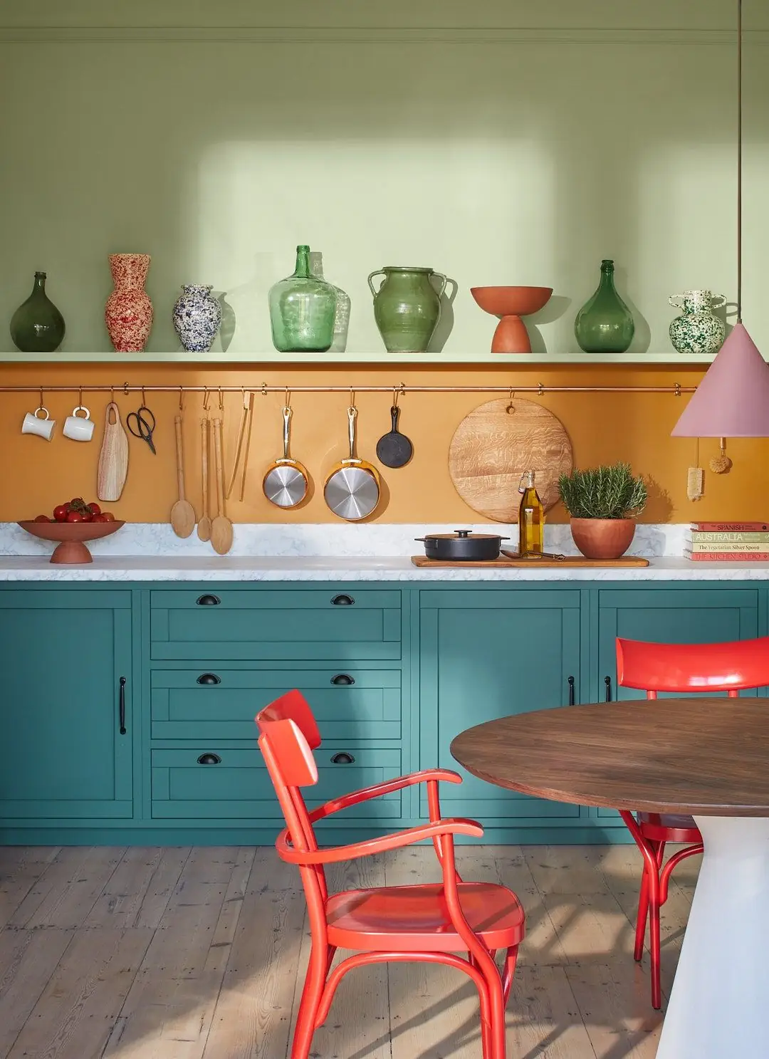
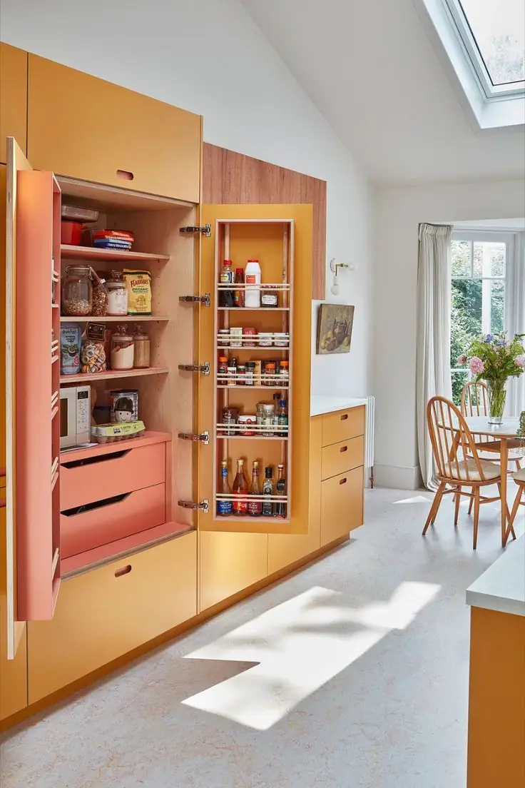
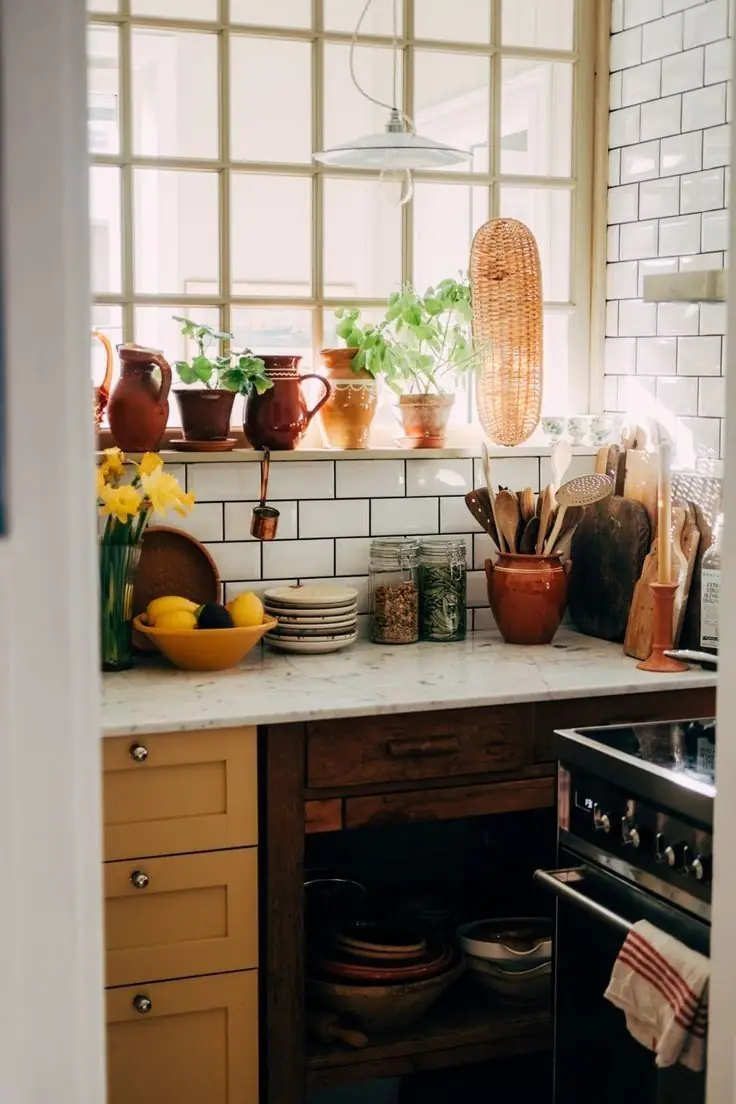
At some level, Tuscan Sunset repeats the wooden surface. It would be a great idea to repaint your kitchen cabinets in amber. From a cottage-style kitchen to an ultra-modern cooking space, this yellow-orange will fit in. Don’t forget to add a neutral to balance this moderately bright paint color. You’ll especially love this golden shade under the direct glow of sun rays.
Bathroom
Bathrooms are usually associated with something cold and primarily utilitarian. Why not make it more stylish, welcoming, and appealing? For instance, try a vivid accent color. Choose Tuscan Sunset on walls or vanities.
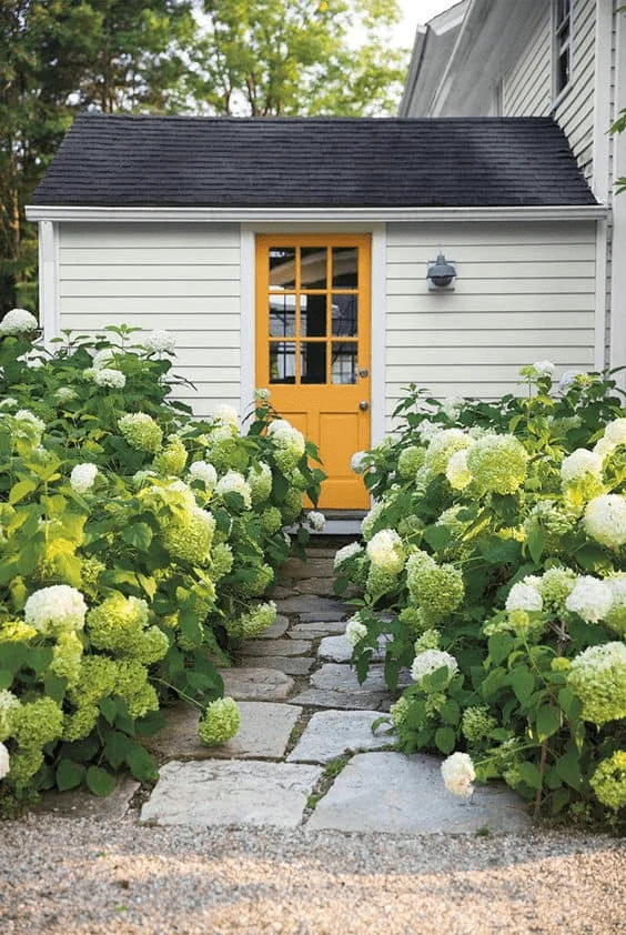
Use of Tuscan Sunset in Exterior Design
Tuscan Sunset is an excellent exterior paint color. It doesn’t fade in natural light and perfectly accents your house exterior. Use it on walls or the front door, and allow charm to become a distinct feature.
Tuscan Sunset by Dulux is a nostalgic yet modern shade of lively amber that replicates the elegance of gold, the earth’s warmth, the coziness of autumn, and the retro vibe of the roaring design styles of the past.