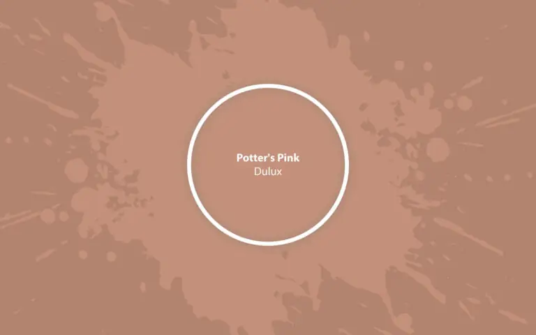
Potter’s Pink (Dulux): What Color Is, Review, and Use
You’ve probably noticed that the terracotta color has been popping up everywhere lately, from fashion to the latest interiors. Indeed, this earthy color is a symbol of timeless beauty, endless comfort, and sophisticated style. No wonder one of the best-rated paint brands, Dulux, introduced this pottery color into its 2024 Color Forecast. According to them, earthy colors bear the warmth and strength necessary to ensure a home feeling of safety and reconnection. We present Potter’s Pink by Dulux, a gorgeous brown shade inspired by the Mediterranean coast homes decorated with artisanal terracotta. Add warmth and coziness to your home in the most stylish way with a no-fail paint color. Yet, first, delve into its specifics.
Potter’s Pink Paint Color Features
Not to confuse with Potters Pink, a Dulux Heritage paint color that renders a feminine pastel pink reminiscent of an English countryside blooming garden. On the other hand, Potter’s Pink is a mid-tone neutral since it can be easily used as a primary or accent color. However, we wouldn’t call it a true neutral. It is full of coloration. It’s safe to say this terracotta shade has a soft, earthy tone that resembles the natural clay color as if it were borrowed from a pottery barn. Potter’s Pink is a dream, earthy color that whispers of a fresh Mediterranean breeze and radiates appealing beauty. Not least, its organic texture will help you reconnect with nature.
Still, why pink, you may wonder. A soft pinkish pigmentation in this neutral brown tone adds charm and makes this particular shade stand out among tens of trendy terracotta paint colors.
You can apply wallpapers, paints, etc. on walls and see how they look in various interiors.

Potter’s Pink: Is It Warm or Cold?
We cannot associate a terracotta shade with coldness. Still, we can determine how warm this paint color actually is. For this, colorists offer the RGB value – the red-green-blue concentration. R: 194, G: 144, B: 122. Do you see the difference? The red amount substantially outruns the remaining two. Now, we can safely state Potter’s Pink is a warm paint color.
How Does Lighting Affect Potter’s Pink?
It’s easy to use a paint color in your home when you know how it will behave in specific conditions. Lighting and exposure are paramount. Let’s take a room with south-facing windows. The orange-yellow natural light will make Potter’s Pink feel warm and glowing. Expect a cheerful pink-pigmented orange-brown with a sweet pastel effect. Switching to the other side of the house – in a north-exposed room, this earthy tone turns into a paler caramel shade, less saturated and balanced by a subtle gray scent. Be aware that Potter’s Pink will seem much more muted at night, even with artificial lighting. Ensuring appropriate lighting is a must.
If Potter’s Pink looks great in one house, it doesn’t mean it will be the same in your home. To make sure it will meet your expectations, use a color sample first. Try experimenting at different times of the day to observe this color’s behavior.
Potter’s Pink LRV
Colorists use the Light Reflectance Value to determine how light or dark a paint color is on a scale from 0 (black) to 100 (white). Potter’s Pink has an LRV of 37 – a medium brown tone leaning toward dark shades. Its LRV allows it to thrive in its rich saturation, yet it needs appropriate lighting. Otherwise, your room will feel slightly dark and enclosed. Reflecting 37% of the light it receives, this pottery shade still bounces around a moderate amount of light.
Potter’s Pink Undertones
Let’s finally discover what color Potter’s Pink actually is! It is undoubtedly a pale brown shade. Cheerful orange-pink undertones, together with a few gray scents, lead to this delightfully appealing, creamy shade. Generally, the resulting color is a perfect interpretation of the natural clay tone, also found in authentic terracotta tiles – the ones with a modern, more neutral effect.
Similar Colors
Terracottas are extremely popular. So, you won’t find any problem exploring similar paint colors to Potter’s Pink. Both Dulux and other manufacturers offer a wide range of alternatives:
Coordinating Colors
Pure and warm whites suit this rich terracotta shade, as well as light blush pink if you aim for a more or less balanced monochromatic palette. For contrast, think of darker accent colors with similarly warm undertones.
Use of Potter’s Pink in Interior Design
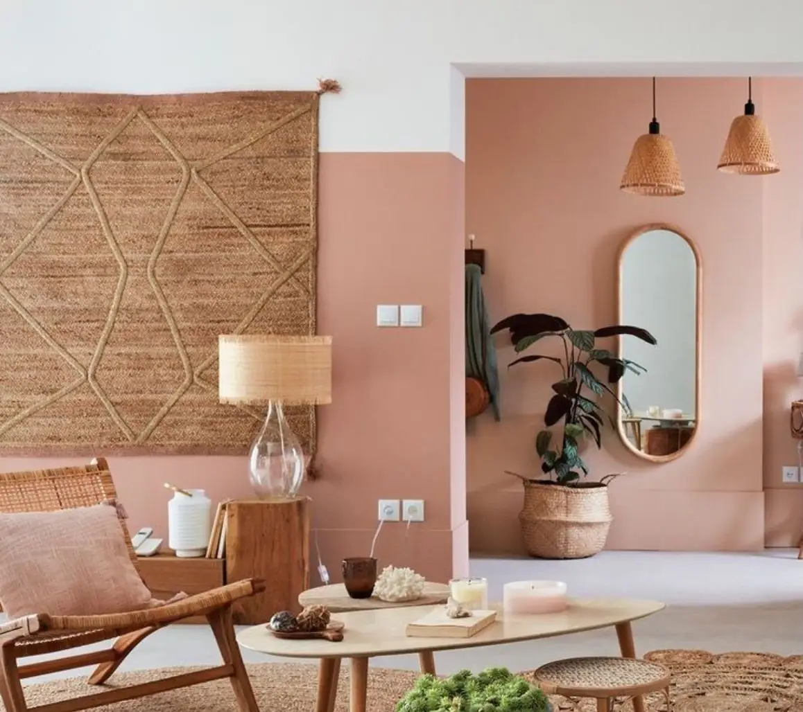
Envelop your home in this charming, earthy color that will make your abode feel like home and render a strong sense of safety. Reminiscent of the warm summer days on the Mediterranean coast, this pottery pink shade will bring much cheerfulness to your bedroom, living room, or kitchen. Feel free to experiment with color in any other design style besides its favorite – Mediterranean. Here are a few stylish ways to use Potter’s Pink in your home.
Rustic Color
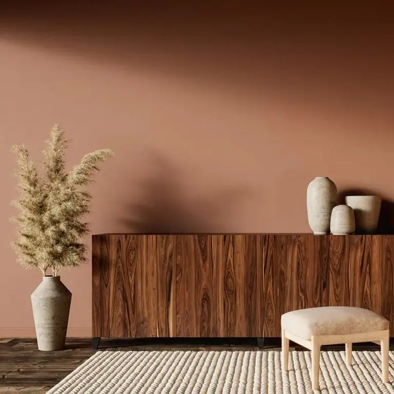
Potter’s Pink from Dulux is 100% rustic paint color. You’ll love its earthy effect in Mediterranean, raw Rustic, Cottage, or Farmhouse interiors where natural textures reign. Lush indoor plants look especially good next to such a contrastive, brown background. Wood, bamboo, sisal, jute, rattan, and organic fabrics look harmonious when paired with Potter’s Pink.
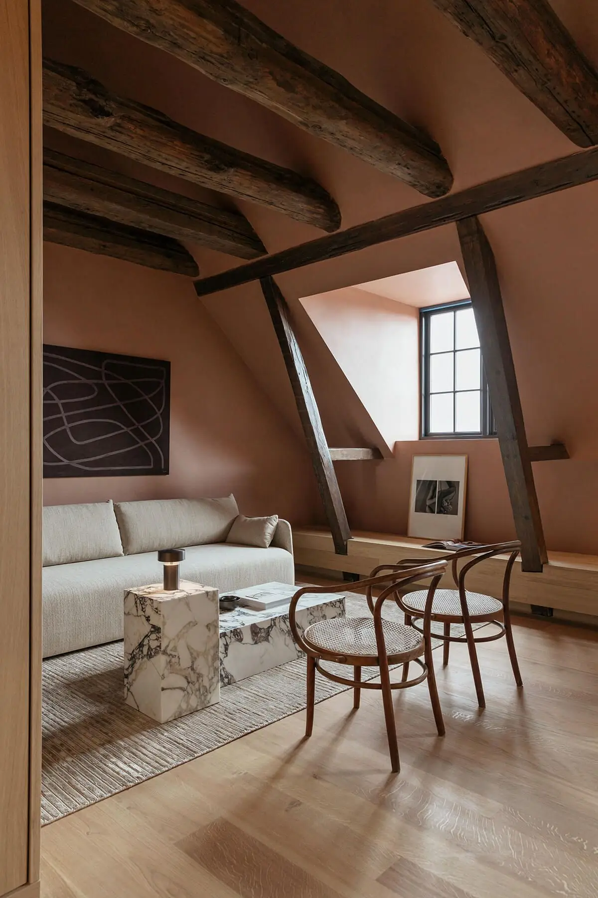
Living Room
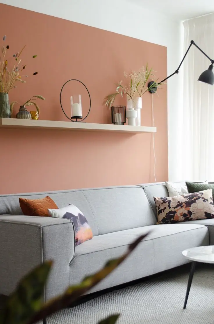
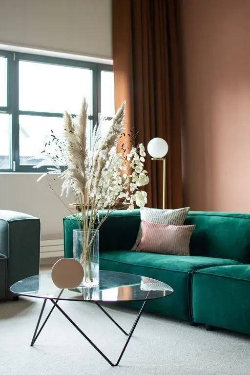
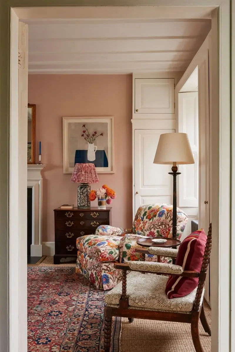
Surround yourself with a warming color to keep you comfy all year round. The great news is that Potter’s Pink suits most design styles. No wonder experts call it neutral. Make it an accent wall, a DIY wall painting, or an all-terracotta color palette. There cannot be too much earthy color unless you cannot ensure appropriate lighting.
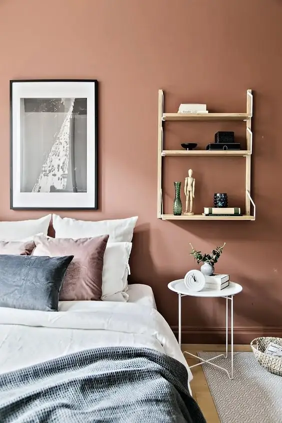
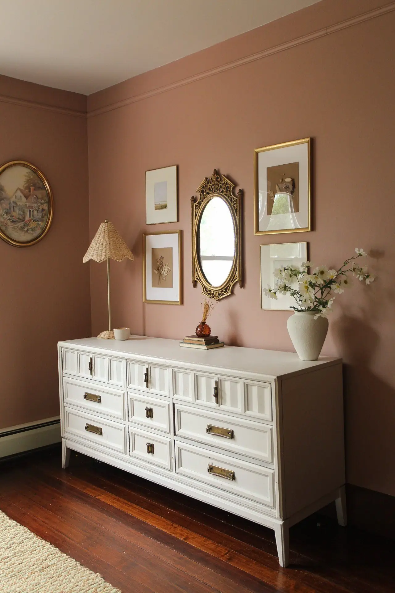
Bedroom
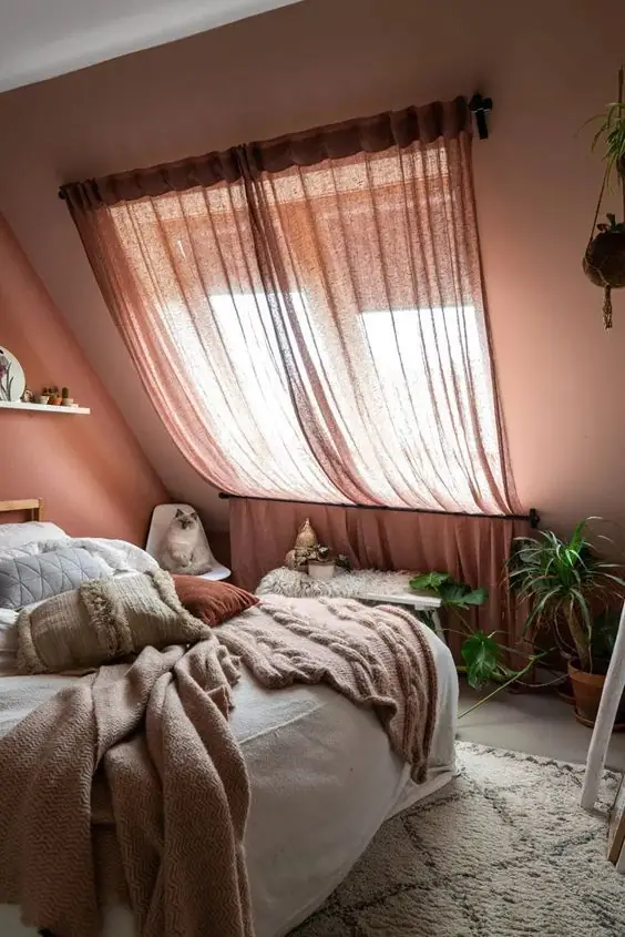
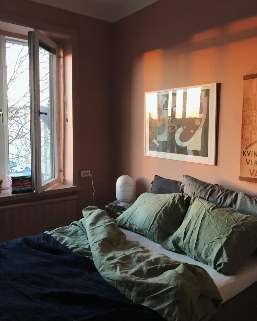
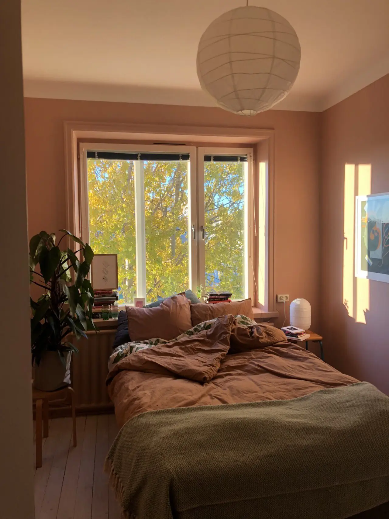
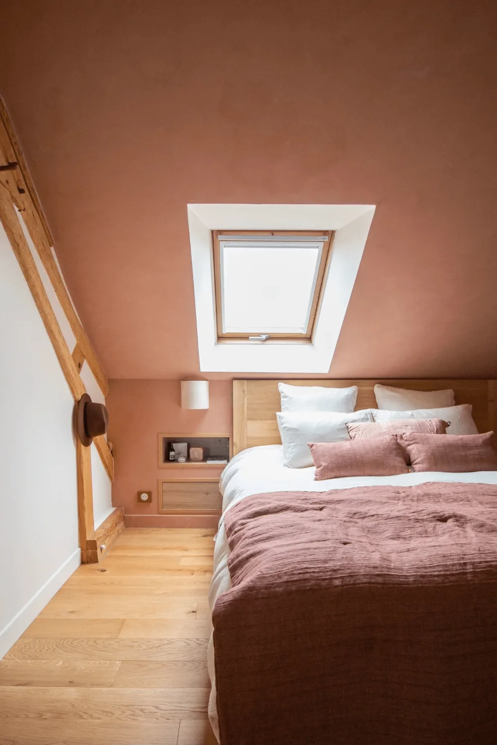
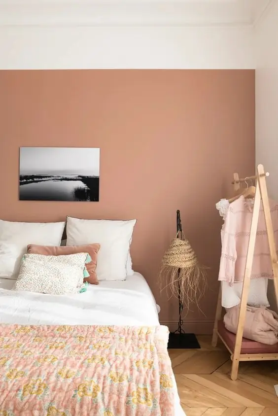
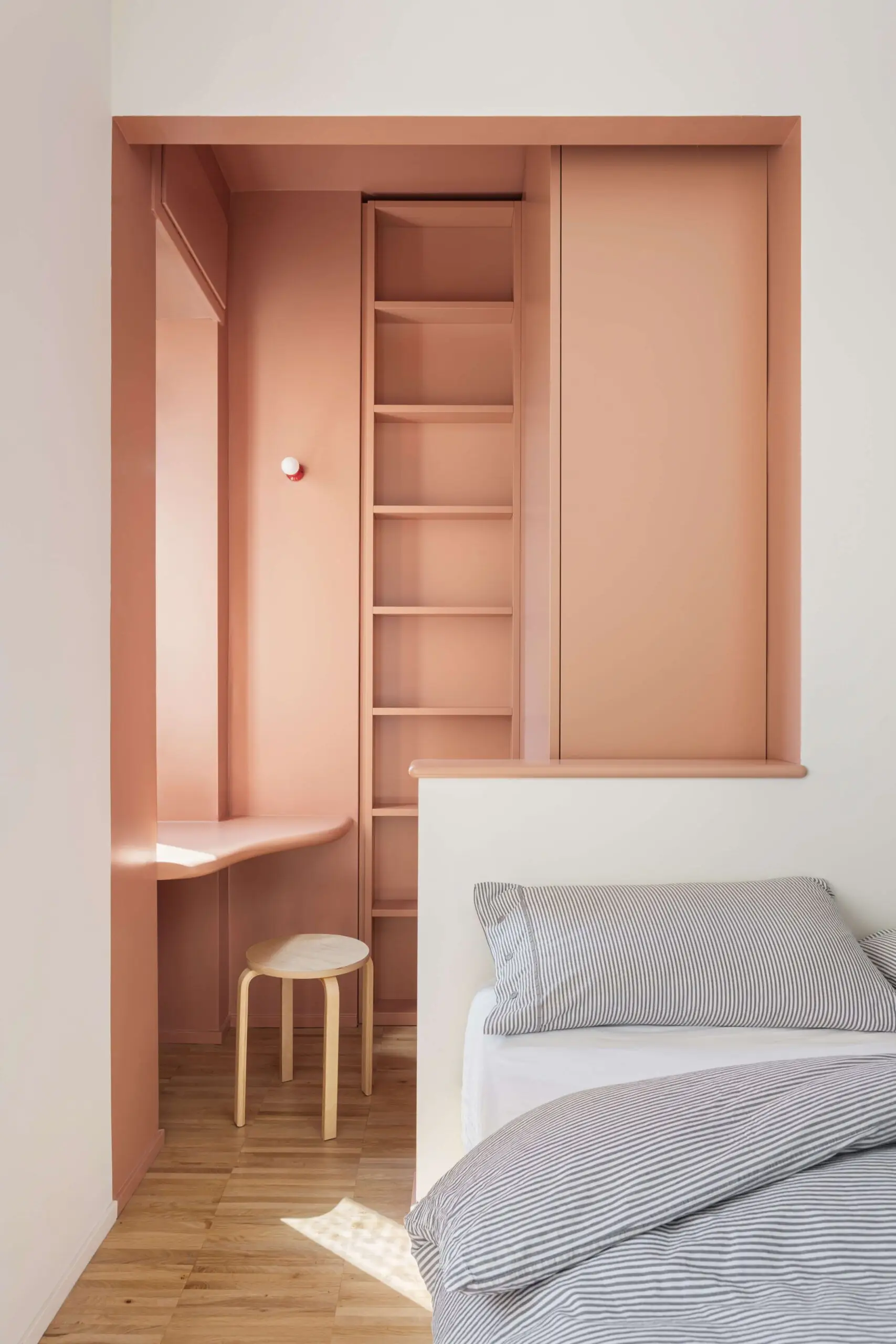
Terracotta is one of the warmest paint colors. Potter’s Pink by Dulux is pretty neutral, and it will easily adapt to your design plans. Designers recommend painting all walls, even the ceiling, and you’ll achieve a moderately moody ambiance.
Kitchen and Dining Room
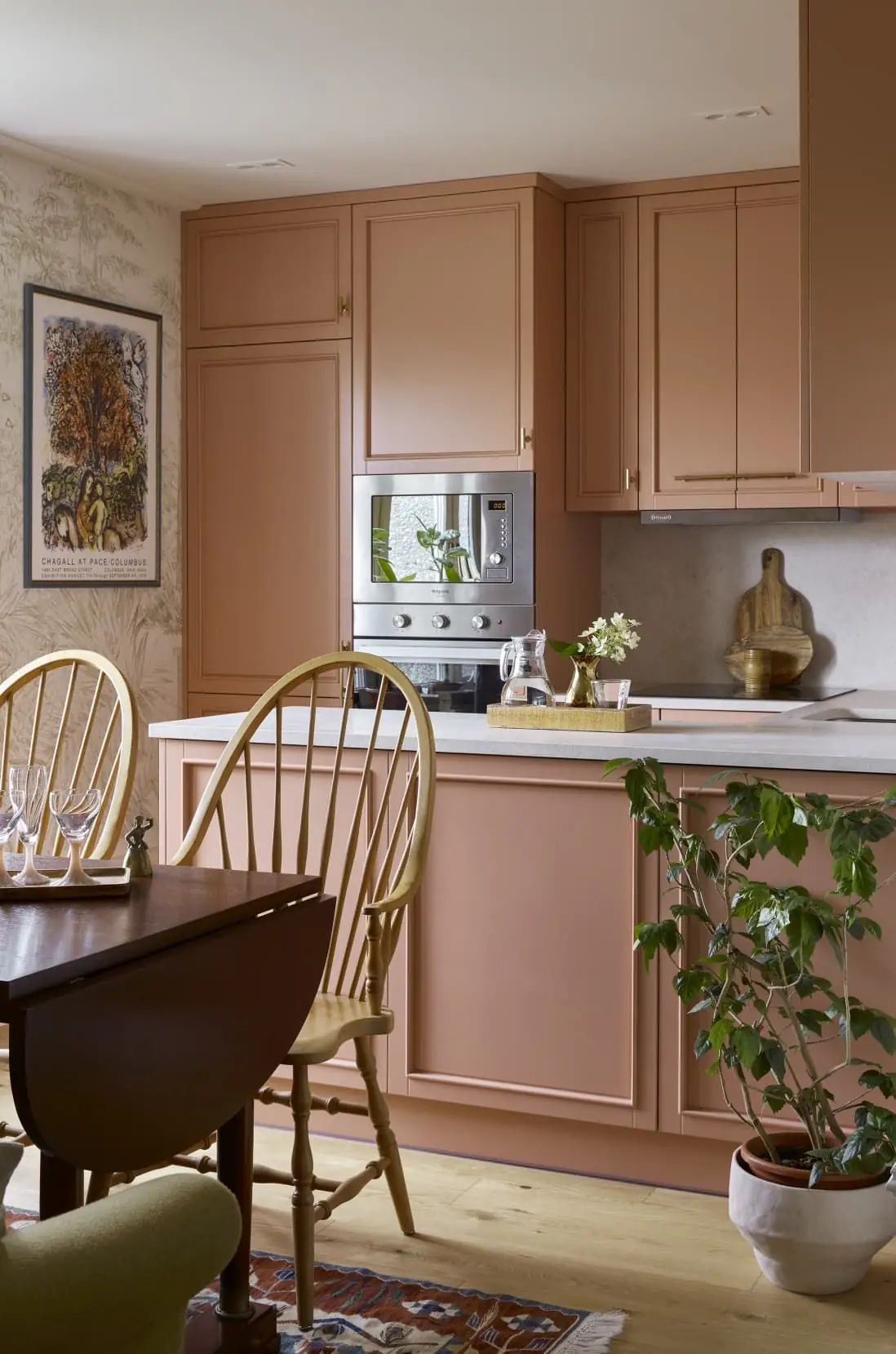
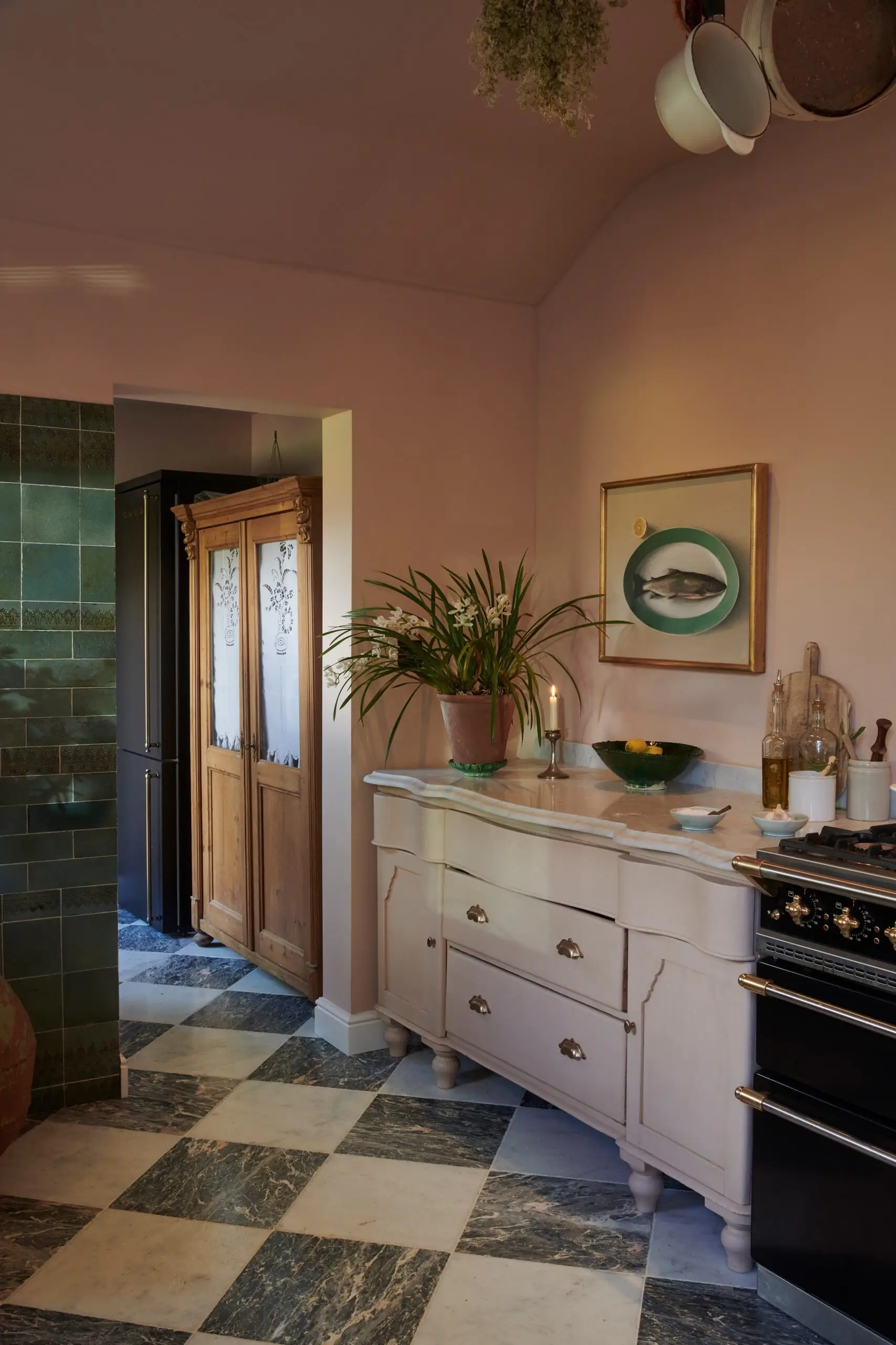
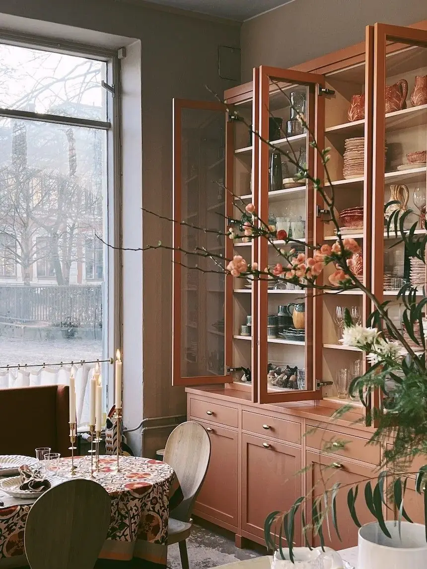
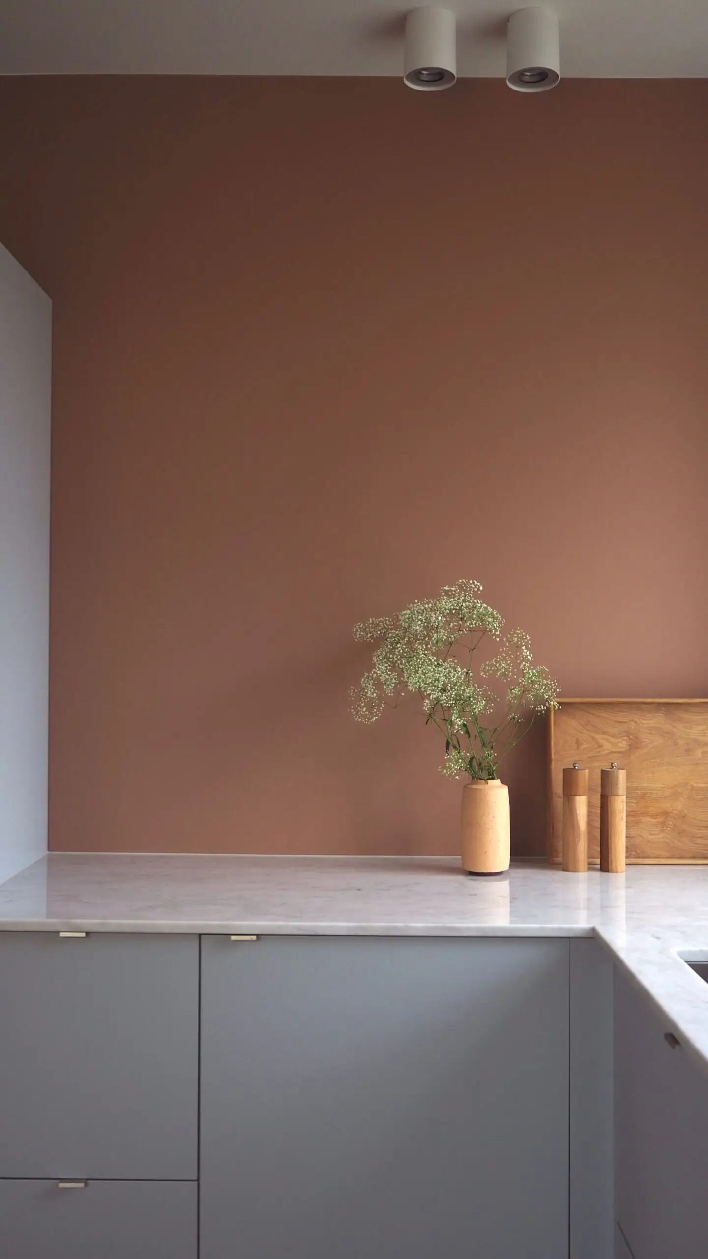
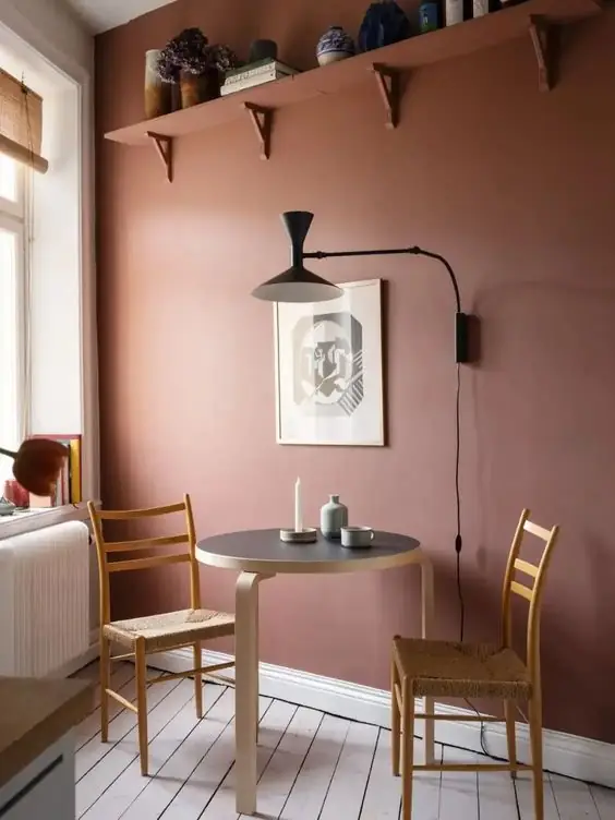
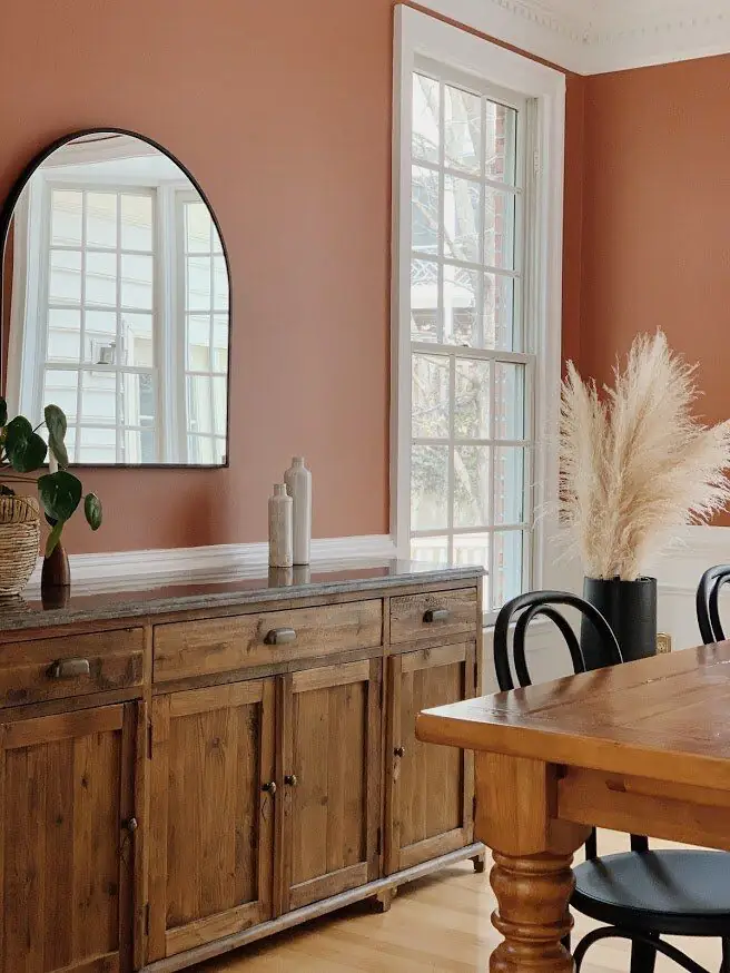
Terracotta doesn’t look good in the kitchen, only as tiles. Use the same shade on cabinets or walls as well. Color affects your mood and lifestyle. Choose this mood-boosting, warming, and inviting color in the cooking space. The same goes for the dining room. Take a look at wooden furniture – it harmoniously fits an earthy color code.
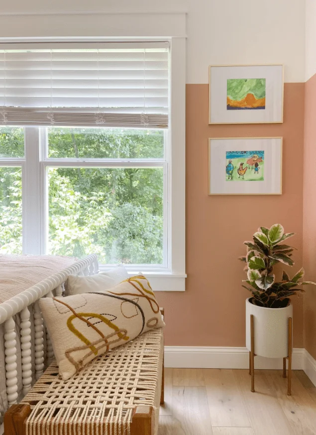
Kids’ Room
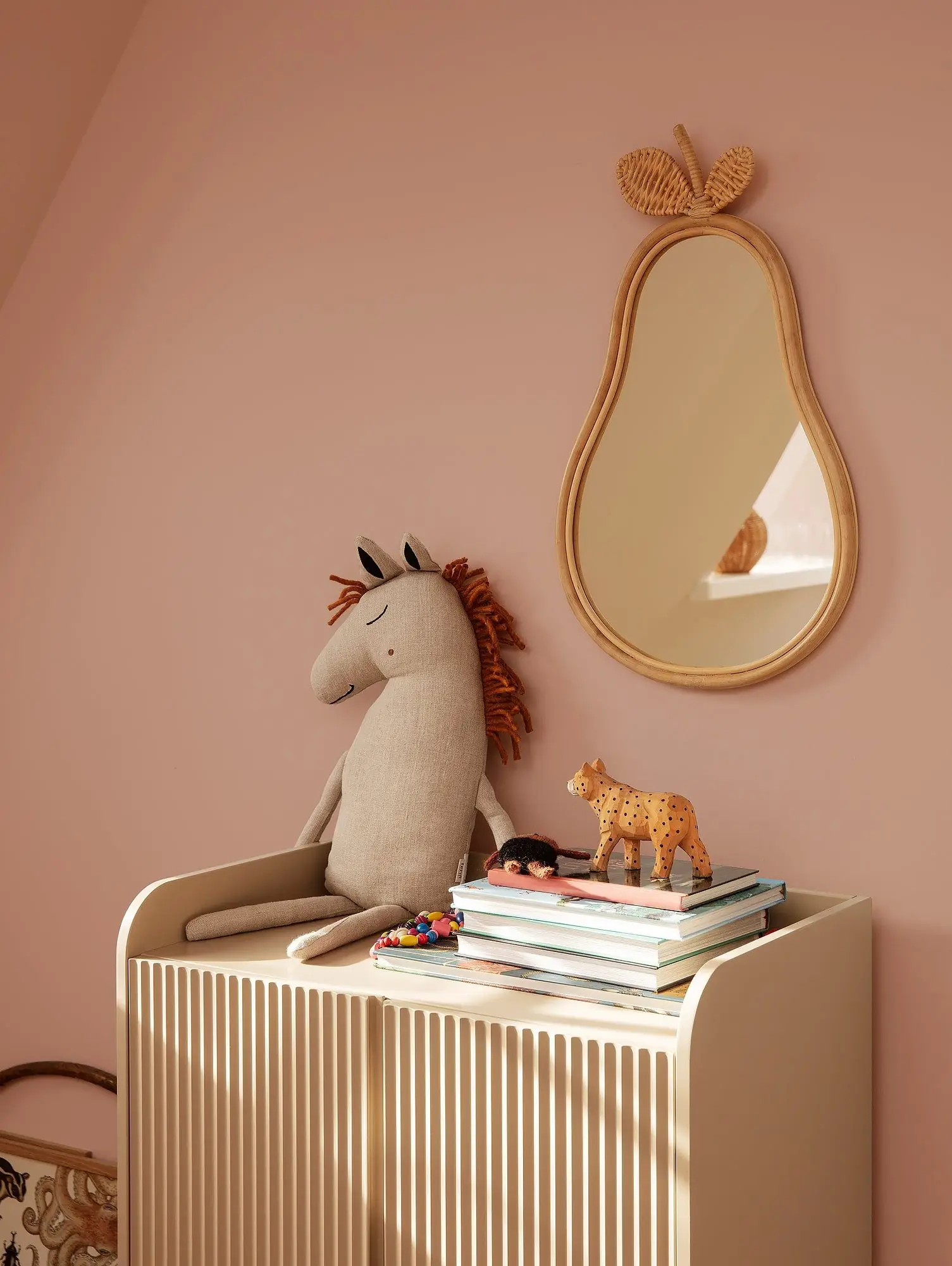
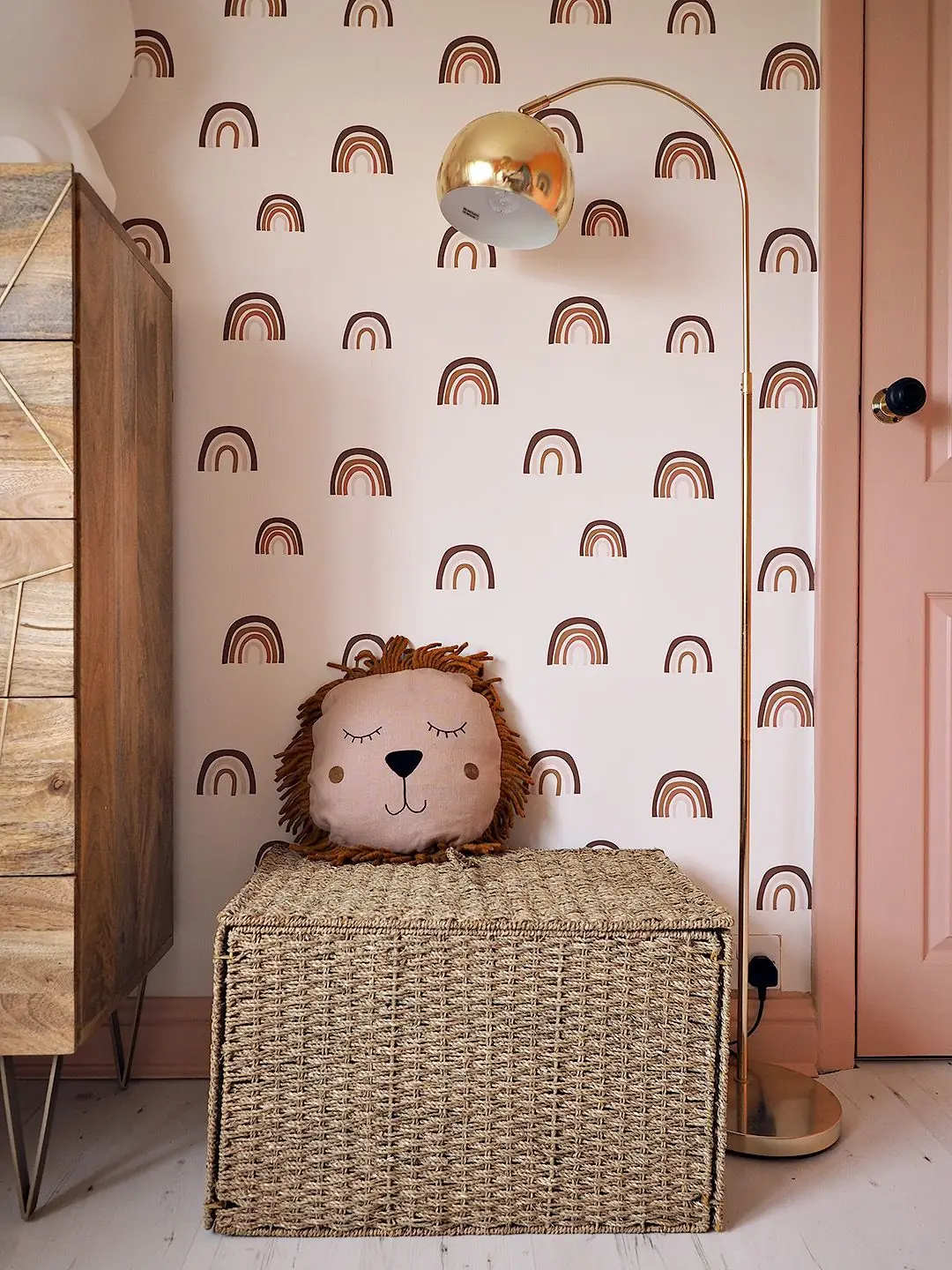
Potter’s Pink by Dulux is a gender-neutral color you can use in the nursery or the kids’ room. Pair light wood, wicker furniture and decor, and terracotta-painted walls for increased comfort with a Mediterranean twist. Try other colorful accents on the clay-colored canvas.
Bathroom
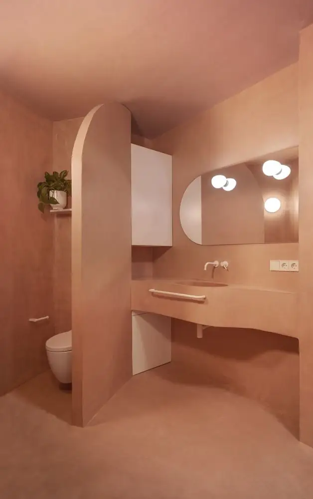

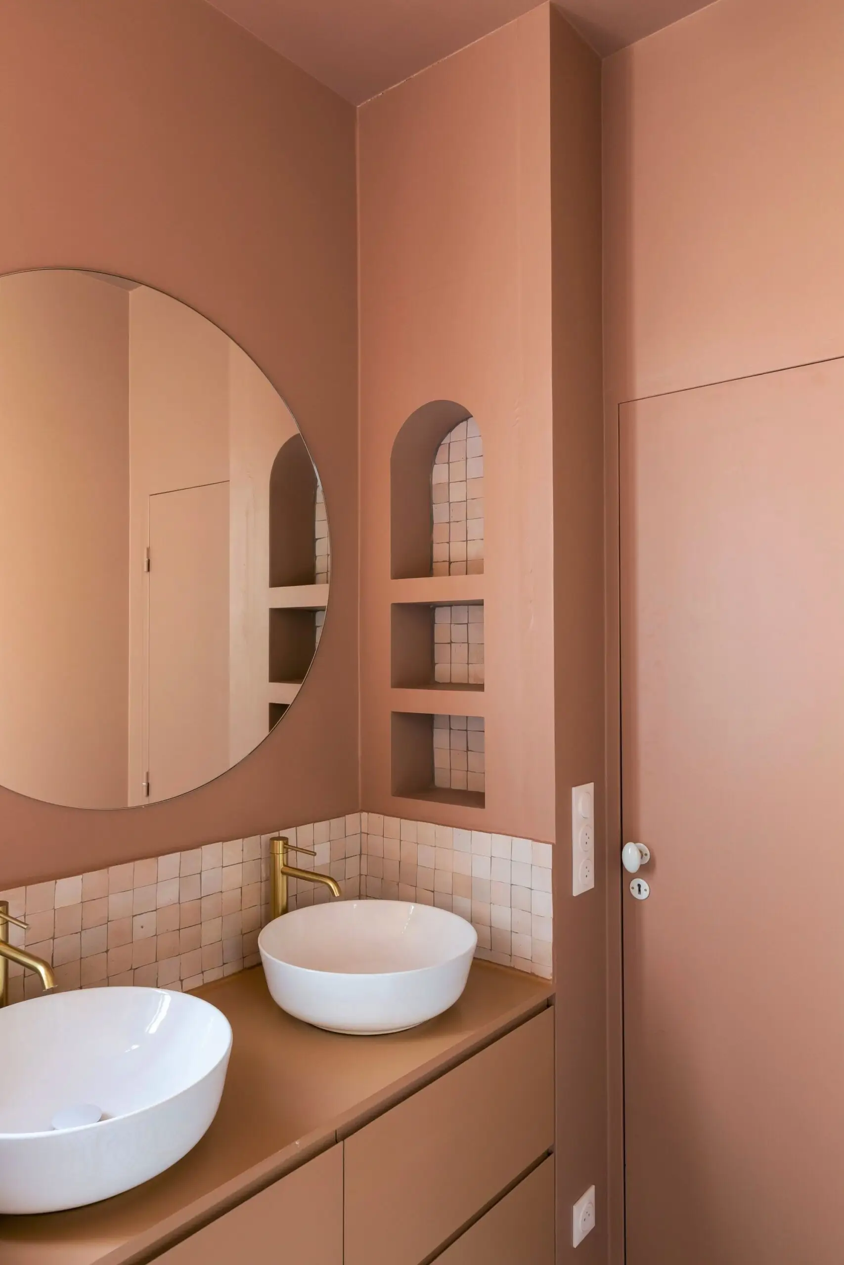
This softest clay shade feels at home the most in the bathroom. Reminiscent of the terracotta tiles, Potter’s Pink offers this space an enclosed effect, adding comfort and Mediterranean allure. Use it in spa-like, rustic, traditional, or modern bathrooms.
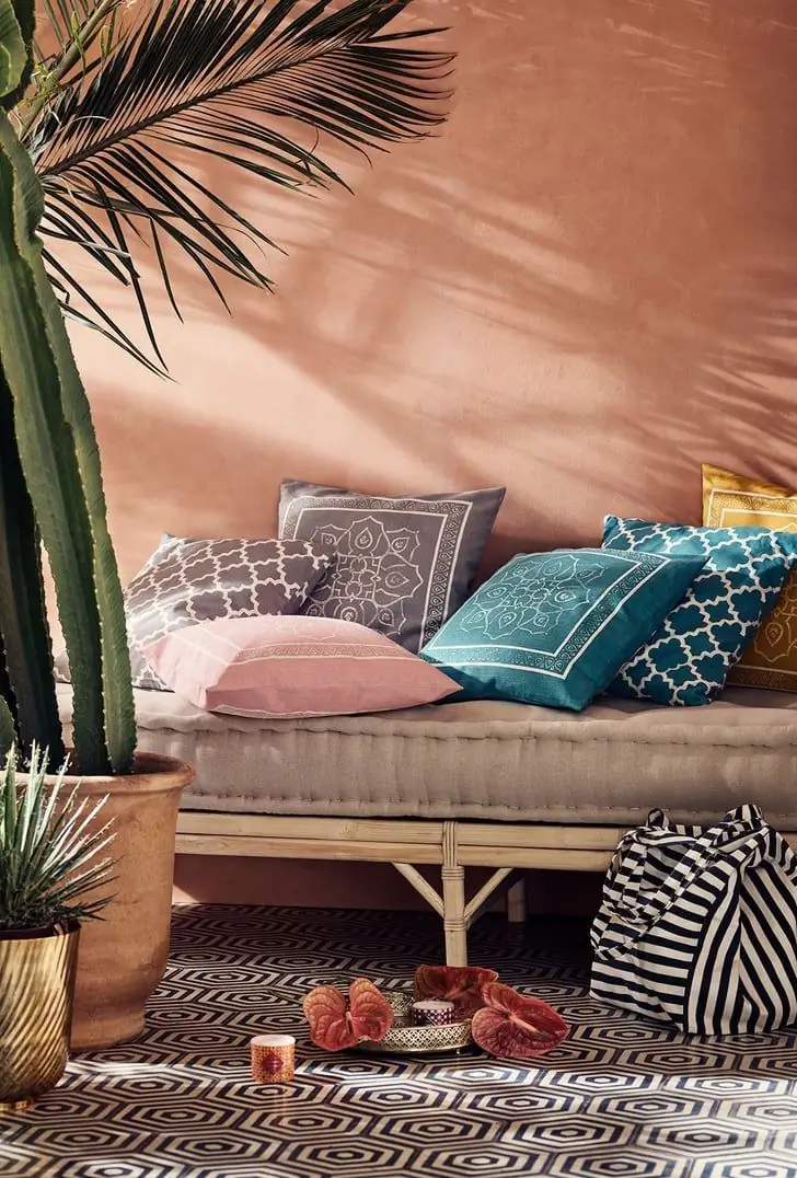
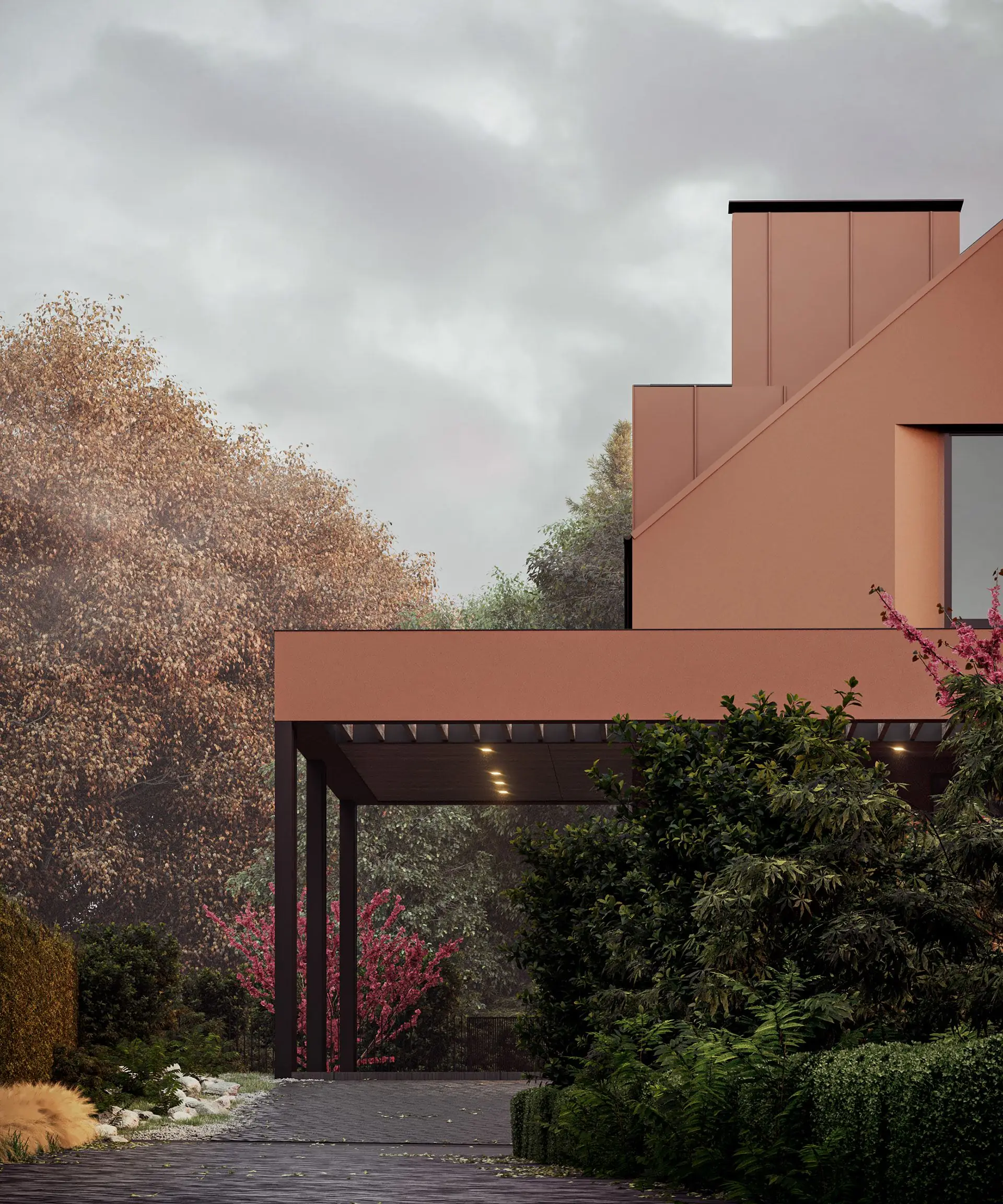
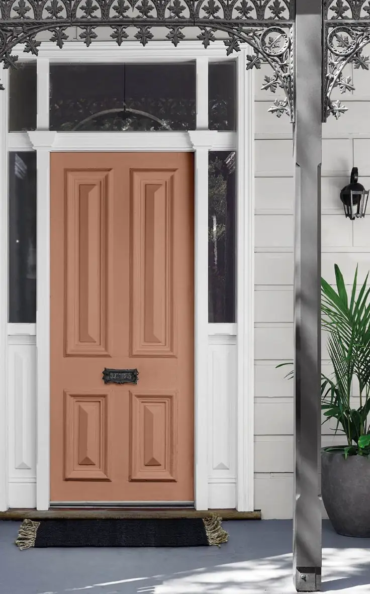
Use of Potter’s Pink for the House Exterior
The dusty blush effect in Potter’s Pink allows it to look stylish and unique among tens of trendy terracotta shades. Due to its blooming pigmentation, this finest clay tone will preserve its saturation even under direct sunlight. Use it on exterior walls or front doors as part of monochromatic or catchy color schemes.
Dulux’s Potter’s Pink paint color is a cozy neutral that pairs well with many shades and textures despite its vivid coloration. The additional drop of pinkish-orange adds unmatchable attractiveness to a Mediterranean-inspired color.