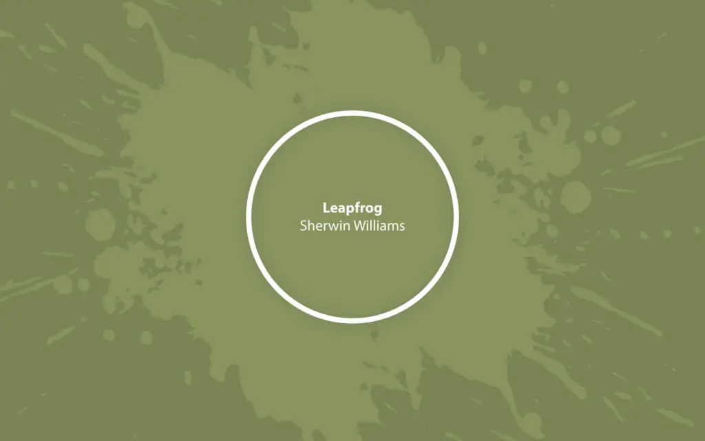
Leapfrog SW 6431
Sherwin-WilliamsA lush green bouncing between middle tones and deep shades. This trendy veggie hue brings so much energy and color to the interior and exterior design.
Paint Technical Profile
| Color ID / SKU | SW 6431 |
| HEX Code | #88915d |
| Light Reflectance (LRV) | 26 |
| Use | Interior, Exterior |
Leapfrog (SW 6431): What Color Is, Review, and Use
We all know that bright paint colors are the top color choices currently. Let’s keep pace with the wave of trends! In this respect, we are exploring plenty of bold paint colors from giant brands. Today, our attention goes to Leapfrog, an expert-pick green shade from one of our favorite brands, Sherwin-Williams. It’s no secret green has been the “it” color lately, and we recommend discovering this statement green paint color you’ll undoubtedly want to use in your home.
Leapfrog Paint Color Features
You cannot skip a paint color with such an attractive name. Leapfrog is a mid-tone-to-dark green shade, pretty saturated yet relatively deep, making it well-balanced. Its bold features make us fall in love with green again. This shade, in particular, looks impeccably suitable as a primary color on all walls and an accent wall color or the perfect green shade for furniture. Besides its awe-inspiring character, Leapfrog creates a moody and dramatic ambiance, adding comfort to large rooms when used on all walls.
Leapfrog: Is It Warm or Cold?
Let’s analyze some facts! We can use the RGB value, the color mix of red, green, and blue in this color, to determine Leapfrog’s temperature. Undeniably, green prevails, which is self-explanatory. Next comes red, with a pretty close amount. Last but not least, blue slightly stands in the shadow. So, Leapfrog is a 100% warm green shade since red is indicative of the warm side.
How Does Lighting Affect Leapfrog?
Leapfrog is not fully saturated, and lighting, as well as exposure, play a great deal in how this paint color appears during the day if we speak about natural light, in particular. Expect a cooler and even less saturated veggie green in north-facing spaces, all due to the slightly bluish natural light. Before noon, Leapfrog will read warm under the yellow natural light in an east-facing room. Simultaneously, it turns into the warmest green under the effect of the outside orange-red light that lasts from afternoon till sunset in a west-facing space. Not least, the southern exposure will ensure an all-day warm green under the constant orange-yellow natural light.
At some level, Leapfrog transforms into a saturated teal shade. On the other side, we can witness a rich olive variation, all due to natural light and exposure. As for artificial lighting, the warmer the light source, the more saturated and welcoming Leapfrog feels. Conversely, cool lighting with a bluish pigment brings a more neutral green to the surface. Yet, Leapfrog doesn’t lose its charm in either of these cases. It is naturally bold.
Leapfrog LRV
The higher the Light Reflectance Value, the more light a particular color reflects. From 0 (true black) to 100 (pure white), Leapfrog enters the mid-tone group with an LRV of 26, yet it is pretty close to dark shades. It’s true that Leapfrog on all walls may lead to a moody effect in the room, yet there is still 26% of the light it bounces around.
Leapfrog Undertones
If you look closely, you’ll see that Leapfrog has yellow undertones – beautiful, charming, and inviting, warm yellow undertones. Unlike most green shades interior designers have been using so far, this green paint color is not grayish or blue-green. It’s a gorgeous yellow-green that brings comfort, creativity, and appeal to a space.
Similar Colors
Leapfrog is one of the trendiest green tones this season. You should know its similar colors, whether you want a close alternative or a lighter or darker substitute. Here are the expert-recommended choices:
Coordinating Colors
For a natural, comfy look, colorists suggest you use Leapfrog paired with light greens, off-whites, or deep blues. The warm yellow undertone in Leapfrog will beautifully resonate with the creamy undertones in white shades for the trim. Not least, for a full contrast with this bold green, take a look at the other side of the color wheel, where we can find purple – the complementary color for green. You may find the following coordinating colors suitable:
Use of Leapfrog in Interior Design
Interior designers and decorators recommend using this trendy green shade primarily as an accent. It can be an accent wall or a piece of furniture. For those who enjoy the charm of moody interiors, don’t hesitate to paint all walls green. Still, don’t stop at a monochromatic palette only unless it’s a blend of green and white. Otherwise, your room risks seeming dull and devoid of character. Experiment with blues, violets, natural textures, metallic accessories, and organic fabrics. Read on to explore the best design ideas with Leapfrog!
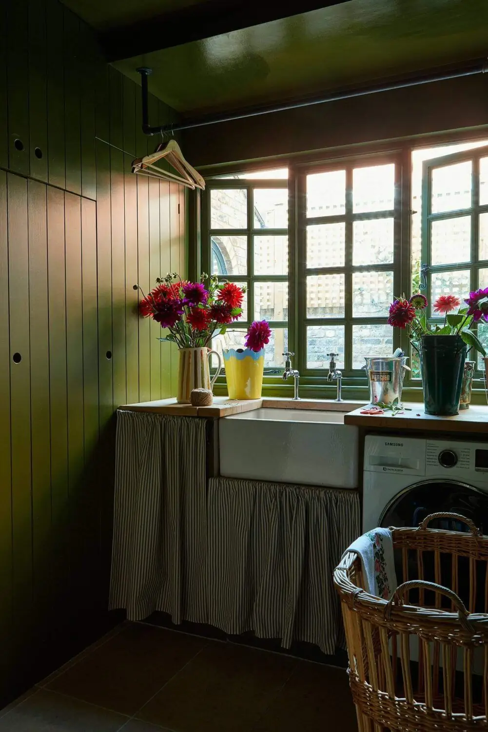
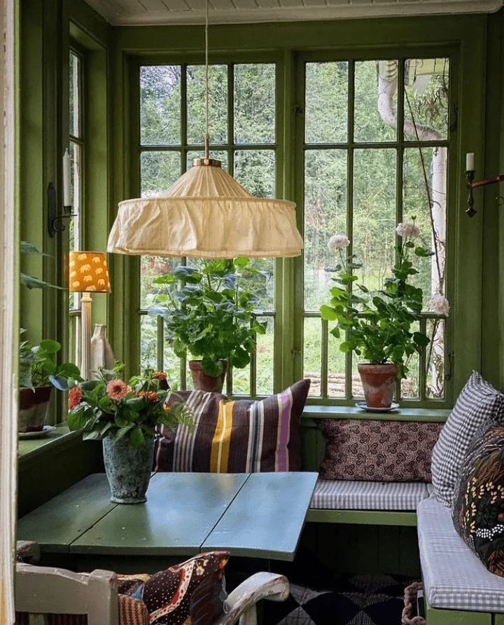
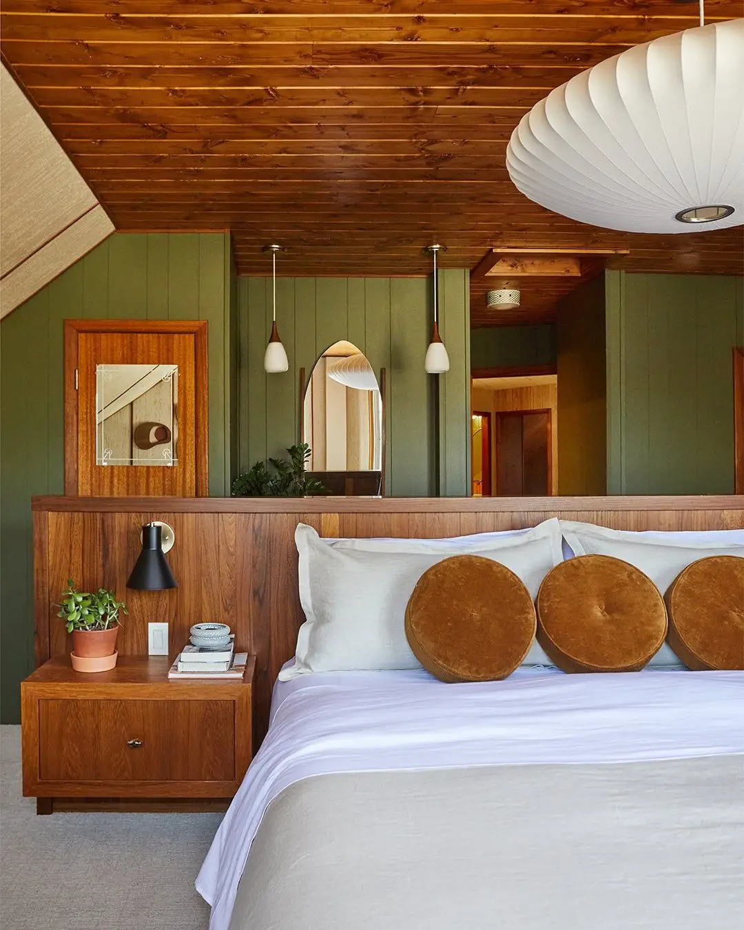
Rustic Green
There is a strong bond between this weathered green and the undisturbed, natural Rustic style. No wonder Leapfrog pairs with wood surfaces so well. Try the newly discovered green shade on all walls or particular parts of the interior combined with wooden wall paneling, naturally textured furniture, and organic textiles. Leapfrog feels so natural, as if meant to beautify a countryside home. Yet, you can bring this charm to your city house or apartment through color.
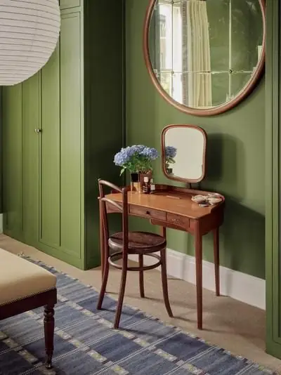
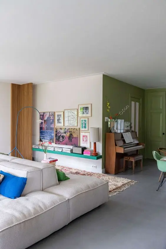
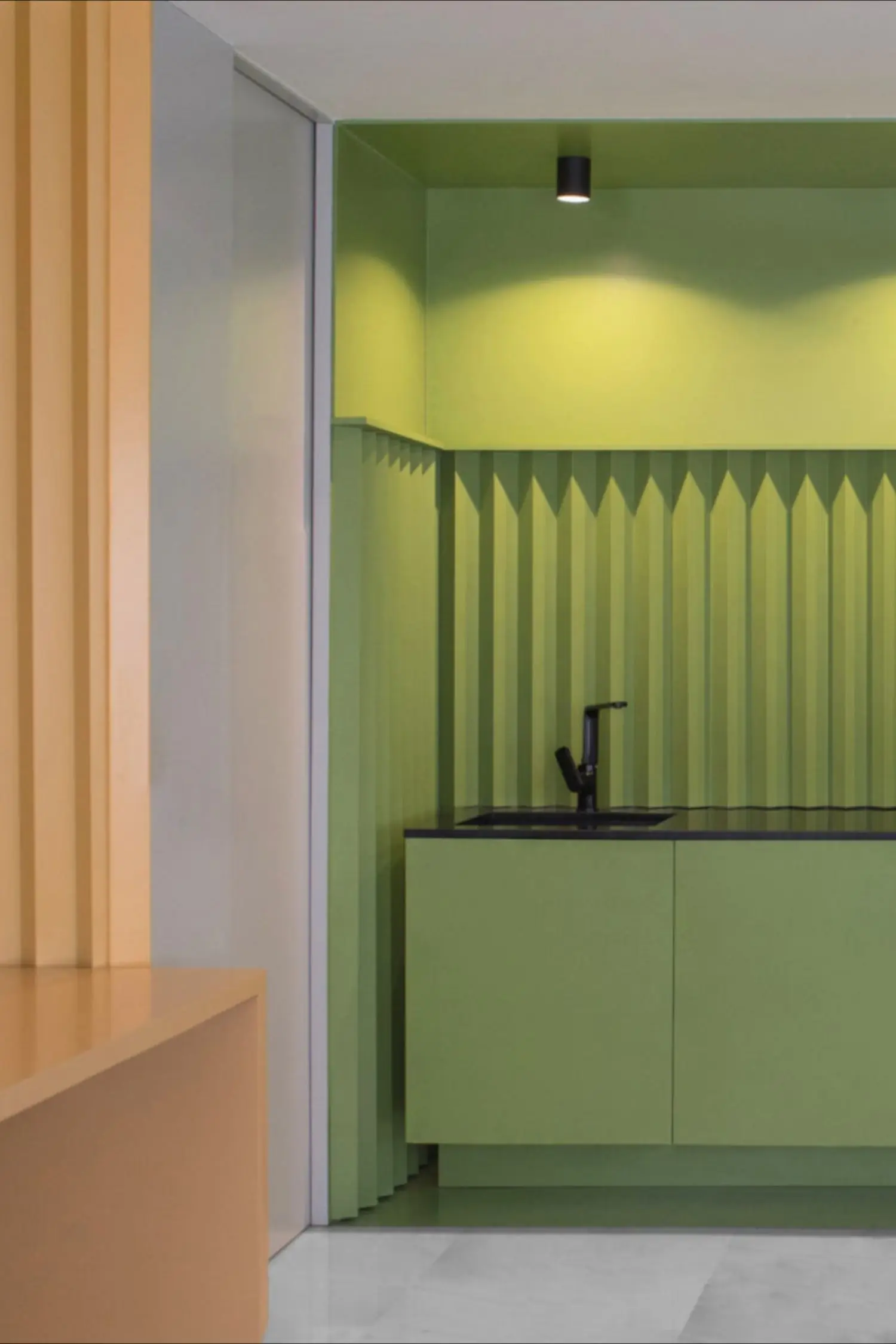
Modern Green
Such a pastel green with an inviting yellowish undertone cannot help but feel contemporary. We invite you to explore the sleek and sophisticated look of Leapfrog in modern interiors, where monochromatic palettes ask for a bold accent or bright color blends need a green pop of color. Bring energy into your home with a vibrant and enlivening color like the veggie green from Sherwin-Williams.
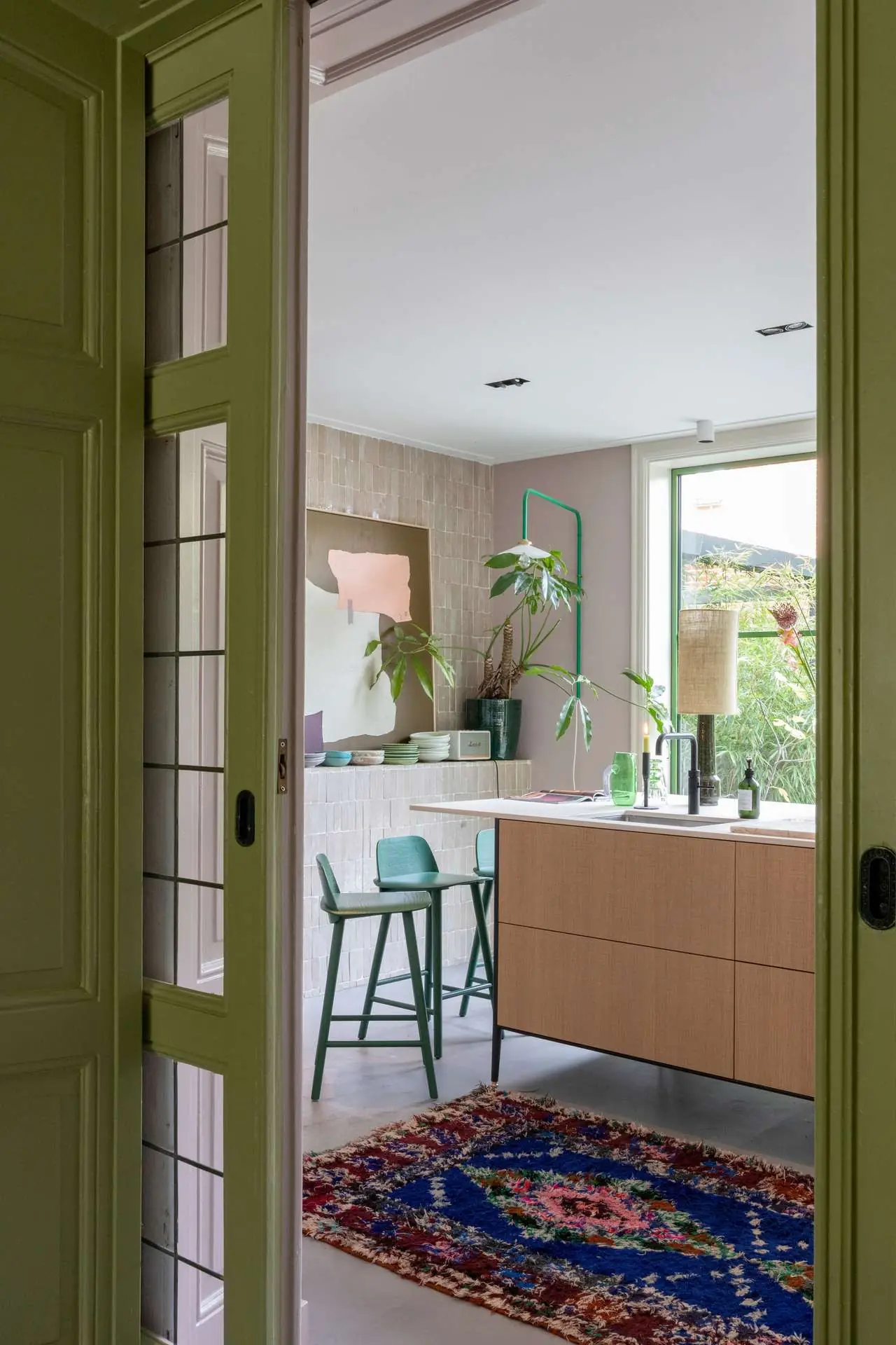
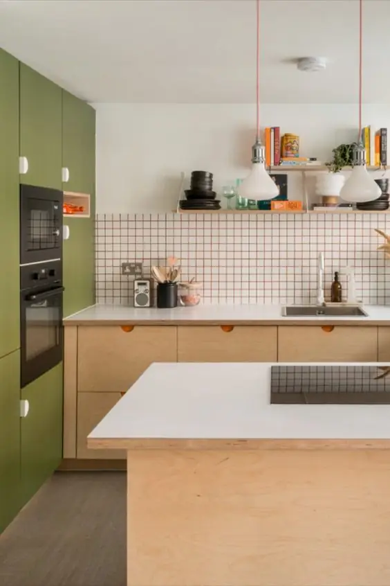
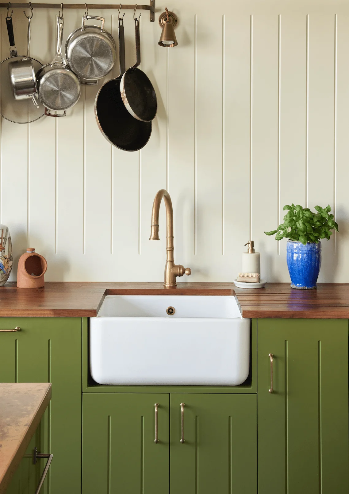
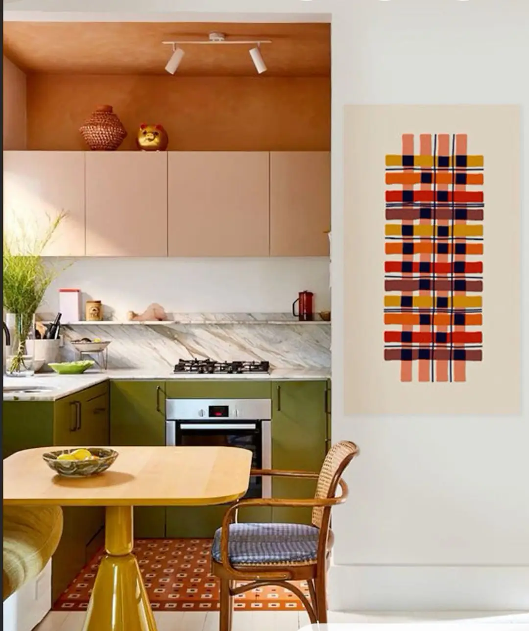
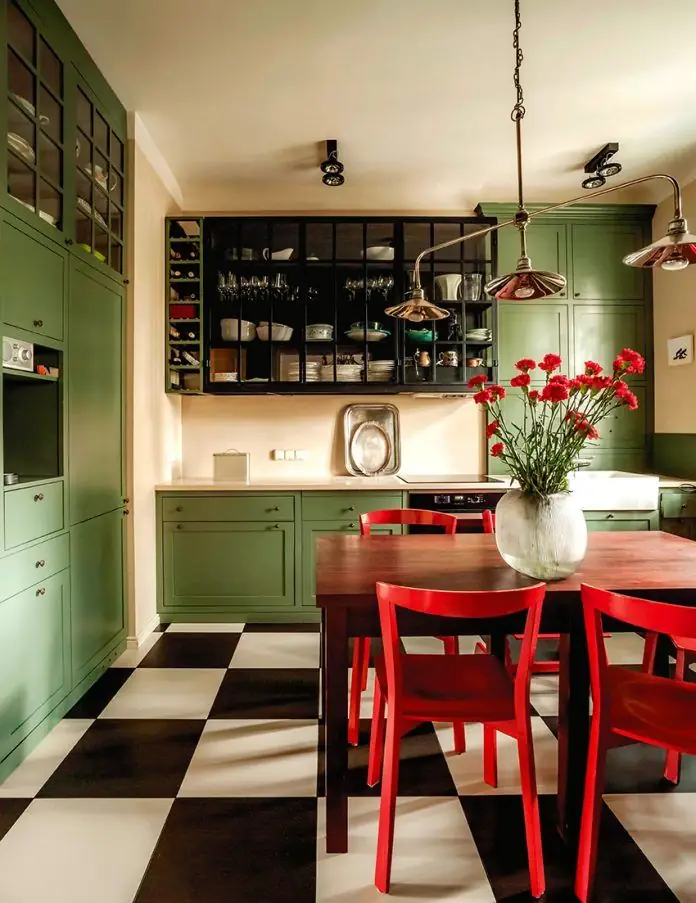
Kitchen and Dining Room
According to designers, green is one of the top kitchen paint colors, from the lightest to the deepest or boldest greens. Ensure a year-long positive mood in your cooking space with tasteful green cabinets. We are simply impressed by how much style and value Leapfrog adds to modern as well as traditional kitchens.
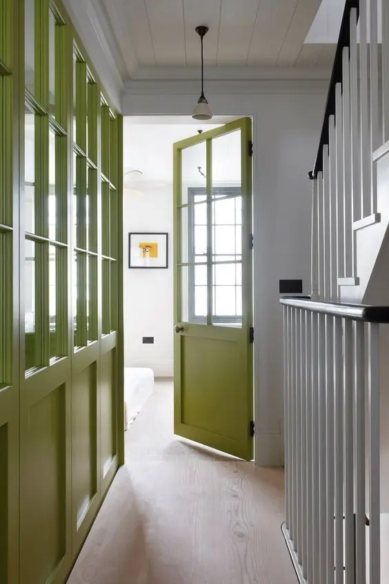
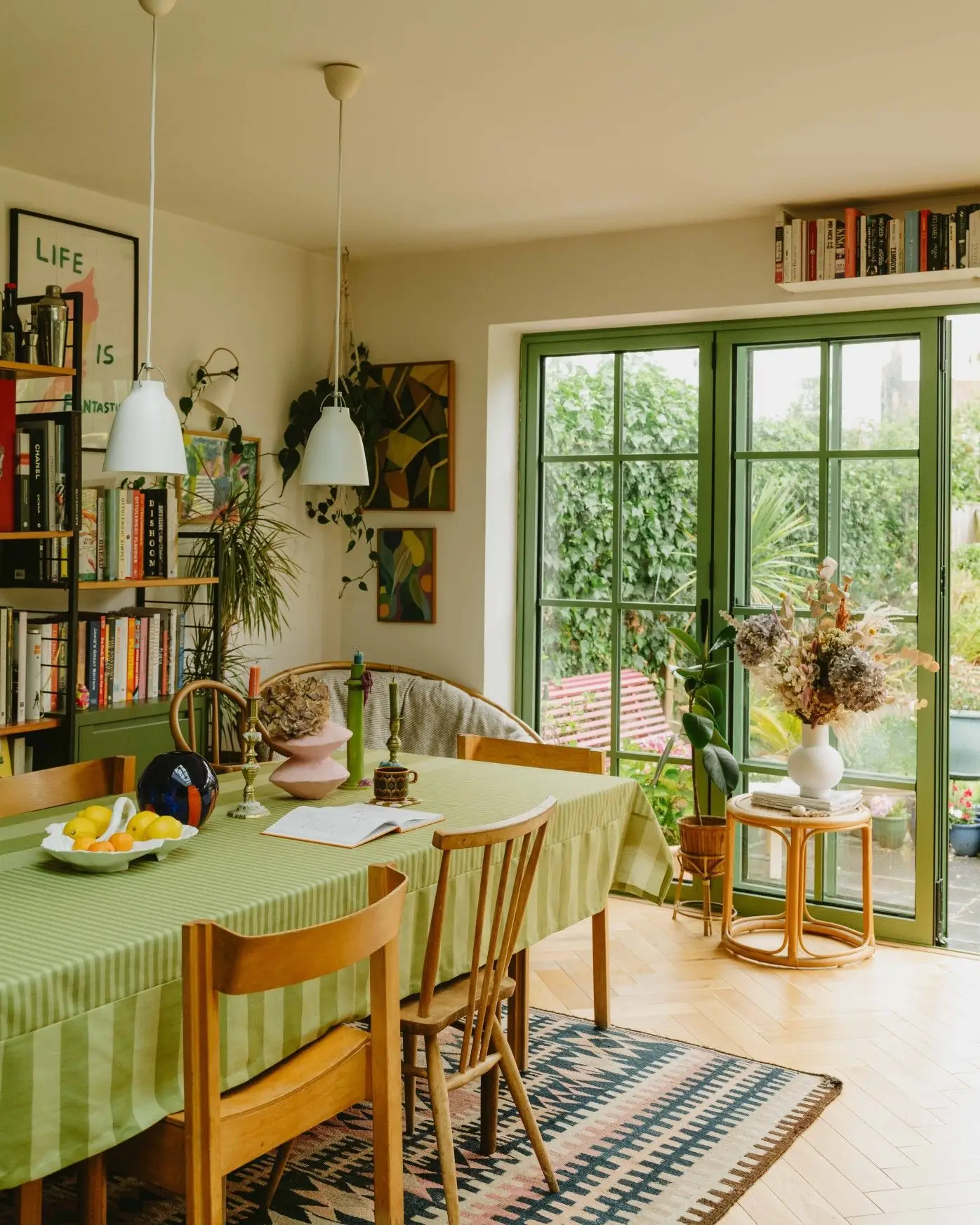
If your dining room lacks color, Leapfrog is your go-to choice. It is trendy, lively, mood-boosting, and a great conversation starter. We are especially in love with the use of this lush green on trim and door or window frames as an accent.
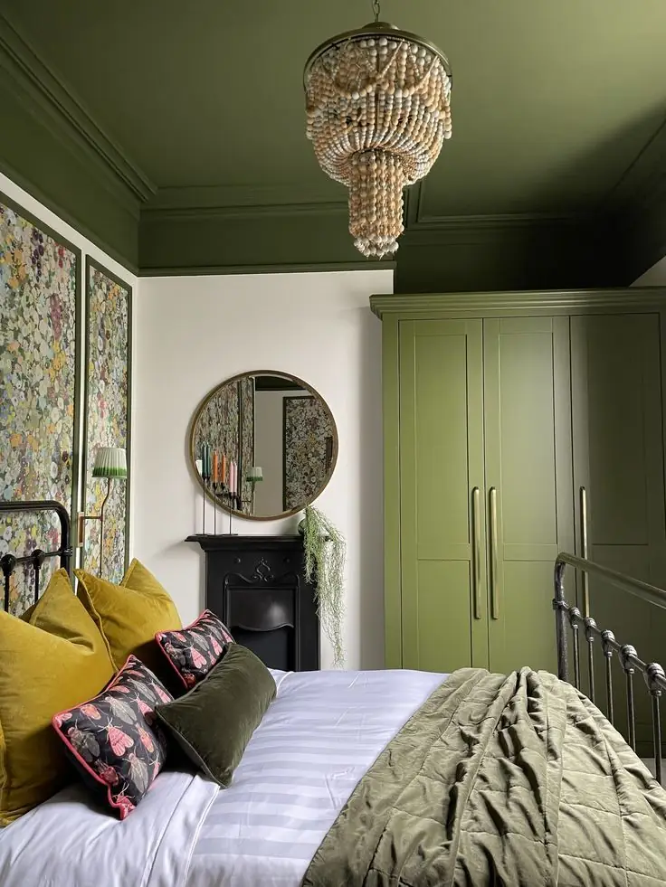
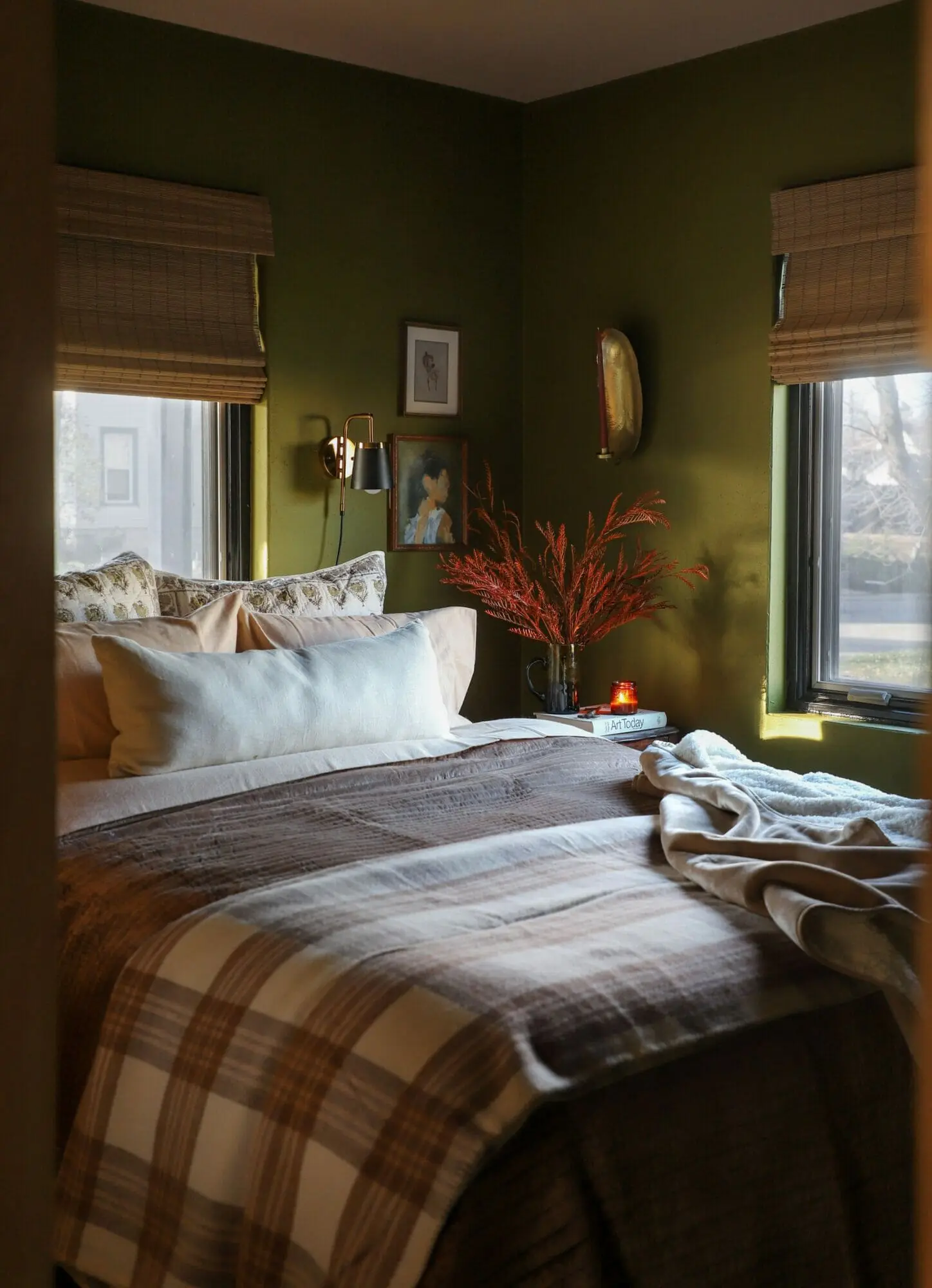
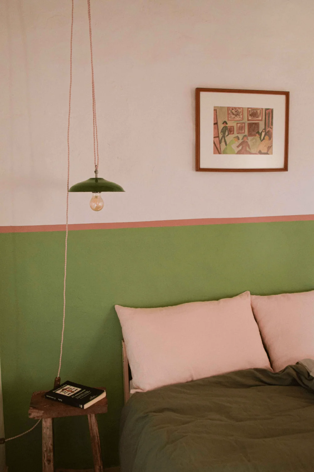
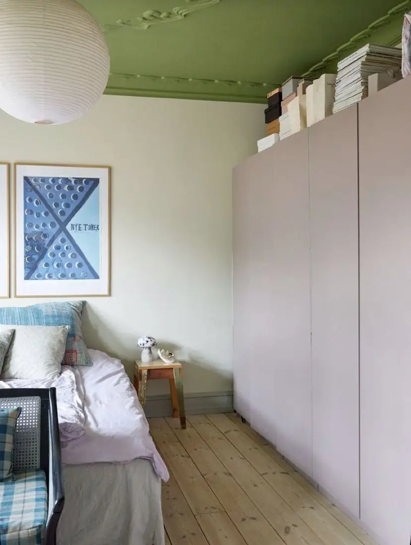
Bedroom
Enjoy the moody and dramatic effect of an all-green bedroom by applying Leapfrog to all walls, including the ceiling. Partly tropical, your sleeping space will feel like a cocoon – comfy and inviting. The deep green shade will deliver a solid sense of safety inside the room. Conversely, think of rich green accents, such as a half-wall painting project or a veggie-painted piece of furniture. Designers also like using colors like this on the ceiling, accompanied by light-colored walls.
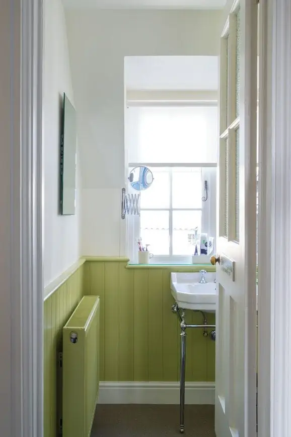
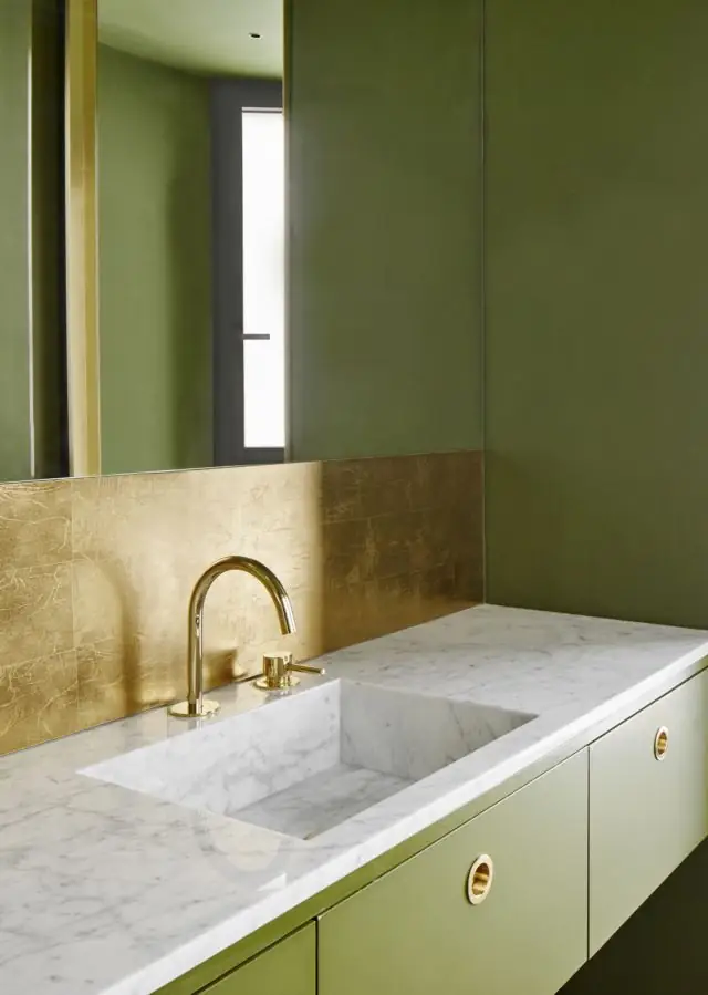
Bathroom
Undoubtedly, green is always welcome in bathrooms. But is Leapfrog, as yellowish as it is, suitable for this space? More than you think. It’s time for a colorful update, and Leapfrog will undeniably bring the awaited change in your bathroom’s style, mood, and taste. Consider the green shade on wall paneling in a traditional bathroom or decorate a modern space with green accents. Wood, marble, and gold are the no-fail accessories for Leapfrog.
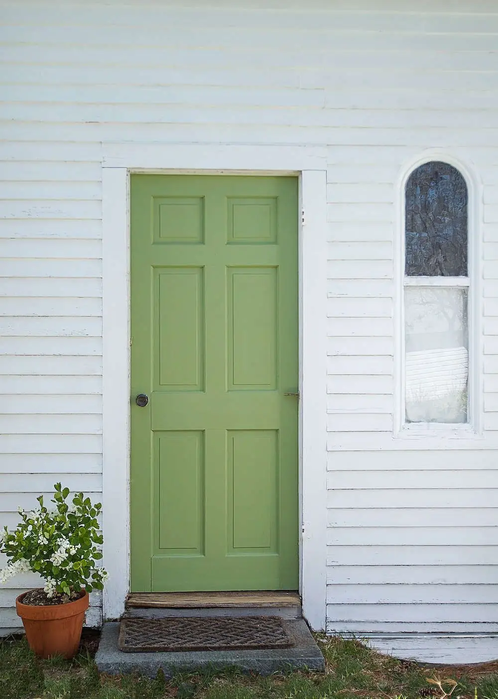
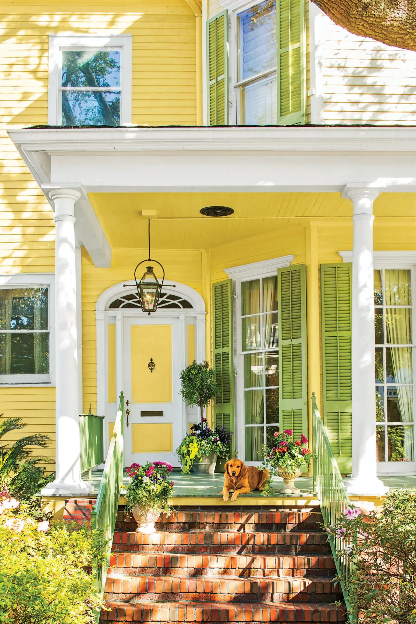
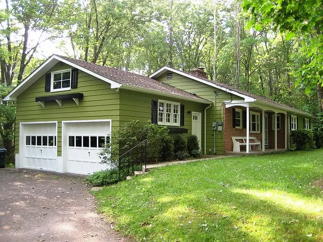
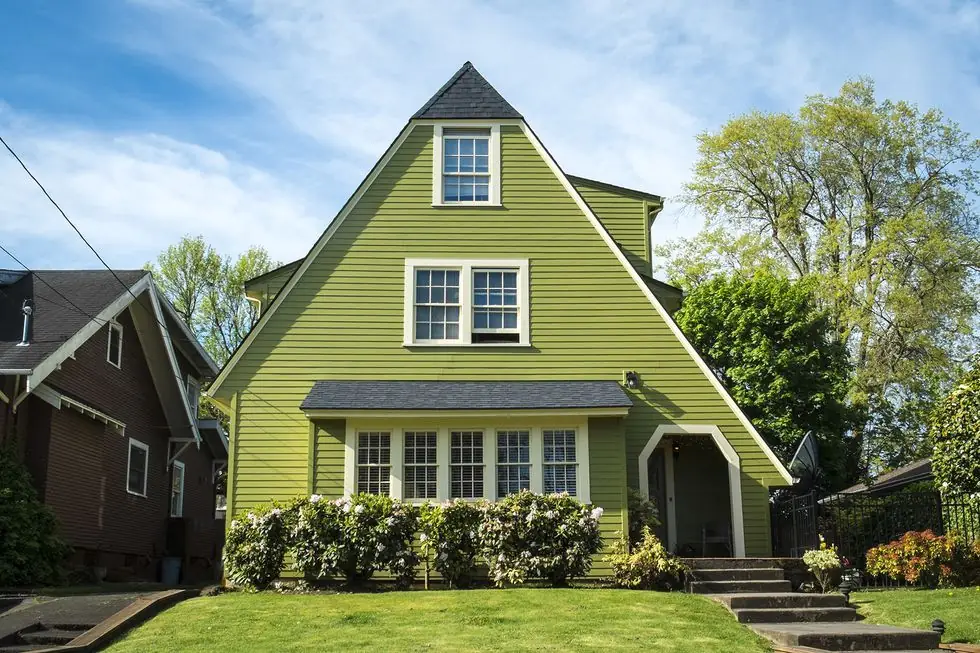
Use of Leapfrog for the House Exterior
Leapfrog is also a great exterior paint color. Its deep and slightly saturated character makes it stand out even when bathed in direct natural light. It is recommended for the exterior house walls, front doors, and shutters. Whether you use it as a primary or accent color is up to you. Yet, the most subtle splash of this green will enhance your house’s curb appeal.
The Leapfrog SW 6431 paint color by Sherwin-Williams catches our attention through its name and shade. A gorgeous, lush green like this is meant for interesting design projects. Opt for a tasteful and positive design concept with Leapfrog!