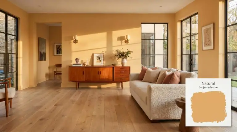
Natural ES-10
Benjamin MooreBenjamin Moore Natural ES-10 is a rich, earthy golden-tan with distinct caramel and subtle terracotta undertones. With an LRV of 45.7, this mid-tone hue provides a warm, sun-baked aesthetic, making it an inviting choice for dining rooms, studies, and cozy living spaces.
Benjamin Moore Natural ES-10: Crafting Sun-Baked Warmth in the Modern Home
Some paint colors sit passively in the background, while others actively heat up the room. Benjamin Moore Natural ES-10 acts as a radiant, architectural material that instantly changes the perceived temperature of your home. This is not a flat, predictable beige that fades into the drywall.
Instead, it is a highly saturated, sun-baked mid-tone that commands intentional styling.
Whether you are layering this golden tan behind a mid-century teak credenza or using it to wrap a dining space in evening warmth, the color demands a thoughtful approach to lighting and material pairings. It thrives on contrast and texture. When applied correctly, Natural ES-10 transforms standard rooms into highly curated, enveloping spaces that feel both historic and remarkably current.
Temperature, Undertones & LRV of Benjamin Moore Natural ES-10
Homeowners constantly ask if this specific shade leans warm or cool on the wall. The answer is an uncompromising, resonant warm. The chromatic profile of Natural ES-10 is built to emulate the feeling of late-afternoon sunlight captured indoors.
To understand how this paint will actually behave in your home, you have to look at its underlying color structure:
With a Light Reflectance Value (LRV) of 45.7, this earthy mid-tone absorbs a moderate amount of light. It possesses enough visual weight to stabilize a room without plunging it into darkness. In bright, open spaces, it reads as a vibrant ochre, while in shadowed corners, it settles into a cozy, muted camel.
You can apply wallpapers, paints, etc. on walls and see how they look in various interiors.

Lighting Effects & The Chameleon Factor
Because of its complex undertones, this color reacts dramatically to the shifting angle of the sun and the specific bulbs in your fixtures. You must anticipate how the light will pull different pigments forward throughout the day.
Here is exactly how the color shifts under different lighting conditions:
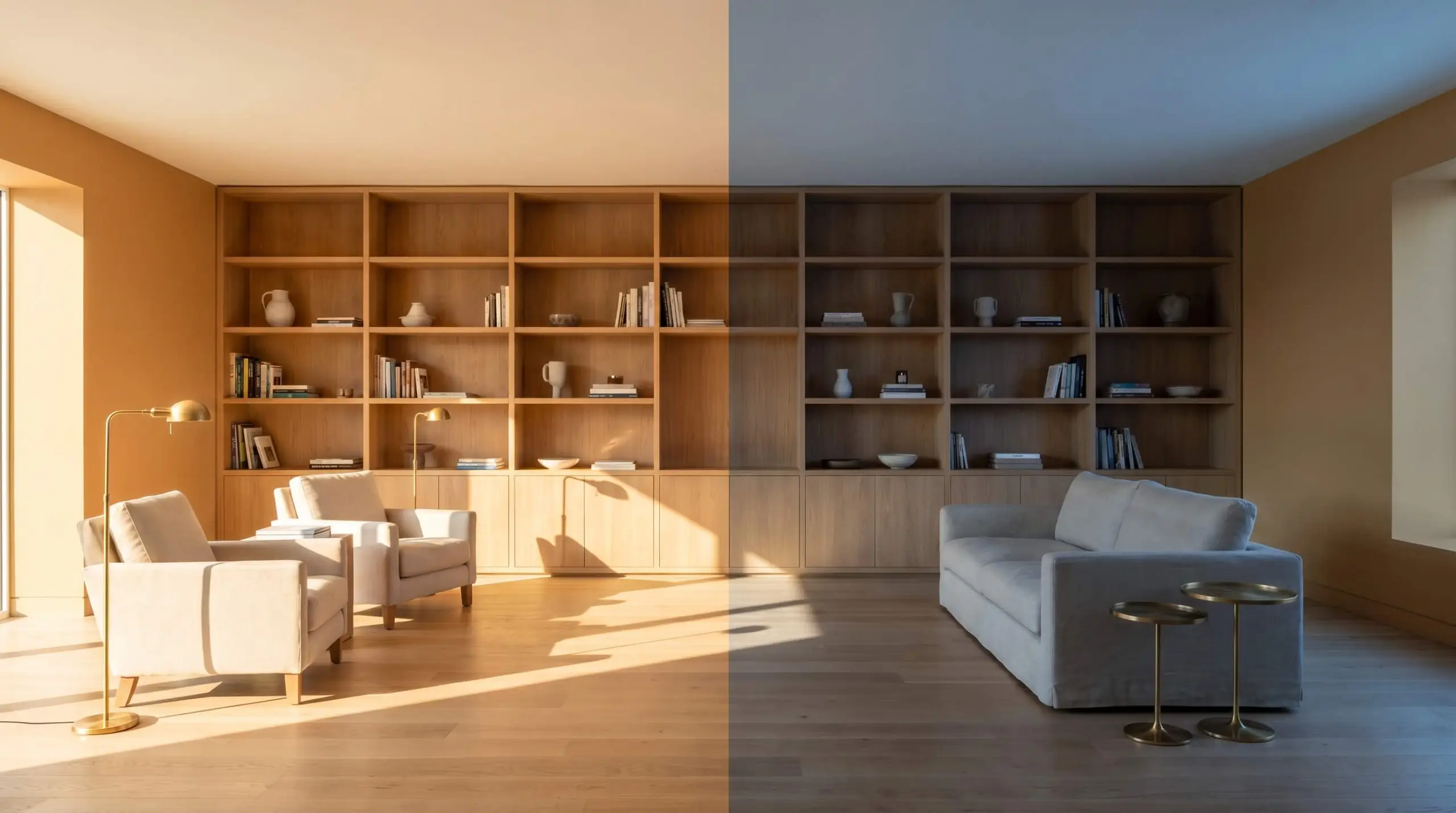
If your room feels too harsh or the paint looks like a muddy brown in the evening, check your lightbulbs immediately. Swap any daylight LEDs for soft white bulbs (around 2700K to 3000K) to instantly revive the paint’s rich caramel notes.
Hackrea Pro-Tip (The Bulb Washout)
Architectural Applications for this Sun-Baked Ochre
Understanding the literal color data is only the first step; the magic happens when you apply that visual weight to a physical room. Because this shade shifts so fluidly between ochre and camel, it adapts beautifully to a wide variety of architectural features and functional spaces.
Formal Dining Rooms
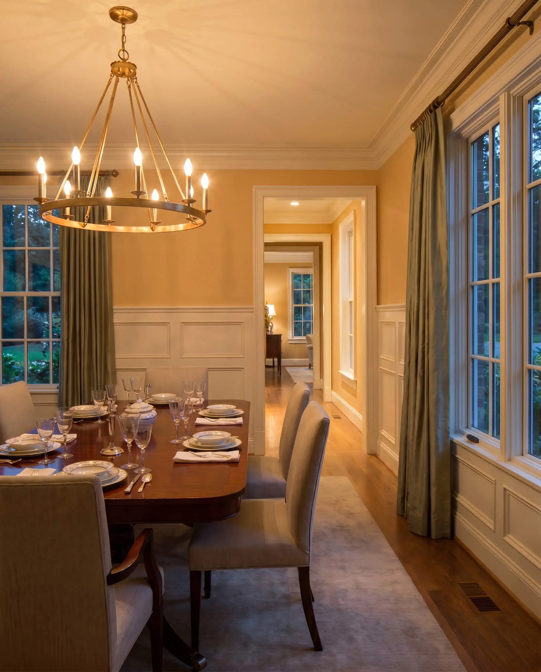
To avoid the predictable, stuffy traditionalism often associated with yellow-based dining rooms, treat the walls as a textural canvas. Apply this golden shade above classic wainscoting painted in a chalky, soft white to keep the room feeling expansive and fresh.
Focus heavily on your evening lighting strategy. Because formal dining often happens after dark, you want to capitalize on the paint’s amber radiance. Install an unlacquered brass chandelier with warm 2700K bulbs to make the walls glow, and frame the windows with raw silk drapery in a muted loden green. The contrast between the sun-baked walls and the cool, rich green textiles creates a highly curated, premium aesthetic.
Home Offices and Studies
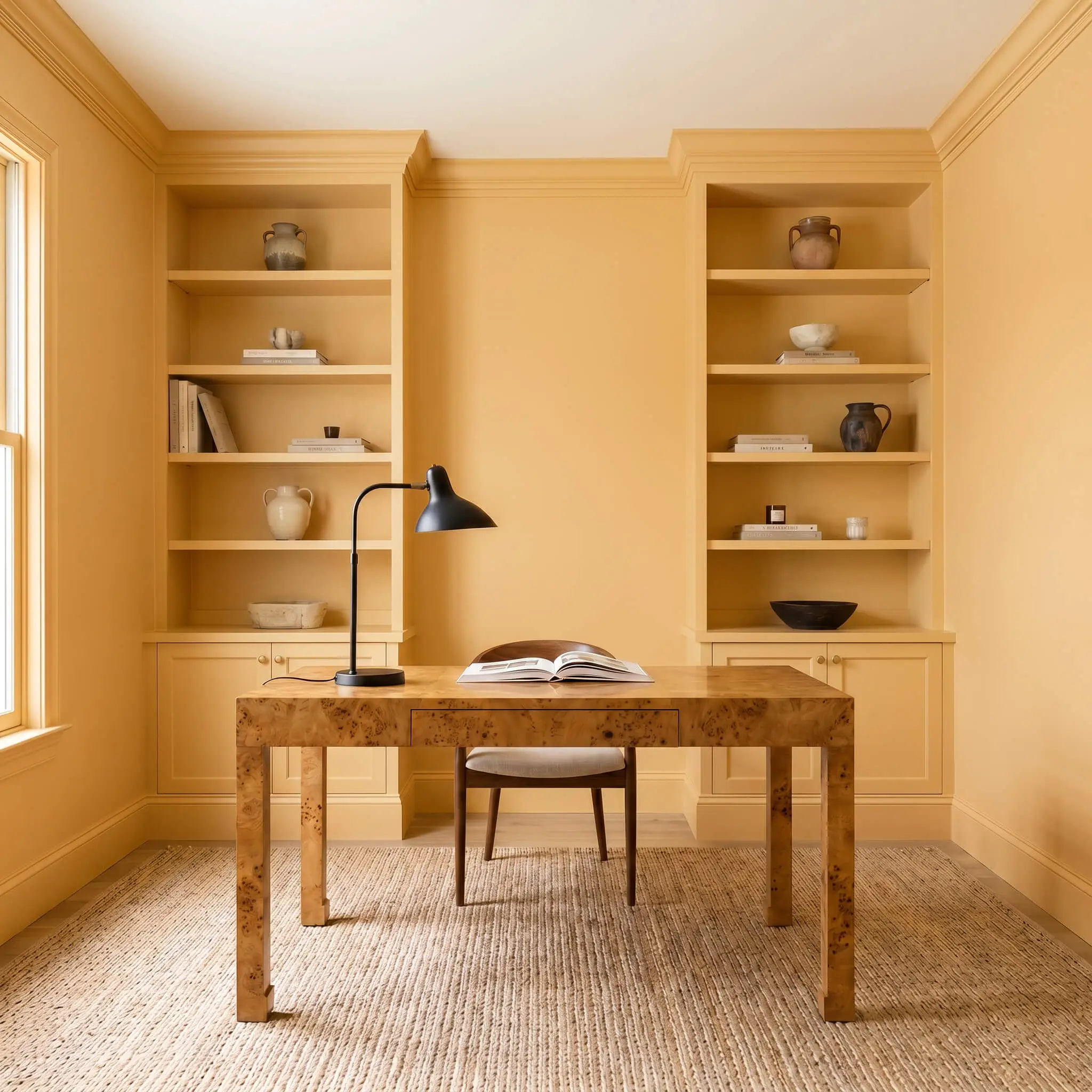
Step away from the standard dark mahogany library stereotype and use this color to build a vibrant, energetic workspace for a creative freelancer. Color-drenching the entire room—including the baseboards, crown molding, and built-in bookcases—wraps the space in a cohesive, distraction-free warmth.
When the walls are entirely saturated, you need to introduce natural, organic textures to break up the visual field. Center the room with a vintage burl wood desk and use a sleek, matte black iron task lamp for a sharp, modern contrast.
If you are painting your built-ins this saturated mid-tone, do not over-stuff the shelves. Leave plenty of negative space and display structural items like vintage ceramics or linen coffee table books to let the caramel backdrop breathe.
Hackrea Design Secret (The Bookshelf Backdrop)
Kitchen Cabinetry
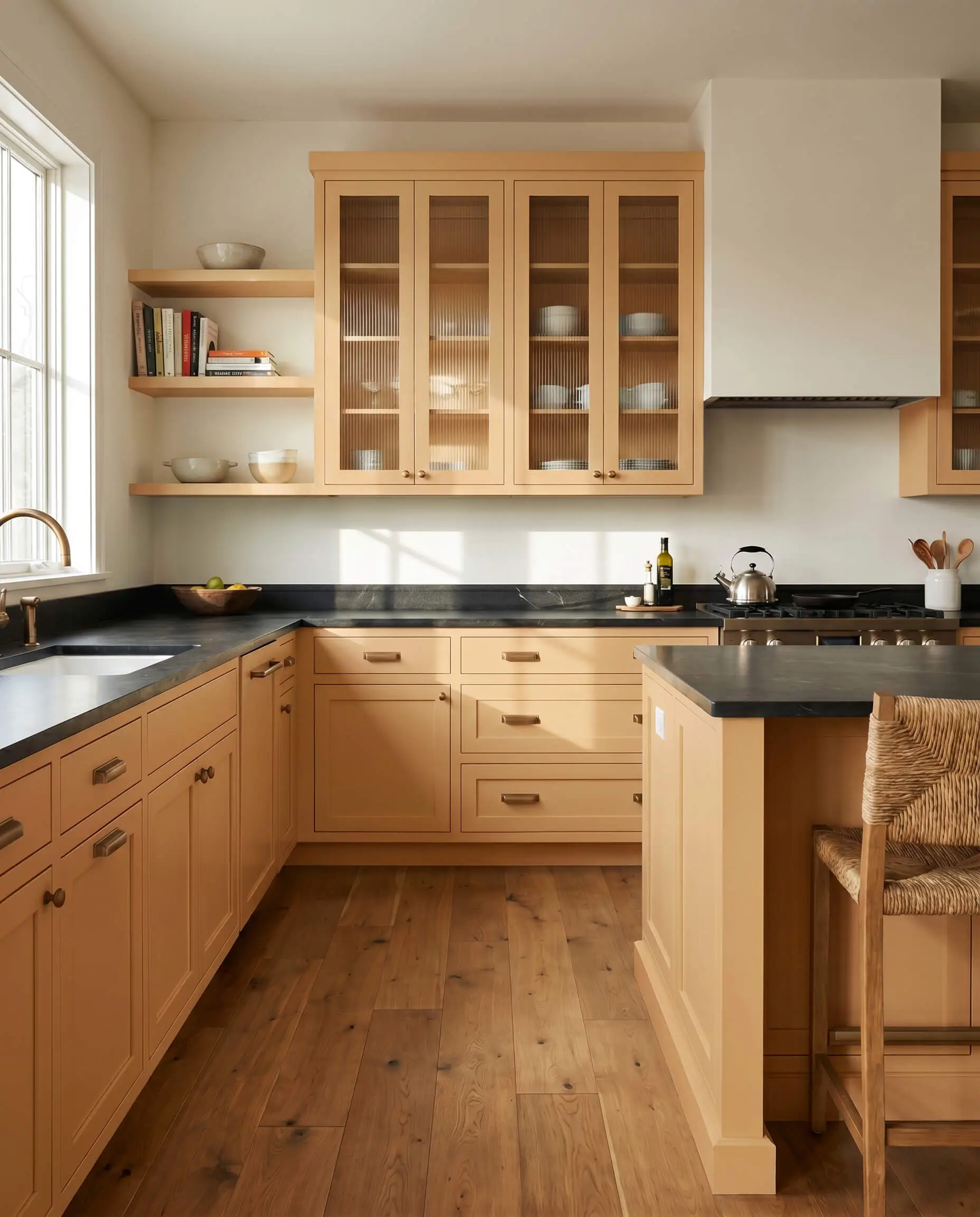
Applying this shade to lower kitchen cabinets or a central island is a brilliant way to inject soul into an otherwise sterile, all-white kitchen. It immediately establishes a welcoming, lived-in energy without requiring a massive architectural renovation.
To keep the kitchen feeling modern rather than adopting a clichéd farmhouse look, pair the painted cabinetry with honed black soapstone countertops. Swap out standard upper cabinets for reeded glass fronts to reflect light around the room. Finish the look with brushed bronze hardware, which naturally complements the terracotta micro-nuance hidden in the paint.
Sunrooms and Conservatories
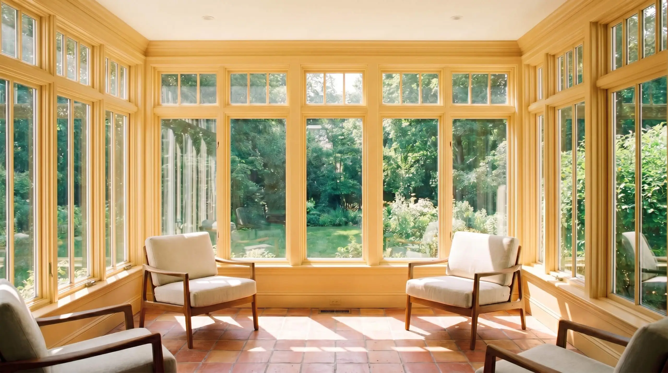
In a room flooded with direct, south-facing light, this paint will hit its maximum vibrancy, radiating a stunning terracotta-gold. Use it on the window sashes and trim to frame the view of the outdoors, turning the architecture itself into a glowing border.
Ground the intense sunlight with earthy, tactile materials across the floor plan. Lay down reclaimed terracotta tiles and furnish the space with mid-century teak chairs topped with performance linen slipcovers. The combination of the radiant trim and the relaxed, durable textiles creates a sophisticated indoor-outdoor transition.
Cozy Living Rooms
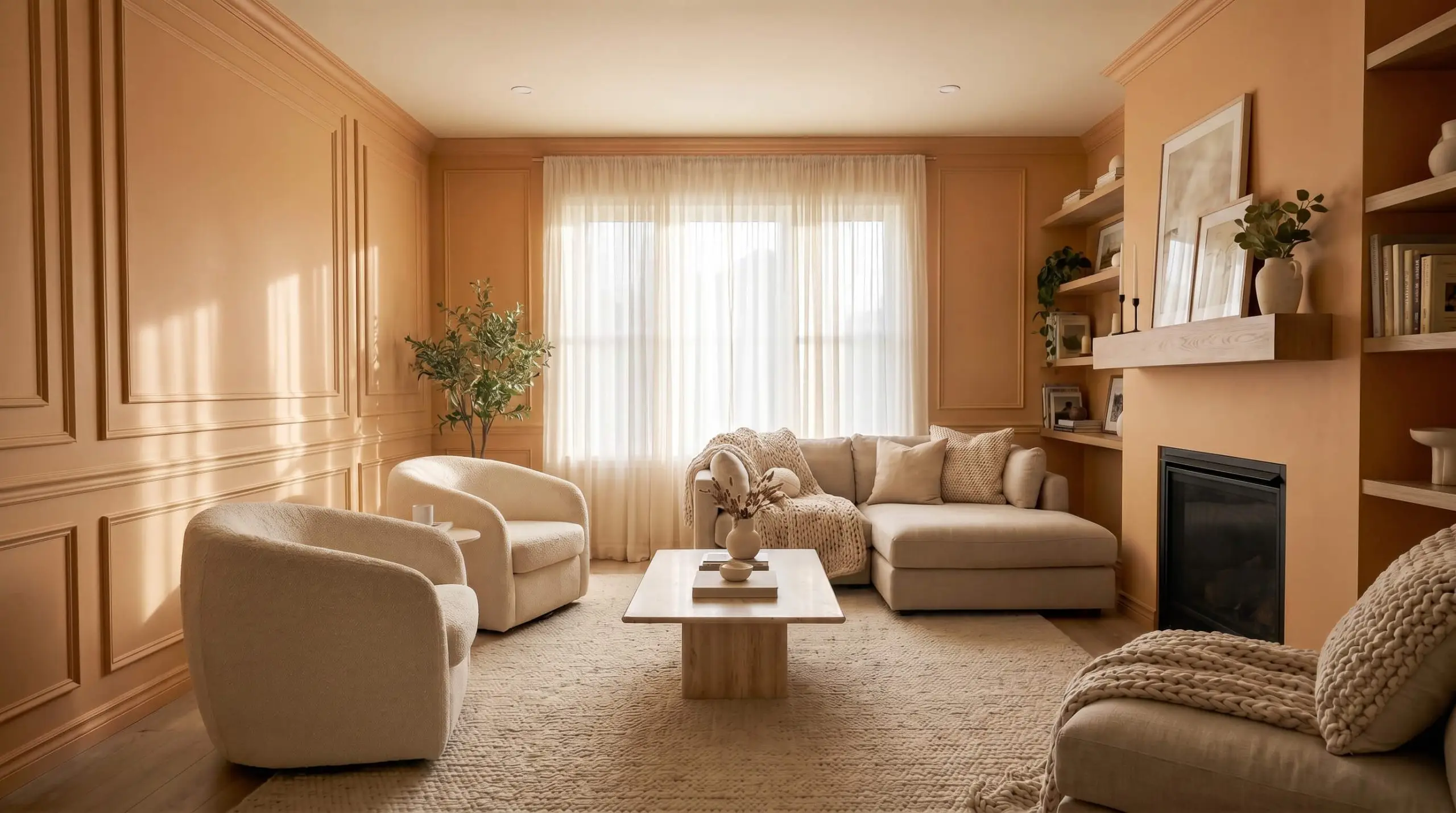
In a living space that receives cooler, north-facing light, the paint will pull back from its golden intensity and read as a stabilized, muted camel. This creates an incredibly inviting, relaxed environment perfect for a busy modern family.
Enhance the room’s architecture by applying the color to applied picture molding, giving the walls subtle depth and shadow play. Furnish the room with a mix of highly tactile, contemporary pieces—think a pair of ivory boucle barrel chairs and a smooth, honed travertine coffee table.
Relational Color Theory: Pairing Benjamin Moore Natural ES-10
Because this specific pigment carries such intense visual heat, it requires deliberate material boundaries to keep it from overwhelming the architecture. It thrives when pushed against crisp, stabilizing neutrals or deeply saturated, opposing hues that absorb its radiant energy.
Architectural Boundaries and Trim
Hardware, Wood & Material Pairings
Curated Palette Combinations
Designer Mood Boards
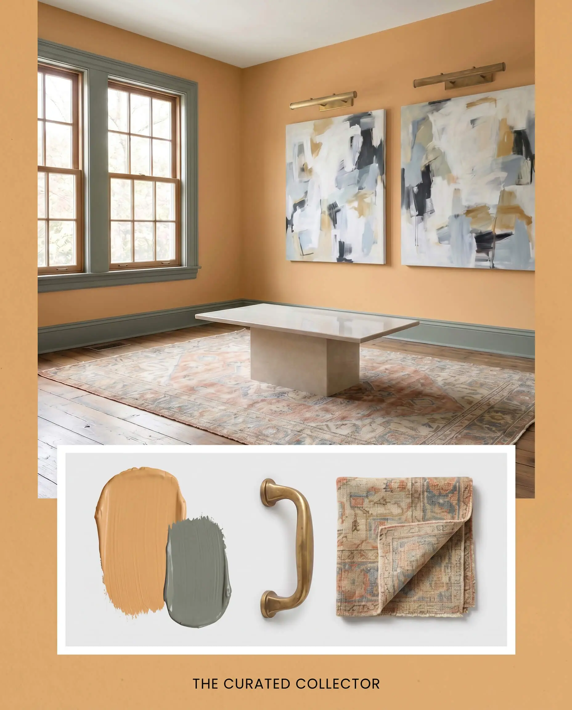
The Curated Collector This palette relies on the tension between historic warmth and sharp modern lines. Wrap the space in this golden tan, then frame the windows with Farrow & Ball Green Smoke 47 on the trim for a striking, saturated boundary. Anchor the floor plan with a faded Oushak rug and introduce a sleek modern plinth table to shatter any overly traditional expectations. Finish the space with unlacquered brass picture lights to highlight abstract canvas art, creating a brilliant interplay of old and new.
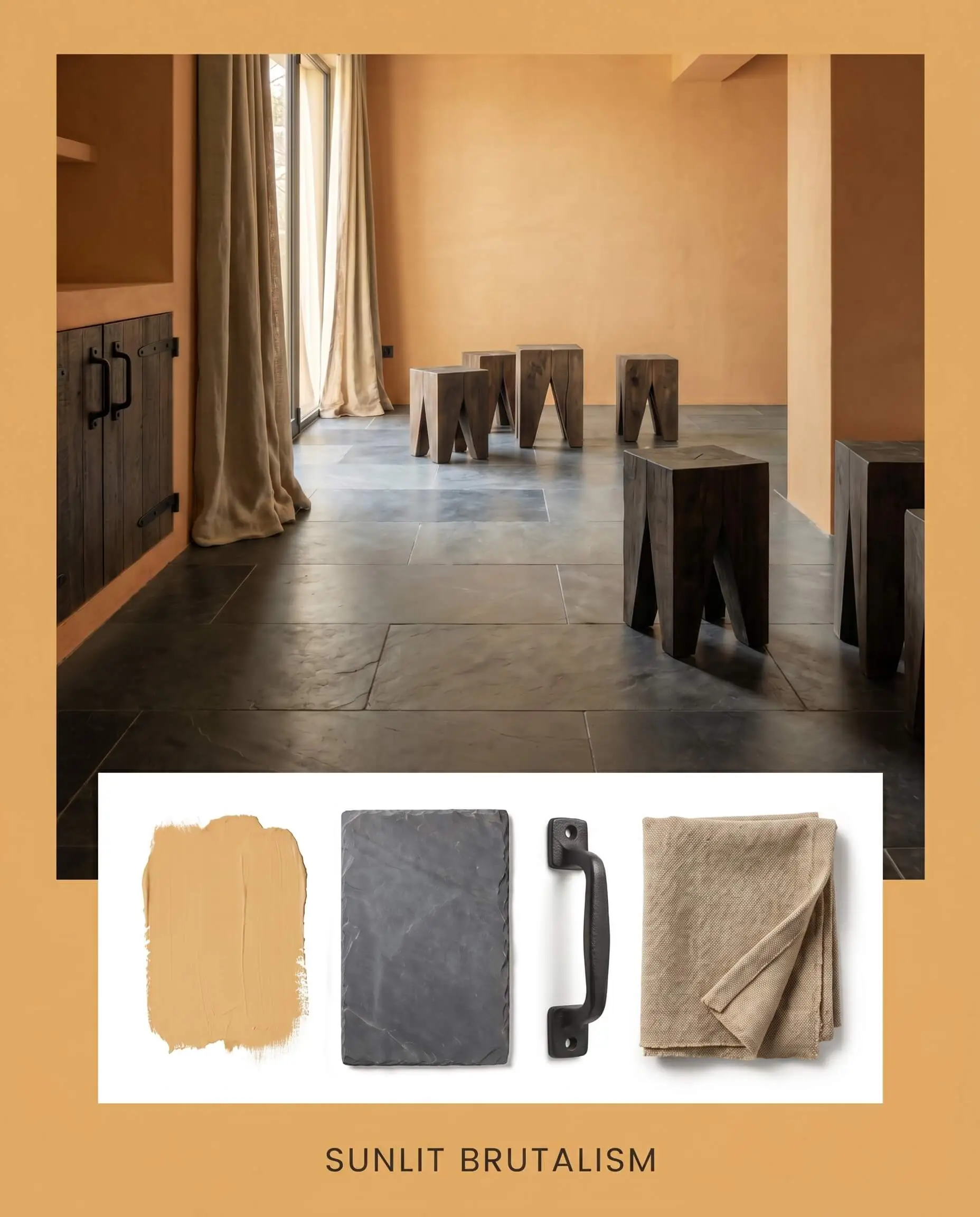
Sunlit Brutalism Here, the radiant warmth of the paint softens the hard edges of industrial, highly tactile materials. Pair the sun-baked walls with expansive floors of honed slate and accent the space with brutalist wooden stools. Incorporate matte black iron hardware to establish crisp visual borders throughout the room. Layer in heavy canvas drapery to absorb sound and light, resulting in a grounded, earthy retreat that feels intentionally raw.
Head-to-Head: Benjamin Moore Natural vs. Industry Rivals
If your room lacks natural light or features specific architectural finishes, you might find that this particular golden tan loses its depth. In these specific scenarios, shifting to a rival shade with a slightly different LRV or undertone profile is the smartest path forward.
Benjamin Moore Natural ES-10 vs. Sherwin-Williams Bakelite Gold SW 6368
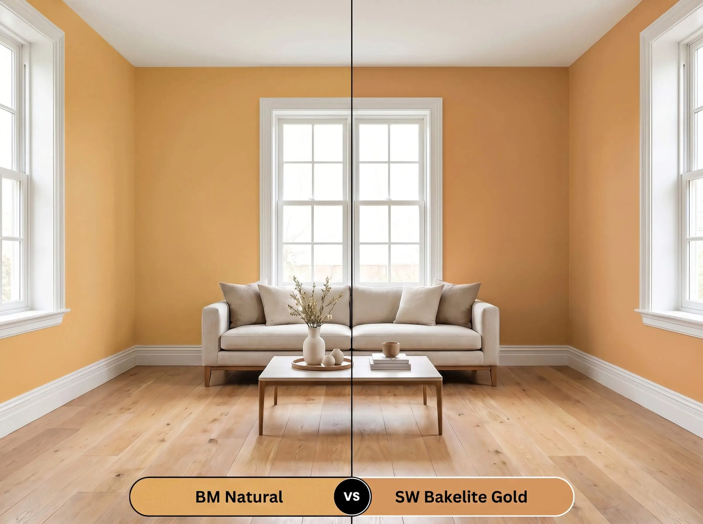
If you are designing a space with intense southern exposure, Bakelite Gold pushes much further into a literal, vibrant yellow. Choose Benjamin Moore’s version if you want the color to remain grounded in earthy caramel. Switch to Sherwin-Williams if you need a louder, unabashedly retro energy.
Benjamin Moore Natural ES-10 vs. Farrow & Ball India Yellow 66
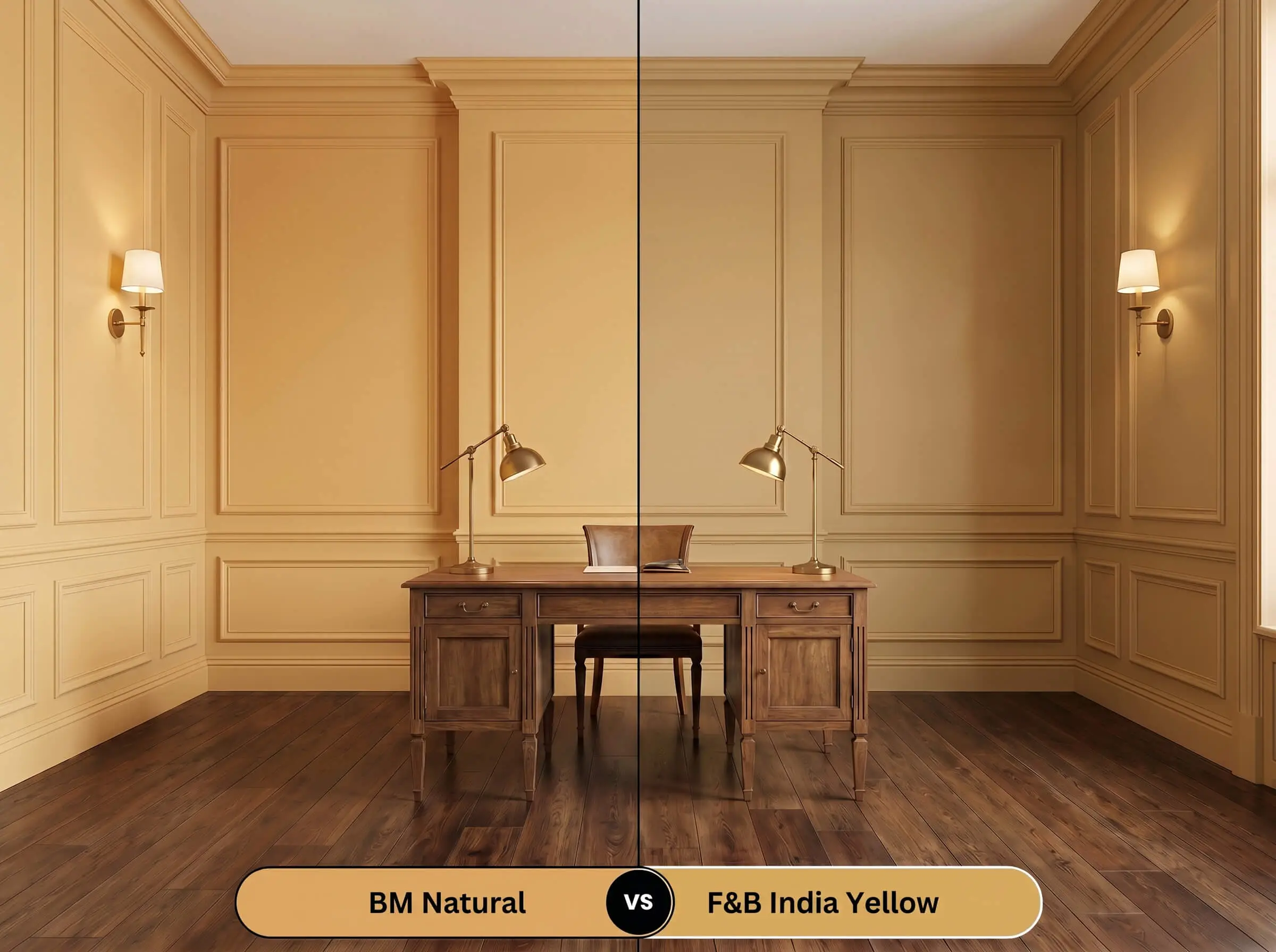
India Yellow carries a significantly darker, moodier mustard undertone that thrives in historic homes with minimal lighting. If your room feels too bright and washes out standard mid-tones, the Farrow & Ball option provides a denser, more historic shadow. Stick with Natural ES-10 for a brighter, more uplifting daytime glow.
Benjamin Moore Natural ES-10 vs. Benjamin Moore Chestertown Buff HC-9
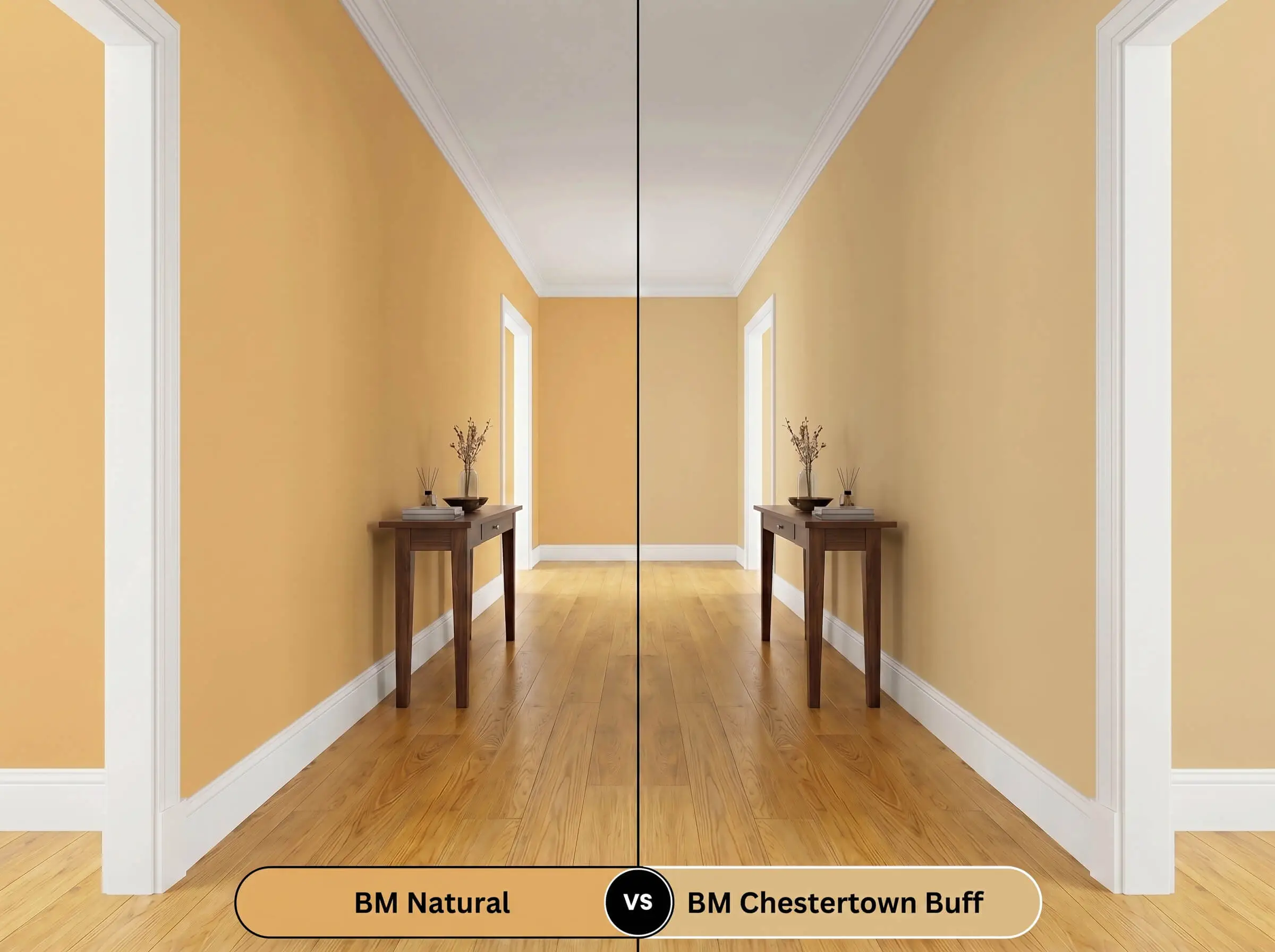
Chestertown Buff strips away the terracotta micro-nuance, presenting as a much cleaner, straightforward wheat color. Opt for Chestertown Buff if your flooring has strong yellow-oak tones, as it will harmonize better without introducing conflicting red notes.
Exploring Alternatives to This Sun-Baked Mid-Tone
Sometimes a room demands just a subtle shift in light reflectance or a slight reduction in warmth to perfectly match your existing furniture.
Same-Brand Variations
Cross-Brand Color Matches
Technical Execution: Painting with Natural ES-10
Moving from color swatches to actual application requires an understanding of how this specific pigment behaves on the roller.
- Flat/Matte (Walls): The absolute best choice for this saturated hue, as it absorbs light and creates a soft, velvet-like finish that hides drywall imperfections.
- Eggshell (High-Traffic Walls): Offers a slight, wipeable glow that will marginally increase the perceived vibrancy of the caramel undertones.
- Satin/Semi-Gloss (Trim & Cabinetry): Essential for millwork, as the higher sheen creates a hard, reflective boundary that makes the golden color pop.
Because yellow-based pigments are notoriously sheer, you must use a high-quality, tinted primer (ideally a light gray) to prevent the underlying drywall color from muddying the final finish.
Expect to roll a minimum of two full coats, cutting in carefully to avoid “flashing” where the brush strokes overlap the roller marks. Maintain a wet edge at all times, as this specific mid-tone will aggressively highlight dry roller stops if you pause halfway down a wall.
When applying highly saturated earthy tones like this, use a 3/8-inch microfiber roller cover. This specific nap thickness holds enough paint to ensure opaque coverage without leaving behind the stippled, orange-peel texture that ruins a premium finish.
Hackrea Pro-Tip (The Roller Nap Rule)
Frequently Asked Questions
Because of its moderate LRV, this color thrives on heavily textured plaster, creating beautiful, dynamic shadow play that a smooth drywall surface simply cannot replicate.
It performs beautifully on exteriors, but the intense natural sunlight will wash out the subtle caramel notes, making it read as a much brighter, faded ochre rather than a dull brown.
Without natural light to activate the golden hues, this shade provides a deeply enveloping, stabilizing warmth that prevents closed-off corridors from feeling sterile or clinical.
The terracotta micro-nuance in this paint actually harmonizes with the red undertones in cherry or mahogany, creating a rich, tonal aesthetic rather than a jarring clash.
Final Verdict: Is Benjamin Moore Natural Right for You?
Benjamin Moore Natural ES-10 is a highly intentional, radiant architectural finish designed for homeowners who want to actively warm up their spaces. It excels in rooms that receive shifting natural light, transforming from a vibrant ochre in the afternoon to a moody, enveloping camel at night. This paint is the perfect foundational layer for organic modern living rooms, creative studios, or highly textured conservatories where tactile materials can truly shine.
However, do not use this paint if your home is dominated by cool, gray-washed luxury vinyl plank flooring or icy, blue-toned marble countertops. The inherent red-orange warmth of this golden tan will fight against those cool, artificial gray tones, resulting in a room that feels visually confused and disjointed. If your fixed materials lean heavily into the cool spectrum, this radiant mid-tone will simply highlight their starkness, making the entire space feel unresolved.