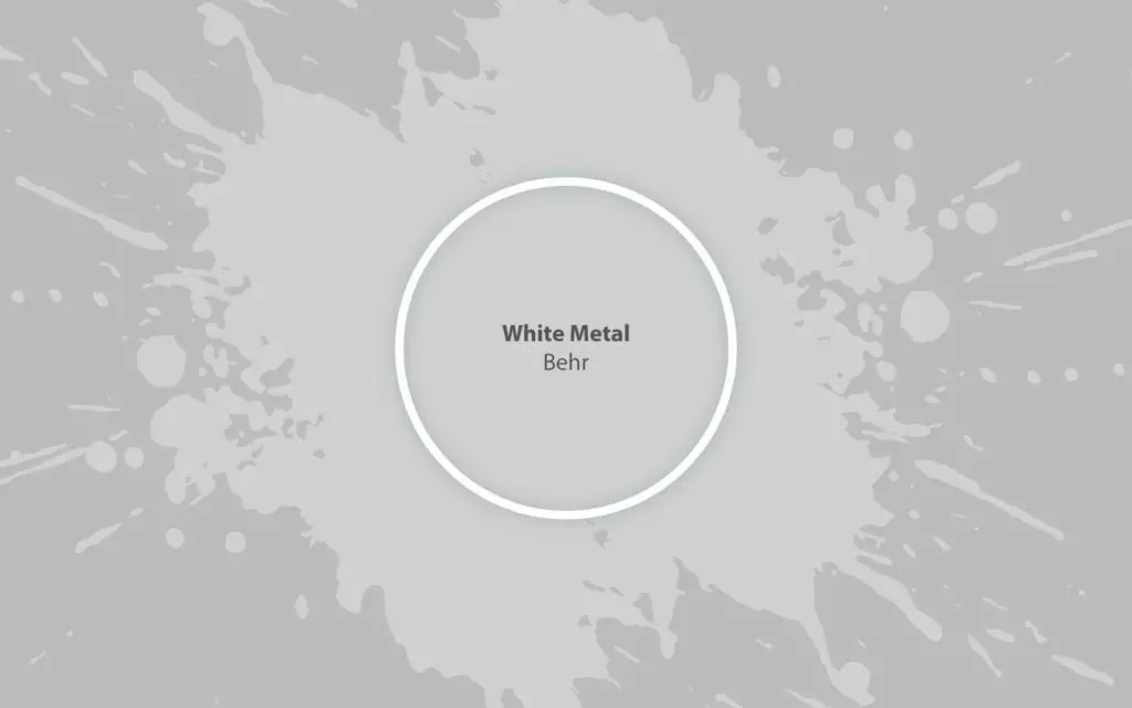
White Metal N520-1
BehrA light gray, reflecting a metallic appearance as the name implies. At one glance - crispy, at another - soft.
Paint Technical Profile
| Color ID / SKU | N520-1 |
| HEX Code | #d1d1cf |
| Light Reflectance (LRV) | 63 |
| Use | Interior, Exterior |
White Metal (Behr N520-1): what color is, review, and use
Are you ready for a splash of silverish vibrancy? White Metal from Behr at your disposal! The popular paint color is a light gray, reflecting a metallic appearance as the name implies. Why white? N520-1 is pretty light. Add to the mentioned features a slight lavender hint, and you achieve the go-to gray that colorists from Behr successfully managed to come up with. Unlike the usual grays, devoid of undertones, this one brings a refined sense of depth, although being a light paint color, all due to the lavender notes. Still, there is more to this shade than just being part of the gray family. Let’s dive deep into its essence!
White Metal paint color features
Looking at White Metal, one may wonder: is it gray or lavender? Indeed, the lavender notes are extremely noticeable. Still, this hue stays true to its gray nature. At one glance – crispy, at another – soft. The thing is that scents from both extremities meet to create this fascinating color. Besides neutralizing the space, it offers a unique feeling of individuality. At the end of the day, both gray and lavender are exceptional shades. Just imagine their collaboration!
White Metal: is it warm or cold?
White Metal is definitely a cool color. We cannot call it cold, but even the soft notes cannot deny its crispy effect. One can firstly notice this feature on the sample while it stays the same when the paint color is applied to the interior and exterior. Moreover, it is a pleasing kind of cool that refreshes, invigorates, and inspires.
How does lighting affect White Metal?
Let’s view this aspect from all perspectives! White Metal feels rather muted in north-facing spaces, penetrated by intense gray and lavender notes. On the other side, in a room with south-facing windows, it seems a pleasant light gray not devoid of its true companions – lavender particles. When it comes to east and west-facing rooms, it depends on how the sunlight penetrates the space, with an effect peculiar to south-facing rooms in the morning and at sunset, while a balance between those two reveals during the day. Regarding artificial lighting, everything is clear as day – the warmer its undertones, the warmer appears the color and the opposite.
White Metal LRV
For a start, it is worth mentioning that LRV stands for Light Reflectance Value, which determines how light or dark a color is on a scale from 0 to 100, where the latter reflects true white shades. The LRV of White Metal is 63, meaning it is a mid-tone shade, gravitating towards the light side. What does it mean in terms of light reflection? N520-1 can reflect a considerable amount of light. To be precise – lavender light since this undertone simply feels like flying in the air. Furthermore, this paint color can make the room seem surprisingly more spacious, which is impressive for its LRV.
White Metal undertones
Isn’t it clear yet? White Metal is full of lavender notes. This undertone is so visible that you can even feel the lavender scent in a space painted this way. It should be noted that the perceived undertone is relatively soft, which cancels any probability of calling this color cold; nothing but a light gray with a crispy appearance and slightly soft lavender notes.
Similar colors
As usual, this shade, part of the gray family, impresses with its range of similarities both at Behr and other color brands. The exciting part is that they are not devoid of the lavender scent, preserving a balance of softness and coolness, although each comes with something new. Let’s discover some alternatives!
Coordinating colors
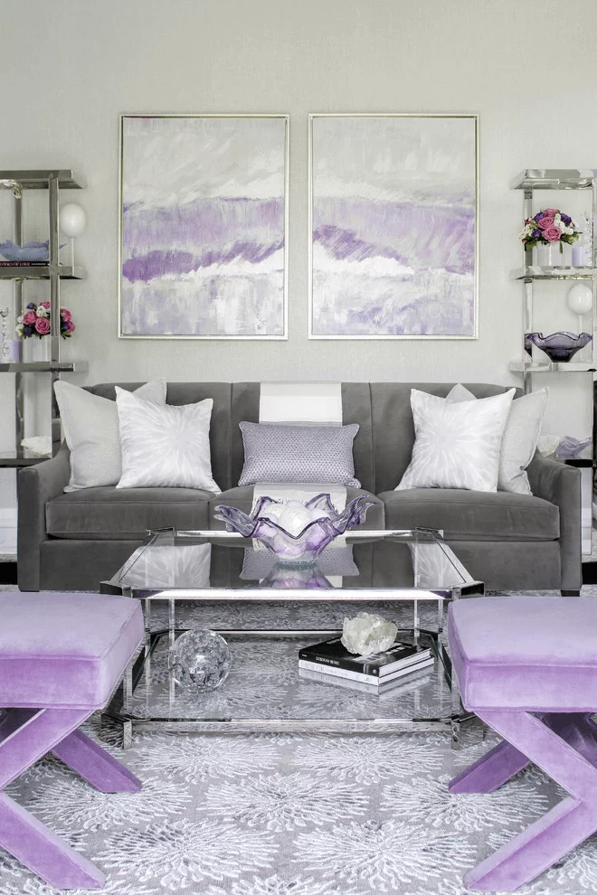
It seems that a gray shade would work with any other color. Still, this one is unique, or, let’s say, its undertones are unusual. The lavender scents change the scenario and make White Metal a perfect companion for other soothing shades of gray and purple without skipping a crispy white, which would perfectly go for the trim. Even a few darker accents can be considered, while the gray shade is no less collaborative when it comes to vibrant variations. The range is still vast. Let’s go through a few examples!
Use of White Metal in interior
As with any other gray shade, this one works perfectly for almost any style and space, adding a refined lavender scent for a bit of individuality. A refreshing modern living room, a calming farmhouse bedroom, an elegant traditional kitchen? The silverish gray from Behr works for each case, bringing something new, unprecedented, original. Let’s go through a few design solutions implying this new gray variation!
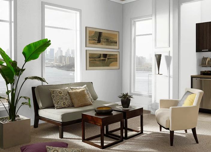
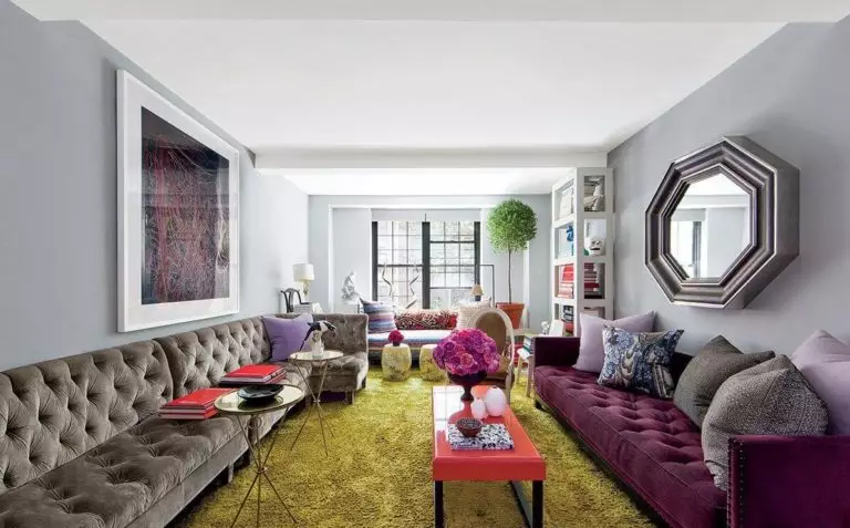
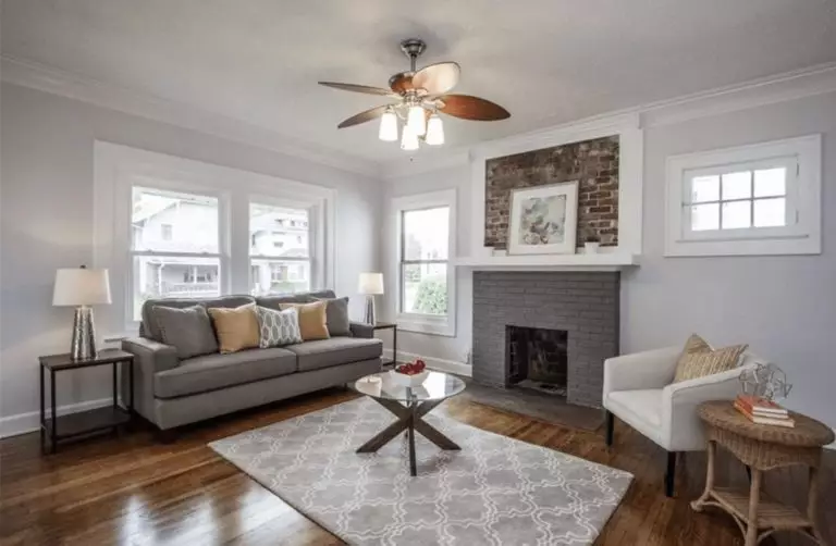
Living room
White Metal goes without any doubt for the walls. You are free to play with texture and colors as regards the rest. With prevailing splashes of white for the trim and furniture, opt for a Neoclassical interior, where the common true gray is replaced with a lavender-scented one. This silverish gray works no less impressively with dark brown furniture for a formal Classical space. Even the brightest ArtDeco splashes of color will sparkle on such a background that is not neutral but rather goes hand in hand with the most unusual accents.
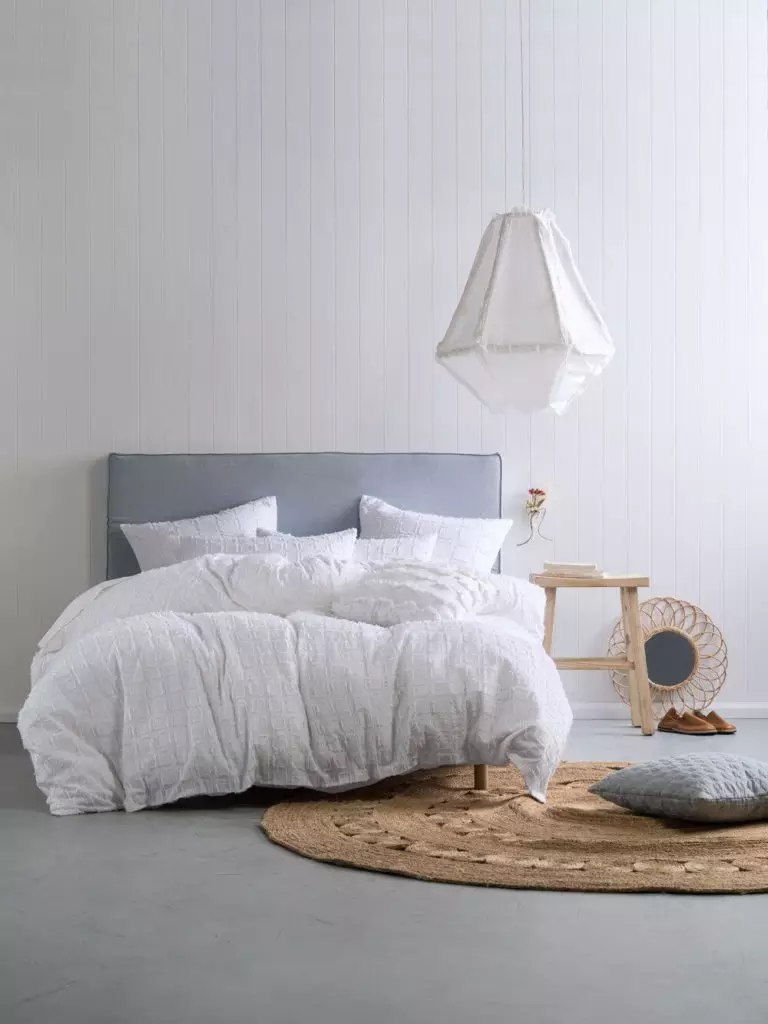
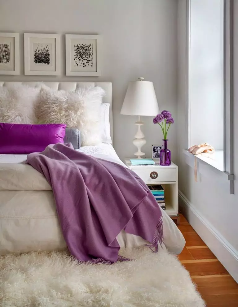
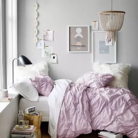
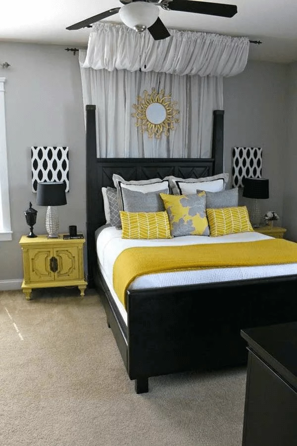
Bedroom
Designers suggest going with a combination of lavender gray and white for a serene bedroom. Consider White Metal for the walls and white for the furniture and bedding. Wood is also welcome, where light wood goes for modern interiors and dark wood for traditional approaches. Don’t hesitate to add a few accents if a few bright splashes feel close to your taste, particularly for the bedding. The lavender scents will offer this space a pleasing-to-the-eye background that fills the room with a calming environment. A good night’s sleep in such an interior will feel like sleeping in a lavender field.
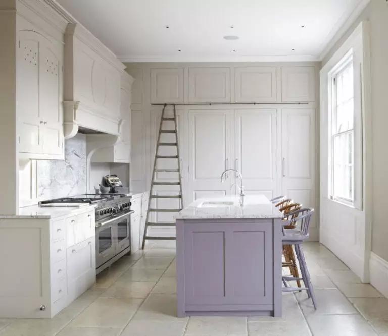
Kitchen and dining room
You can apply White Metal to the walls or cabinets in the kitchen, considering white as its companion for a light interior that reflects cleanliness not devoid of personality. The most modern or traditional kitchen would benefit from such an approach since the lavender gray adapts to any case in part.
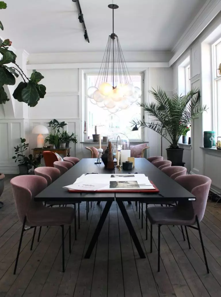
The range of possibilities is no less wide in the dining area. Consider White Metal for the walls and pair it with any texture and colors that feel close to your sense of beauty. We suggest going fully contemporary with a black table and upholstered chairs, accompanied by a gorgeous chandelier of bulbs that combines Industrial with Art Deco. On the other hand, the amateurs of Natural can opt for a Rustic approach with wood furniture that will reveal its texture on the gray background to the fullest.
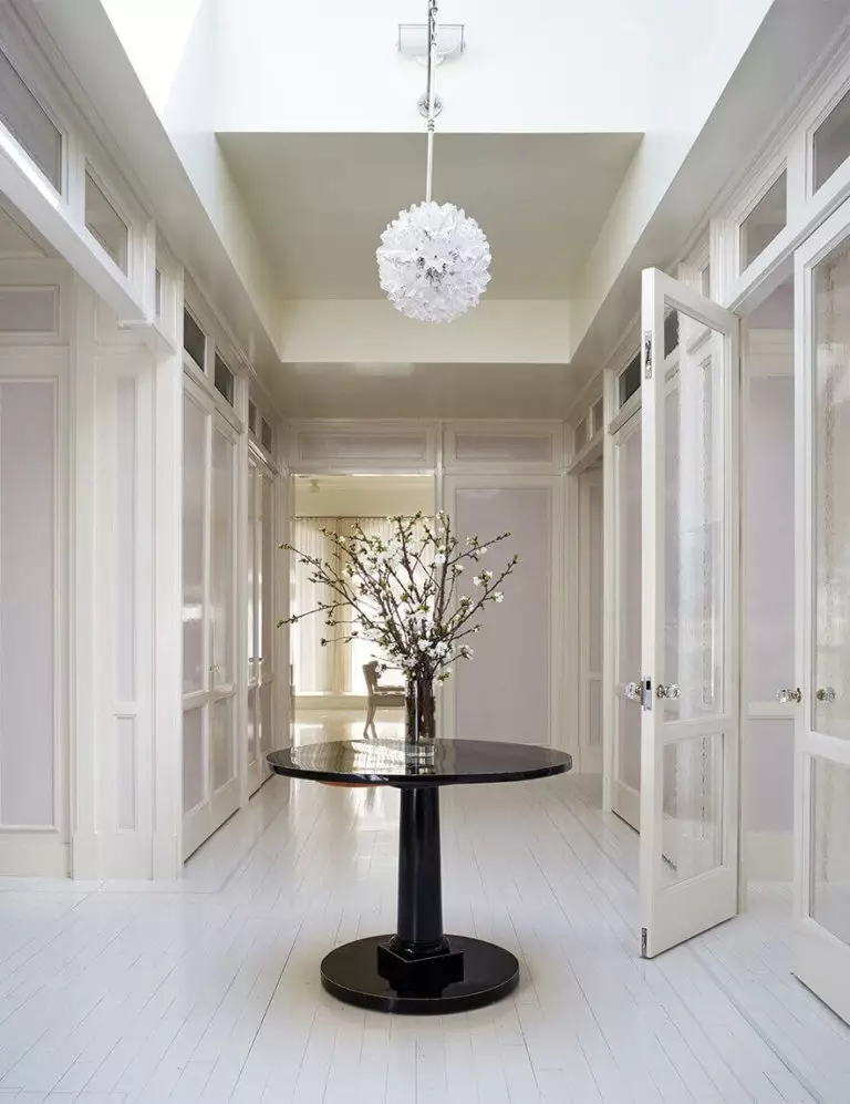
Hallway
For the lovers of neutrals who fancy a bit of originality, even within the hallway, we strongly suggest considering the silverish gray from Behr. Besides serving as a perfect background for any kind of furniture, it is an ideal color to go with even without any companions. The lavender scents will fill the space with a familiar sense of comfort you want to return to as fast as possible.
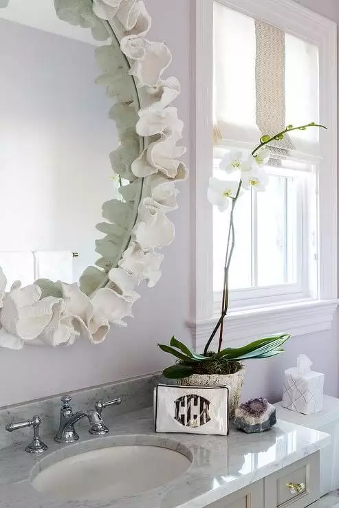
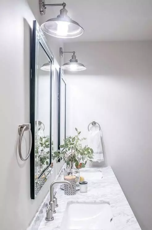
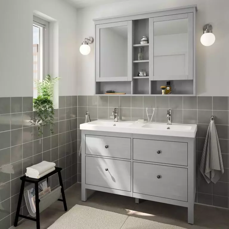
Bathroom
White Metal for the walls and white for the cabinets as a start. Go on with a marble countertop for an elegant touch, considering silverish steel hardware to resonate with the undertones of the background. At the same time, you can safely opt for a more intense lavender shade for the cabinets and display them exquisitely on the lavender gray backdrop. Functional, stylish, and most important – original.
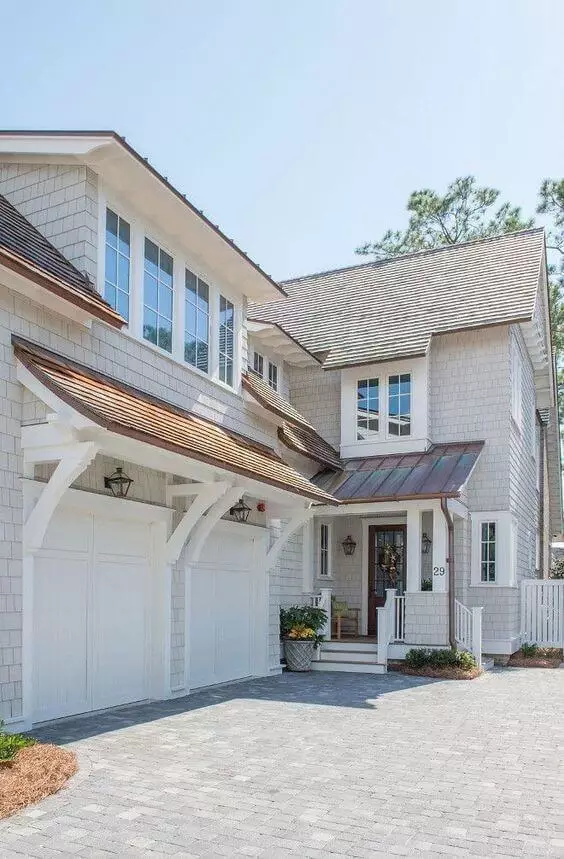
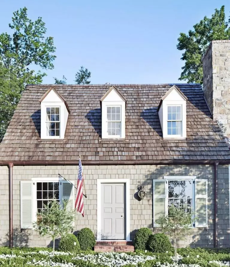
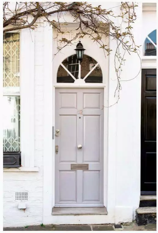
Use of White Metal for house exterior
One should note that White Metal looks lighter when applied to the exterior. Still, it does not lose the fabulous undertones that make it stand out. N520-1 is a perfect neutral for the house walls that blooms in a whole new way when combined with a brown roof and the beloved companion – white for the trim. This paint color looks no less stylish on the front door, considering a light background so that the silverish sparkles can reveal themselves at their finest.
The White Metal N520-1 paint color from Behr is what we call a contemporary gray variation. It seems neutral, although there is more to it that makes this paint color stand out and enrich any style with a refined sense of elegance. Perfect as a background, suitable for any design approach, and full of individuality. Is there any better description of an ideal gray shade?
Closest Cross-Brand Equivalents
The absolute closest scientific color matches for White Metal across top paint brands.