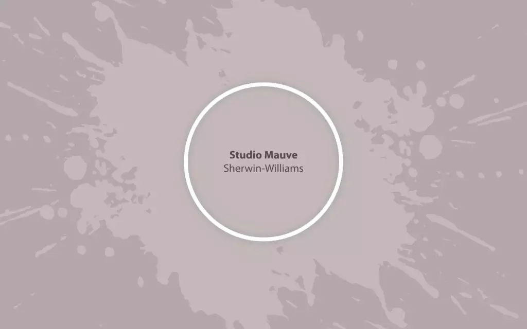
Studio Mauve SW 0062
Sherwin-WilliamsA reviving grayish purple with a rich history enetering the new-era color trends with more creativity, stimulation, and hope for contemporary design.
Paint Technical Profile
| Color ID / SKU | SW 0062 |
| HEX Code | #c6b9b8 |
| Light Reflectance (LRV) | 50 |
| Use | Interior, Exterior |
Studio Mauve (SW 0062): What Color Is, Review, and Use
With the current rise of purples, we are happy to announce the return of one of the colors that changed the fashion and design world centuries ago. Mauve is the new designers’ choice, and Sherwin-Williams’ colorists didn’t disappoint us with their expert pick – Studio Mauve. The SW 0062 paint color is a pale purple, starring in such color collections as Lore (Colormix Forecast 2023), Historic Interior Color Wall, Living Well, and The Jazz Age (1920s).
Studio Mauve Paint Color Features
In the renowned novel The Picture of Dorian Gray by Oscar Wilde, the author says: “Never trust a woman who wears mauve. It always means that they have a history.” Mauve has indeed been a very influential color over the years. With the well-defined name Studio Mauve, the mauve shade from SW is a mid-tone washed-out purple; we would even regard it as pastel. It celebrates the past and the contemporary passion for creativity. Psychologists associate purity, femininity, and renewal with this delightful purple tone.
Studio Mauve: Is It Warm or Cold?
The spring-purple shade is a balanced warm paint color. One of the defining features of this beautiful color is care, and a shade infused with support and comfort cannot be cold. Everything about this paint color, what we see and feel, leads to one conclusion – Studio Mauve is surely warm.
How Does Lighting Affect Studio Mauve?
In rooms with different exposures, where natural light has different temperatures, colors behave differently. Take, for instance, a room with north-facing windows. The generally known as warm Studio Mauve will transform into a cooler gray-purple shade under cold daylight. The same effect gets rendered in rooms with eastern exposure in the evening and western exposure in the morning.
Let’s take a look at the other side of the house! SW 0062 becomes the best version of itself in rooms with south-facing windows, inviting a pleasant pinkish effect. The warm pink-purple shade comes to the surface in interiors with eastern exposure in the morning and western exposure in the evening as well.
All clear with natural light. What about artificial light? It mainly depends on the light temperature, yet artificial lighting tends to bring a rather muted effect on the color, resulting in a pottery mauve shade.
Studio Mauve LRV
If you are new, here is a quick insight: the Light Reflectance Value shows the amount of light reflected by a color from 0 to 100, which is from true black to true white. Simultaneously, it determines how light or dark the particular shade is. With an LRV of 50, SM, aka Studio Mauve, enters the group of middle tones, neither dark nor light. The perfect mauve shade.
It skillfully reflects the light, keeping the space relatively light, yet designers recommend ensuring lots of natural or artificial light to preserve the gorgeous individuality of the springtime purple version.
Studio Mauve Undertones
A mauve shade is more than pale purple. It has distinctive undertones that are responsible for the way it reads. At SM, there are gray and beige undertones, or, as we call it, greige. This explains why in cool light, this mauve leans purple-gray. And, the opposite, in warm light, it reads a warm pottery mauve.
Similar Colors
Over the years, paint manufacturers have worked on various purple shades as the color entered the trends and went out of style several times. Now, it is time the color brands showed their rich collection. Especially for this article, the best mauve shades similar to SW 0062 from Sherwin-Williams and other beloved brands:
Coordinating Colors
Studio Mauve is a romantic color with feminine energy – delicate, aspiring, and, at some level, tricky. Colorists see it paired with other mauve variations, darker or lighter, and deeper and softer tans to keep this free purple shade down to earth. Another designer’s pick is blue – a mid-tone powdery blue would work perfectly. These are the suggested paint colors from Sherwin-Williams:
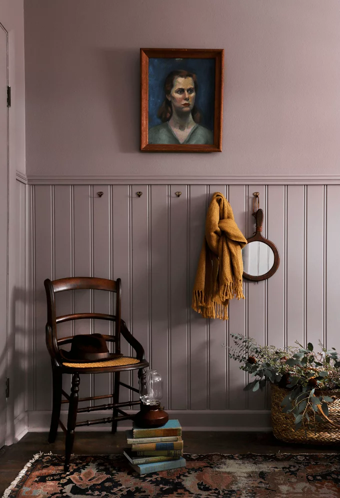
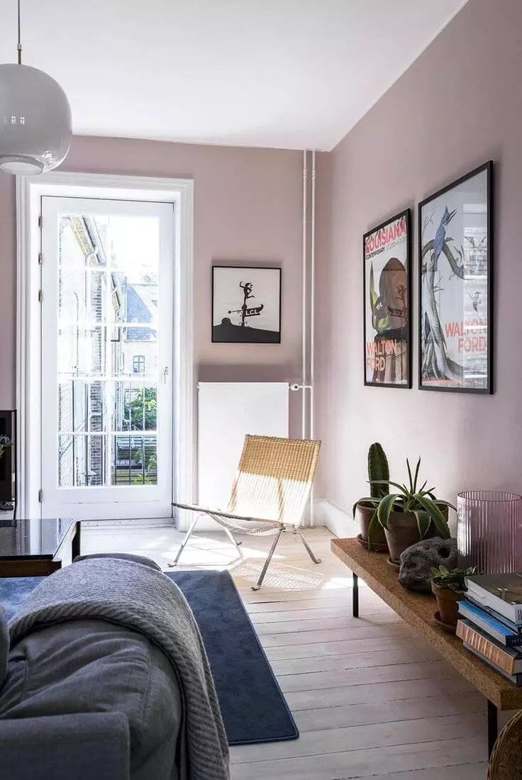
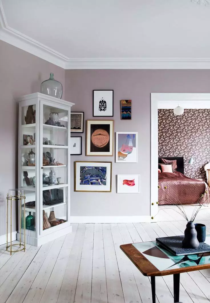
Use of Studio Mauve in the Interior
The so-called blushy pink or smoky mauve from SW is a versatile paint color. Cottage, Coastal, and Vintage styles are associated with this romanticized purple shade. There are also other excellent design ideas for making the most of this trendy paint color in your house.
Cozy Cottage Style
With more coziness than Rustic and added Farmhouse flair, the Cottage style inspired by French Provence or Italian villas feels complemented by such a charming paint color like Studio Mauve. With additional decors, such as a few trinkets, the mandatory gold accents, untreated natural finishes, antique furnishing, and the indisputable mauve paint on walls, the nostalgic ambiance that pays tribute to the romanticized cottage design will become your designer mark.
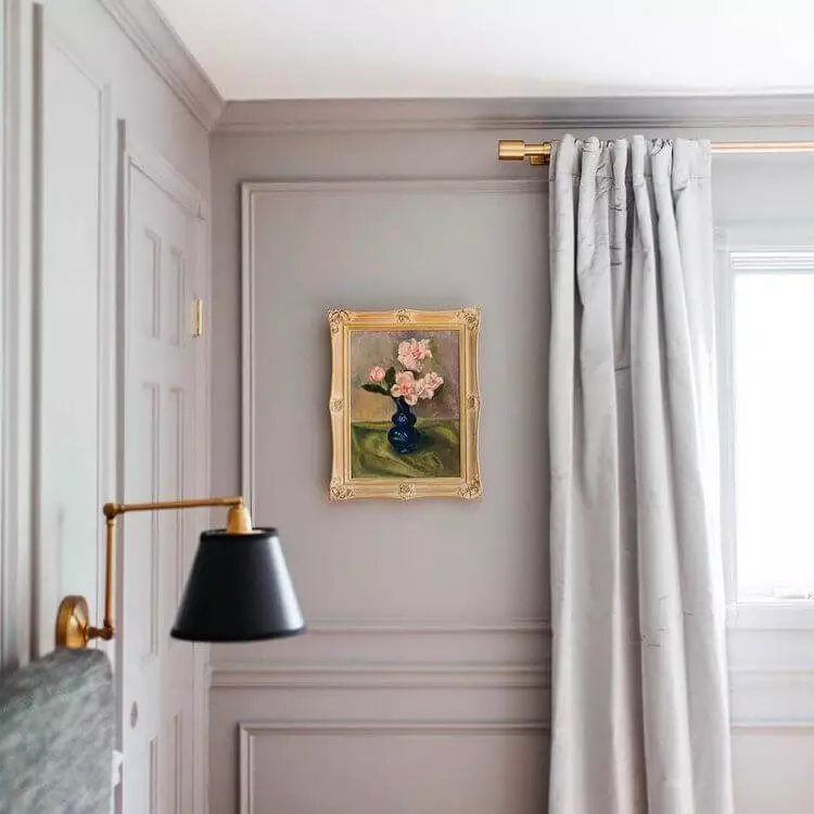
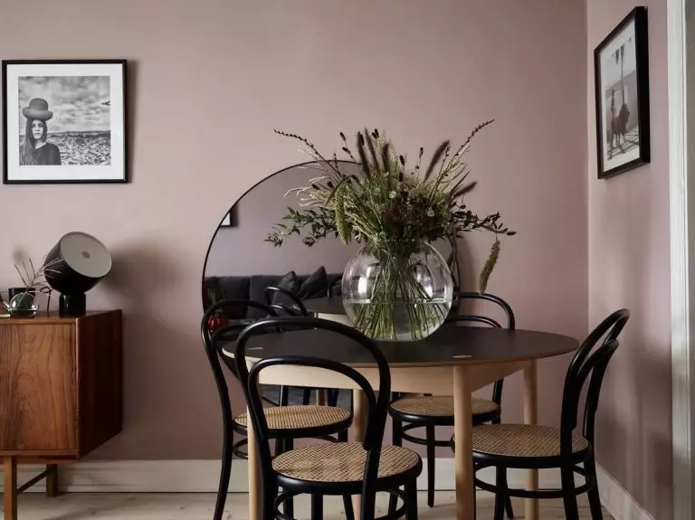
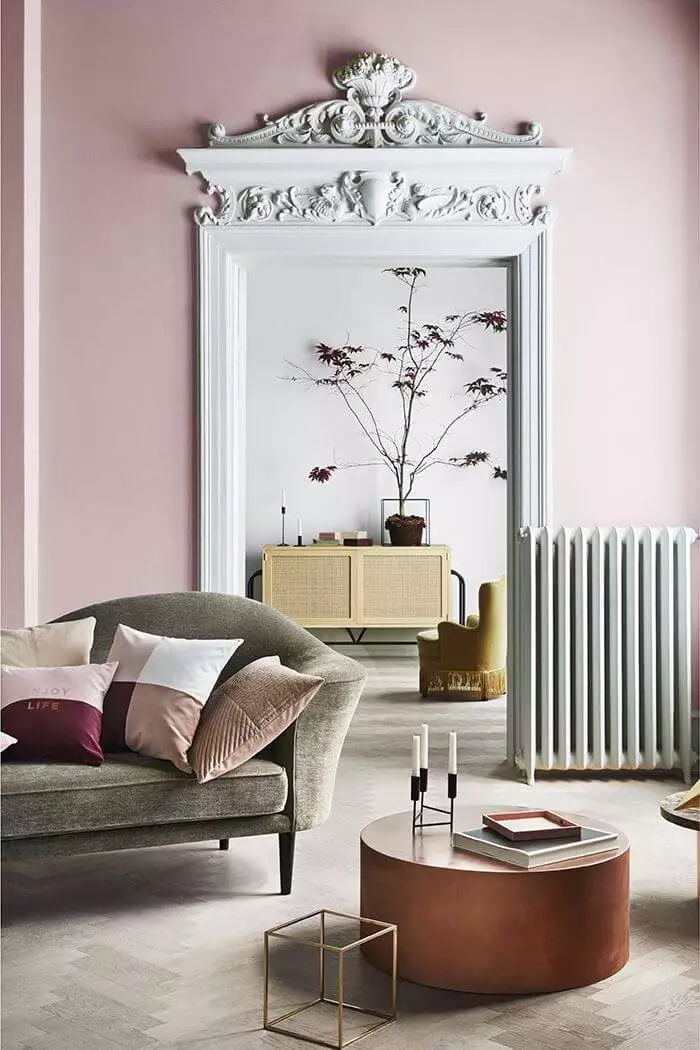
Classic or Modern
If you are into trendy colors, you probably know that purple, particularly lavender, is the color of the year 2023 and sets the beginning of a design age dominated by purple shades. Additionally, purple serves as a transition from neutral to bright that the fashion and design world is experiencing. In the same way, a popular tone, mauve acts in interiors – as a transition from one style to another.
Designers use Studio Mauve as a base color in design projects that assume modern furnishing and decor in once-classic interiors, mostly apartments. The blush purple from SW resonates with the nostalgic classic molding and authentic floor parquet and the freshness of contemporary free layouts and simple lines.
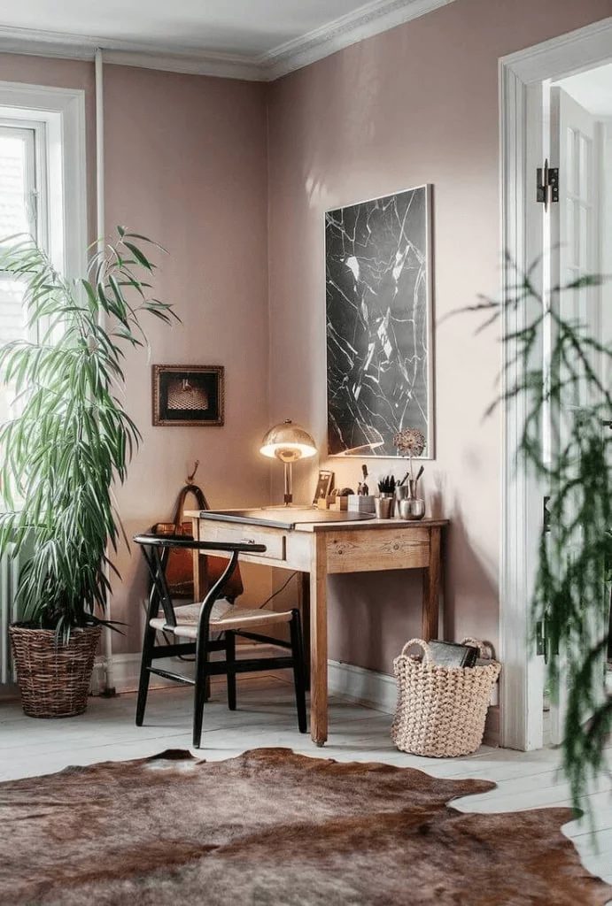
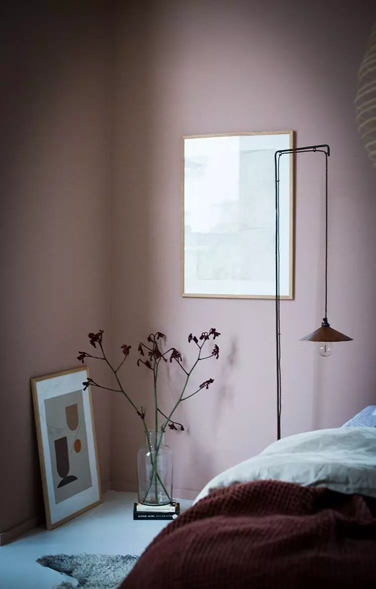
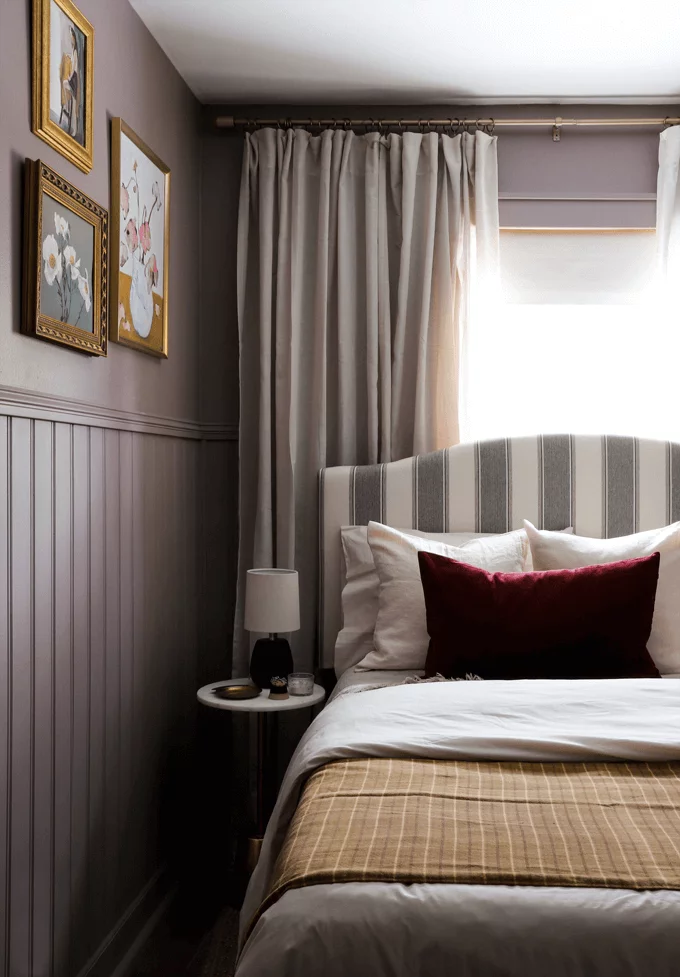
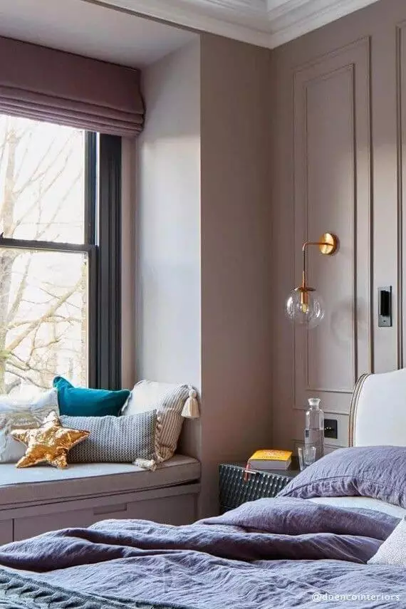
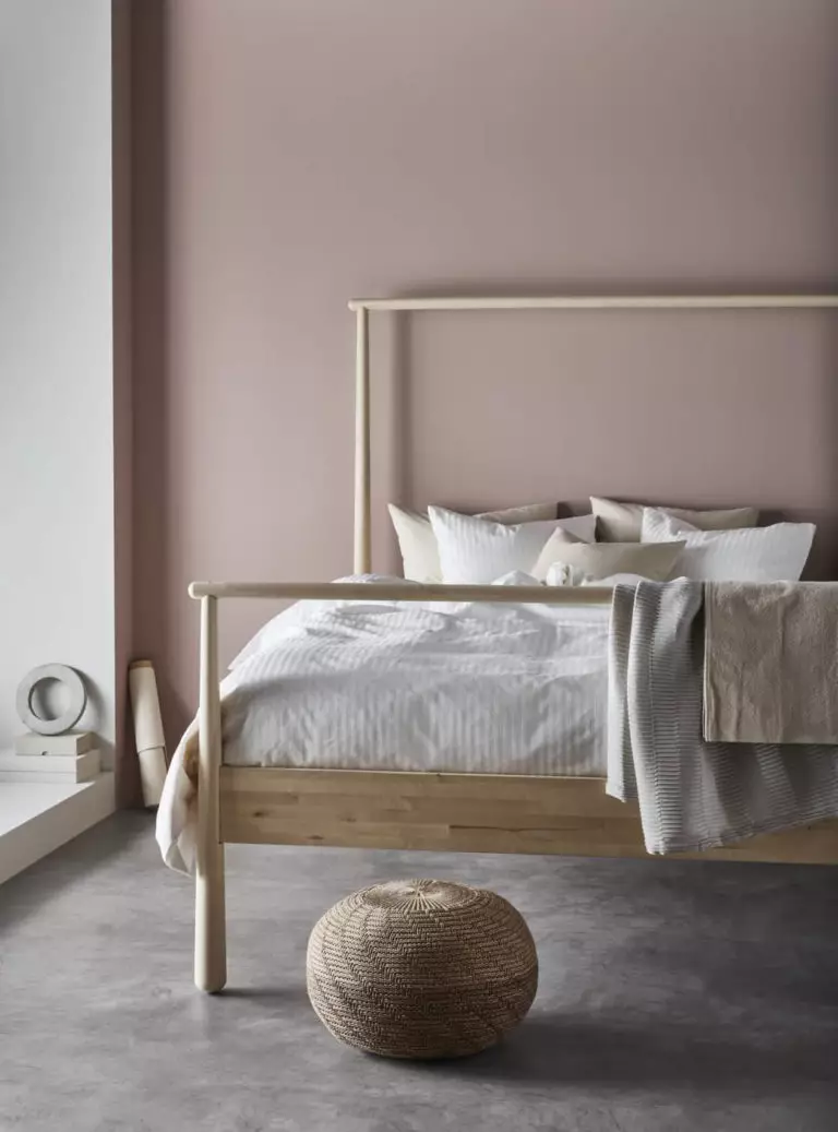
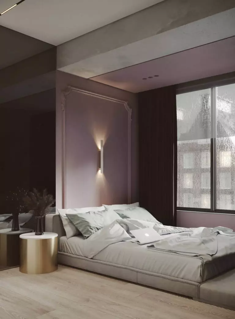
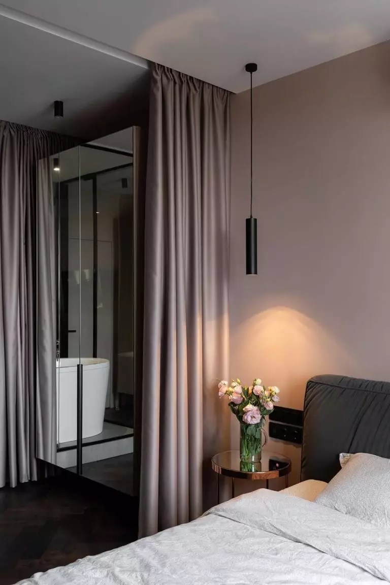
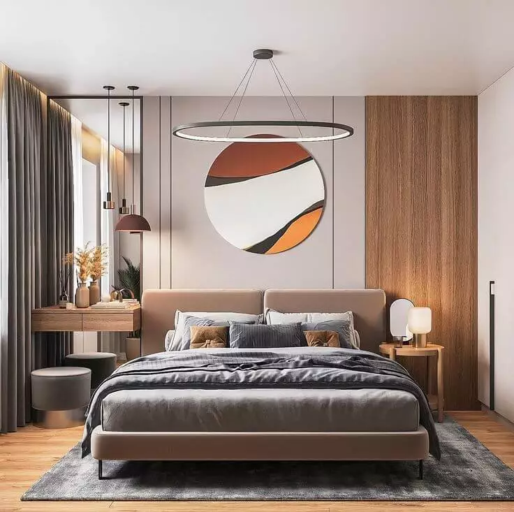
Feel at Home in the Bedroom
Today, it is hard to find a color that appeals to your taste, integrates fast into the existing palette, and doesn’t forget about comfort in the bedroom. Luckily, Studio Mauve, the surprisingly flexible shade of smoky purple, covers all those features, while its neutrality speaks to most tastes. The warm mauve from SW is one of the coziest paint colors for the bedroom that lean toward most styles, Boho, Modern, Neoclassical, Traditional, and so on.
We cannot skip the rushing urge to reveal the feminine energy that hides behind the pastel mauve, making it an expert choice for a woman’s or a teen girl’s bedroom.
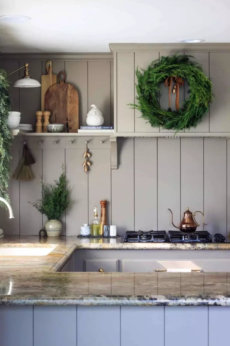
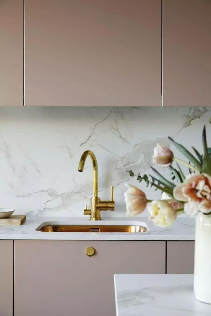
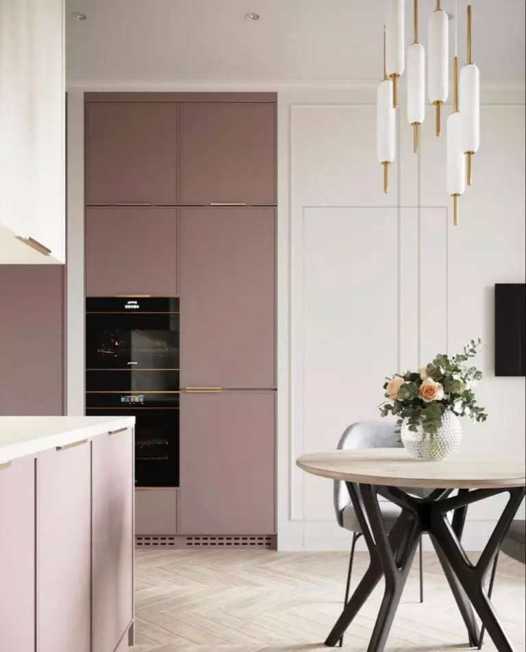
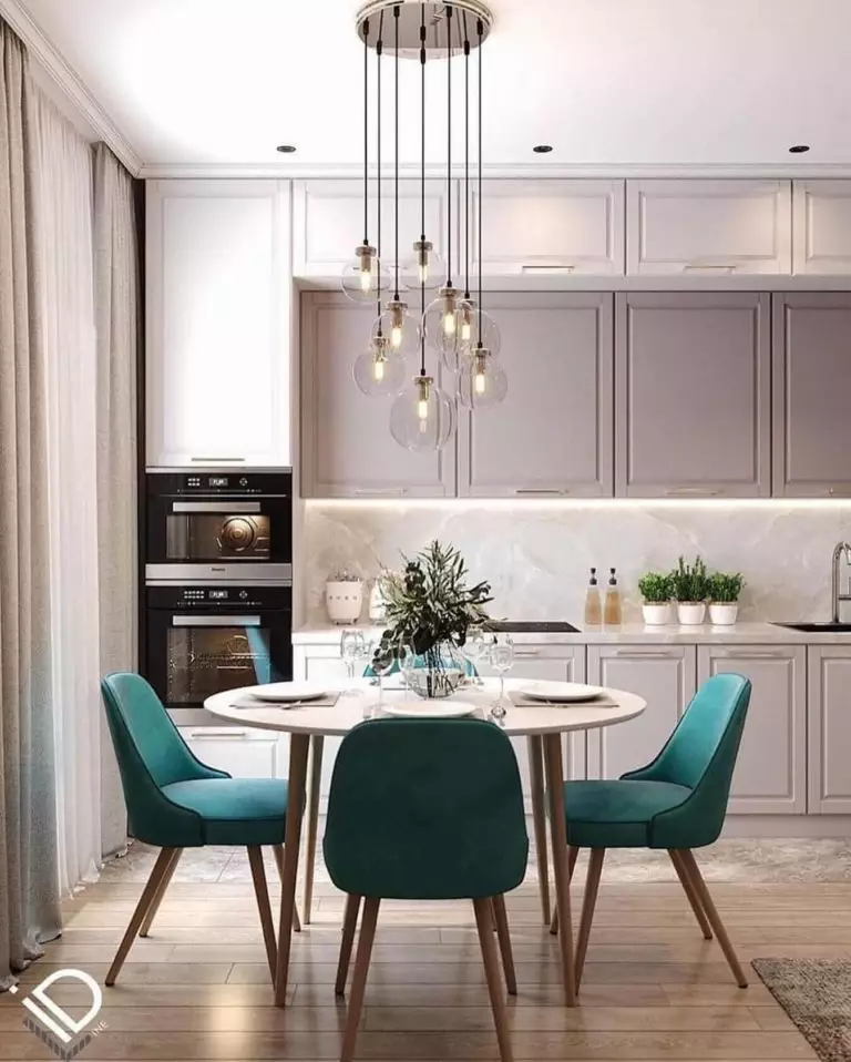
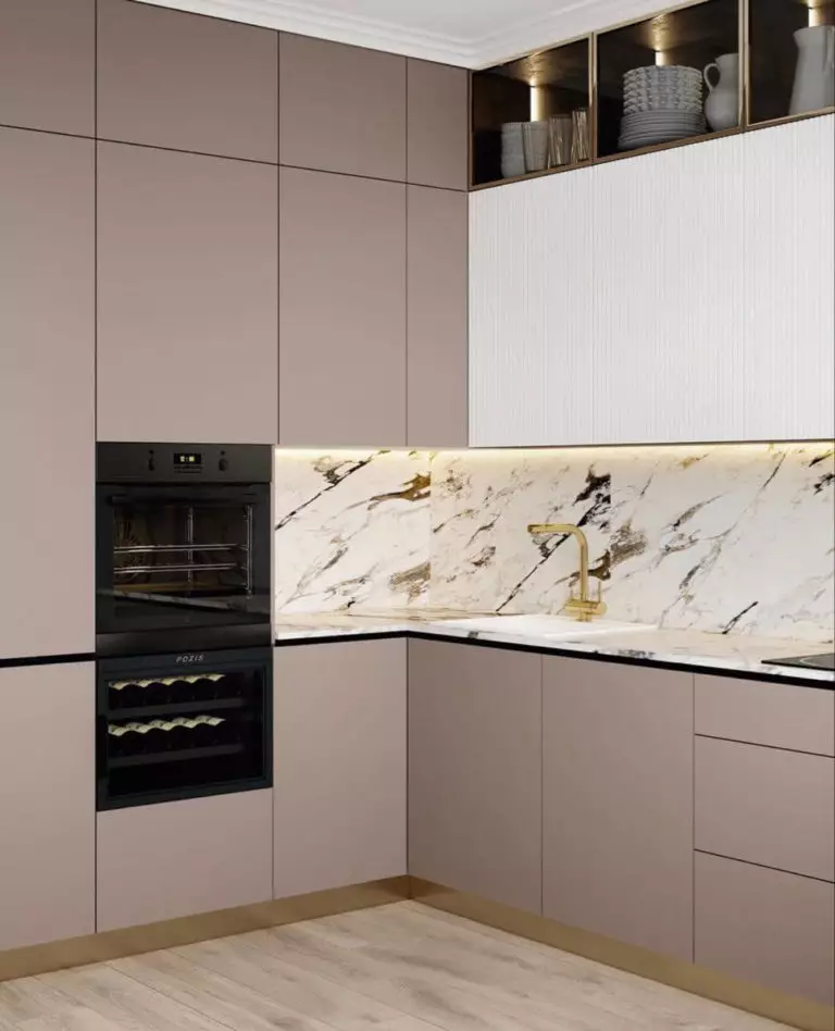
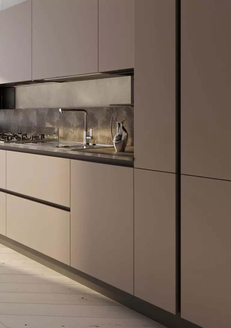
Lavender-Kissed Kitchen
Like classy neutral paint colors, mauve is a timeless shade for kitchen cabinets. No restrictions. Decide on your favorite design style and pair it with SW 0062. The best scenario is combining the grayish purple and gold or black hardware. Lucky you if the sun rays directly hit the color. Additionally, you can give juicy accents a thought, say, emerald green or royal blue accent chairs around the dining table on the canvas mauve background.
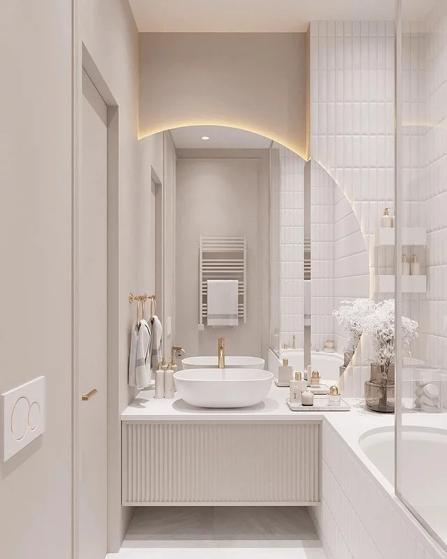
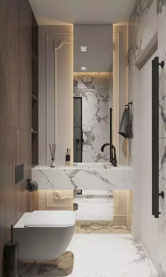
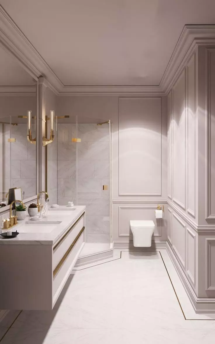
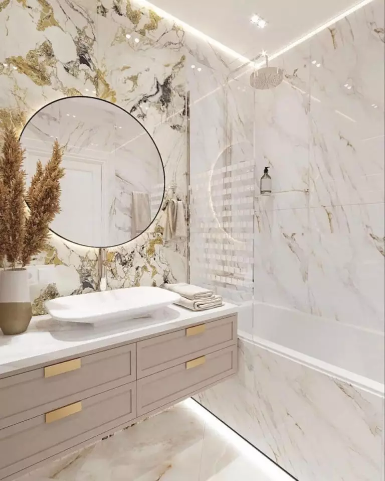
A Bathroom Color to Fall in Love with
Designers have recently rediscovered the charming personality of mauve in the bathroom. Under artificial lighting, it tends to acquire a fantastic pinkish veil that lends unmeasurable taste to a seemingly practical room. The beloved Neoclassical style stands first in line since the pinkish purple underlines the creative side of wall molding. The ultra-modern concept doesn’t stand back, with large mirrors, gold hardware, and downlight fixtures. Studio Mauve is also a successful pairing for luxury design plans, where expensive stones lead in terms of texture.
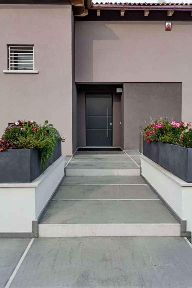
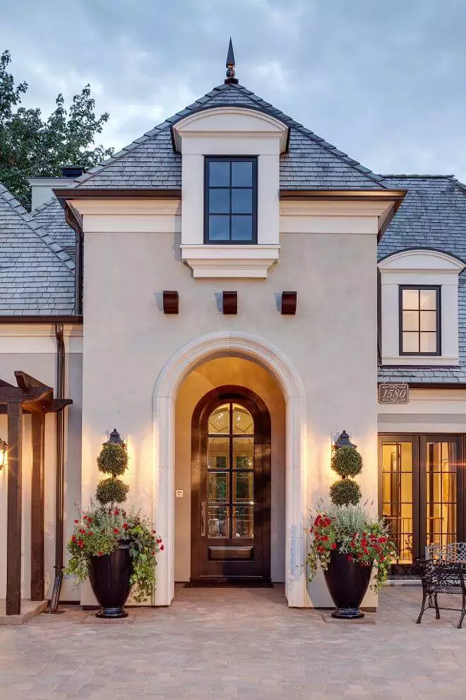
Use of Studio Mauve for the Exterior
On the opposite side of dark paint colors for modern cubic exteriors are the light neutral shades with a history, and guess who takes the first place – Studio Mauve. The unfading mauve paint color looks as organic on traditional house exteriors in the company of a dark-colored roof and wood trim. To be short, it is a stately and creative paint color for the exterior walls.
The Studio Mauve SW 0062 paint color by Sherwin-Williams is a trendy returning shade of purple that designers cannot stop speaking about. Bring the same intrigue and the designers’ approval to your interior and exterior with this historical mauve revival.